My book of pithy aphorisms

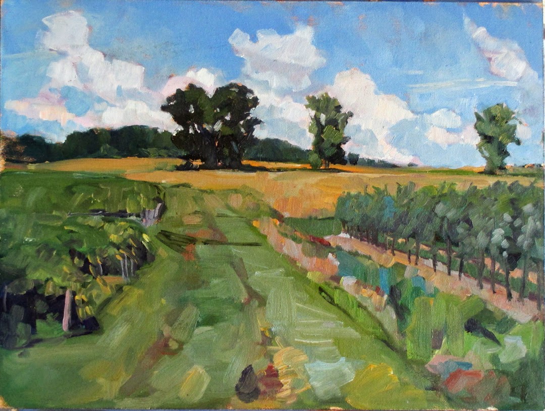
The Mamaroneck River, oil on canvas, by Carol L. Douglas
My teaching year ends at the beginning of June, when I start my summer wanderings. So I was conflicted when V— contacted me about lessons. She is a well-known lithographer and designer. Normally I’d jump at the chance to have her join us, but there’s so little time left in the year. Still, we have time to lay out the basics.

Let’s start with my mantras. These are the things I say so frequently they might even be true.

Slow to Fast

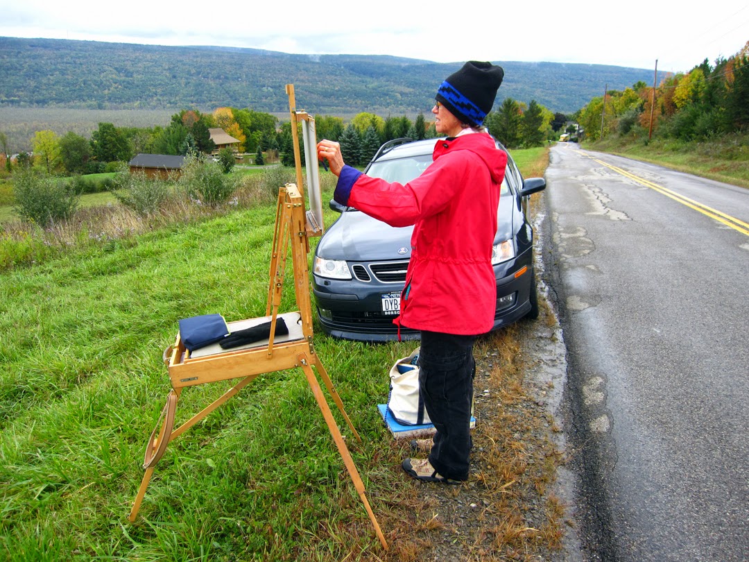
The quality most appreciated in modern painting is assurance.  If you take the time to map out your painting in advance, you will avoid a lot of tentative or corrected brush strokes.
That means doing your measuring, erasing, and composition in the drawing phase.  
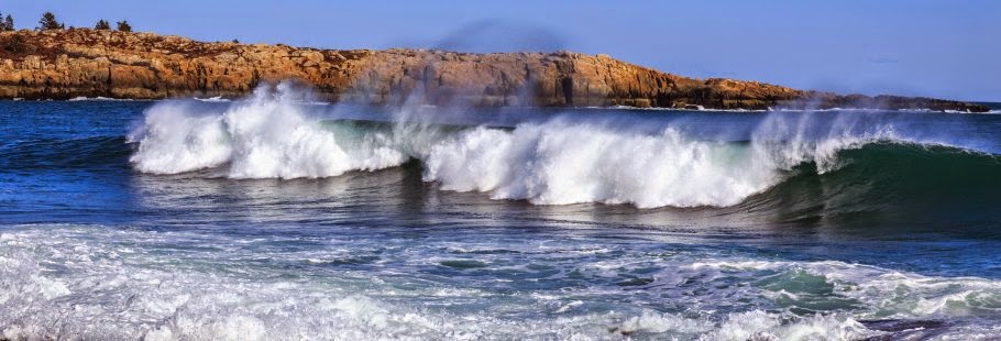
Draw, baby, draw…
Dark to Light

In oils, it’s difficult to paint darks over white. However, this rule is appropriate for all media except watercolor.* If you mass in darks first, you can see the value structure. This gives you a pretty good idea whether the painting will work.
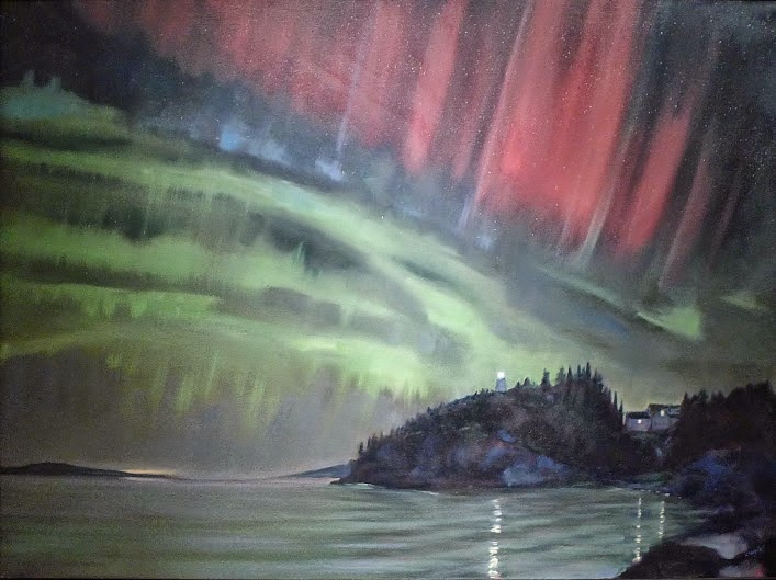
A grisaille by any other name. It is still a great way to start an oil painting. This one, by me.
*In watercolor, you start with light washes. The lights are where you omit paint. It’s important for watercolorists to make a value sketch before they start.
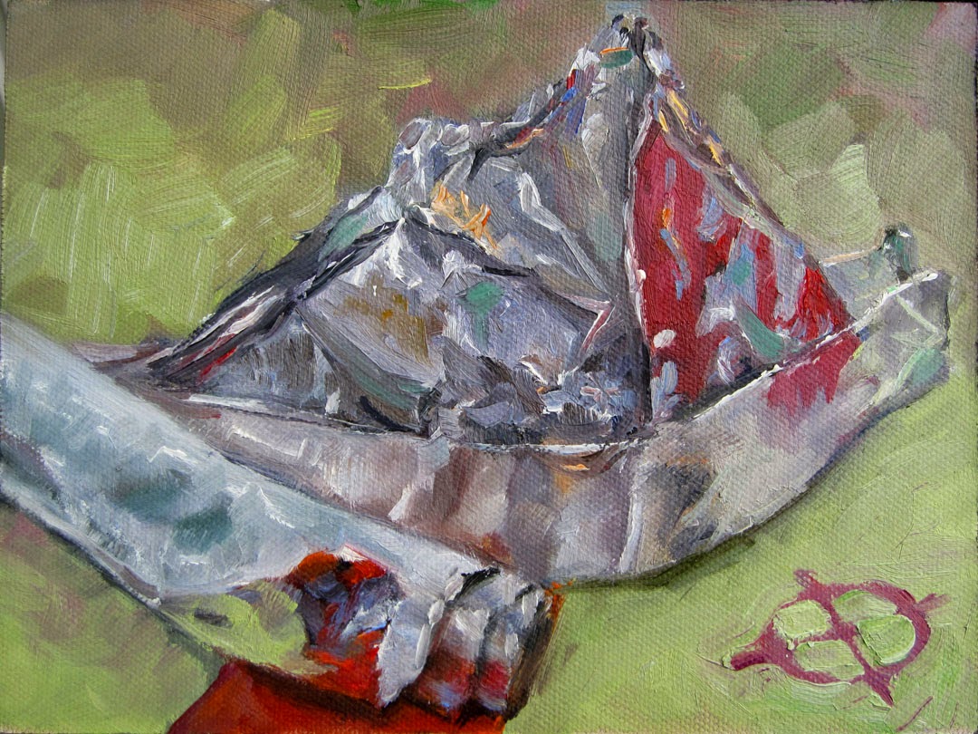
Thin to Thick

Your bottom layers should be lean. Your top layers should be thick and creamy. It doesn’t matter if you want your painting to be clinically hyperrealistic or clotted impasto. This is the only way to paint without cracking or obvious pentimenti. That is a beautiful word to describe an ugly problem: visible reminders of how many times you’ve changed your mind.
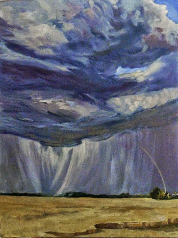
Eventually you get to impasto, but it’s a treat you work up to.
Let me know if you’re interested in painting with me on the Schoodic Peninsula in beautiful Acadia National Park in 2015 or Rochester at any time. Click here for more information on my Maine workshops! Download a brochure here.

Making it look easy

Renocation of the Kirkland Hotel, acrylic on canvas, by Bruce Bundock.

Remember my pal Bruce Bundock from Kingston? He’s on a roll this year. The catalog for his Faces of Vassar is out. And he is featured in this month’s Acrylic Artist Magazine as one of five winners in the 60th anniversary show of the National Society of Painters in Casein and Acrylic.

The Kirkland Hotel at Kingston is on the National Register of Historic Places. Bundock painted it not as a tidy, quaint renovated place, but in the process of shedding its old skin and acquiring its new. “My painting is a form of investigative reporting on light, form and content,” he says.
Renovation of the Kirkland Hotel, #2 by Bruce Bundock
Bruce started by making plein air studies from the parking lot of the hotel and proceeded to a large scale drawing. From there he gridded and painted the finished work. In other words, he works hard to make it look easy.
Bruce’s drawing of the Kirkland Hotel project.
Let me know if you’re interested in painting with me on the Schoodic Peninsula in beautiful Acadia National Park in 2015 or Rochester at any time. Click here for more information on my Maine workshops! Download a brochure here. 

Tenacity

Running feet, oil on canvas, 24X36, Carol L. Douglas
If you think painters have a hard time, you should consider the unpublished novelist. He struggles for months or years on a single work, getting very little feedback. When it’s finished, he peddles it to publishers through a faceless formality called the query letter. He has to be braced for responses from lukewarm to cold. Based on some of the responses he’ll get, publishers apparently hate writers.
One of my friends is doing this right now. The end of her book has coincided with an economic crisis, making the process even more difficult. It’s been very hard to watch her struggle with professional rejection at the same time that her life is so chaotic. I know nothing about the business of writing, meaning that I have absolutely no constructive help to offer.
This is why I was so chuffed to get a text from her last night: “Nervous. Editor has asked for book.”

Waiting, oil on canvas, 24X36, Carol L. Douglas
One of the great things about being old is that you know that seasons of trouble, inertia, doubt, and failure eventually pass. The best artist isn’t the most talented; he’s the one who clings most ferociously to his craft in the face of trouble.

Let me know if you’re interested in painting with me on the Schoodic Peninsula in beautiful Acadia National Park in 2015 or Rochester at any time. Click here for more information on my Maine workshops! Download a brochure here.

It’s tax season

Plein air painters drive around until they find what they want to paint, and then they stop and paint it. That makes absolutely no sense to auditors. This is my dearly-missed painting pal, Marilyn Feinberg, in Naples, New York.
I get a “how to succeed in art” newsletter. A few weeks ago, they sent a sample schedule out. It included time for making and marketing, but no allowances were made for recordkeeping.
I love the time I spend zooming around from plein air event to plein air event in my elderly Prius. However, summer generates not only revenue but receipts. Eventually they all have to be entered in my books.
A scene on the same road, above. They don’t magically happen; you have to look for them.
Some people do that as they go; I prefer to collect a stack of papers and curse at them in March. Not only do I do my income tax and sales tax returns, I also look at our investments and determine if they need to be redeployed. At the end of this, I clear out and reorganize my files, which is why Easter is the one meal we’re able to have at our dining room table.
There was a time when we had a single, standard currency. Although our financial system is pegged to the dollar, we now use credit cards and EFTs more than we use cash. That’s convenient, but it means that we must check credit card statements, Paypal, Amazon, bank statements, EZ pass records, and cash receipts.
A recent tax ruling involving artist Susan Crile validates the idea that artists regularly lose money in the pursuit of future success. This is only fair, since the IRS eagerly taxes those of us whose ship has come in.  But before you can deduct your expenses, you must keep track of them. It’s persnickety business.
And you don’t get beautiful paintings without generating a rather ugly stack of receipts.
 â€œI don’t have a destination,” I once told an IRS auditor. “I drive until I find a view to paint, and then I stop and I paint it.” She couldn’t find a reason to disallow that on the spot, but she warned me that my future mileage logs better include destinations. Now my GPS unit logs my mileage—as longitude and latitude points, which are converted into addresses with software my husband wrote for me.
But most people don’t have a software guru at home, nor should making a living be such an exercise in appeasing government inspectors. I spend about a hundred hours a year on record-keeping to satisfy the IRS. How does that advance art, or advance the American economy?

Let me know if you’re interested in painting with me on the Schoodic Peninsula in beautiful Acadia National Park in 2015 or Rochester at any time. Click here for more information on my Maine workshops! Download a brochure here.

Performance anxiety

Tinfoil Hat, 6X8, oil on canvasboard, Carol L. Douglas
In three months, God willing, I will finish a career of 21 years as the parent of a schoolchild. Hearing a child wail, “I’m going to fail my test” is a sadly regular occurrence. Mercifully, hearing him or her wail, “I failed my test” is usually pretty rare.
We all tend to anticipate disaster, of course. “Sufficient unto the day is the evil thereof,” the Bible tells us. It’s good advice. Whether it’s the results of a biopsy, an exam, a financial challenge, or in a personal relationship, worry is superfluous. When things go really wrong, worry never makes it better.
I had a painting teacher who once announced to us, “You’re all terrified!” I was intrepid enough to come to New York for her classes, I told her, and I wasn’t afraid of no stinking brush. But the truth is, I am sometimes beset by nerves when starting a new painting. We all are. It’s a dive into the unknown.
A drink in the afternoon, 6X8, oil on canvasboard, Carol L. Douglas
What helps? Painting every day at the same time is the best answer. It tells the brain, “we are working now; knock off your nonsense,” and the brain behaves. Regular work habits allow you to get right into the creative mode and minimize distractions.
Of course, it’s early March and I can’t do that. It’s time to do taxes. That requires all my concentration (and can shatter my nerves). But this too shall pass, and the snowpack is melting. Spring really is right around the corner.
Plastic wrap #2, 6X8, oil on canvasboard, Carol L. Douglas. Also known as Portrait of the Artist as a Bookkeeper.
Let me know if you’re interested in painting with me on the Schoodic Peninsula in beautiful Acadia National Park in 2015 or Rochester at any time. Click here for more information on my Maine workshops! Download a brochure here.

Let’s talk about summer, part 2

Start with your pigments. 
Yesterday, it was so warm that I went outdoors in my loafers without socks. There’s still two feet of snowpack out there, but winter’s back is broken. Yes, it will snow again between now and Easter, but it can’t last.
That means that it’s time to get your plein air pack in order.
I use the same palette indoors and out, but my umbrella, my backpack, and my field easel get stashed in a corner. My first order of business is to pull them out and inspect them for cracks, tears and other damage, and to thoroughly vacuum out my backpack.

Check your brushes.
Last fall, I bought a bunch of new brushes so I’m sure that my brushes are in order. Good thing, too, since by the end of last season it felt like I was painting with clubs. Start by getting rid of brushes that are worn out or gunked up.
I buy my paints in cans from RGH Paints in Albany. I keep them in this segmented vitamin box. Generally a plastic box of paints will get me through a week of travel without reloading, and it weighs a fraction of what the same paints in tubes do. Spring is when I clean out the box, check my supplies, and order new paints for the upcoming season.

Baby wipes, bug dope, sunscreen, hooded ponch and a baseball cap are important.
More drawing means less struggling, and I carry a lot of drawing tools, both for myself and my students: charcoal, watercolor pencil, graphite, greyscale markers for fast value studies, and a viewfinder with a dry erase marker. I often use watercolor pencils and a straight edge when architecture is involved.
Don’t forget drawing tools.
I check my sunscreen, bug repellent, painting cap, apron, water bottle, and supply of liquid gloves. I always carry two ponchos—one for me, and one for my painting, because when it rains in the spring, it really rains.
I have two sets of tools, so my field ones generally don’t wander off. They still need to be checked: compass, palette knifes, scraper, bungee cords, level, S-hooks, clips, all-purpose tool, straight edge/angle finder, paint pots and soap.

S-hooks, clips and bungee cords have a thousand and one uses in the field.
It’s time to order new fast-dry mediumand check my supply of mineral spirits. Because I want to travel light, I repurpose old medium containers to hold mineral spirits, and carry my medium in a hotel shampoo bottle or cosmetic pot. I always carry a few plastic grocery bags for trash. The pins and strap are one way to carry finished paintings, if you don’t use a panel carrier. If you do use panel carriers, check the elastics to see if they need replacement. And it’s definitely time to check your inventory of painting boards.

You’ll need wee jars for medium and solvent. Don’t forget to check your stash of boards.
Last, I check my supply of frames and framing tools. If you do plein air events, you need them on hand.
Check your pigments, check your tools, check the stuff you need to be comfortable. Reorder what’s used up, repair what’s broken.
Let me know if you’re interested in painting with me on the Schoodic Peninsula in beautiful Acadia National Park in 2015 or Rochester at any time. Click here for more information on my Maine workshops! Download a brochure here. 

Let’s talk about summer

Sunset off Schoodic Point. Just another day in Paradise.
I’m going to be speakingabout New York painters and their relationship with the Maine Coast at the Moore Auditorium in Acadia’s Schoodic Institute on August 12. This is scheduled concurrently with my workshop at Schoodic from August 9 to 14. The talk is free, and if you’re in mid-coast Maine that week, I hope you join us.
There are four spots left in the workshop. Last year I erred in letting a few extra people sign up, on the assumption that someone would drop and it would all work out. That didn’t happen, and we had too many painters. This year, I’m holding the line strictly at 12 participants, so if you want to come, I recommend you hold a place. From past experience, I’m confident that this workshop will sell out.
Painting the view from Mt. Battie during last summer’s workshop.
We have designed this workshop to include room and board so you can concentrate on painting. Schoodic is an unspoiled gem of the Atlantic coast. Pounding surf, stunning views of Cadillac Mountain, and veins of dark basalt running through red granite rocks are the dominant features of this “road less traveled” in Acadia National Park. Pines, birch, spruce, cedar, cherry, alder, mountain ash, and maples forest the land. There are numerous coves, inlets and islands. And your private room, shared bath, room and board and instruction are just $1150.
Some of last year’s participants asked for more surf, so I went up to Acadia and got them more surf. But they won’t get crowds; Schoodic is the quiet side of this monumentally popular park.
My long-term monitor, Sandy Quang, will not be with us at Acadia this year. She has finished her MA in art history and is working at Christie’s in New York this week, the beginning of her career in curating art. We will enjoy the time we have left with her here in Rochester while knowing that she’s on to bigger and better things. Sandy has studied on and off with me for ten years, and it’s a bittersweet parting. “You give them roots and you give them wings,” someone remarked to me last week. One thing I’m sure of: Sandy will be a painter for the rest of her life.
Stacey painting on a floating dock last summer.
Click here for more information on my Maine workshops! Download a brochure here. 

Objects of Grace

The Heavens Declare, 48X36, oil on linen, 2014
This month I have three pieces in Objects of Grace at Roberts Wesleyan’s Davison Gallery. This show was designed to accompany the school’s Schoenhals Symposium, which this year features art historian and writer Dr. James Romaine.
Dr. Romaine is a New York-based art historian. He is the president and co-founder of the Association of Scholars of Christianity in the History of Art and Associate Professor of Art at Nyack College.
Beauty Instead of Ashes, 48X36, oil on linen, 2014
Three Dimensions of Christian Creativity is scheduled for Thursday, March 19 at 4 PM at the Smith Science Center Auditorium. Romaine will discuss The Art of Tim Rollins + K.O.S. on Friday, March 20 at 4 PM in the same venue, and will lead a discussion at the Davison Gallery on Friday, March 20, from noon to one.
That’s where I come in. Included in the exhibit are four artists (Sandra Bowden, Makoto Fujimura, Edward Knippers, and Joel Shessley) featured in Dr. Romaine’s book, Objects of Grace: Conversations on Creativity and Faith. Also in the exhibit are three “significant local artists treating Christian themes, Scot Bennett, Carol Douglas and Luvon Sheppard,” and pieces from Robert Wesleyan’s permanent collection.
The Harvest is Plenty, 48X36, oil on linen, 2014
I have long been a fan of Luvon Sheppard’s work. His watercolors of Rochester capture the pulse of the city perfectly, with a high degree of technical excellence. He’s a man of faith, but he doesn’t beat the viewer over the head with it. It’s a great honor to be showing with him.
Interested in attending Dr. Romaine’s talks? The Symposium brochure is available here.


Let me know if you’re interested in painting with me on the Schoodic Peninsula in beautiful Acadia National Park in 2015 or Rochester at any time. Click 
here for more information on my Maine workshops! Download a brochure here. 

Debunkery #2: Yes, there was blue in the ancient world.

Lapis lazuli eyes in the 25th century BCE Statue of Ebih-II (eastern Syria).
Today’s misinformationcomes from the same fount that gave us yesterday’s‘four-coned woman.” It’s the idea that the ancients were somehow ignorant of the color blue, as evidenced by the fact that Homer called the ocean the “wine-dark sea.”
Fragment of a fresco from the Bronze Age Palace at Knossos. The blue is kyanos (from which comes our word cyan), a soda/copper frit paste.
Calcium copper silicate was the first synthetic pigment, dating from the Egyptian 4th Dynasty (c. 2575–2467 BCE). Although no Egyptian texts lay out its exact manufacturing process, Vitruvius gave us a formula in his De architectura (c. 15 BCE).
The Egyptians synthesized Egyptian blue because their primary blue pigment, lapis lazuli, could only be found in Afghanistan and therefore was rare and expensive. Lapis has been mined since the 7th millennium BCE, making it one of the oldest known human endeavors.
Carthaginian glass head pendant with cobalt blue hair and eyes, 5th-4th century BCE. Cobalt is another pigment used since antiquity.
By the fourth millennium BCE, the Egyptians already had an established sea and caravan trade network. The Uluburun shipwrecktells us conclusively that the Egyptians were trading blue glass ingots with the Greeks by the late 14th century BC, long before Homer lived.
Blue glass ingot from the Uluburin shipwreck. Chemical analysis indicates that the cobalt blue glass in ancient Egyptian glass vessels and in Mycenaean glass beads were from the same source. Syria in the late Bronze Age was exporting raw glass to both places.
Lapis lazuli’s name derives in part from lāŞaward, which is simply the name of the mineral in Persian. From it comes the English word azure, French azur, Italian azzurro, Polish lazur, Romanian azur and azuriu, Portuguese and Spanish azul, and Hungarian azĂşr. It doesn’t take an etymologist to realize that all these European words come from a common root, one that meant ‘blue’ to its users.
Egyptian blue pyxis, imported to Italy from northern Syria, c 750-700 BCE.

It isn’t a Roman root. The Romans called that blue color caeruleus, deriving from caelum, meaning heaven or sky. The Greeks had a word for blue: kyanos, which comes down to us as cyan. And, yes, the ancient Israelites had a word for blue: tekhelet. This refers to a dye made from a now-unknown marine creature.

On the other hand, the word blue in English derives from a Proto-Germanic word that meant pale, pallid, wan, blue, blue-grey, yellow, discolored and light in color. That is as good a description of the northern sky as anything.
Nobody knows what the marine creature that gave the ancient Israelites tekhelet was, but a piece of wool dipped into Murex-based dye turns green in sunlight, eventually darkening to a blue-violet. This is possibly why the word refers to both blue and green.
So what was Homer—whoever he was—talking about with his references to the “wine-dark sea”? I’ve asked this question before, and my conclusion is that he is speaking of the roiled, opaque, impenetrable ocean.
King Tut’s burial mask (1346 BCE) has lapis lazuli eyelashes, imported from Afghanistan.
Some people have absolutely no poetry in their souls.

Let me know if you’re interested in painting with me on the Schoodic Peninsula in beautiful Acadia National Park in 2015 or Rochester at any time. Click 
here for more information on my Maine workshops! Download a brochure here. 

Debunkery #1: No, you’re probably not a tetrachromat

The distribution of cone cells in the fovea of an individual with normal color vision (left), and a color blind (protanopic) retina, by Mark Fairchild.

Tetrachromacy means that you have four types of cone cells in the retina. Tetrachromats exist among birds, fish, amphibians, reptiles and insects, but in most mammals there are two kinds of cones, and in humans and some of our primate relatives, there are three kinds.

As you remember from high school, there are two types of photoreceptor cells in your retina. (Actually, they now say there are three, but the photosensitive ganglion cells aren’t there for vision). The rods work in low light; the cones work in normal light. The three kinds of cones respond, more or less, to short, medium, and long wavelengths.

The four pigments in a bird’s cones extend the range into ultraviolet. That would do you no good, since your eyes are designed to block ultraviolet rays.

In humans, those three cone types give us the capacity to distinguish a million color variations. Some men suffer from having two kinds of normal cones and a third, mutant, cone that is less sensitive to green and red. We call that color blindness. It’s a sex-specific trait.

In 1948 a scientist named H.L .de Vries studied the daughters of color-blind men to see if they might be carrying the mutant cone type along with their three normal ones. He did notice that the daughters of one of his test subjects responded to reds and greens differently than most women. Since then, a lot of people have searched for the so-called ‘four-coned woman’.

Turns out a significant portion of woman have dud ‘fourth cones.’ In June 2012, after 20 years of studying them, neuroscientist Dr. Gabriele Jordan identified a woman who could detect a greater variety of colors than trichromats could, meaning that she is a ‘true tetrachromat.’

To be a true tetrachromat, you’d have to start by being a carrier female in a family with genetic colorblindness.

One woman thus far. Yes, there probably are several more, but I doubt that includes you. For one thing, you’d need color-blindness to run in your family.

Visual information has to be collected and processed with retinal neurons and the resulting information sent via the optic nerve to the brain. It is processed and refined all along the way. What would the existing neural structure of the brain do with the information it got from a fourth set of cones if the infrastructure to interpret it wasn’t in place?

The cones in your eyes are part of a complex system for distinguishing color. From Anatomy & Physiology, Connexions Web site.

Human vision has plasticity that we don’t even begin to explore. When I first see painting students, they are puzzled about the color temperatures of white and grey. A year later, they’re manipulating color temperature like old pros. That isn’t because they sprouted new hardware; it’s because they’ve started to use the hardware with which they were born.

Want to see more color? Take up painting.

My 2024 workshops: