fbpx

The Opium Eater

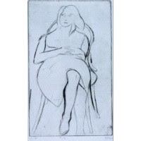
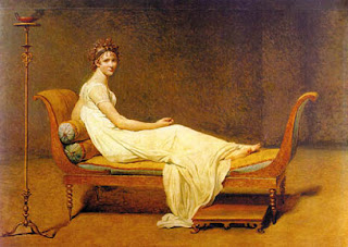
This week’s figure class featured Gail Kellogg Hope modeling a Civil War era gown of her own devising, minus the ruffled hoop. (Readers interested in historic clothing can see Gail’s work here.) Because Gail’s hair was down and she was recumbent, I thought she looked charmingly like a 19th century laudanum addict.
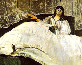
I wanted to begin this essay on languid poses with an American painting, but I was unable to find an American Victorian example. I’m not sure such a painting exists—it would have been contrary to our national myth to see womanhood as anything other than industrious, thrifty, and alert.

ā€œBaudelaire’s Mistress Reclining,ā€ Edouard Manet, 1862, SzĆ©pmüvĆ©szeti Museum, Budapest. http://cgfa.dotsrc.org/manet/p-manet35.htm
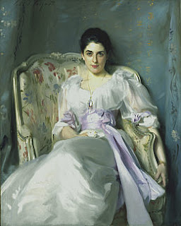
Off to decadent France, then. The portrait above is of Baudelaire’s mistress, Jeanne Duval, who was a native Haitian of mixed race. Thus her coloring is more realistic than one might first suppose, although the blackness of the painting is Manet at his rebellious and intellectual best, as is the iconography (you can read an incredibly tedious essay on the subject here, although it doesn’t answer what is to me the most interesting question: why the title—not Manet’s doing—doesn’t dignify her by name).

ā€œLady Agnew of Lochnaw,ā€ 1892-93, oil on canvas, The National Gallery of Scotland http://www.nationalgalleries.org/collection/online_az/4:322/result/0/5396?initial=S&artistId=4829&artistName=John%20Singer%20Sargent&submit=1

The fin de siĆØcle painters were much more comfortable with slouching. I’ve included this example by Sargent largely because the chair resembles the one in my studio—before a century of wear and grime and burst seams. Sargent’s lady reclines, but she is anything but debauched. Instead, the pose is one of aristocratic grace. Although Lady Agnew levels her gaze at the viewer with the same assurance as Jeanne Duval, her chin is down and demure. Notice the right arm culminating in a firm grip—it belies the rest of the pose and points to why Sargent’s portraits are never dull.

ā€œThe Baths of Caracalla,ā€ Sir Lawrence Alma-Tadema, 1899, private collection http://www.artrenewal.org/asp/database/image.asp?id=610

Sir Lawrence Alma-Tadema was proof that not every Dutch painter was brilliant, although he gets my respect for being silly and exuberant. He was, of course, a fine technician. Although not strictly a Pre-Raphaelite painter, he shares with them the tendency to see women as sensual and emotional creatures. In this painting, his Roman matron sinks comfortably into a hard marble bench. Perhaps the background hints that these baths were built by Rome’s most psychotic emperor, but the matron’s couture, coiffure, coloring and companions are strikingly, calmly English.

ā€œThe Green Sashā€, Henri Matisse, 1919, Art Institute of Chicago http://www.artic.edu/aic/collections/citi/object?id=59919&artist=Matisse&keyword=

After that, it is a relief to return to the ambiguity of Matisse. This painting is austere; in fact it has a lot in common with the Manet above. There is no ā€œsettingā€ per se. As in the Manet portrait, the gown has presence and meaning of its own.

Note that in the portrait of Lady Agnew, Sargent is using Matisse’s patterns while in this painting Matisse is using Sargent’s beloved black paint.

“#13 from the book, 41 Etchings Drypoints,” 1965, Richard Diebenkorn, Fine Arts Museums of San Francisco http://www.thinker.org/imagebase_zoom.asp?rec=6339304212900030

We recognize this last work immediately as a mid-century American drawing by the hemline and the hair. As cloying as that was with Alma-Tadema, it is a virtue in this etching by Richard Diebenkorn. Why is that?

With the hand resting on the abdomen, we have come full circle back to the photo of our model. There seems to be nothing strange about that pose to me, but will future viewers see it as an idiosyncrasy of our age?

Where the movie “Big” was filmed

I just returned from a week downstate. The culmination of this was the seventh annual ā€œPainters on Locationā€ of the Rye Arts Center in Rye, NY. Last year I was overwhelmed by the landscape, the parking, the driving and the event, yet I had a wonderful time. This year, Daisy dePuthod (see her work here) took me under her wing and with the logistics more manageable, I was able to relax and paint.

The artists’ boards were stamped at 3 PM on Friday, since rain was threatening on Saturday morning. Daisy and I gathered our boards and lunches and headed to the Playland boardwalk. Playland was built in 1927 and is the only Art Deco amusement park left in the United States; it’s a National Historic Landmark. The part on which we painted is a public beach. (To learn more about Playland, see here.)

Many people pointed out that the section I chose to paint was
used in a scene in Tom Hanks’
Big. Does this look familiar?

The boardwalk and bathhouse are set on a long curve, which makes for some intriguing arcs. I stood within a stucco arch and focused on the long curving sweep of the roof. Even though the subject of the painting was the bathhouse with its two towers I knew the picture depended on the sweep of the blue roof.


By the time I committed my drawing to canvas, the light was gone. It was a beautiful evening, with lights twinkling along the boardwalk, but useless for painting.

The next morning I arrived in Rye shortly after 6 AM.

No box easel! I can never find anything in them.

My set-up under an arch was a good idea, for it was rainy, cold and dark.

My first task was to refine my drawing in charcoal. Normally, I don’t do much charcoal drawing, but the buildings are complex and I was working fast.


Daisy scoping out the scene…

And Daisy painting the scene…

It was hard to choose among the architectural gems in this place…


I concentrated on painting the orange beams first because I needed them to be believable.


Note that I got rid of the man peering into the Museum windows. I think that was a mistake—he lent good foreground interest. I replaced him with a couple walking a dog—ubiquitous on the boardwalk, but too far away to lend any depth to the scene.


The finished painting:

“Where Big was Filmed”
16X20, oil on Ray-Mar canvas board, sold, Rye, September 15, 2007

Voila! The new studio.

New studio space—spacious, with focus spots, color-corrected ambient lighting, and plenty of north daylight (when the sun is shining).

The project which consumed my August is finished. Here is my new teaching space, a lovely, calm, graceful room with great light. And here are my fall classes, for those readers in the Rochester area:

Studio in Art

Saturday, 10-1
Wednesday, 10-1

(Oil, pastel, acrylic, watercolor)

This class focuses on still life as a fundamental tool for developing drawing and painting technique. It is appropriate for both beginning and advanced students. Instruction emphasizes direct painting, where paint is applied solidly rather than through glazing. For watercolor and acrylic, the emphasis is on alla prima techniques.

$100/month

Figure

Saturday, 2-5
Wednesday, 2-5

(Oil, pastel, acrylic, watercolor, drawing media)

This class focuses on the figure’s relationship with the built environment. In addition to working with live models, we will study human anatomy, drapery and clothing. The class is suitable for both beginning and advanced students. Students without a background in figure drawing are encouraged to begin in charcoal.

$137.50/month

Five questions from Paul Abspoel

My friend Paul Abspoel (here) asked me five questions to be answered on this blog. I apologize for the time it’s taken, but here are the questions and the answers:

Please comment: ā€˜God is an Artist, but his art is not very accessible’

ā€œAccessibleā€ art has a message we easily grasp. Our response to Creation is visceral and consistent: from the molecular to the cosmic level we react with awe.

As the Book of Common Prayer says, ā€œAt your command all things came to be: the vast expanse of interstellar space, galaxies, suns, the planets in their courses, and this fragile earth, our island home. By your will they were created and have their beingā€¦ā€

Who do you consider to be the greatest Dutch painter: Rembrandt van Rijn, Johannes Vermeer, Vincent van Gogh, Pieter Mondriaan or Karel Appel? Tell us what you like about these famous Dutch painters and give us your explanation for the fact that there are so many artistic highpoints in the historic scenery of my flat little country.

Let us start with your last point—why your nation produced so many brilliant painters. Your weather (so damaging to frescoes and tempera) is the reason we have oil painting in the first place. It was developed by the Early Netherlandish painter Jan van Eyk.

Before there was the modern Netherlands, there were the Low Countries. This was the locus of northern Renaissance painting. There was a northern sensibility that was Protestant and Gothic, and which shaped a painting style that was intimate, naturalistic and religious. Unfortunately the Early Netherlandish painters are outside the purview of your question; they include many of my favorite artists.

Your country was birthed as a multicultural, polyglot nation. Flemish capitalists, Sephardic Jews and French Huguenots transformed sleepy Amsterdam into a wealthy world capital. That hybridization was similar to the one which created America, and it seems to work not only for commerce but for culture.

The Dutch Republic was unique in that your wealth was held by merchants and skilled tradesmen, not with the church or nobility. Your bourgeoisie’s tastes ran to portraits, still lives, landscapes and genre paintings, in an ā€œaccessibleā€ style.

On to your painters:

I have often wondered how Rembrandt ever sold a single painting, since he cared so little for Dutch virtuosity. His sensitive character assessments, intentional gawkiness, and fluid brushwork were more suited to Romanticism than to his time.

Rembrandt’s work is often subject to crackpot theories of attribution. Art critics can’t believe that someone so great can be so awkward, but it’s essential to his work. There is a Rembrandt at the Frick called ā€œThe Polish Riderā€ (here) which has been the subject of raging debate about authenticity. I believe it is his, and it illustrates how his technical unevenness contributes to the greatness of his painting.

There are only 35 definitive Vermeers known, so we are blessed to have several in the United States. I am always struck by how tiny his canvases were, since he seems to open the window on entire lives.

Vermeer’s genius lies in the way he reins in his superlative skill. Not for him the luscious, overblown still lives of his peers. We understand that he could paint anything, so what he chose to paint matters. He was a brilliant narrator, opening a tiny window into a story or principle. My mother has had a print of ā€œThe Lacemakerā€ (here) hanging in her dining room for forty years; I appreciate the moral tale (diligence and concentration) but at the same time it is also a lovely painting.

There is another Golden Age painter I’d add to your list: Franz Hals. He is known for his virtuosity, and people assumed he painted in one fast pass. Recent analysis shows that he built his work up in the traditional manner and then applied loose brushwork at the top. His hardy, carousing Dutchmen match my inner vision of your country. His ā€œBanquet of the Officers of the Civil Guardā€ (here) show how gifted he was, but his intimate portraits like this young knucklehead (here) are what I love the best.

Van Gogh is probably the single most important painter of the last two centuries. He stood between the Impressionists and the Expressionists but there is no easy label to affix to him. There is no theoretical detachment in his color study as with the Impressionists; there is no disregard for subject as with the Expressionists. His work was always yoked to drawing and composition, and it is a mistake to assume he worked in one pass, for his work was carefully considered and developed. His paintings were never intellectual exercises or mindless pastorals. He was not distorting reality, but rather painting his own reality.

I admire his landscape technique beyond words, but I also empathize with him as a failed missionary and preacher. There is no way I can pick an iconic painting for him so I will point out an unusual one: ā€œThe Good Samaritanā€ (after Delacroix, here).

Pieter Mondriaan was interested in Theosophy, which makes sense when considered along with his move from expressionism to intellectual color theory. His grids are nicer in life than as reproductions, since they have a hand-made quality that is lost in photos. They are, of course, beautifully composed. However, I would select the beautiful ā€œMolen Millā€ (here) as his iconic painting, even though it’s not what he is remembered for.

Unfortunately, Karel Appel doesn’t do a thing for me. Willem de Kooning was more sensitive, less retrograde, and had a better color sense. But neither belongs in a list of greatest Dutch painters. Sorry.

What is your favourite Psalm? Please also tell us why.

The 23rd. It’s short and memorable. The first three verses are a promise about the Kingdom of Heaven on this earth. The next two describe our special relationship with God. The last one points clearly to our resurrection, as it neatly segues from this life to the next.

What special qualities do you appreciate in your husband and children?

I met my husband at age 15, in high school. We have been married 27 years. He is a brilliant and talented man with utterly no hubris about him. He’s sacrificed a great deal of his personal ambition to support his family, but he’s stoic and uncomplaining. He is not a rigid thinker and therefore my best guide to working through a complex question. He is not particularly reverent, which makes him very funny. And he loves art and history, so we travel happily through life together.

My daughter Julia (18) is an outgoing, entertaining girl with the heart of a missionary. Laura (also 18) is introspective, intellectual, and very loyal. Mary (14) has the soul of an artist, and I think she is most like me: often in trouble, but with a good heart. Dwight (10) is too young to categorize, although I would describe him as affectionate, funny, and unusual.

Outside this interview, what’s the best question someone has ever asked you?

ā€œDo you accept personal checks?ā€

Short break to move studio

I am painting this week with a much larger brush, relocating my studio to accommodate more students. I love to paint, no matter if it’s on a wall or a canvas. Back soon with another “how to paint” adventure!

Visiting Paradise with Susie and Marilyn

When my friend Susie arrived at the farm where we’d agreed to meet, she raised her arms and said, ā€œParadise!ā€ It was a lovely farm alright, but Paradise?

We wandered. We looked at bales of hay in a pole barn and hiked to a rise where we could look down on the dairy barns. (Marilyn and Susie had previously met the farmer.) This was indeed a well-run and beautiful farm, set in a gently sloping valley.

I asked them why they liked this place. Susie said she was enthralled by the colors and the roll of the land. Marilyn said she saw the human figure in the sinuous twists of the hills.

The Bristol Hills aren’t breathtaking but they are gently beautiful. Long ranges of blue hills overlap in the distance. I never respond to these hills in their purely natural state. I need to see that slash of pale gold in a faraway upland field to understand the lavender and indigo and green of the woods.

The Kingdom of Heaven is in some ways a cooperative venture between God and man. So is this landscape. No wonder Susie called it ā€œParadise.ā€

I continue to try to paint in the spirit of the Group of Seven and Tom Thomson. This isn’t really their kind of scene, but the wide disked field presents some of the paint handling issues they addressed. I chose this view for the difficulties presented by that large neutral foreground.


I was working on a 16X20 canvas, a breath of fresh air after all the small studies I’ve done this month. I started with an underpainting in Gamblin’s Transparent Earth Red. You can read more about their transparent Mars colors here.


Although I’ve been trying to work much dryer, the transition from board to untoned canvas makes that a little more difficult. The shadow above the hills is from erasure and isn’t really part of the value study.


Here is the midpoint of my painting. I have decided to do a potentially ugly thing and include the fringe of green at the bottom. As long as the value of the green and the brown are close, I don’t think it will be too awkward-looking.


I still have to unify the sky (yes, there were clouds; they showed up after I started). I have to figure out a paint-handling technique that works for the disked field and make some drawing adjustments on the hill to the right. But, oops! My easel fell and dumped my painting into the ditch.


There are bits of gravel, seeds, and dirt all over the right side of my canvas. The solution is to stop painting, let the surface harden up, and knock the debris loose with a palette knife. Oh, well. I was ready to quit anyway.

BTW, this is my painting buddy Susie:

And Marilyn:


Ironically, when they aren’t wearing billowing white shirts and off-kilter ball caps (to keep the glare out of their eyes) they are both very elegant women.

Field sketch to finished painting

Here are two paintings by Tom Thomson which demonstrate how he went from a field sketch to a finished painting. He changes the aspect ratio a bit but it’s blown up roughly 3.5 times in the final work.


ā€œThe Opening of the Rivers: Sketch for ā€˜Spring Iceā€™ā€ (1915)

oil on wood-pulp board21.6 x 26.7 cm (8.5X10.5 in)


ā€œSpring Iceā€ (1916)

oil on canvas72 x 102.3 cm (28.3X40.3 in)
Both are owned by the National Gallery of Canada, http://national.gallery.ca/ and displayed on http://cybermuse.gallery.ca/.

Napoleon I on his Imperial Throne

http://upload.wikimedia.org/wikipedia/commons/2/28/Ingres,_Napoleon_on_his_Imperial_throne.jpg

My husband and I saw the show ā€œCitizens and Kingsā€ at the Royal Academy of Art in London. Three months later, the painting which sticks in my memory is Ingres’ Napoleon I on his Imperial Throne (1806).

Most paintings are better seen in life, and this is no exception. The marble ball on the throne simply floated in the dim light of the gallery. Ingres was a superb draftsman and renderer of surfaces (see here and here, for example). In fact his crystalline accuracy is one of many things which annoyed his early critics.


http://www.metmuseum.org/explore/Ingres/Ingres/HTML/el_ingres_inter.htm

Despite his skill, Ingres was no photorealist. He was, in fact, deeply sympathetic to medieval art, and you can see that in the rigidly symmetrical composition and symbolism of this portrait. Napoleon holds Charlemagne’s own sword and hand of justice to shore up his legitimacy. Compare this to Jacquie-Louis David’s portrait of Napoleon crossing the Alps (1800), here, and David’s portrait of the Emperor when things started going sour (1812), here.

Ingres’ early career was promising. He won the Grand Prix de Rome in 1801, which entitled him to study in Rome on the French government’s tab (the government, however, was too broke to send him until 1806).

This portrait of Napoleon, however, damaged his career. It was shown at the Salon of 1806 to great criticism, including by his painting master David. He was panned for his imagery, harsh color scheme and his cold precision with paint. But what most baffled his audience was his deliberate quotation of pre-Renaissance art.

Ingres was so stung by the criticism that he remained in Italy more or less until 1841. His career was stunted by persistent criticism of his Salon entries over the years. For a while he earned his bread as a street artist doing pencil sketches of tourists.

In addition to the Napoleon portrait, Ingres showed three portraits of the RiviĆØre family at the 1806 Salon. Compare his portrait of Mlle RiviĆØre (1805), below, to DaVinci’s Lady with an Ermine (1485), below that.


http://upload.wikimedia.org/wikipedia/commons/e/e1/The_Lady_with_an_Ermine.jpg
http://cgfa.dotsrc.org/ingres/p-ingres6.htm

The two portraits above have far more in common than Ingres’ has with his contemporary David’s portrait of Madame RĆ©camier (1800).

http://cgfa.dotsrc.org/jdavid/p-jdavid13.htm

While modern art viewers understand and value this kind of historical reference, it was unappreciated at the beginning of the 19th century. But I am not sure that was why this painting was reviled at the Salon of 1806.

Ingres depicted something ugly and disturbing about Napoleon. He was not the only painter to depict Napoleon in Imperial garb, but to me this portrait walks a fine line between hagiography and caricature. Perhaps Napoleon’s stiff stance makes him seem a bit of a poseur. Perhaps it is the bland arrogance of the expression (probably not painted from life).

To me, Ingres goes someplace dangerous in this portrait. I think the critics lashed out at Ingres in their fear of the Emperor. At the time, it must have seemed like stupidity on Ingres’ part. Now it reads as brilliance.