The devil’s in the details

Pam’s paints weren’t cheap; they were by reputable manufacturers. But she was caught in the maze of historic names and convenience mixes.

Spring Allee, 14X18, oil on archival canvasboard, available.

Last week my students did a green-mixing exercise. Pam Otis had a tough time getting the proper mixes out of the yellows on her palette. After class, she sent me photos of every yellow she had. I spent an instructive half-hour happily looking up each tube.

I know, generally, what’s in colors, but different manufacturers have different ways of getting to that point. If the paint tube isn’t marked (or has been crimped or damaged so you can’t read the tiny type), you must research the paint on the manufacturer’s site. Often, you’ll learn something, because paints are constantly changing.
Vineyard, 30X40, oil on canvas, available.

Some changes are due to market conditions. PO49, quinacridone gold, was a very useful color (as all the quinacridones are). However, it was discontinued by the auto industry in 2001. The fine arts market for pigments is miniscule, so PO49 disappeared. Most modern quinacridone golds are convenience mixes of quinacridone orange (PO48) and nickel azo yellow (PY150). Both are perfectly fine pigments, but they work differently in mixes than the original pigment.

Other substitutions are more inscrutable. The siennas are ancient pigments made of dirt—a mixture of iron and manganese oxides, to be specific. In its natural state, this pigment is yellow-brown and called raw sienna. Cooked, it turns red and is burnt sienna. Along with ochre and umber, raw sienna was among the first pigments ever used by prehistoric humans. It has been used ever since, because it’s cheap, plentiful, harmless, and doesn’t fade. Modern earth pigments are all manufactured analogues, but are chemically indistinguishable from the old mined ore.

I have no idea why Winsor & Newton substitutes a combination of burnt sienna (PR101) and yellow ochre (PY42) for ordinary raw sienna. But that may be why some yellow ochres and raw siennas are indistinguishable out of the tube.
Bracken fern, 9X12, oil on archival canvasboard, available.

A hue is a blend of less-expensive pigments. There is nothing inherently wrong with hues, but they don’t behave the same as the pigments they’re named after. “Cadmium yellow hue” may look like cadmium yellow coming out of the tube, but it makes insipid greens.

Then there is the stuff that watercolorists call Gamboge. The real thing came from tapping the latex of the Garcinia, or Gamboge Tree. It’s a beautiful, transparent, non-staining orange-yellow, but it’s also extremely fugitive (as vegetable dyes tend to be). So, manufacturers substitute other pigments and call the result New Gamboge. The most common ingredients are nickel azo yellow and anthrapyrimidine yellow (PY108) However, there are as many formulas as there are manufacturers, and every combination behaves differently.
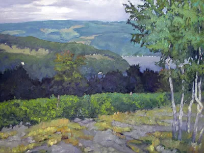
Spring Greens, 8X10, oil on archival canvasboard, available.

The origins of Indian yellow have long been disputed. It was said that it was extracted from the urine of cows fed a diet of only mango leaves. 20th century, art historians doubted this, but recent chemical analysis of historic samples confirm the source as animal urine.

We now reject the idea of starving cows to create pretty pigments (although euxanthic acid can be synthesized in the lab). Today we use combinations of nickel azo, hansa yellow, and quinacridone burnt orange. It’s a terrific paint for making dark greens. The trouble, again, is that every manufacturer has its own formula for Indian Yellow.

Pam’s paints weren’t cheap; they were by reputable manufacturers. But she was caught in the maze of historic names and convenience mixes. Knowing how to read the CII code on your paint tube is important.

The CII code consists of two letters and some numbers. Most paints start with a “P” which means it’s a pigment, not a dye. The next letter is the color family:  PR is red, PY is yellow, etc. The number is the specific pigment included in the tube.

Save this link somewhere accessible from your phone. You’ll need it when you shop. This pigment guide was built for watercolors but is generally true across all media. 

Monday Morning Art School: how to read a paint tube

Knowing how to buy colors will save your time and money in the long run.

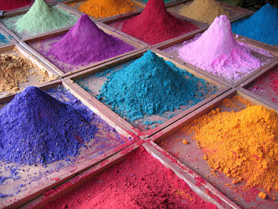
Pigments for sale on market stall, 2005, by Dan Brady. Thank heavens we don’t have to buy pigments in this form in America. It’s dangerous and inconsistent.

Modern painters expect to open a new tube of paint and squeeze out something recognizable. A tube of ultramarine blue made by any reputable manufacturer will have approximately the same amount of oil, and dry in about the same time to about the same gloss and transparency. The differences in binder and pigment load are subtle compared to the products available before the twentieth century.
That’s not by accident. Paint manufacturers subscribe to voluntary associations of quality control. One of these is Colour Index International (CII), a database dating back to 1925. It contains over 27,000 individual products sold under 13,000 different product names. This standard classification system ignores historic, proprietary, and generic names and gives you ‘just the facts, ma’am.’
Just as Benjamin Moore uses names like “Yukon Sky” to peddle grey paint, art paints are often marketed with evocative names. These names appeal to our sense of tradition, even when the old paint has no relationship to its namesake. For example, Indian Yellow no longer has anything to do with the urine of cattle which were fed mango leaves. Today it is made from lightfast diarylide yellow (PY83). If you buy Naples Yellow thinking you’re buying an historic pigment, think again: the modern paint is a convenience mix replacing the historic lead antimonate, which would do you and your painting no good.
The basic information on a tube of acrylic paint. If you’re not seeing this on the tube or display, proceed with caution.
Expect to find, at minimum, the following information on the label of your paint tube:
  • Manufacturer’s name or common name for the color.
  • The CII number and, sometimes, the name of the pigment(s).
  • The manufacturer’s lightfastness or permanence rating.

The CII code consists of two letters and some numbers. Most paints start with a “P” which means it’s a pigment, not a dye. The next letter is the color family:  PR is red, PY is yellow, etc. The number is the specific pigment included in the tube.
Save this link somewhere accessible from your phone: https://www.handprint.com/HP/WCL/waterfs.html
You’ll need it when you shop. This is Bruce MacEvoy’s Handprint pigment guide. It was built for watercolors but is generally true across all media. (Watercolor is the canary in the coalmine of pigments). All painters should understand lightfastness, transparency, and color shift. Granulation, bloom and diffusion, however, are watercolor-specific issues. 
Handprint doesn’t rate pigments for toxicity but comments on it in the notes. Most modern pigments are safe for the painters. For the manufacturers (who may be children in a third-world country) it’s another story.
Beautiful tube, evocative name, but it’s just a blend of PB 29 and PV 19 (Ultramarine Blue and Quinacridone Rose) which you already have on your palette. Many manufacturers offer the same mix under different names.
When you find two colors from different manufacturers that look the same, check their CIIs. Chances are that they contain radically different pigments.
A “hue,” is made of a blend of less-expensive pigments. There is nothing inherently wrong with these pigments, but they don’t behave the same as the more expensive ones, and you should at least know what you’re buying.
Generally speaking, there’s little to be gained by buying a hue mimicking a more expensive pigment. If you are comfortable painting with a hue, then learn what’s in it and mix it yourself. You always have the greatest flexibility by working with pure pigments (rather than mixes) out of the tube.
Most manufacturers include their own lightfastness ratings on the tube. This is a measure of how fast the color fades. If it’s not listed, look it up.
The series number tells you the price. Why are some paints more expensive than others? That’s based on the raw pigments and what they cost the maker. Are pricier pigments better? Not by a long shot. Twentieth-century manufacturing gave us a new world of inexpensive pigments, which tend to be less toxic, higher in chroma and lightfast.
It’s about time for you to consider your summer workshop plans. Join me on the American Eagle, at Acadia National Park, at Rye Art Center, or at Genesee Valley this summer.