Monday Morning Art School: is that painting finished?

Our hectoring superegos are not always the best judges of painterly quality.

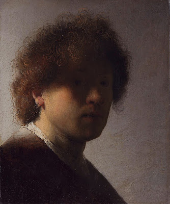
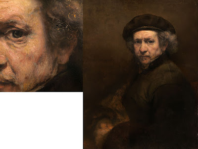
Self Portrait with Disheveled Hair, 1628-29, Rembrandt van Rijn, courtesy Rijksmuseum

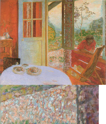
In my studio, there are more than a hundred unfinished paintings in drying racks. I’d feel bad about that, except that most plein air artists I know store up unfinished pictures like squirrels store nuts. We say we’re going to work on them during the winter, and sometimes we do. Other times, we just go out and start more paintings.

There is another stack on the other side of my studio. These are paintings I’ve either decided aren’t first rate or that I won’t ever bother to finish. I periodically go through them with the intention of winnowing them down. Often, I’m surprised that they’re actually not bad at all.

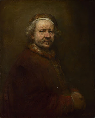
Self Portrait at the Age of 63, 1669, Rembrandt van Rijn, courtesy National Gallery, London

“Ah, a procrastinator,” you might say, but you’d be wrong. I’m actually disciplined in my work habits. I’ve just learned to trust my subconscious more than I did as a younger person. Twenty years ago, I thought a painting was finished when it achieved the effect I was striving for. Today a painting is finished when I’m sick of working on it. I’ve learned to be less critical of myself. My hectoring superego is not always the best judge of painterly quality.

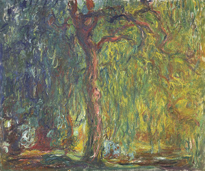
The division between brilliantly-raw and plain-unfinished is highly subjective. That line often changes over the course of an artist’s career. Paul Cezanne’s paintings of Mont Sainte-Victoire done in the 1880s are significantly more refined than those done from 1904-6. Rembrandt’s youthful Self Portrait with Disheveled Hair is an amazing exercise in chiaroscuro, but the brushwork is much tighter than his Self-Portrait at the Age of 63 (the year of his death). The changes in Claude Monet’s final paintings are usually blamed on his failing eyesight, but they are also the culmination of a career-long path toward looser, more audacious painting.

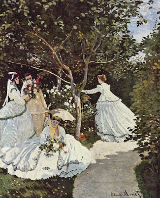
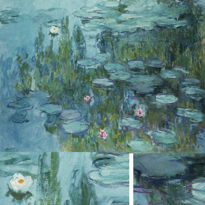
Women in the Garden, 1866–1867, Claude Monet, courtesy MusĂ©e d’Orsay

That is not to say that every artist becomes looser as they age. Grant Wood painted in the same precise style until his death of pancreatic cancer at age 51. Of course, we have no idea how he might have painted had he lived longer. The same is true of Caravaggio, who only made it to 39. On the other hand, Titian, who lived until his late eighties, spent his last years as an impossible perfectionist. He returned to older works and repainted them, fixed up copies made by his students, and kept some paintings in his studio for more than a decade of tweaking—all of which must give art historians the vapors.

The difference lies in what drove these artists in the first place. Cezanne, Rembrandt and Monet were never interested in a high degree of finish, but rather in the effects of paint. The culmination of their efforts was looseness. In contrast, Caravaggio, Titian, and Wood were what we call linear painters, interested in creating the illusion of three-dimensional space through careful modeling. For them to suddenly become interested in dynamic brushwork would have been a complete repudiation of their life’s work.

Weeping Willow, 1918–19, Claude Monet, courtesy Kimball Art Museum

One of the cliches of art instruction I particularly hate is, “Not another brushstroke! Don’t overwork it.” Nobody else can tell you positively that your painting is finished, because nobody else knows your intentions. We can engage you in dialog and help you clarify your thinking. But the only legitimate judge of whether you’re done is you, the artist. 

I have found that when I can’t finish a painting, the best thing I can do is to set it aside. Sometimes, my skills aren’t up to the effect I was trying to achieve, and I need to practice. Sometimes I don’t know how to finish it, and I need to think. Sometimes it’s a lousy painting, and it belongs in the reject pile. And sometimes a period of reflection reveals that the painting was, in fact, finished all along.

Monday Morning Art School: brushwork

Mark-making can be loose and gestural or very controlled. It’s personal, but it’s also something you can learn.

Dining Room in the Country, 1913, Pierre Bonnard, courtesy Minneapolis Institute of Art. Bonnard used small brush strokes, intense colors, and close values.

Brushwork is, on one hand, the most personal of painting subjects. It’s also (especially in watercolor) highly technical. Much of what is called ‘style’ comes down to what brushes we choose and what marks we make with them. I wrote about that here.

Modern viewers are immediately captivated by bravura brushwork; it’s a sign of self-confidence and competence. It comes from lots of practice. It also must rest on a firm foundation of proper color mixing and drafting. Flailing around to fix something negates the freshness and decisiveness of good brushwork.

Wheatfield with Crows, 1890, Vincent van Gogh, courtesy Van Gogh Museum, Amsterdam. The motion in the painting is created by his brush strokes.

The best, most immediate, brushwork lies on a foundation of careful planning. Continuous modification, glazing, changing color, etc., make for diffident marks.

Let’s talk about how not to do it:

  • Unless you’re doing close detail, don’t hold your brush like a pencil. It’s a baton, and holding it to the back of the center-point (away from the ferrule) gives you more lyrical motion. Your grip can still be controlled by your thumb, you can hold it loosely, or even clutch it in your fist. The important thing is to let your arm and shoulder drive the movement of the brush, rather than just your wrist and hand. The farther back you hold the brush, the more scope of movement. To loosen up, blast some music and pretend you’re the conductor and that brush is your baton.
  • Don’t dab. By this I mean a pouncing/stabbing motion with the tip of your brush. It’s amateurish in oils, anemic in acrylics, and hell on your brushes.
  • Don’t use brush strokes that go in all one direction. Learn to apply paint in the round. This is a rule that can be broken, but make sure you’re doing so intentionally, not just because you don’t know how to paint in every direction.
  • Don’t bury your line. Much of the power of Edgar Degas’ mature work comes from his powerful drawing; he was the most accurate draftsman of his age, and he let that stand prominently in his work.

Self Portrait with Beret and Turned Up Collar, 1659, Rembrandt van Rijn, courtesy National Gallery of Art, Washington, DC. Pay close attention to the economy of the brushwork in the hair, and the expressive, unfinished brushwork in the face. In this way, Rembrandt was able to create a powerful focus.

There are many painters whose brushwork I admire, but there’s little point in trying to copy them in my own work. Brushwork is as personal as handwriting. It’s where the artist expresses—or suppresses—his feelings. There’s value in attempting to copy passages by great painters, and I suggest you do so with the samples I’ve attached to this blog. But don’t try to paint like Sargent or Van Gogh or Rembrandt; use what you learn to create your own mature style.

Waterlilies, c. 1915, Claude Monet, courtesy Neue Pinakothek, Munich. Monet makes no attempt to hide his drawing in this painting. The brushstrokes are wet-over-dry.

Style is the difference between our internal vision and what we’re capable of. We often don’t like our own brushwork when we lay it down; I think that’s because it’s too personal. Don’t continuously massage your brushstrokes hoping to make them more stylish. If the passage is accurate in color, line and precision, move on. You may come back to realize it’s wonderful.

Lady Agnew of Lochnaw, 1892, John Singer Sargent, courtesy Scottish National Gallery, Edinburgh. Note that the transparent sleeves are not produced by glazing, but with direct, long brushstrokes.

Use your brushwork to highlight the focal points in your painting. Sharp, clean, contrasting marks draw the eye, where soft, flowing, lyrical passages encourage us to move through. Let there be dry-brush texture and unfinished passages in your painting.

A paean to black paint

Avoiding black keeps you from some of the most elegant colors available in painting.

Vineyard, 30X40, oil on canvas, available. Black can make a whole array of beautiful greens.

One of the absurdities of 20th century art education was the injunction to ‘never use black.’ That limits artists from some of the most elegant colors available in painting. The argument is supposedly based on Claude Monet’s palette; he never used black and you shouldn’t either. Like the so-called Zorn Palette, that’s a stew of half-truth and myth. Most artists’ palettes shift over time.

Asked in 1905 what colors he used, Monet said: â€œThe point is to know how to use the colors, the choice of which is, when all’s said and done, a matter of habit. Anyway, I use flake white, cadmium yellow, vermilion, deep madder, cobalt blue, emerald green, and that’s all.” But earlier in his career, he certainly used a wider palette, including black.

The Servant, 36X40, available. Black is invaluable in creating skin tones.

The argument went that Impressionists avoided black because it doesn’t exist in nature. Black certainly does exist in nature: in basalt, in deep shadows, and in the subtle undertones in animals and people.

Moreover, it was argued, the painterly effects created by managing warm and cool hues are richer and brighter than those created by manipulating tones and shades. They’re more brilliant, certainly, because adding black (or white) always reduces chroma. But part of painting is the dance between high chroma and neutrals.

Anyway, Monet’s buddy and fellow founder of Impressionism Édouard Manet used black paint by the bucketful.

Monet said a mouthful in that quote, however, and it wasn’t the list of colors (most of which would not be great choices in the 21stcentury). Most of us choose paint colors purely out of habit. We become familiar with them and develop deep loyalty to them. That’s smart, as long as we choose wisely to start with.

But then the painter often gets into the bad habit of only mixing colors in a certain way. And that, in the tail end of the 20thcentury, meant never using black.

Obviously, you should never make grey by mixing black and white, because it’s lifeless. But there are many subtle colors available only through black admixture.

Black admixture chart of my palette. You should make one too.

In painting:

  • Tint is a mixture of a color with white;
  • Tone is a mixture of a pigment with grey (black plus white);
  • Shade is a mixture of a pigment with black.

What we consider acceptable in color-mixing is style-driven, just like everything else. For example, see the Permanent Pigments Practical Color Mixing Guide of 1954, below. It’s all about making shades and tints. That’s a hint about why mid-century paintings looked so grey, and probably why the pendulum then swung so far in the other direction. A little shading goes a long way.

Yes, it’s a mess. It’s been kicking around various paint boxes in my family since 1954.

This antipathy to carbon-based blacks resulted in Gamblin’s introduction of chromatic black, which is a convenience mix and thus a waste of money. Like all ‘hues’ It simply doesn’t mix true.

This product was a response to market demand. It’s very hard to paint without some black on your palette, and the real stuff was banned by the cognoscenti. But when I was in school (she says with a geriatric cackle) chromatic black was something we were taught to mix. That’s a valuable exercise in complements. Buying it premixed in a tube circumvents the point.

Monday Morning Art School: the value of value

Why do teachers harp on value? Because it drives everything else in the painting.

Belfast harbor, 11X14, oil on canvas, Carol L. Douglas. Available framed $1087.

You cannot overstate the importance of value in visual art. It drives our perception and guides us through the painting. There are various ways to focus on value: notans, value sketches, and grisailleunderpaintings being the most popular. However we get there, the first step of a good painting is to see each composition in terms of its value structure.

Claude Monet was the greatest optics experimenter of Impressionism (and probably of art history in general). He visited the question of value over and over—in his haystacks, his waterlilies, his series in the Gare Saint-Lazare. We have been happily exploiting his discoveries ever since. We’ve learned that we can substitute color temperature for value, but the value structure remains the most important part of the painting. Even when the dark shapes are not literally dark, they have a form.

Haystacks, (Midday), 1890–91, Claude Monet, courtesy National Gallery of Australia

Just as the human mind can interpolate blue as dark, it has a great capacity to read red for blue as long as the values are true to the scene. The Fauvesexperimented with this, painting skies pink and faces green. We have no trouble identifying what they’re painting. However, it’s an either-or proposition. We can substitute hue for value, or we keep the values accurate and mess with the hues. Mixing them both up together makes an unintelligible mess.

Alla prima painting requires great skill in color mixing, because the goal is to nail it on the first strike. That goes not just the for darks, but every color in the picture. Even a painting with wonderful shadows and lights will have many middle tones, often closely related in value. These are actually the most difficult colors to mix accurately. If you have a painting that isn’t working, ask yourself if it has a full tonal range, or is it simply hitting the highs and lows. For example, when people get in trouble painting texture, it’s usually because they’re overstating the contrast.

Les toits de Collioure, 1905, Henri Matisse, courtesy The Hermitage

All color is relative, meaning it depends on its neighbors. That’s particularly true when it comes to value. Below see a plate from Joseph Albers’ groundbreaking Interaction of Color. The inner violets are the exact same value. But the framing color influences how we see those values, so one looks much lighter than the other.

To mix paint accurately you must become absolutely conversant with the colors on your own palette. The first step is to identify the natural value of your paint, straight out of the tube. No pigment can go darker than its natural hue without the addition of another color. That’s why it’s so difficult to make shadows on lemons.

Plate IV-4 from Joseph Albers’ Interaction of Color, demonstrating how all color is relative. The inner violet colors are the same exact value, but what surrounds them influences how we perceive them.

For oil painters, figuring out the natural value of a pigment is easy. For watercolorists, it’s a bit of work to figure out what that really darkest point is, because it’s never the same as it appears on your palette. The colors wetted are a better guide, but you’ll need a test paper handy to experiment.

When you figure out the darkest natural position of each pigment, you need to see how it tints. For watercolorists, that means dilution. For oil and acrylic painters, that means mixing with white. Every paint has a natural tinting strength. That’s determined by the type of pigment, the amount of pigment and how fine it’s been ground.

There are three things to remember:

·        Value judgments are subjective. There’s no reliable way to measure the value of a color. The camera is as subjective as the human eye.  

·        You can’t get a color to go darker than its ‘natural’ value without distorting the hue or chroma. Thus, there is no natural dark version of cadmium yellow, so the shadows in a yellow object require a workaround.

·        All pigments can make about the same number of discrete steps. While the yellows have a shorter range, the steps are more noticeable. Blues can mix from almost-white to almost-black, but the middle points are very similar. 

Monday Morning Art School: some basic color theory

Mixing paints is simple if you understand how pigments work.

Fallow field, 12X16, oil on canvasboard, available.

In theory, you can paint with just four pigments: red, blue, yellow and white. For beginning painters this is sometimes a good idea, because it’s the fastest way to learn color management. It simplifies the thought process so you have only one decision to make at a time, and it is easier to get a more unified color scheme.

But there is a limiting factor, and that’s the impurity of pigments. They all have overtones that muddy them up in certain mixes. That’s why your local paint dealer uses many, many more pigments than just red, blue, and yellow.

Claude Monet’s palette shifted over time, but included these paints:

  • Chrome yellow
  • Cadmium yellow
  • Viridian green
  • Emerald green
  • French ultramarine
  • Cobalt blue
  • Madder red
  • Vermilion (red)
  • Flake white
  • Ivory black (before 1886)

These are sets of paired pigments. That means he has a warm and a cool of each color, plus black and white. 

I use paired primaries as well, omitting the green but adding in some other earths. (Here are my supply lists for oils,  acrylics, and watercolors.)

The distinction between warm and cool colors has been important in painting since the Impressionists. Warm colors are said to be hues from red through yellow and cool colors are said to be the hues from green through violet. Each hue around the color wheel also has a warm and a cool version.

There’s no factual hot or cold point because this is just a poetic description that works. Much of what we believe about the psychology of color is hocus-pocus, based on the teachings of 19th century cult leader Madame Blavatsky. However, it’s true that if the light is what we call “warm,” the shadows are what we call “cool,” and vice versa.

Paired primaries are simply warm and cool versions of each color.

When we say that lemon yellow is cooler than cadmium yellow deep, we mean that if you are trying to mix a greenish yellow, you’ll get a clearer shade with the lemon than you will with the cadmium yellow deep. The warm-cool language is just a convenient way of saying that.

Different pigments may look the same when squeezed out of the tube, but there the similarity ends. Pigments are impure, and you have to learn and work around those impurities.

To better understand color space, watch Gamblin’s excellent video on the subject, here.

Three blues that look similar out of the tube, but behave very differently. The ‘glaze’ on the left is the undertone. Courtesy Gamblin paints.

Mass tone is the color a pigment is straight out of the tube, dense and unmixed with another color. No real-world pigment, however, is as pure as a color on a video screen. While two pigments may look the same to the naked eye, their behavior when mixed can be radically different.

Undertone is the color revealed when a paint is spread thin enough that light bounces back up from the substrate. Some pigments are fairly consistent when moving from mass tone to undertone. Others have significant color shifts. Not understanding those undertones tones can lead to muddy mixes.

Ultramarine, Prussian and phthalo blue are colors that shift radically from mass tone to undertone. They’re all so dark out of the tube that their differences aren’t apparent to the naked eye. But dilute them, and you’ll find a wide range of blues.

Cadmium Red Hue is usually made with napthol red and a little white. They mix very differently, which is why the hue is a bad substitute for the real pigment. (In its own right, napthol is a fine red, however.) Courtesy Gamblin paints.

Undertones are why buying “hues” instead of pure pigments can be such bad value. Take, for example, cadmium red hue, which is usually a napthol red with a small amount of white added. Out of the tube, the two paints are indistinguishable, but they mix very differently.

To see a pigment’s mass tone, put a small dab of paint on a smooth white board or glass palette and draw it down with a knife, creating a uniform, solid stripe that completely obscures the painting surface.

To see the undertone, draw the sample down again so it is translucent. You should be able to see minute variations in the color, and in the covering power.

Your brush is not a pencil

Mark-making can be loose and gestural or very controlled. It’s personal, but it’s also something you can learn.

Dining Room in the Country, 1913, Pierre Bonnard, courtesy Minneapolis Institute of Art. Bonnard used small brush strokes, intense colors, and close values.

In this week’s painting classes we worked on mark-making and brushwork. This is, on one hand, the most personal of painting issues. It’s also (especially in watercolor) highly technical. Much of what is called ‘style’ comes down to what brushes we choose and what marks we make with them.

Modern viewers are immediately captivated by bravura brushwork; it’s a sign of self-confidence and competence. It comes from lots of practice.

Wheatfield with Crows, 1890, Vincent van Gogh, courtesy Van Gogh Museum, Amsterdam. The motion in the painting is created by his brush strokes.

First, let’s talk about how not to do it:

  • Unless you’re doing close detail, don’t hold your brush like a pencil. It’s a baton, and holding it to the back of the center-point (away from the ferrule) gives you more lyrical motion. Your grip can still be controlled by your thumb, you can hold it loosely, or even clutch it in your fist. The important thing is to let your arm and shoulder drive the movement of the brush, rather than just your wrist and hand. The farther back you hold the brush, the more scope of movement. To loosen up, blast some music and pretend you’re the conductor and that brush is your baton.
  • Don’t dab. By this I mean a pouncing/stabbing motion with the tip of your brush. It’s amateurish in oils, anemic in acrylics, and hell on your brushes.
  • Don’t use brush strokes that go in all one direction. Learn to apply paint in the round. This is a rule that can be broken, but make sure you’re doing so intentionally, not just because you don’t know how to paint in every direction.

Self Portrait with Beret and Turned Up Collar, 1659, Rembrandt van Rijn, courtesy National Gallery of Art, Washington, DC. Pay close attention to the economy of the brushwork in the hair, and the expressive, unfinished brushwork in the face. In this way, Rembrandt was able to create a powerful focus.

There are many painters whose brushwork I admire, but there’s little point in trying to copy them in my own work. Brushwork is as personal as handwriting. It’s where the artist expresses—or suppresses—his feelings. There’s value in attempting to copy passages by great painters, and I suggest you do so with the samples I’ve attached to this blog. But don’t try to paint like Sargent or Van Gogh or Rembrandt; use what you learn to create your own mature style.

Waterlilies, c. 1915, Claude Monet, courtesy Neue Pinakothek, Munich. Monet makes no attempt to hide his drawing in this painting. The brushstrokes are wet-over-dry.

The best, most immediate, brushwork lies on a foundation of careful planning. Continuous modification, glazing, changing color, etc., makes for diffident marks. For the same reason, if you’re happy with the color and form of what you’ve laid down, refrain from ‘touching it up.”

Use your brushwork to highlight the focal points in your painting. Sharp, clean, contrasting marks draw the eye, where soft, flowing, lyrical passages encourage us to move through. Let there be dry-brush texture and unfinished passages in your painting.

Lady Agnew of Lochnaw, 1892, John Singer Sargent, courtesy Scottish National Gallery, Edinburgh. Note that the transparent sleeves are not produced by glazing, but with direct, long brushstrokes.

Above all, don’t bury your line. Much of the power of Edgar Degas’ mature work comes from his powerful drawing; he was the most accurate draftsman of his age, and he let that stand prominently in his work.

Monday Morning Art School: Analyzing Colin Page

Studying a contemporary master painter’s method and technique is a great way to learn.

Columns, Colin Page, courtesy of the artist

Last Thursday I stopped by The Page Gallery in Camden to see Colin Page’s current work. You can visit if you’re careful to mask and observe social distancing. Colin’s work is always worth the effort.

I was drawn to two plein air studies of the pinky schooner Prophet. The brushwork on these paintings is lyrical and loose. Colin told me he has been studying John Singer Sargent watercolors of schooners. A great painter never stops striving to be a better painter.

Italian Sailing Vessels at Anchor, c. 1904-07, John Singer Sargent, courtesy the Ashmolean Museum.

Colin has a massive half-finished commission on the wall. He was taking swipes at it between visitors. It is a rare opportunity to look at his process. Above the painting is a study, perhaps 24” long, in which he mapped out the composition. At his feet are two smaller studies of related materials. His palette is neatly organized by color.

Colin Page at work.

In these lower layers, he keeps the paint very thin, except for the dappled sunlight passages. That means he doesn’t have to deal with pentimento when he changes his mind. Despite his preparation, he didn’t have all the answers before he started. Paintings actually benefit from the struggle being, to some degree, manifest in the surface.

Somewhere mid-stream, he decided to add rolling fog, which is a difficult technical problem. That meant changing the point at which the sunlight enters the work. When I left, he was outlining a new cloud shape. Great painting is based on great drawing.

Above It All, Colin Page, courtesy of the artist.

Before the 19th century, artists used value (the relative lightness or darkness of a color) to model volume. The Impressionists—particularly Claude Monet—introduced the idea of modeling with color temperature. Artists have been experimenting with it ever since. In Above It All (above), Colin demonstrates his mastery of color temperature. Blue stands in for the dark shadows; the light is creamy and warm. Yes, the blues are still darker than the light passages, but they’re not as dark as a traditional painter would have made them.

That doesn’t mean he never uses darks. When he does, they are limpid pools of gemlike color, rather than flat gloom. His anchor huesare reiterated throughout the canvas. In the end, his paintings always have a coherent hue structure that’s as important as the value structure.

Sunday Morning, Colin Page, courtesy of the artist.

Colin paints still lives of great complexity. These are, fundamentally, abstractions that use line and repetition to drive the viewer’s eye. In Sunday Morning, above, there are two triangles of circular objects that anchor the composition. The first is made by the two cups and the muffin. Being dark, it draws our eyes first. The second triangle is created by the sugar bowl, empty plate, and blueberries. These two triangles are mirror images of each other. A third, vertical, triangle is created by the diagonal folds of the fabric and crossword puzzle. 

There is a dazzle of repetitive motifs and myriad other objects thrown in, but the structure of the painting lies in that overlay of triangles. Underneath any great painting, you’ll find a carefully-considered structure.

A visitor stopped to look at the progress on that big canvas. “Only about half of these end up working,” he told her. That’s a comfort for anyone who, like me, is surrounded by failed painting ideas.

Watercolor study for Columns, Colin Page.

On another wall are taped color studies in watercolor. These are beautiful little paintings that most watercolorists would be happy to call finished. Watercolor is a great, fast way to see if a Big Idea works. The more you understand about all kinds of painting, the more you’ll be successful at your primary medium.

Your assignment for this week is to subject one painting you love to the following analysis: how is the artist modeling volume? Through color temperature or value? How is he or she using line and repetition to drive you through the painting? The painting can be by an Old Master, but I think you’ll learn more if you choose one from a contemporary artist.

The Page Gallery is at 23 Bayview Street, Camden, Maine. Contact Kirsten Surbey for an appointment or more information.

Monday Morning Art School: color temperature and palette

Mixing paints is simple if you understand how pigments work.

Tilt-a-Whirl, by Carol L. Douglas, plein air.

In theory, you can paint with just four pigments: red, blue, yellow and white. For beginning painters this is sometimes a good idea, because it’s the fastest way to learn color management. It simplifies the thought process so you have only one decision to make at a time, and it is easier to get a more unified color scheme.

But there is a big limiting factor, and that’s the impurity of pigments. They all have overtones that muddy them up in certain mixes. That’s why your local paint dealer uses many, many more pigments than just red, blue, and yellow.

Split the color wheel in half like this and you have your cool tones on one side, warm ones on the left.

Claude Monet’s palette shifted over time, but included these paints:

  • Chrome yellow
  • Cadmium yellow
  • Viridian green
  • Emerald green
  • French ultramarine
  • Cobalt blue
  • Madder red
  • Vermilion (red)
  • Flake white
  • Ivory black (before 1886)

These are sets of paired pigments. That means he has a warm and a cool of each color, plus black and white. 

I use paired primaries as well, omitting the green but adding in some other earths. (Here are my supply lists for oils,  acrylics, and watercolors.)

The distinction between warm and cool colors has been important in painting since the Impressionists. Warm colors are said to be hues from red through yellow and cool colors are said to be the hues from green through violet. Each hue around the color wheel also has a warm and a cool version.

Paired primaries from my palette.

There’s no factual hot or cold point because this is just a poetic description that works. Much of what we believe about the psychology of color is hocus-pocus, but it’s true that if the light is what we call “warm,” the shadows are what we call “cool,” and vice versa.

Winter sun along my hedgerow, by Carol L. Douglas, plein air. If the light is warm, the shadows are cool, and vice versa.

When we say that lemon yellow is cooler than cadmium yellow deep, we mean that if you are trying to mix a greenish yellow, you’ll get a clearer shade with the lemon than you will with the cadmium yellow deep. The warm-cool language is just a convenient way of saying that.

Different pigments may look the same when squeezed out of the tube, but there the similarity ends. Pigments are impure, and you have to learn and work around those impurities.

Three blues that look similar out of the tube, but behave very differently. The ‘glaze’ on the left is the undertone. Courtesy Gamblin paints.

Mass tone is the color a pigment is straight out of the tube, dense and unmixed with another color. No real-world pigment, however, is as pure as a color on a video screen. While two pigments may look the same to the naked eye, their behavior when mixed can be radically different.

Undertone is the color revealed when a paint is spread thin enough that light bounces back up from the substrate. Some pigments are fairly consistent when moving from mass tone to undertone. Others have significant color shifts. Not understanding those undertones tones can lead to muddy mixes.

Cadmium Red Hue is usually made with napthol red and a little white. They mix very differently, which is why the hue is a bad substitute for the real pigment. (In its own right, napthol is a fine red, however.) Courtesy Gamblin paints.

Ultramarine, Prussian and phthalo blue are colors that shift radically from mass tone to undertone. They’re all so dark out of the tube that their differences aren’t apparent to the naked eye. But dilute them, and you’ll find a wide range of blues.

Undertones are why buying “hues” instead of pure pigments can be such bad value. Take, for example, cadmium red hue, which is usually a napthol red with a small amount of white added. Out of the tube, the two paints are indistinguishable, but they mix very differently.

To see a pigment’s mass tone, put a small dab of paint on a smooth white board or glass palette and draw it down with a knife, creating a uniform, solid stripe that completely obscures the painting surface.

To see the undertone, draw the sample down again so it is translucent. You should be able to see minute variations in the color, and in the covering power.

Click to get a printable PDF

Another way to test colors is to mix through what you have on your palette. Make the above color chart, using three sets of paired primaries:

  • Prussian blue—Ultramarine blue
  • Quinacridone violet—Cadmium orange
  • Indian yellow—Lemon yellow

The purpose of this exercise is to understand how paired primary pigments work together, so that you can make neutrals when you want them, and avoid mud when you don’t.

Draw the chart onto a canvas, and then mix across and down for each square. When I say “mix”, I mean mix them before applying, rather than in the squares themselves.

The left column and the top row should be pure pigments. Fill it in, then, just like the multiplication tables of your youth. For example, the intersection of cadmium orange and ultramarine blue should be a 50-50 mix of those two colors.

If you’re painting in watercolor, use enough water to make a jewel-tone transparency. In oils, the results should be opaque.

Monday Morning Art School: Mark Making

Mark-making can be loose and gestural or very controlled. It’s personal, but it’s also something you can learn.
Dining Room in the Country, 1913, Pierre Bonnard, courtesy Minneapolis Institute of Art. Bonnard used small brush strokes, intense colors, and close values.
When I was a student, I often left heavy edges in my paintings. A teacher told me, “That’s your style.” Well, it wasn’t; I’d just never learned to marry edges. It was a deficiency.
Our marks are our handwriting. I’d rather see them develop naturally, so I generally avoid teaching much mark-making. But sometimes students fall into traps that severely limit their development. It’s better to understand all the ways your brush works and then settle down into something that reflects your character, rather than have to break bad brushwork down the road.
Self Portrait with Beret and Turned Up Collar, 1659, Rembrandt van Rijn, courtesy National Gallery of Art, Washington, DC. Pay close attention to the economy of the brushwork in the hair, and the expressive, unfinished brushwork in the face. In this way, Rembrandt was able to create a powerful focus.
Let’s first talk about how not to do it:
  • Unless you’re doing close detail, don’t hold your brush like a pencil. It’s a baton, and holding it to the back of the center-point gives you more lyrical motion.
  • Don’t dab. This means a pouncing/stabbing motion with the tip of your brush. It’s amateurish in oils, anemic in acrylics, and only possible with any elegance with a wet watercolor brush.
  • Don’t use brush strokes that go in all one direction. Learn to apply paint in the round.
All these rules are successfully broken by great artists. You may go on to break them yourself, but it behooves you to learn the full range of motion of your brush before you do so.
Wheatfield with Crows, 1890, Vincent van Gogh, courtesy Van Gogh Museum, Amsterdam. The motion in the painting is created by his brush strokes.
Mark-making can be loose and gestural or very controlled. It’s not just pertinent to painting; it applies to any material applied to a surface, including three-dimensional and digital art. It’s purely personal, and can be where the artist expresses—or suppresses—his feelings about the subject.
Waterlilies, c. 1915, Claude Monet, courtesy Neue Pinakothek, Munich. Monet makes no attempt to hide his drawing in this painting. The brushstrokes are wet-over-dry.
Mark-making is an important aspect of abstract art, including the kind where the mark-making is not done with a brush (as with Jackson Pollack or Gerhard Richter). But tight brushwork is just as much a hallmark of modern painting—see pop art, for example.
Lady Agnew of Lochnaw, 1892, John Singer Sargent, courtesy Scottish National Gallery, Edinburgh. Note that the transparent sleeves are not produced by glazing, but with direct, long brushstrokes.
I’ve included five great artworks in this assignment. Each has one or more close-ups with it. Your assignment is to try to figure out the brush used and copy the brush-strokes as accurately as you can on an old canvas. Note that I’m not asking you to make a painting; that would be too confusing. I’m just asking you to try to mimic the brushwork.

Monday Morning Art School: the warm and cool of it all

Mixing paints is simple if you understand how pigments work.
Tilt-a-Whirl, by Carol L. Douglas. Painted plein air.
Let’s start with some simple review of the color wheel. Red, blue and yellow are the primary colors. Across the wheel from a color is its complement—the color that completes the circle. The complement of a primary color is always a secondary color. A secondary color is one made by mixing two primary colors.
The color wheel.
In theory, you can paint with just four pigments: red, blue, yellow and white. For beginning painters this is sometimes a good idea, because it’s the fastest way to learn color management in a hurry. It simplifies the thought process so you have only one decision to make at a time, and it is easier to get a more unified color scheme.
But there is a big limiting factor, and that’s the impurity of pigments. They all have overtones that muddy them up in certain mixes. That’s why your local paint dealer uses many, many more pigments than just red, blue, and yellow.
The takeaway lesson here is that different pigments may look similar out of the tube, but they reflect light (and thus mix) very differently. From Scientific Examination of Art: Modern Techniques in Conservation and Analysis, 2003, National Academy of Sciences.
Claude Monet’s palette shifted over time, but included these paints:
  • Chrome yellow
  • Cadmium yellow
  • Viridian green
  • Emerald green
  • French ultramarine
  • Cobalt blue
  • Madder red
  • Vermilion
  • Flake white
  • Ivory black (before 1886)

These are sets of paired pigments. That means he has a warm and a cool of each color. Gamblinmakes a modern version of this impressionist palette. It includes:
  • Cadmium yellow light
  • Cadmium yellow medium
  • Cadmium red light
  • Alizarin permanent (actually anthraquinone red)
  • Ultramarine blue
  • Cerulean blue hue (actually phthalo blue plus white)
  • Viridian
  • Ivory black
  • Flake white replacement (or titanium white)
Paired primaries.
Both Monet’s and Gamblin’s palettes are paired primaries plus green, white and black. I use paired primaries as well, omitting the green but adding in some other earths. (Here are my supply lists for oils,  acrylics, and watercolors.)
The distinction between warm and cool colors has been important in painting since the Impressionists. Warm colors are said to be hues from red through yellow and cool colors are said to be the hues from green through violet. Each hue around the color wheel also has a warm and a cool version.
  
There’s no factual hot or cold point because this is a poetical description that works, rather than a scientific fact. Much of what we believe about the psychology of color is hocus-pocus, but it’s true that if the light is what we call “warm,” the shadows are what we call “cool,” and vice versa.
When we say that lemon yellow is cooler than cadmium yellow deep, we mean that if you are trying to mix a greenish yellow, you’ll get a clearer shade with the lemon than you will with the cadmium. The warm-cool language is just a convenient way of saying that.
Different pigments may look the same when squeezed out of the tube, but there the similarity ends. Pigments are impure, and you have to learn and work around those impurities.
Today’s lesson is an experiment in working through those color shifts. I want you to make the above color chart, using three sets of paired primaries:
  • Prussian blue—Ultramarine blue
  • Quinacridone violet—Cadmium orange
  • Indian yellow—Lemon yellow

The purpose of this exercise is to understand how paired primary pigments work together, so that you can make neutrals when you want them, and avoid mud when you don’t.

Draw the chart onto a canvas, and then mix across and down for each square. The left column and the top row should be pure pigments. Fill it in, then, just like the multiplication tables of your youth. For example, the intersection of cadmium orange and ultramarine blue should be a 50-50 mix of those two colors.
Unless you’re painting in watercolor, the result should be opaque.
Let me know if you have any questions. And have fun!