Monday Morning Art School: an exercise in color

This exercise teaches you to think of the three aspects of color as separate properties.
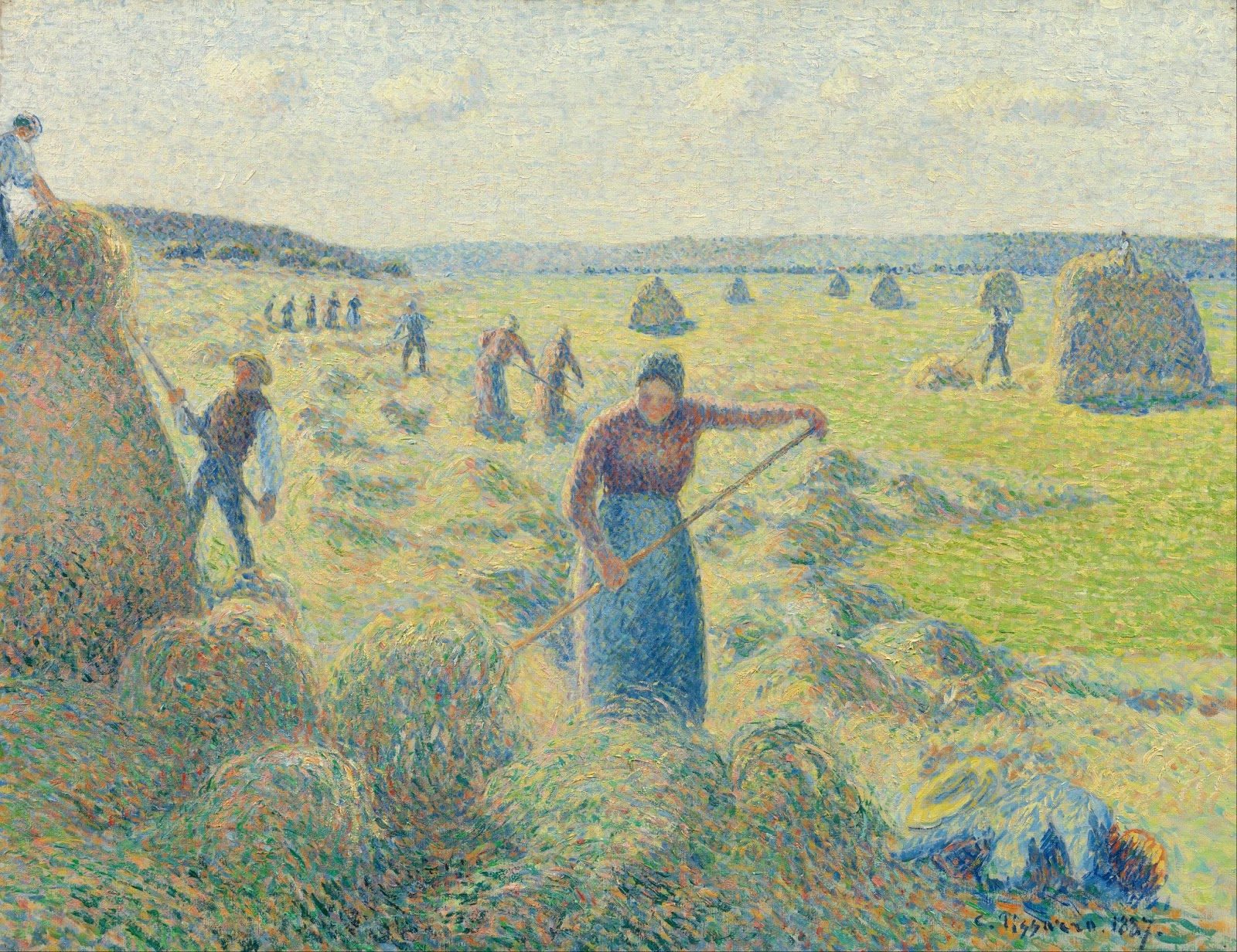
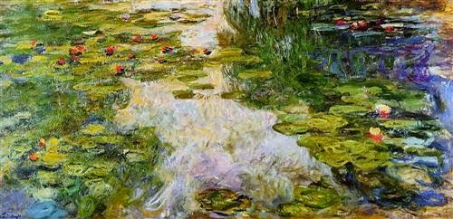
Water lilies (Yellow Nirwana), 1920, Claude Monet, courtesy the National Gallery, London. Much of Monet’s work was experimenting about the nature of color.

When we ask people, “what’s your favorite color,” we’re using the word color in a simple way, and we expect a simple answer. In fact, color has three basic characteristics:

Value â€“ How light or dark is the color? Blue-indigo is the darkest color, yellow is the lightest. Red and green fall somewhere in the middle.
Hue â€“ Where does it sit on the color wheel? All colors fall into one of the following hue families: red, orange, yellow, green, blue and violet. Within those families, however, are many subdivisions.
Chroma â€“ How much intensity, or “punch” does the color have? Grey is low-chroma; fuchsia is high-chroma.
For more detail, see here.
Complementary colors are opposite positions on the color wheel.
Analogous colorsare a set of colors that sit next to each other on the color wheel.
This exercise teaches you to hold value and chroma steady and manipulate only hue. It’s hard to make these judgments subjectively, so your samples may not look exactly like someone else’s.
Go to the paint store and select paint chips in two different color schemes—complementary and analogous. I want you to choose paints with the same value and chroma but the hue will be different.
Complements where the value and chroma are the same.
They don’t necessarily have to be high-chroma combinations. Here’s a pair of complementary hues which have less saturation (lower chroma):
An example of an analogous color scheme where the value and chroma are the same for all three hues:
Once you’ve selected the three paint samples, chop them up and arrange them on a little card as a design. Glue them down in a pattern that pleases you. Try to leave no space between the different colored tiles so your finished work looks something like this:
Above: my chops. Below: Photoshop’s evaluation of how close I came with the values. (Remember, Photoshop is interpreting as much as I am.)

I don’t care what kind of shapes you make or how complicated your design is. I just don’t want white showing between the sections.

If it proves difficult to get out, and you want to get started, you can always make your own paint swatches. But it’s fun to get them from the hardware store, cut them up and make patterns.

Monday Morning Art School: perspective of boats

Don’t fall into the trap of drawing what you know instead of what you see.
The Bridge at Argenteuil, 1874, Claude Monet. All three waterlines are parallel to the horizon.
I prefer painting from a floating dock, where I’m at eye-level with the boats regardless of the tide. However, on Friday, I found myself up on the wall looking across Camden Harbor. That creates a different perspective.
The horizon line in a drawing is the viewer’s eye level, regardless of where the viewer is standing. At the top of Mount Rainier, your horizon line is around 14,410 feet above sea level, and everything is below you. If you’re swimming in the Caribbean, your horizon line is about three inches above sea level and everything but the sharks are above you.
I explained basic perspective in this post about drawing clouds; the exact same rules apply to boats, except that everything is flipped over. We can see down into objects that are at our feet, but not into objects at the same level that are far away. The farther away the object is, the more horizontal our gaze is as we look at it. Our measly 5 or 6 feet in height is nothing compared to the distance across. 
When a boat is a few hundred feet away in the water, it’s for all intents and purposes at eye level. Its waterline is almost absolutely flat, regardless of whether you’re looking at its side, transom, or bow.
The Seine at Argenteuil, 1872, Alfred Sisley. Although it’s also from towpath height, Sisley included more foreground, creating the sense that we are looking down into the Seine.
During the 1870s and 1880s Argenteuil, northwest of Paris on the Seine, became an important painting location for the Impressionists. They immortalized its bridges and boats from every conceivable angle.
We can infer Monet’s point of view in the top painting as being about equal to the house across the river. In other words, he was standing on a towpath. That allows us to see into the boat slightly, as we’re at mast height to it and it’s close to the near bank. We cannot see into the far boats at all. Note that the far bank and the waterlines of the far boats are parallel to the horizon. The bridge, which reaches across the river to us, is not.
Alfred Sisley’s painting is from the same height, but he’s given us more foreground, and therefore the sense of looking down into the water. But while the tree in the river is definitely below us, the boats are not. Again, their waterlines are parallel to the horizon. The river bends, and the land curves away, but the curve is very gradual.
Boating, 1874, Édouard Manet. Here we’re looking straight down into the boat from impossibly close quarters.
We are definitely looking down into Édouard Manet’s pleasure boat in his 1872 painting done on the same river. Manet has us practically standing on the rail looking down into the well of the boat. The horizon isn’t even visible. It would be yards above the boaters’ heads.
An example of incorrectly drawn boats.
Ignoring these rules results in the most common error I see in painting boats. This is from an example I picked up on the internet. The boats are close to the horizon but we still seem to be looking down into them. In fact, the closest boat is at about the angle of Manet’s Boating. This is an impossibility, as the three masterpieces from Argenteuil have demonstrated.
This happens frequently with painters unaccustomed to boats. I think it is a case of painting what we think we know vs. what we see. We know that boats have form, therefore they must have perspective, too. Well, they do, but it’s very subtle from the distance we usually see them.

The lies we tell ourselves about painting

Some have a germ of truth; some are out and out wrong.

Île d’OrlĂ©ans waterfront farm, by Carol L. Douglas. ‘Immediate’ shouldn’t mean half-baked.
Don’t overwork it:This is the most common bromide I hear. I hate it. It encourages painters to stop prematurely, and to not work out the latent potential or problems in the work.
It’s far better to go too far and need to fix your mistakes than never understand your limits or see where you might end up. “Don’t overwork it” is a great way to permanently stunt your growth as a painter.
Replace it with this: “If you can paint it once, you can paint it 1000 times.” It liberates you to scrape out, redraw, paint over, scribe across your surface and otherwise really explore your medium. And it’s actually true.
Cirrus clouds at Olana, by Carol L. Douglas. I couldn’t have painted this had I not learned how to marry edges.
That’s your style: When I was a painting student, I had a teacher tell me that heavy lines were my ‘style’. They weren’t; I just hadn’t learned how to marry, blur or emphasize edges. These are technical skills, and to master them I had to move on to the Art Students League and teachers who understood the difference between technique and style.
Ultimately, we all end up with identifiable styles, but they should be un-self-conscious, the result of putting paint down many, many times. Anything that we do to avoid learning proper technique is not a style, it’s a failure.
Blues player Shakin Smith once told me that his style was the gap between his inner vision and his capacity to render it. That made me stop worrying about style at all.
Vineyard, by Carol L. Douglas, courtesy of Kelpie Gallery. The dominant greens in this painting are based on ivory black.
Don’t use black: “Monet didn’t use black, and you shouldn’t, either!” That’s true, but only after 1886, when Monet (apparently) adopted a limited palette. On the other hand, his palette included emerald green, which was copper-acetoarsenite, the killer pigment of the 19th century. There are limits to aping the masters of the past.
Monet made chromatic blacks, which are mixtures of hues that approximate black. Every artist should learn how to make neutrals, and not rely on buying Gamblin’s premix. But there are places where black is useful. One is in mixing greens. Another is in mixing skin tones. Contemporary painting is all about the tints (mixing with white) but ignores shades (mixing with black) and tones (mixing with black and white).
Back in the day, art students learned not just tints, but shades and tones.
Pros use more paint:Beginning artists generally don’t use enough paint, so it’s useful to tell them to increase the amount of paint. However, there are some great painters out there who work very thin—Colin Pageis an excellent example. The problem is in getting to that point. It’s a mastery born of years of experience. To get there you need—annoyingly—to start with more paint.
Fish Beach, by Carol L. Douglas.
If it’s not beautiful, you’re doing something wrong: Seeking beauty instead of truth is a great way to make static paintings. Paintings go through many ugly phases before they’re finished, and sublimating their ragged edges is a great way to drain all the juice out of your painting.

I’ve got one more workshop available this summer. Join me for Sea and Sky at Schoodic, August 5-10. We’re strictly limited to twelve, but there are still seats open.

Violettomania

I love violet, but there was a time when the critics thought it meant you were defective. I would’ve been considered a sufferer of violettomania.

Lake Tear of the Clouds (Headwaters of the Hudson), 30X40, Carol L. Douglas, private collection.

Richard Liebreich was a distinguished 19th century German ophthalmologist and an admirer of the earlier works of J. M. W. Turner. While visiting London, he called at the National Gallery. He was shocked by the artist’s later works, which were so much looser and hazier than the pieces he knew. “Was the great change
 caused by an ocular or cerebral disturbance?” he asked, and then answered his own question with an exploration of how illness might have affected Turner’s painting. “To be physiologically normal is not at all a fundamental condition in art,” he wrote.

He was not the only 19th century scientist to wonder if contemporary artists had lost their collective minds, vision, or both. “Liebreich’s Sign” came to mean color-blindness as seen in painting.

Italian ophthalmologist Arnaldo Angelucci assembled a large collection of paintings which purported to show color-blindness. He identified five characteristics we could look for in painting to determine that the artist had vision problems. They were:

  1. Exaggerated reds in the highlights;
  2. Too much green in the shadows;
  3. The abuse of violet;
  4. Exaggerating the yellows in highlights and blues in shadows in the color green;
  5. Excessive mixing up of hues in a single object’s color.

He had just described Impressionism in a nutshell.

“Flood tide,” plein air, oil on canvasboard, Carol L. Douglas

“I have finally discovered the true color of the atmosphere,” Claude Monet once declared. “It’s violet. Fresh air is violet.”

Whether he was saying that to annoy his critics, or whether the criticism just naturally followed, is hard to say. He and his fellow Impressionists were gleefully using new pigments churned out by the nascent chemical industry. They were brilliant and they sometimes clashed, but who could know that without trying them out in their raw, pure states?

The first true purple was cobalt violet, synthesized in 1859. That was replaced with manganese violet, first made in 1868, and also called Permanent Violet, Nuremberg Violet or Mineral Violet.

High Tide, Carol L. Douglas

Manganese violet was cleaner, more opaque and less toxic than cobalt violet, and worlds better than the historical violets (capet mortuum and Tyrian purple).

The Impressionists—especially Monet—adored their new violet hues. They used them so much that critics accused them of suffering from “violettomania” or “seeing blue.” The establishment was deeply offended by this reliance on violet, so much so that a critic described the third Impressionist exhibition in 1877 as having the overall effect of a worm-eaten Roquefort cheese.

Whatever the disease of “violettomania” was, it was apparently catching. Eventually, scientists were seeing Liebreich’s Sign in establishment painters like Alfred Munnings.

Mohawk Valley nocturne, oil pastel, Carol L. Douglas.

The Impressionists were justified in their excitement over this new pigment (and with the greens, pinks, and other shades suddenly available to them). It was impossible to mix a true violet with the pigments available to their predecessors. Today we have cleaner blues and quinacridone red tones (first synthesized as a pigment in 1935). It’s not necessary to carry manganese violet in our painting kit. But modern painters—myself included—still love violet.

My 2024 workshops:

Am I done yet?

“Don’t overwork it” is terrible advice. Even the freshest of Impressionists reworked paintings.
Vase of Flowers, started 1882, Claude Monet

Yesterday I wrote about scientific research into color perception and how that affected painting at the end of the 20th century. Another major change of the same period had to do with what constituted a finished painting.

For earlier generations, a painting was complete when it had a slick surface with plenty of detail. The mechanics of painting were carefully hidden underneath the bling of the finish layer. Part of the ideal was that the viewer should have no idea about the sheer hard graft involved in painting. Unfinished paintings had no place in collections and were often destroyed on an artist’s death.
Late 19th century painters inserted the process of painting into the finished work. They used thick impasto, left parts of their canvas bare, and kept outlines and drawing marks visible. That made the painting a temporal record of development as much as a snapshot of a moment. These ideas continue into the modern period (perhaps in some cases to overripeness).
Edmondo and Therese Morbilli, started 1866, Edgar Degas
But were they ever that straightforward? Recently, researchers Kimberly Jones and Ann Hoenigswald analyzedEdgar Degas’ portrait of Edmondo and ThĂ©rĂšse Morbilli at the National Gallery of Art in Washington. They were trying to determine what “finished” meant to Degas.
Degas was a compulsive tweaker of his paintings, sometimes repainting them even after they’d been shown and sold. Many of his paintings appear to be unfinished, but are they? Jones and Hoenigswald discovered that this Morbilli portrait (he painted the couple more than once) was extensively reworked over a period of decades. Passages that appear to be open ground were, in fact, painted over sections with finished detail. The researchers’ conclusion was that, even though they could lay the order of his process bare, they could not determine his intentions.
The myth is that Impressionists recorded things quickly, easily and confidently. Claude Monet’s Vase of Flowers appears to be a finished painting, but in his correspondence, he mentioned his dissatisfaction with it. Analysis shows that he repeatedly returned to it, scraping paint off or painting over dried sections. It sat in his studio for forty years, occasionally being reworked, until he signed it in the 1920s. Did he truly think it was finished, or was he, in his eighties, just sick of working on it?
Route tournante Ă  La Roche-Guyon (A Turn in the Road at La Roche-Guyon), 1885, Paul CĂ©zanne. When part of the aesthetic is to show the bare bones of process, how can anyone but the artist say a painting is done?
Part of the shift in what constituted ‘finished’ might have been driven by economics. During the Renaissance, most work was done to commission. An artist didn’t have the luxury to continuously fiddle with his work.
But part of this is also attitude, and it’s worth thinking about in terms of our own work. Camille Picasso famously said, ‘To finish a work is to kill it.’ The modern interpretation of this is the overused injunction to “not overwork” a painting. This is a corruption of the process-baring aesthetic, and usually terrible advice. If you don’t hit your limit, you’ll never learn how to negotiate past or around it. Jones and Hoenigswald’s analysis shows us that, for Degas, it was possible to bring a painting back from the brink repeatedly.

When part of the aesthetic is process—as it is now—only the artist can definitely say that a painting is finished.

How we arrive at completion is another matter. I prefer a less-detailed surface myself. I often get there by painting over, painting out, and scraping out fussy passages, and, yes, paintings sit around my studio for a long time sometimes. It’s nice to see these techniques validated by art historians.

The scientists of color

We owe a great debt to the engineers and scientists of the 19th century. In many ways, they invented modern painting.
In the Time of Harmony. The Golden Age is not in the Past, it is in the Future, 1893–95, Paul Signac, Mairie de Montreuil

A friend once told me engineers were ‘boring.’ Having now been married to one for 37 years, I can tell you that she was wrong. Equally importantly, we wouldn’t have much art without science and engineering. Art rests on discoveries in the physical world.

Bright Earth: Art and the Invention of Color by Philip Ball is a fun read. It also makes the serious point that art isn’t created merely by artists. Art incorporates the scientific and engineering innovations of its day.
Ball’s emphasis is on the advances made in pigment technology in the 19th century, and how they influenced Impressionism. That’s true as far as it goes, but scientific insight into perception also influenced how painters handled color.
Impression, soleil levant (Impression, Sunrise), 1872, Claude Monet, MusĂ©e Marmottan Monet. This painting is what gave the movement its name.
Michel EugĂšne Chevreul was a famous French chemist. He is best remembered for having invented margarine. He was also the director of the dye works at the Gobelins Manufactory in Paris. In trying to make a uniform black dye, he realized that a color was perceived differently based on its setting. This lead to the idea of simultaneous contrast, which in turn led to the Impressionist understanding of complementary colors.
Scientists have a great influence on art, but they are sometimes reactionary. Chevreul believed chiaroscuro was the most important element in creating natural, or lifelike, paintings. Instead, Impressionists turned to his color relationships to define light and shadows.
Scottish physicist James Clerk Maxwellis most famous for his theory of electromagnetic radiation, but his interests were wide. He was particularly interested in color perception, color-blindness, and color theory. Using linear algebra, he proved that all human color perception was based on three types of receptors. He is the father of colorimetry, or the systematic measurement of color perception.
An image of James Clerk Maxwell’s color photograph of a tartan ribbon. Scanned from The Illustrated History of Colour Photography, Jack H. Coote, 1993
Based on his research into the psychology of color perception, Maxwell designed the first color photography system. He proposed that a color photograph could be made by shooting three black-and-white pictures through red, green and blue filters and then projecting it in the same way. He demonstrated this first color photograph in 1861.
American physicist Ogden Rood was also an avid painter, a member of the American Watercolor Society. Rood divided color into three constants: purity, luminosity, and hue. In 1874 he gave two lectures to the National Academy of Design in New York on Modern Optics in Painting.
La RĂ©colte des Foins, Éragny, 1887, Camille Pissarro, Van Gogh Museum.
Rood suggested that small dots or lines of different colors, when viewed from a distance, would blend into a new color. He believed that the complementary colors of his color wheel, when applied in pairs by the artist, would enhance the presence of a painting: “… paintings, made up almost entirely of tints that by themselves seem modest and far from brilliant, often strike us as being rich and gorgeous in colour, while, on the other hand, the most gaudy colours can easily be arranged so as to produce a depressing effect on the beholder.”
Rood’s theory of contrasting colors influenced Impressionism, and was particularly influential on  Georges-Pierre Seurat. Seurat called his new style chromo-luminarism; Pointillism was a derogatory term invented by his critics. We are now so used to optics experiments in painting that we hardly  give any thought to their origins. But we, along with the painters who came before us, owe a great debt to the work of Maxwell, Chevreul, Rood and others.

The greatest painter of rain

The greatest landscape artist of the 19th century wasn’t a Frenchman. He was Hiroshige, or so his western contemporaries thought.

Sudden Shower Over Shin-Ohashi Bridge At Atake, 1856, Hiroshige.
As I was walking to the post office yesterday, a miniscule rain shower spattered in the woods next to me.  It lasted no more than a second. Being modern, I didn’t recognize it as an omen. Despite the forecast, by midafternoon it was misting heavily enough that no outdoor painting was possible.
We’ve had a lot of rain this spring in the northeast. The St. Lawrence River is full, so they’re holding water back in Lake Ontario, which is in turn flooding parts of Toronto and Rochester. Here in Maine the creeks and rivers patter loudly and joyfully down to the sea. And still it continues to rain; it’s on the forecast for the rest of this week.
Night Rain On Karasaki, Hiroshige
The 19th century Japanese artist Utagawa Hiroshige often used mist and rain as motifs in his compositions. He worked in a genre called ukiyo-e, which translates as “pictures of the floating world.” After Commodore Perry forced Japan opento Westerners in 1854, ukiyo-e was exported to the west. It had a profound influence on Western painting.
Hiroshige was the last master of ukiyo-e. Born in 1797 in Edo (Tokyo), he was left orphaned at the age of 12. His father was the samurai fire fighter of Edo Castle, and this responsibility passed to the son. Although he went on to study and work full time as an artist,he never shirked his duty, eventually passing it along through his family.
Two Men On A Sloping Road In The Rain, Hiroshige
Shortly after his parents’ deaths, he began studying art with the master Utagawa Toyohiroof the Utagawa school. This exposed him to western ideas of perspective, which had been imported in books carried to Japan by Dutch traders. The Utagawa school pioneered landscape painting as an independent genre.
Hiroshage worked with a sketchbook, traveling to other locations to assemble ideas and motifs for his woodcuts. Although he was prolific and famous, he was never wealthy; at one point his wife had to sell clothing and ornamental combs to support his work.
White Rain, Shono, 1833-34, Hiroshige
Hiroshage worked within the narrow genre of meisho-e, or “pictures of famous places.” In a sense, these were the predecessors of picture postcards.
Japonisme took the 19th century world by storm after the International Exposition of 1867 in Paris. Oriental bric-a-brac poured into western Europe. James Whistler reportedly discovered Japanese prints in a tea room near London Bridge. Claude Monet saw them used as wrapping paper. James Tissot and Edgar Degas collected ukiyo-e. Mary Cassatt was an open and avid admirer and imitator of the style. Vincent van Gogh famously copied two of the One Hundred Famous Views of Edo, which were among his collection of ukiyo-e prints.
And it wasn’t just the visual arts. Gilbert and Sullivan produced their comic masterpiece, The Mikado, in 1885. Japanese gardens became the rage. By the end of the century, Hiroshige was being referred to as the greatest painter of landscapes of the 19th century.
Evening Shower At Nihonbashi Bridge, 1832, Hiroshige
Hiroshige died at the age of 62 during a cholera epidemic in Edo. Just before his death, he wrote:
I leave my brush in the East
And set forth on my journey.
I shall see the famous places in the Western Land.

Sadly, the same cultural exchange that sparked so much artistic development in Europe also spelled the end of ukiyo-e. The rapid Westernization following the Meiji Restoration found photography vying with traditional woodblock printing. By the 1890s the tradition was, more or less, dead.

Changing visions

At the Milliner’s Shop, Edgar Degas, between 1905 and 1910.
Stanford opthamologist Michael Marmor has written two books on eye disease and famous artists. He focuses on Edgar Degas and Claude Monet and raises the question of whether their declining eyesight materially changed their painting.
Degas suffered retinal disease as he aged and Monet had cataracts. (While cataracts are easily repaired in the 21st century, retinal disease is a trickier process.)
Woman with Loose Red Hair, Edgar Degas, undated
Marmor used Photoshop to blur and reduce saturation in some of the artists’ later work to give some sense of what they might have seen.
“These simulations may lead one to question whether the artists intended these late works to look exactly as they do,” said Marmor, who concluded that “these artists weren’t painting in this manner totally for artistic reasons.”
Water Lilies, Claude Monet, painted between 1917-19, when his cataract process was well underway.
No artists achieve exactlywhat their mind’s eye lays out for them. The difference between intention and execution is the artifact the world understands as “style.” And no artist paints as he or she does totally for artistic reasons. The Impressionists, in particular, were painting in a period of rapid technological change. New pigments, the invention of the paint tube (leading to plein air painting), gaslight, chemical dyes which literally changed the way the world looked, industrial air pollution and a host of other innovations affected their painting.
“Contemporaries of both have noted that their late works were strangely coarse or garish and seemed out of character to the finer works that these artists had produced over the years,” Marmor wrote.
The Rose Walk, Giverny, Claude Monet, painted from 1920–22, when his cataracts were overripe.
Of course many artists throw over the traces in their old age. It’s the “I don’t give a #$%” phase, where all the aspirations and conventions which have guided one’s work over decades suddenly become tiresome and one just sublimates oneself in the paint. May I live long enough to experience it myself.

Let me know if you’re interested in painting with me on the Schoodic Peninsula in beautiful Acadia National Park in 2015 or Rochester at any time. Click here for more information on my Maine workshops! Download a brochure here.

Twisted

Among the missing: Vincent van Gogh’s Vincent on his way to work / The painter on his way to Tarascon, Property of Kulturhistorisches Museum in Magdeburg, Germany (formerly the Kaiser-Friedrich Museum). Missing from the Stassfurt salt mines art repository near Magdeburg, Germany, on April 12, 1945.
When I was doing art festivals, I never worked very hard to secure the inventory. Most other painters took the same approach. While jewelers and other craftsmen sometimes had things stolen, paintings were immune. Most working artists sell paintings to people who have an emotional response to their work, and that’s something that would be blunted if the work in question were acquired dishonestly. Artwork at this level hasn’t been commodified in the same way that collectible masterworks are.
Among the missing: Emil Nolde’s Red Poppies. Purchased for Sl. Dr. Koch, documented on artist’s list (“Purchaser List”). Lost at Hamburg harbor (Überseehafen) in 1939. Painting appeared again in the 1980s and went from a northern Germany collection into a North German Gallery (Kiel or Hamburg?), and after not selling at auction was sold through the Austrian art market (Salzburg) to an unknown purchaser.
That’s vastly different from one of the main moral dilemmas facing our age: the problem of repatriating paintings stolen by the Nazis. Today’s announcementby Federal officials that an eighteenth century painting has been returned to Poland was timed to coincide with the release of George Clooney’s The Monuments Men.
“If members of the American public question the provenance of cultural objects from World War Two in their possession, they are urged to call Homeland Security Investigations,” said Nicole Navas, a spokeswoman for the Immigration and Customs Enforcement.
Right. The bald fact is that, sixty years after the fact, most Nazi loot is returned only reluctantly.
Among the missing: Claude Monet’s Manet painting in Monet’s Garden, Property of Martha and Max Liebermann Collection. Bought by Max Liebermann in France in 1898; visible in a photo hanging in the salon of his Berlin apartment at Pariser Platz, in 1932. It remained in the possession of Liebermann’s widow Martha until it was confiscated and sold in Berlin in 1943.
The Einsatzstab Reichsleiter Rosenberg or ERR was dedicated to stealing cultural property from subdued nations, Jews in particular. It managed to steal 20% of the known art in Europe, operating in France, Belarus, Belgium, Czechoslovakia, Greece, Italy, Lithuania, the Netherlands, Norway, Poland, Ukraine and the Baltic states.
A vast amount of that was recovered immediately post-war; however, there are still hundreds of thousands of items that have never been returned to their rightful owners (or their descendants, since those owners are mostly now dead).
Among the missing: Raphael’s Portrait of a Young Man. Property of The Czartoryski Museum in Krakow, Poland. Confiscated by Nazi officials in September 1939 for Hitler’s FĂŒhrermuseum, Linz, Austria. Last seen in Dr. Hans Frank’s chalet in Neuhaus on Lake Schliersee, Germany, in January 1945.
Somewhere there is a rich collector who goes to his basement vault to revel in possessing the spectacular haul from the never-solved Isabella Stewart Gardner Museum heist of 1990. That person is pretty twisted. But the unrecovered Nazi loot is far, far worse, in part because of its scale. There are hundreds or even thousands of people out there holding on to it. They eat off silver and crystal in dining rooms graced with paintings that were bought and paid for with the blood of millions of genocide victims. That’s beyond simple theft; that’s absolute perversion of the soul.

Let me know if you’re interested in painting with me in Maine in 2014 or Rochester at any time. Click here for more information on my Maine workshops!