The meaning of blue: color temperature on a snowy day

"Lewis R. French raising her sails," by Carol L. Douglas

“Lewis R. French raising her sails,” by Carol L. Douglas
I’m busy finishing plein air work from last season. Some of this needs nothing more than a few brush-strokes and a signature, some of it returned home as nothing more than color notes that need to be fleshed out into a painting.
That was the case with this small painting of the Lewis R. French raising her sails at Pulpit Harbor. I started this in the early morning, knowing I had only a few minutes to finish before the American Eagle sailed out. I probably did fewer than twenty brush strokes on site, but Sue Baines of the Kelpie Gallery saw something in it and urged me to finish it.
Normally, I trust my plein air sketches for color notes. In this case what I’d recorded didn’t match my emotional memory of the day, which told me that this had happened just after sunrise. So I heated up the lighting structure and it much more closely resembles the mood of that early morning in Pulpit Harbor.
"Doe drinking in the woods," by Carol L. Douglas

“Doe drinking in the woods,” by Carol L. Douglas
Blue shadows on evening snow. (Carol L. Douglas)
I painted Doe drinking in the Woods years ago. It was a demonstration to my students on how the color of light works in practice. The setting and lighting were imaginary.
The photograph of footprints in the ice on a winter evening, above, clearly shows blue shadows across the snow. I think it also gives a sense of my frustration about the condition of the sidewalks.
The exception to the color-of-light rule happens in indirect light. There are many places where an ambient cloudy milkiness is the dominant weather condition. In it, both color temperature and contrast are muted.
Snow shovelers in a snow squall. (Carol L. Douglas)

Snow shovelers in a snow squall. (Carol L. Douglas)
A snowstorm is an exaggeration of indirect light. There are no shadows; there are merely objects in space. A snowstorm exaggerates atmospheric perspective, too, rendering even middle-distance objects indistinct and neutral.
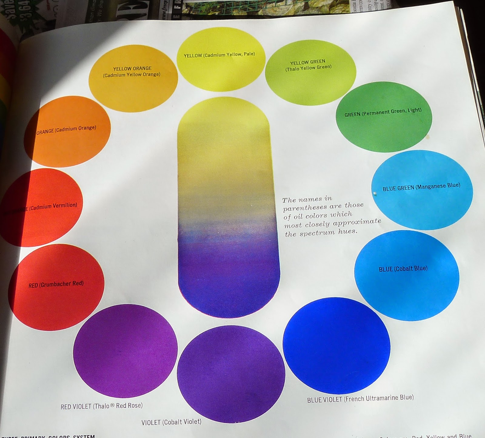
Artists constantly check themselves against a construct called “color temperature.” There are warm and cool colors, and warm and cool variations within each color. A warm color gives us a sense of warmth and energy and tends to draw our eye, like the life preserver on my painting of the Cadet. A cool color recedes from the eye and gives us a sense of static coldness, like the underside of Rockwell Kent’s iceberg from yesterday.
I’ve written before about the color of light, and it’s one of the most important concepts in painting. The earth’s atmosphere bends light just like a prism does, so what you see is always tinted. Either the light is warm and its shadows cool, or the light is cool and its shadows warm. Which that is depends on the time of day and the season of the year.
In the wintertime, the sun barely crests the treetops here in the North. The ground is often covered with neutral white snow. That gives us textbook conditions to see light temperature in action, for the sun on the horizon always gives us warm light and cool shadows.
Blue shadows on evening snow. (Carol L. Douglas)

Doggone brilliant

Portrait of a Jack Russell, by JoaquĂ­n Sorolla (1909)
A reader sent me this Portrait of a Jack Russell, by Joaquín Sorolla (1909). She knows I have an ancient Jack Russell and love Sorolla’s treatment of white and black.
Some of the tones Sorolla used to make white fabric and dog in the painting above.
This painting has no white in it whatsoever and most of the black is modeled with browns and plums, but we understand the dog to be white and black, seated on an off-white drapery, with light coming from the left.

The human mind interprets these colors to be black and white because, in fact, when we look at a black and white object in light, we see neither true black nor true white. Every object’s local color is tempered by the color of the light reflecting off it.

Some of the tones Sorolla used to make the black fur in the painting above.
Remember that color is composed of three characteristics:
Hue: the position on the color wheel, like red, blue and yellow;
Chroma (Saturation): how strong or weak the color is;
Value: how light or dark the color is.
The painting in gray-scale loses depth, because it is modeled with hue as well as value.
In gray-scale, the lighting on Sorolla’s dog is far less striking. That is because Sorolla uses the color of light to define shapes.  His light is warm and his shadows are cool.
I used Photoshop to make a rough hue map of the painting. It is clear that hue is driving this painting at least as much as value is.
Hue map of Sorolla’s painting, above. Clearly the light is coming from the left.

Let me know if you’re interested in painting with me on the Schoodic Peninsula in beautiful Acadia National Park in August 2015. Click here for more information on my Maine workshops! Download a brochure here.

Some basic color theory

Tilt-a-Whirl, 12X9, Carol L. Douglas. This was a plein air painting. Really.

Yesterday I showed you a PDF of a palette chart I like my students to follow. Today I’m going to talk about the basic color theory underlying it.

The three primary colors we learned in primary school are red, yellow and blue. Forget about any other color space you’ve learned about; they’re not relevant to painting.

Above are the three primary colors in subtractive color. This is the color space in which painters work. These three colors are the foundational building blocks on which all other colors are made.

Mix the primary colors in the first illustration with their neighbors and you end up with the secondary colors. A secondary color is always across the color wheel from a primary color.
If you mix the primary colors with those adjacent to them, you get the secondary colors: green (blue and yellow), orange (yellow and red)and purple (red and blue). A secondary color is always across the color wheel from a primary color. If you want to neutralize a color in a hurry, a fast way to do it is to mix it with whatever’s across the color wheel.

This is the theory on which all limited palettes are based. Unfortunately, there are no pure paint pigments. They’re either too warm or too cool, or they have overtones that muddy them up in certain mixes. So all real-world limited palettes have holes in them, places you just can’t get to with the available pigments.
This is why I use paired primaries on my palette. I have a warm and cool blue, warm and cool red, and warm and cool yellow. This allows me to go almost anywhere on the color wheel without sacrificing chroma.

The colors on my palette are a riff on the primary colors. It’s the same principle, but there’s a warm and cool version of each of them.
Why, then, do I have four more tones: yellow ochre, raw sienna and burnt sienna, and black? These are all iron-oxide pigments. They’re cheap and they make great modulators in places where white is inappropriate.

This allows you to go anywhere you want on the color wheel without sacrificing chroma (intensity).
All the colors on my color wheel are modern synthetic pigments (with the exception of the cadmium orange, which is a 19th century organic pigment). The iron-oxide pigments are the most ancient known to man. For some reason, using the modern pigments to create hyper-saturated colors and using the ancient pigments to modulate them works.

Let me know if you’re interested in painting with me on the Schoodic Peninsula in beautiful Acadia National Park in August 2015. Click here for more information on my Maine workshops! Download a brochure here.

Quantifying color

From A. Boogert’s treatise on watercolor pigments, TraitĂ© des couleurs servant Ă  la peinture Ă  l’eau, 1692.
Every artist I know loves color swatches—especially those done by other artists. Old ones are particularly interesting, since there wasn’t much unified color theory until the Impressionists came along. 
From A. Boogert’s treatise on watercolor pigments, TraitĂ© des couleurs servant Ă  la peinture Ă  l’eau, 1692.
A few years ago I wrote about Saussure’s Cyanometer, which attempted to measure how blue the sky was. Today I’d like to introduce you to A. Boogert’s treatise on watercolor pigments,  TraitĂ© des couleurs servant Ă  la peinture Ă  l’eau. This was published in 1692, putting it square in the Dutch Golden Age of Painting. It was intended as an educational tool for artists, but, alas, there was no color printing technology at the time, so its reach was limited.
Boogert describes how to make watercolor paints, mix colors, and dilute the pigment. To illustrate his methodology, he filled 700 pages with exacting shades of color.  Then he indexed all the colors he described.
From A. Boogert’s treatise on watercolor pigments, TraitĂ© des couleurs servant Ă  la peinture Ă  l’eau, 1692.
The book was shelved and forgotten at the Bibliothèque MĂ©janes in Aix-en-Provence, France until art historian Erik Kwakkel published selections from it last year.
Click here to see scans of Boogert’s paint samples.
From A. Boogert’s treatise on watercolor pigments, TraitĂ© des couleurs servant Ă  la peinture Ă  l’eau, 1692.
Let me know if you’re interested in painting with me on the Schoodic Peninsula in beautiful Acadia National Park in 2015 or Rochester at any time. Click here for more information on my Maine workshops! Download a brochure here.

Oldies but Goodies

Adjust the pigments for 21st century tastes and this is a perfect explanation of how paired primaries are actually more versatile than having every pigment on your palette. I’d substitute quinacridone violet for alizarin crimson, and Hansa yellow for zinc yellow.
This weekend, I was on the Schoodic Peninsula to test painting sites for my August workshop. When I got back to Waldoboro, a friend showed me two books she bought at the Damariscotta Public Library used book sale. They are Grumbacher art guides: one for drawing, and one for mixing paint. Each was worth the 25¢ she paid, but the color mixing guide is particularly good.
Best fun I’ve had for a quarter in forever.
In 1966, thalo green and alizarin crimson were the pigments de jour, but today we aren’t keen on either of them. A good art teacher would cross them out and replace them with their 21st century analogs: quinacridone violet for the crimson, and nothing for the thalo green (which has to be the pigment I hate most in this world). But why bother? Another two generations, and archivists will be sneering at the pigments we’re using today.
Ignore the names of the pigments on this chart, and notice instead that violet is the darkest pure pigment, and yellow the lightest.

The principles are what matter. Look at the illustration of primary pairings. It shows an essential rule of painting—there are no pure pigments, so you need a warm and cool version of each primary color to get the greatest gamut (or range of colors). In fact, if you set up your palette with paired primaries, you can dispense with the secondaries altogether. There is no real need for orange, purple or green when you have primaries that can mix to them. (I do keep cadmium orange on my palette and dispense with cadmium red, but that’s an idiosyncrasy that I’ve arrived at after years of painting. Consider it the exception that proves the rule.)

The second half of the book includes mixing examples from their suggested palettes. Ignore the specifics and notice how many neutrals they make with high-chroma pigments. Now go repeat this on your own.
P.S. Dressing in the dark undoes the artist’s advantage in matching his or her clothing. I have no idea if my long johns go with my turtleneck this morning.
Let me know if you’re interested in painting with me in Maine in 2015 or Rochester at any time. Click here for more information on my Maine workshops! Download a brochurehere.