The road home

How much of what we know is truth and how much is the convention of our times?

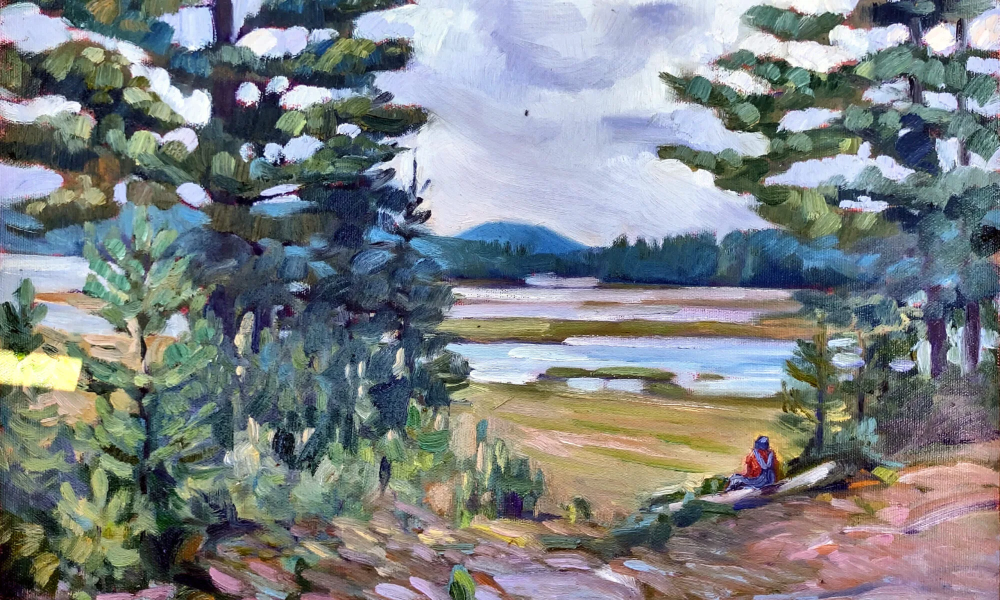
After the final cutting, Carol L. Douglas

In the 21st century, we are being driven inexorably toward higher and higher chroma (color intensity). This isn’t just happening in painting, but also in photography, home furnishings, and hair coloring. Occasionally an artist will take refuge in monochrome, but the delicately modeled colors of our predecessors are out of vogue. We live and die at 1280 x 720 pixels, and delicacy just doesn’t cut it on a computer monitor.
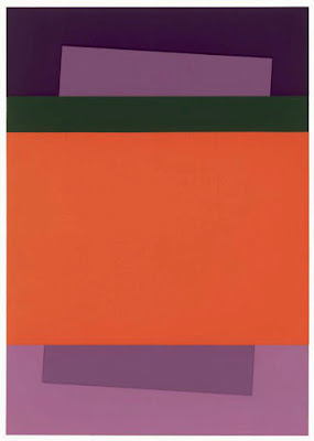
Yesterday, David Dewey spent a few hours with Clif Travers and me, going through a wealth of Joseph Fiore paintings. These are in storage and represent his entire career, from his studies at Black Mountain College until shortly before his death. Unlike most painters, Fiore didn’t run through clearly defined stylistic periods. He operated on parallel tracks of abstraction and realism, each informing the other.
Guardian of the Falls, 1983, Joseph Fiore, oil on canvas, 52 x 44, courtesy of the Falcon Foundation.
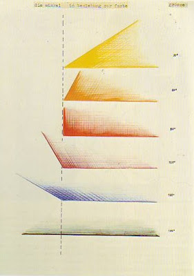
His folios are full of small studies in watercolor, oil, and pastel, now chemically stabilized. The majority are formal color exercises, many based on a mathematical grid of his own devising. David identified these as Bauhaus in character, which in turn takes us back to Paul Klee, Josef Albersand Wassily Kandinsky.
Klee closely connected color and music, making the connection between harmony and complementary colors, and dissidence and clashing colors (whatever they may be). Albers was a hands-on scientific colorist who taught at Black Mountain College when Fiore was there.
Field sketch forGuardian of the Falls (above), courtesy of the Falcon Foundation. It’s watercolor and about 12×16.
Fiore’s color studies are a balm to the eye starved for subtlety. There are grids of closely analogous greens and browns; grids punctuated with black. In addition to being beautiful, they fly in the face of our current color model. 
That just shows how much of what we think we know is the convention of our time, not eternal truths of painting. Take, for example, all of Kandinsky’s twaddle in Concerning the Spiritual in Art.  For much of the twentieth century, people took that seriously.
The artist’s job is to get through all that to the nut of the matter. The only way I know to do that is to paint—a lot.
David mentioned that he uses Arches 500 in his studio work, but mixes it up in the field. The accidents that ensue help him avoid staleness. This is exactly my goal in alternating between watercolor and oil in this residency, and in painting so big and fast. I am trying to shake up my oil painting.
I was able to maintain the truth of the landscape in my sketch.
Nature has a certain awkwardness. We landscape painters are taught to edit that away into a ‘better’ composition. After examining so many paintings, I wondered how much of that is also a fashion issue. I resolved to not do it in my afternoon painting, but to be completely faithful to what God and man had laid down in that field. I don’t think I succeeded. The personal impulse is just too strong to ignore.
But when I started painting, I succumbed to the urge to prettify.
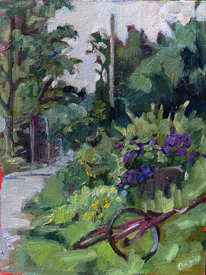
With all that fizzing in our heads, Clif and I went back to the farm and returned to work. The lake was still unsettled from this week’s storm, so I painted the small private cemetery and its lane. The lake beyond made this very much a painting of the intersection between land, water and man.
Having spent the morning in study, I didn’t finish the painting to any high surface. It’s slightly easier to do that with watercolor, since it goes faster. But in either case, the pace is starting to tell on me. I’m getting tired.

Devilishly difficult in the details

Color theory is a great place to get caught up in what you know versus what you see.
Schoodic fog-bow.
It was a splendid North Atlantic morning, looking more like November than August. The horizon was obscured in sea smoke. The rocks at Schoodic Point were covered with gulls who either felt a weather event in the offing or were sick of work. There was an onshore breeze and thunderheads building over Cadillac Mountain.
Plein air painting requires, above all, flexibility. I’d had a different plan for Wednesday, but everyone should spend one day painting the sheer magnificence of Schoodic Point, and today’s weather forecast is iffy. I swapped my plans as well as our location. Instead of teaching about believable greens, I concentrated on the color of light.
Visitors to Schoodic inevitably stop and stare. It’s stupefaction in the face of overwhelming power. 
On a day with a sea fog, all color theory goes out the window. What is the color of light when you are enveloped in a blanket of thick, peaceful, fluffy wool? It’s grey, sometimes tempered with pink, sometimes with blue, but ever-changeable. There’s a lot to leave to the imagination in such a setting. I sometimes paint the fog pale violet, because I like that color, but I don’t want it to become a gimmick.
There are three components to color: hue, saturation and value. They’re all the artist has to lead his viewer through his story, develop points of emphasis, and drive the eye.
I demo through the lunch hour at my workshops…
Value â€“ How light or dark is the paint?
Hue â€“ Where does the color sit on the color wheel? All colors fall into one of the following hue families: red, orange, yellow, green, blue and violet. Within those families, however, are many subdivisions.
Chroma â€“ How much intensity, or “punch” does the color have? A red geranium flower is high-chroma, a fog bank is low-chroma.
That sounds so sensible and neat on paper, but it gets messy on the canvas. The same is true of the color of light.
When the whole visible light spectrum strikes your eye at the same time, you perceive white. In the real world, this doesn’t happen. What you see is always filtered by our atmosphere.
Which is why I was so angry at the gull who thumped me in the shoulder and stole my sandwich from my lips. Rude.
It’s easy to see the gold and peach light of sunset, or the cold light of midday, but what is the color of fog? It’s often a cool, desaturated blue-grey, but that isn’t always true. It depends on the direction you’re looking and the time of day.
Color theory is a great place to get caught up in what you know versus what you see. When that happens, try to understand why it’s not working the way you thought it would. Then paint what you see, or, better yet, paint what you feel.

The lies we tell ourselves about painting

Some have a germ of truth; some are out and out wrong.

Île d’OrlĂ©ans waterfront farm, by Carol L. Douglas. ‘Immediate’ shouldn’t mean half-baked.
Don’t overwork it:This is the most common bromide I hear. I hate it. It encourages painters to stop prematurely, and to not work out the latent potential or problems in the work.
It’s far better to go too far and need to fix your mistakes than never understand your limits or see where you might end up. “Don’t overwork it” is a great way to permanently stunt your growth as a painter.
Replace it with this: “If you can paint it once, you can paint it 1000 times.” It liberates you to scrape out, redraw, paint over, scribe across your surface and otherwise really explore your medium. And it’s actually true.
Cirrus clouds at Olana, by Carol L. Douglas. I couldn’t have painted this had I not learned how to marry edges.
That’s your style: When I was a painting student, I had a teacher tell me that heavy lines were my ‘style’. They weren’t; I just hadn’t learned how to marry, blur or emphasize edges. These are technical skills, and to master them I had to move on to the Art Students League and teachers who understood the difference between technique and style.
Ultimately, we all end up with identifiable styles, but they should be un-self-conscious, the result of putting paint down many, many times. Anything that we do to avoid learning proper technique is not a style, it’s a failure.
Blues player Shakin Smith once told me that his style was the gap between his inner vision and his capacity to render it. That made me stop worrying about style at all.
Vineyard, by Carol L. Douglas, courtesy of Kelpie Gallery. The dominant greens in this painting are based on ivory black.
Don’t use black: “Monet didn’t use black, and you shouldn’t, either!” That’s true, but only after 1886, when Monet (apparently) adopted a limited palette. On the other hand, his palette included emerald green, which was copper-acetoarsenite, the killer pigment of the 19th century. There are limits to aping the masters of the past.
Monet made chromatic blacks, which are mixtures of hues that approximate black. Every artist should learn how to make neutrals, and not rely on buying Gamblin’s premix. But there are places where black is useful. One is in mixing greens. Another is in mixing skin tones. Contemporary painting is all about the tints (mixing with white) but ignores shades (mixing with black) and tones (mixing with black and white).
Back in the day, art students learned not just tints, but shades and tones.
Pros use more paint:Beginning artists generally don’t use enough paint, so it’s useful to tell them to increase the amount of paint. However, there are some great painters out there who work very thin—Colin Pageis an excellent example. The problem is in getting to that point. It’s a mastery born of years of experience. To get there you need—annoyingly—to start with more paint.
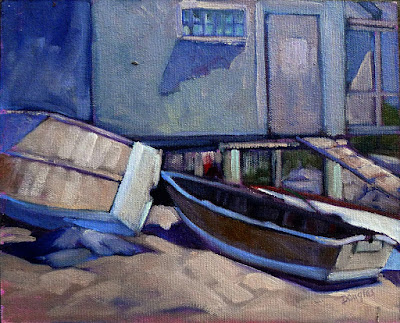
Fish Beach, by Carol L. Douglas.
If it’s not beautiful, you’re doing something wrong: Seeking beauty instead of truth is a great way to make static paintings. Paintings go through many ugly phases before they’re finished, and sublimating their ragged edges is a great way to drain all the juice out of your painting.

I’ve got one more workshop available this summer. Join me for Sea and Sky at Schoodic, August 5-10. We’re strictly limited to twelve, but there are still seats open.

Monday Morning Art School: what is color?

Understanding color space is the most important thing an artist can do.

A little bit of everything, by Carol L. Douglas. That’s the incredibly cool light of a midsummer day.

Color is a word with radically different definitions depending on its use. In optics, it refers to

the unique way in which the cone cells in the human eye are stimulated by electromagnetic radiation. How an object reflects or emits light gives it its unique color.
In common parlance, we think of red, green or blue as colors. In art, however, those aren’t colors. Colors have three attributes, all of which you must understand in order to navigate color space successfully:
Value â€“ How light or dark is the pigment?
Hue â€“ Where does the color sit on the color wheel? All colors fall into one of the following hue families: red, orange, yellow, green, blue and violet. Within those families, however, are many subdivisions.
Chroma â€“ How much intensity, or “punch” does the color have?
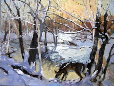
Doe drinking in the woods, by Carol L. Douglas, has warm light and cool shadows.
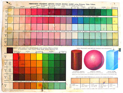
Since color has three attributes, it exists in a three-dimensional color space. However, we’re used to looking at it in two dimensions, in the form of a color wheel. I think the Quiller watercolor wheel is the best color wheel, since it shows you where neutral pigments fall inside the hue families.
Still, the conventional color wheel doesn’t take value into consideration. Every pigment has its own natural darkness or lightness. Dioxazine purple, for example, is very dark coming out of the tube. Lemon yellow is very light coming out of the tube. That does not mean that dark colors are cool and light colors are warm, however. Consider burnt umber. It’s very dark, and it’s also very warm.
Winch (American Eagle),by Carol L. Douglas. There was definitely some warm light that winter day.
There’s a misunderstanding that mixing across the color wheel darkens pigments. Only with certain greens and reds does this work. Mixing across the color wheel gives you neutrals: grays and browns.
We call the hue families of green, blue and violet “cool” and the hue families of yellow, orange and red “warm.” Within each hue family, there are warm and cool variations. Gamblin has this nifty chart of warm and cool pigments so you can see where your paints fall.
White, black, and grey are chromatic neutrals. Raw umber is fairly neutral. Naphthol red and phthalo blue are very high-chroma colors. In general, modern pigments are much more intense than the mineral pigments of the Renaissance.
Cobequid Bay Farm, by Carol L. Douglas. Warm evening light translates to cool evening shadows.
It works to sort colors this way. I use a system of paired primaries which gives me a great, high-key mixing range. However, the whole idea of warm-vs.-cool is a painterly convention. It’s best to not have this discussion with a physicist, who will tell you that you have it backwards. He may be right, but that doesn’t mean he can paint.
I’ve written about the color temperature of light here, but there’s a simple rule that helps. The predominant shadows will always be the opposite (across the color wheel) from the color of the light. On a sunny day, the light will be cool and the shadows will be warm. At dusk the light will be golden and the shadows violet. Of course, there are exceptions to this rule, but it’s a good place to start.
Breaking storm, by Carol L. Douglas, courtesy Camden Falls Gallery. I’m potting around on this boat this week, teaching watercolor. Wish you were here!
I strongly recommend this video from Gamblin, which organizes color space in three dimensions. It’s also full of information about the history of color.
There’s no internet (and darn little cell phone service) out in Penobscot Bay. After this post, my blog is going dark for the week. Don’t be alarmed! Assuming there are no pirates, I’ll be back next Monday.

Mixing complements and making grey

Some people say it doesn’t work. Is that true?

All flesh is as grass, by Carol L. Douglas. Since the Impressionists we have mixed our grays with complements.

Painters use mixes of complementary colors to make neutrals: red and green, blue and orange, or yellow and purple. The exact mixes have to be juggled around depending on the paint, but it’s an efficient system to get soft greys and browns. It’s centuries old and it endures because it’s a useful system.

Yesterday, a student flummoxed me by asking why it works. I could answer in general terms—interference—but I really didn’t know in any detail. I started to read about it and came up with a striking problem: many people don’t believe it actually does work.
From The Natural System of Colours, 1776, by Moses Harris. Courtesy Project Gutenberg. 
The traditional color wheel is a concept that we’ve been tinkering around with since Sir Isaac Newtonand his experiments with light in the 17th century. By the time the Impressionists started their world-changing experiments with light and color, the color wheel was settled in the format we currently use: a triad of so-called primary colors (red, blue and yellow) with secondary colors inserted between them.
A complementary color pair is made up of a primary color and the secondary color that sits across from it on the wheel. For example, yellow is a primary color, and purple is made by mixing red and blue. When yellow and purple paint are mixed, all three primary colors are present.
L’air du soir, c.1893, Henri-Edmond Cross, courtesy MusĂ©e d’Orsay. Pointillism works because the eye averages adjacent spots of color into mixes.
Paints are what we call subtractive color. That means they absorb light. What we see is what’s allowed to bounce back to our eyes. Neutrals happen when no particular color bouncing back to us is able to dominate; the three primary colors cancel each other out.
So why do some scientists and artists say this system doesn’t work? Mostly, it has to do with the impurity of pigment. Historically, all pigments were approximations of pure color, based on what technology could produce.
Our paints never sit exactly on the point of a primary or secondary color. Furthermore, there are a million sets of complements. For this reason, I devised a class exercise based on Stephen Quiller’s painter-specific color wheel, so that my students could find beautiful combinations based on the pigments they actually use. If you missed this lesson, I encourage you to try it now.
Fish Beach, by Carol L. Douglas.
Traditional pigments also change with concentration. We’ve all experienced this: three different reds may look the same out of the tube but end up looking very different when diluted or mixed with white. These imperfections allow us to mix some odd combinations that shouldn’t be possible—ultramarine, which is a violet-blue, can still make a passable green. This is also why we can mix ultramarine and burnt sienna—both on the red side—and get wonderful greys. There are undertones to those pigments that gain prominence when we start manipulating them.
Twentieth century pigments were designed with industrial and commercial applications in mind. They don’t change color with concentration, so mixing historic and new pigments together sometimes yields surprising results.
It’s about time for you to consider your summer workshop plans. Join me on the American Eagle, at Acadia National Park, at Rye Art Center, or at Genesee Valley this summer.

Monday Morning Art School: all color is relative

“Color is the most relative medium in art.” (Josef Albers)

Breakfast of the Birds, 1934, Gabriele MĂŒnter 

Periodically, we’re going to dip into color theory as taught by Josef Albers. Today’s lesson is from Chapter 4 of his Interaction of Color. If you don’t own this book and are serious about painting, I suggest you buy it.

Each November, we Northerners go outside in our down jackets on the first 40°F day and we’re shivering with cold. Come spring, the mercury rises to 40°F again and we’re scampering around in shorts. This is an example of a tactile illusioncalled a contingent aftereffect.
There are visual equivalents, most notably the McCullough effect. These cause us to perceive colors differently depending on what surrounds them. Why this happens is still not completely understood, but they have something to do with edge-sensors in the brain.
Josef Albers understood how important these edge relationships are in painting. He devised an exercise to explore them. It was meant to be done with Color-Aid, which is a delicious but very expensive system of colored papers. You can just as easily go to the paint store and get similar paint chips for free. Or you can draw the design, mix paint, and apply it with a brush.
The important thing is that you must not have raised edges. If you do this with paint chips or Color-Aid, use a sharp blade to cut out the shapes and fit them together like a jigsaw puzzle.
Plate IV-1 from Interaction of Color by Josef Albers. Your assignment is to replicate this in different color schemes, with the two squares always the same color. (Courtesy Yale University Press)
In plate IV-1, the two small squares are the same color. This is the influenced color. The horizontal teal, dark blue, yellow and orange stripes are the influencing colors. In this example, it’s almost unbelievable that the influenced color is the same in both squares.
Your assignment is to repeat Plate IV-1 with other color combinations. You’ll find that some combinations are more pleasing than others. Some color combinations have more influence on the influenced color. Some colors are more easily influenced than others. The more you experiment, the more you’ll learn, and the more you share your homework with others on our Facebook homework site, the more others will learn.
Plate IV-2 from Interaction of Color by Josef Albers. Why do we perceive these grids so differently when they are exactly the same size? (Courtesy Yale University Press)
Plate IV-2 shows a grid of a secondary color on two different backgrounds made of its constituent primary colors. Our perception of the grid is very different when it’s set on cool blue or warm yellow. What is happening in our brains to create that difference?
Plate IV-4 from Interaction of Color by Josef Albers again shows the relationship between influenced color and influencing color. (Courtesy Yale University Press)
In plate IV-4, the two interior violet shapes are the same color, but we see the top violet insert as the same as the bottom violet surround. The bottom surround is a tint (the color mixed with white) of the violet.
Albers designed these exercises to be completely abstract, so that your perception is not altered by symbolic or verbal thinking. Now, let’s toss in some meaning.
Gabriele MĂŒnter’s Breakfast of the Birds with the drapery color changed.
At the very top of this post is Gabriele MĂŒnter’s Breakfast of the Birds, 1934. MĂŒnter had a difficult life, and this painting is thought to be autobiographical. The draperies have been described alternatively as cozy or claustrophobic, the model as reflective or isolated.

Immediately above, I have recolored the draperies to a cool blue. How does that change our perception of the other colors in the piece? How does it change the mood of the piece?

Cult and color

Our ideas of the psychology of color come from a 19th century occultist, Madame Blavatsky.

From Concerning the Spiritual in Art, by Wassily Kandinsky. He believed both shapes and colors had specific meanings.

My student used to love to read aloud to me while I was painting. This is how I ‘read’ Wassily Kandinsky’s Concerning the Spiritual in Art.

Kandinsky was a student of the great occultist of his day, Madame Helena Blavatsky. She has the distinction of being one of the few women to successfully found a cult in modern western society, Theosophy.
Two Helens (Helena Hahn and Helena Blavatsky), artist unknown, is a portrait of the teenage Helena and her late mother.
Born into the Russian nobility, Madame Blavatsky’s nomadic youth exposed her, in turn, to Tibetan Buddhism, Freemasonry and the meandering byways of esotericism. Her mother died when she was 14. Shortly after, she began to experience astral projectionand visions involving a spirit guide, a “mysterious Indian” named Master Morya. He would become the first Master of Ancient Wisdom in Theosophy. Blavatsky claimed to have traveled the world with him.
At age 17, she married a much older man because, she said, he was interested in magic. The marriage was a disaster. She fled, escaping to Constantinople. According to biographer Peter Washington, at this point “myth and reality begin to merge seamlessly in Blavatsky’s biography.” She claimed to visit Asia, the Americas, and Tibet, where she learned a secret language, Senzar, from which she translated the texts of Theosophy. She developed clairvoyance, telepathy, the ability to control another person’s consciousness, to dematerialize and rematerialize physical objects, and to project her astral body. “Hardly a word of this appears to be true,” wrote her biographer.
Madame Blavatsky as a medium in New York. Courtesy New York Public Library.

With Colonel Henry Steel Olcott and Irish Spiritualist William Quan Judge, she founded the Theosophical Societyin 1875. Shortly thereafter, Blavatsky penned the first ‘bible’ of her new religion, Isis Unveiled: A Master-Key to the Mysteries of Ancient and Modern Science and Theology.
Olcott and Blavatsky continued her peripatetic lifestyle, moving first to India, and then to Europe. Meanwhile, Theosophy was a growing concern. By 1885, there were 121 Theosophical Society lodges worldwide. The movement had attracted such luminaries as W. B. Yeats, Thomas EdisonAbner Doubleday and the social reformer social Annie Besant.
Among them were many successful artists, including Wassily Kandinsky. Concerning the Spiritual in Art was written after Madame Blavatsky’s death, but it is heavily influenced by her theories.
Kandinsky was an avid student of occult and mystical teachings, especially Theosophy. Madame Blavatsky taught that creation is a geometrical progression, beginning with a single point. The creative aspect of the form is expressed by a descending series of circles, triangles and squares. Kandinsky adopted this. He based his color teachings on Blavatsky’s writings about the correlation between vibrations, color, and sound. While the framework of his color theory was based on that of Johann Wolfgang von Goethe, the content was pure Theosophy.
Madame Blavatsky and Colonel Olcott in their later years.
We think of Kandinsky as the first abstract painter, but he was in fact attempting to create a visible representation of the astral world as described by Blavatsky.
Kandinsky believed:
  • Yellow is â€œwarm,” “cheeky and exciting,” “disturbing.” This is the color of madness.
  • Green represents passivity and peace. Good for tired people, it can become boring.
  • Blue is a supernatural â€œtypical heavenly color.” The lighter it is, the more calming it is.
  • Red is the color of “manly maturity.” It is restless, glowing, and alive.
  • Light Red means joy, energy and triumph.
  • Middle Red expresses stability and passion.
  • Dark Red is a “deep” color.
  • Brown is inhibited, dull, and inflexible.
  • Orange is a healthy radiant mix of red and yellow. 
  • Violet  is “morbid, extinguished, sad.”
  • White is the harmony of silence.
  • Black  is “Not without possibilities [
] like an eternal silence, without future and hope.”
  • Grey is soundless and motionless, but different from green because it expresses a hopeless stillness.
These ideas still kick around today and influence our beliefs about color.

The truth about red

Why does red pop out at you? The first question to answer is whether that’s actually true.

Tilt-a-Whirl, by Carol L. Douglas

“Your color temperature reference seems to be something other than degrees Kelvin of a black-body radiator. Can you explain?” an engineer wrote me yesterday. The simple answer is that, to the painter, color is not a property of electromagnetic radiation, but a sensory perception question.

During the past few weeks, I’ve told you that much of what we accept as truth about color perception is just social convention. Today I’d like to talk about what (we currently think) is true. Science is constantly discovering new things, and in a hundred years, this understanding might be as obsolete as phrenology.
There are two basic theories of how we perceive color. The Young-Helmholtz Theory tells us that the retina’s three types of cones are sensitive to either red, green or blue. Ewald Hering proposed that we interpret color antagonistically. In other words, it’s either red or green, blue or yellow, black or white. Both theories appear to be true.
Deflatable, by Carol L. Douglas. The orange life jackets stand out because they’re the complement to the blue water.
The range of color (the “gamut”) that normal people can see is limited by this antagonism. We can see yellowish-green easily enough. We can’t see reddish-green because the cones in our eyes can’t perceive red and green simultaneously. Furthermore, we can’t see colors that are outside the limits of our receptors. Of course, the brain is always outsmarting us, so there are times the brain thinks it can see these so-called impossible colors.
Color perception doesn’t just happen on the retina; the visual cortex is involved, too. Some parts of the spectrum get a bigger response in the visual cortex than others, but that depends on what light conditions the visual system is adapting to.
Palm shadow, by Carol L. Douglas.
We’ve all noticed this in practice. On a clear day, a red dinghy bobbing on the turquoise waves stands out. In gloom it is hardly noticeable. Our perception of reds falls off fast in low light conditions. This is why one can’t fall back on truisms like “the retina perceives red first.” The human brain is far too wily for that.
Our mind practices something called color constancy. It’s how we understand that an apple is green whether we see it in the blue light of dawn, the true light of midday, or in the golden light of the setting sun. If we use a viewfinder to isolate the color of the apple, we often realize that what we’re seeing is anything but green. Still, our mind stubbornly processes the object as green.
This is an adaptive process that probably helps keep us alive, but it often mucks painters up. It’s hard to render unusual lighting effects when your brain is trying so hard to normalize them for you.
The same thing happens with lighting levels. That’s why it’s so important to check values against neighboring objects as we go. Our brain constantly adjusts our perception to normalize lights and darks.
Castine lunch break, by Carol L. Douglas
So why does red stand out? The answer is complex. In certain situations, such as a leafy green tunnel of a road, a red stop sign does, indeed, stand out. It’s the complementary color to its environment. But much of our reaction to color is a learned response. We notice red stop signs because we’ve trained ourselves to notice them. We believe red is an energetic color because society tells us so.
I use red to prime my canvases not because I believe it has special properties, but because it’s the complement of the dominant color in my environment, which is green.
Tomorrow, I’m going to introduce you to the 19thcentury cult leader who, more than anyone else, gave us our modern ideas about color. 

Monday Morning Art School: mastering your color palette

Monday Morning Art School now has a Facebook page, a place for online students to post their homework and look at others’ projects. I’ll look in to see what you’re doing. Try to limit your posts to the class exercises, please.
Today’s project is designed to help you learn more about the colors you’ve chosen and to give you more confidence in mixing colors. You can do this in any medium: oils, acrylics, pastels, gouache, colored pencils, watercolor, or even a dime-store paint kit. The examples were done with a Winsor& Newton field kit by my student Sheryl in my Rockport, ME class.
My wheel, above, is an approximation. Every manufacturer formulates its colors differently. Still, I’ve tried to match a pigment name with each spot on the wheel. The biggest circles are what we call the primary colors, followed in size by the secondary colors, and then the tertiary colors.
The outside of the wheel represents the highest chroma (intensity) colors. The center of the wheel represents low-chroma neutrals. The circles in the middle are the common earth pigments.
Start by drawing two circles, one inside of the other, on a piece of paper or a primed white canvas. Then draw a triangle inside the circle to help position your colors.
We’re going to use paint straight out of the tube. The colors on the outside of the wheel are modern pigments. They’re the highest chroma. The earth tones are historic pigments and less intense. Black falls in the middle.
Use only the paints you carry in your paint kit. No painter has everything. One point of this exercise is to find the holes in your colorspace.
Sheryl’s palette, interpreted on the color wheel above. Note how lacking her palette is in cool tones.
Find the closest thing you have to true red, blue and yellow. Choose paints that don’t have overtones of other colors. You might not have a color that is a true primary. Don’t force another color into that spot. Sheryl’s kit didn’t have a clear blue. She put both her blue dots to the left of the primary blue square, because they were both a little on the violet side. Another common paint is cadmium yellow medium. It’s actually pretty orange, so it goes to the side of true yellow. Label your colors, if you know their names.
You will have some tubes in your paint kit that don’t belong on the outside of the color wheel at all. Besides the earth tones, tubes that contain more than one pigment are less intense than straight pigments. (Pigments are usually listed on the tube.) Approximate where they go. For example, Sheryl has sap green, which is mix. She put it slightly inside the pure-pigment wheel, because it’s on the dull side.
Check your color wheel to see where you have gaps. Sheryl’s paint wheel is strongly weighted toward the warm colors—reds and yellows—and short on the blues and violets.
Sheryl’s finished wheel, showing various mixes of pigments. Yours should look something like this.
Draw a dotted line from two pigments on the outside of your color wheel—say quinacridone rose to ultramarine blue. Then make a mixture of those two colors and put a circle of that paint between the two. Repeat this with different combinations until you get bored.
Note that the holes in Sheryl’s palette means she can’t hit a clear blue-green or a clear purple.

Pastel and pencil artists can fill in the missing points with colors they have in their boxes, or they can mix combinations.
You should notice three things:

  • Mixing across the color wheel gives you beautiful neutral tones. They are far more interesting than mixing black and white to get grey;
  • You can never mix a paint that’s more brilliant than the straight-from-the-tube paints you started with. If all your paints are on the dull side, your finished painting will be dull too.
  • What you learned about primary colors in elementary school is only partially true. I remember my disappointment while trying to mix purple as a kid; that was because the paints I had weren’t true blues or reds.

Note: These lessons are a learning experience for me as well as you. I’ve taught painting for many years, but teaching in print is a new experience for me. I’m still trying to figure it out, so your suggestions and input are appreciated. You can email me here.

Monday Morning Art School: Mixing color

Mixing paint colors is easy, but practice makes perfect.
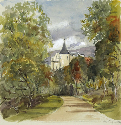
Balmoral Castle from the Approach (Abergeldie Side), 1852, Watercolor, by Queen Victoria.
If you think you’re too busy to paint, consider the above watercolor. It was painted by a mother of nine with a demanding full-time job: Queen Victoria. Note the fine, restrained greens in it and the cool autumn sky. If a queen can do it, so can you.
Green is a so-called secondary color, meaning it is made from a combination of two primary colors (yellow and blue). A secondary color is always across the color wheel from a primary color. It’s handy to remember that. If you want to neutralize a color in a hurry, a fast way to do it is to mix it with whatever’s across the color wheel. That’s its complement.
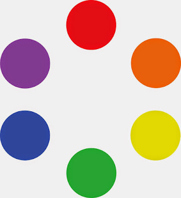
The conventional color wheel.
There are no pure paint pigments. They all have overtones that muddy them up in certain mixes. That’s why your local paint dealer uses many, many more pigments than just red, blue, and yellow. Most artist palettes also have duplicates. I use paired primaries, meaning I have a warm and cool blue, warm and cool red, and warm and cool yellow. (Here are my supply lists for oilsacrylics, and watercolors.)
The distinction between warm and cool colors has been important since the Impressionists, who emphasized the color of light in their paintings. Warm colors are said to be hues from red through yellow and cool colors are said to be the hues from green through violet. There is no ‘right’ answer to which colors are the anchors, but convention says the peaks are red-orange and blue-green.
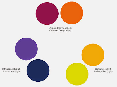
Paired primaries.
I should stress that this is a convention, not a fact. In reality, the hottest stars radiate blue light, and cooler ones are red. Much of what we believe about the psychology of color is hocus pocus.
The only part of this that concerns the painter are the attributes of each individual pigment. We say that Hansa yellow is cooler than cadmium yellow deep, even though they’re both ‘warm’ colors. We mean that if you are trying to mix a greenish yellow, you’ll get a clearer shade with the Hansa than you will with the cadmium. If you’re trying to go more orange, start with the cadmium. The warm-cool language is just a convenient way of saying that.
I lay my paints out in hue-order, and encourage my students to do so, too. Not only does this eliminate the “hunt and peck” method of mixing, it makes it easier for you to compare pigments.
The business of mixing color is simple, but it needs to be practiced. First, find the pigment that’s closest to where you want to end up. Then, determine if it needs to be warmer or cooler and modulate it with the appropriate neighbor. If it’s too intense (too high in chroma), you can cut that by adding some of its complement. That’s the color across the color wheel from the original. In oils and acrylics, you lighten the color with white; in watercolor, you dilute it.
In some cases, you might start with a color that’s too dull. For example, chromium oxide green (PG17) is a good, opaque, solid, non-fading green, but it’s relatively low in chroma (intensity). It can only be made even more dull, not tarted up to greater brilliance. If you use that green on your palette, you may need to back up and mix a green with blue (or black) and yellow to get to the appropriate starting point.
A good way to look at this is to imagine the neutral colors as occupying the middle space of the color wheel. You can easily get to neutral by mixing paints across the wheel, but you can never get more intense than your starting point.
Today’s exercise involves stopping at your local hardware store for a few paint swatches. These are Benjamin Moore brand, but you should be able to find similar ones anywhere. There are two off-whites: one cool and one warm. There’s yellow, green, and two soft blues. Your assignment is to mix until you think you’ve hit the exact color. Then put a dot of it on the card to see how close you got. (If you’re working in watercolor, the dot goes on paper instead.)
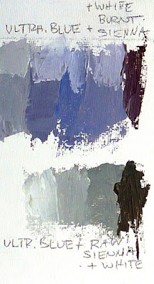
I also ask my students to make neutrals using combinations of ultramarine blue with burnt sienna and raw sienna. I use the combination of ultramarine blue and burnt sienna as my standard dark neutral, because it can go to the warm or cool side depending on how it is mixed.
These combinations are my starting point for rocks and sands. They’re a variation on the complement set of blue-orange. But you can make good neutrals with other complement sets. Try purple and yellow or red and green. Each has its own character.