The power of the Great White North

In the solitary splendor of Canada, these painters found energy, possibility, and a national identity.

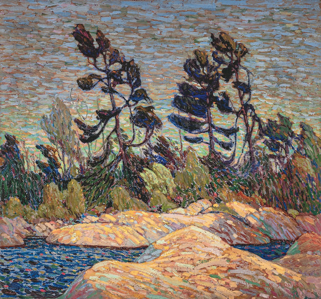
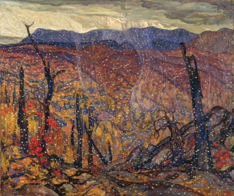
Byng Inlet, Georgian Bay, 1914–1915, Tom Thomson, courtesy McMichael Collection

Here in Maine, we import our weather from Canada. In fact, we share a lot with our Canadian neighbors, including black spruces, granite, and the spodosol soils that are good for growing potatoes, blueberries, evergreens, and not much else.

Maine has a contemporary painting style that’s driven by this sense of place. It’s curiously unrelated to our most famous summer painter, Andrew Wyeth. Instead, it derives from an earlier generation of painters, including Rockwell Kent and Edward Hopper.  Maine is just too sunny and wild to sustain Wyeth’s quiet melancholy.

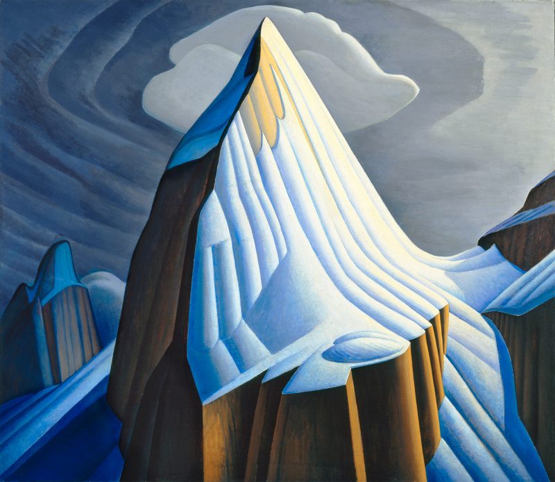
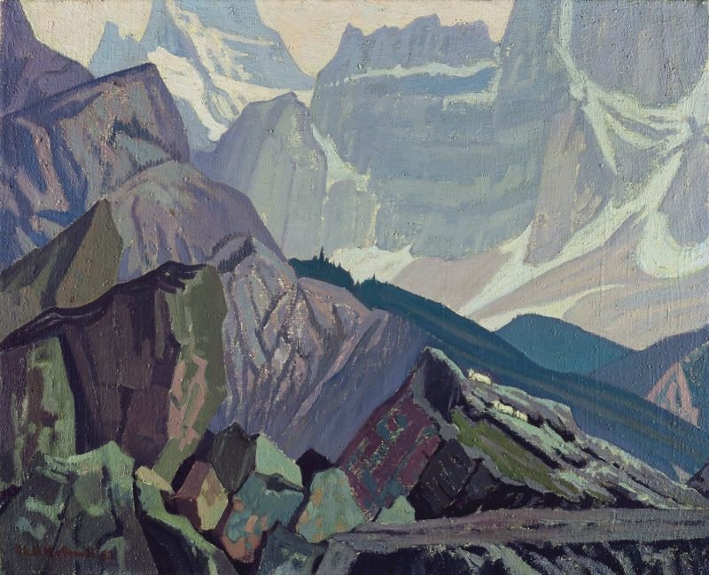
Mt. Lefroy, 1930, Lawren S. Harris, courtesy McMichael Collection

This combination of influences and landscape gives us some curious parallels to our Canadian neighbors, the Group of Sevenpainters. This group consisted of Franklin CarmichaelLawren Harris, AY Jackson, Frank Johnston, Arthur Lismer, JEH MacDonald, and Frederick Varley. Later, AJ Casson, Edwin Holgate and LeMoine FitzGerald joined them.

Bright Land, 1938, Arthur Lismer, courtesy McMichael Collection

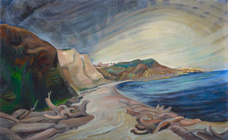
Although he died before the official formation of the group, Tom Thomson was a profound influence on them. Emily Carrwas never an official member as she lived in Vancouver, but she was influenced by them. Lawren Harris, in particular, was a support. “You are one of us,” he told her.

Shoreline, 1936, Emily Carr, courtesy McMichael Collection

Harris was one of the driving forces behind the Group of Seven, and the most able to articulate their mission. He was a very malleable painter. He went from impressionism to art nouveau realism to complete abstraction in a matter of two decades. His break with realism occurred in the early 1930s, after he visited and painted in the Arctic.

Harris believed in the arctic as a living force: “We are on the fringe of the great North and its living whiteness, its loneliness and replenishment, its resignations and release, tis call and answer, its cleansing rhythms. It seems that the top of the continent is a source of spiritual flow that will ever shed clarity into the growing race of America.”

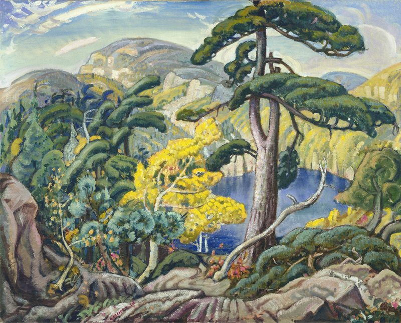
First Snow, Algoma, 1919/1920, AY Jackson, courtesy McMichael Collection

The Group of Seven painted this ethos. In the solitary splendor of Canada, they found energy, possibility, and a national identity. That’s an idea that has become politicized in recent years. Indigenous people have argued that these areas were always inhabited. The depiction of emptiness was a de facto endorsement of the pernicious policy of terra nullius.

But for artists trained in Europe, many of whom saw duty in WWI, Canada was desolate. As AY Jackson wrote, “After painting in Europe where everything was mellowed by time and human associations, I found it a problem to paint a country in outward appearance pretty much as it had been when Champlain passed through its thousands of rock islands three hundred years before.”

Goat Range, Rocky Mountains, 1932, JEH MacDonald, courtesy McMichael Collection

I’ve painted through every Canadian province and Yukon Territory. (Nunavut and Northwest Territories remain on my bucket list.) To my American eyes, Canada is empty, and that’s its attraction. Canada is unique in having so much wilderness, untouched, in the modern world. That Great White North, which reaches down and embraces the country in an iron grip every winter, is wilderness’ fierce protector.

Everything the Group of Seven painted derives from that unique understanding of wilderness and its value. Maine artists work from the same wellspring of inspiration, so it’s no wonder that our paintings look similar to our Canadian neighbors’.

Soul ties

What makes one painter stand out in our mind when another doesn’t even create a ripple?

River at Belvidere, date unknown, Chauncey F. Ryder, courtesy Blue Heron Fine Art

I was contemplating the dormant branches of a birch tree when Eric Jacobsen suggested I look at the work of Chauncey Ryder. “Who?” I asked. Eric goggled.

“He’s the reason I became an artist,” he enthused. Once he showed me some images on his phone, I understood, but until that moment, Ryder had never pierced my consciousness.

Mín Herðubreið / My Herðubreið, 1938, Gísli Baldvin Björnsson, courtesy Icelandic Times

My pal Bruce McMillan writes frequently about Icelandic painters on his blog. Without him, I never would have been introduced to the austere abstraction of painters like Louisa MatthĂ­asdĂłttir or GĂ­sli Baldvin Björnsson. At first, I found them uncomfortably brutal. Recently I’m finding that their exceptionally cool mien speaks to me.

I myself have a long-standing passion for mid-century Canadian and British painters, many of whom are, frankly, quirky. I was thrilled to find the work of Alfred Wallis, a Cornish fisherman who didn’t pick up a brush until he was widowed, past the age of seventy (which ought to be an inspiration to us all). To call his work naïve is to underrate its sheer oddity.

The Hold House Port Mear Square Island Port Mear Beach, c. 1932 by Alfred Wallis

Wallis was ‘discovered’ by mid-century British modernists Ben Nicholson and Christopher Wood in 1928. They brought his work to London; Nicholson even bought one of his paintings and presented it to MoMA. But Wallis never saw himself as anything but a retired St. Ives laborer who painted what he knew—“What I do mosley is what use To Bee out of my memory what we might never see again,” he wrote. It was unnecessary for him to laboriously unlearn the artistic conventions of his time; he’d never learned them in the first place.

I have a deep affection for Tom Thomson and the Group of Seven, but I never saw their work until I was an adult. And yet I grew up a few blocks from the Canadian border, right across the Niagara River from Group of Seven country. Buffalo’s Albright-Knox Art Museum has a very fine Abstract-Expressionist collection because its leading light, Seymour Knox II, was crazy for modernism. His tastes were firmly fixed by New York, so the museum owns nothing of Thomson and his peers. They were too figurative for Mr. Knox’ taste.

Evening, (field sketch) 1913. Tom Thomson, courtesy Art Gallery of Ontario, Toronto

What makes one painter stand out in our mind when another doesn’t even create a ripple? In the past, it might have been a question of what we could see. Outside the major cities we had limited access to the panoply of art being made out there. But that’s not true today. We can all see new art, almost in real time, via social media and online museum shows.

Part of this, I’m sure, comes down to maturity. I probably wasn’t ready to see the quiet beauty of Chauncey Ryder when I was 14 and being dazzled by Clyfford Still. Part of it comes from looking at lots of art. The more I learn, the more I realize how little I know, and the less I’m inclined to quick judgments. But there’s something else there, too, and that’s the response of the soul, which is—simply—ineffable.

Monday Morning Art School: painting evergreens

Your assignment this week is to paint an evergreen, using one of the great masters as your muse.
Herdsmaid, 1908, Anders Zorn. You could identify the species of trees in this painting, but it’s short on detail.

Last week, I wrotethat there are as many ways to paint water as there are moments in the day. The same is true of painting evergreens.

We can look to the painters of the great northern landscapes for guidance on evergreens. Swedes Bruno Liljefors and Anders Zorn, Tom Thomson and the Group of Seven, the Russian Peredvizhniki, and the northeastern painters from Winslow Homer to Andrew Wyeth are all worth studying.
Winter landscape at dawn, 1900, Bruno Liljefors. If the evergreens are in a supporting role, they’re often painted as a single mass.
Spend an hour searching their work on the internet along with the key words “spruce,” “pine”, or “evergreen.” You’ll notice that most of these artists handled the subject differently depending on whether they were in the studio or painting en plein air, or if the trees were the main subject or incidental.
After the bath, 1895, Anders Zorn, courtesy Nationalmuseum. The evergreens are nothing more than a few brushstrokes, but they’re perfectly realized.
Anders Zorn often used evergreens behind his pulchritudinous nudes. The contrast between his perfectly-observed trees and cookie-cutter models is striking. The Herdsmaid (1908) is probably the best evergreen painting ever executed. It’s all about the young trees, but Zorn never overstates the detail. Instead, he allows his brush to wash softly over the darker background, suggesting the softness of pine needles.
That apparent artlessness rests on a solid ground of observation. Zorn (and Wyeth) were able to be specific but loose because they drew and observed endlessly from nature. Each species of tree has a specific design. There are no shortcuts to knowing and understanding them. If you want to be able to paint trees, you must first draw them—a lot. Observe their branching structure, their needles or leaves, their bark, and where they like to grow.
Spruce Gun, watercolor, 1973, Andrew Wyeth, private collection
But trees are also forgiving; when you understand their structure, you can fearlessly mess with their form. While Wyeth’s tree in Spruce Gun looks perfectly natural to us, it’s also stylized to give a dynamic boost to the gun.
North Woods Club, Adirondacks (The Interrupted Tete-a-Tete), watercolor, 1892, Winslow Homer, courtesy Art Institute of Chicago. The trees are simple silhouettes, but they work because they’re accurate.
Either watercolor or oil are perfect for the organic character of trees; they can be schooled into great detail or allowed to wash with great softness across the canvas or paper.
It’s easy to become overwhelmed with detail in a tree, but it’s best, instead, to concentrate on overall values and colors instead. Start with the large shapes and concentrate on a few details at the end. After all, when we notice trees at all, we generally perceive them as masses, rather than as individual details. The exception is when someone is interacting with the tree, as in Mary Cassatt’s Child Picking a Fruit.
Isles of Spruce, silkscreen, c. 1943, Arthur Lismer. While the contrast between background and foreground is high, the values within individual trees are quite close.
How do we create form in trees? The same way we do with any other subject, by creating a pattern of light and dark. Our first question ought always be, “where is the light coming from?” The second question should be, “Is the light cool or warm?”
Start with a drawing. This is where you can get carried away with the gothic intricacies of the structure, and get them out of your system. Make sure that the height and width relationship is accurate. Also double-check that you have branches on all sides of the trunk, not just to the sides. Some will come directly towards you. While these are difficult to draw, they’re what anchor the tree in space.
Dusk, 1900, Isaac Levitan, courtesy State Tretyakov Gallery. Depending on the light, evergreens may be represented with no green at all.
I’ve written before about working with a green matrix; you can use it as successfully with evergreens as with deciduous trees. Let’s assume you’re drawing in early morning and the light is golden. Make the shadows cooler and darker and the highlights warm and light. It’s possible that the only true greens in your tree will be in the midtones or highlights. But avoid excessive value jumps; making the highlights too light can end in visual chaos. It’s usually what’s happened when someone complains that they’ve gotten lost in the detail.
Montreal River, c. 1920, Lawren S. Harris, courtesy McMichael Canadian Art Collection. The Group of Seven painters were interested in trees as screens.
Unless you’re painting a deciduous tree in the dead of winter, the branches and trunk are secondary to the masses of foliage. 
Your assignment this week is to paint an evergreen, either from life or a photograph. Before you start, find a masterpiece from one of the artists I’ve mentioned above, and study his paint application carefully. Try to emulate that in your painting.

Monday Morning Art School: continuing education

We learn from studying our peers and the painters who’ve gone before us.
Victoria Street, oil on linen, 16×20, by Carol L. Douglas
Bruce McMillan emailed me last week. “Just in case you feel you’re painting a lot, in 1911, from early August to late September on Monhegan, Robert Henri painted 300 paintings, most of them on 12×15 wooden boards, his last major foray into marine art.”
I churned out fifteen largish canvases in thirteen days during my Parrsboro residency and wondered if I was sacrificing quality for quantity. But I’m familiar with Henri’s marine paintings; they’re simple, monumental and brilliant. Bruce’s reassurance came at exactly the right time.
Once we’re done with art classes, we learn mostly from observing other artists. When we see something that we admire, we want to incorporate the essence of that idea into our work. It’s not stealing; it’s how all art develops.
Miss Margaret, oil on canvasboard, 8×10, by Carol L. Douglas. Maggie was my roommate for two weeks.
Alison Hill is a painter I’ve known since before I moved to Maine. We were set up next to each other at Cape Elizabeth Paint for Preservation last month, so I had time to study her brushwork. She lays it down once and leaves it.
A writer told me recently, “you can rewrite that ending eight times and it won’t necessarily be better; you’ll just have eight different endings.” At least with the written word, they’re separate. In alla prima painting, those previous iterations lie there in the murk and muddy up the top layers.
I’d never heard of Tom Forrestall before this current trip. He’s sometimes called the Canadian Andrew Wyeth because of the precision of his egg tempera technique. But beneath that is a light, quirky vision. It’s magical realism unencumbered with social commentary. Can this kind of ruthless observation be learned? I won’t know until I try.
Clearing to the west, oil on canvas, 12×16, by Carol L. Douglas
Tara Will is a pastel painter from Maryland. She has never met a compositional rule she’s not willing to bend, break or pummel into submission. I look at everything she posts because her paintings are always colorful, light, and energetic. She keeps pastel lean and fresh.  
Marc Granboisis a plein air painter from Quebec. His snow and ice are tremendous, but his skies are what I’m interested in these days. He can pull moody, brooding, and dramatic out of a leaden northern sky. There’s tremendous energy in his linework and patterning.
Every artist needs to know art history to understand where he or she fits into the great saga of art. A number of Nova Scotians commented that my painting style looked very Tom Thomson or Group of Seven. That’s partially because they’re familiar to Canadians, but it’s also because I have studied them for many years.
Recent landslide (Cape Sharp), oil on linen, 18×24, by Carol L. Douglas. This painting is the only one that’s going to get a studio revision–in this case, a crop, I think. I removed something at the last minute and it unbalanced the composition. 
More recently, I’ve been thinking about the Scottish Colourists, particularly Francis Cadell. Both the Canadians and Scottish groups are post-impressionist, but they’re as interested in a sense of place as they are in formal order and structure.
Most of the painters I’ve mentioned are not superstars; they’re my fellows in the trenches. Who do you admire right now? What can you learn from their painting?

Your list will be different from mine, but thinking about what you like in your peers’ work gives you an idea of what you might want to change in your own. It’s a moving target. In a year, we’ll be talking about entirely different artists.

Challenge to the ideal of femininity

Canadian painter Prudence Heward was an audacious post-Impressionist, and so much more.
Rollande, 1929, Prudence Heward, courtesy National Gallery of Canada.

When I first saw the painting above, I laughed aloud. I was painting badly, my nose dripping horribly. Young Rollandeperfectly echoed my mood. Kudos to the aficionado who texted it to me.

Rollande’s discontent is epitomized by her pink work apron. It is the initial focus of the painting and must have been loathsome to a girl with ambition. She stands, hands on hips, separated by a fence from the Quebec farm that is her lot in life. Even her posture is confrontational. She may be staring directly at us in the Modernist mode, but hers is no happy face. It’s almost as if we are part of the problem.
Compare her face to Bronzino’s Portrait of a Young Man, c. 1530, and you sense where Prudence Heward is heading. Bronzino’s anonymous poet can stare with unsmiling hauteur and we understand that he is the cock of the walk. But women—especially low-status women—are supposed to be cheerful.
Sisters of Rural Quebec, 1930, Prudence Heward, courtesy Art Gallery of Windsor
Rollande also modelled for Heward’s Sisters of Rural Quebec, 1930. The younger girl is her sister, Pierrette. The composition is a brilliant, complex slash of diagonal and vertical lines. It serves to further isolate the sisters, both from each other and from us. Not only are their faces stark and emotional, but note the sunflower at the bottom left corner. It’s in darkness, a mute testimony to their ‘real’ life on the farm.
Apple Tree (Study for Portrait of Ellen), c. 1935, Prudence Heward, courtesy National Gallery of Canada.
“I think that of all the arts in Canada painting shows more vitality and has a stronger Canadian feeling,” Heward wrote in 1942. At that time, Canadian painting had reached a brilliant maturity, separate from its American and British siblings. It was uniquely reflective of the country, its circumstances, its ethos and its pride.
Anna, c. 1927, Prudence Heward, courtesy National Gallery of Canada. She looks as if she’s fallen in the snow.
Prudence Heward was primarily known as a figure painter, although I’ve included a few of her landscapes as well. She was not limited by traditional QuĂ©bĂ©cois expectations herself. Rather, she was born in Montreal to a large, affluent family who supported her artistic inclinations.
During World War I she served with the Red Cross in England. Returning to Canada, she resumed painting, joining the modernist Beaver Hall Hill Group. Her first exposition was in 1924; her first solo show in 1932.
Farmhouse and Car, c. 1933, Prudence Heward, courtesy National Gallery of Canada.
In 1925, she went to Paris on scholarship, studying at the Académie Colarossi. Her work was profoundly influenced by the monumentality and color sensitivity of Paul Cézanne, Henri Matisseand Henri Rousseau.
In Paris, she met her lifelong friend, Isabel McLaughlin. Together, they returned to Paris in 1929 and took sketching classes at the Scandinavian Academy. Heward traveled with McLaughlin and other artist friends throughout her life. They visited the Heward summer home near Brockville on the Saint Lawrence, northern Ontario, the Laurentians and Bermuda. In 1933, Prudence Heward co-founded the Canadian Group of Painters, the successor group to the Group of Seven
The Immigrants, Prudence Heward, 1929, private collection, Toronto
A serious car accident in 1939 was the beginning of the end of her career. She continued to paint until 1945, when her health problems forced her to give up her brush. Primary was her worsening asthma. She was seeking treatment for it in Los Angeles when she died in 1947 at the age of fifty. It was an unfortunate, untimely loss for Canadian painting.

My favorite painter?

The Procession to Calvary, 1564, Pieter Bruegel the Elder

“Who are your favorite painters?” a reader asked. That’s an impossible question. Instead, here are some painters who I profoundly admire and you should too.

Pieter Bruegel the Elder was the most significant of the Dutch/Flemish Renaissance painters. Among the first generation to paint other than religious scenes, he was a great landscape artist. His paintings, especially genre paintings, are a whirl of human activity. But what I admire the most is his ability to hide the focal point, or multiple focal points, in insignificant corners of his paintings. His figures are as fresh and realistic as when they were painted.

Knight, Death and the Devil, 1513, Albrecht DĂŒrer

Albrecht DĂŒrer was a great painter, but I admire his engravings, woodcuts and drawings most. He was a superlative draftsman, particularly in perspective. It’s his simple, profound understanding of the Passion that moves me most. He did at least three versions, and they’re the visual equivalent of J.S. Bach’s St Matthew Passion.

The Fall of the Damned, c. 1620, Peter Paul Rubens

Peter Paul Rubens may have been intellectual, classically trained, and the favorite painter of the Counter-Reformation, but to me, he’s the progenitor of comic-book art. I draw a direct line between his dynamic canvases and the work of the late Steve Ditko. Both dealt with cosmic issues in a restless, complex way.

Weymouth Bay, c. 1816, John Constable

John Constable is best known for his great set-pieces like The Hay Wain, but he is also the (largely uncredited) inventor of modern plein air painting. In place of a classical education, he spent his youth wandering the fields of his native Essex. This “made me a painter, and I am grateful,” he said. By the time he convinced his father to let him study art, the damage was done—he was a fresh, observational painter in an age when classicism was king.

The Railway Station, 1873, Édouard Manet

Édouard Manet is known as a pivotal painter in the transition between Realism to Impressionism., but his importance to me is his surface treatment. He was the first painter to eschew sparking bright lights and a superlative finish in favor of his own, raw, handwriting. He is, in this sense, the father of Modernism.

The Red Vineyard, 1888, Vincent van Gogh

Vincent van Gogh hardly needs any introduction, being one of the most influential painters in art history. His importance to landscape painters can’t be overstated. He was the precursor to Fauvism, and that, far more than Impressionism, is what speaks to our own times.

Algoma Sketch 48, 1919-20, by Lawren Harris (member of the Group of Seven)

Tom Thomson and the Group of Sevencame into being across Lake Ontario from my hometown of Buffalo, but I didn’t really learn about them until adulthood, since realism was so out of favor in my youth. Still, these painters did more than any others to apply the principles of Impressionism to the North American landscape. They vary greatly in style, but they were united by their love of the Great White North and the wilderness. They were intrepid extreme plein air painters.

Resurrection Bay, Alaska, 1965, by Rockwell Kent

Rockwell Kent was eulogized as “a thoughtful, troublesome, profoundly independent, odd and kind man” by the New York Times. That’s all true, but he was also terrific painter, aggressively simplifying his subjects to their essence. His subjects—concentrating on the Adirondacks, Alaska and Monhegan—are all about the ever-changing light of the north.

Red Shirt and Window,2013, Lois Dodd (courtesy Alexandre Galley, New York.

Lois Dodd could be admired just for her tenacious success in the male-dominated New York art scene. Her credentials are as sterling as any of her male peers, but she had her first career museum retrospective in 2013, when she was already in her eighties. That would mean nothing if she weren’t also a superlative, self-directed painter. She ignored Abstract-Expressionism and Pop Art to forge her own, realistic way.

My 2024 workshops:

Autumn color is hitching up its skirts and getting ready to sprint

Interested in fall foliage? This is the ultimate road trip for a leaf-looker.
Glade #1, by Carol L. Douglas. Watercolor on Yupo.

We haven’t had a frost yet, but with each day I see a bit more color. To date, it’s mostly the sumacs and undergrowth, but the top of the birches are starting to glint gold.

Someone sent me this cool interactive fall foliage map. It’s probably a good, broad sketch, but I’m skeptical about the details. I know, for example, that Penobscot Bay is unlikely to change in tandem with Fort Kent, ME. Nor will Rochester turn side-by-side with the high peaks of the Adirondacks.
Maine’s official color-spotters agree with me. “Northern Maine is at or near peak conditions the last week of September into the first week of October. Central, and western mountains of Maine are at or near peak Columbus Day week/weekend. Coastal and southern Maine generally reach peak or near peak conditions mid-to-last October.”
Glade #2, by Carol L. Douglas. Oil on canvas.
If it were up to me, I’d be heading north to Canada’s Algonquin Provincial Park today, with my canoe. It’s not a western park, but it would give me aspen, tamarack and maples, set against black spruce.
Then I’d spend a few days in Ottawa, Montreal and Quebec City for a dose of Canadian city life. I’d continue to Halifax and spend a few days knocking about Nova Scotia’s eastern shore, reveling in ancient maritime Canada. Eventually, I’d head to Digby and the ferry to St. John, NB. I’d then roll south, making sure to stop at West Quoddy Head Light and the boreal trail at Quoddy Head State Park.
Marshes along the Ottawa River, Plaisance, Quebec, by Carol L. Douglas
Stop right there, Carol. “You just skipped mysterious, moody Eastport,” I admonish myself. Well, I also skipped Lunenburgand Peggy’s Cove in Nova Scotia, and the fossil cliffs of New Brunswick. Not to mention the superlative Group of Sevencollection at the National Gallery in Ottawa. It’s impossible to list the interesting stuff you’d see on this trip, but if you can’t blow four weeks driving from Algonquin to Boston, you’re not really trying.
It’s under 3000 km. The trip of a lifetime, I tell you.
Speaking of the Group of Seven, I’m finishing up my residency at the the Joseph Fiore Art Center with a classically Go7 exercise which I periodically attempt and at which I never excel. That’s painting a glade. I don’t want a dominant tree, or to use white birches as a foil for dark foliage. I’m looking for a deeper kind of compositional integrity, and, so far, I haven’t found it.
This tiny glade first attracted me because of the glitter of the lone yellow tree against all that green. It would have been difficult enough to paint it in sunlight. In the dripping gloom and mist and rain we’ve had this week, it’s been maddening. I don’t think either painting was a success, but they’re both interesting, and that’s all I really want for today.
We’re winding down now. Clif Travers and I agree that today is the last day it’s possible to paint in oils and have work that’s dry enough to move. I may paint in watercolor Saturday, or I may coo at my brushes and clean up my kit for my next big event.

What’s in a name?

How dare anyone lecture Emily Carr—even posthumously—on relations with her indigenous neighbors?
The Indian Church, 1929, Emily Carr, courtesy Art Gallery of Ontario. Lawren Harris once owned this painting.

Canadians are a mythically polite people. That reputation has at least some basis in fact. Why else would they rename Emily Carr’s iconic 1929 painting Indian Church as Church at Yuquot Village?

Georgiana Uhlyarik, of the Art Gallery of Ontario, told CBC Radio that the former title contained “a word that causes pain.” (Uhlyarik is not indigenous herself.) I’m not certain why it should be a painful word. If anything, ‘Indian’ is an indictment of our ancestors, not the people it was applied to. Emily Carr named her painting in the common parlance of her day.
Carr was always sympathetic and knowledgeable about the native people she painted. In her lowest days she made pottery for sale to tourists. “I ornamented my pottery with Indian designs — that was why the tourists bought it. I hated myself for prostituting Indian Art; our Indians did not ‘pot,’ their designs were not intended to ornament clay — but I did keep the Indian design pure.
Blunden Harbour, 1930, Emily Carr, courtesy National Gallery of Canada
“Because my stuff sold, other potters followed my lead and, knowing nothing of Indian Art, falsified it. This made me very angry. I loved handling the smooth cool clay. I loved the beautiful Indian designs, but I was not happy about using Indian designs on material for which it was not intended and I hated seeing them distorted, cheapened by those who did not understand or care as long as their pots sold,” she wrote.
Carr was born in Victoria, BC, in 1871 to English parents. She studied art at the San Francisco Art Institute and in London. By the turn of the century she was already focusing on her subject: the indigenous people of the Pacific Northwest. But it was not until she visited France in 1912 that she would marry that subject to post-impressionism.
Kitwancool, 1928, Emily Carr, courtesy Glenbow Museum
Her personality was too uncouth to be a good teacher, and her work was too distinctive to sell easily. She struggled to find a business model that worked. Failing, she traveled north to the Queen Charlotte Islands (now Haida Gwaii) and the Skeena River, to document life among the HaidaGitxsan and Tsimshianpeople.
Carr documented the art of the Pacific Northwest with anthropological precision. “These things should be to us Canadians what the ancient Briton’s relics are to the English. Only a few more years and they will be gone forever into silent nothingness and I would gather my collection together before they are forever past,” she said.
Public response remained dismal. Carr returned to Victoria to run a boarding house, doing almost no painting. She grew fruit and vegetables in her backyard and raised chickens, rabbits and bobtail sheepdogs for sale.
She was middle-aged when she was finally ‘discovered’. After a visit to her studio in 1926, anthropologist Marius Barbeau wrote to Eric Brown, director of the National Gallery of Canada, suggesting that the Gallery purchase her entire collection. Brown was cool to the idea until he visited her studio during planning for a show entitled Exhibition of Canadian West Coast Art – Native and Modern.
Odds and Ends, 1939, Emily Carr, courtesy Art Gallery of Greater Victoria. In later life, Carr began to focus on pure landscape and environmental issues.
Brown selected twenty-six paintings and hooked rugs and pottery for the exhibition. He suggested that Carr read Frederick Housser’s A Canadian Art Movement, introducing her to the Group of Seven. He also gave her a complimentary rail pass to get to Ottawa for the opening. 
On the way, she visited A. Y. Jackson’s studio in Toronto. “I felt a little as if beaten at my own game. His Indian pictures have something mine lack — rhythm, poetry. Mine are so downright. But perhaps his haven’t quite the love in them of the people and the country that mine have. How could they? He is not a Westerner and I took no liberties. I worked for history and cold fact. Next time I paint Indians I’m going off on a tangent tear. There is something bigger than fact: the underlying spirit, all it stands for, the mood, the vastness, the wildness, the Western breath of go-to-the-devil-if-you-don’t-like-it, the eternal big spaceness of it. Oh the West! I’m of it and I love it,” she wrote.

Algonquin mystery

"Algonquin Rocks," by Carol L. Douglas. I was  most interested in the flaming soft maples. Lakes? I've seen a few this trip.

“Algonquin Rocks,” by Carol L. Douglas. I was most interested in the flaming soft maples. Lakes? I’ve seen a few this trip.
One of the enduring mysteries of the art world is how Canada’s great artist, Tom Thomson, age 39 and an experienced guide and woodsman, died on Canoe Lake in Algonquin Provincial Park.
A century after his death, the facts are limited. At noon on Sunday, July 8, 1917, Thomson left his cabin to fish. That afternoon, Martin Blecher and his sister Bessie saw Thomson’s canoe floating upside down as they motored on the lake. They did not stop to check it, saying they thought it was another canoe that had slipped its moorings.
On Tuesday, guide Mark Robinson was called in to search for the body. He and others checked portages and inlets for the following week.
Tom Thomson's guide license. He was an experienced woodsman.

Tom Thomson’s guide license. He was an experienced woodsman.
The news of the missing artist spread rapidly. “Mr. Thomson is very well known here and everyone will hope that he will be found safe and well. The other alternative is not pleasant to consider but should it be found that he has been drowned, Canada will have lost one of her most accomplished landscape artists, and a thorough gentleman,” wrote the Owens Sound Sun.
Thomson’s body surfaced on Monday, July 16. Robinson and Dr. Goldwin Howland, of Toronto, examined it. They found a bruise on the left temple about four inches long, “Evidently caused by falling on a Rock otherwise no marks of Violence on Body,” wrote Robinson. The decomposing body was quickly buried at Canoe Lake.
One of the countless streams that form the roadways of Algonquin Provincial Park, a place that promises you backwoods peace and solitude.

One of the countless streams that form the roadways of Algonquin Provincial Park, a place that promises you backwoods peace and solitude.
On Tuesday, the coroner arrived from North Bay and assembled an inquest. “There is Considerable Adverse Comment regarding the taking of the Evidence among the Residents,” Robinson wrote in his diary. Almost immediately, Thomson’s family sent a steel coffin and requested that his body be exhumed and sent home to Leith, Ontario.
That is where the facts end. Even his final resting place in dispute, with one group of people saying the undertaker balked at exhuming his remains and sent an empty casket back instead. Thomson, they say, is buried at a secret spot near Canoe Lake.
Was it accidental drowning, as the coroner decided? Was it manslaughter, as Mark Robinson came to believe? Was it suicide?
Martin Blecher was 26 when he saw the overturned canoe. He was the son of German immigrants, a quarrelsome, alcoholic recluse who told people that he was a private detective employed by the William J. Burns International Detective Agency in Buffalo. Robinson, who listed local war deaths in his diary, believed Blecher was a German spy.
“I had heard that there was some ill feeling between Tom and some man in that region [Mowat]. It was somewhat casually referred to by someone at Canoe Lake possibly one of the Rangers, but as this was while we were still looking for Tom and I was still hopeful of his safe recovery, I didn’t at the time attach any serious importance to the report,” wrote Thomson’s brother George.
Was the man Blecher or someone else? Daphne Crombie, who was in Mowat that spring, remembered, “Tom and George
they’d had a party. They were all pretty good drinkers, Tom as well. Well, they went up and had this party. They were all tight and Tom asked Shannon Fraser for the money that he owed him because he had to go and get a new suit
Anyway, they had a fight and Shannon hit Tom, you see, knocked him down by the grate fire, and he had a mark on his forehead
Annie [Fraser] told me all this and also Dr. MacCallum. Tom was completely knocked out by this fight. Of course, Fraser was terrified because he thought he’d killed him. This is my conception, and I don’t know about other people’s. My conception is that he took Tom’s body and put it into a canoe and dropped it in the lake. That’s how he died.”
Why did Thomson need a new suit? According to Annie Fraser, he’d gotten local woman Winnie Trainor pregnant and had to marry her. After Thomson’s death, Trainor traveled to Philadelphia to stay with friends, and rumors persisted that she was pregnant. She never married and was protective of his reputation for the remainder of her life.
I started painting Lake Huron in the morning but was rained out. It was a windy whippy day; I'll finish this in the studio.

I started painting Lake Huron in the morning but was rained out. It was a windy, whippy day; I’ll finish this in the studio.
Years later, Robinson elaborated on his finding of the body: “His fishing line was wound several times around his left ankle and broken off.  There was no sign of the rod, his Provisions and kit bag were in the front end of the Canoe when found. The lake was not Rough.”
““You might interview Martin and Bessie Blecher but again be careful. They possibly know more about Tom’s sad end than any other person,” he added darkly.
Even in Algonquin, solitude and peace are an illusion.

Twice told tales

"Avalanche Country," oil on canvas by Carol L. Douglas.

“Avalanche Country,” oil on canvas by Carol L. Douglas.
Mary is flat on her back, ill with something I cannot figure out. I have a nasty cold; she has that and something else. I left her sleeping in a room at the Toad River Lodge and headed back to Muncho Lake to paint.
Northwest Canada and Alaska rivers and lakes are often strangely-colored—milk chocolate brown, ivory, or turquoise. This is caused by rock flour, which is a substance of fine-grained particles of rock ground off bedrock by glacial erosion. Because the silt is so fine, it ends up suspended in glacial meltwater, creating cloudy water sometimes called glacial milk.
These fellows came to visit me while I was painting. When they realized there was a human involved, they skedaddled. There was a foal with them, who stayed carefully behind. I'm ashamed to say I have no idea what species they are.

These fellows came to visit me while I was painting. When they realized there was a human involved, they skedaddled. There was a baby with them, who stayed carefully behind. I’m ashamed to say I have no idea what species they are.
Lake Louise in Alberta is the most famous of these rock flour lakes, but they occur anywhere there’s glaciation. West of Toad River there are great dumps of till that look for all the world like glacial moraines. We haven’t seen a true glacier in hundreds of miles, but there are permanent snow caps here.
Mary’s illness gave me the opportunity to paint rock-flour water. Muncho Lake is about 50 km west of Toad River community, so I backtracked there, first to paint the Toad River along an avalanche path, then to paint the lake itself in the afternoon sun.
"Muncho Lake," by Carol L. Douglas.

“Muncho Lake,” by Carol L. Douglas.
The Toad was named for the enormous toads found there by Hudson’s Bay Company explorers.  â€œI have seen some which weighed upwards of a pound, and the Indians inform me there are some to be seen of a much larger size,” wrote John McLeod in 1831.
It is so much easier to paint something commonplace than something unusual. Get the general shape of a teapot and your viewers will understand it to be a teapot. Hit the color of rock-flour water almost perfectly and it looks absurd.
The Toad River Valley is full of glacial till.

The Toad River Valley is full of glacial till.
I’ve thought a great deal about Tom ThomsonEmily Carr and the Group of Seven painters while on this trip. There is something fantastical about their paintings that the American viewer sees as romanticism, or, to put it bluntly, exaggeration for effect. In fact, it turns out to be literal truth-telling. Thomson’s famous Jack Pine may be stylized, but it’s also a tremendously accurate drawing, particularly of the squat black mountains in the background.
Can a viewer in the east understand that a western black spruce might rise like a stick in the air and sends out a bulb of branches at its tip, oddly reminiscent of a fiddlehead fern? Or that some wildfires kill, and other wildfires seem to simply prune, the trees sending out shoots from their blackened trunks?
One too many inquiries.

One too many inquiries.
If you see struggle in these two paintings, you’re looking at them correctly. The colors here are so otherworldly that I’m having trouble committing them to canvas.
I returned to Toad River in the early evening to find that Mary still hadn’t stirred. At this point, my husband took over as long-distance logistician. He has us moving in slow stages over the next few days so that she can rest and recover—and above all, not camp. I’m alright with that, since the temperatures in Jasper and Banff National Parks are well below freezing at night. Even better, there is a clinic in Fort Nelson, and one at Dawson City. If she isn’t perkier today, she’s going to see a doctor.