The devil’s in the details

Pam’s paints weren’t cheap; they were by reputable manufacturers. But she was caught in the maze of historic names and convenience mixes.

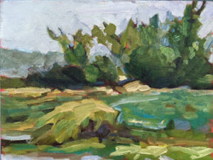
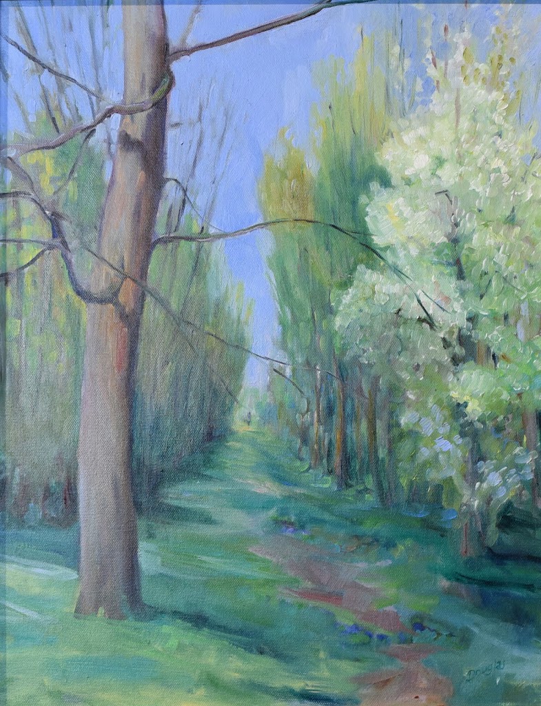
Spring Allee, 14X18, oil on archival canvasboard, available.

Last week my students did a green-mixing exercise. Pam Otis had a tough time getting the proper mixes out of the yellows on her palette. After class, she sent me photos of every yellow she had. I spent an instructive half-hour happily looking up each tube.

I know, generally, what’s in colors, but different manufacturers have different ways of getting to that point. If the paint tube isn’t marked (or has been crimped or damaged so you can’t read the tiny type), you must research the paint on the manufacturer’s site. Often, you’ll learn something, because paints are constantly changing.

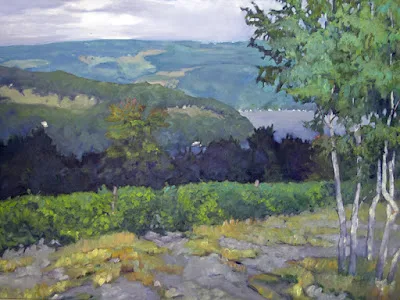
Vineyard, 30X40, oil on canvas, available.

Some changes are due to market conditions. PO49, quinacridone gold, was a very useful color (as all the quinacridones are). However, it was discontinued by the auto industry in 2001. The fine arts market for pigments is miniscule, so PO49 disappeared. Most modern quinacridone golds are convenience mixes of quinacridone orange (PO48) and nickel azo yellow (PY150). Both are perfectly fine pigments, but they work differently in mixes than the original pigment.

Other substitutions are more inscrutable. The siennas are ancient pigments made of dirt—a mixture of iron and manganese oxides, to be specific. In its natural state, this pigment is yellow-brown and called raw sienna. Cooked, it turns red and is burnt sienna. Along with ochre and umber, raw sienna was among the first pigments ever used by prehistoric humans. It has been used ever since, because it’s cheap, plentiful, harmless, and doesn’t fade. Modern earth pigments are all manufactured analogues, but are chemically indistinguishable from the old mined ore.

I have no idea why Winsor & Newton substitutes a combination of burnt sienna (PR101) and yellow ochre (PY42) for ordinary raw sienna. But that may be why some yellow ochres and raw siennas are indistinguishable out of the tube.

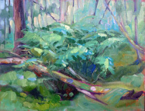
Bracken fern, 9X12, oil on archival canvasboard, available.

A hue is a blend of less-expensive pigments. There is nothing inherently wrong with hues, but they don’t behave the same as the pigments they’re named after. “Cadmium yellow hue” may look like cadmium yellow coming out of the tube, but it makes insipid greens.

Then there is the stuff that watercolorists call Gamboge. The real thing came from tapping the latex of the Garcinia, or Gamboge Tree. It’s a beautiful, transparent, non-staining orange-yellow, but it’s also extremely fugitive (as vegetable dyes tend to be). So, manufacturers substitute other pigments and call the result New Gamboge. The most common ingredients are nickel azo yellow and anthrapyrimidine yellow (PY108) However, there are as many formulas as there are manufacturers, and every combination behaves differently.

Spring Greens, 8X10, oil on archival canvasboard, available.

The origins of Indian yellow have long been disputed. It was said that it was extracted from the urine of cows fed a diet of only mango leaves. 20th century, art historians doubted this, but recent chemical analysis of historic samples confirm the source as animal urine.

We now reject the idea of starving cows to create pretty pigments (although euxanthic acid can be synthesized in the lab). Today we use combinations of nickel azo, hansa yellow, and quinacridone burnt orange. It’s a terrific paint for making dark greens. The trouble, again, is that every manufacturer has its own formula for Indian Yellow.

Pam’s paints weren’t cheap; they were by reputable manufacturers. But she was caught in the maze of historic names and convenience mixes. Knowing how to read the CII code on your paint tube is important.

The CII code consists of two letters and some numbers. Most paints start with a “P” which means it’s a pigment, not a dye. The next letter is the color family:  PR is red, PY is yellow, etc. The number is the specific pigment included in the tube.

Save this link somewhere accessible from your phone. You’ll need it when you shop. This pigment guide was built for watercolors but is generally true across all media. 

Cheap paint is a false economy

Don’t skimp on paint quality, or you’ll defeat yourself from the outset.

Ogunquit, by Carol L. Douglas. If the pigment isn’t in the paint to start with, you can’t magically enhance it. 

When I send supply lists, I suggest brands. These are Golden for acrylics, QoR for watercolor, and RGH or Gamblin for oils. In pastels, there is too much variation in hardness for a blanket recommendation, but I like Unison myself. Of course, nobody’s paying me for these endorsements; they’re just my preferences.

That doesn’t mean these are the only good art supplies out there. They have a combination of pigment load and handling characteristics that I like. There are many excellent makers of paint out there. They come in a variety of price points, but price is not the sole indicator of quality.

Late October, Beauchamp Point, by Carol L. Douglas

There are an equal number of horrible paints on the market. You might think you’ve saved a few bucks, but they’re an expensive mistake, one that will cost you time in learning. Don’t skimp on paint quality, or you’ll defeat yourself from the outset. Instead, cut down on the number of colors you buy.

All paints (and pastels) consist of pigment and a binder. There are differences in the quality of binders, in the amount of pigment the manufacturer uses, and how the pigments are stabilized. There may be filler added, or drying agents.

Most major paint brands in the US subscribe to voluntary associations of quality control. (RGH is an exception; that’s too bad, because their paint is excellent.) The most well-known is Colour Index International (CII), a database dating back to 1925. It contains over 27,000 individual products sold under 13,000 different product names. This standard classification system gives you the facts about the pigments in your tube.

Autumn Farm, by Carol L. Douglas

Just as Benjamin Moore uses names like Yukon Sky to peddle grey paint, art paints are often marketed with evocative names. These names appeal to our sense of tradition, even when the old paint has no relationship to its namesake. If you buy Naples Yellow thinking you’re buying an historic pigment, think again: the modern paint is a convenience mix replacing the historic (and toxic) lead antimonate.

Expect to find, at minimum, the following information on the label of your paint tube:

  • Manufacturer’s name or common name for the color.
  • The CII number and, sometimes, the name of the pigment(s).
  • The manufacturer’s lightfastness or permanence rating.

The CII code consists of two letters and some numbers. Most paints start with a “P” which means it’s a pigment, not a dye. The next letter is the color family:  PR is red, PY is yellow, etc. The number is the specific pigment included in the tube.

Save this link somewhere accessible from your phone: https://www.handprint.com/HP/WCL/waterfs.html

You’ll need it when you shop. This pigment guide was built for watercolors but is generally true across all media. (Watercolor is the canary in the coalmine of pigments). All painters should understand lightfastness, transparency, and color shift. Granulation, bloom and diffusion, however, are watercolor-specific issues. 

Winch, by Carol L. Douglas

When you compare paints with the same names, check their CIIs. Are they the same or different pigments? A “hue,” is made of a blend of less-expensive pigments. There is nothing inherently wrong with hues, but they don’t behave the same as the pigments they’re named after. For example, “cadmium yellow hue” may look like cadmium yellow coming out of the tube, but it makes insipid greens.

There’s little to be gained by buying a hue mimicking a more expensive pigment. If you are comfortable painting with a hue, then learn what’s in it and mix it yourself. You always have the greatest flexibility by working with pure pigments (rather than mixes) out of the tube.

Most manufacturers include their own lightfastness ratings on the tube. This is a measure of how quickly the color fades. If it’s not listed, look it up.

The series number tells you the price. Are pricier pigments better? Not by a long shot. Twentieth-century manufacturing gave us a new world of inexpensive pigments, which tend to be less toxic, higher in chroma and lightfast.

I’m thinking about supply lists because it’s time to send them out for Find Your Authentic Voice in Plein Air in Tallahassee, Florida, in early November. There are enough students to go, but there are still openings, so I’d be excited if you signed up. s

From there on in, it’s all Zoom, Zoom, Zoom until the snow stops flying. The Tuesday morning class is sold out; there are still openings for Monday night Zoom classes.

Monday Morning Art School: mastering value

The essence of alla prima painting is to nail the color on the first pass.

The top of this canvas is a simple grisaille; the bottom is a single layer of paint applied right over that. This is the gist of alla prima painting. 

You cannot overstate the importance of valuein painting. Even when artists represent value with hue(a technique pioneered by the Impressionists) the dark shapes in a painting have a form. That form drives our perception and guides us through the painting. There are various ways to get this right, but the most common is a quick value sketch. I ask watercolor students to then make a value study in paint before they start their finished project. I have oil and acrylic students do their paint study in the form of a rough grisaille on their canvases. It has to be thin, and it has to be worked fairly dry, or you can’t paint over it.

Where early oil painters sometimes trip up is in making that bottom layer too dark, thick, or soupy. Then, they hope they can somehow lighten it up by adding white back in. Indirect painting works almost like this, so they may have seen something similar on a video. In indirect painting, the artist works into this dark layer; in modern direct painting, or alla prima, it’s there as a roadmap, so it’s applied more lightly.

Close-value mixing is the heart of painting, and the hardest mixing to do.

Direct painting requires great skill in color mixing, because the goal is au premier coup, or to nail it on the first strike. That goes not just the for darks, but every color in the picture. Even a painting with wonderful shadows and lights will have many middle tones, often closely related in value. These are actually the most difficult colors to mix accurately. If you have a painting that isn’t working, ask yourself if it has a full tonal range, or is it simply hitting the highs and lows. When people get in trouble painting texture, it’s usually because they’re overstating the contrast.

Plate IV-4 from Joseph Albers’ Interaction of Color, demonstrating how all color is relative. The inner violet colors are the same exact value, but what surrounds them influences how we perceive them.

All color is relative, and that’s particularly true when it comes to value. Above see a plate from Joseph Albers’ groundbreaking Interaction of Color. The inner violets are the exact same value. But the framing color influences how we see those values, so one looks much lighter than the other. This is why oil painters should tone canvases, by the way.

I made the oil-painting sample at the top of this page for my students. The top is the value study; the bottom is a finished painting. I keep it around to demonstrate that when we say “darks to lights” we don’t mean a thick mask of dark paint; we mean that we think through our values in that order. (In watercolor, we do the same thing, but the application is reversed to go from light to dark.)

Copy and print me.

To mix paint accurately you must become absolutely conversant with the colors on your own palette. You can download this pigment test chart and print it on watercolor paper (trimmed to size) on your laser printer. Or, just grid off a canvas or paper to match. (Don’t try doing this in watercolor on plain copy paper. It isn’t sized, and your pigment will just sink.)

Use the pigments you usually have on your palette (if there’s more than eleven, we may need to talk).

What is the natural value of your paint, straight out of the tube? Compare it to that scale above.


The first step is to identify the natural value of your paint, straight out of the tube. For oil painters, this is easy. For watercolorists, it’s a bit of work to figure out what that really darkest point is, because it’s never the same as it appears on your palette. The colors wetted are a better guide, but you’ll need a test paper handy to experiment.
Your finished exercise should look something like this.

When you figure out the darkest natural position of that pigment, paint it in the appropriate position on your scale. Then make lighter steps to match the greyscale strip you’ve printed from the sample above. For watercolorists, that means dilution. For oil and acrylic painters, that means cutting with white.

There are three things to remember:

  1. These judgments are subjective. There’s no reliable way to measure the value of a color. The camera is as subjective as the human eye.  
  2. You can’t get a color to go darker than its ‘natural’ value without distorting the hue or chroma. Thus, there is no natural dark version of cadmium yellow, so the shadows in a yellow object require a workaround.
  3. All pigments can make about the same number of discrete steps. While the yellows have a shorter range, the steps are more noticeable. Blues can mix from almost-white to almost-black, but the middle points are very similar. 

Monday Morning Art School: an exercise in color

This exercise teaches you to think of the three aspects of color as separate properties.
Water lilies (Yellow Nirwana), 1920, Claude Monet, courtesy the National Gallery, London. Much of Monet’s work was experimenting about the nature of color.

When we ask people, “what’s your favorite color,” we’re using the word color in a simple way, and we expect a simple answer. In fact, color has three basic characteristics:

Value – How light or dark is the color? Blue-indigo is the darkest color, yellow is the lightest. Red and green fall somewhere in the middle.
Hue – Where does it sit on the color wheel? All colors fall into one of the following hue families: red, orange, yellow, green, blue and violet. Within those families, however, are many subdivisions.
Chroma – How much intensity, or “punch” does the color have? Grey is low-chroma; fuchsia is high-chroma.
For more detail, see here.
Complementary colors are opposite positions on the color wheel.
Analogous colorsare a set of colors that sit next to each other on the color wheel.
This exercise teaches you to hold value and chroma steady and manipulate only hue. It’s hard to make these judgments subjectively, so your samples may not look exactly like someone else’s.
Go to the paint store and select paint chips in two different color schemes—complementary and analogous. I want you to choose paints with the same value and chroma but the hue will be different.
Complements where the value and chroma are the same.
They don’t necessarily have to be high-chroma combinations. Here’s a pair of complementary hues which have less saturation (lower chroma):
An example of an analogous color scheme where the value and chroma are the same for all three hues:
Once you’ve selected the three paint samples, chop them up and arrange them on a little card as a design. Glue them down in a pattern that pleases you. Try to leave no space between the different colored tiles so your finished work looks something like this:
Above: my chops. Below: Photoshop’s evaluation of how close I came with the values. (Remember, Photoshop is interpreting as much as I am.)

I don’t care what kind of shapes you make or how complicated your design is. I just don’t want white showing between the sections.

If it proves difficult to get out, and you want to get started, you can always make your own paint swatches. But it’s fun to get them from the hardware store, cut them up and make patterns.

Devilishly difficult in the details

Color theory is a great place to get caught up in what you know versus what you see.
Schoodic fog-bow.
It was a splendid North Atlantic morning, looking more like November than August. The horizon was obscured in sea smoke. The rocks at Schoodic Point were covered with gulls who either felt a weather event in the offing or were sick of work. There was an onshore breeze and thunderheads building over Cadillac Mountain.
Plein air painting requires, above all, flexibility. I’d had a different plan for Wednesday, but everyone should spend one day painting the sheer magnificence of Schoodic Point, and today’s weather forecast is iffy. I swapped my plans as well as our location. Instead of teaching about believable greens, I concentrated on the color of light.
Visitors to Schoodic inevitably stop and stare. It’s stupefaction in the face of overwhelming power. 
On a day with a sea fog, all color theory goes out the window. What is the color of light when you are enveloped in a blanket of thick, peaceful, fluffy wool? It’s grey, sometimes tempered with pink, sometimes with blue, but ever-changeable. There’s a lot to leave to the imagination in such a setting. I sometimes paint the fog pale violet, because I like that color, but I don’t want it to become a gimmick.
There are three components to color: hue, saturation and value. They’re all the artist has to lead his viewer through his story, develop points of emphasis, and drive the eye.
I demo through the lunch hour at my workshops…
Value – How light or dark is the paint?
Hue – Where does the color sit on the color wheel? All colors fall into one of the following hue families: red, orange, yellow, green, blue and violet. Within those families, however, are many subdivisions.
Chroma – How much intensity, or “punch” does the color have? A red geranium flower is high-chroma, a fog bank is low-chroma.
That sounds so sensible and neat on paper, but it gets messy on the canvas. The same is true of the color of light.
When the whole visible light spectrum strikes your eye at the same time, you perceive white. In the real world, this doesn’t happen. What you see is always filtered by our atmosphere.
Which is why I was so angry at the gull who thumped me in the shoulder and stole my sandwich from my lips. Rude.
It’s easy to see the gold and peach light of sunset, or the cold light of midday, but what is the color of fog? It’s often a cool, desaturated blue-grey, but that isn’t always true. It depends on the direction you’re looking and the time of day.
Color theory is a great place to get caught up in what you know versus what you see. When that happens, try to understand why it’s not working the way you thought it would. Then paint what you see, or, better yet, paint what you feel.

Monday Morning Art School: what is color?

Understanding color space is the most important thing an artist can do.

A little bit of everything, by Carol L. Douglas. That’s the incredibly cool light of a midsummer day.

Color is a word with radically different definitions depending on its use. In optics, it refers to

the unique way in which the cone cells in the human eye are stimulated by electromagnetic radiation. How an object reflects or emits light gives it its unique color.
In common parlance, we think of red, green or blue as colors. In art, however, those aren’t colors. Colors have three attributes, all of which you must understand in order to navigate color space successfully:
Value – How light or dark is the pigment?
Hue – Where does the color sit on the color wheel? All colors fall into one of the following hue families: red, orange, yellow, green, blue and violet. Within those families, however, are many subdivisions.
Chroma – How much intensity, or “punch” does the color have?
Doe drinking in the woods, by Carol L. Douglas, has warm light and cool shadows.
Since color has three attributes, it exists in a three-dimensional color space. However, we’re used to looking at it in two dimensions, in the form of a color wheel. I think the Quiller watercolor wheel is the best color wheel, since it shows you where neutral pigments fall inside the hue families.
Still, the conventional color wheel doesn’t take value into consideration. Every pigment has its own natural darkness or lightness. Dioxazine purple, for example, is very dark coming out of the tube. Lemon yellow is very light coming out of the tube. That does not mean that dark colors are cool and light colors are warm, however. Consider burnt umber. It’s very dark, and it’s also very warm.
Winch (American Eagle),by Carol L. Douglas. There was definitely some warm light that winter day.
There’s a misunderstanding that mixing across the color wheel darkens pigments. Only with certain greens and reds does this work. Mixing across the color wheel gives you neutrals: grays and browns.
We call the hue families of green, blue and violet “cool” and the hue families of yellow, orange and red “warm.” Within each hue family, there are warm and cool variations. Gamblin has this nifty chart of warm and cool pigments so you can see where your paints fall.
White, black, and grey are chromatic neutrals. Raw umber is fairly neutral. Naphthol red and phthalo blue are very high-chroma colors. In general, modern pigments are much more intense than the mineral pigments of the Renaissance.
Cobequid Bay Farm, by Carol L. Douglas. Warm evening light translates to cool evening shadows.
It works to sort colors this way. I use a system of paired primaries which gives me a great, high-key mixing range. However, the whole idea of warm-vs.-cool is a painterly convention. It’s best to not have this discussion with a physicist, who will tell you that you have it backwards. He may be right, but that doesn’t mean he can paint.
I’ve written about the color temperature of light here, but there’s a simple rule that helps. The predominant shadows will always be the opposite (across the color wheel) from the color of the light. On a sunny day, the light will be cool and the shadows will be warm. At dusk the light will be golden and the shadows violet. Of course, there are exceptions to this rule, but it’s a good place to start.
Breaking storm, by Carol L. Douglas, courtesy Camden Falls Gallery. I’m potting around on this boat this week, teaching watercolor. Wish you were here!
I strongly recommend this video from Gamblin, which organizes color space in three dimensions. It’s also full of information about the history of color.
There’s no internet (and darn little cell phone service) out in Penobscot Bay. After this post, my blog is going dark for the week. Don’t be alarmed! Assuming there are no pirates, I’ll be back next Monday.

Monday Morning Art School: how to read a paint tube

Knowing how to buy colors will save your time and money in the long run.

Pigments for sale on market stall, 2005, by Dan Brady. Thank heavens we don’t have to buy pigments in this form in America. It’s dangerous and inconsistent.

Modern painters expect to open a new tube of paint and squeeze out something recognizable. A tube of ultramarine blue made by any reputable manufacturer will have approximately the same amount of oil, and dry in about the same time to about the same gloss and transparency. The differences in binder and pigment load are subtle compared to the products available before the twentieth century.
That’s not by accident. Paint manufacturers subscribe to voluntary associations of quality control. One of these is Colour Index International (CII), a database dating back to 1925. It contains over 27,000 individual products sold under 13,000 different product names. This standard classification system ignores historic, proprietary, and generic names and gives you ‘just the facts, ma’am.’
Just as Benjamin Moore uses names like “Yukon Sky” to peddle grey paint, art paints are often marketed with evocative names. These names appeal to our sense of tradition, even when the old paint has no relationship to its namesake. For example, Indian Yellow no longer has anything to do with the urine of cattle which were fed mango leaves. Today it is made from lightfast diarylide yellow (PY83). If you buy Naples Yellow thinking you’re buying an historic pigment, think again: the modern paint is a convenience mix replacing the historic lead antimonate, which would do you and your painting no good.
The basic information on a tube of acrylic paint. If you’re not seeing this on the tube or display, proceed with caution.
Expect to find, at minimum, the following information on the label of your paint tube:
  • Manufacturer’s name or common name for the color.
  • The CII number and, sometimes, the name of the pigment(s).
  • The manufacturer’s lightfastness or permanence rating.

The CII code consists of two letters and some numbers. Most paints start with a “P” which means it’s a pigment, not a dye. The next letter is the color family:  PR is red, PY is yellow, etc. The number is the specific pigment included in the tube.
Save this link somewhere accessible from your phone: https://www.handprint.com/HP/WCL/waterfs.html
You’ll need it when you shop. This is Bruce MacEvoy’s Handprint pigment guide. It was built for watercolors but is generally true across all media. (Watercolor is the canary in the coalmine of pigments). All painters should understand lightfastness, transparency, and color shift. Granulation, bloom and diffusion, however, are watercolor-specific issues. 
Handprint doesn’t rate pigments for toxicity but comments on it in the notes. Most modern pigments are safe for the painters. For the manufacturers (who may be children in a third-world country) it’s another story.
Beautiful tube, evocative name, but it’s just a blend of PB 29 and PV 19 (Ultramarine Blue and Quinacridone Rose) which you already have on your palette. Many manufacturers offer the same mix under different names.
When you find two colors from different manufacturers that look the same, check their CIIs. Chances are that they contain radically different pigments.
A “hue,” is made of a blend of less-expensive pigments. There is nothing inherently wrong with these pigments, but they don’t behave the same as the more expensive ones, and you should at least know what you’re buying.
Generally speaking, there’s little to be gained by buying a hue mimicking a more expensive pigment. If you are comfortable painting with a hue, then learn what’s in it and mix it yourself. You always have the greatest flexibility by working with pure pigments (rather than mixes) out of the tube.
Most manufacturers include their own lightfastness ratings on the tube. This is a measure of how fast the color fades. If it’s not listed, look it up.
The series number tells you the price. Why are some paints more expensive than others? That’s based on the raw pigments and what they cost the maker. Are pricier pigments better? Not by a long shot. Twentieth-century manufacturing gave us a new world of inexpensive pigments, which tend to be less toxic, higher in chroma and lightfast.
It’s about time for you to consider your summer workshop plans. Join me on the American Eagle, at Acadia National Park, at Rye Art Center, or at Genesee Valley this summer.

To each their own, within limits of course…

Look, Ma! No red! The red tones are made of quinacridone violet and  cadmium orange. (Finger Lakes marshes in autumn, 14X18, oil on canvasboard)

JG writes: What red do you like for plein air painting? Are there any substitutes for cadmium red that work as well but are cheaper?
Dear JG: I have pigments I like that others will find incomprehensible. That’s not just a question of personal taste; it is also a matter of where you live and the colors of the rocks, the soil, the foliage and the light.
I stopped using cadmium red many years ago because I could never use it up before the tubes hardened. It seems like a pricey paint to use as a modulator for greens. Where I live, there are few naturally-occurring true reds, even in the headiest autumn days, and cadmium red always seemed to obtrude unnecessarily. For a time I substituted naphthol red. It’s cheaper, tends to harden in the tube less quickly, and is less chalky when mixed with white. However, it tends (like cadmium red) to make muddy violets.
A few years ago, I stopped using red completely, and now I mix a combination of quinacridone violet and cadmium orange as an approximate substitute for red in the landscape. (I still use cadmium red for figure painting.) That gives me the weight of cadmium red, but it’s slightly less glaring, and the quinacridone violet permits me to mix to the blue-violet side without muddiness.
And while we’re on the subject, there are no greens in this painting, either.  (Catskill waterfall, 11X14, oil on canvas)

CB writes: I bought a paint labeled “Cerulean Blue Hue” that was a lot cheaper than the Cerulean Blue. What’s the difference?
Dear CB: A paint that is called a “hue,” such as “cadmium red hue,” is made of a blend of less-expensive pigments. There is nothing inherently wrong with these pigments, but they don’t behave the same as the more expensive ones, and you should at least know what you’re buying.
Every tube of paint made by a reputable manufacturer has a Color Index Name in really tiny type. This—rather than the seductive and often romanticized paint name—is what you should pay attention to. It’s a simple code, and no chemistry knowledge is necessary.
The vast majority of paints start with the letter P, which means it’s a pigment. Following that is a letter that indicates the basic hue family: R for red, O for orange, Y for yellow, G for green, B for blue, V for violet, Br for brown, W for white, Bk for black. Then there’s a number referring to the specific pigment itself. This is the best chart I know for paint pigments; it was designed for watercolor, but the pigment characteristics are the same through all media.
Generally speaking, there’s little to be gained by buying a hue mimicking a more expensive pigment. If you are comfortable painting with Cerulean Blue’s proximate, then it behooves you to learn what’s in it and mix it yourself, since you always have the greatest flexibility by working with pure pigments (rather than mixes) out of the tube.
If you’re interested in joining me for a fantastic time in mid-Coast Maine this summer, check here for more information.