All-natural

In paint, the old ways can be the most dangerous.

Sketch for ‘The Hay Wain’ c.1820, oil on paper on panel, John Constable, courtesy the Yale Center for British Art

In most disciplines, ‘all-natural’ evokes the idea that something is made of pure, safe, wholesome materials, better for us and the environment than the products of a chemistry lab. That may be true of food, although in America, the “all-natural” label means little or nothing.

In paint, ‘all-natural’ can be a very bad label indeed. The pigments drawn directly from the earth are sometimes the most dangerous ones on the palette.

We know what John Constable’s palette contained, because the artist died unexpectedly in 1837, leaving behind four wooden palettes, a wooden sketching box with brushes, chalk holder, palette knife and pigments in glass phials. There was also a wooden box full of pigments, and a metal field-painting box.

Constable’s metal paint box c.1837, courtesy of the Tate

This box contains eleven paint bladders, a piece of white gypsum and a glass bottle of blue pigment. Constable could have purchased these paints pre-mixed, or mixed the pigments and poppy-seed oil binder himself. Since the paint tube hadn’t been invented yet, the mixed pigments were stored in pig’s bladders tied at the top with twine.

Constable was very forward-looking in terms of technique and materials. He popularized plein air painting, and brought respectability to landscape painting. In a milieu where smooth paint application was a primary virtue, he was flicking colors on with a palette knife.

In one respect, though, he was a traditionalist: he persisted in using ground lazurite instead of synthesized ultramarine. He believed that the natural pigment had a better color range than its synthetic analogue.

In Constable’s paint box were:

Chrome yellow
Yellow ochre
Vermillion
Red madder
Cobalt blue
Prussian blue
Emerald green
Raw sienna
Burnt sienna
Flake (lead) white
Lamp black

Sienna, ochre and umber are the oldest pigments known to mankind, going back to prehistory. All of them are based on iron oxide. They differ in color depending on how much manganese is present and how long they’ve been cooked. They are absolutely safe pigments.

Woman Embroidering, 1812, by Georg Friedrich Kersting, courtesy Kunsthalle Kiel. The 19th century craze for copper-arsenite greens was a health disaster among the fashionable.

But others on Constable’s palette are not so benign. Chrome yellow, along with Naples yellow and flake white, are banned from the modern paintbox because they’re lead-based. Vermillion is made from the mineral cinnabar, which contains toxic levels of mercury. All are absolutely natural—and absolutely deadly.

Constable’s cobalt blue was probably ground glass (smalt). In that form cobalt is benign, but the pigment itself is toxic. And emerald green is copper-acetoarsinite, which in addition to use as a pigment, made a good rodenticide and insecticide. That color, fashionable in the 19th century, was the root of countless deaths from arsenic poisoning, and is posited as the cause of Napoleon’s stomach cancer. Even the innocuous-sounding ‘lamp black’ wasn’t as innocent as its name implies. It was made of soot, which is an inhalation carcinogen.
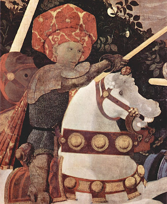
The Battle of San Romano, 1438, Paolo Uccello, courtesy National Gallery. In addition to being toxic, vermillion darkens over time. The horse’s bridle was originally bright red.

Plant and animal pigments are generally not toxic, but they’re not light-fast, either. Red madder was an extract of Rubia tinctorum, the same pigment source as natural alizarin crimson. The synthetic analogues are cheaper and more stable.

The carmine (crimson) of antiquity was extracted from an insect, Kermes vermilio, which lives on oak trees in the Mediterranean basin. Unfortunately, carmine and its close cousin cochineal fade rapidly on exposure to sunlight. That’s not a problem if you’re making food coloring, but it is a problem when you use it for paint.

Most modern pigments were first designed to be used in industrial settings, not for painting. Because of this, they must be light-fast and safe to use in large quantities. An example is phthalo blue, used widely in the printing industry. It’s cheap, plentiful, and not known to be toxic to man or animal. 
Monday Morning Art School: take a walk on the wild side

We’re products of our times, which are shifting rapidly. Why not cross the direct-indirect painting line and see if the other side speaks to you?

Bluebird and Cottonwoods, 1917, Charles E. Burchfield, is a direct water-media painting. Done with watercolor, gouache and graphite on joined paper mounted on board. Courtesy Burchfield-Penney Art Museum.

There is nothing inherently wrong with indirect painting; it’s how I initially learned. Indirect painting is useful in portraiture, still-life, or the big tableaux of Peter Paul Rubens. It’s less useful in plein air because it’s so slow. Moreover, the same dark shadows that are mesmerizing in Rembrandt’s self-portraits can be stultifying in landscape.

In every medium, the major division in technique is between direct and indirect painting, although that line is porous. Modern alla prima oil painters still lay out their paintings as a grisaille; we work thin in the underpainting, reserving thicker paint for the top layers. Except in plein air, few of us are fast enough to finish a painting entirely wet-on-wet. We sometimes glaze to correct color or deepen shadows. Conversely, masters of the Renaissance like Jan van Eyck  Rogier van der Weyden and Rembrandt used wet-on-wet passages in their paintings. Frans Hals worked almost entirely alla prima.

Study of clouds above a wide landscape, 1830, John Constable, is an example of a transparent watercolor. Courtesy Victoria and Albert Museum.

In direct painting, the artist attempts to hit the proper color (hue, saturation and value) on the first stroke. We sometimes call this alla prima or au premier coup. Regardless of the name, the goal is minimal modification and correction, leading to fresh, open brushwork. That’s true in oils, watercolor and acrylics.

Direct painting is largely the legacy of the 19th century, facilitated by a dizzying array of factors including paint tubes, railroads, modern chemistry, and the mindset of the Impressionists. Modern chemistry also brought us alkyd and acrylic paints. These are tailor-made for indirect painting, but the technique still sits on the sidelines. That’s largely because of our collective temperament.

Indirect painting is done with multiple thin layers of paint. Each subsequent layer is intended to modulate, rather than cover, what’s below. These layers usually dry between coats, but not always; you can achieve remarkable effects by painting into wet transparent passages with opaque paint. But in general, indirect oil painters start with a dark transparent layer, followed by a middle layer of opaque color. These are allowed to dry and the final modulation of color is done by glazing thin layers of color on top. At the very end, the artist will add highlights and opaque or semi-opaque scumbling in some passages. The contrast between opacity and transparency can be very beautiful.

Self portrait, 1659, Rembrandt, courtesy National Gallery of Art, is an example of indirect oil painting.

In watercolor, the order of operations is somewhat reversed: traditionally, watercolor starts with light glazes and then adds darks at the end. But watercolor need not be applied in a series of discreet glazes any more than oils must be.

Glazing, however, allows the artist to work thin, slowly, and thoughtfully. Indirect painting allows for meticulous detail that can never be achieved in direct painting.

Self-Portrait with Two Circles (detail), c.1665–1669, Rembrandt, courtesy Kenwood House. This shows the scumbling, impasto, and opaque painting that the best indirect painters used on their top layers.

A glaze is just a thin, transparent layer of paint. It gets thinned with medium (oil) in oil painting, with water in watercolors, and with a combination of water and medium in acrylics. It’s hardly worth taking a class to learn to do it, although I can certainly show you. Here are the general rules:

  1. The fat-over-lean rule is imperative in solid media. Scale up the amount of medium in each successive layer, and keep it as lean as you can;
  2. Glazing works best with transparent pigments;
  3. If you must glaze with white, use zinc white instead of titanium (and it’s the only application for zinc white in oil painting);
  4. Glazing over impasto gives you a very irregular finish. Unless that’s your goal, avoid it.

In good glazing, light is able to bounce back from whatever is below the surface—the substrate or opaque layer in oils and acrylics, or the paper in watercolor. That’s why opaque pigments—especially titanium white—don’t work well. What remains visible at the end is a combination of all the layers. The colors in all layers appear to mix, although they are, in fact, physically separate.

Stag at Sharkey’s, 1909, George Bellows, courtesy Cleveland Museum of Art, shows the immediacy and power of direct painting.

Mainstream oil painters have been painting directly for nearly 150 years. Mainstream watercolor painters, on the other hand, sometimes seem stuck in a sea of indirect glazes. We’re in a rapidly-shifting period in history. Why not experiment with the other side and see if it speaks to you?

My favorite painter?

The Procession to Calvary, 1564, Pieter Bruegel the Elder

“Who are your favorite painters?” a reader asked. That’s an impossible question. Instead, here are some painters who I profoundly admire and you should too.

Pieter Bruegel the Elder was the most significant of the Dutch/Flemish Renaissance painters. Among the first generation to paint other than religious scenes, he was a great landscape artist. His paintings, especially genre paintings, are a whirl of human activity. But what I admire the most is his ability to hide the focal point, or multiple focal points, in insignificant corners of his paintings. His figures are as fresh and realistic as when they were painted.

Knight, Death and the Devil, 1513, Albrecht DĂźrer

Albrecht Dürer was a great painter, but I admire his engravings, woodcuts and drawings most. He was a superlative draftsman, particularly in perspective. It’s his simple, profound understanding of the Passion that moves me most. He did at least three versions, and they’re the visual equivalent of J.S. Bach’s St Matthew Passion.

The Fall of the Damned, c. 1620, Peter Paul Rubens

Peter Paul Rubens may have been intellectual, classically trained, and the favorite painter of the Counter-Reformation, but to me, he’s the progenitor of comic-book art. I draw a direct line between his dynamic canvases and the work of the late Steve Ditko. Both dealt with cosmic issues in a restless, complex way.

Weymouth Bay, c. 1816, John Constable

John Constable is best known for his great set-pieces like The Hay Wain, but he is also the (largely uncredited) inventor of modern plein air painting. In place of a classical education, he spent his youth wandering the fields of his native Essex. This “made me a painter, and I am grateful,” he said. By the time he convinced his father to let him study art, the damage was done—he was a fresh, observational painter in an age when classicism was king.

The Railway Station, 1873, Édouard Manet

Édouard Manet is known as a pivotal painter in the transition between Realism to Impressionism., but his importance to me is his surface treatment. He was the first painter to eschew sparking bright lights and a superlative finish in favor of his own, raw, handwriting. He is, in this sense, the father of Modernism.

The Red Vineyard, 1888, Vincent van Gogh

Vincent van Gogh hardly needs any introduction, being one of the most influential painters in art history. His importance to landscape painters can’t be overstated. He was the precursor to Fauvism, and that, far more than Impressionism, is what speaks to our own times.

Algoma Sketch 48, 1919-20, by Lawren Harris (member of the Group of Seven)

Tom Thomson and the Group of Sevencame into being across Lake Ontario from my hometown of Buffalo, but I didn’t really learn about them until adulthood, since realism was so out of favor in my youth. Still, these painters did more than any others to apply the principles of Impressionism to the North American landscape. They vary greatly in style, but they were united by their love of the Great White North and the wilderness. They were intrepid extreme plein air painters.

Resurrection Bay, Alaska, 1965, by Rockwell Kent

Rockwell Kent was eulogized as “a thoughtful, troublesome, profoundly independent, odd and kind man” by the New York Times. That’s all true, but he was also terrific painter, aggressively simplifying his subjects to their essence. His subjects—concentrating on the Adirondacks, Alaska and Monhegan—are all about the ever-changing light of the north.

Red Shirt and Window,2013, Lois Dodd (courtesy Alexandre Galley, New York.

Lois Dodd could be admired just for her tenacious success in the male-dominated New York art scene. Her credentials are as sterling as any of her male peers, but she had her first career museum retrospective in 2013, when she was already in her eighties. That would mean nothing if she weren’t also a superlative, self-directed painter. She ignored Abstract-Expressionism and Pop Art to forge her own, realistic way.

My 2024 workshops:

How long did Van Gogh take to complete a painting?

The modern plein air movement is only about 30 years old. How is it changing art?
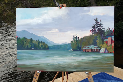
Not nearly finished…36X24.

I worked on one painting all day yesterday, carefully, methodically and in a focused manner. The Adirondacks are in an unstable weather phase, so I was forced off my dock three times by electrical storms. Still, I spent a solid six hours on this one painting. I expect it will take that much again to finish—if I get that time without another storm.

This is a new approach for me. I’m working bigger, slower, and more deliberately. Rushing to make many small works sometimes like writing postcards. The difference makes me wonder how plein air events shape the way we work.
Rocky, for Cape Elizabeth Land Trust, took me 2.5 days to finish.
It’s easy to forget how new modern plein air culture is. In 1985, painter Denise Burns formed Plein-Air Painters of America (PAPA). The next year, her group started an annual exhibition on Santa Catalina Island. The discipline has exploded in popularity with both artists and collectors. Plein air painting is accessible and comprehensible. The Art Establishment may look down on it, but the typical punter loves it.
Today there are hundreds of these events nationwide. There are also nomads whose profession is to participate in them. But these events are very different from getting together with your pals at the town park. For example, I never would have forced my work through a line of storm squalls if I were at home. I could return when the light matched my start, rather than struggling to finish in sub-optimal conditions. In fact, I could work an hour a day for a week on one painting, if I wanted to. None of these options are available for the event painter. We must work fast.
Towering Elms, for Castine Plein Air, only took me half a day.
Festival deadlines give rise to a fast landscape style as inexorably as the Internet has given rise to the 500-word blog post. 
According to the Van Gogh Museum, Vincent Van Gogh “put a great deal of preparation into The Potato Eaters, his first large figure study, working on dozens of preparatory studies. The final painting took ‘many days’ to complete, spread over a longer period of time. However, during the last two months of his life in Auvers-sur-Oise, Vincent completed a painting every day.”
Clearly, that kind of pace can drive you nuts.
Dry Wash, for Santa Fe Plein Air, took the better part of a day.
As a youth, John Constable was a dedicated rambler, sketching in the Suffolk and Essex countryside. These scenes, he said, “made me a painter, and I am grateful.” But this was a low-brow form of education for the time, and the art establishment suggested he not give up his day job. Constable always maintained a strict division between his loose field sketches and his finished paintings.
Paul CĂŠzanne, of course, didn’t have a car to dump his gear into and go. Instead, he painted Mont Sainte-Victoire more than eighty times, from various vantage points. Most frequently, he worked from what is now known as the Terrain des Peintres. It was close to his studio. 
Tom Thomson was transformed into a landscape painter through his intimate relationship with Algonquin Park. His patron, Dr. James MacCallum, said that Thomson’s paintings “made me feel that the North had gripped Thomson as it had gripped me since I was eleven when I first sailed and paddled through its silent places.”
The modern plein airpainter doesn’t generally develop that deep relationship with a particular place. On the other hand, we are forced to paint very fast, and that often results in a different kind of energy and verve. And it’s always fresh. We, like our society, are constantly on the move. That’s making a new kind of art.

Monday Morning Art School: how to be painterly

Bravura brushwork rests on a foundation of practice and skill.
Wheatfield with Crows, 1890, Vincent Van Gogh, courtesy Van Gogh Museum, Amsterdam
“Painterly” describes a painting that is comfortable in its own skin. It uses the paint itself to create movement and expression. It’s a quality found in every medium; even sculpture is sometimes described as painterly. Painterly works are loose and emotive, and they lead with their brushwork.
This is a sensual, rather than intellectual, quality. It comes from experiencing the paint itself. You’re there when you no longer fight the paint, but work with it. It’s the opposite of photorealism, where the artist works hard to conceal all evidence of his process. A painterly painting doesn’t fuss over the details.
Does that mean it must be impasto? No. Peter Paul Rubens, JMW Turner and JoaquĂ­n Sorolla were all painterly painters, and none of them wallowed in paint. There are many fine contemporary painters who work thin and expressively.
Cloud study, watercolor over graphite, 1830–35, John Constable, courtesy of the Metropolitan Museum of Art. We don’t usually think of Constable as painterly, but he was in his plein air work.
The term “painterly” was coined in the 20th century by art historian Heinrich Wölfflin. He was trying to create an objective system for classifying styles of art in an age of raging Expressionism. The opposite of painterly, he felt, was “linear,” by which he meant paintings that relied on the illusion of three-dimensional space. To him this meant using skillful drawing, shading, and carefully-thought-out color. Linear was academic, and painterly meant impulsive.
That didn’t make the Old Masters inevitably linear, however. Rembrandt and Lucian Freud are both painterly painters. Richard Estesand Sandro Botticelliare both linear.
Today, we don’t see accurate drawing as an impediment to expression. In plein air work, acute drawing is often overlaid with expressive brushwork. The idea of painterliness—of being loose and self-assured—is treasured even as we strive for accuracy.
House in Rueil, 1882, Ă‰douard Manet, courtesy National Gallery of Victoria, Melbourne
How do we develop painterliness?
First, master the fundamentals. “You can practice shooting eight hours a day, but if your technique is wrong, then all you become is very good at shooting the wrong way,” said basketball great Michael Jordan. “Get the fundamentals down and the level of everything you do will rise,” he said. That’s very true of painting, where there is a specific protocol for putting paint down.
Then practice, practice, practice. “I’m not out there sweating for three hours every day just to find out what it feels like to sweat,” said Jordan.
Expect failure. It comes with pushing your technique. “I have missed more than 9,000 shots in my career. I have lost almost 300 games,” said Jordan. “On 26 occasions I have been entrusted to take the game winning shot… and missed. And I have failed over and over and over again in my life. And that is why I succeed.”
Beach at Valencia, 1908, JoaquĂ­n Sorolla, courtesy Christie’s
You can’t teach yourself to be relaxed; you can only get there through experience. The only way to be painterly is to paint. I can show you expressive brushwork techniques, but there are still no shortcuts. It happens automatically and naturally with experience. You stop focusing on the mechanics, and start focusing on what you see. Your eye is on the ball.
Many times, artists only realize their painterly styles in old age. That is when Titianstarted painting in blotches, in a style that came to be known as spezzatura, or fragmenting. “They cannot be looked at up close but from a distance they appear perfect,” wrotethe Renaissance art critic Giorgio Vasari. Rembrandt is another painter who started out painting precisely but ended up loose. Édouard Manet is still another. In fact, the list is inexhaustible.
Vincent Van Gogh is the personification of painterliness. He died at 37, but still managed to produce around a thousand paintings (that we know of).
Bravura brushwork simply rests on the foundation of all those paintings that went before.
I’m at Saranac Lake, prepping for Adirondack Plein Air, which starts this morning. I wrote Extreme Art: Painting inside the Blue Line just for this event. It’s not on my blog, so if you’ve ever been interested in what goes on at a plein air event, enjoy.

Keeping the beat

What’s important in painting? Master the basics and the mark-making will take care of itself.


Mother of Pearl and Silver: The Andalusian, 1888–1900, James Abbott McNeill Whistler, National Gallery of Art, Washington, DC. This painting demonstrates the power of letting a single value dominate the composition. 

My husband has this thing he likes to tell young musicians: “Just do what you’re doing but do it in time.” That’s because they like to try things that are more complicated than their skill supports, and they end up losing the beat. He wants them to understand that the beat is what’s essential, not slick fingering.

Of course, young musicians are fascinated with ornamentation. For one thing, it’s actually easier than keeping the beat.
On Monday, I wrote, “I never bother much about my mark-making [in drawing]. It can take care of itself. I’m mostly interested in applying accurate values.” If it becomes your focus, mark-making can be the slick fingering that makes you lose the beat.
That’s not to say that mark-making isn’t important. But what’s essential in painting is:
Values: A good painting rests primarily on the framework of a good value structure. This means massed darks in a coherent pattern, simplified shapes, and a limited number of value steps. In a strong composition, one value generally takes precedence over the others. It in effect ‘sets the mood.’
Weymouth Bay, 1816, John Constable. This uses closely analogous colors to create cohesiveness in a painting of raw natural elements.
Color: Right now, we focus on color temperature, but that hasn’t always been the case. Every generation has had its own ideas about color unity, contrast, and cohesion. A good color structure has balance and a few points of brilliant contrast to drive the eye. It reuses colors in different passages to tie things together.
Movement: A good painter directs his audience to read his work in a specific order, by giving compositional priority to different elements. He uses contrast, line, shape and color to do this. If nothing’s moving, the painting will be boring.
Line: These are the edges between forms, rather than literal lines. These edges lead you through the painting. They might be broken (the “lost and found line”) or clear and sharp. Their character controls how we perceive the forms they outline.
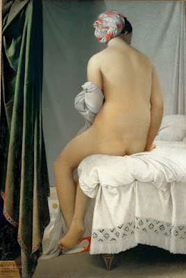
Even the most linear of painters uses movement to direct the viewer in reading his work. The Grand Baigneuse, also called The Valpinçon Bather, 1808, Jean-Auguste-Dominique Ingres, the Louvre.
Form: Paintings are made of two-dimensional shapes, but they create the illusion of form. That is the sense that what we’re seeing exists in three dimension. While some abstract painting ignores form, a feeling of depth is critical in representational painting.
Texture: A work is called ‘painterly’ when brushstrokes and drawing are not completely controlled, as with Vincent van Gogh. A work is ‘linear’ when it relies on skillful drawing, shading, and controlled color, as with Jean-Auguste-Dominique Ingres.
Unity: Do all the parts of the picture feel as if they belong together, or does something feel like it was stuck there as an afterthought? In realism, it’s important that objects are proportional to each other. Last-ditch additions to salvage a bad composition usually just destroy a painting’s unity.
Loose brushwork does not mean lack of drawing or preparation. Vase of Sunflowers, 1898, Henri Matisse, Hermitage Museum, St. Petersburg, Russia.
Balance: While asymmetry is pleasing, any sense that a painting is heavily weighted to one side is disconcerting.
Focus: Most paintings have a main and then secondary focal points. A good artist directs you through them using movement, above.
Rhythm: An underlying rhythm of shapes and color supports that movement.
Content: I realize this is a dated concept, but it’s nice if a painting is more than just another pretty face, if it conveys some deeper truth to the viewer.
By the time you master these, scribing and mark-making will come naturally to you.

What about Goya?

Who really invented abstraction? Everyone.
A dog engulfed in sand, 1819-1823, Francisco Goya, courtesy of Museo del Prado

A thoughtful reader sent me this essay yesterday, which nominates the Swedish painter Hilma af Klint, rather than Wassily Kandinsky, as the first practitioner of abstract art. Like Kandinsky, she was a follower of Madame Helena Blavatsky, occultist, spirit medium, and founder of Theosophy. Like Kandinsky, she believed her abstract paintings were, in fact, representations of spiritual ideas.

When I studied art back in the last millennium, the first abstract painting was attributed to the great Spanish romantic, Francisco Goya. The painting in question, now called A Dog Engulfed in Sand, or simply El Perro, was one of Goya’s so called ‘black paintings,’ from the end of his life. These are haunted works, reflecting Goya’s bitter disillusionment and fears.  He had lived through the terrible Napoleonic Wars and their political aftermath in Spain. He was elderly, nearly deaf, and had survived two brushes with death.
Seascape Study with Rain Cloud (Rainstorm over the Sea), 1824-28, John Constable, courtesy Royal Academy of Arts
Goya never intended El Perro or any of the other black paintings to be shown. By the 20th century, however, El Perro was famous. Pablo Picasso certainly knew it. Antonio Saura called it “the most beautiful picture in the world”. Rafael Canogar described it as the first symbolist painting of the West. The sculptor Pablo Serrano paid homage to it.
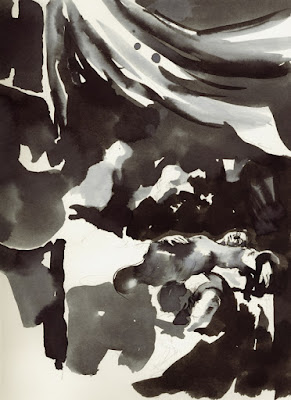
A study in pencil, ink, ink wash, brush and pen, for The Death of the Virgin, 1601-1606, Caravaggio
“The sleep of reason begets monsters,” wrote Goya about Los Caprichos. By the end of his life, the monsters were visiting him during the daytime, too.
Any meaning we ascribe to A Dog Engulfed in Sand comes from its title. That was added later, by art historians. None of the black paintings were titled. They were intensely private, painted as murals on his walls. And what a happy home that must have been.
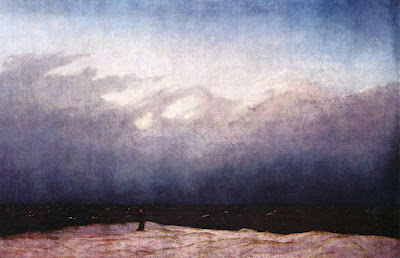
The Monk by the Sea, c. 1808–1809, Caspar David Friedrich
At first sight, El Perro doesn’t seem to be a figurative painting at all. Two dominant blocks of color intersect. At that point a blob of grey paint, the face of a dog, represents all of Goya’s anguished humanity. We, the viewers, are being squashed between relentless forces.
“Abstraction” is a word Goya would not have understood, let alone used. But it is abstraction that gives El Perro its awful power.
Mountain market, clearing mist, Yu Jian, Song Dynasty, China
Many early artists used raw abstraction to work out ideas, or just to doodle, just as figurative painters still do today. I’ve included a few famous examples here, ranging from Caravaggio to Caspar David Friedrich. And that’s just in the western canon. In eastern art, the idea of the voidmeant that slavish adherence to representation was never a paramount virtue.

Masters of the northern skies

On a bitter spring day, a painter’s thoughts turn to clouds and how to paint them. It beats going outside.
Rainstorm over the Sea,  c.1824-28, John Constable
Yesterday, I asked Shary Cobb Fellows whether the Mary Day had hauled last year. “I think so,” she mused, “because these boats need their bottoms done every year.”
“Then how did I miss her?” I wondered. A few hours in the blistering, paint-peeling wind answered that question. It was probably too miserable to paint that week.
I wrapped myself in the blizzard blanket that’s still in my car. However, I could barely squeeze the paint out of my tubes. My easel was thrumming in the wind. I’ve got a good start and if the weather cooperates before the Mary Day moves out, I’ll be able to finish.
Easter Morning, 1835, Caspar David Friedrich
Most of the schooner fleet were originally coastal cargo or fishing boats, saved from ignominious decay in some shaded inlet by their conversion to the tourist trade. Mary Dayis different; she was purpose-built in the 1960s as a tourist boat. I chose a high angle, painting off an access road that leads down into the shipyard. It’s a pretty view, but it magnified the wind, and the sky was terribly gloomy.
Gloom has its purposes. Caspar David Friedrich used it to convey a world in mourning in his Easter Morning, above. 
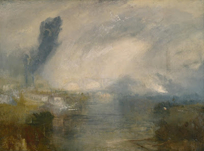
The Thames above Waterloo Bridge, c. 1830-5 Joseph Mallord William Turner
Fog, too, can convey emotional moods as varied as that in Claude Monet’s Waterloo Bridge, Sunlight Effect to J. M. W. Turner’s The Thames above Waterloo Bridge. They were both painting the dangerous industrial pea soupers that plagued London until the Clean Air Act of 1956, and they handled the subject in very different ways.
The Maas at Dordrecht, c. 1650, Aelbert Cuyp
When the land is flat and low or the subject is the sea, clouds assume monumental importance. It is no surprise that the Dutch Golden Age Painters had a particular mastery of the sky in all its phases and seasons.
The Danish painter Christen Købke had a special affinity for the flat, low light of the far north, in those times when clouds barely permeate the overall gloom. A nationalist and a Romantic, he was determined to paint his nation’s delicate beauty on its own terms.
Roof Ridge Of Frederiksborg Castle, Christen Købke
John Constable did many field studies of clouds, which are startling in their modernity. “Skies must and always shall with me make an effectual part of the composition,” he wrote. “It will be difficult to name a class of landscape in which the sky is not the key note, the standard of scale and the chief organ of sentiment.”
The example I’ve shown is close to a modern gesture drawing, a quick capture of that moment when the clouds start dumping their load of water as they move in from the sea. It is not just a rainstorm, it is “an extraordinary force of emotion,” as critic Andrew Shirley observed.
An Teallach between Bristol and Mullagragh, James Morrison, University of Sterling Art Collection
The finest cloud painter working today is Scotland’s James Morrison. Born in Glasgow in 1932, he studied at the Glasgow School of Art and is an Academician of the Royal Scottish Academy. His paintings of the landscapes around his home in Angus and of Assynt in Sutherland are, in truth, mostly sky studies. He is a meticulous observer of the movement and development of clouds.
I have written about how to paint clouds here, using examples from my own work. It’s important to know the different types of clouds and how they move across space. Yes, you can paint clouds without being able to draw, but they’re not going to be as convincing as those that are carefully observed. As with everything, practice makes perfect. 

John Constable, master of plein air

Reverse of Branch Hill Pond, Hampstead, oil on canvas by John Constable, about.1821-22. Recently discovered during relining at the Victoria and Albert Museum, London.
As everyone knows, the Barbizon and Impressionist painters invented plein air painting—except, of course, that they didn’t.
An Italian trip had long been a requisite of study for the best European painters. They went to study the masters of the Italian Renaissance, but also to draw and paint the artifacts of Imperial Rome littering the Italian landscape.
Among the values acquired in these southern trips was the idea that color was as important as line. This freed painters from a strict drawing-values-color methodology, which in turn got them out of the studio and into the fresh air. By the eighteenth century, oil sketching was widespread throughout Europe. There is a long list of painters who worked outdoors long before the practice was dignified with a name.
Seascape Study with Rain Cloud, John Constable, 1827. Don’t you wish you’d painted that?
One of the finest was John Constable. Recently the Victoria & Albert Museum announced the discovery of a Constable sketch in the lining of his Branch Hill Pond: Hampstead. The latter painting was being cleaned and relined in anticipation of a blockbuster Constable show scheduled for next fall.
Given that the V&A already owned an impressive collection of Constable sketches, I’m saving my pennies to go. (These sketches are published in John Constable: Oil Sketches from the Victoria and Albert Museum.)
Hampstead Stormy Sky,1814, John Constable
Constable worked en plein air from his youth forward. His sketches are as free and fresh as those of any 21st century master, which should humble those of us for whom freshness is the only virtue in painting.
Most of his field brushwork is thin and dry, with a few points of impasto in the foliage or sky. (These spots are frequently flattened in his surviving canvases; Constable, like the rest of us, stacked his field canvases while wet.) He worked on tinted grounds ranging from brown to reddish-brown to pink. He allowed that color to show through as part of his work, and carried that technique into his studio paintings.
Weymouth Bay, with Jordan Hill, 1816, John Constable.
Constable used these sketches for color references, to record cloud formations and their patterns of light and shade, and to record the details of different species of trees. He often noted the location, the date and time, and the wind conditions on the back of his canvas. From this we know that many of these sketches were completed very quickly, often in the space of an hour.
Stonehenge, 1835, John Constable. Watercolor on paper.
At the end of his career, Constable abandoned oil sketching for watercolor, due in part to the privations of age and in part from an appreciation of watercolor’s spontaneity. Constable’s late studio paintings were criticized for “scattering his lights about in a manner that deprives it of repose, and renders it almost painful for the eye to look upon.” (Wilton) That increased reliance on white in his oils may have been related to his increased use of watercolor as a sketch medium. But it also put him squarely on-trend with what would follow, something his critics missed entirely.


Let me know if you’re interested in painting with me in Maine in 2014 or Rochester at any time. Click here for more information on my Maine workshops!