Monday Morning Art School: why follow the rules?

There is broad consensus on how paint is applied, even if you take your craft to places I’ve never dreamed of.
The Race, by Tim Moran, watercolor on cold-press paper.
If you’ve studied with me for any length of time, you know I’m big on protocol. “Do it this way now,” I urge my students. “Then when you go back to your everyday painting, you can incorporate the things that work and discard what doesn’t work for you.”
The business of laying down paint is a craft, one that’s been developed over millennia. It’s possible to take this craft to new places, but only on a firm foundation of technique. That doesn’t mean I think that things don’t change; if they didn’t, we’d all be still painting encaustic funerary portraits a la the Romans. But there is still broad consensus on how oil paint and watercolor paint are applied. When you take my class, you’re not getting anything new. Everything I tell you, I learned from someone else.
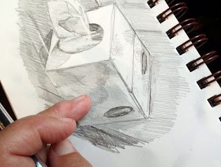
Tim’s first value sketch.
What’s different is that I’ve written these instructions down as protocols. I’ve already shared them with you: here in oil, and here in watercolor. Students usually balk at the idea of spending so much time in the preparatory stages, particularly if they know an excellent painter who doesn’t bother. There are some. These are usually people who have a tremendously refined sense of design, and can do the first steps in their heads. People who do that well, by the way, are not that common.
I also assign homework to make sure these protocols are locked down in my students’ heads. Last week, watercolor student Tim Moran came in with such a perfectly-executed process that I asked him if I could share it with you.
Tim’s redesign, done after he did his monochromatic painting.
Tim started with a value drawing in his sketchbook of four sailboats racing off Camden. He did that because identifying a strong value structure at the beginning is the most important thing a watercolor artist can do to make a strong painting.
Then he did a monochromatic value study, using a combination of burnt sienna and ultramarine to make a dark neutral. This was where he made choices of his values for lights and darks. It’s a crucial step in being able to apply watercolor confidently. Being unsure of the color makes us naturally diffident.
But Tim was not just blindly following my instructions here. He was also thinking. And what he thought was that the four-boat structure was static. So, he went back—literally—to the drawing board, and reconfigured his drawing to be three boats.
Tim’s monochromatic painting, at top, and his final painting, at bottom. Note that he’s testing his paints before he applies
He didn’t have to redo the monochromatic value study because the value structure was the same whether there were three or four boats. Instead he moved directly to the final painting.
Note that he tested his pigments on the left side of his paper. That test strip is another important part of watercolor that many people skip. The more thinking you’ve done about placement and composition before you start, the less likely you are to obliterate your light passages.
It’s a little harder to see those phases in an oil-painting student’s work because the monochromatic underlay gets obliterated in the final phase. But this is a class that’s taking my instruction very seriously. It’s days like this that remind me of how much I love to teach.

Monday Morning Art School: start with drawing

Before you can paint successfully, you have to learn to draw.
I love drawing in church, especially when there are sleepy teenagers. This drawing started with simple analysis of shape.

One of the problems with writing about ‘how to do art’ is that you’re speaking to all levels of experience. Today we’re going right to the beginning of measurement. Almost everyone can get the details of a drawing right. Where they go wrong is with overall proportion. Drawing is, first and foremost, a technical exercise in seeing size relationships. Get that right, and the details hardly matter.

All objects can be broken down into simple shapes and angles.

You’ve all seen artists holding a pencil up to an object. What they’re doing is rough measuring. It’s simple to do, but tough to photograph. Hold your pencil up like a ruler in front of the object you’re drawing. Move it around to see the relative height and width of the thing. For example, the toy truck below is about 1.5 times as wide as it is tall. Figure that out by holding your pencil first along the vertical access, then along the horizontal access, and comparing where the lengths stop along the pencil.

It’s not just an affectation; it’s really how artists measure.

A common beginner error is thinking that you have to transcribe the lengths exactly to the paper. The drawing can be any size you want. Start by figuring out how big you want the object to be on your paper, and make two hash marks to represent that. Then, if your object is half as wide as it is tall, figure out that relationship and mark it too.

Start by measuring out the simple shapes and angles.

You can also use your pencil to figure out the other important thing in drawing: the angles of lines. Formal perspective is important, but not as important as learning to see angles. If you develop the ability to see angles, you’ll have better natural perspective than if you try to fit up what you see to a theory.

Next, rough in the values. That means the lights and darks.

Do your measuring with one eye closed, especially if you’re working in a tight space. Art books will tell you to measure with your arm straight out. That’s not always practical. Instead, try to have the pencil the same distance away from your eye each time you take a measurement. I do that by noting how my arm is cocked.

Today’s exercise is based on a tissue box I drew in church. It had lovely angles. However, what you see in the photo isn’t what I saw while working. A drawing from life will never match what the camera records. Cameras lie just as much as artists do.

Begin to refine and strengthen the light and dark shapes.

All drawing starts with simple shapes. After laying them down, I check and correct them. I do this by analyzing each large shape. Where does the back of the box intersect the tissue column? Is the curve of the cutout fat enough? I discovered that my cube wasn’t really tall enough, so I added some to the bottom. 

The next step is to establish some overall values.  â€œValue” just means how light or dark something is. This box was sitting on a south-facing windowsill behind a person who was casting another shadow. Thus, the window-frame behind the box was in deep shadow, but not nearly as dark as the photograph. I roughed in those darks first. They helped me know how to shade the box properly.

If you’re using graphite or charcoal, you can blend with your finger. Otherwise, use a stump, a tortillon, or a bit of rag.

Next, I set shadows on the tissue box itself. I am more concerned with the column of tissue, so with each pass, I spend more time on that.

Finally, I did some blending, using the handiest tool I carry: my finger. You should use a stump or tortillon on work you care about, but in a pinch, your finger works great. But don’t blend pigments other than graphite or charcoal with your finger; they may contain toxic metals.

Voila! I have a tissue box drawn and my pastor is just winding down his peroration.
Note that I never bother much about my mark-making. It can take care of itself. I’m mostly interested in applying accurate values. I did this drawing with a mechanical pencil, which will never be as luscious as a good graphite stick, but it survives banging around in my purse week after week.
Some general rules:
  • Draw everyday objects. The better you get with these, the better you’ll be with complex subjects. There’s amazing beauty in everyday things.
  • Draw any time you get the chance. I did this drawing in church, and I didn’t miss a word. Drawing and language don’t use the same channels of your brain.
  • Measuring is the most important part of drawing. Keep checking and correcting sizes.
  • Start with big shapes and break them down into little shapes. If the big shapes are right, the smaller parts will slip into their spots just fine.
  • Value is relative. How dark something is, is only important in terms of how dark its neighbor is.
  • Constantly recheck shapes and values as you go.

Monday Morning Art School: the architecture of trees

To paint trees, you have to know trees. That doesn’t mean you need to memorize species, but you do need to be able to see the differences.

Along the Ottawa River, by Carol L. Douglas. You don’t need to be able to identify species at 200 paces, but you do need to be able to recognize how trees differ.
Trees, clouds and rocks are all frequently abused in the same way: the oblivious painter never thinks about their individual characteristics but paints them interchangeably. That’s a mistake.
There is a major division in the forest world between conifers (the trees with needles) and broadleaf trees. Most, but not all, conifers are evergreens; the biggest exception being the larches (tamaracks), which turn a delicious yellow-gold in autumn. Which are dominant in your landscape? Even in the Pine Tree State, the distribution of conifers to deciduous trees is about 50/50.
Old Bones, by Carol L. Douglas

For broadleaf trees, the most important distinguishing characteristic is the branching pattern of the tree, which defines the shape of its canopy. Silver maples are large trees with open, vase-like canopies. Oaks have large spreading crowns; beeches have similar crowns that appear to have melted. Most broadleaf trees branch alternately but maple, ash, dogwood and horse chestnut branch in opposite pairs.

Pines have fewer branches than spruces or firs, and their branches grow in circular whorls on the trunk. As they age, they develop an open, jagged canopy. Spruce branches grow in an upturned direction; as youngsters, they look the most like ‘Christmas trees’. In their dotage, they turn a fine, weathered figure to the wind. Firs have wide lower branches and a downcast mien. Notably, their cones point upward.
Most scenes will include a variety of canopy shapes.
(Something that puzzles me: why do people find ancient trees more beautiful than their offspring, but prefer looking at young people over the elderly?)
Conifers are most easily identified by their needles. Pine needles grow in clusters of two, (red pines), three (yellow pines), or five (white pines), held onto the stem with a tiny papery wrapper. Spruce needles are short, stiff and grow individually from twigs. Fir needles are soft and flat. Cedars have flat, scale-like leaves and stringy bark. Junipers (including, confusingly, the Eastern Red Cedar) have berrylike, bluish cones on the tips of their shoots.
Along Kiwassa Lake, by Carol L. Douglas
Many people can identify the common broadleaf trees by their leaves, and I’ve included a chart to help you. The important part for the painter, however, is to see the differences in color. Silver maples have a lovely grey-silver color. Sycamores are garbed in military-fatigue green. Black spruces are dark while Eastern White Pines are fair and soft in their coloring.
This is why I discourage my students from using tube greens and encourage them, instead, to mix a matrix of green colors.
Basic broadleaf leaves.
Too often, we painters ignore young trees, something I tried to rectify (with varying success) last season. Young trees often look radically different from their aged ancestors, but they have a beauty of their own.
To be a convincing painter, you don’t need to memorize the species of trees, but you do need to learn to distinguish between them. Any plausible landscape will contain a variety of them, with different bark, branch structures, and leaf colors.
Baby black spruce and pines, by Carol L. Douglas
It’s almost the end of Early Bird discounts for my summer workshops. Join me on the American Eagle or at Acadia National Park this summer.

This column was originally published on May 18, 2018. 

Monday Morning Art School: drawing a globe

Start with the mechanical measurement and work your way down to the details.
All illustrations are by Carol L. Douglas (left) and Sandy P. Quang (right)
By now, the long slog to decorate for the Christmas holidays is in full swing. If you haven’t got your tree up, you’ve at least located the boxes and asked your family to help you carry them down from the attic. (Good luck with that, by the way.) Find a simple, round, reflective ornament. That’s your subject for today.
Those of you who don’t believe in Santa Claus or haven’t found the ornaments yet can find a spherical object to substitute. A ball or a snow-globe will work just fine.
The ornaments in question.
Some of you might know Sandy Quang; she was my painting student in Rochester. She went on to get a BFA from Pratt and an MFA from Hunter and now works at Maine Media Workshops and Camden Falls Gallery. And, she just enrolled in an MBA program at University of Maine. The girl never sleeps.
I asked her if she wanted to draw with me. As my students do, she had her sketchbook tucked in her backpack. “Which one do you want?” I asked her. She chose the spider ornament.
Noting the axes.
Recently, I wrote about drawing a glass dish, which is a series of ellipses on a central axis. A circle is easier to draw than an ellipse; it’s an ellipse that is symmetrical on all sides. A sphere appears to be a circle when it’s viewed in two dimensions. This is an unbreakable rule.
We both added details. Mine were the ellipses on the collar of the ornament; Sandy’s were the beaded legs of the spider and her first markings for reflections.
Both of us started with the axis of our drawing. For me, that was the vertical axis; for Sandy it was the axis holding her circles together. I mention this because when people say “I can’t draw!” they seldom realize how much of drawing is mechanical, simple measurement. It’s best to learn this from life, since the measurement has already been done for you when you work from a photo. You can easily work back from life drawing to working with pictures, but it’s harder to go the other way.
Next, we both put the appendages on our spheres. For me, that meant measuring the ellipses in the collar, as I demonstrated in detail in an earlier post. For Sandy, it was the beaded spider legs. Sandy was starting to note the overall areas of reflection in her spheres.
Marking out the outlines of our reflected shapes.

Sandy and I chose different approaches in the next step, dictated by the paper we were working on. Because I had a smooth Bristol, I was able to blend my pencil line into smooth darks with my finger. Sandy could only work light-to-dark on the rougher paper she was carrying. That gives you the chance to see two different approaches to shading.

We both worked on shading next. I finished my shading with an eraser, Sandy couldn’t do that because her paper was too rough.
Sandy has a shadow under her final drawing because the ornament was sitting directly on my coffee table. I put the reflection of myself drawing in my ornament.
All drawing rests on accurate observation and measurement. Get that right and the shading and mark-making is simple.
This post originally ran in December, 2017. It’s been edited.

Monday Morning Art School: how to choose a workshop

The ads are flying fast and furious (including mine). How can you tell what workshop is right for you?

Storm clouds over Schoodic.

There are many fine teachers out there. We each stress something different, but when we’re in a back room chatting, it turns out that most of us really use the same methodology and work through the same fundamentals. But there’s more to a workshop. Here are questions you should ask yourself when choosing.

How many students? This is the first question I’d ask about any workshop. Mine are limited to 12 students, with a monitor or crew supporting me. Any more than that and the teacher will spend most of his or her time demoing, because there’s no way anyone can give personal attention to twenty or thirty students.
Tuscany or Teaneck? There are fine teachers all over America, or you can follow your dreams to Europe or beyond. The great advantage of local classes and workshops is that they’re affordable, and that’s where most of us learn our craft.

Waves, by Carol L. Douglas, oil on canvas

However, the travel workshop is immersive, and that brings out something different in your work. You’ll work, live, talk, eat and think in the culture of that place. Painting in new places is fun, and you meet new friends.

Are you up to this? Plein air workshops are not physically grueling (for the student) but they do require some physical capacity. I accommodate mobility issues in my land-based workshops, but it would be difficult on American Eagle. Talk clearly with the instructor beforehand about special needs.

On shore leave from American Eagle. Photo courtesy of  Ellen Trayer.

Do you like the teacher’s work? Most good teachers can see through your individual style to the technical questions you face. However, the things a painter stresses in his or her own work will be the things that are stressed in instruction. If, for example, you strive to be a Luminist, you’re unlikely to be happy in a class that stresses modern color theory.

Is the instructor a good teacher? This will set the tone for the entire workshop. He or she should be supportive and kind while still giving you practical suggestions to push you forward. There is no reason to put up with bad temper or class management. There are many fine painter/teachers out there who are also very nice, organized people. Ask the instructor what percentage of returning students he or she has. And why not ask for references?

Aboard schooner American Eagle for my annual Age of Sail workshops.

Is the workshop properly permitted and insured? Teaching in national and state parks requires permits and insurance, and teaching on private property requires consent. You should ask whether the workshop organizer has those permissions in place.

What are you getting for your money? The per-person rate for my workshops includes room and board (or berth). Some—including my watercolor workshops—even include materials. That’s a great advantage where accommodations are scarce and/or expensive, and it has the advantage of saving lots of time. Know what your fee is covering—is it just instruction, or does it include other things?

Schoodic Peninsula, site of my annual Sea & Sky Workshop.

My workshops for 2020 include two watercolor workshops aboard the schooner American Eagle. I’ll also be reprising my popular Sea & Sky workshop at Schoodic Institutein August. Both revolve around the incredible landscape and water of the Maine coast, but are very different experiences.

On American Eagle, we concentrate on capturing the quickly-changing marine view in watercolor sketchbooks. At Schoodic, we’re at the largest National Park Service Research Learning Centers in the United States, with superlative landscapes right at our fingertips.
I’ll be marketing these through Facebook and Instagram throughout the Christmas season, but the important thing to remember is that if you register before January 1, you get an early-bird discount. That’s an encouragement to give a workshop to yourself or to a loved one for Christmas.

Monday Morning Art School—drawing from the inside out

There are times when you have to dance backwards in 2-inch heels. Or at least do the equivalent in pencil. Here’s how.


My soap dish and towel. These are very small drawings, by the way—about three inches across.

If you’ve been reading this blog for a while, you know I stress working from big shapes to little shapes.  We start with generalizations and move to detail. This is such a fundamental rule of drawing that it seems almost inviolable.

Yet there are times where the reverse can work brilliantly. There are artists—Albert Handell, for example—who work from their focal point outward. It’s a good trick to have in your kit. Practicing it occasionally helps you see composition differently.
Don’t hate me for the state of that soap dish. At least I wash my hands!
Your assignment this week is to draw a small still life, starting from whatever detail first catches your eye. I used my grimy soap dish. For me, the most attractive thing was the elliptical shadow thrown by the bar of soap, so I started there.
The soap and its shadow. That would soon change.
When is a still life not a still life? When it’s a-travelin’, man. The soap and brush were still wet. As the towel settled down into its pose of casual insouciance, it deflated somewhat. All the pieces moved, imperceptibly at first, and then faster. The soap and brush slithered across the table and on to the floor. This happened three times before I got them to sit and stay.
Finding the arcs of the soap dish around the soap.
One of the advantages of drawing the what interests you first is that it helps you avoid losing your subject. This is particularly important if you draw people on the subway, or lobster boats in harbor. Both will leave on their schedule, not yours.
Fit the dish shapes around the soap like puzzle pieces. Note that the brush has mysteriously flipped over.
If you were drawing this big-to-small, you would start with the ellipse of the dish and its placement on the bigger shape of the towel. You would then break the dish down into its parts. Reversing that, I started with the bar of soap and its shadow. I then built the dish around those objects. To do that, I figured out how they fit around my brush and soap, like pieces of a puzzle, paying careful attention to the so-called negative shapes that resulted.
Brush and soap in their bowl.
(Remember that what you see in the photo isn’t what I saw in real life. Photos distort reality.)
After that, it’s just a question of continuing the process outward. At the end you’ll want to spend a few moments integrating everything and setting a few final, strong lines to hold the composition together.
Growing a shadow.
Where might I use this technique? If there’s one object that’s the focus of my piece, like a beautiful tree, I might start by positioning it elegantly on my canvas and working around it. I sometimes draw hanging coats from small-to-big, since it can be difficult to get the parts to flow together. I always work small-to-big when the object of my attentions is in danger of moving along soon. 
I developed the drapery from the inside out, as well, like little puzzle pieces.
This is a technique applicable to drawing, for the most part. The only time I do it when painting is when my subject is a boat and I’m concerned it will soon be off to sea. Oil paintings can’t be cropped as easily as watercolor or pastel. Making an error of placement at the beginning is a difficult mistake to work around. In oils, it makes the most sense to do a careful drawing and tuck it away against the possibility of losing your subject.
This technique works well for drapery. This is someone’s jacket, draped over a chair.

(This post originally appeared on January 15, 2018.)

Five opportunities to study with me

And for my workshops, there are early-bird discounts available!

Four Ducks, by Carol L. Douglas. There are so many ways to paint water!

“There’s no phone reception out on the ocean,” I casually mentioned to my electrical-engineer husband. He immediately outlined a low-cost plan to extend coverage offshore. I looked at him in wonder. “Please don’t. That’s the best thing about sailing!”

I leave this evening for my last workshop of the season, aboard schooner American Eagle. (As many times as I see her, I still have a crush on that boat.) I’ve had so many inquiries about upcoming classes and workshops that I pulled them all together for you before leaving.
How to paint water: I’m speaking to the Waterville Art Society on Thursday, October 3 on how to paint water. The meeting starts at 6 PM at Chace Community Forum, 150 Main Street, Waterville, ME. For more information, email here.
Dennis Pollock, right before he went for a swim during our weekly painting class. (Photo courtesy of Jennifer Johnson.)
Our next mid-coast Maine painting classes start on Tuesday, October 22. These classes meet on Tuesday mornings from 10-1, and this session runs six weeks, from October 22 to November 26.
This is primarily a plein air class.  Autumn is a fantastic time to paint in mid-coast Maine, as it stays warmer here longer than inland. When weather permits, we paint at locations in the Rockport-Rockland-Camden area. When the weather turns, we meet in my studio at 394 Commercial Street, Rockport. For more information, see here, or register here. (If you’re a returning student, you can just email me.)
Painting aboard schooner American Eagle with Diane Fulkerson, Mary Ellen Pedersen, and Lynne Twentyman.
I’ll be teaching two watercolor sketch workshops aboard the historic schooner American Eagle next year. The first is during the opening run of the Maine windjammer fleet and includes the Gam, the annual fleet raft-up. That’s June 7-11. The second, from September 20-24, is timed for the coast’s peak foliage season.
All materials—and they’re professional grade—are included, and if you want, you can help with the sailing too. More information is here.
Rebecca Bense and me, at Sea & Sky on Schoodic Point. (Photo courtesy of Jennifer Johnson.)
Last, but certainly not least, is my annual Sea & Sky workshop at Schoodic Institute. It’s an opportunity to study painting in America’s oldest national park, surrounded by breathtaking nature, but insulated from the ‘madding crowds’.
This workshop is five days long and includes all meals and accommodations. This year we’ve added a commuter option as well. This workshop was waitlisted last year, and for good reason—it’s a fun and informative time, open to students in oils, pastels, watercolor, gouache or acrylic. More information can be found here.
Ellen Trayer and Lynne Twentyman, painting on a deserted island.
All of my workshops include an Early-Bird discountfor those of you signing up before January 1. (Workshops, of course, make great Christmas gifts for the painters in your life.) If you have any questions, you can email me.
I won’t be able to answer until next week, of course, because in a few hours I’m throwing my rope-soled shoes and duffle-bag in the car and heading down to the harbor. That also means no blog on Friday. Fair winds and following seas to you, and I’ll see you on Monday.

Monday Morning Art School: aspect ratio

When working big, start with a smaller sketch and grid it up. It’s easy.
A large canvas transferred from a 9X12 sketch.
When you’re on the road, no two billets are the same. I was confident that I could use a tethered hotspot to write this morning’s blog, but then realized I’m in a cell-signal hole. So I’m reworking an earlier blog on aspect ratio. It’s especially important when transferring a field value sketch to your finished paper or canvas.
The largest I generally work is 60X60. This is too large to draw directly, as I can’t get far enough away to see the whole thing as I’m drawing. When I’m working this big, I always do a smaller sketch in oil or cartoon in graphite first. Then I scale it up. This prevents proportion distortion.
I have a projector, but I find that gridding is more accurate and takes less time.
I realize many artists are math-phobic, but there are times when an small bit of arithmetic can save  you a lot of work. I’ll try to make this painless.
The first step is to work out whether the aspect ratio of your sketch is the same as the canvas. This is the proportional relationship between height and width. If you’re cropping a value sketch, you want to be sure that the aspect ratio of your crop is the same as will be in the finished canvas.
Usually I grid in Photoshop because it’s faster and I can just delete the lines with a keystroke. But you can grid just as well with a pencil on your sketch.
Sometimes this is very obvious, such as a 9X12 sketch being the same aspect ratio as an 18X24 canvas. But sometimes, you’re starting with a peculiar little sketch drawn on the back of an envelope. You can use a trick you learned back in elementary school.
Remember learning that 1/2 was the same as 2/4? We want to force our sketch into a similar equivalent ratio with our canvas.
Let’s assume that you’ve cropped your sketch to be 8” across. You want to know how tall your crop should be to match your canvas.
Write out the ratios of height to width as above.
To make them equivalent, you cross-multiply the two fixed numbers, and divide by the other fixed number, as below:
Use your common sense here. If it doesn’t look like they should be equal, you probably made a mistake. And you can work from a known height as easily as from a known width; it doesn’t matter if the variable is on the top or the bottom, the principle is the same.
The next step is to grid both the canvas and sketch. You could spend a lot of time calculating the distances, but I prefer to just divide it in even amounts in each direction. I use a T-square and charcoal, and I’m not crazy about the lines being perfect; I adjust constantly as I go.
The last step is to transfer the little drawing, square by square to the larger canvas. I generally do this in a dark neutral of burnt sienna and ultramarine. It’s time-consuming, but with big paintings it saves a lot of work in the long run.

State of mind

If you don’t engage with your subject, you’ll waste time if you paint it.

This year we have a service dog with us. He could make anyone happy. (Photo by Jennifer Johnson)

I started this year’s workshop with an exercise I haven’t done in years. I took the protocols I published the last two Mondays (hereand here) and had my students execute them in two groups. Each team member took turns doing a step of the process. Together they brought a painting from initial design to finished product.
Process is everything in painting. Being involved, rather than just watching, makes it stick in the mind.
The oil painting group work on their painting. (Photo by Jennifer Johnson)
An hour in, I asked myself, “What have I done?” In the end, my misgivings were ungrounded. Yes, the students learned my process. More importantly, the exercise took away their performance anxiety. They leapfrogged right over the usual bad first painting.
Unfortunately, we can’t always have group exercises to loosen up. We need other strategies to help us focus. One of the most important—to me—is to work at the same time every day. That tells my body and brain when to get serious.
The watercolor group faithfully executed every step I assigned to them.
Another technique I’ve recently adopted is to sit quietly with a view for several minutes and gauge my reaction. I’ve realized there are scenes which irritate or bore me. They may be iconic, beautiful and lovely, but I’ll be fighting my reaction all the way. There are other scenes which touch a deep wellspring of positive feeling. And there are places where my reaction is simply disinterested. The trick is to give myself enough time to understand these reactions, instead of relying on my logical mind to determine what will make a good painting. Or even worse, a ‘sellable’ painting.
Rhea Zweifler relaxing into her drawing. (Photo by Jennifer Johnson)
This is not a geographical issue. Every place I’ve ever been is multifaceted. I’ve painted lovely landscapes in Terre Haute, Indiana, which is flat farmland bisected by the muddy Wabash River. And I’ve painted absolute gibberish in famous beauty spots.
Yesterday, one student ended up wiping out her afternoon painting. “I set up here and thought, ‘I guess I’ll paint that scene over there.’ But I wasn’t really interested. I should have walked around more and found something that I really loved.” She was irritated by her choice and never fully engaged with the painting. Had she recognized that at the start, she would have saved herself a lot of work.
That’s another way preparatory sketches are helpful. We hate abandoning projects we’ve started. However, if your sketch isn’t dynamic and powerful, you need to stop and figure out why. It could be a composition problem, but it’s equally likely that you don’t really like the view as much as you think you ought.
Into each workshop an obligatory lecture/demo must fall.
I have—too many times—slogged through a painting for three or four hours only to turn around and ask myself, “why didn’t I paint that?” A little quiet reflection at the start of my process would have saved me a lot of wasted time.
It’s far easier to paint something your heart responds to, rather than something that bores or annoys you. If it’s the right scene, you’ll get lost in your work, forgetting time. If it’s not, you’ll spend most of the session wishing you were done. The only way to know which you’ve got is to sit quietly and let it speak to you.
Is this rational? No. Is it true? Absolutely.

Monday Morning Art School: basic protocol for painting in watercolor

An efficient plan for fast plein air painting in watercolors.

Surf at Marshall Point, by Carol L. Douglas

Last week I gave you a basic primer for oil painting in the field. This week, I’ve done the same for watercolor.

1. Set up your paint box/palette with pigments arranged in a rainbow pattern.
You don’t need as many colors as you think you do. But be sure to replace a color when you run out, not when you think you’ll next need it.
2. Do a value drawing of the scene in question, in your sketchbook.
Identifying a value structure at the beginning is the single most important thing a watercolor artist can do to make a strong painting.

Blueberry Barrens, by Carol L. Douglas
3. Crop your drawing, and identify and strengthen big shapes and movements.
If you start by filling in a little box, you only allow yourself one way to look at the composition. Instead, draw what interests you first, and then contemplate how it might best be boxed into a painting.
A watercolor value study. I sometimes do this in oils as well, when I’m a little concerned about my composition.
4. Do a monochrome value study, using a combination of burnt sienna and ultramarine to make a dark neutral.
This is where you solidify your choices of lights and darks. It’s a ‘practice swing’ for the final painting. I took a watercolor workshop from the incomparable Poppy Balser a few years ago and was chuffed to see that she teaches the same thing.
5. Transfer contour drawing to watercolor paper.
The more thinking you’ve done about placement and composition before you start, the less likely you are to obliterate your light passages.
Glade, by Carol L. Douglas
6. Apply Initial Washes
Using a large brush, start with the sky and work down. Allow lighter washes to bleed across spaces for darker objects and let the sky bleed into the sea, if applicable.
7. Add darks and definition
Work down from medium to smaller brushes, remembering to leave some white space showing.
8. Paint the Cast Shadows
The cast shadows should be transparent and colorful, not gray.