Monday Morning Art School: when you lose your drawing

You do a lovely underpainting and you lose it in the top layers. Why does that happen?

Fog Bank, by Carol L. Douglas. This will be on display at Maine Farmland Trust Gallery later this month.

The human mind loves complex, irrational space divisions. The same mind perversely regularizes what it paints and draws. A split-rail fence, where the gaps between posts diminish haphazardly into infinity, attracts us when we see it. However, unless we’re mindful, when we paint it, we regularize the spacing. The same thing happens with trees, flowers and clouds. In nature, they’re artfully erratic. We too often space them in neat lines. Bobbi Heath calls this anti-entropy. It’s a good description of the brain’s powerful impulse to push ideas, images and tones into patterns.

We’re best at drawing when we’re fresh. The challenge is to keep that freshness throughout the finished layers of a painting.

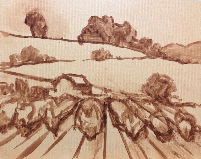
Visan Vineyard underpainting, by Bobbi Heath.

Bobbi graciously allowed me to share an example for this post. She painted the underpainting above last year in France and finished the work this month in her own studio. That in itself is a challenge. No matter how good your visual memory is, it diminishes over time. You’ll always be most accurate if you finish work quickly.

Bobbi made significant changes between the drawing and the final work. The far hill doesn’t rear up as energetically. The ends of the rows are lower on the canvas, and thus less important. More critically, she reduced the contrast, softened the perspective lines, and the ends are less incisive. She also changed the value of the midfield. In my opinion, the painting was weakened by these changes (although it’s still beautiful).

Visan Vineyard, by Bobbi Heath.

I stress drawing on paper before painting, instead of going straight to the canvas. It’s important to work out the compositional questions before you pick up a brush. It’s just as important to have reference to consult when the light changes or your painting gets distorted. A photo on your phone will just tell you what was there, not how you drew it.

Avoid too much solvent in the bottom layers. In alla prima painting, the bottom layer should have enough OMS in it to move fluidly, but not enough to run. You cannot keep a tight drawing if you’re painting over mush, nor can you keep the colors separated and bright. If you have laid down too much pigment (and it should be thin) lighten it up with a rag, not an OMS-soaked brush. If you can see reflections in your underpainting, it’s too goopy for clean alla prima painting.

It’s a fallacy to think that you draw first and paint second. Painting is continuous drawing, and the initial drawing must be restated constantly. I leave important lines showing until I’m certain I have finished the passage, and sometimes I don’t obliterate them at all. You can’t cover up your drawing and expect to reiterate the freshness of the original line. That early drawing will always be your most delightful.

Home Farm, by Carol L. Douglas. This will be on display at Maine Farmland Trust Gallery later this month.

I prefer to work large in general. It’s easier to be accurate and poetic with a large sweeping line. The smaller the canvas, the more jarring small errors of measurement become. For most brushwork, I recommend holding the brush at a point more than halfway back from the ferrule. That gives your brushwork bounce and grace. But for accurate fine drawing, hold it like a pencil.

Kudos to Bobbi for offering to let me critique her painting publicly. “I wish I’d showed it to you earlier so you could have told me to restate the drawing,” she said. That’s a pal.

A version of this post first appeared in October, 2019.

Speed and confidence

They’re a feedback loop—speed creates confidence, and confidence in turn generates speed. Once you enter that loop, your painting will change very fast.

From behind Rockefellar Hall, by student Carrie O’Brien (all photos courtesy of Jennifer Johnson, and I apologize for the color; they were taken indoors).

The ferocious winds yesterday kicked the surf up and blew the last remaining clouds out to sea. Unfortunately, it also blew the last warmth away. It’s a chilly 42° out there this morning. However, the beauty of autumn is cold nights and warm days, and it will be sweater weather by the time we lift our brushes.

From Frazer Point, by student Rebecca Bense.

I have a location in mind for each day’s lesson; yesterday’s was to be the Mark Island overlook. This gives us a beautiful view of the Winter Harbor Lighthouse and the islands of Mount Desert Narrows. Unfortunately, it’s on the west side of the peninsula, backed by a mountain. The winds were roaring in from the northwest. Becky and Jean, who got there first, told us it was an untenable situation; something or someone was bound to be blown down the rocks.

From Blueberry Hill, by student Ann Clowe.

Instead, we sheltered in the leeward side of Rockefeller Hall, which is a massive faux-Tudor pile that houses Schoodic Institute’s offices. That gave us a shimmer of water through a screen of trees—a classic Canadian Group of Seven subject, and one that is ripe for personal interpretation. Lesser artists might look at that deceptively-simple screen of trees and lawn and decide there was nothing there. My students embraced the idea that they were certain timeless forms waiting to be rearranged in any order they chose.

Surf by student Linda DeLorey.

The greatest impediment to good, clean painting is flailing around—not having a well-thought-out plan, or not sticking to it. A consistent painting process not only gives you a bright, clean result, it also allows you to paint a good field sketch in three hours. That’s not important because you can churn out more paintings, but because the freshness of alla primapainting lies in its immediacy. I have several students in this class who are at that point already, and the rest are getting close.

From Frazer Point, by student Beth Carr.

Speed and confidence are a feedback loop—speed creates confidence, and confidence in turn generates speed. Once a student enters that feedback loop, his painting will change very fast. It is more important to concentrate on painting a lot than on painting perfectly, a point drilled home by David Bayles and Ted Orland in their classic Art & Fear: Observations On the Perils (and Rewards) of Artmaking.

From Blueberry Hill, by student Jean Cole.

Because these students have embraced process so avidly, we’ve been able to move beyond questions of paint application to more advanced issues like pictorial distance and the lost-and-found line. We’ve spent a lot of time working on clean traps and edges and avoiding mush. Today, we’ll be painting boats, which are the maritime equivalent of architecture.

And like that—boom!—another week at Schoodic is done. Dang.

Jack pines by student Jennifer Johnson.

After this, there’s Find Your Authentic Voice in Plein Air in Tallahassee, Florida, in early November. Today’s the deadline to register, but Natalia Andreevais painting in Apalachicola and has no signal, so you’ve got the weekend. After that, I have a few more plein air classes in Rockport, ME. From there on in, it’s all Zoom, Zoom, Zoom until the snow stops flying. For a year when nothing was happening, time has sure flown by.

“The first time I felt normal in a long time.”

If you’re depressed or anxious right now, for heaven’s sake, turn off your laptop and TV.

Jane Chapin with my new dog, Guillo (short for Guillermo and pronounced Gee-zho).

There’s a small hamlet here that’s a New Mexican Brigadoon, a tiny community that time forgot. It’s otherworldly, like a set from a movie. Modest adobe houses are set on a bluff overlooking a verdant valley. The dogs and the people are generous and friendly.

This is one of my favorite places, where I could paint the rest of my life in contentment. That’s a fairly high bar, since I’ve painted in many of the world’s beauty spots.

Yesterday I shared this place with the six students in my Pecos workshop. It’s a well-earned reward, because I’m working them harder than I’ve ever worked students before. On Monday, we did a day-long joint project where I demoed step-by-step in watercolor and oils. They followed along, duplicating my processes exactly. On Tuesday, we threw color theory into that mix. All six of them draw well, so they’re able to keep up.

Mary Silver working on values. It’s all about that base.

Yesterday, they were spread out along a dusty track running from the road back to the morada, which is the meeting house of New Mexican penitentes. As is my usual technique, I spent much of the day going from person to person, working one-on-one. This creates the opportunity for intimate conversation (and is why so many of my students have become lifelong friends).

“This is the first time I’ve felt normal in a long time,” two of them told me independently of each other. Those within earshot heartily agreed with them. We’re in a place that’s anything but normal. Our group is disparate, with students from students from Texas, Missouri, New Mexico, New Hampshire and Maine. I had to ask them what made them feel normal.

Jean Cole with our ride. And here I thought I had overdone it by getting a full-size truck.

It’s being in a group and not wearing masks, they thought. I suspect they’re right. Human beings are primarily social animals. We read each other through body language and facial expressions as much—or more—than with our words. Here we can talk and laugh, and we needn’t worry overmuch about whether we’re maintaining a proper two-meter separation (as if there was any science behind that rather arbitrary number).

But there’s more to it than that. We’re also in a media blackout. One thing I like about painting here (and in Acadia, and Alaska and Patagonia and other remote places) is that I don’t have cell-phone reception. I’m not seeing the news or looking at Facebook. Here I can’t even take a phone call. If you want me, text me and I may see your message by the end of the day.

Linda DeLorey and Jean Cole painting in Paradise.

That means we haven’t talked or thought about COVID-19 all week. And there’s a lesson in that—if you’re depressed or anxious right now, for heaven’s sake, turn off your laptop and TV. Go for a walk in this crystalline September air. Play with a puppy. Do anything that involves your real community and doesn’t involve the whole generalized human condition. It’s what’s around you that’s real, not what the talking heads keep telling you.

A student asked me whether we are going to have safe-distancing accommodations at Sea & Sky this year. The answer is yes. For this year only, everyone gets their own apartment. However, if you’re coming from Massachusetts or any other supposedly high-risk state, you will need a negative COVID test to stay at Schoodic Institute. (Of course, that too may change by October.)

Last but certainly not least, I’m going to do a free cocktail-hour webinar on October 2, where I’ll talk about objectives in studying painting. Everyone is welcome, and I hope you bring lots of questions.

Are you a tortoise or a hare?

The person for whom drawing comes easily may not end up being the best draftsman.

Shoes, by Carol L. Douglas. Oil on canvasboard, available.

One of my students is a retired violinist. We were musing on the question of technique last week. “Practice doesn’t make perfect,” she said. “Perfect practice makes perfect.” An aspiring violinist can spend hours dragging a bow across strings, but if someone hasn’t told him about rosin, the resulting caterwauling will be awful.

As a hater of school and generally bad student (I never could sit still) I was probably more self-taught than I was educated. But, to be honest, there’s still very little ‘self’ in my education. My father taught me to draw and paint when I was a child. I then revised my technique at the Art Students League in New York. Whenever I come up against a technical barrier I can’t get over, I find someone who has solved that problem and I study their technique, either by taking a workshop from them or reverse-engineering one of their paintings.

Baby monkey, by Carol L. Douglas. Oil on canvasboard, available.

This past week, I promised my Zoom students the most difficult class they’d ever work through. (You can read it on my blog here.) I also assured them that, if they were patient and mastered what I was teaching, they would immediately be much better artists. That’s because most painters trip up in the drawing phase. Angles and measurements are the root of all drawing.

When people say someone is ‘talented’, they usually mean that person can draw well. But that’s not an innate skill; it’s learned, even by those of us for whom it seems almost intuitive. There will be some of us who can push our skills to become NASCAR drivers, but the majority of us can learn to draw as fluently as we can drive.

Saran wrap and stuffed toy, by Carol L. Douglas. Oil on canvasboard, available.

I’m someone for whom drawing comes easily. It’s taken me a long time to realize that can actually be an impediment to real skill. Because people like me can see spatial relationships quickly, without having to think through them, we don’t always take the time to measure. That’s great, except when our intuition fails us—and it will. The human mind is stubbornly attached to regularity. Left to its own devices, my brain will shorten long distances, generalize the shapes of trees, and otherwise cut corners. Artists who rely on their intuitive drawing skills will never understand why all their rocks look the same and their trees have no character.

Meanwhile, our tortoises struggle to draw an ellipse, and find the business of measuring difficult. Still, they persevere and practice. They draw through their daily lunch break, taking fifteen minutes a day to measure and depict the most prosaic things—a box of tissues, their keys. Suddenly—aha!—the idea of angles as a tool of measurement makes sense. They suddenly understand that the same technique they used to measure their car keys can also be used to mark off the rivulets and turns of a river valley, or a mountain range. It takes them longer to get to the stage where they can draw anything, but—unlike our intuitive draftsman—they learn to draw those things accurately.

Happy New Year, by Carol L. Douglas. Oil on canvasboard, available.

Cornelia Fossonce told me that her painting teacher made her draw a matchbox one hundred times. Today, she is able to play with paint handling and composition precisely because her drawing is so perfect.

I have to admit that I didn’t like that lesson when Cornelia handed it out, but I’ve come to appreciate it. If you want to be a better artist, sublimate your inner hare. Be a bit more of a tortoise. Take the time to learn to draw accurately, and your painting will improve immeasurably.

Monday Morning Art School: Perspective

Every landscape painter should understand two-point perspective, but don’t draw those rays in the field.

Midsummer, by Carol L. Douglas. It’s important to understand perspective, but don’t use those vanishing points when drawing in the field.

A door is commonplace, but it’s also a series of repeating shapes that can teach you a lot about perspective. If you have a choice, use a door with panels like this one. A flat slab door will be so much less fun to draw.

I left mine slightly ajar, but it doesn’t have to be. Seat yourself as far away as you can get from it. The closer you are, the more difficult it is to keep your measurements straight. Position yourself at an angle to it so you can think about perspective.

This is intended to be a fast drawing, taking you no more than 15 or 20 minutes. The same rules apply to a careful drawing, of course; you’d just be more meticulous in your measuring and marking. But you’ll learn just as much going fast.

My first task is to figure out the angles of the top and bottom of the door. (My camera distorts perspective so what’s in the photo won’t match what’s on my drawing.) I do that by holding my pencil along the bottom of the door and figuring out the angle.

I find that setting my pencil down on my paper at the appropriate angle helps me see it better.

Then I do the exact same thing on the top.

Note that the shelf at my eye level is completely horizontal. Any level surface at eye level has to be horizontal; that’s a hard-and-fast rule. 

Two-point perspective, courtesy Luciano Testoni. All those lines traveling off to the vanishing points on the left and right? Let’s call them rays.

The picture above is classical two-point perspective with a lot of extra bells and whistles. I don’t want you to get bogged down in it; I included it so you can compare the rays in that drawing to what you see in your room. Notice that when you look at lines high in your room, the ‘rays’ travel downward to the sides, where the so-called ‘vanishing points’ are. When you look at objects near the floor, the rays travel upward to the vanishing points. That’s because the vanishing points are always at the viewer’s eye level. 

Every landscape painter should understand two-point perspective, but should never draw those rays in the field. Like every other kind of 3D projection, it’s useful in drafting, but it is a falsehood when it comes to what you’re actually seeing. That’s because the vanishing points would be so far away in the real world as to be rendered useless.

But you can take away some useful information from two-point perspective. The farther away an object is, the less perspective distortion there is. And perspective works the same way above the horizon line as below it, so clouds are arrayed the same way trash cans are.

Next, I do that nifty measuring thing that involves holding my pencil in front of my eye and using it as a ruler. Since the height is already determined by my angled lines, I just need to figure out how wide the door is relative to the height. I figured the door is a little less than half as wide as it was tall. Later, I’ll find out just how off I was.

This shape is called a trapezoid, and there’s an easy way to find its center. Just draw an X from corner to corner as shown. That’s very useful information in perspective drawing, because it helps you place windows, doors, roof peaks, etc. correctly. Make a habit of finding it.

And here’s a quick-and-dirty way to get the perspective right. Divide the two side lines into equal units—thirds, quarters, eighths, or whatever other units you can mark off by eye. Then just draw lines connecting the corresponding sides. The 1/3 point on the left gets attached to the 1/3 point on the right, etc. You’ll have the perspective rays right in one try.

I never get my measurements right on the first try, so I’ve learned to not fuss too much on my initial measurements. The great thing about repeating shapes is that your mistakes are easy to see. I realized the door was slightly too short and wide, so I adjusted them slightly.

I can’t draw a straight line without a ruler, and my initial drawing had a free-hand curl on the right-bottom corner. I took a moment to correct that. Note how useful the center point is in placing the central spine of the door. I know that the moulding around the glass is the same width all around, so this is one of those repeating shapes I can use to check my work. (Of course, it’s going to be ever so slightly wider on the side closer to me, because of perspective.)

My final drawing. You can finish yours to your heart’s content, but the important part is learning how to use your pencil as a marker to see angles and distances.

This post originally appeared on November 17, 2017.

Monday Morning Art School: Restate the darks

The dark passages in a painting are what anchor it and drive our eyes through it.

Bend in Harkness Creek, 10X8, by Carol L. Douglas.

“A painter should begin every canvas with a wash of black, because all things in nature are dark except where exposed by the light,” Leonardo da Vinci wrote. Well, he would think that way, being a Renaissance man. We haven’t painted with chiaroscurosince art was upended in the 19th century by the Impressionists.

That doesn’t mean light and dark are unimportant. We must still find ways to anchor ourselves in the darkness that defines the light. These “dark” passages may not be literally dark; they may be defined by color temperature, as Claude Monet demonstrated.

It was a very dreary day so I started by amping up the color.

A ‘passage’ means the same thing in painting as it does in literature: a short excerpt that’s meaningful in itself. There’s an overtone of the word’s roots in this, because an artistic passage often takes us from one place to another. Painting is all about motion on the canvas. When you stop seeing painting as the business of copying objects, and start seeing it as creating passages, you will have advanced from being a student to being a painter.

The dark passages in a painting are what anchor it and drive us through it. I drill my students constantly on the importance of value studies before they pick up their paintbrush, so they know how to make a thumbnail and then either a grisailleunderpainting (oils or acrylics) or a monochrome study (watercolor) before they move to color. But the most common problem among student painters is that they make these value studies and then ignore them.

I had less than two hours to paint this, so by necessity, it was blocked in roughly.

Watercolor painters—assuming they’ve reserved enough light—can add darks at the end. It’s not quite so easy in oils. Oil painters must periodically check to see that they’ve not obliterated the dark passages. In practice, that means continuously restating the darks.

My diagonal doesn’t follow the creek bed, but the shadow pattern.

This is particularly true in plein air painting, where the light shifts and the painter can be led astray. There are only two imperfect solutions:

  1. To work on the painting in a short time-frame over a period of several days;
  2. To keep your value study right next to your painting on the easel and consult it repeatedly.

For practical reasons, I prefer solution number 2.

Restating the darks just means going over the dark passages to firm them up and regain some of the initial shapes that first attracted you to the subject. Even advanced painters need to restate the darks periodically.

In oils, it’s hard to paint dark over light, which is one reason to restrain ourselves from heaping on too much paint in the beginning. You might need to scrape back to get any kind of power back into your dark passages. Don’t hesitate; scraping is one of the oil painter’s best tools. It often reveals things we’ve completely forgotten.

Almost done, and a neighbor stops to say hello.

It’s a traditional axiom of oil painting that dark passages should remain translucent, and light passages should get the heft of impasto. Rembrandt’s self-portraits are the archetype of this technique. It’s wonderful when working indirectly, but it’s difficult in alla prima painting. Nor is it necessary.

Consider restating the darks as an opportunity to add color into shadows. A small bit of white in these darks will make them sing if they’re well-mixed, but will be brutally honest if you were just plopping down boring neutrals in the shadows.

The readability of your painting relies on a good pattern of darks and lights. I’m assigning you three paintings to analyze this week. Your job is to sketch out the patterns of darks and lights and tell me how your eye is being driven through them. They are:

Miss La La at the Cirque Fernando, 1870, Edgar Degas

London, Houses of Parliament, the Sun Shining Through the Fog, Claude Monet, 1904.

Winter, Monhegan Island, 1908, Rockwell Kent

Dare to dream!

And don’t worry; if my workshops are cancelled for coronavirus, I’m giving a full refund.

The lovely American Eagle at rest in Penobscot Bay.

We held out as long as possible, but we’ve been forced to cancel my first summer workshop, our June 7 Age of Sail adventure aboard the schooner American Eagle. Students have been invited to transfer their reservations to the September 20 trip, or they can get a full refund.

These workshops sparkle because of the floating venue, an historic schooner meticulously maintained by Captain John Foss. I saw him yesterday. He was wrestling a snowplow either on or off his truck—it was hard to tell, given the cold. Messmate Sarah Collins was bundled in layers and lying prone in the wind to varnish along the gunwales. This is the part of windjamming the public never sees: the sheer hard graft to keep these boats in perfect nick. Captain John is older now than he’s ever been. He’s making noises about retirement. When he goes, the Age of Sail workshop almost certainly goes too. I can’t imagine anyone else hosting it so well.
Painting aboard the American Eagle. There’s always plenty of time for sailing, too.
If there’s any lesson to be learned from the current crisis, it’s that nothing lasts forever. If you’re interested in that September 20 trip, contact me now and let me know.
We work so hard. Photo courtesy Ellen Trayer.
That still leaves two other workshops for the season, both of which are still very much on. Both concentrate on the same material, but the settings are very different. We work on:
  • Plein air composition
  • Color theory
  • Accurate drawing
  • Mixing colors
  • Finding your own voice
  • Authentic brushwork
Schoodic Point. Photo courtesy Claudia Schellenberg.

Sea & Sky in Acadia National Park is a perennial favorite for good reason. This is the part of Acadia most visitors never visit. Schoodic Peninsula has the same dramatic rock formations, windblown pines, pounding surf and stunning mountain views that draw visitors to the Mount Desert Side. But Schoodic doesn’t suffer the crowds that the main part of the park does. Still, it’s just a 90-minute drive from Bangor International Airport (or a pleasant meander up the coast from Portland or Boston).

A group exercise at Acadia National Park.
Because of the wonderful isolation, we offer this week-long workshop with lodging and meals included. All you have to do is concentrate on painting. Last year it sold out; I don’t expect that in these uncertain times, but you never know. Contact me if you’re interested.
Pecos, NM. Photo courtesy of Jane Chapin.
Last, but certainly not least is my newest offering, Gateway to the Pecos Wilderness, in the high mountain community of Pecos, New Mexico. The Pecos River, Santa Fe National Forest, Pecos National Historical Park, Glorieta Pass, and Pecos Benedictine Monastery are all nearby. All provide superb mountain views. Ranches and small adobe settlements seem to grow organically out of the landscape. This is a place of colorful skies, hoodoos, dry washes, pine wildernesses, horses, and pickup trucks. Yet it’s within commuting distance of Santa Fe, so accommodations, necessities and world-class galleries are just a short drive away. This workshop is five full days long and there is ample accommodation in the area. Read more about it here, or contact me.
Pecos National Historic Park. Photo courtesy Jane Chapin.
Refunds aren’t something I have much experience with, so I’m learning about them now. It turns out they’re a little more complicated than just reversing the sale on a credit card. But don’t worry; if your workshop is cancelled because of coronavirus, I’ll be giving you a full refund. You can make plans without worrying that you’ll lose your deposit.

Monday Morning Art School: the color of Spring (part 1)

It’s time to assemble the proper pigments to paint beautiful greens this spring.
Fog over Whiteface Mountain, by Carol L. Douglas.
If March didn’t exactly come in like a lamb this year, it at least came in like a sheep. Don’t be fooled. Some of our most brutal winter storms have been known to happen in March. Walking to church, I pondered the depleted state of our woodpile. I wasn’t the only person thinking on these lines. My pal Naomi told me she was going home to move wood “while the ground is still frozen.”
That doesn’t mean that color is not peeping through here and there. The days are growing longer. We may see snowdrops and winter aconite appearing along granite foundations this week. Back in western New York, two witch hazels ought to be blooming, planted by me.
Spring arrives in a host of rich colors, and we’ll discuss that next week. But we must start with the predominant color, which is green. In my own yard, the green moss on the stone wall and my shed roof are the only visible cues that the season is changing. They tell me that growth and warmth are happening under the surface.
Beaver Dam on Quebec Brook, by Carol L. Douglas
Michael Wilcox published a famous watercolor pigment guide called Blue and Yellow Don’t Make Green. Most of what it tells you can now be found on the internet, but it’s where I first got the idea to add back the banned black.
His point was that there are many routes to the same destination, and that to really mix colors, you need to understand what pigments you’re using, not work from trade names for colors. Consider sap green, for example—a staple of many plein air painters’ toolkit. It’s really a convenience mix made of a phthalo blue and some kind of yellow. The same is true of Hooker’s Green.
Mixed greens, in oils.
The single-pigment (‘true’) greens available are chromium oxide green, viridian, and cobalt green. Chromium oxide green is a lovely, heavy, natural green. Unfortunately, it outweighs everything it’s mixed with. Viridian and cobalt green are lovely, but expensive. Beware viridian hue—it’s just another phthalo in disguise. Any other greens you buy in a tube are just variations of those pigments, or convenience mixes.
To make a whole range of beautiful greens, make sure you have the following pigments in your toolkit. Since they’re all-around useful colors, they make a lot more sense than carrying several greens.

  • Black
  • Ultramarine blue
  • Prussian (or phthalo) blue
  • Hansa (or Cadmium lemon) yellow light
  • Diarylide (“Indian”) yellow
  • Yellow ochre

The rookie error of landscape painting is to make all your greens using the same basic color, modulating lighter or darker for highlights and shadows. You’ll have much more life in your trees if you know all the different ways you can get to leafy green. 

Chart courtesy of Victoria Brzustowicz
In fact, the best way to navigate the colors of foliage is to avoid greens out of a tube altogether. A system of paired primaries gives you more options, avoiding the acidity of phthalo, the weight of chromium oxide green, or the soul-sucking darkness of sap green.
In my experience, bad paint mixing causes paintings to go wrong faster than anything else. Constantly over-daubing to modulate the paint color distorts the original drawing and makes a grey mush. If you’re confident of the color, you can apply it fast and accurately.
Green modulation swatches by student Jennifer Johnson.
I make my greens on a matrix, which I’ve shown you both mixed and on a chart. After mixing greens according to the chart, you can then experiment with modulating your resulting greens with tints (meaning a mix of white and a color). The specific tints are unimportant, but the most useful one for landscape is a mix of white, ultramarine and quinacridone violet, making a pale lavender. It is great for atmospheric perspective.
Note that blue/black pigments are much stronger than the yellows. You need about half the amount of blue or black as you do yellow.

Paint in beautiful Pecos, New Mexico, September 13-18, 2020

New Mexico’s a vastly different landscape, yet has the same long views and limpid light that so captivate me about Maine.

Dry Wash, by Carol L. Douglas

It takes a lot to get me to teach anywhere but Maine these days. But there’s another place I love to paint. I haven’t taught in New Mexico in more than a decade, and it’s time to go back.

The village of Pecos, NM lies along the Pecos River, which flows out of the Santa Fe National Forest. Nearby, Pecos National Historical ParkGlorieta Pass, and Pecos Benedictine Monastery provide superb mountain views. Ranches and small adobe settlements dot the landscape. This is a landscape of colorful skies, hoodoos, dry washes, pine wildernesses, horses, and pickup trucks. Yet it’s within commuting distance of Santa Fe, so accommodations, necessities and world-class galleries are just a short drive away.
Horses at a ranch in Pecos, NM. Photo courtesy Jane Chapin.
I first painted in the Pecos area during a plein airevent in 2018. I was supposed to range all over the state, but I loved Pecos so much I stayed right there. Then I came back the following winter. I’ve explored the ridges and canyons, the river valley, horse pastures, fallow bottomlands, and I think I have a great itinerary planned for you.

Old farmyard, Pecos, NM, by Carol L. Douglas. If I were going to buy a second home, this would be it.

I’m delighted to offer this opportunity in conjunction with the brand-new Pecos Art Center (about which I’ll be telling you more soon). This organization was founded to bring arts and culture to the local community. Each workshop instructor is asked to present a program for local school students before or after their workshop. This augments local art education and gives back to the local community. “In Pecos, we believe we live in a unique and authentic place and want to give something back to the community who has welcomed us to paint there,” said organizer Jane Chapin. “We want to preserve its character while leaving a footprint of opportunities for the next generation.”

Adobe and beautiful mountains. Photo courtesy Jane Chapin.
This workshop is aimed at helping painters refine their personal technique in plein air. All media are welcome: watercolor, pastel, oils and acrylics. This is an intensive class, with morning and afternoon on-site painting sessions and lunch-time demos. Classes are kept small so every student gets the attention they deserve.
My friend Jimmy Stewart critiquing my painting along the river bottom. Photo courtesy Jane Chapin.
Opportunities for accommodations are varied. There are seasonal rentals in the area, or commute up from Santa Fe if you want a more urban setting.
The workshop fee is $600. That includes five days of highly-personalized instruction and a social gathering on Sunday evening, where you’ll meet your classmates. Email me here for more information.
Snow at higher elevations (downdraft), by Carol L. Douglas
Carol Douglas has 20 years’ experience teaching students of all levels in watercolor, oils, acrylics and pastels. “Some teachers are good artists, and some artists are good teachers, but it is rare to find a good artist who is also a good teacher. Carol is one of them. She will teach you the fundamentals you need to know, which a lot of teachers gloss over without explanation, but she also takes you to the next level, wherever you are on the learning curve.” (David Blanchard)

Uncovering your mark and more

Two opportunities to learn in mid-coast Maine
Meeting Up, by Ann Trainor Domingue, acrylic on canvas
Baby Joshua and his mom are doing great, so I can concentrate on work again. There are several things I should have told you about and missed with the excitement of the last two weeks. Here are two very important ones.
I’m bringing Ann Trainor Domingue to teach a day-long workshop in my studio because she does something that seems magical to me, and I want to know how. Ann paints lyrical, mysterious, narrative paintings, seemingly drawn from within her own psyche. “I love the same things you do about New England. I just reflect on them in a different light,” she says. Annie’s developed a series of exercises to loosen up our thinking, and they will be good for everyone, no matter what their style.
Here’s Annie!

Uncovering Your Mark, with Ann Trainor Domingue

Sat June 6th, 10-4
Carol L. Douglas Studio
394 Commercial Street, Rockport, ME 04856
Cost $95 per person.
Confused by too many options? Feel uninspired? Need help to get back to your artmaking? Uncovering Your Mark workshop could be just what you need to find your way!
Discover personally meaningful imagery and ideas through a fun guided exploration of things you love. Bring clarity and focus to help make sense as you implement fresh ideas for this phase of your lifelong art journey.
Think quietly about what kinds of things energize you. Sort and combine insights to form something new that feels more authentic by finding your mark.
Take time to work on loose sketches to explore these exciting new ideas and directions to help you stay on your path.

This workshop is a hands-on class aimed at artists of all levels. The first part of the class is a process of guided inquiry. Then, students will apply their self-discoveries through small scale sketching exercises and preliminary color play. It’s strictly limited to twelve students so you’ll get lots of attention. Every style is welcome.
Ann Trainor Domingue is a graduate of Rhode Island College with a BA Studio degree in painting. Her career has included working in adver­tising, as a teacher and as a painter. She is represented in public collections and galleries nationwide.
Download a flyer here or a registration form here.

Tin-foil hat, by Carol L. Douglas. You don’t have to learn about painting reflections by looking at a vase!
Next session of weekly classes in my Rockport studio starts next week.
Some people wonder what we paint when the winter weather drives our class indoors. I build still lives, but they aren’t typical. For example, yesterday’s creation was a clash of greens including pine boughs, gift bags, wine bottles and more. The idea was to learn to mix and use a medley of greens without using any green out of a tube. That’s excellent preparation for spring, which really is just around the corner.
Marie told me, “I always come in and see a still life and think, ‘ugh’, but then I get into it and it’s great.” I’m not interested in still-life as a genre either, but I think painting from life is critically important, so I make an effort to make them unusual and interesting.
Back it up (hard drive and bubble wrap), by Carol L. Douglas
Working in my studio gives us a great opportunity to focus on color theory and technique. We have more time to concentrate on mixing colors and brushwork than we do in the field, where the demands of the scene takes over.
Our next mid-coast Maine painting session will meet on Tuesday mornings, from 10-1. The dates are:
February 25
March 3
March 10 (followed by a two-week break while I hare off to Argentina)
March 31
April 7
April 14
Peppers, by Carol L. Douglas
Painters are encouraged to broaden their skills in drawing, brushwork and color. Your own individual style will be nurtured. We’ll learn how to paint boldly, with fresh, clean color, to build commanding compositions, and to use hue, value and line to draw the eye through our paintings.
Watercolor, oils, pastels and acrylics are welcome. Because it’s a small group, I can work with painters of all levels. The fee is $200 for the six-week session, and we meet at 394 Commercial Street in Rockport.