The rookie error for summer is to paint all foliage using the same basic color. You lose more points if it’s sap green.
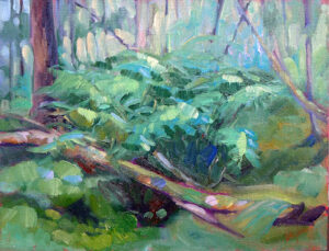
 |
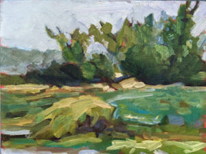
| Bracken Fern, by Carol L. Douglas, 9X12, oil on canvasboard, $869. |
I’m in Malta, so I don’t know if this is timely or not, but we’re about due for the earliest color to start budding out in New England. It’s time to talk about mixing pretty and varied greens, although if it’s snowing again I’m deeply apologetic.
Michael Wilcox published a famous watercolor pigment guide called Blue and Yellow Don’t Make Green. It’s where I first got the idea to add back the banned black.
 |
| Mixed greens. Almost a salad. |
His point was that there are many routes to the same destination, and that to really mix colors, you need to understand what pigments you’re using, not work from trade names for colors. Consider sap green, for example-a staple of many plein air painters’ toolkit. It’s really a convenience mix. The same is true of Hooker’s Green in watercolor.
The single-pigment (‘true’) greens available are chromium oxide green, viridian, and cobalt green. Chromium oxide green is a lovely, heavy, natural green. Unfortunately, it outweighs everything it’s mixed with. Viridian and cobalt green are lovely, but expensive. Beware viridian hue-it’s just another phthalo in disguise.
 |
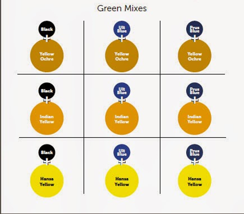
| Chart courtesy of Victoria Brzustowicz |
The rookie error is to paint all your greens using the same hue, modulating lighter or darker for highlights and shadows. You’ll have much more life in your trees if you know all the different ways you can get to leafy green. One of the most useful greens is black plus cadmium yellow lemon, or Hansa yellow, which is a non-toxic analog.
The best way to navigate the colors of foliage is to avoid greens out of a tube altogether. A system of paired primaries gives you more options, avoiding the acidity of phthalo, the weight of chromium oxide green, or the soul-sucking darkness of sap green.
In my experience, bad paint mixing causes paintings to go wrong faster than anything else. Constantly over-daubing to modulate the paint color distorts the original drawing and makes a grey mush. If you’re confident of the color, you can apply it fast and accurately.
I make my greens on a matrix, which I’ve shown you both mixed and on a chart. Note that blue/black pigments are much stronger than the yellows. You need about half the amount of blue or black as you do yellow.
 |
| Swatches by Jennifer Johnson |
First mix greens according to the chart, and then modulate your resulting greens with tints (meaning a mix of white and a color). The specific tints are unimportant, but the most useful one for landscape is a mix of white, ultramarine and quinacridone violet, making a pale lavender. It is great for atmospheric perspective.
 |
| Your assignment is to hit paint swatches as closely as you can. |
The second exercise involves stopping at your local hardware store for a few paint swatches. These are Benjamin Moore brand, but you should be able to find similar ones elsewhere. There are two off-whites: one cool and one warm. There’s yellow, green, and two soft blues. Your assignment is to mix until you think you’ve hit the exact color. Then put a dot of it on the card to see how close you got. (If you’re working in watercolor, the dot goes on paper instead.)
 |
| Detail of Jennifer’s chart, above, showing her blue to sienna mixes. |
I also have my students make neutrals using combinations of ultramarine blue with burnt sienna and raw sienna. I use ultramarine blue and burnt sienna as my standard dark-neutral, because it can go to the warm or cool side depending on how it is mixed. Raw sienna plus ultramarine is my go-to starting point for granite and the sands of our northern beaches.
This spring’s painting classes
Zoom Class: Advance your painting skills
Mondays, 6 PM – 9 PM EST
April 28 to June 9
Advance your skills in oils, watercolor, gouache, acrylics and pastels with guided exercises in design, composition and execution.
This Zoom class not only has tailored instruction, it provides a supportive community where students share work and get positive feedback in an encouraging and collaborative space.
Tuesdays, 6 PM – 9 PM EST
April 29-June 10
This is a combination painting/critique class where students will take deep dives into finding their unique voices as artists, in an encouraging and collaborative space. The goal is to develop a nucleus of work as a springboard for further development.
Registration is now open for workshops in 2026! Reserve your spot:
- Advanced Plein Air Painting | Rockport, ME, July 13-17, 2026
- Sea & Sky | Acadia National Park, ME, August 2–7, 2026
- Find your Authentic Voice in Plein Air | Berkshires, MA, August 10-14, 2026
- New! Color Clinic 2026 | Rockport, ME, October 3-4, 2026
- New! Composition Week 2026 | Rockport, ME, October 5-9, 2026
Can’t commit to a full workshop? Work online at your own pace: