fbpx

Monday Morning Art School: seeing abstract shapes

If you start with a shed, you can ramp yourself up to Windsor Castle in no time.

It all comes down to abstract shapes.
This week I gave my painting class the assignment of doing three thumbnail sketches of their own home or the view from it. This is an assignment with two goals:
  1. To see beauty in the everyday;
  2. To learn how to draw better thumbnails.

Most of us, including me, think we live in uninspiring houses. My first reaction when I started these drawings was that the shrubberies at the front of my house really need attention. I also realized that I have only a vague sense of what my house looks like from the outside. And it’s nothing special, just an old house that also needs its shutters painted.

My house, shivering in the first frost of the season.
Ultimately, though, everything comes down to a pattern of light and shadow. Will my viewers know I have vinyl siding and replacement windows, and that my house is located on busy Route 1? Or will they see it in its bones, as an old Maine farmhouse at the top of a hill? Unless I’m remarkably picayune with the details, it’s the essence that shows.
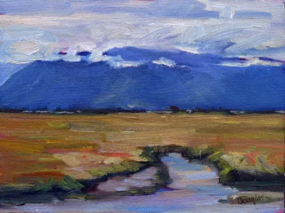
I think I like this view better. It’s what I used for the drawing at top.
A big part of learning to paint is learning to see. In my class we don’t use viewfinders. I also discourage doing thumbnails in pre-drawn boxes. That means creating a bounding box in the same aspect ratio as the final painting, and then drawing your thumbnail inside it. (If you don’t know what aspect ratio is, see here.)
Those devices defeat the purpose of the thumbnail, which is exploration.  A good thumbnail sprawls without boundaries, even though it’s quite small. When it’s finished, you can figure out how you want to crop it. Or, as in my example below, you may find that you need to crop it more than once to get it right.
First, figure out which border is critical. In my example, it’s the top; I don’t want that much tree. What’s the next most-important border? Since I want a little light sneaking into the background, it’s the right side. The bottom crop is at a natural point, below (but not too close to) the shed. After that, I approximated where the left line went to make the drawing fit a 12X16 canvas.
You may take a ruler to my drawing and determine that it’s not exactly the right aspect ratio. That doesn’t matter; it’s easy enough to make fix that on the fly. 
That wasn’t too hard, was it?
Let’s build on this exercise and do marker sketches of the same three views. By doing so, we start to see them as abstract shapes. That’s actually tricky to do, but it’s the key to all good drawing.
You must force yourself to stop thinking of the object you’re looking at as “my shed” and start to see it as a series of shapes. First, draw a series of pencil lines to indicate the overall shape. Then, using a pen or marker, doodle in the dark values. If you catch yourself thinking “window,” or “door,” stop and force yourself to relabel your object as merely a light or dark shape. Your brain will catch on, I promise.
If I painted my house from this angle, it would be about the shadows of the tree, which I didn’t even notice when I was drawing the thumbnail.
All objects can be reduced to a certain, limited number of shapes, which build on each other to make a whole. When you see things as abstract shapes, you expand your possible subject matter. A plastic pencil case is not inherently much different from a shed, which in turn has the same, simplified, forms as a house. If you start with a shed, you can ramp yourself up to Windsor Castle in no time.

Like this post? Monday Morning Art School is a weekly feature. Subscribe at right!

Monday Morning Art School: how to do a gesture drawing

Fast, effortless drawing is the artist’s most important skill. It’s easy to learn and lots of fun.

Michelle reading, by Carol L. Douglas

Drawing sometimes seems like the “eat your vegetables” of art lessons. It’s what students need most, but they believe its unpalatable. So we teachers are always hiding it in our painting lessons. Once you start drawing from life, however, you realize it’s tremendous fun. I’m constantly sneak-drawing in unlikely places: the train, waiting rooms, or in church.
The single best exercise you can do to get better at figure-drawing is the one-minute gesture drawing. When I taught figure, I started my class with ten of these, progressed to a five-minute drawing, then to a twenty-minute drawing, and from there to the long pose everyone believed they were most interested in.
Gesture drawings not only free up your hand, they teach you how to measure painlessly. If you’ve never done one, conscript a friend or family member to model. The more twist and curve in the pose, the better. After all, they only have to hold it for a minute.
Gesture drawings are conventionally done nude, but that’s not really necessary. You’ll still benefit from drawing clothed figures. The important thing is that you use a timer and not exceed one minute per drawing.
The paper and pencil you use are unimportant. In fact, gesture drawings of your co-workers are the best possible use for your pre-printed meeting notes.
There is no right or wrong way to do a gesture drawing. On the other hand, the method I outline below is fast, easy and accurate, so why not try it?

Draw a single line indicating the axis of motion. My model had an extreme torso twist, so I got a little more engaged in this line than I usually do. Usually this is just a simple angled or curved line.

Next, scribble in the shapes of the pelvis and the shoulders. One of my students called these “atomic string balls.” The term fits. The two most powerful joints in the human body are the pelvis and the shoulders. This is a fast way of indicating their angle. By scribbling a ball, you also give them volume and energy.

 I then make smaller power balls at each additional joint, locating them quickly in space. I don’t lift the pencil up much, but drag it along between joints. As rough as this looks, you already have most of the essential information about the pose.

From there, it’s a simple matter to add volume. Use the remainder of your time to shade and refine. However, you shouldn’t really take time to erase.

A gesture drawing by nature emphasizes the torso at the expense of details, extremities and the face. Once you’ve mastered the one-minute gesture drawing, you can move along to the five minute drawing, as shown below. That’s a continuation of a one-minute drawing, but it allows time to develop more detail.

Monday Morning Art School: Extreme painting

Hunting season is approaching, posing unique issues for the plein air painter. I’m having (routine) medical tests this morning, so I asked a guest expert (my daughter) to answer my mailbag.
The Road to Seward, Alaska, by Carol L. Douglas

Dear Carol,

 
Last week, you mentioned the wild turkeys near your residency. I am, unfortunately, afflicted with both hoplophobia and meleagrisphobia – fears of guns and those creatures most fowl. When is it appropriate to pepper spray a turkey?
 
Yours, Allie N., New Mexico
 
Allie,
I have good news and I have bad news. As of 1992, the EPA was still looking for data on the effectiveness of capsaicin (the active spicy spice that makes spices spicy) against birds.1They accepted that it was probably effective against birds, in addition to other animals. Obviously, it has been several years since then. Two scientists at the University of California, San Francisco, discovered in 2002 that, while birds have the vanilloid receptors that taste capsaicin for us, theirs are immune to capsaicin.2 In conclusion, you could probably pepper spray a turkey and it would irritate and startle him. However, you’d get the same effect by shrieking and flapping your arms wildly. In my opinion, the perfect time to pepper spray a turkey is directly before he goes into the oven.
Mary Helen
The Alaska Range, by Carol L. Douglas
Greetings Carol,
 
It’s my favorite time of year here in Success, Saskatchewan – the air is crisp and clear, the leaves are changing, and it’s finally moose season. I can’t wait to make all my favorite moose recipes once my wife comes back from hunting. Moose chili, moose enchiladas, moose tartare, coleslaw with moose meatballs, moose bulgogi – you name it, I’ll eat it! I love going with my wife on her hunting trips all around the wilderness of Saskatchewan. You’ve been there. You know how it is! It’s a great time to do some plein airpainting while enjoying some quality time with the missus. How can I best keep myself from getting mistaken for a moose? You know, we share so many of the same features.
 
Bill Winkleman, Saskatchewan
 
Bill,
Moose season in Saskatchewan this year is from October to December. Soon it will be too cold to do much painting en plein air. However, here’s good advice on how to avoid being mistaken for a large ungulate:
  • Wear brightly-colored clothing when out in the woods. I recommend a large, heavily starched tie-dye wizard’s hat.
  • Try to sing as loudly as possible at all times. It’s common knowledge that moose are fans of jazz and Scandinavian black metal, so stick to old pop standards and famous Canadian sea shanties.
You may find that when you’re painting en plein air, you may find moose walking around en trails. Worse than that, you may find that some enterprising hunter has left moose entrails en trails and you have to walk gingerly. I recommend wellies.
Mary Helen
Confluence, by Carol L. Douglas
Carol –
 
My Oma and I are planning a cycling trip up the Alaska Highway next summer. We’ve already begun shopping for a truly inspiring collection of very tight, padded shorts and we’ve got our cameras ready to see all the wildlife. How do you get your best photos of bears?
 
Hildegard
 
Hildy,
It’s GREAT to hear from you again! My advice for taking photos of bears from your bicycle from the shoulder of the Alaska highway is, uh, DON’T!
Black bears can run between 25 and 30 miles an hour and brown bears can run even faster. A ridiculously lost polar bear can run even faster than that! For comparison, your 97-year old grandmother can probably only manage about ten miles an hour. Just put something to make noise in the spokes of your bike and leave the bears alone. Instead of stopping to photograph them as they forage on the roadside, why not take a quick snapshot of the other tourists taking their picture as you zoom by to safety?
Laird Hot Springs, by Carol L. Douglas. This was the site of a fatal bear attack in 1997.
In July 2018, conservation officers in British Columbia responded to 25 calls about grizzlies and 179 calls about black bears.3,4The Yukon Government reported that at least 63 bears were killed in Yukon,5a five-year high. Human interaction with bears is not only dangerous for the humans, but dangerous for the bear. Remember – a fed bear is a dead bear.
Mary Helen
  1. R.E.D. Facts – Capsaicin. (1992, June). Environmental Protection Agency.
  2. Jordt, S., & Julius, D. (2002, February 8). Molecular basis for species-specific sensitivity to “hot” peppers. Cell, 108(3), 421-430.
  3. Predator statistics: black bear. (2018, September). Conservation Officer Service of British Columbia.
  4. Predator statistics: grizzly bear. (2018, September). Conservation Officer Service of British Columbia.
  5. 63 bears destroyed in Yukon this year because of human conflict. (2017, November 29). CBC News.

Monday Morning Art School: mass tones, undertones and mixing

The imperfection of paint is what gives it its liveliness and depth, but it also makes mixing colors tricky.
Autumn, by Carol L. Douglas. This painting contains no reds. The red tones are a combination of cadmium orange and quinacridone magenta.
Last week, I made a flippant remark about clashing colors. This weekend, I had an opportunity to see clashing at work, in an ottoman proposed for my living room. It was a cool rose tint and looked horrible with my sectional’s warm red cushions. I’m usually happy with putting closely analogous colors together but this combination would be terrible. The mass tones were fine; the undertones were all wrong.
A mass tone is the color a pigment is straight out of the tube, dense and unmixed with another color. No real-world pigment, however, is as pure as a color on a video screen. While two pigments may look the same to the naked eye, their behavior when mixed can be radically different.
Undertone is the color revealed when a paint is spread thin enough that light bounces back up from the substrate. Some pigments are fairly consistent when moving from mass tone to undertone. Others have significant color shifts. Not understanding those undertones tones can lead to muddy mixes.
Three blues that look similar out of the tube, but behave very differently. The ‘glaze’ on the left is the undertone. Courtesy Gamblin paints.
Ultramarine, Prussian and phthalo blue are colors that shift radically from mass tone to undertone. They’re all so dark out of the tube that their differences aren’t apparent to the naked eye. But dilute them, and you’ll find a wide range of blues.
Undertones are why buying “hues” instead of pure pigments can be such bad value. Take, for example, cadmium red hue, which is usually a napthol red with a small amount of white added. Out of the tube, the two paints are indistinguishable, but they mix very differently.
Cadmium Red Hue is usually made with napthol red and a little white. They mix very differently, which is why the hue is a bad substitute for the real pigment. (In its own right, napthol is a fine red, however.) Courtesy Gamblin paints.
Even paints with the same pigments can have different undertones depending on the manufacturer. I’m experiencing this right now with my quinacridone violets, which I’ve been replacing with whatever I can buy along the road. That comes back to the imperfectability of pigments and their essential complexity.
A drawdown test showing a paint’s undertone. Courtesy Utrecht paints.
If you’re considering two different pigments, or thinking about switching brands, you could test them. It’s fast and easy. To see their mass tone, put a small dab of paint on a smooth white board or glass palette and draw it down with a knife, creating a uniform, solid stripe that completely obscures the painting surface.
To see the undertone, draw the samples down again so they are translucent. You should be able to see minute variations in the color, and in the covering power.
To understand the behavior of each more fully, you now need to make tints, tones and shades of each sample.
  • A tint is a color plus white.
  • A shade is a color plus black.
  • A tone is a color plus black and white.

This old paint chart from my studio explains tints, shades and tones.
Even when the mass tone appears quite similar, two close colors will act very differently when mixed. Their unique qualities of tinting strength, chroma, undertones and color temperature come into play here. But mixing paint with white or black immediately adds another layer of complexity. Different blacks and whites have their own undertones. Titanium white has a cool undertone. Zinc white is warmer, but it’s also brittle and thin, making it a bad choice for general painting. Ivory black is slightly warm.
The imperfection of paint is what gives it its liveliness and depth. It’s also why I don’t use a limited palette, but a system of paired primaries, which I described here.

Monday Morning Art School: the coastal composition problem

It’s easy to throw all the weight to one side when painting on the coast. Here’s one way to fix that.
Roger Akeley’s solution to the coastal composition problem.
A few weeks ago, I got a message from student Roger Akeley. Roger had arrived at a drastic solution to the composition problem bedeviling his painting.
Squares are more static than rectangles, which is one reason I seldom paint in that format. However, that means their weightiness helps subdue out-of-balance compositions. More importantly, Roger cut off a good deal of the material that was pulling the painting to the left. That allowed the scree and seaweed at the bottom to take their proper place on the stage. It was a decisive solution.
Roger was dealing with a problem that regularly bedevils painters of ocean scenes: all the weight falls on one side. The second problem I commonly see (which he avoided) is a shoreline that’s an unbroken ellipse. It’s inelegant and unbelievable.
How can you avoid these problems?

Palm, by Carol L. Douglas
Seek out irregularity in the coastline. On the North Atlantic, this isn’t too difficult; great granite fingers reach out into the ocean. In the Bahamas, I found that significantly more difficult, as the coast was even and featureless and the surf lackluster. I used a foreground object—a palm—to create interest, above.
Historic Fort Point, by Carol L. Douglas
Still, there are places where the weight inevitably falls to one side, and there are no atmospherics to correct the scene. When this happens, I try to keep the values tight, as I did in my painting above. If the water isn’t significantly lighter than the trees, the composition will gel. The risk is in being boring, hence the high chroma.
For true mastery of this problem, we must consult that genius of coastal painting, Winslow Homer. In his watercolors from Cullercoats, he frequently used figures to break the horizon. His paintings from Maine, however, used two more elemental and powerful devices, which are ours for the looking.  

Sunshine and Shadow, Prout’s Neck, 1894, Winslow Homer (watercolor), courtesy Art Institute of Chicago
Homer was the master of the sweeping diagonal. He used this over and over to hold our visual interest, playing it off the strict horizontal of the horizon line. In the watercolor above, the whole charge of the painting lies in the interrupted diagonal silhouette and its counterpoint in the clouds and sinuous driftwood. Only after serious looking do we notice the beach roses at the bottom; they are completely subdued into the shadows.
Northeaster, 1895-1901, Winslow Homer, courtesy Metropolitan Museum of Art
Northeaster, above, uses a similar diagonal, this time playing against the towering white shape of the spray. In themselves, these two elements would have made a brilliant painting. But wait—as they say on late night TV—there’s more. The dark in the wave to the far right echoes the rocks. It’s a threatening element, but it also gives us an easy order in which to ‘read’ the painting. We see rock, the shadow on the breaker, the spray, and finally that wisp of light in the distant waves. It’s not painterliness that draws us through this work; it’s masterful composition.
The Artist’s Studio in an Afternoon Fog, 1894, Winslow Homer, courtesy Memorial Art Gallery, Rochester, NY.
I seldom ask my students to copy masterworks. The Artist’s Studio in the Afternoon, also by Homer, is an exception. I don’t care if you do it in paint or pencil, but take an hour and set down a copy of this painting. It is a perfect composition—energetic, spare, lively. When you’re done, please post a comment in Monday Morning Art School on Facebook telling me what you’ve learned.

Monday Morning Art School: How to paint a really bad watercolor

Painting horrible watercolors isn’t just my special skill; it’s something anyone can do!

A lot of artists don’t like Winsor & Newton field kits, but they’re still my go-to for extreme backwoods drawing and painting.
Don’t test your colors
Beginning watercolorists usually put down washed-out, delicate colors. These have too much water in the mix. Or, they’ll use too little water, and their unloaded brush will scumble instead of flow. Sometimes they’ll miss the proper color entirely and spend the rest of the painting trying to fix their bad mix.
The answer is to make informal swatches on a scrap piece of paper. Just make sure you use the same paper and brush you plan to use for the final assault.
Pay attention to where excess water might be entering your process. Are you unconsciously washing your brush after every stroke, or not mixing enough paint and trying to stretch it out?
Fiddling
Putting layers and layers of light color down makes great mud. So does putting paint down and then endlessly fussing with it. See above, make the proper color, and lay it down in a few strong strokes.
Do a value study, unless your watercolor is a value study. Then do it anyway.
Too small a brush

Small brushes give you less control, not more. They’re harder to hold still and they run out of paint just when you need it most. Worse, artists get diddly with them. Practice with larger brushes and a lighter hand.
Bloom is almost unavoidable when painting off the deck of an ocean-going boat, but it’s still annoying.
Bloom

More properly known as backflow, this happens because the paper is still wet, even though the surface looks dry. Bloom can be used as a watercolor effect, but it more typically happens because the artist isn’t patient, or because environmental conditions are such that your paper will never dry. Or, in my case, because I’ve spattered water all over everything.
Use bad materials
Good watercolor paper contains sizing to keep paint from sinking into the paper. That allows colors to sparkle, and stops the paper from buckling. Cheap papers aren’t properly sized.
Brushes are more important in watercolor than they are in oils. It’s not necessary to have only expensive brushes, however; my go-to rounds are Princeton Neptunes.
As in all painting, cheap paints are a false economy. Better paints contain more pigment.
Watercolor can capture the passing scene better than any other medium. This was painted off the deck of American Eagle. The speckling in the sky was caused by salt spray. What a life!
Don’t bother with a preparatory value sketch
Value sketches are critically important in all media, but especially in watercolor. You should start with a plan, and your plain is laid out in lights and darks.
Unlike oils and pastels, you have few options to correct a bad drawing once you start it. It behooves you to work out all the kinks before you lift a brush.
Don’t mix your colors in advance
Time is a critical factor in watercolor, and if you have to stop and mix in the middle of a passage, you’re going to make a muddy, blotchy mess. Instead, mix the colors you think you need for that step and test them on your scrap paper.
Let your paper breathe!
Don’t leave white space
Watercolor is all about paper showing through, so why not let that happen?
Use all the colors
Watercolorists tend to carry far more pigments than oil painters. Want to keep it fresh? Pare down your palette and keep mixes down to three or fewer pigments per pass. And avoid hues and convenience mixes; they’re already mixtures and will further muddy the waters.
Get fussy, fast
Start by thinking out the big shapes first. Too much detail too fast throws the volume relationships off in a painting or drawing.
Watercolorists who fixate on detail at the beginning tend to delineate everything, everywhere. They haven’t given their minds time to sort out what’s important. Detail belongs in the focal point(s) of a painting.

Monday Morning Art School: when to do major surgery

Nothing in a painting is precious because it looks great in and of itself. It must support and add to the painting, or it should be replaced.
Electric Glide, by Carol L. Douglas. 24X36, oil on canvas.
Among my cardinal rules is to never add tchotchkes* at the last minute to try to balance out a bad composition. “It needs something,” is seldom fixed by adding a pine tree or a boat. Rather, you must return to first principles to figure out what’s wrong.
Last week I did the painting, Electric Glide, over several days. I started laying it out on Tuesday, and then spent all day Wednesday dodging electrical storms to get the version I showed you here. Taking a photo and looking at it on my laptop was a real eye-opener; I hated the bottom third of the composition. The water was accurate for the stormy day on which it was painted, but it was turbid, rollicking, and uninviting. It didn’t have the intimate, welcoming quality of an iconic Adirondack lake. Furthermore, the elongated diamond of light I’d invented for the water did absolutely nothing to support the top of the composition.
Before I removed and repainted the water.
If you painted it once, you can paint it again one thousand times. Stop believing your delightful passage is a happy accident; you can and will do great things again and again.  Nothing in a painting is precious because it looks good in and of itself. It has to support and add to the painting, or it should be replaced by something else that pulls its own weight.
The motion in the bottom of the painting did nothing to support or enhance the motion in the top. It justflattened everything out.

When I went back very early on Thursday morning, the surface was glassy and flat. This is a telling characteristic of Adirondack lakes, and I knew it would strengthen the painting.

That meant major surgery, which could only be done with a palette knife and patience. I started at the waterline and worked down. This painting was on a canvas rather than a board. My hand had to be light to avoid stretching the fabric. It took many passes to knock it down.
Had the painting been dry, I’d have had trouble making that change. The changes would have produced pentimenti, which are visible traces of mid-painting changes. That’s why it’s wise to keep impasto down until you’re sure you’ve solved the major composition questions.
I did not use any solvent in this scrape-out. It would have created a soup I couldn’t work over, with a risk of damaging and softening nearby paint. Moreover, the remaining watery grey was a great foil for the reflections. I scumbled them vertically over the grey paint and then worked in the horizontals with a large brush.
I like doing wet-on-wet corrections with a brush held nearly parallel to the surface of the painting.
Scumbling is a technique where a layer of broken or speckled color is laid over another color so that bits of the lower layers show through. There are many ways to do this in both oils and watercolors, but, wet-on-wet, my preferred method is to hold a brush almost parallel with the surface of the painting and drag. This prevents the brush from digging in and disturbing the underlayer.
Value sketch of a different painting.
Changing a section or passage of your original design is one response to “it needs something.” The other is to restate the dark pattern. This is where a separate value sketch, on paper, is so important. If you’ve just done your value study as a grisaille underpainting, you can’t refer back to it. If it’s on paper, you can always compare it to your work in progress. If the pattern of lights and darks is gone, you need to put them back in, regardless of what the shadows and sun are now doing.
The value structure of the initial underpainting slavishly follows my sketch.
Still, adding that electric boat in the last hour broke my own no-tchotchke rule. I didn’t do it to balance the composition. That never works. I added it because I was utterly charmed by it.
How did I get away with it, without ruining an already-balanced composition? I lightened the value of the hull, which was very dark, almost black, and tied it chromatically with the reflection of the land mass on the left. Otherwise it would have stuck out like a sore thumb.
*A tchotchke (CHOTCH-kə ) is a pretty, sentimental bauble that serves no purpose. If Granny loves it but a burglar wouldn’t steal it, it’s a tchotchke.

Monday Morning Art School: perspective of boats

Don’t fall into the trap of drawing what you know instead of what you see.
The Bridge at Argenteuil, 1874, Claude Monet. All three waterlines are parallel to the horizon.
I prefer painting from a floating dock, where I’m at eye-level with the boats regardless of the tide. However, on Friday, I found myself up on the wall looking across Camden Harbor. That creates a different perspective.
The horizon line in a drawing is the viewer’s eye level, regardless of where the viewer is standing. At the top of Mount Rainier, your horizon line is around 14,410 feet above sea level, and everything is below you. If you’re swimming in the Caribbean, your horizon line is about three inches above sea level and everything but the sharks are above you.
I explained basic perspective in this post about drawing clouds; the exact same rules apply to boats, except that everything is flipped over. We can see down into objects that are at our feet, but not into objects at the same level that are far away. The farther away the object is, the more horizontal our gaze is as we look at it. Our measly 5 or 6 feet in height is nothing compared to the distance across. 
When a boat is a few hundred feet away in the water, it’s for all intents and purposes at eye level. Its waterline is almost absolutely flat, regardless of whether you’re looking at its side, transom, or bow.
The Seine at Argenteuil, 1872, Alfred Sisley. Although it’s also from towpath height, Sisley included more foreground, creating the sense that we are looking down into the Seine.
During the 1870s and 1880s Argenteuil, northwest of Paris on the Seine, became an important painting location for the Impressionists. They immortalized its bridges and boats from every conceivable angle.
We can infer Monet’s point of view in the top painting as being about equal to the house across the river. In other words, he was standing on a towpath. That allows us to see into the boat slightly, as we’re at mast height to it and it’s close to the near bank. We cannot see into the far boats at all. Note that the far bank and the waterlines of the far boats are parallel to the horizon. The bridge, which reaches across the river to us, is not.
Alfred Sisley’s painting is from the same height, but he’s given us more foreground, and therefore the sense of looking down into the water. But while the tree in the river is definitely below us, the boats are not. Again, their waterlines are parallel to the horizon. The river bends, and the land curves away, but the curve is very gradual.
Boating, 1874, Édouard Manet. Here we’re looking straight down into the boat from impossibly close quarters.
We are definitely looking down into Édouard Manet’s pleasure boat in his 1872 painting done on the same river. Manet has us practically standing on the rail looking down into the well of the boat. The horizon isn’t even visible. It would be yards above the boaters’ heads.
An example of incorrectly drawn boats.
Ignoring these rules results in the most common error I see in painting boats. This is from an example I picked up on the internet. The boats are close to the horizon but we still seem to be looking down into them. In fact, the closest boat is at about the angle of Manet’s Boating. This is an impossibility, as the three masterpieces from Argenteuil have demonstrated.
This happens frequently with painters unaccustomed to boats. I think it is a case of painting what we think we know vs. what we see. We know that boats have form, therefore they must have perspective, too. Well, they do, but it’s very subtle from the distance we usually see them.

Monday Morning Art School: don’t chase the light

Nice advice. How exactly do you avoid making mush as the light changes?

The Thimble, Carol L. Douglas, oil on gessoboard, sold.

I’m painting bigger this season, with the goal of doing some very large landscapes during my Joseph A. Fiore Art Center residency. Down the Reach from last week, is 24X20; The Thimble, above, is 20X16. Big paintings outlast the light. Having a protocol to deal with shifting light is essential.

One technique is to go back to the same location over many days. In the Northeast, weather is capricious. You’re as likely to come back to a sea fog as to the limpid light of the prior day. The tide doesn’t move in sync with daylight, meaning the light may be the same but the scene will change.
In many cases, it’s impossible to come back and set up at the same spot over and over. A little preparatory work will save you hours of frustration later in your painting.
Value sketch of the Monument.
Make a value sketch.
This is the most important step in painting. I don’t care whether you do this in watercolor, with charcoal, a gel pen, as a notan, or in mixed media. Make a study, or multiple studies. 
In my classes I strongly discourage the use of viewfinders. The value study is where one explores relationships and determines the ‘final cut.’
Don’t make a bounding box and fill it in; instead, do a drawing and then crop it to the shape of your board. It’s in the value sketch that you can make subtle adjustments to the elements of the scene. You can’t do that when you’re slavishly transcribing a scene from a viewfinder.
Value underpainting for The Monument. This early in the morning, the light was warm.
Choose a color scheme.
I’ve written about the color of light many times. One of three situations must prevail:
  • Shadows are warm and the light is cool. This is what happens at midday.
  • Shadows are cool and the light is warm. This is the golden light of early morning and late afternoon.
  • Shadows and light are neutral. This happens mostly on grey days.

Choose one of these and stick with it.
Do a fast underpainting that’s a direct transcription of your value sketch.
I don’t look at the landscape very much at this stage. I have my sketch in my right hand and my brush in my left. I paint in the big dark shapes in an already-mixed shadow color and the big light shapes in an already-mixed highlight color. At this phase, my paint is lightly thinned with odorless mineral spirits or turpentine. Knowing how much thinner to use is a matter of practice. The paint layer should be thin, but there shouldn’t be so much turpentine that everything applied over it turns to mush.
The Monument, by Carol L. Douglas.
Paint the details on top of that underpainting, making sure to retain your original values.
Go ahead and paint in details now, matching values to what’s on your canvas rather than what you see. During the great flat light of midday, you will have a good opportunity to paint into your already-defined shadows and highlights. However, at some point after the sun swings completely over the yardarm, you’re going to have to stop. Your light source will be inverted. 
Make a drawn reference to any spectacular lighting effects that whiz by.

Atmospheric effects like crepuscular rays, breaking clouds and rainbows are transient. Before you add them, be certain they support your composition. If so, and you’re in a position to do so, paint them right in. If you’re not at that point of development, sketch what’s happening so you can refer back to your notes.
They may be beautiful but clash with your existing composition. If that’s the case, just sit back and enjoy them, or record them in your sketchbook for another painting.
Sea Fog on Main Street, by Carol L. Douglas. By the time I finished this, the fog had completely evaporated. My sketch and underpainting saved this painting.
Notice there is nothing in here about capturing effects on your camera.

You should be able to develop a plein air painting without any relying on photo reference at all.
I’ve got one more workshop available this summer. Join me for Sea and Sky at Schoodic, August 5-10. We’re strictly limited to twelve, but there are still seats open.

Monday Morning Art School: the lost-and-found edge

Sometimes it’s about what you don’t say.
Girl with the Red Hat, c. 1665-66, Johannes Vermeer, courtesy National Gallery of Art, Washington, DC.

Earlier this month, I mentioned I once had a painting teacher who told me that heavy edges were “my style.” Like many younger artists, I just hadn’t learned how to marry edges in my painting. Beginning painters tend to give all edges equal weight—they are borders to be colored in. Part of the learning process is learning when to keep the edge and when to lose it.

Vermeer’s Girl with the Red Hat, above, perfectly illustrates the lost-and-found edge. The smooth transitions between the hair and the hat on the left, within her gown, and the lack of contrast in the shadow side of the model’s face drive our eye to the highlighted passages. Squint and concentrate on just the shape of the highlighted passage for a moment. It’s just one long, beautiful abstract shape in a sea of darkness.
In Church at Old Lyme, 1905, Childe Hassam softened the edges between leaves and sky by making them the same value. Courtesy Albright-Knox Art Gallery.
Losing the edges helps link visual masses into a coherent whole. It deemphasizes things that aren’t important. It’s a way to create rhythm in a painting.
The human mind is adept at filling in blank spots in visual scenes (and seeing things that aren’t there). If you doubt this, squint while looking around your room. In any collection of similar-value objects, you don’t see edges, but you understand what you’re looking at. Your mind sorts it out just fine.
A careful drawing is different from a value study. Both are important, and the wise artist does them both. But a drawing explores the shapes and contours of an object. It’s a fact-finding mission. A value study concentrates on the links between objects and the final composition.
The Daughters of Edward Darley Boit, 1882, John Singer Sargent, courtesy of the Museum of Fine Arts, Boston. 
In the oil painting The Daughters of Edward Darley Boit, John Singer Sargentuses the great dark entryway as a framing device, a compositional accent, and a poignant social statement. Only a hint of light in the shape of a window implies what is behind. The girls recede into space in order of age, with the eldest (Florence, age 14) almost enveloped in the darkness of the drawing room. Florence and Jane have no accents in their hair; their dresses and stockings disappear into the murk.
The Bridge of Sighs, c. 1903-04, John Singer Sargent.
Sargent painted at least two versions of this study of the Bridge of Sighs; a mirror-imageis in the Brooklyn Museum. In this version, Sargent placed a hard edge at the top of the arch where sky meets stone. The shadows on the left bleed without any attempt at architectural precision. This creates the same kind of murky dark passage as in The Daughters of Boit. (A note for watercolor purists—the whites of the gondoliers’ clothes were done with white paint.)
In Two Women on a Hillside, 1906, Franz Marc tied the women to the background by repeating greens in their skin and garb. Courtesy Franz Marc Museum.
To lose an edge in painting, start by making both sides of the line the same value, even when they’re different hues. Conversely, the highest contrast will give you the sharpest edge. You can add to either effect by softening or sharpening the paintwork with your brush. Introducing the color of the adjacent object will also soften the contrast between an object and its background, as in the Franz Marc painting above.
Detail from John Singer Sargent’s Lady Eden, 1906, courtesy Philadelphia Museum of Art.
Remember that the sharpest, most contrasting edges draw our eye. The trick is to find a balance that supports the composition. Sometimes only a small flick of paint is necessary, as with Sargent’s sequins in the detail from Lady Eden, above. These support the dynamics and direction of the composition. If they didn’t, they’d undermine all his careful compositional work.