From the archives: Extreme painting

My guest expert (my daughter) wrote this post in 2018, because I was indisposed due to medical tests. I’m having tests again today (one of life’s eternal verities) and was reminded of this classic.
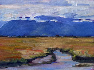
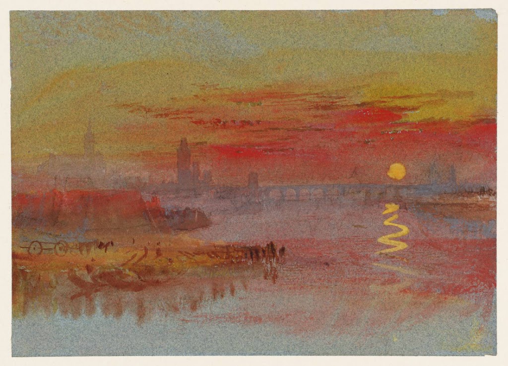
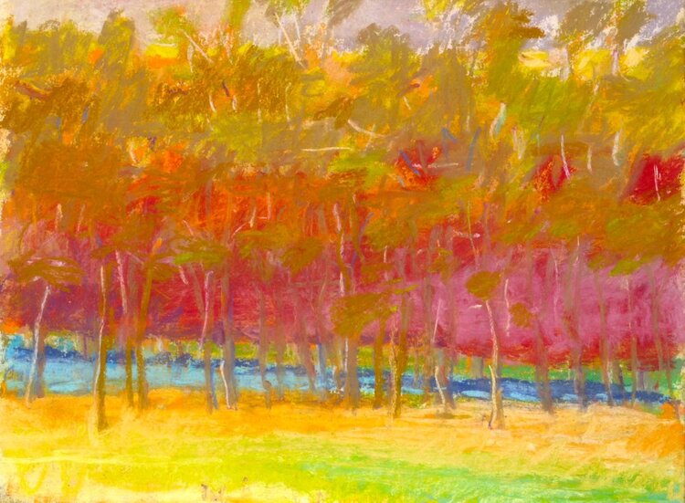
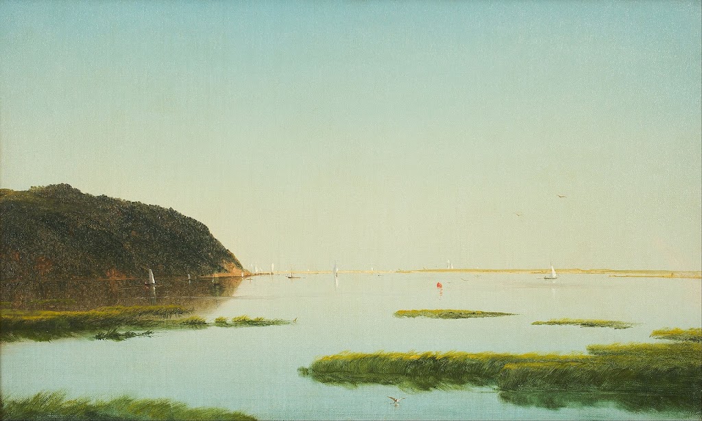
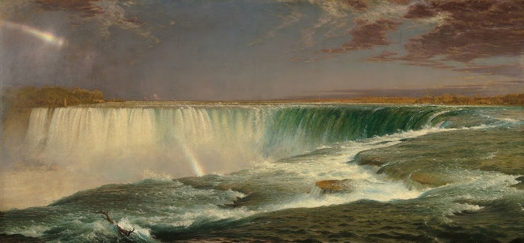
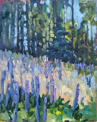
The Road to Seward, Alaska, by Carol L. Douglas

Dear Carol,

Last week, you mentioned the wild turkeys near your residency. I am, unfortunately, afflicted with both hoplophobia and meleagrisphobia – fears of guns and those creatures most fowl. When is it appropriate to pepper spray a turkey?
 
Yours, Allie N., New Mexico
 
Allie,
I have good news and I have bad news. As of 1992, the EPA was still looking for data on the effectiveness of capsaicin (the active spicy spice that makes spices spicy) against birds.1They accepted that it was probably effective against birds, in addition to other animals. Obviously, it has been several years since then. Two scientists at the University of California, San Francisco, discovered in 2002 that, while birds have the vanilloid receptors that taste capsaicin for us, theirs are immune to capsaicin.2 In conclusion, you could probably pepper spray a turkey and it would irritate and startle him. However, you’d get the same effect by shrieking and flapping your arms wildly. In my opinion, the perfect time to pepper spray a turkey is directly before he goes into the oven.
Mary Helen
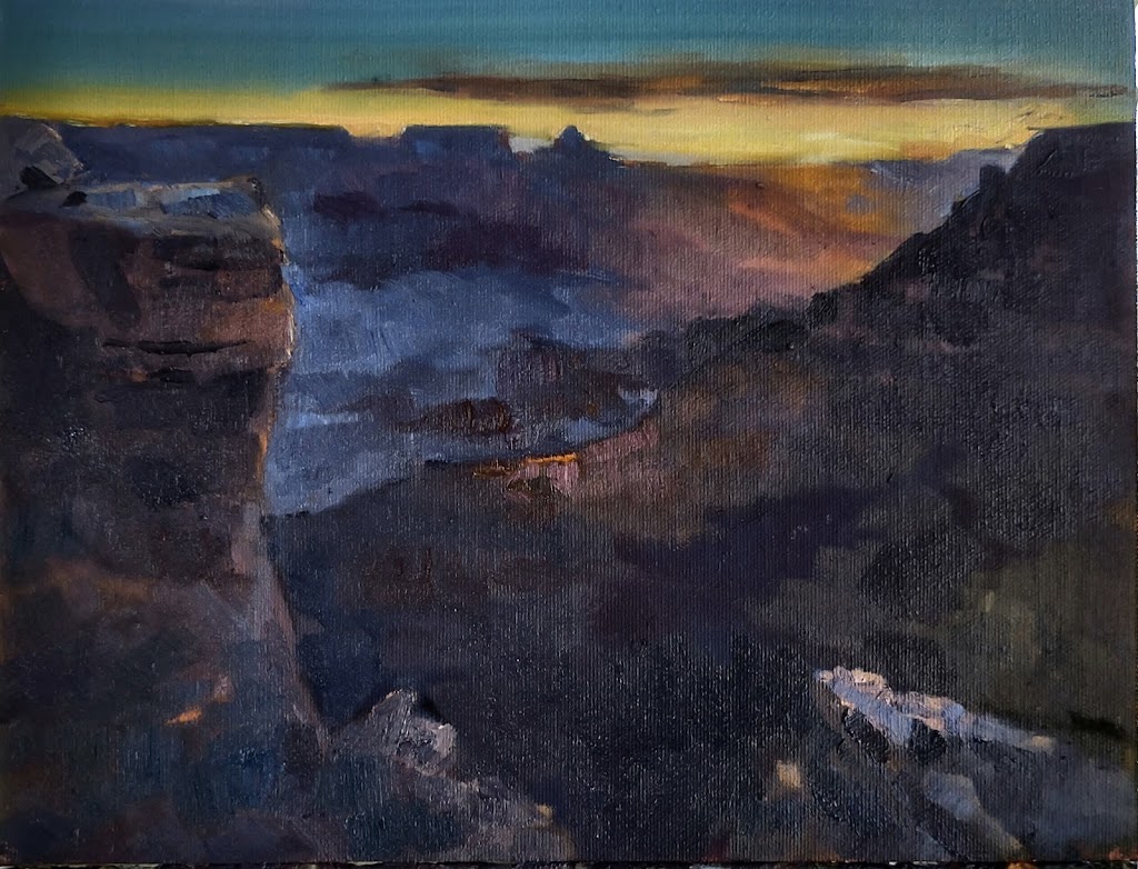
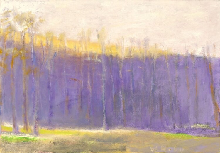
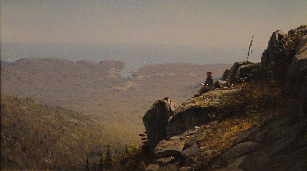
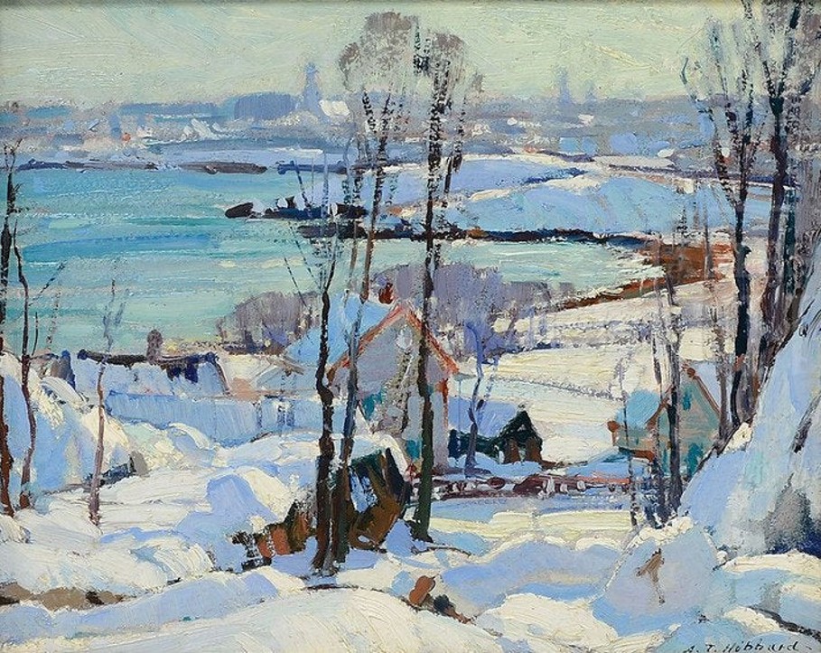
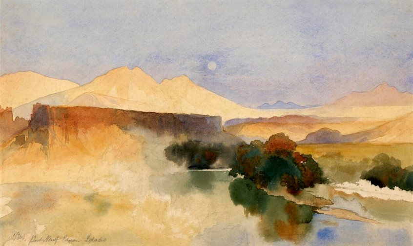
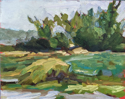
The Alaska Range, by Carol L. Douglas
Greetings Carol,
 
It’s my favorite time of year here in Success, Saskatchewan – the air is crisp and clear, the leaves are changing, and it’s finally moose season. I can’t wait to make all my favorite moose recipes once my wife comes back from hunting. Moose chili, moose enchiladas, moose tartare, coleslaw with moose meatballs, moose bulgogi – you name it, I’ll eat it! I love going with my wife on her hunting trips all around the wilderness of Saskatchewan. You’ve been there. You know how it is! It’s a great time to do some plein airpainting while enjoying some quality time with the missus. How can I best keep myself from getting mistaken for a moose? You know, we share so many of the same features.
 
Bill Winkleman, Saskatchewan
 
Bill,
Moose season in Saskatchewan this year is from October to December. Soon it will be too cold to do much painting en plein air. However, here’s good advice on how to avoid being mistaken for a large ungulate:
  • Wear brightly-colored clothing when out in the woods. I recommend a large, heavily starched tie-dye wizard’s hat.
  • Try to sing as loudly as possible at all times. It’s common knowledge that moose are fans of jazz and Scandinavian black metal, so stick to old pop standards and famous Canadian sea shanties.
You may find that when you’re painting en plein air, you may find moose walking around en trails. Worse than that, you may find that some enterprising hunter has left moose entrails en trails and you have to walk gingerly. I recommend wellies.
Mary Helen
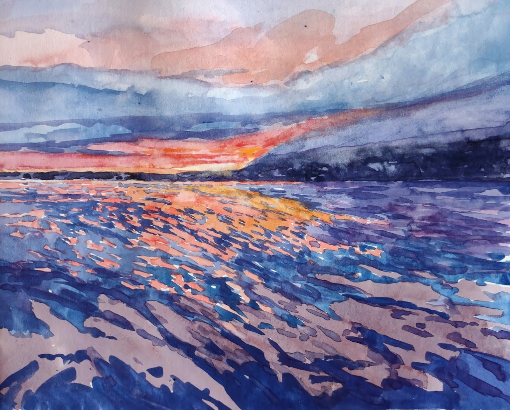
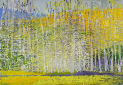
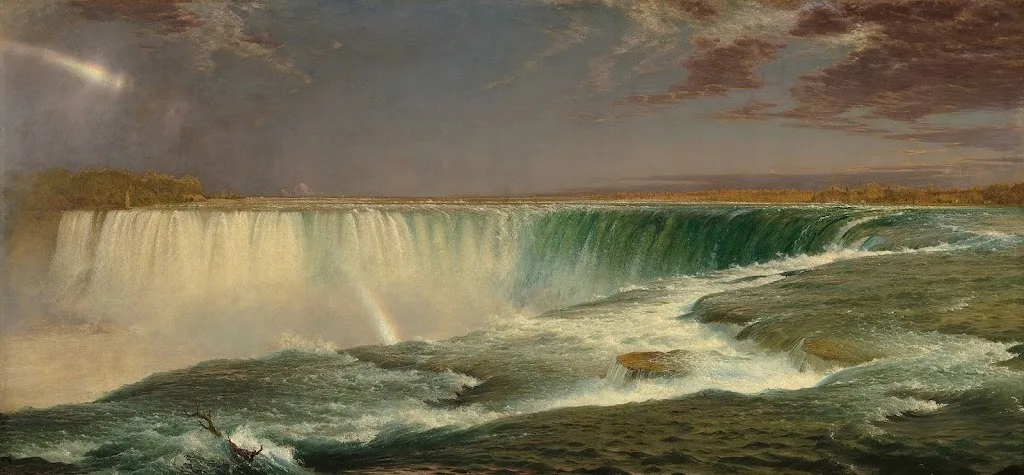
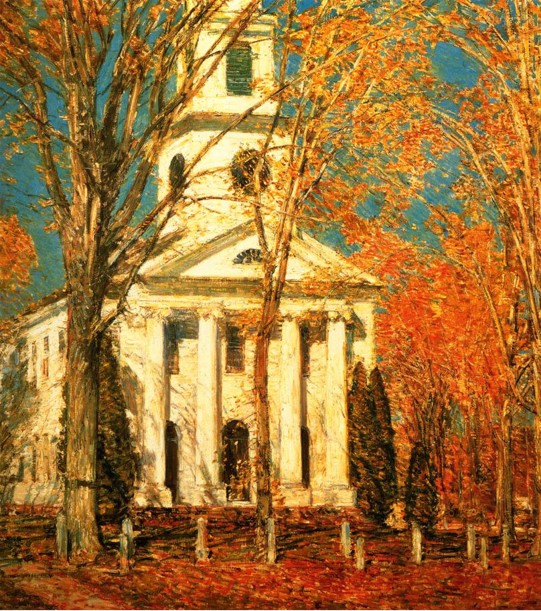
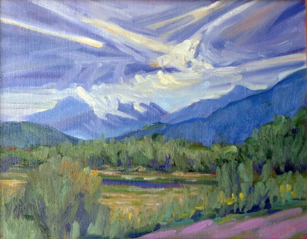
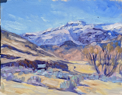
Confluence, by Carol L. Douglas
Carol –
 
My Oma and I are planning a cycling trip up the Alaska Highway next summer. We’ve already begun shopping for a truly inspiring collection of very tight, padded shorts and we’ve got our cameras ready to see all the wildlife. How do you get your best photos of bears?
 
Hildegard
Hildy,
It’s GREAT to hear from you again! My advice for taking photos of bears from your bicycle from the shoulder of the Alaska highway is, uh, DON’T!
Black bears can run between 25 and 30 miles an hour and brown bears can run even faster. A ridiculously lost polar bear can run even faster than that! For comparison, your 97-year old grandmother can probably only manage about ten miles an hour. Just put something to make noise in the spokes of your bike and leave the bears alone. Instead of stopping to photograph them as they forage on the roadside, why not take a quick snapshot of the other tourists taking their picture as you zoom by to safety?
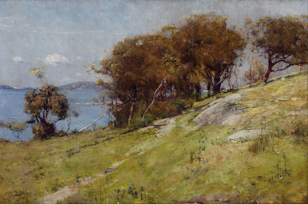
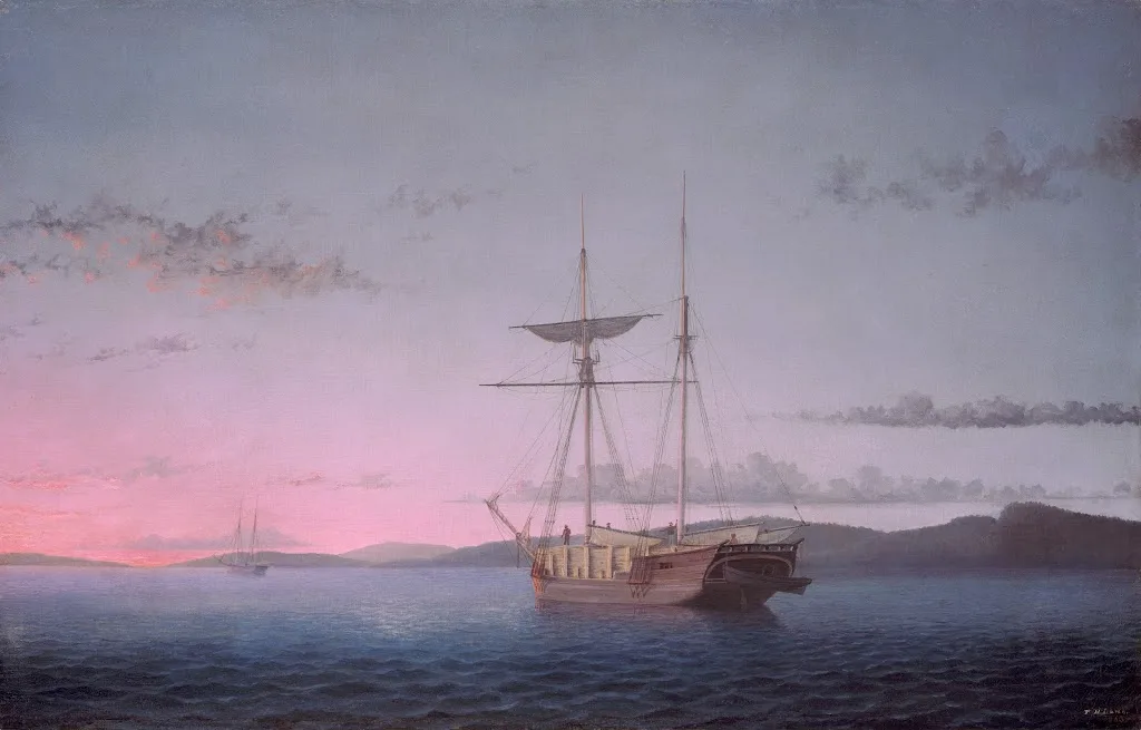
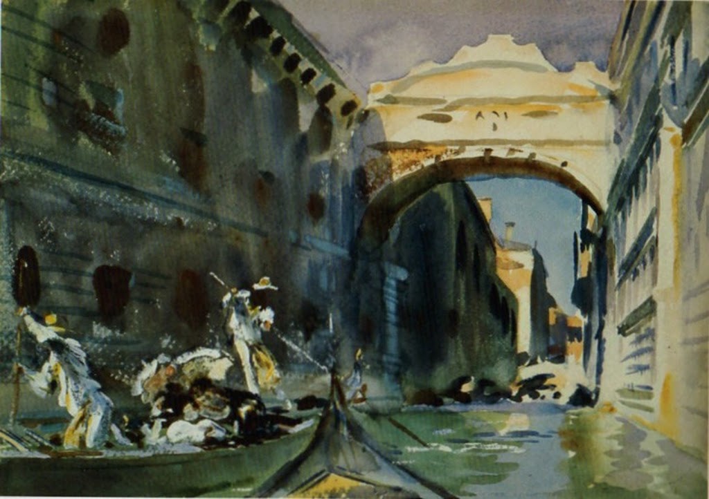
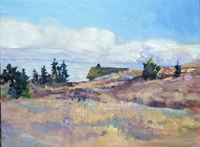
Laird Hot Springs, by Carol L. Douglas. This was the site of a fatal bear attack in 1997.
In July 2018, conservation officers in British Columbia responded to 25 calls about grizzlies and 179 calls about black bears.3,4The Yukon Government reported that at least 63 bears were killed in Yukon,5a five-year high. Human interaction with bears is not only dangerous for the humans, but dangerous for the bear. Remember – a fed bear is a dead bear.
Mary Helen
  1. R.E.D. Facts – Capsaicin. (1992, June). Environmental Protection Agency.
  2. Jordt, S., & Julius, D. (2002, February 8). Molecular basis for species-specific sensitivity to “hot” peppers. Cell, 108(3), 421-430.
  3. Predator statistics: black bear. (2018, September). Conservation Officer Service of British Columbia.
  4. Predator statistics: grizzly bear. (2018, September). Conservation Officer Service of British Columbia.
  5. 63 bears destroyed in Yukon this year because of human conflict. (2017, November 29). CBC News.

Monday Morning Art School: paint with precision

We’re all proponents of loose-is-more, but there are times when you have to be able to hit it right.

Cremorne Pastoral, 1895, Arthur Streeton, courtesy Art Gallery of New South Wales. There are few details, but the ones that are, are very accurately painted.

Detail and precision are not in style right now. “The artist should fear to become the slave of detail,” wrote Albert Pinkham Ryder. “They should strive to express their thought and not the surface of it. What avails a storm cloud accurate in form and color if the storm is not therein?” We’re all proponents of this loose-is-more theory of painting.

However, this is a current trope, and not an artistic truth. There are contemporary figure and still life painters who focus on detail, and artists practicing modern trompe l’oeil. Even in plein air, there are fine painters who eschew looseness for careful attention to detail. Richard Sneary, Jay Brooks and Patrick McPhee come to mind.

The Girl with the Wine Glass, c. 1659, Johannes Vermeer, courtesy Herzog Anton Ulrich Museum. We’re so focused on the clarity of Vermeer’s vision that we barely notice how empty the room is.

Many people get caught up in the details before they get the big shapes right. That’s overwhelming. Before you ever get to the point of painting in blades of grass, the rhythm of light and dark must be researched and articulated properly. How do you do that? The same way as with an alla prima finish—through sketch and underpainting.

Even the exuberant Dutch Golden Ageartists left things to the imagination. We’re so busy looking at all the stuff they crammed into their canvases that we sometimes don’t notice what they’ve left out. Not every detail deserves the same attention.

Banquet of the Amsterdam Civic Guard in Celebration of the Peace of Münster, 1648, Bartholomeus van der Helst. Courtesy Amsterdam Museum

Great painters distill the visual noise, and then concentrate on the important parts. Consider the problems facing Bartholomeus van der Helst in his monumental commission, Banquet of the Amsterdam Civic Guard in Celebration of the Peace of Münster, above. It’s a portrait of 24 august gentlemen and one lady. (And wouldn’t you love to know why she was included?) None of the subjects would have been happy to be represented with a few Impressionistic brush strokes. There were symbols that needed to be included—pikestaff, drum, silver drinking horn and the paper on the side of the drum. In addition, the men were garbed in their very best frippery, and they meant to show that off.

Van der Helst pared away at the composition with ruthless efficiency. The background is muted. He let black hats and black garb sink wherever he could. Thank goodness for the fashion of ruffs and white linen collars—they allow the faces to stand out. The remaining textiles are held in a rigid pattern of gold, blue, and red. The color harmony is, in large part, holding the picture together.

It’s unlikely that an artist will ever paint a monumental commission like this again. It’s more likely that we’ll add a few details to a much looser painting. These details can fool the eye into thinking there’s more there than is actually present.

Out Back, Peter Yesis, courtesy of the artist.

Peter Yesis is the best painter of flowers I know. In my mind’s eye, I see his paintings as detailed, but they’re actually very restrained. The focal points draw our eyes, allowing our minds to fill in the other areas. This engages our imagination, which is far more potent than anything on the canvas.

I wrote last week about pareidolia, our ability to see meaningful images in ambiguous visual patterns. Humans find this much more compelling than having things spelled out for them.

We’ve been using that technique since the Impressionists to engage viewers. But to do it, you need to be able to occasionally lay down a tight, accurate line.

Painting precisely is a matter of slowing down and exerting greater direct control over your brush. Smaller brushes can help, but a light hand is most important. (Most of us are slightly tremulous, and smaller brushes can result in shakier lines.) There’s no way to get there but to practice your fine motor control.

Monday Morning Art School: avoid the Velvet Elvis

How do you paint the sunset without it looking like kitsch?

Sunset Sail, oil on canvas, Carol L. Douglas, available.

In class last week, a student said she’d painted the shadow areas of a sunset painting grey. “I wanted to avoid the Velvet Elvis look,” she said.

As with so many things in mid-century America, the popularity of velvet paintings in the 1970s was the result of one person’s mad ingenuity. Doyle Harden created a block-long factory in Ciudad Juárez, Mexico to mass-produce velvet paintings for the American market. “I never met many people who would even admit they would have them in their homes,” Harden said. “But I’ve sold more than $100 million worth of velvets, and to me it’s beautiful art.”

A mid-century velvet sunset painting.

(If you do have one, there’s a thriving secondary market on ebay. You may be able to recoup what Grandma paid for it.)

Black velvet painting, in fact, may be the reason that black paint fell out of favor at the end of the 20th century. What distinguishes black velvet painting is the inky blackness of the dark passages, created by the fabric itself. It’s a by-word for kitsch, and that’s what my student wanted to avoid.

But black is, in fact, what’s left optically in contrast to the sunset. Objects in relief in front of a sunset will read as dark neutrals or, at best, as inky indigo blue.

Grand Canyon at sunrise, Carol L. Douglas, available. One issue with extremely dark paintings is that they’re tough to photograph.

There will, however, be an aura of the sun’s light. It may be directly around the orb, as in the photo above, or it may reflect across a valley, as in my painting of the Grand Canyon at sunrise. Either way, everything in relief is not unremittingly black.

There will likely be shades of grey within that darkness. Here you can gain some relief by adding blues or even purples.

American Eagle at sunset, taken during my September Age of Sail workshop last year.

We have two kinds of color receptors in our eyes—rods and cones. Rods work better at night, but are less receptive to the red end of the spectrum. This is the Purkinje effect, and it leaves us perceiving things as deep blue—right before we lose any sense of color at all.

Some objects are partially illuminated by the sunset light streaming through them. The flag of American Eagle, above, is an extreme example, but there are others, including glass and water.

Watercolor sketch of sunset, Carol L. Douglas, NFS.

In addition, we can see some color in objects that are close to us. That’s because there’s still reflected light bouncing around us. However, a lot of that is remembered or implied color. For example, in the photo of American Eagle, we ‘see’ the name of the boat as gold, but sampling it in the photo tells you that it’s really a very desaturated greyish brown. A little color goes a long way in these dark passages.

But that’s optical perception, and on top of that you have to add emotional response. I ‘knew’ there were greens and reds in the Grand Canyon; I could just see the ghostly outlines of trees. Adding them into that stew of darkness was not a problem as long as I kept the value universally dark.

In watercolor, the problem is exacerbated by the fact that deep darkness is not always watercolor’s best look. One option is to run head-on into the darkness, as Bruce McMillan did here, to great effect.

The Scarlet Sunset, c. 1830-40, watercolor and gouache, JMW Turner, courtesy the Tate.

Still, sunsets are overwhelmingly the province of oil painters, because of that darkness issue. The exception to the rule is Joseph Mallord William Turner, who painted them many times in watercolor and gouache. His solution is to lighten the dark passages considerably, letting them fade into inconsequence.

Monday Morning Art School: what we can learn from Wolf Kahn

Color is the dominant theme of our age.

Autumn trees, undated, Wolf Kahn, from a commercial lithograph

Wolf Kahnwas a mid-century American landscape painter who was influenced significantly by Abstract-Expressionismand Color Fieldpainting. The fog on Deer Isle, Maine led to an epiphany about color: “I began to let the color come through on my canvases,” he wrote. “My pastels were always intense, and finally my painting caught up with them.”

Brilliant Green Trees, 1997, Wolf Kahn, courtesy Walter Wickiser Gallery

Kahn’s canvases are deceptively simple. What can we learn from them?

Color is the dominant theme of our age

That was beginning to be true in the 1960s when Kahn was coming into his own, but we now live in the full maturity of color. We are surrounded by a surfeit of chromatic intensity. Imagery has always been influenced by what’s around us, and today that’s our cell phones, monitors, and televisions. Printing technology is far better than it was even thirty years ago, so the photos in our books are clearer and brighter than ever. Paint and pigment technology have undergone similar improvement, which is why we’re seeing houses with navy blue vinyl siding—they’ve managed to make a dark blue that doesn’t fade.

Will this trend last forever? For all I know, there will be an equal and opposite reaction into monochrome. But for the moment, we’re living in an age of intense color, and if you are painting in our times, you’d best know how to use color.

That includes understanding and using modern organic pigments.

Midsummer, 1993, Pastel, Wolf Kahn, courtesy Walter Wickiser Gallery

The ‘real’ hue is irrelevant if the value is right

Kahn is famous for substituting impossible colors into the landscape: orange scrub, fuchsia woods and purple hills. One of his favorite techniques is to make the trunks of saplings the exact same value as the background, but the complementary color. The brain reads this as the screen of trees.

Stripped down to their essential form, objects are still recognizable to the human brain

Our minds are programmed to read images from the faintest stimuli, which is why we see faces in the steam on our shower door. This tendency to perceive meaningful images in ambiguous visual patterns is called pareidolia

This is not a purely human response, either. Occasionally, one of my hiking trails will be blocked off with a sawhorse festooned with signs. Until he’s close enough to investigate them, my dog finds these shapes very threatening. He’s seeing a vaguely-animal shape.

Our human pareidolia is the same response. We’re programmed to investigate visual stimulus that looks sort of familiar. Kahn and other abstract artists are exploiting this.

That’s an aspect of modern art that is likely to stay with us, as it’s built on our fundamental brain architecture. If we want to paint within our times, we need to stop spelling everything out.

Reluctant Green, 2001, Wolf Kahn, courtesy Walter Wickiser Gallery

It’s all an interplay of warm and cool

While Kahn’s selection of substitutionary colors might seem random, he is careful about color temperature. Where he wants objects to recede, they’re cool. Where he wants them to pull, they’re warm. Again, he’s playing with our brains and eyes and how they’re designed to perceive color.

Bright Center, 2015, Wolf Kahn, courtesy Addison-Ripley Fine Art

Chromatic intensity matters

In most instances in Kahn’s work, one hue leads. That color is given the greatest chromatic intensity. In others, two colors are balanced in chromatic intensity, but one leads by virtue of being warmer. None of this is accidental. Kahn was acutely aware of chroma and its importance.

We painting teachers bang on and on about value, and it’s certainly fundamental. However, color temperature and chromaare also important.

Monday Morning Art School: the power of light

In a world obsessed with rawness, you could do worse than studying the Luminists.

Lumber Schooners at Evening on Penobscot Bay, 1863, Fitz Henry Lane, courtesy National Gallery of Art. The setting for this painting is, quite literally, out my back door.

Luminism is a distinctly American painting movement of the middle of the 19th century. It was chiefly concerned with the effects of light on the landscape. Significant painters of the movement included Fitz Henry LaneMartin Johnson HeadeSanford Gifford, and John F. Kensett. The latter two you might recognize as Hudson River School painters. In fact Luminism was closely related to the Hudson River School and painters like Frederic Edwin Church and Albert Bierstadt sailed very close to the wind of Luminism.

A fascination with light is something Luminism shares with Impressionism, but the path there is exactly opposite. Impressionism is what art historians call painterly—there are visible brushstrokes in the top layer. Luminism is what is called linear—modeling and distance are created with skilled drawing and brushstrokes are suppressed.

View of the Shrewsbury River, New Jersey, 1859, John Frederick Kensett, courtesy Rutgers University

In the Luminist world, light is generally hard. The soft, ambiguous atmospherics of Claude Monetor James Abbott McNeill Whistler were inconceivable to these painters. Attention is paid to detail, which is often picked out by some larger-than-life weather event. Atmospheric perspective is exaggerated for effect.

For this reason, scenes of mountain vistas and the ocean were especially popular. They allow us to see light playing itself out in all its variations. Fitz Henry Lane was a popular painter of the Maine and Massachusetts coasts, and his work is a compendium of Luminism’s themes. There’s extensive detail, an expanse of interesting sky, and careful attention to value.

There’s often an elevated viewpoint, where we are looking down on the scene in a very personal way. It’s a viewpoint that’s not quite possible in reality. It seats us right next to God, in effect.

The Artist Sketching at Mount Desert, Maine, 1864-1865, Sanford Robinson Gifford, courtesy National Gallery of Art. 

Luminism has no meaning divorced from its themes, which were intimately related to those of the Hudson River School painters: discovery, exploration and settlement. In their telling, America is a peaceful Eden where nature and human beings coexist peacefully. The schooner rests quietly at anchor; tilled fields nestle undisturbed below the mountains; There are no blizzards, tornadoes, or wolves to disturb the balance. There is only that sublime light from the heavens.

Hudson River School artists believed that the American landscape was a reflection of God. Luminism, in particular, is connected with Transcendentalism, which saw a close link between the spiritual and physical worlds.

This has to be set against the times in which these paintings were created. It was a period of fast settlement and rapid industrialization, particularly in the east coast where these painters sold their work. Luminism was painting an America that—if it existed at all—was short-lived and vanishing.

Cotopaxi, 1862, Frederic Edwin Church, courtesy Detroit Institute of Arts. Church showed Americans the whole New World through a Luminist lens.

At the same time, there was an intense curiosity about parts of the country that most people had never seen. That’s why tens of thousands of people were willing to pay 25¢ each to see Church’s Niagaraon exhibit. The massive, glowing canvas was a proxy trip to the Niagara Frontier. And Church could, with a flick of his brush, conveniently excise all the people who lived and worked in Niagara at the time.

The tags Hudson River School and Luminist came long after both movements had ended. They were initially dismissive. Impressionism, Post-Impressionism and Abstraction had taken the western art world by storm. Careful brushwork and drawing were filed in the back of our consciousness. The cognoscenti considered them quaint. But they’ve always had their fans in Middle America.

Much can be learned from these painters in regards to light. And it hurts nobody to know how to use the brush carefully and discreetly at times, to feather, brush and model with delicacy and intention. In a world obsessed with rawness, you could do worse than studying the Luminists.

Monday Morning Art School: losing your edge

There are many ways to soften an edge; the important thing is recognizing where you should do it.

Niagara, 1857, Frederic Edwin Church, courtesy Corcoran Gallery

Almost every good painting is a combination of hard and soft edges. Edges may be lost through brushwork or they can be muted using contrast or color. A variety of edges not only adds interest to a painting, they support its composition and thus how the painting is ‘read’.

Broken brushwork, or broken color, means that the artist applies paint in small or skipping strokes but does not blend them. Colors blend optically rather than literally. Broken brushwork can take the form of small, intentional marks, scumbling, or palette-knife painting. The goal is to create tension, a vibration of color. Broken brushwork is an excellent way to lose the edge in painting.

Winter Harbor Scene with City Views Beyond,Aldro T. Hibbard

Chauncey Foster Rider was admired in his day for both his vigorous, adventurous brushwork and the degree to which he pushed his landscape paintings toward abstraction. He had a particular gift for painting the feathery bare branches at the top of winter trees in both watercolor and oils. He had several ways of doing this: wet on wet, broken color created by pushing paint with a palette knife, dragging his brush through wet paint, and by making low-contrast shifts within value masses. At times he painted the middle distance in thin paint, or dry-brushed thin paint over an already-textured sky. But perhaps the most effective of his techniques was creating masses that are barely darker than the winter sky. From a distance, they read as a mass of bare branches.

Another fine painter of New England winter was Aldro T. Hibbard. He too had a variety of tricks for painting the filigree of bare branches, including dry-brush scumbling, as shown in the example above. He played these soft shapes against the hard lines of positively-painted tree trunks to great effect.

Before there was broken brushwork, there was blending and softening. In Frederic Edwin Church’s Niagara, at top, the rim of the cataract veers between sharp and blurred edges. A long bright triangle, stabbing to the right, is accentuated by the soft colors of the mist. The far shore shimmers in the spray. It’s a tour de force of a type of painting we don’t see enough of these days.

Church at Old Lyme, 1905, Childe Hassam, courtesy Albright-Knox Art Gallery 

There are indirect ways to make edges recede, too. In Church at Old Lyme, above, Childe Hassam makes the leaves and sky the exact same value. Even though their edges are sharp and the colors complements, they flow into each other, leaving no doubt that the subject of the painting is the white church.

The Bridge of Sighs, c. 1903-04, John Singer Sargent

John Singer Sargent’s watercolors of the Bridge of Sighs balance the hard edge where the sky meets the stone against the soft shadows. These are allowed to bleed into the muck of darkness, a great way to deemphasize too many hard edges. By the way, for those purists who hate white paint in watercolor, Sargent used it quite cheerfully.

Portneuf Canyon, Idaho,1879, Thomas Moran

Reducing contrast reduces the perceived hardness of the edges, as Thomas Moran’s Portneuf Canyon, Idaho, above, demonstrates. That’s how we instinctively read the far distance as receding. And, of course, watercolorists can always wet an edge to soften it, or paint into wet paper.

Two Women on a Hillside, 1906, Franz Marc, courtesy Franz Marc Museum

We know that value contrast can support or diminish a hard edge, but so also can hue. In Two Women on a HillsideFranz Marc tied the women to their setting by reflecting the greens of the grass in their skin and garb.

The important thing isn’t necessarily the way you lose your edges, it’s knowing where and when it should be done. That’s best learned by looking at great paintings and analyzing the pas de deux between hard and soft edges.

Monday Morning Art School: pochade boxes for every budget

I hate to see people waste money on a cheap pochade box that won’t work.

My current system is an Open M box on a carbon-fiber tripod. It’s lightweight and puts up with a lot of abuse.

Last week I discussed how Google drove me toward inexpensive and fatally-flawed Meeden pochade boxes. I do not generally tell people what boxes to buy, as there’s a tremendous range of excellent options. But I don’t want to see students waste money on a cheap box that won’t work.

We’re a month out from the start of plein air season here in the northeast, so it’s time to research and order a box if you need one. Some manufacturers are on their seasonal hiatus, but if they make the box you want, it’s worth waiting for.

My super-light pochade box when it was new (and clean).

Unfortunately, most pochade boxes are sold on the internet, so you can’t twiddle the dials in person. You must rely on word-of-mouth. The good news is that there are some excellent products out there.

Many people have been given some version of a French box easel by loving friends or relatives. If you’ve got one, by all means use it, but don’t voluntarily inflict one on yourself. They’re heavy, difficult to set up, and you can’t slide the paint out and store it in the freezer. Pochade boxes are lighter and nimbler.

If money is an issue, make your own. I have instructions here for making a lightweight aluminum box. This was my primary box for several years and I still use it for backpacking, as it’s the lightest box I own.

Jennifer Johnson’s variation on that theme.

My student Jennifer Johnson decided to make a box like mine, but her husband ordered the wrong binder. It was a fortuitous accident, because her box is smaller and stronger. It pairs up perfectly with her Mabef M-27 field easel without any drilling or special machining. She’s used two of them—one for acrylics, one for oils—for four years now without any problems.

Or, you can use Victoria Brzustowicz’ ingenious, cheap and simple solution. She hinged two aluminum baking sheets from the Dollar Store together with a strip of duct tape. Open, it’s a paint box; closed, it goes in a plastic bag in the freezer. She also uses it with a Mabef field easel.

Victoria Brustowicz’ variation on the theme cost her all of $2.

That Mabef field easel can also be used with a plastic Masterson sta-wet palette box and disposable palette paper for another lightweight and inexpensive combination.

In all cases, you’ll have to tinker with bungee cords and clamps to secure the box to the easel, but it does work.

A few of my students have the Leder easel. At $119 (not including the tripod), it’s reasonably priced, stable, and extremely compact. You must buy your own tripod and paint box, but that, again, means you can use a sta-wet palette box. It’s also a useful system for pastels, because it allows you to use your existing pastel box.

New Wave u go pochade box belonging to Ann Clowe.

I’ve also seen several New Wave u.go pochade boxes over the past year. They’re birch and use magnets instead of clasps. They seem solidly built and have a lift-out palette.

My current everyday box is an Easy L box by Artwork Essentials. (I also use their umbrella, because it stays where I put it.) The box is durable, basic, and you can set it up so it hangs with the palette at the same angle as your canvas. That’s useful for demoing but I never do it in real life.

Another lovely box in a similar style is Open M’s panel/palette holder. It’s also well made of Baltic birch. The major difference is in the style of hardware.

Terrie Perrine using the Leder system with her own pastel box.

Guerrilla Painteris a well-known brand of extremely-robust pochade boxes. I have a 12X16 Guerrilla box that is so tough I could drive over it with my truck and then use it. That comes at a price, however; the box is too darn heavy for anything other than park-and-paint plein air.

Strada makes the only aluminum pochade boxes that I know of. That’s a pity, because aluminum is stronger and less prone to moisture damage than wood. It doesn’t result in much weight savings, however; the 11X12 Strada box weighs only an ounce less than the 10X12 Open M box.

En Plein Air Pro now has a system for oil and acrylic painters with a greyscale mixing tray. They also have a portable pastel easel. I worked briefly with the oil-palette at my Sedona workshoplast month, and it seemed quite solid and practical. I have had one of their tripod trays for years, however. It’s rigid and durable.

All opinions on these products are my own. A handful of them use affiliate links; if you click and make a purchase, I may receive a commission. 

Monday Morning Art School: drawing realistic clouds

 Clouds have volume and are subject to the rules of perspective.

Clouds over Whiteface Mountain, oil on canvasboard, available.

Clouds are not flat. The same perspective rules that apply to objects on the ground also apply to objects in the air. We are sometimes misled about that because clouds that appear to be almost overhead are, in fact, a long distance away.

I’ve alluded before to two-point perspective. I’ve never gotten too specific because it’s a great theoretical concept but a lousy way to draw. Today I’ll explain it.

A two-point perspective grid. You don’t need to draw all those rays, just the horizon line. The vertical lines indicate the edges of your paper.

Draw a horizontal line somewhere near the middle of your paper. This horizon line represents the height of your eyeballs. Put dots on the far left and far right ends of this line, at the edges of your paper. These are your vanishing points.

All objects in your drawing must be fitted to rays coming from those points. A cube is the simplest form of this. Start with a vertical line; that’s the front corner of your block. It can be anywhere on your picture. Bound it by extending ray lines back to the vanishing points. Make your first block transparent, just so you can see how the rays cross in the back. This is the fundamental building block of perspective drawing, and everything else derives from it. You can add architectural flourishes using the rules I gave for drawing windows and doors that fit.

A cube drawn with perspective rays. It’s that simple.

I’ve included a simple landscape perspective here, omitting some of the backside lines for the sake of clarity.

As a practical tool, two-point perspective breaks down quickly. In reality, those vanishing points are infinitely distant from you. But it’s hard to align a ruler to an infinitely-distant point, so we draw finite points at the edges of our paper. They throw the whole drawing into a fake exaggeration of perspective. That’s why I started with a grid where the vanishing points were off the paper. It doesn’t fix the problem, but it makes it less obvious.

All objects can be rendered from that basic cube.

(There is also three-point perspective, which gives us an ant’s view of things, and four-point perspective, which gives a fish-eye distortion reminiscent of mid-century comic book art. And there are even more complex perspective schemes. At that point, you’ve left painting and entered a fantastical world of technical drawing.)

Basic shapes of clouds using the same perspective grid.

Still, two-point perspective is useful for understanding clouds. Clouds follow the rules of perspective, being smaller, flatter and less distinct the farther they are from the viewer. The difference is that the vanishing point is at the bottom of the object, rather than the top as it is with terrestrial objects.

Cumulus clouds have flat bases and fluffy tops, and they tend to run in patterns across the sky. I’ve rendered them as slabs, using the same basic perspective rules as I would for a house. They may be far more fantastical in shape, but they obey this same basic rule of design.

You can see that basic perspective when looking at a photo of cumulus clouds.

A flight of cumulus clouds or a mackerel sky will be at a consistent altitude. That means their bottoms are on the same plane. However, there can be more than one cloud formation mucking around up there. That’s particularly true where there’s a big, scenic object like the ocean or a mountain in your vista. These have a way of interfering with the orderly patterns of clouds.

I don’t expect you to go outside and draw clouds using a perspective grid. This is for understanding the concept before you tackle the subject. Then you’ll be more likely to see clouds marching across the sky in volume, rather than as puffy white shapes pasted on the surface of your painting.

This post was originally published on March 8, 2021.

Monday Morning Art School: Creativity loves constraints

Two things I learned teaching my workshop last week.

Kamillah Ramos at the Grand Canyon.

I start each class and workshop by handing my students protocols for painting in oils and watercolor. “If you follow these steps,” I tell them, “you will understand how to paint.” These instructions are not unique; they’re how most successful artists work through drawing, composition, and paint application.

Just try it for the length of the class, I tell them. If it doesn’t improve your painting, go back to what you were doing before. But I’m confident that following this traditional approach works. Anyways, most people take painting classes because they recognize that something in their system isn’t working. 

A set of step-by-steps is oddly liberating. Working out the problems in advance leads to looser and more lyrical brushwork.

Student Becca Wilson responded by telling me that there’s a phrase for this: “creativity loves constraints.” Bam.

The idea that limits can lead to extraordinary creative output seems counterintuitive. After all, the creative pursuits (and particularly the visual arts) are often thought to be about feelings and thus limit- and rule-free. In reality, they’re quite the opposite. Every creative pursuit has its own established practice, and painting is no exception.

Constraints set up processes within which problems can be solved. Separating painting into discrete steps—value study, color mixing and then, finally, brushwork—helps cut it down into manageable pieces. Only when you can do the steps automatically will you find your authentic, unique artistic voice.

Kamillah Ramos and I were painting on Mather Point at 5:30 AM yesterday morning. This is a busy time at the Grand Canyon. The weather is good and schools are on spring break. Hundreds of people came by in the 4.5 hours we were painting, and many of them stopped to ask us questions or comment on our work.

“There’s nothing like plein air painting for changing the vibe of a place,” Kamillah said. She’s so right.

Our workshop painted in six separate locations in Sedona, which was also jam-packed with tourists. People might have found our presence irritating, but instead they were interested and enthusiastic. In fact, in decades of painting outside, I’ve had universally-positive reactions from passers-by.

Artists are very much a cultural and economic asset, and that’s worth remembering.

(Sorry this is brief but I’m about to board a red-eye to Portland.)

Monday Morning Art School: it’s plein air season

How can you get the most from a workshop or class? Here are some simple suggestions.

Early Spring, Beech Hill, 12X16, oil on canvas board, $1449 framed.

I’ve been to enough beauty spots in this world that few really astonish me, but the red rocks of Sedona managed it. Brilliant cliffs and spires of sculpted sandstone soar directly above the town. After seeing a dozen or so sites, I turned to my monitor, Ed Buonvecchio, and said, “It’s all wonderful.”

I’m here to teach the first workshop of my season, and it feels great to be out of the cool damp of the northeast, although the temperature there is steadily rising. I’ll be going home to spring painting and it’s time to get prepared.

Lupines and woods, 8X10, oil on canvasboard, $522 unframed.

How can you get the most from a workshop or class? Here are some simple suggestions:

Study the supply list.

Note that I didn’t say, “run right out and buy everything on it.” Every teacher has a reason for asking for specific materials. In my case, it’s that I teach a system of paired primaries. You can’t understand color theory without the right starting pigments. Another teacher might have beautiful mark-making. If you don’t buy the brushes he suggests, how are you going to understand his technique?

A tube of cadmium green that I once bought for a workshop and never opened still rankles. I never want to do that to one of my students. When you study with me, I want you to read my supply lists. If something confuses you, or you think you already have a similar item, email and ask.

Spring Greens, 8X10, oil on canvasboard, is available through the Rye Arts Center.

Bring the right clothes.

I’d forgotten that I didn’t have enough warm-weather painting clothes to take to Arizona; I retired most at the end of last year. It was warm in Phoenix but just 50° in Sedona yesterday. That means a variety of clothing, because you’ll be chilled in the evenings but might need shorts and a tee-shirt during the day. Layer, baby, layer.

I send my students a packing list for clothes and personal belongings. If you’re going on the Age of Sail, Shary will send you a different list, meant for a boat. Follow these instructions, especially in the matter of insect repellent and sunscreen. Bugs and skin cancer are, unfortunately, eternal verities.

End of winter, Wyoming, 8X10, oil on canvasboard, $522 unframed. It will be much warmer when I teach there in September.

Know what you’re getting into.

“How can you stand this? It’s all so green!” an urban painter once said to me after a week in the Adirondacks.

There are amenities in Sedona, but not in other places I teach. If you’re dependent on your latte macchiato, you may find the wilderness uncomfortable at first. There are compensatory attractions. Last night I listened to a duet sung by a coyote and a domestic dog. It was magical.

Be prepared to get down and dirty.

I’m not talking about the outdoors here, I’m talking about change and growth. I am highly competitive myself, so it’s difficult for me to feel like I’m struggling. However, it’s in challenging ourselves that we make progress. Use your teacher’s method while you’re at the workshop, even if you feel like you’ve stepped back ten years in your development. That’s a temporary problem.

You can disregard what you learn when you go home, or incorporate only small pieces into your technique, but you traveled to be challenged, and you can’t do that if you cling to what you know.

Connect with your classmates

I know painters from all over the US. I met most of them in plein air events. There’s power in those relationships. Exchange email addresses. Keep in contact. Follow them on Instagram or Twitter.
Take good notes.

Listen for new ideas, write down concepts, and above all, ask questions. If your teacher can’t stop and answer them mid-stream, save them for after the demo.