Monday Morning Art School: Mastering values

Value is the engine that drives composition. Here’s a great exercise to help you get it right.

Four value studies of my boots. From top left: flat light, side light, fill light, back light. There’s a diagram below.
I learned to paint in New York, where the sun don’t shine. I’m good with flat lighting; I still struggle with the often-dazzling light of coastal Maine. That’s one of the reasons I encourage doing value studies before pulling out all the stops in a plein air setting.
Value means the lightness or darkness of a color. There are two other attributes of color: hue (where it sits on the color wheel) and chroma (its saturation or intensity). The human eye perceives value first, so artists rightly concentrate on it.
This week, I’m pulling out an old exercise. I didn’t think it up; it has been handed down from teacher to student since the tenebrists.
The boots themselves, from top left: flat light, side light, fill light, back light.
I want you to do four different value studies of the same object. Choose an object appropriate for your drawing experience and the amount of time you have, as long as it’s not too regular or spherical. An avocado, coffee mug, or an apple will do. I used my boots. We’ve been very close friends over the past three weeks, but they were more time-consuming than was strictly necessary.
The first drawing you’ll do (top left) should be in ambient light in your studio or room, preferably during the day. The lighting should be flat, the contrast minimal. Then, add a spotlight to your process. Any table lamp minus its shade will do. Start with the light behind your right shoulder. In the third drawing, move it so that it is lighting your object directly from the side. In the fourth, bring it around as far as you can to back-light the object. (You’ll blind yourself if it’s shining directly in your eyes.)
Limit your drawing to three levels of grey and black. I used Prismacolor neutral grey markers because that’s what I use in my classes and workshops. You can use pencils, charcoal or pre-mixed paint. Just discipline yourself to keep your exercise strictly to three values.
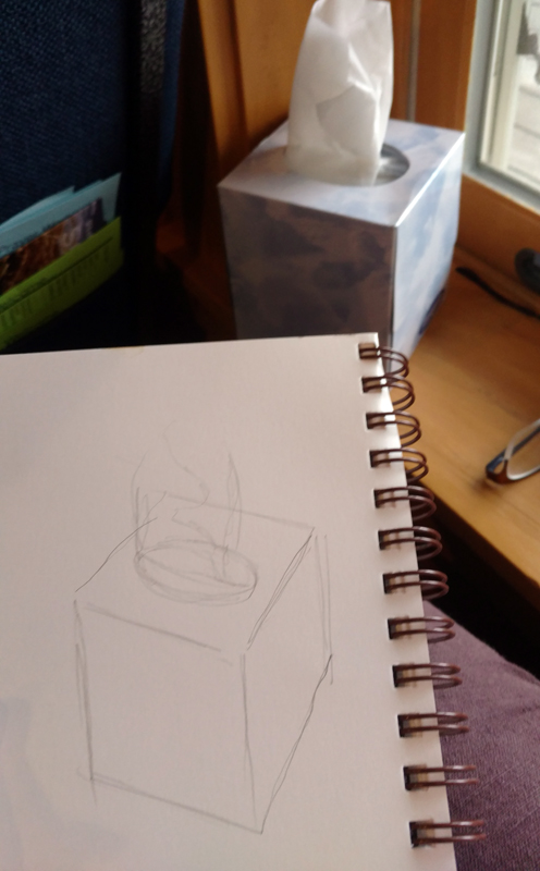
Your starting line drawing should be no more complicated than this.
Start with a simple line drawing in your sketchbook, as I did with figure 1. Then divide this into light-medium-dark areas. Fill them in appropriately and see what you get.
Obviously, there is a gradual range from absolute dark to light in a real-world scene. How you break that into light-medium-dark is subjective. You will not see the jumps at the same place I saw the jumps. Experiment! And don’t worry about creating finished artwork—I didn’t. This is a process-driven exercise. It should result in a flurry of paper rather than a masterpiece.
You will lose lines, which are what we think of as defining shapes. That’s one of the major points of this exercise. Edges have their place, but their place isn’t everywhere.
Our lighting scheme. #1 was done with ambient room (flat) light, #2 with a fill light, #3 with a side light, and #4 was back lit.
What our minds read is, “boot sitting on a table (which your mother told you not to do).” What we actually see is a series of values, in which the back corners of those boots meld into darkness and the fronts stick out and reflect light. It’s in following the values and ignoring the lines that we begin to create an artistic vision.
This is not meant to replace the pencil sketch, which is invaluable in understanding an object. Rather, it’s an extra step in planning a painting. Working in masses of values helps you to:
  • Use the full range of values; 
  • Simplify shapes;
  • See in abstract compositional terms; 
  • Focus on the movement of the eye through the painting;
  • Create more depth.

Remember, there’s a Facebook page for Monday Morning Art School. I’d love to see your finished exercises there! 

Monday Morning Art School: How to mix skin tones

Michelle reading, by Carol L. Douglas

Recently I gave you an assignment on mixing warm and cool tones. The example I used was my figure-painting palette. A reader asked for more specific information on mixing skin tones.

I have read many short articles on mixing skin tones and they all seem to start with a basic misconception. That is that the human form can be represented by just a few brownish colors.
An extended matrix for mixing skin tones, by student Matthew M. The warm tones are quinacridone violet, burnt sienna, naphthol red, raw sienna, yellow ochre, cadmium yellow, transparent yellow and something I can’t identify. He modulated them with tints of ultramarine blue, black, Prussian blue, dioxazine purple, and a warm mix. Overkill, perhaps, but it explains how he learned to paint so well.
We all understand that the human race has a variety of skin tones. Each person has a range of tones as well. There are pinker areas and yellower areas, and areas with distinct blue and green tones. Our skin varies by the season, the lighting, and even by the day, which is why we sometimes say, “your color is off,” or “you look peaked.”
If you mix three colors to make a human figure, you’re going to end up with something very inadequate. There are as many different tones in a single human body as there are in a landscape.
The resulting tones. With more or less white, these all appear in the human figure.
The palettes I’ve shown were done by a high-school student working in my Rochester studio. In practice, I don’t usually mix the entire array, but as a learning experience, it’s very useful. When I’m painting a person I’ve never painted before, I usually start with an extensive selection of these tones. Only after I’ve worked for a while can I see what sections of the palette I will use, and whether I need more or less white added into the mix.
You could, of course, skip that step and just hold a print of Matthew’s palette up to see if your model tends to have blue or violet or warm undertones. There are, in fact, entire books of color recipes for skin tones, which you’re supposed to use exactly that way.  I recommend against that, because as soon as you do that, you’re making assumptions instead of looking.
The workhorse dark-neutral, ultramarine blue and burnt sienna.
I always start my figure drawings on canvas with a mix of ultramarine blue and burnt sienna. If the shadows are cool, I push the mix to the blue side. If they’re warm, I push it to the brown side. If I balance them perfectly, they’re as close as is necessary to a chromatic black.
Self-Portrait with Beret and Turned-Up Collar, Rembrandt van Rijn, 1659, National Gallery of Art
Getting the shadow color right allows you to leave your darks thin and loosely worked, a technique that Rembrandt used with great effect. This is usually a technique associated with indirect painting, but it works well in all figure painting.
To make a mix for blocking in the midtones, I generally start with a mixture of cadmium orange, black and white. But these are colors I use only for drawing. When it comes to applying measurable paint, I use the matrix above.
A figure painting still at the drawing stage. As you can see, I’m not interested in the subtlety of color here, but rather in getting the shapes right.
Two things will wreck the color in figure painting. The first is working under spotlights. Wherever possible, figure should always be worked under natural light. Spotlights change and narrow the color range of human skin. The second is working from photographs. Even the best cameras narrow the chromatic range of human skin.
I used the exact same palette for this portrait as I did for the figure painting at the top, with less tinting.
Race has far less to do with differences between people than is generally believed. In 1972, geneticist Richard Lewontin showed that most of the variation (80–85%) within human populations can be found within local geographic groups. Differences we casually attribute to race are a very minor part of human genetic variability. A study by Noah Rosenberg, et al showed that differences among individuals account for 93-95% of all genetic variation. Race accounts for just 3-5% of all human difference. As Ken Malik wrote, “Imagine that some nuclear nightmare wiped out the entire human race  apart from one small population – say, the Masai tribe in East Africa.  Almost all the genetic variation that exists in the world today would still be present in that one small group.”
And I usedthe same palette for this painting, whose model is Central American.
But, surely, skin tone is one area where racial differences are pronounced, you might say. After painting figure for many years, I disagree. There’s really no such thing as “white” skin color, “black” skin color, or “Asian” skin color. They are mixed with the same array of paints; we just control how much white paint we add to the mix.

Monday Morning Art School: drawing a globe

Start with the mechanical measurement and work your way down to the details.

All illustrations are by Carol L. Douglas (left) and Sandy P. Quang (right)
By now, the long slog to decorate for the Christmas holidays is in full swing. If you haven’t got your tree up, you’ve at least located the boxes and asked your family to help you carry them down from the attic. (Good luck with that, by the way.) Find a simple, round, reflective ornament. That’s your subject for today.
Those of you who don’t believe in Santa Claus can find a spherical object to substitute. A ball or a snow-globe will work just fine.
The ornaments in question.
Some of you might know Sandy Quang; she was my painting student in Rochester. She went on to get a BFA from Pratt and an MFA from Hunter and now works at Camden Falls Gallery. She came by yesterday to hang the high ornaments on my tree.
I asked her if she wanted to draw with me. As my students do, she had her sketchbook tucked in her backpack. “Which one do you want?” I asked her. She chose the spider ornament.
Last week, I wrote about drawing a glass dish, which is a series of ellipses on a central axis. A circle is easier to draw than an ellipse; it’s an ellipse that is symmetrical on all sides. A sphere appears to be a circle when it’s viewed in two dimensions. This is an unbreakable rule.
Noting the axes.
Both of us started with the axis of our drawing. For me, that was the vertical axis; for Sandy it was the axis holding her circles together. I mention this because when people say “I can’t draw!” they seldom realize how much of drawing is mechanical, simple measurement.
We both added details. Mine were the ellipses on the collar of the ornament; Sandy’s were the beaded legs of the spider and her first markings for reflections.
Next, we both put the appendages on our spheres. For me, that meant measuring the ellipses in the collar, as I demonstrated in detail last week. For Sandy, it was the beaded spider legs. Sandy was starting to note the overall areas of reflection in her spheres.
Marking out the outlines of our reflected shapes.
Sandy and I chose different approaches in the next step, dictated by the paper we were working on. Because I had a smooth Bristol, I was able to blend my pencil line into smooth darks with my finger. Sandy could only work light-to-dark on the rougher paper she was carrying. That gives you the chance to see two different approaches to shading.
We both worked on shading next. I finished my shading with an eraser, Sandy couldn’t do that because her paper was too rough.
Sandy has a shadow under her final drawing because the ornament was sitting directly on my coffee table. I put the reflection of myself drawing in my ornament.
All drawing rests on accurate observation and measurement. Get that right and the shading and mark-making is simple. And remember, you’re welcome to post your finished work on the open Facebook page, Monday Morning Art School.

Monday Morning Art School: pie plates and pies

Learn how to draw a pie plate, dish, cup, or vase. I’m throwing in my secret pie crust recipe, so you can learn that too.

When drawing round objects, we have to look for the ellipses, which are just elongated circles. Ellipses have a horizontal and a vertical axis, and they’re always symmetrical (the same on each side) to these axes.

The red lines are the ellipse and its vertical and horizontal axes. The two sides of the axes are mirror images of each other, side to side and top to bottom.

Same axes, just tipped.

This is always true. Even when a dish is canted on its side, the rule doesn’t change; it’s just that the axes are  no longer vertical or horizontal to the viewer.

This is where I learned that I can’t balance a pie plate on the dashboard while traveling.

As always, I started by taking basic measurements, this time of the ellipse that forms the inside rim of the pie plate. (My measurements won’t match what you see because of lens distortion.)

The inside rim of the bowl.

An ellipse isn’t pointed like a football and it isn’t a race-track oval, either.

It’s possible to draw it mathematically, but for sketching purposes, just draw a short flat line at each axis intersection and sketch the curve freehand from there.
The horizontal axis for the bottom of the pie plate.

There are actually four different ellipses in this pie plate. For each one, I estimate where the horizontal axis and end points will be. The vertical axis is the same for all of them.

Three of the four ellipses are in place.
Next I find the horizontal axis for the rim, and repeat with that. It’s the same idea over and over. Figure out what the height and width of each ellipse is, and draw a new horizontal axis for that ellipse. Then sketch in that ellipse. The pencil marks are freehand; the red is measured on my computer. 
Four ellipses stacked on the same vertical axis.

Because of perspective, the outer edge of the rim is never on the same exact horizontal axis as the inner edge, but every ellipse is on the same vertical axis. We must observe, experiment, erase and redraw at times. Here all four ellipses are in place. Doesn’t look much like a pie plate yet, but it will.

The suggestion of rays to set the fluted edges.
If I’d wanted, I could have divided the edge of the dish by quartering it with lines. I could have then drawn smaller and smaller units and gotten the fluted edges exactly proportional. But that isn’t important right now. Instead, I lightly sketched a few cross did lines to help me get the fluting about right. It’s starting to look a little more like a pie plate.
Voila! A pie plate!
Now that you’ve tried this with a pie plate, you can practice with a bowl, a vase, a wine glass, or any other glass vessel. Meanwhile, here’s my pie-crust recipe. Nobody in their right mind would ask me to cook, but I can bake. This week I noticed that while I have a written recipe, I’ve changed it around enough that it’s unrecognizable.

I use a food processor, but the principle is the same doing it by hand.

Double Pie Crust
2.5 cups all-purpose white flour, plus extra to roll out the crusts
2 tablespoons sugar
1 ¼ teaspoon salt
12 tablespoons lard, slightly above refrigerator temperature, cut into ½” cubes.
8 tablespoons butter, slightly above refrigerator temperature, cut into ½” cubes.
7 teaspoons ice water
Thoroughly blend the dry ingredients. Cut in the shortening (lard and butter) with either a pastry blender or by pulsing your food processor with the metal blade. It’s ready when it is the consistency of coarse corn meal. (If it’s smooth, you’ve overblended.) Sprinkle ice water over the top, then mix by hand until you can form a ball of dough. If the dough seems excessively dry, you can add another teaspoon of ice water, but don’t go nuts.

Divide that ball in two and flatten into disks. Wrap each disk in wax paper, toss the wrapped disks into a sealed container and refrigerate until you’re ready to use them.
Don’t worry if the dough appears to be incompletely mixed or the ball isn’t completely smooth; mine comes out best when it looks like bad skin.
Let the dough warm just slightly before you start to roll it out. And while you don’t want to smother the dough with flour when rolling, you need enough on both the top and the bottom of the crust that it doesn’t stick. If you’re doing this right, you should be able to roll the crust right up onto your rolling pin and unroll it into your pie plate with a neat flourish.

(If you’ve never rolled out a pie crust, watch this.)
I use this crust for single- or double-crusted, fruit and savory pies.

Monday Morning Art School: Repeating shapes and perspective

Everyone has a door somewhere in their house, right? It’s a great subject to practice drawing.

I’m sure you have a door almost exactly like this one somewhere in your house. It’s commonplace, but it’s also a series of repeating shapes that can teach you a lot about perspective.

I left it slightly ajar, but it doesn’t have to be. Seat yourself as far away as you can get from it. The closer you are, the more difficult it is to keep your measurements straight. I’d like you to sit at a slight angle to it so you can think about perspective.


This is intended to be a fast drawing, taking you no more than 15 or 20 minutes. The same rules apply to a careful drawing, of course; you’d just be more meticulous in your measuring and marking. But you’ll learn just as much going fast.

My first task is to figure out the angles of the top and bottom of the door. (My camera distorts perspective so what’s in the photo won’t match what’s on my drawing.) I do that by holding my pencil along the bottom of the door and figuring out the angle.
I find that setting my pencil down on my paper at the appropriate angle helps me see it better.
Then I do the exact same thing on the top.
Note that the shelf at my eye level is completely horizontal. Any level surface at eye level has to be horizontal; that’s a hard-and-fast rule. 
Two-point perspective, courtesy Luciano Testoni. All those lines traveling off to the vanishing points on the left and right? Let’s call them rays.
The picture above is classical two-point perspective with a lot of extra bells and whistles. I don’t want you to get bogged down in it; I included it so you can compare the rays in that drawing to what you see in your room. Notice that when you look at lines high in your room, the ‘rays’ travel downward to the sides, where the so-called ‘vanishing points’ are. When you look at objects near the floor, the rays travel upward to the vanishing points. That’s because the vanishing points are always at the viewer’s eye level. 
My measuring hashmarks
Next, I do that nifty measuring thing that involves holding my pencil in front of my eye and using it as a ruler. Since the height is already determined by my angled lines, I just need to figure out how wide the door is relative to the height. I figured the door is a little less than half as wide as it was tall. Later, I’ll find out just how off I was.
This shape is called a trapezoid, and there’s an easy way to find its center. Just draw an X from corner to corner as shown. That’s very useful information in perspective drawing, because it helps you place windows, doors, roof peaks, etc. correctly. Make a habit of finding it.
And here’s a quick-and-dirty way to get the perspective right. Divide the two side lines into equal units—thirds, quarters, eighths, or whatever other units you can mark off by eye. Then just draw lines connecting the corresponding sides. The 1/3 point on the left gets attached to the 1/3 point on the right, etc. You’ll have the perspective rays right in one try.
I never get my measurements right on the first try, so I’ve learned to not fuss too much on my initial measurements. The great thing about repeating shapes is that your mistakes are easy to see. I realized the door was slightly too short and wide, so I adjusted them slightly. I also took out the free-hand curl on the right-bottom corner. Note how useful the center point is in placing the central spine of the door. I know that the moulding around the glass is the same width all around, so this is one of those repeating shapes I can use to check my work. (Of course, it’s going to be ever so slightly wider on the side closer to me.)
No, I can’t draw a straight line, not without a ruler.
My finished drawing. I would have enjoyed putting in all the details, and I could always be more careful, but I still have letters to write. You can finish it or not, to your heart’s content.
Next week, I’m going to have you draw a pie plate. That means you have to finish up the leftover pie before Monday. And a reminder, you can post your homework here. There are lots of people reading Monday Morning Art School; I’d love to see some drawings!

Monday Morning Art School: Add back the banned black

A color exercise that can be done with anything from a dime-store watercolor kit to a professional palette.

Back before black was banned from the palette, we had shades and tints. Shades are made by adding black to a pure color. Tints are an admixture of white to a pure color. Shades aren’t an effective way to make something darker, but they often make nice new hues.
What we consider acceptable in color-mixing is style-driven, just like everything else. For example, see the Permanent Pigments Practical Color Mixing Guide of 1954, below. It’s all about making shades and tints. That’s a hint about why mid-century paintings looked so grey. A little shading goes a long way.
A mid-century guide to mixing colors.
Today’s exercise is to make a paint chart playing the warm tones on your palette against the cool tones. Both of these examples were done in class by students. My definition of warm vs. cool has shifted over time. Ten years ago, I included quinacridone violet among the cools; last month I had my student stick it in among the warms. That’s because warm-vs.-cool is an arbitrary designation.
The chart in watercolors.

The instructions are a little different for solid-media students than for watercolorists. In either case, start by marking off your paper or canvas with 1” squares, allowing enough room for the cool colors on the left and the warm colors across the top.

Watercolorists (and users of fluid acrylics) just need to mix the colors. Oil painters need to tint their colors with a little bit of white. I’ll get to that below.
In watercolor, the column on the far left should be pure pigments straight from the tube: blues, greens, black, and violets if you want to call them cool. The row across the very top should also be pure pigments, but in the warm tones: reds, oranges and yellows.
The boxes in the middle of the chart are all mixtures. For example, the second-row-second-column box on Sheryl’s chart is black+raw umber. The third-row-second-column box is ultramarine blue+raw umber. The bottom right box is sap green+quinacridone violet, and so on.
The greatest difficulty for watercolor painters is to try and keep the color balance equal. Pigments differ in density, and it’s hard to control dilution. Still, try to use the same amount of each in your mixtures.
Sheryl was doing something my friend Poppy Balser calls “licking the paper.” (That’s partly because she was using a very cheap paper.) That means she was fussing after she put the first brushstroke down. That gave her final chart a mottled appearance. Try to get the mixture down in one brushstroke and leave it.
The chart in oils.
Solid media (oil, gouache, and acrylic) painters have a slightly different assignment. They need to add white to their mixtures. I always add it on the cool side of the chart, by mixing a large clump of the cool-plus-white colors and using that to work across, modulating the warm colors. Working this way, your second-row-second-column box will be (black+white)+raw umber. The third-row-second-column box will be (ultramarine blue+white)+raw umber, and so on.
Note that there is one three-way mixture on the left column. I do not typically paint with a tubed violet, so row five started with a mixed violet to which I added white. If you use a dioxazine purple, it belongs here.
The chart above was designed for figure painting, but applies everywhere. It easily adapts for differences in skin color. Figure commission by Carol L. Douglas
Your last task for this week is to use color temperature, rather than value (lightness or darkness) to define the volume of a sphere, as in Sheryl’s example, below. Her shadows are warm, and her light is cool. Experiment with reversing that as well.
The shape of this sphere isn’t defined with value (lightness or darkness) but with a shift in color temperature. Try it!

Monday Morning Art School: How to draw almost anything

There’s now a Facebook group for you to post your homework, folks. 
You’ve all seen artists holding a pencil up like the clip art below. What they’re doing is rough measuring. It’s simple. Just hold the pencil up like a ruler in front of the object you’re drawing. Move it around to see the relative height and width of the thing. For example, a vase may be twice as tall as it is wide. That’s all you’re figuring out; you can make the vase any size you want on the paper.
It’s not just an affectation.
You can hold your pencil up to figure out the other important thing in drawing: the angles of lines. I could give you a formal perspective lesson before we start drawing, but it’s not as important as learning to see angles. If you develop the ability to see angles, you’ll have better natural perspective than if you try to fit up what you see to a theory.
I used my pencil as a measuring tool to get the relative sizes and angles right.
The tissue box I was drawing in church yesterday had lovely angles. However, what you see in the photo isn’t what I saw while working. A drawing from life will never match what the camera portrays. Cameras are not as subjective as artists, but they lie just as much as we do.
You should do your measuring with one eye closed, especially if you’re working in a tight space, as I was. Art books will tell you to measure with your arm straight out. I find that uncomfortable. Instead, I just shoot for always having the pencil the same distance away from my eye as I work.
Then I checked the sizes and angles and corrected them. The box was taller than I originally thought.
All drawing starts with simple shapes. After laying them down, I check and correct them. I do this by analyzing each large shape. Where does the back of the box intersect the tissue column? Is the curve of the cutout fat enough? I discovered that my cube wasn’t really tall enough, so I added some to the bottom.
After I was reasonably confident I had the shapes right, I added some overall values.
The next step is to establish some overall values.  “Value” just means how light or dark something is. This box was sitting on a south-facing windowsill behind a person who was casting another shadow. Thus, the window-frame behind the box was in deep shadow, but not nearly as dark as the photograph. I roughed in those darks first. They helped me know how to shade the box properly.
I added shadows to the box itself, and developed some detail.
Next, I set shadows on the tissue box itself. I am more concerned with the column of tissue, so with each pass, I spend more time on that.
Finally, I did some blending, using the handiest tool I carry: my finger. You should use a stumpor tortillonon work you care about, but in a pinch, your finger works great.
Blending using the side of my finger.
Note that I never bother much about my mark-making. It can take care of itself. I’m mostly interested in applying accurate values. I did this drawing with a mechanical pencil, which will never be as luscious as a good graphite stick, but it survives banging around in my purse week after week.
Time to go home!
Some general rules:
  1. Draw everyday objects. The better you get with these, the better you’ll be with complex subjects. There’s amazing beauty in everyday things.
  2. Draw any time you get the chance. I did this drawing in church, and I didn’t miss a word. Drawing and language don’t use the same channels of your brain.
  3. Measuring is the most important part of drawing. Keep checking and correcting sizes.
  4. Start with big shapes and break them down into little shapes. If the big shapes are right, the smaller parts will slip into their spots just fine.
  5. Value is relative. How dark something is, is only important in terms of how dark its neighbor is.
  6. Constantly recheck shapes and values as you go.

Monday Morning Art School: mastering your color palette

Monday Morning Art School now has a Facebook page, a place for online students to post their homework and look at others’ projects. I’ll look in to see what you’re doing. Try to limit your posts to the class exercises, please.
Today’s project is designed to help you learn more about the colors you’ve chosen and to give you more confidence in mixing colors. You can do this in any medium: oils, acrylics, pastels, gouache, colored pencils, watercolor, or even a dime-store paint kit. The examples were done with a Winsor& Newton field kit by my student Sheryl in my Rockport, ME class.
My wheel, above, is an approximation. Every manufacturer formulates its colors differently. Still, I’ve tried to match a pigment name with each spot on the wheel. The biggest circles are what we call the primary colors, followed in size by the secondary colors, and then the tertiary colors.
The outside of the wheel represents the highest chroma (intensity) colors. The center of the wheel represents low-chroma neutrals. The circles in the middle are the common earth pigments.
Start by drawing two circles, one inside of the other, on a piece of paper or a primed white canvas. Then draw a triangle inside the circle to help position your colors.
We’re going to use paint straight out of the tube. The colors on the outside of the wheel are modern pigments. They’re the highest chroma. The earth tones are historic pigments and less intense. Black falls in the middle.
Use only the paints you carry in your paint kit. No painter has everything. One point of this exercise is to find the holes in your colorspace.
Sheryl’s palette, interpreted on the color wheel above. Note how lacking her palette is in cool tones.
Find the closest thing you have to true red, blue and yellow. Choose paints that don’t have overtones of other colors. You might not have a color that is a true primary. Don’t force another color into that spot. Sheryl’s kit didn’t have a clear blue. She put both her blue dots to the left of the primary blue square, because they were both a little on the violet side. Another common paint is cadmium yellow medium. It’s actually pretty orange, so it goes to the side of true yellow. Label your colors, if you know their names.
You will have some tubes in your paint kit that don’t belong on the outside of the color wheel at all. Besides the earth tones, tubes that contain more than one pigment are less intense than straight pigments. (Pigments are usually listed on the tube.) Approximate where they go. For example, Sheryl has sap green, which is mix. She put it slightly inside the pure-pigment wheel, because it’s on the dull side.
Check your color wheel to see where you have gaps. Sheryl’s paint wheel is strongly weighted toward the warm colors—reds and yellows—and short on the blues and violets.
Sheryl’s finished wheel, showing various mixes of pigments. Yours should look something like this.
Draw a dotted line from two pigments on the outside of your color wheel—say quinacridone rose to ultramarine blue. Then make a mixture of those two colors and put a circle of that paint between the two. Repeat this with different combinations until you get bored.
Note that the holes in Sheryl’s palette means she can’t hit a clear blue-green or a clear purple.

Pastel and pencil artists can fill in the missing points with colors they have in their boxes, or they can mix combinations.
You should notice three things:

  • Mixing across the color wheel gives you beautiful neutral tones. They are far more interesting than mixing black and white to get grey;
  • You can never mix a paint that’s more brilliant than the straight-from-the-tube paints you started with. If all your paints are on the dull side, your finished painting will be dull too.
  • What you learned about primary colors in elementary school is only partially true. I remember my disappointment while trying to mix purple as a kid; that was because the paints I had weren’t true blues or reds.

Note: These lessons are a learning experience for me as well as you. I’ve taught painting for many years, but teaching in print is a new experience for me. I’m still trying to figure it out, so your suggestions and input are appreciated. You can email me here.

Monday Morning Art School: Mixing color

Mixing paint colors is easy, but practice makes perfect.

Balmoral Castle from the Approach (Abergeldie Side), 1852, Watercolor, by Queen Victoria.
If you think you’re too busy to paint, consider the above watercolor. It was painted by a mother of nine with a demanding full-time job: Queen Victoria. Note the fine, restrained greens in it and the cool autumn sky. If a queen can do it, so can you.
Green is a so-called secondary color, meaning it is made from a combination of two primary colors (yellow and blue). A secondary color is always across the color wheel from a primary color. It’s handy to remember that. If you want to neutralize a color in a hurry, a fast way to do it is to mix it with whatever’s across the color wheel. That’s its complement.
The conventional color wheel.
There are no pure paint pigments. They all have overtones that muddy them up in certain mixes. That’s why your local paint dealer uses many, many more pigments than just red, blue, and yellow. Most artist palettes also have duplicates. I use paired primaries, meaning I have a warm and cool blue, warm and cool red, and warm and cool yellow. (Here are my supply lists for oilsacrylics, and watercolors.)
The distinction between warm and cool colors has been important since the Impressionists, who emphasized the color of light in their paintings. Warm colors are said to be hues from red through yellow and cool colors are said to be the hues from green through violet. There is no ‘right’ answer to which colors are the anchors, but convention says the peaks are red-orange and blue-green.
Paired primaries.
I should stress that this is a convention, not a fact. In reality, the hottest stars radiate blue light, and cooler ones are red. Much of what we believe about the psychology of color is hocus pocus.
The only part of this that concerns the painter are the attributes of each individual pigment. We say that Hansa yellow is cooler than cadmium yellow deep, even though they’re both ‘warm’ colors. We mean that if you are trying to mix a greenish yellow, you’ll get a clearer shade with the Hansa than you will with the cadmium. If you’re trying to go more orange, start with the cadmium. The warm-cool language is just a convenient way of saying that.
I lay my paints out in hue-order, and encourage my students to do so, too. Not only does this eliminate the “hunt and peck” method of mixing, it makes it easier for you to compare pigments.
The business of mixing color is simple, but it needs to be practiced. First, find the pigment that’s closest to where you want to end up. Then, determine if it needs to be warmer or cooler and modulate it with the appropriate neighbor. If it’s too intense (too high in chroma), you can cut that by adding some of its complement. That’s the color across the color wheel from the original. In oils and acrylics, you lighten the color with white; in watercolor, you dilute it.
In some cases, you might start with a color that’s too dull. For example, chromium oxide green (PG17) is a good, opaque, solid, non-fading green, but it’s relatively low in chroma (intensity). It can only be made even more dull, not tarted up to greater brilliance. If you use that green on your palette, you may need to back up and mix a green with blue (or black) and yellow to get to the appropriate starting point.
A good way to look at this is to imagine the neutral colors as occupying the middle space of the color wheel. You can easily get to neutral by mixing paints across the wheel, but you can never get more intense than your starting point.
Today’s exercise involves stopping at your local hardware store for a few paint swatches. These are Benjamin Moore brand, but you should be able to find similar ones anywhere. There are two off-whites: one cool and one warm. There’s yellow, green, and two soft blues. Your assignment is to mix until you think you’ve hit the exact color. Then put a dot of it on the card to see how close you got. (If you’re working in watercolor, the dot goes on paper instead.)
I also ask my students to make neutrals using combinations of ultramarine blue with burnt sienna and raw sienna. I use the combination of ultramarine blue and burnt sienna as my standard dark neutral, because it can go to the warm or cool side depending on how it is mixed.
These combinations are my starting point for rocks and sands. They’re a variation on the complement set of blue-orange. But you can make good neutrals with other complement sets. Try purple and yellow or red and green. Each has its own character. 

Monday Morning Art School: Reflections

Time for art class. Get out your pencils and get started.

Reflections off American Eagle in Stonington, watercolor, by Carol L. Douglas
Artists often trip up on the stochastic processes: things that have a general pattern but can’t be predicted precisely. We tend to either ignore the pattern altogether or overstate it into rigid regularity. These are everywhere in nature: in the distribution of leaves on trees, wildflowers in fields, the cleaving of rocks, and the behavior of water.
The surface of water is one of the most fascinating and difficult things to paint. It can be utterly still, or random and choppy, or it can create orderly patterns of surface ripples or waves. When it hits an obstacle like a ledge or the shore, its surface behavior is dictated by what’s underneath. In a rainstorm, fresh water floats on the surface of salt water, adding another pattern.
I like to sketch what the surface of water is doing. This changes quickly, so it helps to do this in a fast-working medium like pencil or watercolor. I did the above sketch while anchored off Stonington last week, but you don’t need an ocean for this exercise. There’s standing water almost everywhere: in ponds, lakes, or streams.
Light reflects identically but opposite. That’s immutable. What changes with water is the shape of the surface.
Reflection involves two rays – an incoming (incident) ray and an outgoing (reflected) ray. Physics tells us that the angles are identical but on opposite sides of a tangent. This is immutable. It’s why reflections that do not run in a generally-straight line down to the viewer are always wrong.
If water were perfectly still and perfectly reflective, its surface would be a mirror. Two factors prevent that. First, some rays of light are absorbed, and not reflected. This is true in both directions. Some of the light from the sky is absorbed. At the same time, we can see some of the color (or objects) under the water. Furthermore, the surface is never flat; it’s wavy or worse, just like a fun-house mirror.
The surface of the water at the Isaac H. Evans’ berth in Rockland.
In most cases, a sea wave’s surface is also windblown and irregular. That makes its surface infinitely varied. Rays are reflected at many different angles, radically disrupting the image. This gives the surface of the sea or its spray a solid or matte appearance.
Where we see directly into water, it’s the least reflective. That can either mean looking straight down or into the face of the wave. These surfaces are most likely green or brown in tone, depending on what’s underneath. The tops of the waves reflect the sky, but the sky isn’t the same color in all directions. Other surfaces reflect what’s in the distance—moonlight, other boats, structures, trees. Often these last reflections take the form of rings.
In relatively still water, reflections are irregularly elliptical.
In relatively still water, reflections are generally elliptical, although those ellipses may join in long strings or have vibration interference depending on the surface breeze. As the water becomes less still, water generally sorts itself into waves with identifiable patterns.
Waves can range from very tiny ripples to towering structures nearly a hundred feet tall. Most of us see waves as they approach the shore. There their behavior changes radically. They tend to pile up as the water gets shallower, effectively growing taller and slowing down. As they break, all predictability ends. The spray from a breaking wave can and does go anywhere.
The light stream is fresh water on top of salt water during a rainstorm.
Your assignment, then, is to find a body of standing water somewhere near you, and draw or paint the reflections. Don’t worry about the setting; we are only concerned with the behavior of the waves you are seeing.