Monday Morning Art School: drawing realistic clouds

 Clouds have volume and are subject to the rules of perspective.

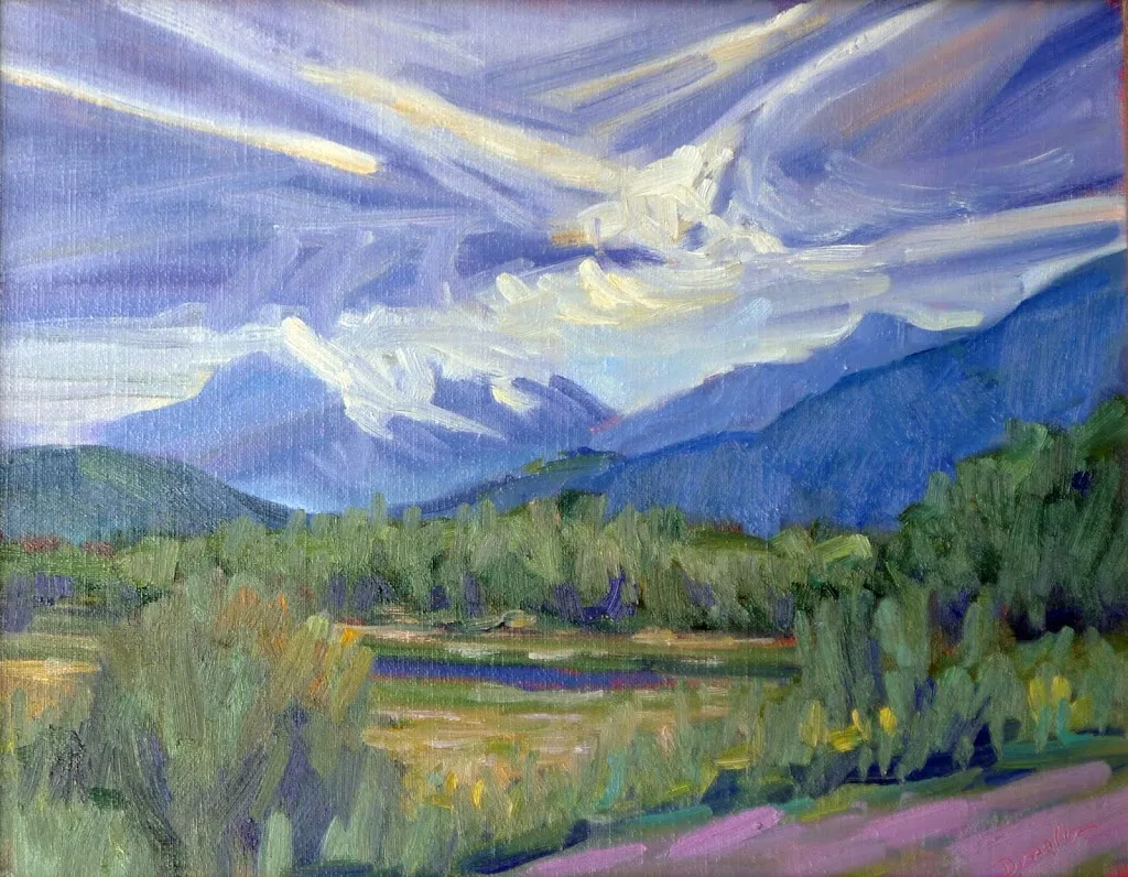
Clouds over Whiteface Mountain, oil on canvasboard, available.

Clouds are not flat. The same perspective rules that apply to objects on the ground also apply to objects in the air. We are sometimes misled about that because clouds that appear to be almost overhead are, in fact, a long distance away.

I’ve alluded before to two-point perspective. I’ve never gotten too specific because it’s a great theoretical concept but a lousy way to draw. Today I’ll explain it.

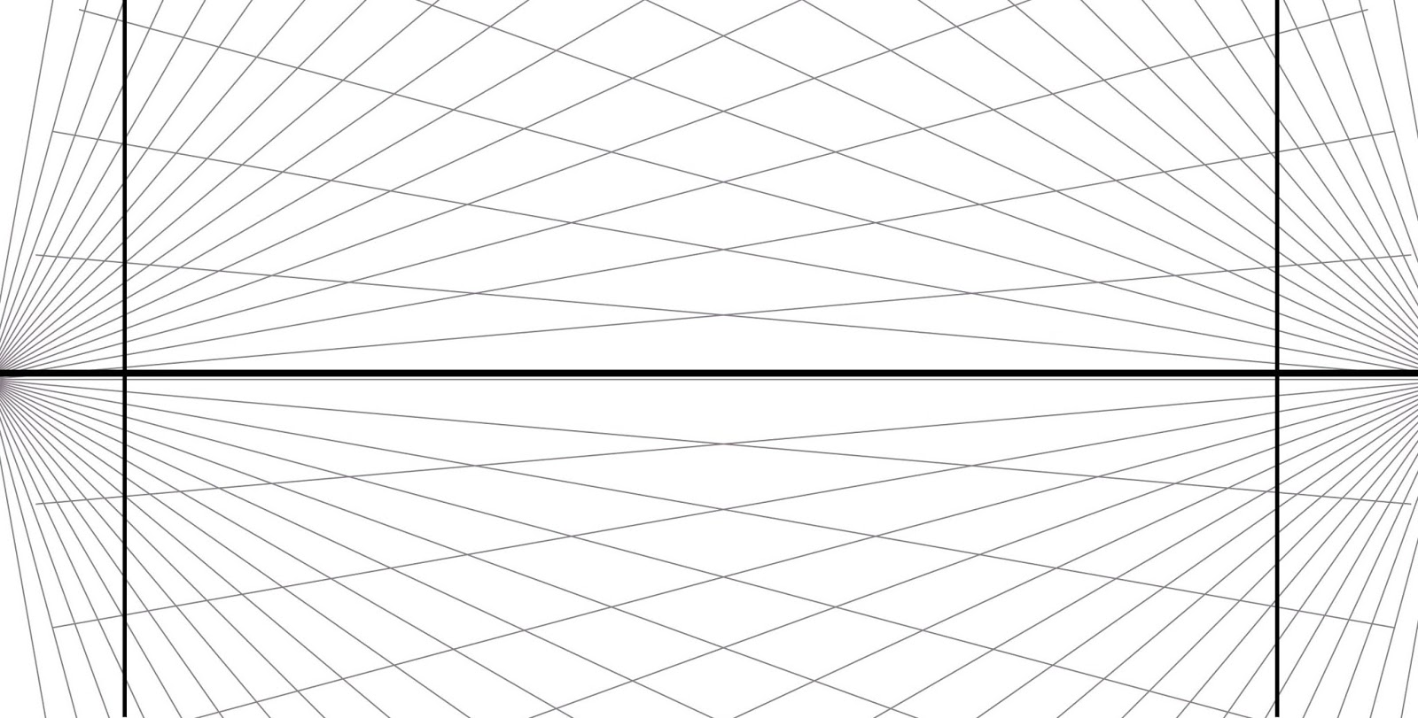
A two-point perspective grid. You don’t need to draw all those rays, just the horizon line. The vertical lines indicate the edges of your paper.

Draw a horizontal line somewhere near the middle of your paper. This horizon line represents the height of your eyeballs. Put dots on the far left and far right ends of this line, at the edges of your paper. These are your vanishing points.

All objects in your drawing must be fitted to rays coming from those points. A cube is the simplest form of this. Start with a vertical line; that’s the front corner of your block. It can be anywhere on your picture. Bound it by extending ray lines back to the vanishing points. Make your first block transparent, just so you can see how the rays cross in the back. This is the fundamental building block of perspective drawing, and everything else derives from it. You can add architectural flourishes using the rules I gave for drawing windows and doors that fit.

A cube drawn with perspective rays. It’s that simple.

I’ve included a simple landscape perspective here, omitting some of the backside lines for the sake of clarity.

As a practical tool, two-point perspective breaks down quickly. In reality, those vanishing points are infinitely distant from you. But it’s hard to align a ruler to an infinitely-distant point, so we draw finite points at the edges of our paper. They throw the whole drawing into a fake exaggeration of perspective. That’s why I started with a grid where the vanishing points were off the paper. It doesn’t fix the problem, but it makes it less obvious.

All objects can be rendered from that basic cube.

(There is also three-point perspective, which gives us an ant’s view of things, and four-point perspective, which gives a fish-eye distortion reminiscent of mid-century comic book art. And there are even more complex perspective schemes. At that point, you’ve left painting and entered a fantastical world of technical drawing.)

Basic shapes of clouds using the same perspective grid.

Still, two-point perspective is useful for understanding clouds. Clouds follow the rules of perspective, being smaller, flatter and less distinct the farther they are from the viewer. The difference is that the vanishing point is at the bottom of the object, rather than the top as it is with terrestrial objects.

Cumulus clouds have flat bases and fluffy tops, and they tend to run in patterns across the sky. I’ve rendered them as slabs, using the same basic perspective rules as I would for a house. They may be far more fantastical in shape, but they obey this same basic rule of design.

You can see that basic perspective when looking at a photo of cumulus clouds.

A flight of cumulus clouds or a mackerel sky will be at a consistent altitude. That means their bottoms are on the same plane. However, there can be more than one cloud formation mucking around up there. That’s particularly true where there’s a big, scenic object like the ocean or a mountain in your vista. These have a way of interfering with the orderly patterns of clouds.

I don’t expect you to go outside and draw clouds using a perspective grid. This is for understanding the concept before you tackle the subject. Then you’ll be more likely to see clouds marching across the sky in volume, rather than as puffy white shapes pasted on the surface of your painting.

This post was originally published on March 8, 2021.

The photograph lies but my sketch yells the truth

Stop taking snapshots you’ll never use and start sketching instead.

Collapsing shed, 9X12, oil on canvasboard, Carol L. Douglas, $696 unframed, 25% off this week.

“The photograph lies but my sketch yells the truth,” I told my student, and then gawped at what I’d just said. In our culture, we talk about ‘photographic proof’ as if it is an absolute. If you’re looking for evidence to nail a drug dealer or your philandering husband, photographs are great—although by now we all know they can be manipulated.

For guiding a painting, photos have their limits. They distort distance and spatial relationships. Modern point-and-shoot cameras (especially cell phones) blow contrast up, because that’s what buyers like. In exchange, subtle value shifts disappear.

“Great!” you answer. “You’re always telling me that paintings are an interplay of light and dark, warm and cool, so exaggerating the value structure will help, right?”

Unfortunately, the exaggeration of light and dark happens at the expense of warm and cool. On Wednesday, I painted a sketch of lupines in a field, above. There was a soft haze of mauve at the far edge of the field, created (I assume) by the immature seed heads of the grasses. In the foreground, rain-beaten weeds reflected a cool aquamarine. The light shining through the lupine leaves was yellow-green. I recorded those color shifts as accurately as I could.

My snapshot. Who would be interested in painting that wall of green?

Compare that to my snapshot of the scene. All those subtle shifts in color are washed away. We are left with a wall of green that would be horribly uninteresting in a painting. The subtle shifts in color that make lupines so beautiful are all washed out; in fact, they’re ugly in the photo. There’s nothing in this photo that would inspire me to paint.

Pincushion distortion from a telephoto lens.

Cameras are great at creating depth in the picture frame; excessively so, in fact. Cell phones are made with wide-angle lenses so we can all crowd into our selfies. Wide angle lenses expand space. Objects look further apart and more distant than normal. This exaggerates the size difference between the foreground and background, creating an illusion of greater depth than is really there.

That’s great for photos of the Rockies. It makes for laughable results when shooting pictures of the Bidens with the Carters. It also makes your photos of a barn in the middle-distance appear flat and uninteresting.

But let’s say you’re a keen photographer and you’ve invested in a top-end Nikon with interchangeable lenses (as I did before my Argentina trip). You can also create equally-bad distortion with a telephoto lens. They compress space, making objects appear larger and closer together than normal. That spatial compression creates great abstractions, but it also distorts perspective.

Prospettiva accidentale di una scala a tre rampe, eseguita con il metodo dei punti misuratori, 1995, Luciano Testoni, courtesy Wikipedia.

The farther away we are from an object, the flatter the perspective. In the beautiful drawn example above, the top line is the horizon. The closer we get to the it (our furthest point), the flatter the lines get. So, if you take a photo of a beautiful building on a far hill with your 300 mm telephoto lens, the perspective will be flattened out of all recognition.

Photos have their place, but for recording impressions, working from life is always better. That means sketching instead of taking snapshots. The human brain has a remarkable capacity to interpret and interpolate information. We can access that quickly, with nothing more complex than a pencil and paper. In a world filled with lies, you can usually trust your own eyes to tell you the truth.

Monday Morning Art School: creating depth in your paintings

Paintings with depth engage our minds more and keep us looking longer.

Sunlight on the Coast, 1890, Winslow Homer, courtesy Toledo Museum of Art

Pictorial depth in a painting, is—of course—not real. It’s an illusion, suggested by cues that help the observer translate a 2D image to a 3D space. These cues include shadows, size, and lines that dwindle into the horizon.

Since the human mind is programmed to perceive depth, the artist doesn’t have to work terribly hard to engage his viewer. We can break the tools we use into three distinct approaches, however, and then see how we can move beyond the most obvious into more challenging approaches.

The first is to create receding bands of content. Larger objects create a screen through which we see a layer of smaller objects behind them. The human eye records this as distance. Painterly marks decrease in size along with objects, the farther we travel into the painting.

Tired Salesgirl on Christmas Eve, date unknown, Norman Rockwell, courtesy Christies. This is the acme of layered planes for effect; we don’t even notice that there’s no real perspective.

I had a painting teacher who kvetched that this was all Norman Rockwell ever did, to which I responded that he did it very well for a guy who was churning out weekly magazine covers. I’ll cede the point though. This is the least difficult design concept, and it can prove static, especially when it takes the form of a lonely tree posed against a far hill.

The second method is to establish perspective with lines that move into the distance. This is sometimes simplified into the idea of “a path into the painting.” This may not be a literal path but rather a design armature. In paintings like this, we are seeing over the objects, and they recede into distance, drawing us in with them.

High Surf Along the Laguna Coast, Edgar Payne, before 1947, courtesy Wikimedia Commons

The two paintings above, by Winslow Homer and Edgar Payne, illustrate the difference. Homer has established his design with walls of water and rock, which we’re allowed to peek over. In Payne’s painting, we’re above the roiling surf, and we follow it back into the distance.

For this latter kind of painting to work, the artist must have excellent drawing chops, because the relative sizes of the objects, their placement, their angle, and—above all—the negative shapes, must be spot on. So, if you want to graduate from the first kind of perspective to the second, keep practicing your drawing.

The third kind of perspective is atmospheric. This relies on some general optics rules that are based on the interference of bouncing light and dust in the atmosphere:

  1. Far objects are lower in contrast and generally lighter in color.
  2. Far objects are generally lower in chroma than near objects, because:
  3. Warm colors drop out over distance.

First the reds drop out, next, the yellows drop out, leaving us with blue-violet. Which is how we end up with “purple mountain majesty” as we approach the Rockies, or did, before excessive growth on the Front Range polluted the skies.

Payne Lake, before 1948, Edgar Payne, courtesy Steven Stern Fine Arts

Psychologists have researched the subject of distance perception (of course) and it turns out that depth perception is linked to our higher thinking. That’s no surprise, since visual cues are very basic for survival. From that, we can construe that paintings with depth engage our minds more and keep us looking longer.

Monday Morning Art School: Perspective

Every landscape painter should understand two-point perspective, but don’t draw those rays in the field.

Midsummer, by Carol L. Douglas. It’s important to understand perspective, but don’t use those vanishing points when drawing in the field.

A door is commonplace, but it’s also a series of repeating shapes that can teach you a lot about perspective. If you have a choice, use a door with panels like this one. A flat slab door will be so much less fun to draw.

I left mine slightly ajar, but it doesn’t have to be. Seat yourself as far away as you can get from it. The closer you are, the more difficult it is to keep your measurements straight. Position yourself at an angle to it so you can think about perspective.

This is intended to be a fast drawing, taking you no more than 15 or 20 minutes. The same rules apply to a careful drawing, of course; you’d just be more meticulous in your measuring and marking. But you’ll learn just as much going fast.

My first task is to figure out the angles of the top and bottom of the door. (My camera distorts perspective so what’s in the photo won’t match what’s on my drawing.) I do that by holding my pencil along the bottom of the door and figuring out the angle.

I find that setting my pencil down on my paper at the appropriate angle helps me see it better.

Then I do the exact same thing on the top.

Note that the shelf at my eye level is completely horizontal. Any level surface at eye level has to be horizontal; that’s a hard-and-fast rule. 

Two-point perspective, courtesy Luciano Testoni. All those lines traveling off to the vanishing points on the left and right? Let’s call them rays.

The picture above is classical two-point perspective with a lot of extra bells and whistles. I don’t want you to get bogged down in it; I included it so you can compare the rays in that drawing to what you see in your room. Notice that when you look at lines high in your room, the ‘rays’ travel downward to the sides, where the so-called ‘vanishing points’ are. When you look at objects near the floor, the rays travel upward to the vanishing points. That’s because the vanishing points are always at the viewer’s eye level. 

Every landscape painter should understand two-point perspective, but should never draw those rays in the field. Like every other kind of 3D projection, it’s useful in drafting, but it is a falsehood when it comes to what you’re actually seeing. That’s because the vanishing points would be so far away in the real world as to be rendered useless.

But you can take away some useful information from two-point perspective. The farther away an object is, the less perspective distortion there is. And perspective works the same way above the horizon line as below it, so clouds are arrayed the same way trash cans are.

Next, I do that nifty measuring thing that involves holding my pencil in front of my eye and using it as a ruler. Since the height is already determined by my angled lines, I just need to figure out how wide the door is relative to the height. I figured the door is a little less than half as wide as it was tall. Later, I’ll find out just how off I was.

This shape is called a trapezoid, and there’s an easy way to find its center. Just draw an X from corner to corner as shown. That’s very useful information in perspective drawing, because it helps you place windows, doors, roof peaks, etc. correctly. Make a habit of finding it.

And here’s a quick-and-dirty way to get the perspective right. Divide the two side lines into equal units—thirds, quarters, eighths, or whatever other units you can mark off by eye. Then just draw lines connecting the corresponding sides. The 1/3 point on the left gets attached to the 1/3 point on the right, etc. You’ll have the perspective rays right in one try.

I never get my measurements right on the first try, so I’ve learned to not fuss too much on my initial measurements. The great thing about repeating shapes is that your mistakes are easy to see. I realized the door was slightly too short and wide, so I adjusted them slightly.

I can’t draw a straight line without a ruler, and my initial drawing had a free-hand curl on the right-bottom corner. I took a moment to correct that. Note how useful the center point is in placing the central spine of the door. I know that the moulding around the glass is the same width all around, so this is one of those repeating shapes I can use to check my work. (Of course, it’s going to be ever so slightly wider on the side closer to me, because of perspective.)

My final drawing. You can finish yours to your heart’s content, but the important part is learning how to use your pencil as a marker to see angles and distances.

This post originally appeared on November 17, 2017.

Monday Morning Art School: ellipses with a recipe thrown in

Learn how to draw a pie plate, dish, cup, or vase. I’m throwing in my pie crust recipe, so you can learn to make a pie, too.

When drawing round objects, we have to look for the ellipses, which are just elongated circles. Ellipses have a horizontal and a vertical axis, and they’re always symmetrical (the same on each side) to these axes.
The red lines are the ellipse and its vertical and horizontal axes. The two sides of the axes are mirror images of each other, side to side and top to bottom.
This is always true. Even when a dish is canted on its side, the rule doesn’t change; it’s just that the axes are no longer vertical or horizontal to the viewer.
Same axes, just tipped.
As always, I started by taking basic measurements, this time of the ellipse that forms the inside rim of the pie plate. (My measurements won’t match what you see because of lens distortion.)
This was where I learned that I couldn’t balance a pie plate on the dashboard in my husband’s old minivan.
An ellipse isn’t pointed like a football and it isn’t a race-track oval, either.
It’s possible to draw it mathematically, but for sketching purposes, just draw a short flat line at each axis intersection and sketch the curve freehand from there.
The inside rim of the bowl.

There are actually four different ellipses in this pie plate. For each one, I estimate where the horizontal axis and end points will be. The vertical axis is the same for all of them.

The horizontal axis for the bottom of the pie plate.

Next, I find the horizontal axis for the rim, and repeat with that. It’s the same idea over and over. Figure out what the height and width of each ellipse is, and draw a new horizontal axis for that ellipse. Then sketch in that ellipse.

Three of the four ellipses are in place.

Because of perspective, the outer edge of the rim is never on the same exact horizontal axis as the inner edge, but every ellipse is on the same vertical axis. We must observe, experiment, erase and redraw at times. Here all four ellipses are in place. Doesn’t look much like a pie plate yet, but it will.

Four ellipses stacked on the same vertical axis.

If I’d wanted, I could have divided the edge of the dish by quartering it with lines. I could have then drawn smaller and smaller units and gotten the fluted edges exactly proportional. But that isn’t important right now. Instead, I lightly sketched a few crossed lines to help me get the fluting about right. It’s starting to look a little more like a pie plate.

The suggestion of rays to set the fluted edges.

Now that you’ve tried this with a pie plate, you can practice with a bowl, a vase, a wine glass, or any other glass vessel.

Voila! A pie plate!

Meanwhile, here’s my pie-crust recipe. Nobody in their right mind would ask me to cook, but I can bake.

Double Pie Crust

2.5 cups all-purpose white flour, plus extra to roll out the crusts
2 tablespoons sugar
1 Âź teaspoon salt
12 tablespoons lard, slightly above refrigerator temperature, cut into ½” cubes.
8 tablespoons butter, slightly above refrigerator temperature, cut into ½” cubes.
7 teaspoons ice water
Thoroughly blend the dry ingredients. (I use a food processor, but the process is the same if you’re cutting the fat in by hand.) Cut in the shortening (lard and butter) with either a pastry blender or by pulsing your food processor with the metal blade. It’s ready when it is the consistency of coarse corn meal. (If it’s smooth, you’ve overblended.) Sprinkle ice water over the top, then mix by hand until you can form a ball of dough. If the dough seems excessively dry, you can add another teaspoon of ice water, but don’t go nuts.
Divide that ball in two and flatten into disks. Wrap each disk in wax paper, toss the wrapped disks into a sealed container and refrigerate until you’re ready to use them.
Don’t worry if the dough appears to be incompletely mixed or the ball isn’t completely smooth; mine comes out best when it looks like bad skin.
Let the dough warm just slightly before you start to roll it out. And while you don’t want to smother the dough with flour when rolling, you need enough on both the top and the bottom of the crust that it doesn’t stick. If you’re doing this right, you should be able to roll the crust right up onto your rolling pin and unroll it into your pie plate with a neat flourish.
(If you’ve never rolled out a pie crust, watch this.)
I use this crust for single- or double-crusted, fruit and savory pies.

Monday Morning Art School: think in contours

The closer the object, the more foreshortening and distortion there is. Objects at a distance appear to have almost no perspective at all.
Shoes, by Carol L. Douglas
Every object, we have been famously taught, is comprised of simple shapes—globes, cylinders, cubes—stacked together. That’s absolutely true… until it stops being true. There are some shapes that are organic and asymmetrical. A shoe is a great example. It has evolved to accommodate the human foot, not to obey the laws of symmetry.
When we draw these shapes, we must draw their contours. This is different from a contour drawing, which is just an outline. I’m talking about contours in the sense of a topographic map, which shows us the bumps on the earth’s surface.
I drew my examples during church on Sunday. It was so crowded I sat behind the sound booth. There was a molded plastic wastebasket which is neither rectangular nor round; instead it’s a splashy combination of the two.
I started by drawing the cross at the top to give me the orientation of the bin. From there I drew the best approximation of the shape that I could come up with, but it wasn’t until I segmented it into planes that I could correct my drawing errors.
This looks like a very simple drawing, and it’s quite small (about 1.5 inches tall). However, it took a long time to get the contour lines right. I measured, erased, and measured again. Shading and detail is almost irrelevant; In the end, it’s getting the contour right that makes a drawing successful.
I repeated the process with a Dunkin Donuts cup. It was on a ledge above my head, so its perspective is reversed from what we usually expect. Its symmetry made the drawing easier, since it is really just a series of cylinders of differing widths. But again, it’s getting the contour lines right that make the drawing work.
This was so much fun that I decided to apply the same system to a gentleman sitting nearby. It’s always the same system, whether it’s a glass, a person, or a building—find the shapes and mark out their planes.
Rockport Harbor, by Dwight A. Perot (courtesy of the artist)
I was sitting close to the cup and the wastebasket, so their perspective is quite pronounced. The closer the object, the more foreshortening and distortion there is. In the photo above, you can see the reverse effect, as happens with a telephoto lens. Objects far away from us appear to have almost no perspective at all. The telephoto lens faithfully records that, and it looks ‘wrong’. From a long distance the difference in scale and, thus the foreshortening, is almost meaningless.
Your assignment—should you choose to accept it—is to find an object in your house that’s rounded; in other words, one that’s not a box. Break it down into contour lines indicating the shifting planes and curves.

Monday Morning Art School: perspective of boats

Don’t fall into the trap of drawing what you know instead of what you see.
The Bridge at Argenteuil, 1874, Claude Monet. All three waterlines are parallel to the horizon.
I prefer painting from a floating dock, where I’m at eye-level with the boats regardless of the tide. However, on Friday, I found myself up on the wall looking across Camden Harbor. That creates a different perspective.
The horizon line in a drawing is the viewer’s eye level, regardless of where the viewer is standing. At the top of Mount Rainier, your horizon line is around 14,410 feet above sea level, and everything is below you. If you’re swimming in the Caribbean, your horizon line is about three inches above sea level and everything but the sharks are above you.
I explained basic perspective in this post about drawing clouds; the exact same rules apply to boats, except that everything is flipped over. We can see down into objects that are at our feet, but not into objects at the same level that are far away. The farther away the object is, the more horizontal our gaze is as we look at it. Our measly 5 or 6 feet in height is nothing compared to the distance across. 
When a boat is a few hundred feet away in the water, it’s for all intents and purposes at eye level. Its waterline is almost absolutely flat, regardless of whether you’re looking at its side, transom, or bow.
The Seine at Argenteuil, 1872, Alfred Sisley. Although it’s also from towpath height, Sisley included more foreground, creating the sense that we are looking down into the Seine.
During the 1870s and 1880s Argenteuil, northwest of Paris on the Seine, became an important painting location for the Impressionists. They immortalized its bridges and boats from every conceivable angle.
We can infer Monet’s point of view in the top painting as being about equal to the house across the river. In other words, he was standing on a towpath. That allows us to see into the boat slightly, as we’re at mast height to it and it’s close to the near bank. We cannot see into the far boats at all. Note that the far bank and the waterlines of the far boats are parallel to the horizon. The bridge, which reaches across the river to us, is not.
Alfred Sisley’s painting is from the same height, but he’s given us more foreground, and therefore the sense of looking down into the water. But while the tree in the river is definitely below us, the boats are not. Again, their waterlines are parallel to the horizon. The river bends, and the land curves away, but the curve is very gradual.
Boating, 1874, Édouard Manet. Here we’re looking straight down into the boat from impossibly close quarters.
We are definitely looking down into Édouard Manet’s pleasure boat in his 1872 painting done on the same river. Manet has us practically standing on the rail looking down into the well of the boat. The horizon isn’t even visible. It would be yards above the boaters’ heads.
An example of incorrectly drawn boats.
Ignoring these rules results in the most common error I see in painting boats. This is from an example I picked up on the internet. The boats are close to the horizon but we still seem to be looking down into them. In fact, the closest boat is at about the angle of Manet’s Boating. This is an impossibility, as the three masterpieces from Argenteuil have demonstrated.
This happens frequently with painters unaccustomed to boats. I think it is a case of painting what we think we know vs. what we see. We know that boats have form, therefore they must have perspective, too. Well, they do, but it’s very subtle from the distance we usually see them.

Monday Morning Art School: drawing clouds

Clouds are objects with volume, obeying the rules of perspective.

Whiteface makes its own weather, by Carol L. Douglas
Clouds are not flat. The same perspective rules that apply to objects on the ground also apply to objects in the air. We are sometimes misled about that because clouds that appear to be almost overhead are, in fact, a long distance away.
I’ve alluded before to two-point perspective. I’ve never gotten too specific because it’s a great theoretical concept but a lousy way to draw. Today I’ll explain it.
A two-point perspective grid. You don’t need to draw all those rays, just the horizon line and the two vanishing points.

Draw a horizontal line somewhere near the middle of your paper. This horizon line represents the height of your eyeballs. Put dots on the far left and far right ends of this line. These are your vanishing points.

A cube drawn with perspective rays. It’s that simple.

All objects in your drawing must be fitted to rays coming from those points. A cube is the simplest form of this. Start with a vertical line; that’s the front corner of your block. It can be anywhere on your picture. Bound it by extending ray lines back to the vanishing points. Make your first block transparent, just so you can see how the rays cross in the back. This is the fundamental building block of perspective drawing, and everything else derives from it. You can add architectural flourishes using the rules I gave for drawing windows and doors that fit.

All objects can be rendered from that basic cube.

I’ve included a simple landscape perspective here, omitting some of the backside lines for the sake of clarity. (I apologize for the computer drawing; I’m recovering from surgery and it’s hard to draw with my foot up.)

As a practical tool, two-point perspective breaks down quickly. In reality, those vanishing points are infinitely distant from you. But it’s hard to align a ruler to an infinitely-distant point, so we draw finite points at the edges of our paper. They throw the whole drawing into a fake exaggeration of perspective. That’s why I started with a grid where the vanishing points were off the paper. It doesn’t fix the problem, but it makes it less obvious.
Staircase in two-point perspective, 1995, Luciano Testoni
The example above is from Wikipedia’s article on perspective. It’s a masterful drawing, but it isn’t true two-point perspective, because he tosses in several additional points. There is also three-point perspective, which gives us an ant’s view of things, and four-point perspective, which gives a fish-eye distortion reminiscent of mid-century comic book art. And there are even more complex perspective schemes. At that point, you’ve left fine art and entered technical drawing.
Still, two-point perspective is useful for understanding clouds. Clouds follow the rules of perspective, being smaller, flatter and less distinct the farther they are from the viewer. The difference is that the vanishing point is at the bottom of the object, rather than the top as it is with terrestrial objects.
Basic shapes of clouds using the same perspective grid.
Cumulus clouds have flat bases and fluffy tops, and they tend to run in patterns across the sky. I’ve rendered them as slabs, using the same basic perspective rules as I would for a house. If I wasn’t elevating my foot, I’d have finished this by twisting and changing their shapes in my imaginary bounding boxes.
Mackerel sky forming over the Hudson, by Carol L. Douglas
A flight of cumulus clouds or a mackerel sky will be at a consistent altitude. That means their bottoms are on the same plane. However, there can be more than one cloud formation mucking around up there. That’s particularly true where there’s a big, scenic object like the ocean or a mountain in your vista. These have a way of interfering with the orderly patterns of clouds.
I don’t expect you to go outside and draw clouds using a perspective grid. This is for experimenting at home before you go outside. Then you’ll be more likely to see clouds marching across the sky in volume, rather than as puffy white shapes pasted on the surface of your painting.
It’s about time for you to consider your summer workshop plans. Join me on the American Eagle, at Acadia National Park, at Rye Art Center, or at Genesee Valley this summer.

Monday Morning Art School: how to draw windows and doors that fit

 The South sure loves its Greek Revival pillars, doors and windows. Here’s a little trick to draw them evenly.

My painting of Siloam Baptist Church from last week.

The South also observes Blue Laws. That meant I wasn’t able to get a replacement sketchbook at Hobby Lobby yesterday. I drew these on tissue paper; the quality is terrible.

Earlier, I taught you how to draw a door in basic perspective. The door makes a shape called a trapezoid. (Don’t be frightened; that’s as mathematical as we’re going to get here.) When drawing buildings, most people get basic two-point perspective right but then mess up in spacing windows and doors. Here’s a technique you can use to divide the face of any building into regular units, no matter what angle you are looking at it from.
Dividing in half
Just draw an X from corner to corner. The vertical line that runs through the middle of this X is the center of your building. This is very useful for buildings, because if there’s a pitched roof, it almost always comes down from that center point.

Dividing into thirds

Draw a star shape, starting from the bottom outside corners and running to the top-middle and the top-outside corners.
Do the same thing, upside down, so that you have a six-pointed star.
The points where the lines intersect are the thirds.
Dividing into fourths
This requires that you figure out the middle of one side of your trapezoid. Then draw a line between it and the middle-point. Now you have the horizontal center-line. It will not be level; it should hit both sides at the mid-point.
Draw your star-shape again. The points where it intersects the center line are the quarters.
Dividing into fifths

This is the most complicated and fun of the divisions. Start with a horizontal center-line as you did above.
Now you’re going to draw some crazy diagonals:
  • From the bottom left corner to the top middle.
  • From the bottom middle to the top right.
  • From the top left to the right middle.
  • From the middle left to the right bottom.

The points where those diagonals meet are the 1/5 divisions.
In practice you can divide and subdivide these units to figure out the placement of windows and doors pretty quickly. Here is my division of Siloam Baptist Church, above (yes, the bottom line was wrong; I fixed it after I took this photo):
And here is a fast division of my first drawing. I just broke the units I had into smaller ones using the same principles:
Which I then extrapolated into this purely imaginary facade of a house:
I didn’t do any of this with a ruler, but with another piece of paper as a straight-edge. Once you learn these divisions of space, they take only seconds to do. They are much easier than guessing and erasing.

Monday Morning Art School: pie plates and pies

Learn how to draw a pie plate, dish, cup, or vase. I’m throwing in my secret pie crust recipe, so you can learn that too.

When drawing round objects, we have to look for the ellipses, which are just elongated circles. Ellipses have a horizontal and a vertical axis, and they’re always symmetrical (the same on each side) to these axes.

The red lines are the ellipse and its vertical and horizontal axes. The two sides of the axes are mirror images of each other, side to side and top to bottom.

Same axes, just tipped.

This is always true. Even when a dish is canted on its side, the rule doesn’t change; it’s just that the axes are  no longer vertical or horizontal to the viewer.

This is where I learned that I can’t balance a pie plate on the dashboard while traveling.

As always, I started by taking basic measurements, this time of the ellipse that forms the inside rim of the pie plate. (My measurements won’t match what you see because of lens distortion.)

The inside rim of the bowl.

An ellipse isn’t pointed like a football and it isn’t a race-track oval, either.

It’s possible to draw it mathematically, but for sketching purposes, just draw a short flat line at each axis intersection and sketch the curve freehand from there.
The horizontal axis for the bottom of the pie plate.

There are actually four different ellipses in this pie plate. For each one, I estimate where the horizontal axis and end points will be. The vertical axis is the same for all of them.

Three of the four ellipses are in place.
Next I find the horizontal axis for the rim, and repeat with that. It’s the same idea over and over. Figure out what the height and width of each ellipse is, and draw a new horizontal axis for that ellipse. Then sketch in that ellipse. The pencil marks are freehand; the red is measured on my computer. 
Four ellipses stacked on the same vertical axis.

Because of perspective, the outer edge of the rim is never on the same exact horizontal axis as the inner edge, but every ellipse is on the same vertical axis. We must observe, experiment, erase and redraw at times. Here all four ellipses are in place. Doesn’t look much like a pie plate yet, but it will.

The suggestion of rays to set the fluted edges.
If I’d wanted, I could have divided the edge of the dish by quartering it with lines. I could have then drawn smaller and smaller units and gotten the fluted edges exactly proportional. But that isn’t important right now. Instead, I lightly sketched a few cross did lines to help me get the fluting about right. It’s starting to look a little more like a pie plate.
Voila! A pie plate!
Now that you’ve tried this with a pie plate, you can practice with a bowl, a vase, a wine glass, or any other glass vessel. Meanwhile, here’s my pie-crust recipe. Nobody in their right mind would ask me to cook, but I can bake. This week I noticed that while I have a written recipe, I’ve changed it around enough that it’s unrecognizable.

I use a food processor, but the principle is the same doing it by hand.

Double Pie Crust
2.5 cups all-purpose white flour, plus extra to roll out the crusts
2 tablespoons sugar
1 Âź teaspoon salt
12 tablespoons lard, slightly above refrigerator temperature, cut into ½” cubes.
8 tablespoons butter, slightly above refrigerator temperature, cut into ½” cubes.
7 teaspoons ice water
Thoroughly blend the dry ingredients. Cut in the shortening (lard and butter) with either a pastry blender or by pulsing your food processor with the metal blade. It’s ready when it is the consistency of coarse corn meal. (If it’s smooth, you’ve overblended.) Sprinkle ice water over the top, then mix by hand until you can form a ball of dough. If the dough seems excessively dry, you can add another teaspoon of ice water, but don’t go nuts.

Divide that ball in two and flatten into disks. Wrap each disk in wax paper, toss the wrapped disks into a sealed container and refrigerate until you’re ready to use them.
Don’t worry if the dough appears to be incompletely mixed or the ball isn’t completely smooth; mine comes out best when it looks like bad skin.
Let the dough warm just slightly before you start to roll it out. And while you don’t want to smother the dough with flour when rolling, you need enough on both the top and the bottom of the crust that it doesn’t stick. If you’re doing this right, you should be able to roll the crust right up onto your rolling pin and unroll it into your pie plate with a neat flourish.

(If you’ve never rolled out a pie crust, watch this.)
I use this crust for single- or double-crusted, fruit and savory pies.