Paintings with depth engage our minds more and keep us looking longer.
 |
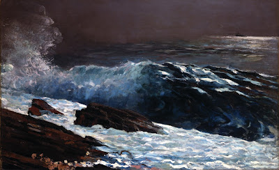
| Sunlight on the Coast, 1890, Winslow Homer, courtesy Toledo Museum of Art |
Pictorial depth in a painting, is—of course—not real. It’s an illusion, suggested by cues that help the observer translate a 2D image to a 3D space. These cues include shadows, size, and lines that dwindle into the horizon.
Since the human mind is programmed to perceive depth, the artist doesn’t have to work terribly hard to engage his viewer. We can break the tools we use into three distinct approaches, however, and then see how we can move beyond the most obvious into more challenging approaches.
The first is to create receding bands of content. Larger objects create a screen through which we see a layer of smaller objects behind them. The human eye records this as distance. Painterly marks decrease in size along with objects, the farther we travel into the painting.
 |
| Tired Salesgirl on Christmas Eve, date unknown, Norman Rockwell, courtesy Christies. This is the acme of layered planes for effect; we don’t even notice that there’s no real perspective. |
I had a painting teacher who kvetched that this was all Norman Rockwell ever did, to which I responded that he did it very well for a guy who was churning out weekly magazine covers. I’ll cede the point though. This is the least difficult design concept, and it can prove static, especially when it takes the form of a lonely tree posed against a far hill.
The second method is to establish perspective with lines that move into the distance. This is sometimes simplified into the idea of “a path into the painting.” This may not be a literal path but rather a design armature. In paintings like this, we are seeing over the objects, and they recede into distance, drawing us in with them.
 |
|
High Surf Along the Laguna Coast, Edgar Payne, before 1947, courtesy Wikimedia Commons |
The two paintings above, by Winslow Homer and Edgar Payne, illustrate the difference. Homer has established his design with walls of water and rock, which we’re allowed to peek over. In Payne’s painting, we’re above the roiling surf, and we follow it back into the distance.
For this latter kind of painting to work, the artist must have excellent drawing chops, because the relative sizes of the objects, their placement, their angle, and—above all—the negative shapes, must be spot on. So, if you want to graduate from the first kind of perspective to the second, keep practicing your drawing.
The third kind of perspective is atmospheric. This relies on some general optics rules that are based on the interference of bouncing light and dust in the atmosphere:
- Far objects are lower in contrast and generally lighter in color.
- Far objects are generally lower in chroma than near objects, because:
- Warm colors drop out over distance.
First the reds drop out, next, the yellows drop out, leaving us with blue-violet. Which is how we end up with “purple mountain majesty” as we approach the Rockies, or did, before excessive growth on the Front Range polluted the skies.
 |
|
Payne Lake, before 1948, Edgar Payne, courtesy Steven Stern Fine Arts |
Psychologists have researched the subject of distance perception (of course) and it turns out that depth perception is linked to our higher thinking. That’s no surprise, since visual cues are very basic for survival. From that, we can construe that paintings with depth engage our minds more and keep us looking longer.

Thank you for your informative guidance. Can’t wait to apply these principles in my next painting.