Penny-wise, pound foolish

Cheap materials or weird deviations from process inevitably lead to disastrous results, but artists keep doing it.

Untitled (Floral), 1960, Morris Louis, showing deterioration of untreated cotton duck ground, courtesy the Museum of Fine Arts, Houston (it’s since been restored).

This week, I’m assembling materials for my watercolor workshops aboard schooner American Eagle. I’m giving them QOR watercolors by Golden. These are professional-quality paints, not student-grade—even though some of my students will have never painted before. I want to create impassioned painters, and bad materials are the best way to nip creativity in the bud.

Cheap materials are only part of the problem. There’s a mistaken association between ephemeral materials and ‘authenticity’ that arose in the latter part of the 20th century. It echoes today, and drives artists to experiment with painting on cardboard, collaging paper with oil paints and other unstable methods.

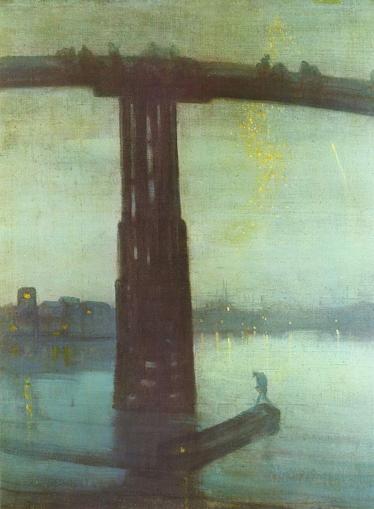
Misty Moonlight, c. 1885, Albert Pinkham Ryder, courtesy Crystal Bridges Museum of American Art

“I was beginning to wonder if it was just the art historian in me, but I see people using such unbelievable crap in their artwork and it makes me shake my head,” a reader wrote.

There are vogues that sometimes result in spurious results. Oiling out is a traditional technique where a hint of linseed oil is applied to a dried layer to make the next layer appear to sink into it. A variation appeared about a decade ago. Painters would paint into a soup of wet medium. It was supposedly okay because the medium was fast-drying alkyd, and it allowed mediocre painters to produce something that looked like Tonalism.

Moonlight, c. late 1880s–1890s, Ralph Albert Blakelock, courtesy Phillips Collection

I was immediately reminded of the sad fate of Ralph Blakelock’s paintings. He was a Tonalist, also interested in luminosity. He tinkered with his paint application in search of new effects. Unfortunately, many of his canvases are badly deteriorated because of it.

Another painter whose work has rotted out because of bad technique is Albert Pinkham Ryder. Ryder built up his paintings with layers of paint, resin, and varnish applied haphazardly on top of each other. He painted into wet varnish and disregarded the different dry times of his pigments. He experimented with candle wax, bitumen and novel oils. That gave his paintings the luminosity that he was aiming for, but at a price.

Paintings by Ryder are consistent only in their instability. They’ve darkened seriously over time and developed terrible cracks and crazing. In some cases, they’ve never fully dried or have completely disintegrated.

There are only a few oils with natural drying properties. These are linseed, tung, poppy seed and walnut oil. Non-drying oils like almond or olive oil are never suitable for oil painting

Similarly dubious is the process of starting a painting in acrylics and then finishing it with oils. It’s unnecessary once the painter masters the process of wet-on-wet painting, and it has no long history proving it to be archivally sound. We know that the reverse (acrylic over oil) delaminates almost immediately. That means the layers do not bond.

I learned to paint back in the 1970s with a homemade medium comprised of turpentine, Damar varnish, linseed oil and a drop of cobalt drier. It was fairly standard for the time. I used it until I spent a day wandering around the Albright-Knox Art Gallery looking at the terrible cracks and crazes in Clyfford Stillpaintings. The 20th century masters are not paradigms of painting technique; many of their paintings are now in terrible shape. Zinc oxide grounds were much in vogue at the time, and the heavier cadmium pigments are pulling away from them now.

Companies like Grumbacherand Gamblin hire chemists to make and test materials. I trust them far more than I trust my own judgment in chemistry.

Bad grounds are a chronic problem for conservators. “Morris Louis did wonderful color work on unprimed canvas,” my reader noted. “Museums tear their hair out.” Yes, a good ground can be expensive, but it will extend the life of your paintings—and make the painting itself easier. If you insist on painting on cardboard, make sure you insulate it from your paint with an acrylic or PVA sealant.

Oil painting is 1400 years old. There’s not much that hasn’t been tried in that time, and the standard protocol we use today is the result of that trial-and-error. Cheap materials and weird deviations inevitably lead to disastrous results, but artists keep doing it. That’s a misdirection of creativity.

Falling apart

A plea to use traditional materials and practices in painting, whenever you can.
American Landscape with Indian Camp, by Ralph Blakelock, showing the damage that can result from tinkering with technique.

Yesterday I mentioned the deterioration in Albert Pinkham Ryder’s paintings. He was not, by any means, the only painter whose work has suffered over time.
Prior to the 19th century, painters had a limited range of materials at their disposal: vegetable oils, waxes, plant gums and resins, and eggs, milk, and animal hides. Pigments were made by either grinding minerals or extracting dyes from plants and insects.  Some of the extracted pigments turned out to be fugitive (meaning they aren’t light-fast) but generally those old paintings are in remarkably good condition.
Holy Virgin Mary by Chris Ofili. Now, seriously, how does a conservator preserve elephant dung stuck to a canvas?
The 19th and 20th centuries were a period of constant modification of materials. Some changes have been inarguably for the better—for example, there would have been no Impressionism had there not been an explosion of new pigments in the mid-19th century.
Whenever I visit the modern collection at the Albright-Knox Art Gallery I am struck anew by how badly some of their paintings have aged.  20th century artists had no reason not to use the tremendous variety of synthetic materials that industry was creating—synthetic media, plastics, adhesives, and drying agents. As the definition of what constituted painting broke down, artists also incorporated materials the ancients would have understood to be ephemeral or beneath their calling: dung, straw, paper, urine, blood, etc.
Woman, by Willem de Kooning, 1965. He definitely experimented with obscure additives to keep his paints open longer, but so far scientists haven’t actually found any mayonnaise in his paintings.
Willem de Kooning, for example, allegedly mixed house paint, safflower oil, water, oil and egg in with his paints. Some surfaces of his paintings remain soft and sticky fifty years later, which has to present a bit of a problem for conservators. Anselm Kiefer has used lead, sand and straw in many of his paintings.
Learning to paint in the 1960s and 1970s, I used a medium made of equal parts varnish, turpentine and linseed oil, with a few drops of cobalt drier thrown in. Having seen the ghastly cracking of fifty-year-old paintings made with this medium, I decided that medium shouldn’t be a DIY project. Better to trust the scientists who work for the reputable paint manufacturers.
Mildew attacking orange paint in a Clyfford Still painting. Courtesy Clyfford Still Museum.
Another technique I discontinued is underpainting my oil paintings in acrylics. Certainly, oil-over-acrylic won’t delaminate the way acrylic-over-oil will, but who can say how the two paint systems will interact over time? I think it’s fine to paint in oils on acrylic-primed canvas, but any part of the painting that shows through (and that includes the toning) should be done in oils.
It was trendy a few decades ago to dismiss the archival aspects of painting, to embrace the ephemeral. If de Kooning is the equal of Rembrandt, why would we not want to see his works survive for the ages?
This post first appeared on October 6, 2013. I realize my use of Yupo is inconsistent with this viewpoint, but I believe it to be chemically compatible with watercolor. 

In looking for this, I came across posts about the 2013 government shutdown. The more things change


The trouble with nocturnes

Modern nocturnes document only the contrast between bright lights and the void. There are so many other cool things that go bump in the night.

Nocturne in Blue and Gold: Old Battersea Bridge, c. 1872-1875, James Abbott McNeill Whistler

Yesterday, a student was describing a late-evening sky she had seen, with the objects bathed in an unusual warm light. “I’m sick of nocturnes always being done in Prussian blue fading to black,” she complained. Since she has an MA in art history and works in a gallery, she’s not talking through her hat.

“We always paint nocturnes wearing headlamps,” said another student. “The human eye takes about 25 minutes to fully adapt from bright sunlight to complete darkness, and the headlamp continuously interrupts that. Cameras lie, too, about what darkness looks like.”
The Polish Rider, 1655, Rembrandt van Rijn 
She had just explained the technical problem with painting nocturnes in a nutshell. They are driven by our current technology—headlamps and easel lights—just as the high contrast of Frederic Remington’s nocturnes were driven by camera technology of his day. Headlamps and easel lights exaggerate the contrast between dark and light because they’re constantly stimulating our eyes to stay in a photopic(daylight) state.
Winter, Midnight, 1894, Childe Hassam
Human night vision is limited to discriminating between different values of black and white, and the resolution and contrast are poorer. But there are many steps between light and true darkness, and most nocturnes are in fact painted using mesopicvision, which we use when we’re faced with a combination of lighting.
Moonlight, Ralph Albert Blakelock
When we transition from day to night, our eyes create photopigments in the cones and rods to increase sensitivity. The adaptation period is different for rod and cone cells. Cone cells can do this in about ten minutes of darkness, but rods require between 30-45 minutes. There are, of course, differences in how fast each of us can make the adaptation. Old age, as with so many other things, slows us down.
Snow in New York, 1902, Robert Henri
The transition from dark to light happens much more quickly. It takes about five minutes for the eyes to bleach out the photopigments they created to see in the dark.
The Call for Help, Frederic Remington
Humans are color-blind in true low-light situations. However, at twilight, when most nocturnes were painted, we suffer from something called the Purkinje shift. During the daytime, people are most sensitive to light that is greenish-yellow. At night, people are more sensitive to greenish-blue light.
The Tornado, 1835, Thomas Cole
The rods in our eyes (which are more light-sensitive and thus more important in low-light situations) respond best to green-blue light. The cones in the retina, which respond to colors, don’t work well in lower-light situations. As the light gets lower, our ability to see reds falls off.
Moonrise, 1894, David Davies
Scientists and tinkerers have long understood that red lights don’t trigger our eyes into photopic vision. That’s why they’re used in control rooms or the nocturnal animal displays at the zoo.  
Starry Night Over the RhĂŽne, 1888, Vincent Van Gogh
Historically, nocturnes were about solitude, or sometimes, bad behavior. In our jazzed, electric world, they’re more likely to focus on lighting and energy. The modern nocturne is always a description of civilization overtaking nature. It is a brightly-lit subject set against an empty field of blackness. By definition, that’s urban, and it contrasts our desires against our fears. The best modern nocturnes create a place to go to escape encroaching darkness. I’d say there’s more to that than just how our eyes work, but our vision certainly plays a part.
Nocturnes are very popular right now, both with painters and with buyers. I don’t paint them often, because I’m not a night person, but several of my friends do, and do it well.
Hiawatha, 1870, Thomas Eakins
Today’s post is absurdly larded with illustrations, but I wanted to show you the many ways in which people painted nocturnes before we had headlamps.

The most famous painter you never heard of

Moonlight, c. 1883-1889, Ralph Albert Blakelock, courtesy of the High Museum, Atlanta, Georgia

With the time change, the rhythms of the night are all wrong. Between that, the full moon, and the low-pressure system that is bearing down on us, I’ve spent too many hours up during the long reaches of the night.

Whenever I watch moonlight, I think of Ralph Albert Blakelock, the most famous painter you never heard of. In 1916 he managed to set a record for the highest price paid for a painting by a living American artist ($20,000). Sadly, he was in an insane asylum at the time.
Blakelock was born on Christopher Street in what is now Greenwich Village, in 1847. He was just too young to have served in the American Civil War, at that impressionable age of boyhood where war is glorious and terrifying.
He started studies at what is now City College of New York, intending to be a homoeopathist like his father. After three terms, he dropped out.
Moonlight, c. 1885-1889, Ralph Albert Blakelock, courtesy of the Brooklyn Museum
After the Civil War, many artists traveled through the American west under the auspices of the Federal government or trading companies. From 1869-72, Blakelock did a similar thing, but as a free agent. Traveling alone in the west at that time was a very dangerous matter. Blakelock lived among the Sioux for a time, traveled down the California coast to Mexico, and returned to New York via a fruit boat from Panama.
Almost completely self-taught, he began producing landscapes and scenes of Indian life based on his notes and sketches. His work was recognized and lauded, and he produced a show at the National Academy of Design. In 1877, Blakelock married; he and his wife had nine kids.
Moonlight, Indian Encampment, 1885-1889, Ralph Albert Blakelock, courtesy of the Smithsonian American Art Museum
Blakelock may have been a great painter, but he was a financial incompetent and plagued by doubts about the worth of his work. He was simply unable to establish any kind of business to support his family. Profoundly depressed, he began to show signs of mental breakdown. Meanwhile, his wife and children lived in acute financial hardship, which was amplified by the Depression of 1893.
Blakelock suffered his first complete breakdown in 1891. For eight years he suffered from schizophrenic delusions until he was committed to the Middletown State Homeopathic Hospital in Orange County, New York. At the time, that was the backwoods. He would live there almost until his death.
And that’s where his story went from tragic to sordid. The 19th century romanticized mental illness. Rich people visited asylums for fun, watching the antics of inmates with great interest, or inviting them to be entertainment at their parties. Newspapers printed stories of the odd adventures of lunatics. Blakelock, with his quirks, his odd way of painting, and his weird behavior, was perfect fodder for this cruel mania.
Enter the swindler, in the form of one Beatrice Van Rensselaer Adams, née Sadie Filbert. Her questionable charities were outweighed by her political and social credentials. Blakelock was a perfect lamb to be led to slaughter. Adams established the Blakelock Fund to support his family, but of course, its purpose was to enrich her.
Moonlight, 1885-1889, Ralph Albert Blakelock, courtesy of the Corcoran Museum. Are you detecting a theme here?
Harrison Smith, a reporter for the New York Tribune eventually convinced Blakelock’s keepers that he was, in fact, a famous artist with work in a major retrospective in the city. When taken to New York to see the show, Blakelock confided to Smith that several of the paintings on exhibit were forgeries. Since the man was a diagnosed lunatic, however, Smith kept this information under his hat.
At the time of his death on August 9, 1919, Blakelock was hailed by the London Times as “one of the greatest of American artists.”
Blakelock painted in the style we now call tonalism. Popular between 1880 and 1915, it emphasized mood, myth and spirituality, in landscapes that were rendered in dark, neutral tones. Tonalism was in part an emotional reaction to the profound, heartbreaking damage of the Civil War. It was the perfect mĂ©tier for a fragile, broken man.