A bit of local color

Who painted these lovely, overlooked murals in Rockland ME?
Mural at Ocean State Job Lot, Rockland, ME.
Inside the lobby at Rockland’s Ocean State Job Lot—in the northwest corner where they put promoted seasonal merchandise—is a set of murals. There are more in the breakroom, where we never go. These were painted more than 25 years ago, when the building was a Wal-Mart. To Ocean State’s credit, they’ve never been painted over, but they are badly in need of restoration. The fluorescent lighting in the store is pretty awful.
Mural at Ocean State Job Lot, Rockland, ME.
The murals are an utterly charming look at Rockport and Camden and their fine flurry of sailing vessels. The American Boat Yard sheds are still standing below Mount Battie. An amazing potpourri of wonderful vessels bobs around the light at Rockland, including schooner Victory Chimes and the US Coast Guard Cutter Thunder Bay. The lobster smack Joseph Pike is tied up at its dock.
At first you think the boats were transcribed from photos, but then you take a good look at them and realize that nothing in these murals are real. Rather, they’re fantastical, as if in a dream. Camden has fewer houses than it would have in a 19th century painting by Fitz Henry Lane.
Mural at Ocean State Job Lot, Rockland, ME.
One of the pieces has a clear signature: Ed L. Roberts ’92. An Ocean State employee thought he was someone who worked at the store. A cursory Google search tells me nothing. So, sadly, I know nothing of their provenance. Rather, I’m asking you: who painted these and when? If you have any idea, please comment below.
Mural at Ocean State Job Lot, Rockland, ME.
If you’re visiting Rockland, Ocean State Job Lot is probably not on your bucket list. Still, you might want to stop and take a quick gander at this amazing folk art. If you think of it, thank the manager for not painting over them. They’re a charming part of our local history.

So you want to paint in Maine

Tell me what you want to paint and I’ll tell you where to go.
Cliff below Owls Head, by Carol L. Douglas, courtesy The Kelpie Gallery.
This afternoon, I’ll show Poppy Balser around my few miles of Maine coastline. It’s the best fun two artists can have.
Belfast lies at the mouth of the Passagassawakeag River. It is a city only in the organizational sense—it has about 6700 people this time of year. Its boom was in the early 19th century, and its mansions and brick-fronted commercial streets reflect that.
Belfast’s real charm to the painter lies in its exceptional harbor access via Harborwalk, which runs along a working boatyard out to the Armistice footbridge. From there, you can see its iconic red tugboats and look back on the harbor from the water side (courtesy of the footbridge).
The Three Graces, by Carol L. Douglas, courtesy Camden Falls Gallery.
Just south of Belfast is Bayside, founded as the Northport Wesleyan Grove Camp Meeting in 1848. At one time, it drew thousands of the faithful to its 30 acres of oceanfront. Today, it’s a sleepy hamlet of historic beachfront cottages, most built between 1870 and 1920. There are no services, no stores, and no stoplights.
Lincolnvilleis low to the ground, a beach fronting its main street, so it has the whiff of more southerly climes. My favorite place to paint here is the mouth of the Ducktrap River, which snakes into Penobscot Bay around a gravel bar.
Poppy will have seen Camden, one of the great summer colonies along the coast. It’s famous for its schooners and pleasure boats. Many of these will be wrapped for the season. But there’s always something to paint in this harbor.
Rockport Autumn Day, by Carol L. Douglas (private collection)
I don’t even need to go that far. Rockport’s fishing fleet is clustered in the mouth of our harbor, bounded by beautiful old buildings and a working boatyard. It’s one of the prettiest villages on the Maine coast.
But if Poppy wants to paint trawlers, she’ll have to go south to Rockland’s Municipal Fish Pier. We could paint at the North End Shipyard or the city’s famous lighthouse. Below the Apprentice Shop, there’s a great view of the working harbor. It’s a city famous for its art, from the Farnsworth Art Museumand Center for Maine Contemporary Art to its innumerable commercial galleries. Like Belfast, it has a beautiful downtown.
American Eagle in Drydock, by Carol L. Douglas, courtesy Camden Falls Gallery.
The St. George Peninsula, however, is my favorite place to paint in this area. We can start at Owls Head, with its lighthouse and beautiful waterscapes in every direction. There’s a good angle on its fishing fleet from Lighthouse Road. Down the road is South Thomaston. The Weskeag River passes through it, changing character with the tide. From Spruce Head to Port Clyde, this peninsula has some of the best rocky shoreline south of Acadia. We might slip down to Clark Island, or over to Long Cove. 
Tenant’s Harbor is a place I haven’t painted enough. It has a lobster pound, a fishing fleet, an inlet and beautiful architecture. Mosquito Harboris lined with low marshes. Then there’s Drift Inn beach, and the Marshall Point Lighthousebefore we get to Port Clyde. This is another famous beauty spot, with a great fishing harbor visible from many angles. It’s also where we catch the ferry to Monhegan.
Lobster Pound at Tenants Harbor, by Carol L. Douglas, courtesy The Kelpie Gallery.
That represents slightly more than 40 miles of driving, but it’s enough to keep a painter busy for a lifetime. Consider, then, that the Maine coast is about 5000 miles long. All the landscape painters in America could come here and we’d never fully capture its infinite variety.

Wallowing in plastic

A witty series of nature prints point out our devastating dependency on plastic packaging.
Double-crested Cormorant, Male, by John LaMacchia et al.
Rockland, ME, has provisionally passed a law banning single-use plastic shopping bags. These bags are invaluable to plein air painters, but we’re a cheap group and we’ll figure out another way to dispose of our oily rags. (One of my most popular posts ever was instructions on how to fold a plastic shopping bag to fit more neatly in your kit.)
I support the new law, although some of my friends are opposed. Plastic bags caught in branches are an annoying side effect of densely-packed people, and we get lots of visitors in the summer. It won’t go into effect until next January, giving small retailers a chance to unload their stocks of bags. Plastic bags are already controlled in major cities in Canada. And my favorite grocery store—alas, not in Maine—has always had a bring-your-reusable-bag policy, which I navigated for years without trouble.
The ubiquitous tree-bag of North America.
Nobody knows how long it really takes for plastic packaging to break down, because we haven’t had it long enough to tell. Plastic degrades when exposed to sunlight, but it happens more slowly when it’s cold. A current guesstimate is that a foam plastic cup will take 50 years to decompose and a disposable diaper will take 450 years. On both ends of the plastic bag’s life cycle, it creates microplastics—either as bits and bobs from the manufacturing process, or as waste from the breakdown of bigger plastics. Marine organisms are indiscriminate foragers, so they eat these microplastics. Bigger pieces of plastic end up in marine animals’ guts, with deadly results.
Not using plastic packaging is often an easy choice, a matter of choosing the eggs in the cardboard container instead of that other brand. It’s far easier than, say, buying a smaller car or building a new mass-transit infrastructure.
Eastern Towhee, 1. Male 2. Female, by John LaMacchia et al.
Artist John LaMacchia describes himself as “an artist that makes things… and then he shows them to you.” Among his current work is a riff on John James Audubon’s Birds of America. This series of giclĂ©e prints, also called Birds of America, points up the difference between the environment of America 200 years ago and the environment today. For the birds, it’s our trash that makes the difference.
Red Knot, Female, by John LaMacchia et al.
Of course, the modern artist is an idea man, and must outsource the art skills. For that, LaMacchia turned to British ornithologist and illustrator Daniel Cole. LaMacchia sketches out his ideas using a combination of photography and drawing, and Cole executes them. A calligrapher, Hamid Reza Ebrahimi, does the plate notations in calligraphy, using an English Round Hand style commonly used for copperplate engraving.
LaMacchia’s goal is to create 435 plates, matching Audubon’s complete oeuvre. He’ll have to speed up the process, though, since the trio has finished six prints since they started in 2014. Of course, Audubon included birds that are now extinct, like the Ivory-billed Woodpecker, the Carolina Parakeet, and the Passenger Pigeon. That should cut down the final count.

Art and advertising

An amendment to the Rockland building code brings us full circle back to Pop Art.

Robert Indiana’s art sign is on the left and the commercial Strand sign on the right. Which is art? Photo courtesy of Coastal Maine Realty.

 Heading into Rockland, ME from the south, you can’t help but notice Robert Indiana’smassive Electric Eat sign on the roof of the Farnsworth Art Museum. It’s been there since 2009 and has become a fixture of the local skyline.

The piece was initially commissioned for the New York State Pavilion at the 1964 World’s Fair. Fair attendees immediately queued for the non-existent restaurant. After a day of frustration for all concerned, the sign went dark. It wasn’t relit again until it moved to Maine.
In its original setting, the piece blurred the line between art and life a little too effectively.
While the piece is unequivocally good for Rockland’s cityscape, it was also the bellwether for an issue recently facing Rockland’s town board: when is a sign a sign, and when is it art?
The question facing code enforcement officer John Root was whether a sign proposed for the front of Ada’s Kitchen constitutes art or advertising. It will read, simply, “East.”
Ada’s Kitchen is owned by Jen and Rick Rockwell. “There’s no such business as EAST,” Rick Rockwell told the Pen Bay Pilot. â€śEAST is a concept. It’s a general direction. The object of this piece is to celebrate the past of Rockland. It speaks about our proximity as being in the eastern part of our country, in the most eastern parts of our state.”
I Saw the Figure 5 in Gold, 1928, Charles Demuth, Metropolitan Museum of Art. This is proto-pop.
The paper reported that Jen Rockwell told the City Council, “further north, toward her establishment, drivers start speeding up due to their perception that there’s nothing more to look at until the ferry terminal.” Well, now she’s talking about advertising. I’d have to disagree with her anyway, because one of my favorite signs in town is for the Rockland Café. That’s very close to their location.
But Ms. Rockwell was right that the visual concentration is weighted to the south end of town. She was, in essence, critiquing Main Street as a work of art in itself, and saying its balance is off. 
Rockland has successfully recreated itself as the northeast’s art mecca. With art sales, I suppose, comes public art. Not all of it is going to be by artists of the stature of Robert Indiana, but a Code Enforcement Officer isn’t qualified to judge aesthetics. Nor, I suppose, does he want to.
Campbell’s Tomato Juice Box, 1964, Andy Warhol. Synthetic polymer paint and silkscreen ink on wood. Museum of Modern Art. This is full-blown Pop Art
He does need to assess whether the sign is properly sized, lighted and hung, and to be sure that it won’t swing loose in a Nor’easter or fall and crush visitors. To do that, he needs a specific code addressing art signs, and now he has one.
My own definition of art is that it’s something that’s useless for any practical purpose. The Rockland City Council came close to the same conclusion when it concluded that a sign is art if it doesn’t advertise the product being sold by the business. In other words, you can hang an art lobster up if your business is selling hand-knitted scarves, but you can’t hang a lobster up if you actually sell lobsters.
Then one looks at the sign for the Strand Theatre and realizes that it’s as much an art statement as anything on Main Street, even though it advertises their specific business. That brings us full circle to Robert Indiana’s work and the whole Pop Art movement of the 1960s. Their goal was to blur the line between mass culture and fine art. And now it is done.

Wine pairings

Manship Toasting the Angels, by Barry Faulkner, 1923. At the Farnsworth.

My favorite work in the Farnsworth Art Museum in Rockport, ME is Manship Toasting the Angels by Barry Faulkner. This 1923 wall screen shows angels coming down from heaven bearing wine. Two couples (Faulkner, his pal Paul Manship, and their wives) raise their glasses in anticipation; meanwhile, Adam and Eve party down in Eden. Note the solid trees-as-Swiss-chard, the traveling coupe, the smiling sun. The names of the great wine-producing regions are inscribed along the borders.

I don’t understand why the Farnsworth doesn’t sell a postcard of this screen; my purchases of it alone would catapult it to top-seller status.
Mankind living in close quarters can do amazing things, but inevitably fouls up the water supply. Until there were water-treatment plants, civilization rested on fermentation. Used responsibly—say, small beer for breakfast and no fortified wines until luncheon—alcoholic spirits are a wonderful boon to humanity. Wine truly is a gift from God.
School has been back in session for almost a week. My favorite sommelier and wine professional, Martha Hoag Schmidt, recently sent me some wine pairings that seem perfect for the busy household with school-age kids. 
“Sauvignon Blanc is excellent with gluten-free Cinnamon Chex. However, I could not find a wine that paired well with Cheetos.
“Pinot Noir and gluten-free cheese goldfish crackers are a classic, good for lunch and dinner.  Pinot is such a versatile grape.
“Classic Bordeaux-style blend and buttered toast are a great combination, but it just can’t stand up to peanut butter.  If you prefer your toast with peanut butter, switch to crisp Chardonnay. It works surprisingly well.
“Popsicles need a fruitier—perhaps rosé—sparkler.”
And there you have it. Since she is also the sommelier who introduced me to my favorite everyday red (in a screw-top bottle), I take her recommendations very seriously.

In addition to this fantastic screen, the Farnsworth is chock full of Wyeths and other Maine painters. We visit it during each of our Where the Sea Meets the Sky Workshops. If you haven’t but want to, know that October 2013—last session with openings in 2013—is selling out fast. Or, let me know if you’re interested in painting with me in 2014. Click here for more information, or email Lakewatch Manor!

Last evening class of summer

When we realized our Auburn Trail site wasn’t going to work, we put up this nifty sign. Went back after class to take it down, and it was gamely hanging in there!

The wise artist investigates locations by painting them repeatedly and in depth, which is why Cezanne had his Mont Sainte-Victoire, Homer his Prout’s Neck, and Van Gogh his Saint-Rémy. This is why I usually hold my evening plein air classes in the same location for a full season.

Last evening class of the summer and I finally found a painting site that tripped my trigger. That’s Catherine, Sandy and Carol in Powder Mills Park.

This summer, however, we were a restless group. The Erie Canal at Schoen Place worked for a while, but didn’t have enough variety for an entire summer. Tinker Park seemed too manicured, and the part that is compelling (the swamp) is a long way back from the parking lot. The Center at High Falls closed and took away our High Falls restroom. Barben Farm is lovely, but I didn’t want to wear out our welcome.

Isn’t it lovely?

Wednesday evening promised to be very fine. We decided to try our luck with the Auburn Trail in Victor. A rails-to-trails project, it is about 9 miles long, following the old Auburn and Rochester Railroad. The site we were interested in is a thousand feet or so off the road, where a spur of Irondequoit Creek crosses the trail.

Young Sophia is trying to take credit for Sandy’s painting.

My initial scheme was for our mobility-impaired student to zoom down the path on her walker. (She’s very quick; she just needs support.) However, the trail was very recently graveled, so the surface was too soft for her walker’s wheels. My second scheme was to move the barrier cones aside and drive her down in my car. My conscience kicked in, however, and I couldn’t do it. No cars, I admitted to myself, meant no cars.

Carol Thiel brought some paintings to show us from a recent paint-out in Saranac Lake. I particularly like the middle distance in this one.
Isn’t this a neat idea? Old textbook, repurposed as a sketchbook. Great for value studies.

So we relocated to the fish hatchery at Powder Mills Park, and there we found the beautiful painting site we’d been searching for. Virginia was overjoyed to paint pond scum. The rest of us concentrated on more conventional views. Meanwhile, cedar waxwings flitted around us and a bluegill cavorted in the shadows. It was a magical end to summer.

And Lyn’s painting went head over teakettle on the ground, followed by her cup of mineral spirits, which sat in a puddle on the top of the painting. All in all, a great time was had by all.
Join us in October, 2013 at Lakewatch Manor—which is selling out fast—or let me know if you’re interested in painting with me in 2014. Click here for more information on my Maine workshops!

Monhegan

Painting on a porch overlooking Manana Island. It’s a tough life.
On the road with fruit smoothies in our bellies and egg sandwiches in hand (courtesy of the fantastic chef at Lakewatch Manor) we were queuing at the Monhegan ferry at 7 AM in a steady drizzle. Our plan was to paint from the deck of a private residence, but that plan changed when we met George, a multiple-generation islander who kindly drove down to the dock to fetch us and our painting gear.
Matt in touch with his inner pirate.
George offered the use of his porch, a roaring fire, his coffee-maker, his dining room, and a second-floor painting aerie.  How could anyone resist on a chilly, misty day?

Preparatory to painting.
It was a fantastic day, but all too soon the ferry’s inexorable schedule called us back. From Port Clyde, I was on the road to the 2013 Castine Plein Air Festival. It was hard saying goodbye to my students, but they all promise to be back next year.

George and I compared aprons.
Nancy was a veritable painting machine–three paintings in less than eight hours.
Nancy’s painting of daylilies and the sea.

Nancy’s painting of Manana Island.

Nancy’s second painting of daylilies.

Matt’s painting of Manana.

Pamela’s painting of Manana.

Pamela’s painting of rooftops.
We finishing up on a real high note! August and September are sold out, but there are openings in October! Check here for more information.

How to recover from a fail

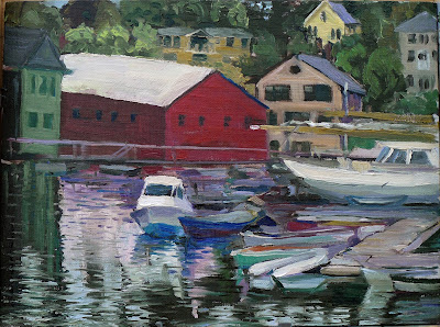
Pamela’s lovely painting of Camden harbor. Yes, the sheds across the harbor are completely cockamamie.
Nobody goes to a painting workshop expecting to do brilliant work, but my students have been painting at a high level. But into each life come a few tough painting days, and today was one of them.
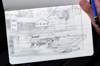
Pamela’s sketch for the above. Her first try on canvas lost this lovely composition.
Camden is a busy harbor and one never knows where and when the boats will be moving. A commercial fishing dock, a fleet of wooden schooners, a mix of pleasure boats, and international luxury yachts all vie for space. It’s no surprise that painters find it a reach, but a reach is always better than the same old same-old.
So we used her viewfinder to grid the drawing and she was able to accurately move it to canvas.
I prefer to paint from floating piers, but that isn’t possible at Camden (or most other working harbors). Viewed from the landing, the curves of the hulls are constantly changing as the tide comes in and out. (They start out being devilishly difficult anyway, so it hardly seems fair.)
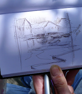
Sue painted half this dinghy before the owner moved it on her. A cell phone camera and a matching dock made for a nice save.
Each of my students came up against a difficult problem today. Pamela’s was the easiest to solve. She did a terrific drawing. In moving it to her canvas, she unconsciously changed the crop. It was a simple matter to wipe out that first draft, and then I showed her an easy way to make sure her drawing stayed in scale.
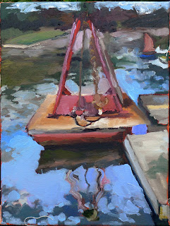
Matt’s buoy was symmetrical, yes, but static, no.
Matt’s was a problem of composition. He was drawn to the reflections under a buoy, but “knew” he shouldn’t center it on his canvas. However, the buoy itself is strongly symmetrical needed to be centered on the canvas. A few sketches later, it was apparent that the floating dock and background would give the composition energy.
Sue’s problem was more exasperating. To avoid the overwhelming clutter of the harbor, she concentrated on a single dinghy. Out of dozens there, what were the chances that someone would choose that one to take out? But choose it they did, after she was half finished. Her solution was to work partly from memory and partly from a photo on her cell phone along another patch of dock.
Nancy did a lovely sketch, transcribed it faithfully to her canvas, and blocked in her color successfully. Then she took a look at Pamela’s painting and pronounced her own effort “boring”. Hours later, she was still very unhappy. I liked her treatment of the boats; she emphatically didn’t. Perhaps restating the darks with heavier paint would help, I thought, but no.
Nancy’s lovely sketch.
Half an hour later, she was ready to scrape it out. She walked down the landing to scope out a different painting. “Well,” I reasoned, “if she’s going to wipe it out anyways, I might as well see if I can rescue it before she comes back.”
But Nancy didn’t like where the painting went. She pronounced it boring. (I loved the little boat with the lateen sail. Very Van Gogh. But she didn’t agree with me.)
Sometimes students resent their teachers painting on their canvases, but sometimes teachers paint on them because it’s the only way they can figure out what’s going wrong. The first thing I realized is that Nancy wasn’t using enough paint. I pushed some thicker paint against her boats, and immediately they were stronger and livelier—and I never changed a thing on them. (That lateen sail is my favorite part of her painting.)
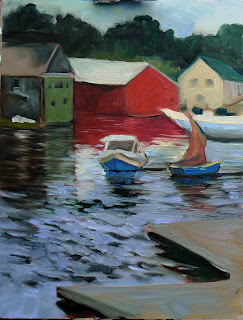
Just a few things changed, and one can see the route to salvaging this painting. Still not perfect, but it is definitely doable.
When Nancy did her sketch, I imagine she saw the foreground water as having form. That didn’t transfer to her painterly version. So I lengthened the reflections of the background buildings, and built in patterns of ripples. I tied the floating dock to the water by using the same highlight color (a diffuse blue-violet). Lastly, I pointed up the buildings a bit and simplified the treeline.
I still see a lot more that could be done, but it’s well on the way to being salvaged.
When it’s all going wrong:
  • Step back and look at it from a distance;
  • When you’re nervous, you’re probably not using enough paint. That results in an anemic painting;
  • Restate your darks. It often happens that you hate your painting because you lost the overall value pattern that attracted you in the first place;
  • Take a break. Have some coffee. Flirt with the lobstermen. You will usually come back to your work in a far better frame of mind.

Tomorrow: Monhegan! We’re finishing up the workshop session strong! August and September are sold out, but there are openings in October! Check here for more information.

Atmospheric perspective

Atmospheric enough for you?
Today was damp and drizzly—a perfect opportunity to consider atmospheric perspective. We did so at Glen Cove in Rockport, where on a clear day we can see islands in the far distance. Today was not a clear day; it became steadily less clear as we went on.
Matt’s view of the above scene. Yes, those are water droplets on his canvas.
Atmospheric (or aerial) perspective is the tendency of objects far away to have less contrast and chroma than objects nearby. In painting, we create the illusion of depth by depicting more distant objects as lighter and less-detailed than closer objects.
Pamela chose a long view of a boat at anchor. By the time she finished, the scene was monochromatic.
That’s not just a painterly convention. Solar radiation approaches the Earth in a direct beam, but is then scattered around in our atmosphere. That’s what gives us blue skies, pink sunsets and atmospheric perspective. On a clear day, there’s more of it bouncing around between you and that distant hill than between you and your coffee cup, so the distant hill looks bluer.
Nancy chose the same view, and experienced the same change in conditions.
Of course, when fog comes into play, it is water droplets that obscure that distant hill. However, the effect is the same. The easiest way to execute it is to just add some of the sky color—whether that’s blue, or grey, or violet—into the greens of the distant hills. The more distant the object, the more sky color should be added to it.
Sue chose the beach view.
At about 2 PM, the atmospherics had gotten a bit too thick to see much of anything at all, so we had a cup of hot tea and proceeded to the Farnsworth.  There we saw, among many fantastic paintings, Fitz Henry Lane’s Shipping in Down East Waters (1854) which is a luminous painting of boats in fog. Nothing like seeing how a master did it!
Sue hard at work.

And if these days weren’t enough, my intrepid students went out last night and painted the full moon over Chickawaukie Lake:
Matt’s view across Chickawaukie Lake.

Pamela’s view across Chickawaukie Lake showed the sinuous ripples that were there.
Matt’s second view across Chickawaukie Lake.
Nancy’s view across Chickawaukie Lake.

Pamela’s second view across Chickawaukie Lake.
The second of my Maine workshops started today. August and September are sold out , but there are openings in October! Check here for more information.

I forecast a fantastic week ahead

Fitz Henry Lane, Owl’s Head, Penobscot Bay, Maine, 1862, 15.7 in. by 26 in., Museum of Fine Arts, Boston. Read about it here. This is where it all starts.
This morning I saw a Facebook posting from one of July’s workshop students. It read, “On my way for a week of painting in beautiful Maine!” She’s excited; I’m excited too. I will be joined by artists from Manhattan, the Hudson Valley, Rochester, Vermont, and Maine. By week’s end, we will have forged new friendships and made some fantastic art.
The little harbor at Owl’s Head today.
We’ll have a reception this evening at beautiful Lakewatch Manor. Tomorrow we will set off to our first destination: Owl’s Head, with its iconic 1826 lighthouse and beautiful rocky promontories.  Fitz Henry Lane painted it in 1862, when the little community of Owl’s Head was raw but not new. It was “discovered” by Samuel de Champlain in 1605, but of course the Abenaki Indians had never really lost it in the first place.
There are still schooners sailing around Owl’s Head today. They come out of Camden, Rockland and Rockport harbors, and we’ll see them regularly. You can learn more about them here.
And how about this weather forecast?

Today: Sunny, with a high near 73. North wind around 5 mph becoming south in the afternoon.
Monday: Sunny, with a high near 71. Light and variable wind becoming south 5 to 10 mph in the morning.
Tuesday: Showers likely, mainly between 7am and 8am. Cloudy, with a high near 70. Northeast wind around 5 mph. Chance of precipitation is 60%.
Wednesday: A 30 percent chance of showers. Mostly cloudy, with a high near 73.
Thursday: A 40 percent chance of showers. Mostly cloudy, with a high near 72.
Friday: Mostly cloudy, with a high near 75.
Students painting on a shingle beach below the lighthouse.
A student does a value study preparatory to painting.
The second of my Maine workshops starts today. August and September are sold out , but there are openings in October! I’m also starting a contact list for 2014. Interested? Let me know. Check here for more information.