Monday Morning Art School: it’s plein air season

How can you get the most from a workshop or class? Here are some simple suggestions.

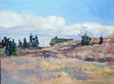
Early Spring, Beech Hill, 12X16, oil on canvas board, $1449 framed.

I’ve been to enough beauty spots in this world that few really astonish me, but the red rocks of Sedona managed it. Brilliant cliffs and spires of sculpted sandstone soar directly above the town. After seeing a dozen or so sites, I turned to my monitor, Ed Buonvecchio, and said, “It’s all wonderful.”

I’m here to teach the first workshop of my season, and it feels great to be out of the cool damp of the northeast, although the temperature there is steadily rising. I’ll be going home to spring painting and it’s time to get prepared.

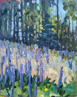
Lupines and woods, 8X10, oil on canvasboard, $522 unframed.

How can you get the most from a workshop or class? Here are some simple suggestions:

Study the supply list.

Note that I didn’t say, “run right out and buy everything on it.” Every teacher has a reason for asking for specific materials. In my case, it’s that I teach a system of paired primaries. You can’t understand color theory without the right starting pigments. Another teacher might have beautiful mark-making. If you don’t buy the brushes he suggests, how are you going to understand his technique?

A tube of cadmium green that I once bought for a workshop and never opened still rankles. I never want to do that to one of my students. When you study with me, I want you to read my supply lists. If something confuses you, or you think you already have a similar item, email and ask.

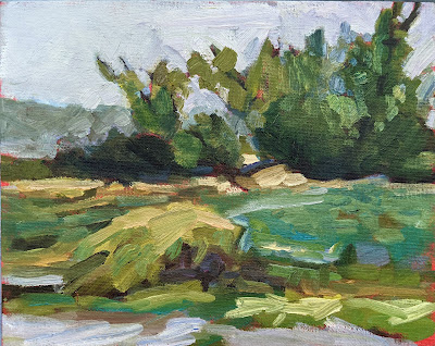
Spring Greens, 8X10, oil on canvasboard, is available through the Rye Arts Center.

Bring the right clothes.

I’d forgotten that I didn’t have enough warm-weather painting clothes to take to Arizona; I retired most at the end of last year. It was warm in Phoenix but just 50° in Sedona yesterday. That means a variety of clothing, because you’ll be chilled in the evenings but might need shorts and a tee-shirt during the day. Layer, baby, layer.

I send my students a packing list for clothes and personal belongings. If you’re going on the Age of Sail, Shary will send you a different list, meant for a boat. Follow these instructions, especially in the matter of insect repellent and sunscreen. Bugs and skin cancer are, unfortunately, eternal verities.

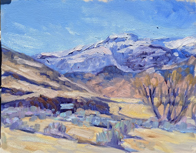
End of winter, Wyoming, 8X10, oil on canvasboard, $522 unframed. It will be much warmer when I teach there in September.

Know what you’re getting into.

“How can you stand this? It’s all so green!” an urban painter once said to me after a week in the Adirondacks.

There are amenities in Sedona, but not in other places I teach. If you’re dependent on your latte macchiato, you may find the wilderness uncomfortable at first. There are compensatory attractions. Last night I listened to a duet sung by a coyote and a domestic dog. It was magical.

Be prepared to get down and dirty.

I’m not talking about the outdoors here, I’m talking about change and growth. I am highly competitive myself, so it’s difficult for me to feel like I’m struggling. However, it’s in challenging ourselves that we make progress. Use your teacher’s method while you’re at the workshop, even if you feel like you’ve stepped back ten years in your development. That’s a temporary problem.

You can disregard what you learn when you go home, or incorporate only small pieces into your technique, but you traveled to be challenged, and you can’t do that if you cling to what you know.

Connect with your classmates

I know painters from all over the US. I met most of them in plein air events. There’s power in those relationships. Exchange email addresses. Keep in contact. Follow them on Instagram or Twitter.
Take good notes.

Listen for new ideas, write down concepts, and above all, ask questions. If your teacher can’t stop and answer them mid-stream, save them for after the demo.

Try not to bankrupt your students, fellow teachers

We should remember that pinch in the pocketbook when we draw up our supply lists.
Plastic wrap, by Carol L. Douglas. I can paint without cadmium yellow or cadmium red, but not without cadmium orange.

During my absence last week, one of my students took a workshop with another painter, an excellent artist I quite admire. Studying with other teachers is good practice. It reinforces what is essential. And since every teacher has ideas that are simple preference, it helps put those in perspective, too.

Before she went, we spent time talking over the supply list. A student should go into a class with the materials the teacher has requested; otherwise she is hobbled from the beginning. On the other hand, I have had too much experience to not be skeptical of supply lists, which often include everything but the kitchen sink.
True to form, she came back with three or four unopened tubes of paint. I really wish teachers would stop doing that. It’s expensive and its irresponsible.
Teachers should strive to help students navigate through color space. This was a class exercise by Jennifer Johnson.
I moved a tube of Cadmium Green around for years. It currently lists at $24.95 for 37 ml. It’s a great color for the sallow greens in skin tones, but an effect that can easily be approximated with black and yellow. I was painfully poor the year I took that class, but we never touched the tube.
I’ve come to feel the same way about Cerulean Blue in oil painting. It’s a heavy, dense blue that sells for $34.95 for 37 ml. I learned to paint skies with it, and there is nothing more luscious. Still, skies can be painted quite adequately with Ultramarine or Prussian Blue, which cost exactly a third of what Cerulean costs. 
However, because it’s dense and opaque, Cerulean Blue occupies a niche in watercolor that can’t be easily filled by other pigments; hence it stays on my watercolor palette.
Cobalt violet is beautiful but hardly indispensable.
Cobalt Violet is another very pricey pigment that can be approximated at a fraction of the cost. Note that I said “approximated,” rather than mixed. You can’t mix a respectable Cerulean Blue or Cobalt Violet hue. (For an explanation of hues and other arcana of paint tubes, see here.) You can only learn ways to paint with less expensive pigments. When possible, that should be the starting point for the teacher. Let your students shop for their Cadillacs on their own.
Our responsibility is more than just financial. We have a duty to train up new artists in safe, environmentally-friendly techniques. All three of the colors I mentioned above are toxic inorganic pigments. They’re harmless as paint, unless you eat or bathe in the stuff. The problem lies in their manufacture (and, to a lesser extent, their disposal). There’s only one plant currently making cadmium pigments in the US, under our strict environmental and worker-safety controls. That means the pigments in your paint are probably coming from offshore, and we have no idea if the process is safe or not.
It’s nearly impossible to clear all the inorganic pigments off our paint-tray, but we can minimize their use. My palette still contains cadmium orange, I’m afraid, because I’ve never found an analog that answers.
Part of my goal is to teach people to mix colors rather than buy them.
Then there is the question of substrates. Most beginning students are fine with cheap boards, with the caveat that once they start selling work, they need to move up to an archival-quality board. The problem is in the backing, and that’s an issue for future conservators, not for painting class. When I was a student, we worked as often on gessoed paper as on canvases. There is absolutely no reason to make your students buy archival boards for value exercises.
The exception to this is in watercolor and pastel. In both cases, the substrate is as important as the pigment. But even here, one can buy decent-quality student products.
The flip side of this is the teacher who’s afraid to tell his or her students what to buy at all. I find it’s helpful to just list what you carry and work from there, being mindful that some things are just preference, not necessities. Be specific—if you want sanded pastel paper, specify that, for example. But don’t be so specific as to be restrictive. If a student is using a phthalo blue, there’s no point in having him replace it with Prussian blue. They function in the same niche.
Here are my supply lists:
I’m happy to share them with painting students and as a template for teachers to create their own supply lists, but please don’t copy them without credit!

I’ve got one more workshop available this summer. Join me for Sea and Sky at Schoodic, August 5-10. We’re strictly limited to twelve, but there are still seats open.

How to plein air paint on the cheap(er)

If you’re trying painting for the first time, it makes sense to use less-expensive equipment and supplies. Here are corners you can cut.

Above Lake Champlain, by Carol L. Douglas
My friend Catherine is thrifty. When she took up plein air painting, she did it with softwood tripod easel—which you can get at Michaels this week for $7.99—and a TV table. She set a good example for those who want to try plein airpainting without breaking the bank.
The worst beginner error is to buy super-cheap paints and brushes. There are good student-grade brands out there in all media:

Cath setting up to paint with her inexpensive easel. Its limitations are fewer than you’d expect.
The difference between professional and student grade paints and pastels is the amount of pigment and the quality of the binders. In some cases, more expensive pigments will be copied with “hues.” Cadmiums and cerulean blue are often mimicked; check the label to see what you’re getting. A hue mimics (badly) the color of a single-pigment paint with less-expensive materials. For example, “cerulean blue hue” is often a combination of zinc white and phthalo blue.
A better solution is to avoid pricier pigments in the first place. There are modern pigments that do the job equally well at a lower cost. That’s what I aim for in my supply lists for oils, watercolor, acrylics, and pastels. (They’re directed to the serious amateur/professional, so the paint brands are not student grade.)
An expensive kit that I no longer use. It’s just too heavy.
I started painting on the same kind of tripod easel that Catherine bought. I still have mine. My father used a handmade version of the same easel for his whole life. It was the standard for outdoor painting in the mid-20thcentury.
I’d rather you bought one of them than a French easel. These are heavy, inefficient, and often badly-made. I gave mine away years ago. Pochade boxes are the most versatile field easels, but they’re expensive. If you’re handy, you can make one like I did. Or, there’s the classic cigar-box pochade.
The best value for money in a better easel is Mabef’s Universal Tripod Field Easel and its big brother, the Giant Field Easel. I’ve had one for decades. Even with a cracked leg, it still gamely stands up.
Mabef’s Universal Tripod Easel can be used with oils or watercolors, and is flexible enough to fit in small spaces.
Brushes don’t have to break the bank either. Even though I have a slew of fine watercolor brushes, I still often reach for my Princeton Neptunes. Oil and acrylic are trickier since cheap brushes sometimes drop bristles in your work. Jerry’s Creative Mark are fine, and Princeton also makes good, inexpensive oil/acrylic brushes, especially their 5200and 5400series. If you want a synthetic brush, make sure it imitates hog bristles, not sable. A softer brush isn’t meant for direct painting.

But wait, there’s more!

Packing for a road trip is my most hated job. Perhaps a list will help me stay more organized.

To me, a successful job of packing means I come home with one clean pair of panties. I’d rather waste space on painting tools and supplies than on my personal gear. My last trip, however, ran a little longer than I’d expected. Washing clothes on the road was no big deal, but I didn’t have sufficient meds. It was a lesson that one can, in fact, cut it too fine.
I leave for Nova Scotia tomorrow. The forecast is for temperatures ranging from 9° to 24° C, which is 50°-75° in real money. That means double packing, because I must must be prepared for any weather.
Packing is my least-loved part of my job. I’ve decided to make a list, in the hope that it makes me a little more efficient. This is in addition to my list of painting supplies, which you can find here for oils, for watercolor, and for acrylics.
Feel free to comment with additional suggestions.
Rain happens, especially in the Northeast. In a plein air event, that’s no excuse for not getting your painting done.
One week of clothing for the traveling artist

Clothing:
Fleece or cotton hoodie
Fleece or wool sweater
Cardigan or shawl for evening
Hiking boots
Hiking socks
Totally paint-spattered shirts—number of days +1
Totally paint-spattered capris—number of days divided by 2
One pair of long pants
Painting hat
Underpants—number of days +2
Bras—2
My bathing suit—not that I ever use it, but I can dream
A swim towel—ditto
Sandals
Raingear—a jacket AND waterproof pants
Sleepwear
One moderately dressy outfit for casual events
One actual dress or skirt for reception
Jewelry
Nobody does the painting hat quite as elegantly as Marjean Coghill.
Grooming:
Cosmetics—especially for you guys. You look downright unkempt at times
Sunglasses, glasses cleaner and cleaning cloth
Sunscreen
Insect repellent
SPF lip balm
Aloe vera lotion for when you forget the sunscreen
Deodorant
Hairbrush and/or comb
Hair ties and bobby pins
Nail clipper
Razor
Shampoo and conditioner
Body wash
Prescription medications and vitamins. I sort mine prior to leaving into daily med containers
Toothbrush—I can get five weeks out of my electric toothbrush without a charge. I’ve tested this.
Toothpaste
Floss
Monthly feminine supplies
(You’ll need a clear plastic bag if you’re flying for some of these things)
Downloaded media will be your best friend when you’re stuck on the road back of beyond.
First aid:
A small first aid kit in your trunk
Over-the-counter allergy meds
Aspirin and/or your favorite NSAID

Odd equipment for when I am traveling overland and have space to burn:
Bandana—I can soak this in water and stay cool on a hot day.
Porta-potty
Foldable wagon
Headlamp for nighttime painting
Small secateur clipper
Extra plastic poncho to cover easel in case of monsoon
Folding chair
Water bottle and a larger jug to refill
Nutritional bars and trail mix—no chocolate, unless you like cleaning up melted food
Brush soap
Baby wipes

Electronics
Camera and charger
Cell phone and charger
Laptop and charger, if applicable
GPS if applicable
Fitbit charger
Spare charged external battery—this is a lifesaver when traveling
Headphones
For every show, there will be an opening, and you’re supposed to dress for it. Try to look as good as this posse, please: Mira Fink, Crista Pisano, me, Marlene Wiedenbaum, Laura Bianco, Kari Ganoung Ruiz (who just took Best in Show at Finger Lakes) and Tarryl Gabel.
Lastly…

Cash
Credit cards
Remember to turn on foreign cell service, if necessary
Download any media to phone or Kindle before leaving your wifi behind.

The problem with supply lists

I should KonMari my paint collection, not add to it. We go to workshops weighed down with too much stuff.

No, I don’t need any more watercolor pigments.
Many years ago, I took a workshop from a figure painter who specified cadmium green. I came home with an unopened tube and dropped it in a drawer. It’s still unopened.
I have great sympathy for students faced with a new supply list. In some instances, buying from them is redundant. For example, my list calls for Prussian blue, but if you already have phthalo blue, you’ve already got an excellent pigment for that color space.
It helps to understand the instructor’s reasoning. My list is based on paired primaries because I believe it allows the greatest range in color space. It occasionally changes as my painting technique evolves.  
Students usually show up with too much stuff because they don’t want to be caught without something they need. Most of what they carry, they never use. I’m feeling that urge to over-pack as I assemble the materials for Poppy Balser’s workshop in May.  Poppy, like me, is loath to send her students on spending sprees. However, it makes no sense to drive that distance and not be prepared.
And I don’t need a new mixing tray, either.
I trotted out my watercolor basket expecting to have to fill in color gaps. Actually, I should KonMarimy paints. What’s in the picture, above, is probably a quarter of the tubes in my basket. Does anyone really need five tubes of ‘opera pink’? More importantly, what is ‘opera pink,’ anyway?
Manufacturers love labeling convenience mixes with historic names. Consider Naples Yellow, used from the 18th to the 20th century. The real pigment is toxic lead antimonate. Modern paints labeled “Naples yellow” are made with a mix of modern pigments. You can make your own easily enough with white and yellow ochre.
That is the only name that really matters.
Pigments are listed on the tubes of all major paint makers in the form of Colour Index (CI) numbers. These are in tiny lettering on the side of most paint tubes. If the first letter is a “P,” that’s a pigment; if it’s an “N,” that’s a lake of a naturally-occurring substance like cochineal. The second letter tells you the general color family. The third tells you the actual pigment used.
A glance at my tube of ‘opera pink’ tells me it’s really PR122+BV10. The first is my old friend quinacridone magenta. Unfortunately, the second is a dye, rhodamine B, which bleeds and isn’t lightfast at all. I should pitch all five of those tubes.
My brushes, on the other hand, need help. New Yorkers will recognize some as being from the cheap bin at Pearl Paint.
If there is more than one CI number on the tube, you’re actually buying a hue or convenience mix. Many paint manufacturers sell hues of expensive pigments like the cadmiums and cerulean blue. They’re not consistent across brands, and they never have the handling characteristics of the more expensive paints they’re meant to imitate.
As with opera pink, even if the main pigment is lightfast, its partner may not be. Almost always, using single-pigment paint gives you the most flexibility in mixing.
There are many pigment guides on the web. Here is my favorite. Although it’s meant for watercolor, pigments are consistent across all media.

Hey, Carol, what am I supposed to buy for this workshop?

Years ago, I took a figure workshop from a well-known American figure painter. On receiving his supply list, I noted several pigments that are not normally on my palette. Two were transparent earth colors; one was Naples yellow; one was cadmium green. I duly bought them, took the workshop, and came home having never touched them. The transparent earths were occasionally useful for glazing, but that $20 tube of cadmium green sat in my cabinet until it thickened and died.
I never want to do that to anyone. (Not that I’m totally immune to it; my oldest students will remember my infatuation with Payne’s Grey back in the day.)
Here are my paint supply lists for both local plein air painting (in Rochester) and workshop painting in Maine this summer:
¡         Watercolor
¡         Pastels
¡         Oils
I expect that experienced painters already have a palette they like and tools they’re comfortable with. If you have questions about why I have something included, just ask; you may already have something that can substitute.
Nevertheless, there are certain paints I recommend at the expense of others. For example, it never makes sense to buy alizarin crimson. The real thing (PR83) is extremely fugitive,*
so many manufacturers have decided to make “hue” formulations that mimic it. Many of these are either also fugitive and or so high-stain that they tend to bleed up through drying paint. Yet alizarin crimson is a staple in the paintboxes of so-called traditionalists.
How much more sensible it is to buy straight up quinacridone magenta (PR122) and mix it to the color you want when you need it!
Another example is Naples yellow, which was originally made of yellow antimony (PY 41) and is one of the oldest of pigments. Unfortunately, it’s also extremely toxic. There are a million proximates on the market—so called “convenience mixes”—because that dense, chalky yellow is extremely useful in landscape painting. But why carry a convenience mix when you can make up something equally as useful from yellow ochre and white, which both have a million other uses on the palette? (Yes, I know some of you watercolorists take great pride in never using white, but when you use a Naples yellow you’re using white whether or not you admit it.)
On the other hand, there arepigments that make reasonable substitutions. For example, I want oil painters to have a high-stain greenish blue, but phthalo blue cyan (PB15:3) will just do as well as Prussian blue (PB 27) if that’s what you have.
Recently I wrote about hues and the Color Index system. Handprint has a more detailed explanation here. For the sake of efficient painting, I urge you to avoid hues and convenience mixes. Single pigment paints are most efficient in the field.
And if you haven’t signed up for my Rochester classes or Maine workshops, what on earth are you waiting for? August and September are sold out for my workshop at Lakewatch Manor in Rockland, ME… and the other sessions are selling fast.  Join us in June, July and October, but please hurry! Check here for more information.

*”Fugitive” just means the pigment fades over time, and real alizarin crimson—an extract of the madder plant—is among the most fugitive pigments of all.