
Fear of failure doesn’t come out of nowhere. It’s learned, layered and reinforced over time until it feels like part of our personalities. It isn’t and you don’t have to suffer from it.
At its core, fear of failure is about protection. One of the most important functions of the human mind is keeping us safe. However, when that extends to psychological safety, it can become counterproductive. Yes, we’d all like to be spared embarrassment, wasted effort or feeling like failures. Sadly, testing our limits in painting has the potential to trigger all these responses.
Some of us were praised for being good at art as children. Others, equally powerfully, were told we weren’t. We learned that art had a verdict attached to it—good (talented) or bad (you’d best take math classes instead). That kind of binary thinking helps nobody. Internalized, it means that every effort at art (or math) becomes a test of identity rather than an adventure.
Life doubles down on this. We try to avoid being wrong, because being wrong costs us something. We become careful. Then cautious. Then hesitant. That conditioning is always running in the background.
Uncertainty intolerance
Uncertainty intolerance is our tendency to feel stressed, anxious or threatened when we don’t know what’s going to happen next. If you think you don’t do this, let me cancel your next flight and see how you react.
Often, things that don’t go according to plan are opportunities, not problems, but we still don’t like the feeling. Our brains crave predictability. Uncertainty is uncomfortable. It slows us down, urges us to control everything. Painting is full of moments of uncertainty, which is why we try to fix every passage before moving on. Overworking is more about resolving uncertainty than about seeking perfection.
Comparison
We’re constantly looking at others’ work online or in museums and galleries. It’s finished and polished. My messy middle can’t compare to someone else’s finished painting, so it’s easy to feel like I’m failing. The impulse is to force our paintings to a high level of finish way too early.
Attachment
People don’t set out to get attached to outcomes—it happens gradually, almost invisibly, as meaning gets layered onto the whatever we’re doing. In painting, attachment forms when the work stops being a process and the final result becomes paramount.
When you spend hours on a piece, you naturally care about it and want it to turn out well. That’s good. But then a small, pernicious shift in mindset can happen: if this painting is good, I’m good, and if not, then maybe I’m not.
Fear of failure may not be a sign that you care too much; it can mean that you’ve tied your self-worth too tightly to the outcome.
Painters who move forward haven’t eliminated fear. They’ve changed their relationship to it. They expect things to go wrong. They build that into their process. A bad day of painting isn’t a verdict; it’s a data point.
You can’t fail if you aren’t trying something difficult and new. If you start seeing failure as a positive, you can ride with it. Painting will no longer be a referendum on your ability.
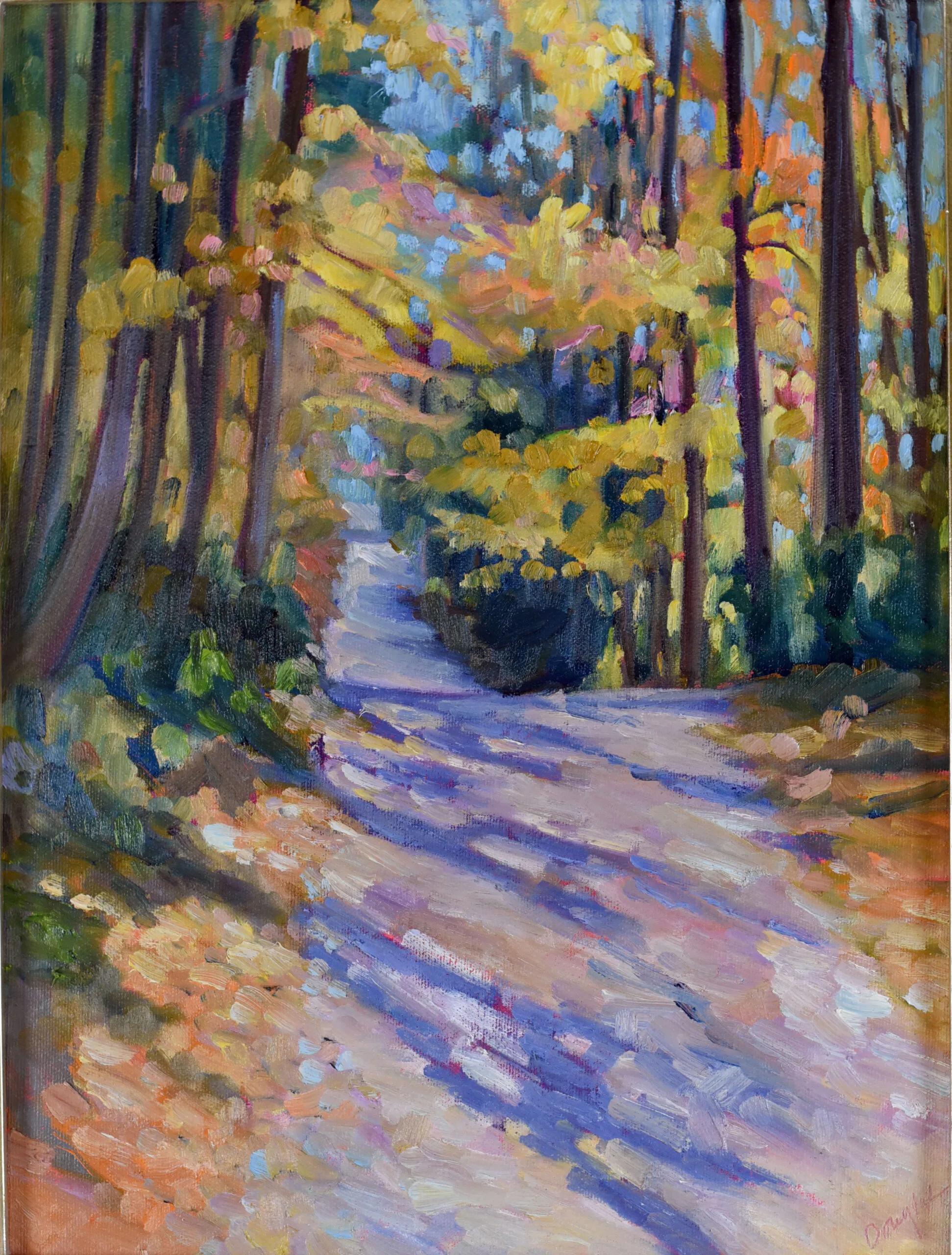
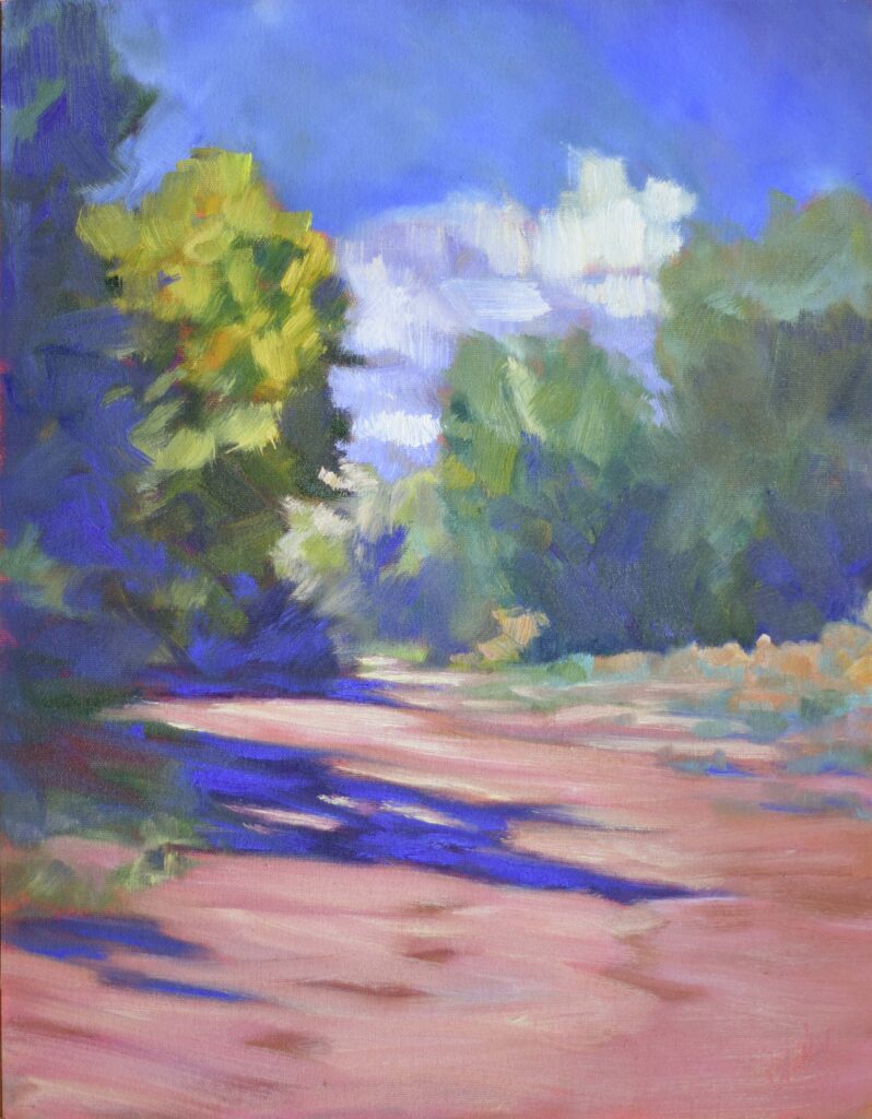
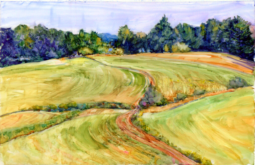
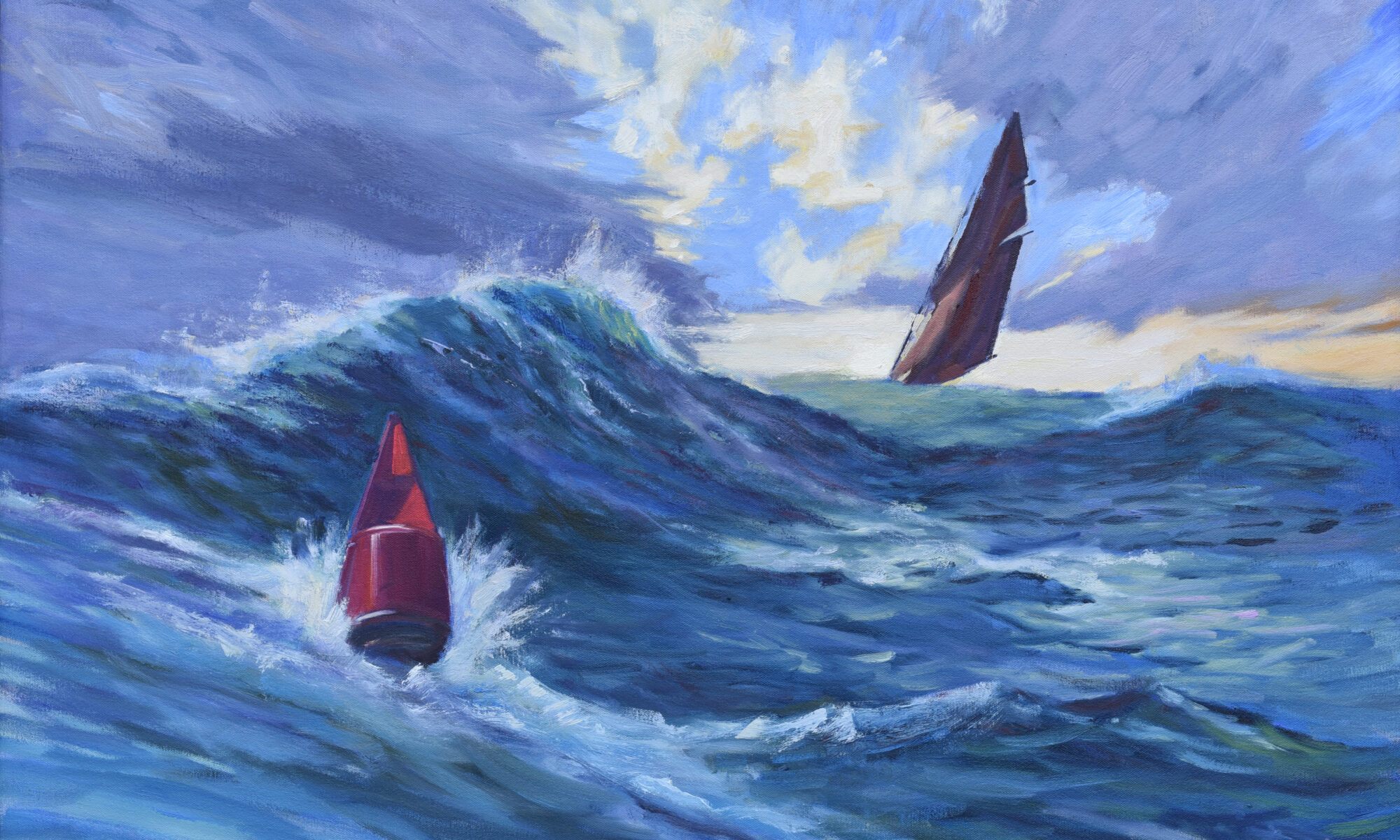
It helps when you’re working in a framework where failure is part of the process. A supportive learning space, by which I mean good classes and workshops, can make all the difference. If you want that kind of structure, feedback, and encouragement, consider joining one of my workshops, below. Learn to trust your decisions, simplify your process, and, most importantly, keep moving forward.
Registration is now open for workshops in 2026! Reserve your spot:
- Advanced Plein Air Painting | Rockport, ME, July 13-17, 2026
- Sea & Sky | Acadia National Park, ME, August 2–7, 2026
- Find your Authentic Voice in Plein Air | Berkshires, MA, August 10-14, 2026
- New! Color Clinic 2026 | Rockport, ME, October 3-4, 2026
- New! Composition Week 2026 | Rockport, ME, October 5-9, 2026
Can’t commit to a full workshop? Work online at your own pace:


