Monday Morning Art School: why copy a masterpiece?

Think of it as getting a painting lesson from the masters.

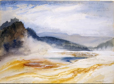
Great Springs of the Firehole River, by Thomas Moran, 1871, is one of the paintings my students will be copying this week. Courtesy National Park Service.

If you visit art museums regularly, you may have seen students set up to copy masterpieces. Or, you’ve seen copies made by great artists of other artists’ work. What were they trying to accomplish?

Vincent van Gogh admitted himself to the Saint-Paul asylum in May, 1889. He painted around 150 canvases there, including the iconic The Starry Night. He also made about thirty copies of masterworks of others.

“I started making them inadvertently and now find that I can learn from them and that they give me a kind of comfort,” he wrote. “My brush then moves through my fingers like a bow over the strings of a violin – completely for my pleasure.”

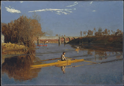
The Champion Single Sculls (Max Schmitt in a Single Scull), by Thomas Eakins, 1871, is one of the paintings my students will be copying this week. Courtesy Metropolitan Museum.

Copying masterworks is a time-honored way of learning, both in western traditions and in others. Transmission by Copying is one of the six principles of Chinese painting laid down by the Chinese art historian Xie He in 550 AD.

“Nobody is born with a style or a voice. We don’t come out of the womb knowing who we are. In the beginning, we learn by pretending to be our heroes. We learn by copying,” wrote Austin Kleon.

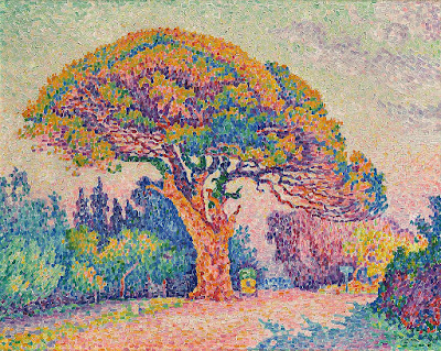
The Pine Tree at Saint Tropez, by Paul Signac, 1909, is one of the paintings my students will be copying this week. Courtesy Pushkin Museum.

Copying is a way to study and evaluate a painting that’s far more immersive than simple looking. It enables us to understand another artist’s process. It forces us to consider what we find admirable in art in general. And it teaches us brushwork.

Most importantly, it sets aside our own need to tell a story. That liberates us from the frustration of our own limitations. We can concentrate on composition and color instead of being fully engaged in the problem-solving of unique subject matter.

It makes sense to copy works you admire. If you’re drawn to the paintings of the Canadian Group of Seven, don’t copy a Titian. You’re going to be paying a lot of attention to the painting you copy. It should be something you really love.

Today, we have a technical advantage over Van Gogh, locked up as he was. We can easily retrieve high-quality images from the internet. Many museums even have scalable images on their websites.

You must be able to see the brushwork to fully immerse yourself into the work. (Of course, if you’re copying a linear painter like Bronzino, there may not be much visible brushwork to copy.)

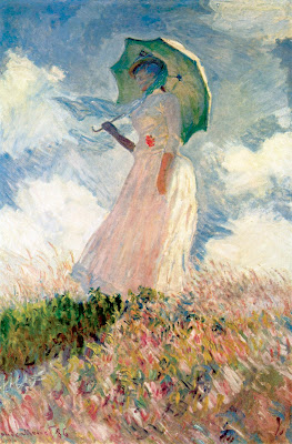
Woman with a Parasol, Turned to the Left, by Claude Monet, 1886, is one of the paintings my students will be copying this week. Courtesy MusĂ©e d’Orsay.

What you can’t see on the internet is the dimensionality of the painting, its impasto, so that is one area where you’ll have to interpolate.

“I was surprised at how small the Mona Lisa is,” is a common sentiment about one of the world’s most-copied paintings. It’s important to know how large the work you’re copying is, even if your copy is going to be very small. The brushes appropriate to a massive painting are not appropriate to a miniature, and that will affect your interpretation.

Mona Lisa shows that paintings can undergo significant changes through restoration, fading, or the appearance of pentimenti. She once had eyebrows and eyelashes and was lighter in color; all those changes have occurred in the 500 years since Leonardo set down his brush. That doesn’t mean we can’t learn from copying her, but it’s something we should be aware of.

Monday Morning Art School: brushwork

Mark-making can be loose and gestural or very controlled. It’s personal, but it’s also something you can learn.

Dining Room in the Country, 1913, Pierre Bonnard, courtesy Minneapolis Institute of Art. Bonnard used small brush strokes, intense colors, and close values.

Brushwork is, on one hand, the most personal of painting subjects. It’s also (especially in watercolor) highly technical. Much of what is called ‘style’ comes down to what brushes we choose and what marks we make with them. I wrote about that here.

Modern viewers are immediately captivated by bravura brushwork; it’s a sign of self-confidence and competence. It comes from lots of practice. It also must rest on a firm foundation of proper color mixing and drafting. Flailing around to fix something negates the freshness and decisiveness of good brushwork.

Wheatfield with Crows, 1890, Vincent van Gogh, courtesy Van Gogh Museum, Amsterdam. The motion in the painting is created by his brush strokes.

The best, most immediate, brushwork lies on a foundation of careful planning. Continuous modification, glazing, changing color, etc., make for diffident marks.

Let’s talk about how not to do it:

  • Unless you’re doing close detail, don’t hold your brush like a pencil. It’s a baton, and holding it to the back of the center-point (away from the ferrule) gives you more lyrical motion. Your grip can still be controlled by your thumb, you can hold it loosely, or even clutch it in your fist. The important thing is to let your arm and shoulder drive the movement of the brush, rather than just your wrist and hand. The farther back you hold the brush, the more scope of movement. To loosen up, blast some music and pretend you’re the conductor and that brush is your baton.
  • Don’t dab. By this I mean a pouncing/stabbing motion with the tip of your brush. It’s amateurish in oils, anemic in acrylics, and hell on your brushes.
  • Don’t use brush strokes that go in all one direction. Learn to apply paint in the round. This is a rule that can be broken, but make sure you’re doing so intentionally, not just because you don’t know how to paint in every direction.
  • Don’t bury your line. Much of the power of Edgar Degas’ mature work comes from his powerful drawing; he was the most accurate draftsman of his age, and he let that stand prominently in his work.

Self Portrait with Beret and Turned Up Collar, 1659, Rembrandt van Rijn, courtesy National Gallery of Art, Washington, DC. Pay close attention to the economy of the brushwork in the hair, and the expressive, unfinished brushwork in the face. In this way, Rembrandt was able to create a powerful focus.

There are many painters whose brushwork I admire, but there’s little point in trying to copy them in my own work. Brushwork is as personal as handwriting. It’s where the artist expresses—or suppresses—his feelings. There’s value in attempting to copy passages by great painters, and I suggest you do so with the samples I’ve attached to this blog. But don’t try to paint like Sargent or Van Gogh or Rembrandt; use what you learn to create your own mature style.

Waterlilies, c. 1915, Claude Monet, courtesy Neue Pinakothek, Munich. Monet makes no attempt to hide his drawing in this painting. The brushstrokes are wet-over-dry.

Style is the difference between our internal vision and what we’re capable of. We often don’t like our own brushwork when we lay it down; I think that’s because it’s too personal. Don’t continuously massage your brushstrokes hoping to make them more stylish. If the passage is accurate in color, line and precision, move on. You may come back to realize it’s wonderful.

Lady Agnew of Lochnaw, 1892, John Singer Sargent, courtesy Scottish National Gallery, Edinburgh. Note that the transparent sleeves are not produced by glazing, but with direct, long brushstrokes.

Use your brushwork to highlight the focal points in your painting. Sharp, clean, contrasting marks draw the eye, where soft, flowing, lyrical passages encourage us to move through. Let there be dry-brush texture and unfinished passages in your painting.

Your brush is not a pencil

Mark-making can be loose and gestural or very controlled. It’s personal, but it’s also something you can learn.

Dining Room in the Country, 1913, Pierre Bonnard, courtesy Minneapolis Institute of Art. Bonnard used small brush strokes, intense colors, and close values.

In this week’s painting classes we worked on mark-making and brushwork. This is, on one hand, the most personal of painting issues. It’s also (especially in watercolor) highly technical. Much of what is called ‘style’ comes down to what brushes we choose and what marks we make with them.

Modern viewers are immediately captivated by bravura brushwork; it’s a sign of self-confidence and competence. It comes from lots of practice.

Wheatfield with Crows, 1890, Vincent van Gogh, courtesy Van Gogh Museum, Amsterdam. The motion in the painting is created by his brush strokes.

First, let’s talk about how not to do it:

  • Unless you’re doing close detail, don’t hold your brush like a pencil. It’s a baton, and holding it to the back of the center-point (away from the ferrule) gives you more lyrical motion. Your grip can still be controlled by your thumb, you can hold it loosely, or even clutch it in your fist. The important thing is to let your arm and shoulder drive the movement of the brush, rather than just your wrist and hand. The farther back you hold the brush, the more scope of movement. To loosen up, blast some music and pretend you’re the conductor and that brush is your baton.
  • Don’t dab. By this I mean a pouncing/stabbing motion with the tip of your brush. It’s amateurish in oils, anemic in acrylics, and hell on your brushes.
  • Don’t use brush strokes that go in all one direction. Learn to apply paint in the round. This is a rule that can be broken, but make sure you’re doing so intentionally, not just because you don’t know how to paint in every direction.

Self Portrait with Beret and Turned Up Collar, 1659, Rembrandt van Rijn, courtesy National Gallery of Art, Washington, DC. Pay close attention to the economy of the brushwork in the hair, and the expressive, unfinished brushwork in the face. In this way, Rembrandt was able to create a powerful focus.

There are many painters whose brushwork I admire, but there’s little point in trying to copy them in my own work. Brushwork is as personal as handwriting. It’s where the artist expresses—or suppresses—his feelings. There’s value in attempting to copy passages by great painters, and I suggest you do so with the samples I’ve attached to this blog. But don’t try to paint like Sargent or Van Gogh or Rembrandt; use what you learn to create your own mature style.

Waterlilies, c. 1915, Claude Monet, courtesy Neue Pinakothek, Munich. Monet makes no attempt to hide his drawing in this painting. The brushstrokes are wet-over-dry.

The best, most immediate, brushwork lies on a foundation of careful planning. Continuous modification, glazing, changing color, etc., makes for diffident marks. For the same reason, if you’re happy with the color and form of what you’ve laid down, refrain from ‘touching it up.”

Use your brushwork to highlight the focal points in your painting. Sharp, clean, contrasting marks draw the eye, where soft, flowing, lyrical passages encourage us to move through. Let there be dry-brush texture and unfinished passages in your painting.

Lady Agnew of Lochnaw, 1892, John Singer Sargent, courtesy Scottish National Gallery, Edinburgh. Note that the transparent sleeves are not produced by glazing, but with direct, long brushstrokes.

Above all, don’t bury your line. Much of the power of Edgar Degas’ mature work comes from his powerful drawing; he was the most accurate draftsman of his age, and he let that stand prominently in his work.

Why travel to paint?

Sometimes it takes different light, and different objects, to shake us into really seeing.

The artistically-mature Vincent van Gogh: View of Arles, Flowering Orchards, 1889. Courtesy Neue Pinakothek

It’s possible to achieve mastery as an artist while never leaving your little village. That’s especially true today, with museum and learning resources so widely available. Yet few great artists ever stayed put. The ones who did—like Frans Hals—lived in places like Haarlem, which were so cosmopolitan that they brought the world to the artist.

Artistic itchy feet are nothing new. In medieval Northern Europe, painters (and other craftsmen) were expected to complete the wanderjahre. For a minimum of three years after their apprenticeship, they traveled around Europe learning their craft from different masters. This is where the English word (and custom) ‘journeyman’ originated.

Van Gogh developing his color sense in Paris: Fritillaries in a Copper Vase, 1887. Courtesy MusĂ©e d’Orsay

The most intrepid, of course, traveled the farthest. Albrecht DĂŒrer was on the road for four years after his apprenticeship ended, including two trips to Italy. (An unhappy arranged marriage might have contributed to his wanderlust.) Pieter Bruegel the Elder went to France and Italy. Not only did the wanderjahreallow craftsmen to study with the best practitioners of their age, it had a tremendous effect on culture itself. The ideas and practices of the Renaissance were transmitted across Europe by these working journeymen.

Vincent van Gogh invented himself as a painter with his move to Paris in 1886. There he met the avant-garde and dropped the somber color palette and subjects of his northern painting. It was not until he went to the south of France in 1888, however, that his style became fully realized.

Van Gogh newly arrived in Paris: Le Moulin de Blute-Fin, 1886. Courtesy Bridgestone Museum of Art

Van Gogh found a place that fitted his sensibilities, and his painting expanded to embrace the place. That’s something that happens to many artists, and is perhaps why so many of them are so darn footloose (myself included). But isn’t this just self-indulgence? Can’t you achieve the same thing at home?

A few years ago, I assigned a student to draw a fishing boat in Rockport harbor. Becca & Meagan was iconic; she’s red and was a popular subject for artists and photographers. Sheryl would draw a line; I would correct it. We went back and forth until she finally stopped me and made me really look. The boat she was drawing wasn’t Becca & Meagan at all; the owner had hauled her and replaced her with a different red boat. I was so familiar with the scene that what I ‘knew’ had overwritten what I saw.

Van Gogh in the Netherlands: his first major work, The Potato Eaters, 1885. Courtesy Van Gogh Museum

I had an epiphany while watching a student painting an horno in New Mexico last week. These bake ovens are traditional conical structures, deceptively simple in form. Linda, who’s from New England, couldn’t rely on what she thought she knew. She had to hunker down with the essentials of measurement and line to get it right. Because she did, she drew (and then painted) the hornoaccurately.

When we’re painting what we’re familiar with, we can fall into relying on a few sketchy lines to suggest what we already know. That leads to ambiguous, waffling painting. Sometimes it takes different light, and different objects, to shake us into really seeing.

I’m doing a FREE Zoom workshop on Friday, October 2 at 5 PM. Consider it Happy Hour, and join me with a glass of wine, a spritzer, or whatever else. We’re going to talk about studying painting. What should students expect to get from a workshop or class? What should teachers offer? Have you always wanted to try painting but been afraid of classes? Are you taking classes but want to get more out of them? Join us for a free-ranging discussion.

While this is in advance of my Find your Authentic Voice in Plein Air workshop in November in Tallahassee, everyone is welcome. There’s absolutely no charge or obligation. Signups are already brisk, so register soon!

Monday Morning Art School: paint like a fauve

When the light is bad, give yourself a jolt of color.
Hardwood, by Carol L. Douglas, 6X8, oil on canvasboard 
Driving from Boston to Philadelphia, the sky was full of light, fleecy cirrus clouds. Bobbi Heathand I watched them happily. We were due to start painting at Plein Air Brandywine Valleyat 3:30 in the afternoon. While I love the wooded, rolling hills of Brandywine country, it’s not my natural subject. But I know that a good sky drives everything, and we seemed set to have a great sky.
Unfortunately, by the time we arrived, the clouds had solidified into a solid, grumbling, low mass of grey. The site we were painting on—a sloping, treed lot—wasn’t helped by the lack of sunlight. My go-to answer in impossible situations is to think of how other, greater artists have handled the same situation. (That’s another good reason to know art history.)
It’s hard to get excited about this light.
I could have channeled Andrew Wyeth and romanced a figure into that bleakness, but that would have taken it outside the realm of observational plein air. Plus, we were limited to a 6×8 canvas. And I have no interest in luminismor tonalism, although they may be the right answer for you.
I saw Colin Page briefly at his opening last week. That sparked the question, “What Would Colin Do?” The answer—as well as I can understand another painter—would be to amp the color relationships up, systematically and logically. Of course, Colin does this fluidly and gracefully, because this is the visual space in which he lives.
Salt Marsh, by Carol L. Douglas
Last week, I posted on color harmonies. Two of my students did color harmony paintings last week, both very successfully. I might as well put my own instruction to the test, I thought. I chose a split-complement scheme of gold against green-violet-blue. In truth, the scheme flipped a bit as I went, becoming less systematic, but that was fine too.
Soft Wood, by Carol L. Douglas, oil on canvasboard. This was a rain soaked day.
This kind of painting is the reverse of adding color to a subject under dull light. Soft Wood, above, was painted in a rollicking rainstorm from a farm porch. It’s a more typical way of adding color to a dull scene, and there’s nothing inherently wrong with it. In fact, it relies on the same understanding of color harmonies.
Autumn trees in Durand Park, Carol L. Douglas, oil on canvasboard. A similar color sketch from long, long ago.
When I finished yesterday’s painting, I said it looked like a bad Van Gogh. It’s probably more Fauvist. Post-Impressionistfor sure, and that’s not a bad color space for a plein air painter to wallow for a while. Once I’ve started down this rabbit hole, I’m staying here for the nonce. It’s dawning pink and blue here in Delaware, so who knows where the light will go?
Why do I go down these paths, when I already have a style that sells? Why does any artist do that? We’re always striving to get better. Artists are driven to paint because they’re essentially thinkers. When we stop thinking, we stop really painting.

Monday Morning Art School: Mark Making

Mark-making can be loose and gestural or very controlled. It’s personal, but it’s also something you can learn.
Dining Room in the Country, 1913, Pierre Bonnard, courtesy Minneapolis Institute of Art. Bonnard used small brush strokes, intense colors, and close values.
When I was a student, I often left heavy edges in my paintings. A teacher told me, “That’s your style.” Well, it wasn’t; I’d just never learned to marry edges. It was a deficiency.
Our marks are our handwriting. I’d rather see them develop naturally, so I generally avoid teaching much mark-making. But sometimes students fall into traps that severely limit their development. It’s better to understand all the ways your brush works and then settle down into something that reflects your character, rather than have to break bad brushwork down the road.
Self Portrait with Beret and Turned Up Collar, 1659, Rembrandt van Rijn, courtesy National Gallery of Art, Washington, DC. Pay close attention to the economy of the brushwork in the hair, and the expressive, unfinished brushwork in the face. In this way, Rembrandt was able to create a powerful focus.
Let’s first talk about how not to do it:
  • Unless you’re doing close detail, don’t hold your brush like a pencil. It’s a baton, and holding it to the back of the center-point gives you more lyrical motion.
  • Don’t dab. This means a pouncing/stabbing motion with the tip of your brush. It’s amateurish in oils, anemic in acrylics, and only possible with any elegance with a wet watercolor brush.
  • Don’t use brush strokes that go in all one direction. Learn to apply paint in the round.
All these rules are successfully broken by great artists. You may go on to break them yourself, but it behooves you to learn the full range of motion of your brush before you do so.
Wheatfield with Crows, 1890, Vincent van Gogh, courtesy Van Gogh Museum, Amsterdam. The motion in the painting is created by his brush strokes.
Mark-making can be loose and gestural or very controlled. It’s not just pertinent to painting; it applies to any material applied to a surface, including three-dimensional and digital art. It’s purely personal, and can be where the artist expresses—or suppresses—his feelings about the subject.
Waterlilies, c. 1915, Claude Monet, courtesy Neue Pinakothek, Munich. Monet makes no attempt to hide his drawing in this painting. The brushstrokes are wet-over-dry.
Mark-making is an important aspect of abstract art, including the kind where the mark-making is not done with a brush (as with Jackson Pollack or Gerhard Richter). But tight brushwork is just as much a hallmark of modern painting—see pop art, for example.
Lady Agnew of Lochnaw, 1892, John Singer Sargent, courtesy Scottish National Gallery, Edinburgh. Note that the transparent sleeves are not produced by glazing, but with direct, long brushstrokes.
I’ve included five great artworks in this assignment. Each has one or more close-ups with it. Your assignment is to try to figure out the brush used and copy the brush-strokes as accurately as you can on an old canvas. Note that I’m not asking you to make a painting; that would be too confusing. I’m just asking you to try to mimic the brushwork.

Feeling rejected?

In the end, there’s an audience for nearly everything. The trick is finding it.
The Red Vineyard, 1888, Vincent van Gogh. It was sold to Anna Boch for 400 francs in 1890. Courtesy Pushkin Museum, Moscow.
“I like paintings with buildings in them,” a non-artist friend told me yesterday. “Scenes are beautiful, and I appreciate them, but if there’s a few cottages by the shore I can imagine the lives of the people who live in them forever. It’s more interesting over the long haul.”
I was driving at the time (with Bluetooth, of course) back from picking up paintings at What’s Nude in Boothbay Harbor. I try to send them two paintings every year. A naked person on the living room wall isn’t to everyone’s taste, but every once in a while, someone will express an interest in one and off it goes.
In the evening, someone else mailed me two images of really odd paintings. “My friend does some stra-a-a-a-nge art,” she said. I couldn’t disagree, and yet they were on their way to a juried show.
Ward in the Hospital in Arles, 1889, Vincent van Gogh, courtesy Oskar Reinhart Collection.
Recently, I wrotethat all art criticism is by nature subjective. That’s never truer than in a particular gallery or show. There, a single juror usually holds sway. There are also factors about which we’ll never know, like where we live, our subject matter, and the media in which we work
 or if we’ve somehow offended the gallerist or organizer in the past.
It’s very easy to lose your nerve after a string of rejections, especially in the dead of winter when most show apps are made. Keep on persevering. One never knows what the outcome will be.
“A lot of what we sell is popular because it’s pretty and unchallenging,” says a fictional gallerist in a so-so novel I’m reading. “I do well out of those artists and that means I can keep stocking artists whose output is actually meaningful.”
Wouldn’t we all like to meet such a gallerist in real life! But the truth is that accessible, pretty, and unchallenging does sell most quickly.
The Round of the Prisoners (after DorĂ©), 1890, Vincent van Gogh. Courtesy Pushkin Museum, Moscow.
‘I, for my part, know well enough that the future will always remain very difficult for me, and I am almost sure that in the future I shall never be what people call prosperous,’ Vincent van Gogh wrote to his brother Theo.
Legend has it that Van Gogh sold only one painting in his lifetime, to fellow artist Anna Boch. This is not true. Vincent sold several works, but his income from painting was never sufficient to support him.
“Nothing would help us to sell our canvases more than if they could gain general acceptance as decorations for middle-class houses. The way it used to be in Holland,” Theo van Goghwrote back.
The Church at Auvers, 1890, Vincent van Gogh. MusĂ©e d’Orsay, Paris.
Theo was an influential art dealer in his own right, and was able to further the careers of Impressionists like Claude Monet and Edgar Degas. But championing his brother’s ‘strange’ artwork was beyond even him.
Of course, the great barrier was that Vincent was painting farther into the future than his peers. His work wasn’t accessible to the contemporary Parisian in a way that Monet’s and Degas’ were. He had an authentic voice, and it got in the way of his sales.
In the end, there’s an audience for nearly everything, but the great career dilemma for the painter is to find it.

Georgia O’Keeffe has an acne problem—and she’s not the only one

Artists are, for the most part, practical chemists with no education in the subject.
Pedernal, 1941, Georgia O’Keeffe, courtesy Georgia O’Keeffe Museum. All three paintings in this post have been identified as suffering from saponification.
For decades, conservationists, scholars and even Georgia O’Keeffeherself assumed that the tiny bumps along her paintings were grains of sand from the desert of New Mexico. Eventually, those bumps began to grow and flake off.
The bumps are metal soaps, formed by a chemical reaction between lead and zinc pigments and the fatty acids in the linseed oil binder. Medieval alchemists made boiled linseed oil by exploiting this same reaction, tossing lead oxide in to make the oil thicken.
O’Keeffe’s paintings aren’t the only ones suffering from these surface pimples. The problem is found in works by artists as diverse as Rembrandt and Vincent Van Gogh. As many as seven in ten museum masterpieces may be affected.
The Anatomy Lesson of Dr Nicolaes Tulp, 1632, Rembrandt courtesy the Mauritshuis 
Anecdotal evidence shows that moving paintings, exposing them to daylight, and changes in humidity contribute to the problem. “There seems to be some correlation between the number of times the paintings have traveled to public exhibitions and the size and maturity of the surface disruption. The more times the paintings have traveled, the more likely it will be that the protrusions are larger and more numerous, saidDale Kronkright, head of conservation at the Georgia O’Keeffe Museum.
Detail of Madame X (Madame Pierre Gautreau), John Singer Sargent, 1884, showing saponation in the black dress.
To test this theory, a team from Northwestern’s McCormick School of Engineering has developed a handheld scanner to document continuing changes in painting.
“If we can easily measure, characterize and document these soap protrusions over and over again with little cost to the museum, then we can watch them as they develop,” saidOliver Cossairt, an associate professor of computer science at McCormick. “That could help conservators diagnose the health and prescribe treatment possibilities for damaged works of art.”
What does this have to do with us working artists? After all, we’re not using lead paint anymore, and if we’re smart, we don’t use zinc white, either. The problem is, most artists are all practicing chemistry with very little education in the subject, self included.
Falling Leaves, 1888, Vincent Van Gogh, courtesy Van Gogh Museum
Don’t think you’re getting away from the metals because you’ve moved to a modern palette. Metals are naturally-occurring elements of great usefulness, and that includes making pigments. An incomplete list of the metal pigments we currently use includes cobalt blue and violet, manganese blue and green, ultramarine blue, the cadmiums, Prussian blue, viridian, the iron oxide pigments (sienna, umber, and black), and titanium white. In other words, you can’t get away from them. Nor can you get away from the fatty acids in oil binders. Whatever the binder you’re using—walnut oil, beeswax or linseed oil—it’s an organic fatty acid.
This process of saponification is also what is going to make you and I dissolve into a pile of grave wax someday. Even the ancients knew that nothing lasts forever: “Then I considered all that my hands had done and the toil I had expended in doing it, and behold, all was vanity and a striving after wind, and there was nothing to be gained under the sun,” (Eccl 2:11)
Meanwhile, we’ve managed to keep paintings intact for a few thousand yearsand we can continue to do just that. Just continue to paint fat over lean, avoid known fugitive or reactive pigments, and don’t follow untried, crackpot approaches, and your work should last a long time.

If it was good enough for my grandfather

Was litharge in earlier paintings, or did Rembrandt just get lucky?
Rembrandt’s impasto.
I’m constantly railing about using time-tested technique in your painting. Painters have been experimenting with weird additives in their paints for centuries. The results are often disastrous. Rembrandt van Rijn may be the exception that proves the rule.
Now, 350 years later, we tend to think of Rembrandt as the model of traditional art. That’s especially true since, through most of the 20thcentury, his indirect painting techniques were taught as a sort of ‘purer’ painting in reaction to the volatility of Abstract-Expressionism.
It’s easy to forget that he and his Dutch Golden Agefellows were highly innovative, creating whole new genres of painting and challenging the Baroquestatus quo.
Portrait of Marten Soolmans, 1634, is one of three Rembrandt paintings in which plumbonacrite has been found. Courtesy of the Louvre.
Rembrandt’s is probably the most-studied technique in art history. We know his palette: lead white, ochre, Cassel earth, bone and ivory char, vermillion, madder lake, yellow lake, lead-tin-yellow and very limited use of azurite and ultramarine blue.
We know that, in his later paintings, he used moody glazes of dark color punctuated by fat impasto passages of pure light, often modeled with a soft brush after they were laid down. These impasto layers were then glazed with color.
Susanna and the Elders, 1647, is one of three Rembrandt paintings in which plumbonacrite has been found. Courtesy of the Staatliche Museen zu Berlin.
For that he needed a thick, fast-drying white. The danger with that is brittlenesss and cracking. Adding lead and heat-treated oils kept the paint layers more pliable over time. So Rembrandt used a combination of lead white, chalk, and smalt (ground glass). His paintings look great today.
Recently, researchers have found traces of a lead carbonate mineral— plumbonacrite—in three of Rembrandt’s best-known paintings. They’re terrifically excited, because the previously earliest-known appearance of plumbonacrite was in Vincent Van Gogh’s Wheat Stack under a Cloudy Sky (1889).
Wheat Stacks under a Cloudy Sky, 1889, Vincent Van Gogh, Kröller-MĂŒller Museum
Since lead is cheap and plentiful, it’s been used in paints since antiquity. But it can darken or fade other pigments. In 2015, chemists were trying to figure out what was damaging the red lead pigment in Van Gogh’s picture. In the space between the sample’s reddish-orange Pb3O4 core and the light blue PbCO3 layer that surrounds it, they found plumbonacrite. That was the first time it was ever seen in a pre-20th-century painting.
How did Rembrandt manage to get plumbonacrite into his paintings two centuries before it came into common use? “[O]ur research shows that its presence is not accidental or due to contamination, but that it is the result of an intended synthesis,” wroteVictor Gonzalez of the Rijksmuseum and Delft University of Technology.
Bathsheba at her Bath, 1654, is one of three Rembrandt paintings in which plumbonacrite has been found. Courtesy of the Louvre.
Their best guess is that it came from litharge, which is an oxide of lead used to refine silver. In the seventeenth century litharge was made by pumping a set of bellows to send very hot air across molten lead, creating the oxide and sending it flying into a nearby receptacle. If this sounds dangerous, it is.
Litharge did create some pretty colors. Litharge of gold is litharge mixed with red lead, which may have been how Van Gogh acquired it. Litharge of bismuth is a brownish silver color—just the kind of color that would appeal to Rembrandt, in fact.
Why would Rembrant have even considered adding litharge to his paint? The most obvious possibility is that it was in use all along, and appears in other, earlier paintings that scientists haven’t examined yet. Or, Rembrandt was messing around and got lucky.

Monday Morning Art School: repetition, pattern and rhythm

Variation is your friend when you’re striving for movement in your painting.

Beach Saplings, Carol L. Douglas
“You have a great sense of visual rhythm,” I told the young artist.
“I’m not sure I even know what that means,” he answered.
“Well, I’m not sure I do either, but I’m sure that between the two of us, we can figure it out,” I replied.
Public Figures, Do-Ho Suh 2001 Art Experience:NYC. The artist understood how to create movement enough that he intentionally suppresses it for a powerful political statement.
Rhythm creates visual tempo that provides a path for the viewer’s eye to follow. It’s closely aligned to movement and action, and it’s usually achieved through the repetition of lines, shapes and colors.
Rhythm builds on two other artistic concepts: Repetition, which is one object or shape repeated, and pattern, which is a combination of elements or shapes repeated in a recurring and regular arrangement. Rhythm is the song produced from these elements. It can be random, as in a pottery glaze, or obviously patterned.
The basic building block of rhythm is a motif. It need not be a real object. It can just as easily be an abstract shape.
Ejiri in Suruga Province, c. 1830, Katsushika Hokusai, courtesy Metropolitan Museum of Art
Ejiri in Suruga Province demonstrates the importance of motifs, rhythm and repetition in creating a sense of movement. Katsushika Hokusai wanted us to understand that it was a very windy day. The blowing papers, the pattern of the grasses, the figures themselves and the doubled tree trunks are different motifs. They’re running across each other in different rhythms, giving an intense sense of motion to the foreground. This contrasts with the utter stillness of Mount Fuji in the background.
Campbell’s Soup Cans, 1962, Andy Warhol, courtesy MoMA

Repetition can lift the prosaic into a new level, as Andy Warhol’s Campbell Soup Cans illustrate. Warhol went to his local grocery store and bought every flavor of soup Campbell was then making, 32 in all. Alone, one can of soup was meaningless; blocked together on shelves as at a grocery store, they created an immediately-recognizable symbol of the plentitude of American culture. (When asked why he painted soup cans, Warhol said, “I used to drink it, I used to have the same lunch every day, for twenty years.”)

Lucas, 1986-87, by Chuck Close, fair use. His changing mark-making provides the only relief in these remarkably static portraits.
The work of American painter Chuck Close demonstrates the ability of rhythm to gin up an otherwise static painting. His first  paintings were monumental monochrome hyperrealistic portraits. By the 1980s, he was superimposing a grid over them, breaking down the image into a series of dashes, dots, thumbprints, paper, or shapes. The pixelization gives them a degree of dynamism the earlier paintings don’t have.
How can you apply those principles of rhythm to your work?
Under the Marshall Point Light, Carol L. Douglas
Don’t be so quick to eliminate all evidence of the built world from your landscape paintings. Cars, telephone poles, houses and roads all create interesting visual patterns.
Be conscious of the rhythmic motifs in your subject before you start painting. Overlapping hills, granite outcroppings, tree patterns, and water ripples are all complex rhythmic patterns. Rhythm is a fundamental attribute of nature. Focus on it.
The Church in Auvers-sur-Oise, View from the Chevet, 1890, Vincent Van Gogh, MusĂ©e d’Orsay
Mark-making is an excellent way to insinuate rhythm into a painting. You can drive the viewer’s eye around your canvas by changing the thickness, length and direction of your strokes. The greatest practitioner of this was Vincent van Gogh; study his work to see how you can apply this technique.
Children on the beach, 1910, JoaquĂ­n Sorolla, Museo del Prado, Madrid

Color is a powerful tool for repeating motifs. See how JoaquĂ­n Sorolla uses color temperature alone to make a pattern of ripples around his bathing children, above. Understand and use color temperature.
Your assignment—should you choose to accept it—is to find and draw a naturally recurring motif in your immediate environment.