My favorite painter?

The Procession to Calvary, 1564, Pieter Bruegel the Elder

“Who are your favorite painters?” a reader asked. That’s an impossible question. Instead, here are some painters who I profoundly admire and you should too.

Pieter Bruegel the Elder was the most significant of the Dutch/Flemish Renaissance painters. Among the first generation to paint other than religious scenes, he was a great landscape artist. His paintings, especially genre paintings, are a whirl of human activity. But what I admire the most is his ability to hide the focal point, or multiple focal points, in insignificant corners of his paintings. His figures are as fresh and realistic as when they were painted.

Knight, Death and the Devil, 1513, Albrecht DĂŒrer

Albrecht DĂŒrer was a great painter, but I admire his engravings, woodcuts and drawings most. He was a superlative draftsman, particularly in perspective. It’s his simple, profound understanding of the Passion that moves me most. He did at least three versions, and they’re the visual equivalent of J.S. Bach’s St Matthew Passion.

The Fall of the Damned, c. 1620, Peter Paul Rubens

Peter Paul Rubens may have been intellectual, classically trained, and the favorite painter of the Counter-Reformation, but to me, he’s the progenitor of comic-book art. I draw a direct line between his dynamic canvases and the work of the late Steve Ditko. Both dealt with cosmic issues in a restless, complex way.

Weymouth Bay, c. 1816, John Constable

John Constable is best known for his great set-pieces like The Hay Wain, but he is also the (largely uncredited) inventor of modern plein air painting. In place of a classical education, he spent his youth wandering the fields of his native Essex. This “made me a painter, and I am grateful,” he said. By the time he convinced his father to let him study art, the damage was done—he was a fresh, observational painter in an age when classicism was king.

The Railway Station, 1873, Édouard Manet

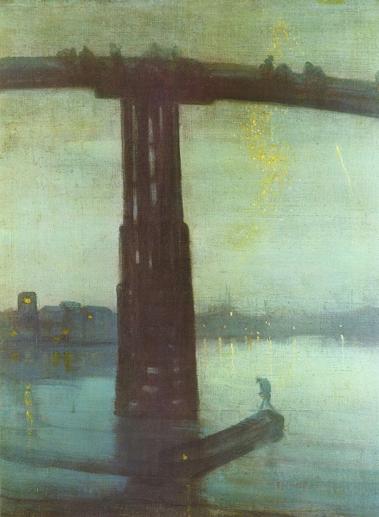
Édouard Manet is known as a pivotal painter in the transition between Realism to Impressionism., but his importance to me is his surface treatment. He was the first painter to eschew sparking bright lights and a superlative finish in favor of his own, raw, handwriting. He is, in this sense, the father of Modernism.

The Red Vineyard, 1888, Vincent van Gogh

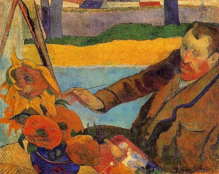
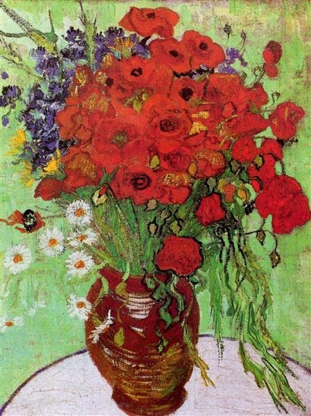
Vincent van Gogh hardly needs any introduction, being one of the most influential painters in art history. His importance to landscape painters can’t be overstated. He was the precursor to Fauvism, and that, far more than Impressionism, is what speaks to our own times.

Algoma Sketch 48, 1919-20, by Lawren Harris (member of the Group of Seven)

Tom Thomson and the Group of Sevencame into being across Lake Ontario from my hometown of Buffalo, but I didn’t really learn about them until adulthood, since realism was so out of favor in my youth. Still, these painters did more than any others to apply the principles of Impressionism to the North American landscape. They vary greatly in style, but they were united by their love of the Great White North and the wilderness. They were intrepid extreme plein air painters.

Resurrection Bay, Alaska, 1965, by Rockwell Kent

Rockwell Kent was eulogized as “a thoughtful, troublesome, profoundly independent, odd and kind man” by the New York Times. That’s all true, but he was also terrific painter, aggressively simplifying his subjects to their essence. His subjects—concentrating on the Adirondacks, Alaska and Monhegan—are all about the ever-changing light of the north.

Red Shirt and Window,2013, Lois Dodd (courtesy Alexandre Galley, New York.

Lois Dodd could be admired just for her tenacious success in the male-dominated New York art scene. Her credentials are as sterling as any of her male peers, but she had her first career museum retrospective in 2013, when she was already in her eighties. That would mean nothing if she weren’t also a superlative, self-directed painter. She ignored Abstract-Expressionism and Pop Art to forge her own, realistic way.

My 2024 workshops:

Was Vincent Van Gogh murdered?

A teenage bully, a troubled artist, wealth, power, and a conspiracy of silence have created the myth of Van Gogh’s suicide.
Farm near Auvers, 1890, Vincent Van Gogh, courtesy of the Tate

I stood for a moment catching my breath in Saranac Lake’s lovely old Beaux-ArtsTown Hall. A man sidled up, watching carefully to be sure we were utterly alone within the hubbub. He was reacting to last Thursday’s post.

“It’s been proven conclusively that Vincent Van Gogh was murdered,” he whispered.
Van Gogh’s suicide is legendary, so when biographers Steven Naifeh and Gregory White Smith questioned it in their 2012 biography, they were met with furious criticism. Some of their arguments don’t convince me. He left no note; not all suicides do. And anyone who’s had the misfortune to know a suicide knows that they can be simultaneously planning for the future and for their final exit.
The Church in Auvers-sur-Oise, View from the Chevet, 1890, Vincent Van Gogh, courtesy MusĂ©e d’Orsay
Other parts of their argument are more compelling. Shooting oneself in the gut is a painful and unlikely way to top oneself. Equally unlikely is staggering home over a mile of countryside to seek help.
If not Van Gogh himself, then who? Naifeh and Smith drew the bead on one René Secrétan, the 16-year-old son of a Paris pharmacist. He was a rich, privileged bully. Obsessed with Wild Bill Cody, he wandered around Auvers dressed in fringed buckskin, a cowboy hat and chaps, twirling a decrepit pistol. (And his neighbors called Van Gogh crazy.)
RenĂ© cozied up to Van Gogh. He modelled for the artist, shared his porn stash and paid for drinks. He and his friends let the artist listen as they consorted with ‘dancing girls’. At the same time, RenĂ© taunted and tormented Van Gogh.
The Road Menders, 1889, Vincent Van Gogh, courtesy the Phillips Collection
Van Gogh was shot on the road to the SecrĂ©tan villa, using René’s pistol. (“It worked when it wanted,” RenĂ© joked.) Why wasn’t it investigated as a murder? SecrĂ©tan was the child of wealthy summer people, while Van Gogh was a dodgy weirdo. But he was also starting to be recognized as a painter. The suicide story was a neat cap on his legend, helping to create careers and drive up prices for his paintings.
Naifeh and Smith hired noted forensic expert Dr. Vincent Di Maioto analyze the records. They published the results in Vanity Fair.
Auvers Town Hall on 14 July 1890 (Bastille Day), Vincent Van Gogh, private collection. This was painted fifteen days before his death.
“It is my opinion that, in all medical probability, the wound incurred by Van Gogh was not self-inflicted. In other words, he did not shoot himself,” Di Maio wrote. As mystery fans might have expected, the gun was in the wrong hand.
The evidence for SecrĂ©tan’s guilt is there. But, as a curator at the Van Gogh museum wrote to Naifeh and Smith, “I think it would be like Vincent to protect the boys and take the ‘accident’ as an unexpected way out of his burdened life. But I think the biggest problem you’ll find after publishing your theory is that the suicide is more or less printed in the brains of past and present generations and has become a sort of self-evident truth. Vincent’s suicide has become the grand finale of the story of the martyr for art, it’s his crown of thorns.”

How long did Van Gogh take to complete a painting?

The modern plein air movement is only about 30 years old. How is it changing art?
Not nearly finished…36X24.

I worked on one painting all day yesterday, carefully, methodically and in a focused manner. The Adirondacks are in an unstable weather phase, so I was forced off my dock three times by electrical storms. Still, I spent a solid six hours on this one painting. I expect it will take that much again to finish—if I get that time without another storm.

This is a new approach for me. I’m working bigger, slower, and more deliberately. Rushing to make many small works sometimes like writing postcards. The difference makes me wonder how plein air events shape the way we work.
Rocky, for Cape Elizabeth Land Trust, took me 2.5 days to finish.
It’s easy to forget how new modern plein air culture is. In 1985, painter Denise Burns formed Plein-Air Painters of America (PAPA). The next year, her group started an annual exhibition on Santa Catalina Island. The discipline has exploded in popularity with both artists and collectors. Plein air painting is accessible and comprehensible. The Art Establishment may look down on it, but the typical punter loves it.
Today there are hundreds of these events nationwide. There are also nomads whose profession is to participate in them. But these events are very different from getting together with your pals at the town park. For example, I never would have forced my work through a line of storm squalls if I were at home. I could return when the light matched my start, rather than struggling to finish in sub-optimal conditions. In fact, I could work an hour a day for a week on one painting, if I wanted to. None of these options are available for the event painter. We must work fast.
Towering Elms, for Castine Plein Air, only took me half a day.
Festival deadlines give rise to a fast landscape style as inexorably as the Internet has given rise to the 500-word blog post. 
According to the Van Gogh Museum, Vincent Van Gogh “put a great deal of preparation into The Potato Eaters, his first large figure study, working on dozens of preparatory studies. The final painting took ‘many days’ to complete, spread over a longer period of time. However, during the last two months of his life in Auvers-sur-Oise, Vincent completed a painting every day.”
Clearly, that kind of pace can drive you nuts.
Dry Wash, for Santa Fe Plein Air, took the better part of a day.
As a youth, John Constable was a dedicated rambler, sketching in the Suffolk and Essex countryside. These scenes, he said, “made me a painter, and I am grateful.” But this was a low-brow form of education for the time, and the art establishment suggested he not give up his day job. Constable always maintained a strict division between his loose field sketches and his finished paintings.
Paul CĂ©zanne, of course, didn’t have a car to dump his gear into and go. Instead, he painted Mont Sainte-Victoire more than eighty times, from various vantage points. Most frequently, he worked from what is now known as the Terrain des Peintres. It was close to his studio. 
Tom Thomson was transformed into a landscape painter through his intimate relationship with Algonquin Park. His patron, Dr. James MacCallum, said that Thomson’s paintings “made me feel that the North had gripped Thomson as it had gripped me since I was eleven when I first sailed and paddled through its silent places.”
The modern plein airpainter doesn’t generally develop that deep relationship with a particular place. On the other hand, we are forced to paint very fast, and that often results in a different kind of energy and verve. And it’s always fresh. We, like our society, are constantly on the move. That’s making a new kind of art.

Monday Morning Art School: how to be painterly

Bravura brushwork rests on a foundation of practice and skill.
Wheatfield with Crows, 1890, Vincent Van Gogh, courtesy Van Gogh Museum, Amsterdam
“Painterly” describes a painting that is comfortable in its own skin. It uses the paint itself to create movement and expression. It’s a quality found in every medium; even sculpture is sometimes described as painterly. Painterly works are loose and emotive, and they lead with their brushwork.
This is a sensual, rather than intellectual, quality. It comes from experiencing the paint itself. You’re there when you no longer fight the paint, but work with it. It’s the opposite of photorealism, where the artist works hard to conceal all evidence of his process. A painterly painting doesn’t fuss over the details.
Does that mean it must be impasto? No. Peter Paul Rubens, JMW Turner and JoaquĂ­n Sorolla were all painterly painters, and none of them wallowed in paint. There are many fine contemporary painters who work thin and expressively.
Cloud study, watercolor over graphite, 1830–35, John Constable, courtesy of the Metropolitan Museum of Art. We don’t usually think of Constable as painterly, but he was in his plein air work.
The term “painterly” was coined in the 20th century by art historian Heinrich Wölfflin. He was trying to create an objective system for classifying styles of art in an age of raging Expressionism. The opposite of painterly, he felt, was “linear,” by which he meant paintings that relied on the illusion of three-dimensional space. To him this meant using skillful drawing, shading, and carefully-thought-out color. Linear was academic, and painterly meant impulsive.
That didn’t make the Old Masters inevitably linear, however. Rembrandt and Lucian Freud are both painterly painters. Richard Estesand Sandro Botticelliare both linear.
Today, we don’t see accurate drawing as an impediment to expression. In plein air work, acute drawing is often overlaid with expressive brushwork. The idea of painterliness—of being loose and self-assured—is treasured even as we strive for accuracy.
House in Rueil, 1882, Ă‰douard Manet, courtesy National Gallery of Victoria, Melbourne
How do we develop painterliness?
First, master the fundamentals. “You can practice shooting eight hours a day, but if your technique is wrong, then all you become is very good at shooting the wrong way,” said basketball great Michael Jordan. “Get the fundamentals down and the level of everything you do will rise,” he said. That’s very true of painting, where there is a specific protocol for putting paint down.
Then practice, practice, practice. “I’m not out there sweating for three hours every day just to find out what it feels like to sweat,” said Jordan.
Expect failure. It comes with pushing your technique. “I have missed more than 9,000 shots in my career. I have lost almost 300 games,” said Jordan. “On 26 occasions I have been entrusted to take the game winning shot
 and missed. And I have failed over and over and over again in my life. And that is why I succeed.”
Beach at Valencia, 1908, JoaquĂ­n Sorolla, courtesy Christie’s
You can’t teach yourself to be relaxed; you can only get there through experience. The only way to be painterly is to paint. I can show you expressive brushwork techniques, but there are still no shortcuts. It happens automatically and naturally with experience. You stop focusing on the mechanics, and start focusing on what you see. Your eye is on the ball.
Many times, artists only realize their painterly styles in old age. That is when Titianstarted painting in blotches, in a style that came to be known as spezzatura, or fragmenting. “They cannot be looked at up close but from a distance they appear perfect,” wrotethe Renaissance art critic Giorgio Vasari. Rembrandt is another painter who started out painting precisely but ended up loose. Édouard Manet is still another. In fact, the list is inexhaustible.
Vincent Van Gogh is the personification of painterliness. He died at 37, but still managed to produce around a thousand paintings (that we know of).
Bravura brushwork simply rests on the foundation of all those paintings that went before.
I’m at Saranac Lake, prepping for Adirondack Plein Air, which starts this morning. I wrote Extreme Art: Painting inside the Blue Line just for this event. It’s not on my blog, so if you’ve ever been interested in what goes on at a plein air event, enjoy.

The trouble with nocturnes

Modern nocturnes document only the contrast between bright lights and the void. There are so many other cool things that go bump in the night.

Nocturne in Blue and Gold: Old Battersea Bridge, c. 1872-1875, James Abbott McNeill Whistler

Yesterday, a student was describing a late-evening sky she had seen, with the objects bathed in an unusual warm light. “I’m sick of nocturnes always being done in Prussian blue fading to black,” she complained. Since she has an MA in art history and works in a gallery, she’s not talking through her hat.

“We always paint nocturnes wearing headlamps,” said another student. “The human eye takes about 25 minutes to fully adapt from bright sunlight to complete darkness, and the headlamp continuously interrupts that. Cameras lie, too, about what darkness looks like.”
The Polish Rider, 1655, Rembrandt van Rijn 
She had just explained the technical problem with painting nocturnes in a nutshell. They are driven by our current technology—headlamps and easel lights—just as the high contrast of Frederic Remington’s nocturnes were driven by camera technology of his day. Headlamps and easel lights exaggerate the contrast between dark and light because they’re constantly stimulating our eyes to stay in a photopic(daylight) state.
Winter, Midnight, 1894, Childe Hassam
Human night vision is limited to discriminating between different values of black and white, and the resolution and contrast are poorer. But there are many steps between light and true darkness, and most nocturnes are in fact painted using mesopicvision, which we use when we’re faced with a combination of lighting.
Moonlight, Ralph Albert Blakelock
When we transition from day to night, our eyes create photopigments in the cones and rods to increase sensitivity. The adaptation period is different for rod and cone cells. Cone cells can do this in about ten minutes of darkness, but rods require between 30-45 minutes. There are, of course, differences in how fast each of us can make the adaptation. Old age, as with so many other things, slows us down.
Snow in New York, 1902, Robert Henri
The transition from dark to light happens much more quickly. It takes about five minutes for the eyes to bleach out the photopigments they created to see in the dark.
The Call for Help, Frederic Remington
Humans are color-blind in true low-light situations. However, at twilight, when most nocturnes were painted, we suffer from something called the Purkinje shift. During the daytime, people are most sensitive to light that is greenish-yellow. At night, people are more sensitive to greenish-blue light.
The Tornado, 1835, Thomas Cole
The rods in our eyes (which are more light-sensitive and thus more important in low-light situations) respond best to green-blue light. The cones in the retina, which respond to colors, don’t work well in lower-light situations. As the light gets lower, our ability to see reds falls off.
Moonrise, 1894, David Davies
Scientists and tinkerers have long understood that red lights don’t trigger our eyes into photopic vision. That’s why they’re used in control rooms or the nocturnal animal displays at the zoo.  
Starry Night Over the RhĂŽne, 1888, Vincent Van Gogh
Historically, nocturnes were about solitude, or sometimes, bad behavior. In our jazzed, electric world, they’re more likely to focus on lighting and energy. The modern nocturne is always a description of civilization overtaking nature. It is a brightly-lit subject set against an empty field of blackness. By definition, that’s urban, and it contrasts our desires against our fears. The best modern nocturnes create a place to go to escape encroaching darkness. I’d say there’s more to that than just how our eyes work, but our vision certainly plays a part.
Nocturnes are very popular right now, both with painters and with buyers. I don’t paint them often, because I’m not a night person, but several of my friends do, and do it well.
Hiawatha, 1870, Thomas Eakins
Today’s post is absurdly larded with illustrations, but I wanted to show you the many ways in which people painted nocturnes before we had headlamps.

How to choose a view

Writers are told to write about what they know. What should artists depict?
The Red Truck, by Carol L. Douglas
Yesterday I stopped to sit for a few minutes on a stone wall in Rockport. In my solitude, I noticed the beautiful asymmetry of the house across the street. Its white clapboard and modest door were framed by dark spruces and a dandelion-studded lawn.
Most people zip down this street with no more than a passing glance at the historic homes and the harbor below. Yet there are many quietly memorable moments: a brook burbling over granite, ancient gnarled beeches, sunlight glancing off cedar shakes. The only way to see them is to get out of the car and walk.

“Yes, well, views are very nice, Hastings. But they should be painted for us so that we can study them in the warmth and comfort of our own homes. That is why we pay the artist for exposing himself to these conditions on our behalf.” (Poirot: The Adventure Of The Clapham Cook)

Drying Sails, by Carol L. Douglas.

 â€œHow and why do you choose the views you paint?” a reader asked. The answer depends, in part, on why I’m painting. If I’m in a plein air event or on the road, the views I choose will tend to be more iconic. Here in mid-coast Maine, I have the luxury of intimacy.

Anything can be the subject of a painting. That doesn’t mean content is unimportant. I paint what matters to me: boats, rocks, water, skies, earth and trees. This was never a conscious choice, but the impulse is so strong that it drove me from Western New York to Maine.
Keuka Lake, by Carol L. Douglas
I don’t think you can force this choice. Most artists experiment with subject matter before finding their mĂ©tier. Piet Mondrian’s windmills and Vincent Van Gogh’s dark peasant studies are two examples.
Composition must drive any painting. In Rochester last week, a student showed me her first design, of a row of peonies marching at a diagonal across her page. I suggested she move 90° to catch the slight S-curve in the row. The difference was staggering.
Castine Lunch Break, by Carol L. Douglas
Closely tied to this is the question of light. Sunlight is the major organizing principle in landscape painting, but we can’t always order it up. In today’s drear, I’m going to suggest to my plein air class that we concentrate on close-ups rather than vistas. The architecture of objects can partly cover for the absence of light.
“There are no lines in nature, only areas of colour, one against another,” Edouard Manet said. The northeast is overwhelmingly cool in color: blue or grey skies against similar seas and green foliage. I look for color patterns within that, particularly those with a flash of warmth: the orange line in the seaweed, the pink of granite, a yellow glint in the sky. After light, color patterns are paramount.
Dinghy, Camden Harbor, by Carol L. Douglas
I also think about meaning. This is old-fashioned, but I don’t see the point of painting if my work says nothing. I hope that my paintings speak about the relationship of man to his environment, about the enduring qualities of the earth, and about simple joy.
Rocks at the American Yacht Club,by Carol L. Douglas.
Addendum: if you’re a landscape photographer, you might be interested in this contest sponsored by Machias Savings Bank.

The greatest painter of rain

The greatest landscape artist of the 19th century wasn’t a Frenchman. He was Hiroshige, or so his western contemporaries thought.

Sudden Shower Over Shin-Ohashi Bridge At Atake, 1856, Hiroshige.
As I was walking to the post office yesterday, a miniscule rain shower spattered in the woods next to me.  It lasted no more than a second. Being modern, I didn’t recognize it as an omen. Despite the forecast, by midafternoon it was misting heavily enough that no outdoor painting was possible.
We’ve had a lot of rain this spring in the northeast. The St. Lawrence River is full, so they’re holding water back in Lake Ontario, which is in turn flooding parts of Toronto and Rochester. Here in Maine the creeks and rivers patter loudly and joyfully down to the sea. And still it continues to rain; it’s on the forecast for the rest of this week.
Night Rain On Karasaki, Hiroshige
The 19th century Japanese artist Utagawa Hiroshige often used mist and rain as motifs in his compositions. He worked in a genre called ukiyo-e, which translates as “pictures of the floating world.” After Commodore Perry forced Japan opento Westerners in 1854, ukiyo-e was exported to the west. It had a profound influence on Western painting.
Hiroshige was the last master of ukiyo-e. Born in 1797 in Edo (Tokyo), he was left orphaned at the age of 12. His father was the samurai fire fighter of Edo Castle, and this responsibility passed to the son. Although he went on to study and work full time as an artist,he never shirked his duty, eventually passing it along through his family.
Two Men On A Sloping Road In The Rain, Hiroshige
Shortly after his parents’ deaths, he began studying art with the master Utagawa Toyohiroof the Utagawa school. This exposed him to western ideas of perspective, which had been imported in books carried to Japan by Dutch traders. The Utagawa school pioneered landscape painting as an independent genre.
Hiroshage worked with a sketchbook, traveling to other locations to assemble ideas and motifs for his woodcuts. Although he was prolific and famous, he was never wealthy; at one point his wife had to sell clothing and ornamental combs to support his work.
White Rain, Shono, 1833-34, Hiroshige
Hiroshage worked within the narrow genre of meisho-e, or “pictures of famous places.” In a sense, these were the predecessors of picture postcards.
Japonisme took the 19th century world by storm after the International Exposition of 1867 in Paris. Oriental bric-a-brac poured into western Europe. James Whistler reportedly discovered Japanese prints in a tea room near London Bridge. Claude Monet saw them used as wrapping paper. James Tissot and Edgar Degas collected ukiyo-e. Mary Cassatt was an open and avid admirer and imitator of the style. Vincent van Gogh famously copied two of the One Hundred Famous Views of Edo, which were among his collection of ukiyo-e prints.
And it wasn’t just the visual arts. Gilbert and Sullivan produced their comic masterpiece, The Mikado, in 1885. Japanese gardens became the rage. By the end of the century, Hiroshige was being referred to as the greatest painter of landscapes of the 19th century.
Evening Shower At Nihonbashi Bridge, 1832, Hiroshige
Hiroshige died at the age of 62 during a cholera epidemic in Edo. Just before his death, he wrote:
I leave my brush in the East
And set forth on my journey.
I shall see the famous places in the Western Land.

Sadly, the same cultural exchange that sparked so much artistic development in Europe also spelled the end of ukiyo-e. The rapid Westernization following the Meiji Restoration found photography vying with traditional woodblock printing. By the 1890s the tradition was, more or less, dead.

It’s a fake, darn it!

“Women working in wheat field, Auvers-sur-oise,” 1890, Vincent van Gogh

“Women working in wheat field, Auvers-sur-oise,” 1890, Vincent van Gogh.
I often say I’m not a big believer in an art genius, any more than I’m a believer in a math genius or a language genius. Almost everyone can learn to draw, just as almost everyone can learn to do sums, write or sing. To make this point, I frequently point people to Van Gogh’s drawing. By dint of hard work, his drawing went from pedestrian to splendid in just a few short years.
Vincent van Gogh: the Lost Arles Sketchbook was published simultaneously this week in France, the United States, Japan, Britain, Germany and the Netherlands. Its author, Bogomila Welsh-Ovcharov, is a respected Van Gogh scholar from the University of Toronto. “When I opened it up, the first thing I said was, ‘No, unbelievable!’ The first drawing that I took out and held in my hands, it was a moment of total mystical experience: ‘Oh my goodness, this is impossible!’” said Welsh-Ovcharov.
The book is based on a folio purported to contain 65 recently-discovered Van Gogh drawings from his mature period. Van Gogh’s drawings are very instructive. He used a pencil or pen with the same flourish as a brush, creating works with energetic and detailed mark-making using an enormous range of technique. Even at the nosebleed list price of $85, the book was making my credit card hand start to itch.
“Small house on road with pollarded willows,” 1881, Vincent van Gogh.

“Small house on road with pollarded willows,” 1881, Vincent van Gogh.
But wait, there’s more! On Tuesday the Van Gogh Museum in Amsterdam—the accepted top dogs on the subject—released a statement saying that the drawings are fakes. Among other things, they say that the drawings do not show the rapid development in skill that was the hallmark of this period in his work.
I wouldn’t need anything more to convince me, because that’s the defining characteristic of his drawing career. However, the Museum also notes that the drawings include topographical errors. Van Gogh was a meticulous recorder of reality. It is inconceivable that any painter would forget the details of a place in which he lived and worked. Drawing has a way of deeply imprinting them on your being.
“Vincent's boarding house In Hackford Road, Brixton, London,” 1873, Vincent van Gogh

“Vincent’s boarding house In Hackford Road, Brixton, London,” 1873, Vincent van Gogh.
I feel like a kid who just got socks for Christmas instead of the toy I really wanted. This doesn’t, however, negate what Van Gogh’s drawings say to me as an artist and teacher: to paint, you need to be able to draw, and you need to do it as regularly and naturally as you brush your teeth.

Drawing the genie from the bottle

Van Gogh Painting Sunflowers, 1888, Paul Gauguin. If still life couldn’t express emotion, Van Gogh’s sunflowers wouldn’t move us.

I have a young Facebook friend on the other side of the country who likes to draw. I try to give him pointers long-distance, but that isn’t always easy. His problems are less technical than emotional. He was the victim of significant and deep abuse and is now separated from his family. He has a creative block—lots of ability, lots of feelings, but he’s been taught (or taught himself) to repress them so deeply that even expressing them through drawing is difficult. His default behavior is to anesthetize his feelings with drugs, not unpack them and look at them.
He often asks, “What should I draw?” This is not a question most teens ask; usually their ideas outrun their skill. It doesn’t mean his creativity is impaired; it means he has his thoughts and emotions bottled up. The genie-in-the-bottle is so big that it must be unpacked and examined piece by piece.
If he were here, I would have him draw and paint still lives. They have no meaning of their own. They are a means through which art students learn technical skills. However, powerful emotions have a way of leaking out around the edges no matter what the subject matter is.
Red Poppies and Daisies, 1890, Vincent van Gogh
Yesterday, I was coming back from New Jersey, and found this Facebook message from him: “How do I make drawings of how I feel? What do I draw? I want to draw it but I don’t know how.”
In recent weeks, my friend has made a good start by drawing the temple that symbolized his abuse. He has drawn it consumed by fire, wrapped in a snake, destroyed by a fire-eating dragon. It doesn’t take a psychologist to see this as a leap forward.
I often refer to Vincent van Gogh when discussion the importance of practice in drawing. This is Miners in the snow at dawn, drawn in 1880.
Earlier this year, I wrote about a test called the House-Tree-Person. As initially designed by John Buck in 1948, this test was meant to be purely subjective—the artist would draw a house, a tree, and a person. The psychologist would interpret them.
And this is Road with Pollard Willows and Man with Broom, from 1881. What a year with a sketchbook can do!
I suggested to my young friend that he start by drawing these three things. They are both universal and meaningful, because they represent home, life and growth. But I’m a painting teacher, not a therapist. Any of you with proper qualifications who want to chime in with suggestions, they would be very helpful.


Let me know if you’re interested in painting with me in Maine in 2014 or Rochester at any time. Click here for more information on my Maine workshops!

Growing pain

The Yellow Christ, Paul Gauguin, 1889, is no longer the “art of the present” but it’s one of my favorites at the Albright-Knox. 
The Albright-Knox Art Gallery has announcedthat it plans an addition to its venerable space on Elmwood Avenue in the city of Buffalo. While it’s true that the current 19,000 square feet of floor space is crammed, one wonders—of course—who is going to pay for the addition.
The museum’s collection contains about 6,740 works, of which it can only exhibit about 200 at a time, according to Thomas R. Hyde, president of the museum’s board. “Campus development is no longer an option; it is a necessity,” he added. “We are, in many ways, a middleweight museum with a heavyweight collection.” And then he mentioned the cracks in the marble floors of the gallery’s original building.
(Veterans of capital campaigns will recognize that last gambit: throw in some deferred maintenance and people are supposed to stop kvetching about major changes.)
Side of Beef, Chaim Soutine, c. 1925, is another of my favorite Albright-Knox pieces.
Meanwhile, gallery director Janne Siren insists that plans are still in the ‘conversation’ phase. Having said that, the board has been rattling the can for expansion since publication of their 2001 strategic plan.  â€œSiren took over the directorship of the Buffalo gallery shortly after city fathers in Helsinki, Finland rejected a plan he had spearheaded to build a large Guggenheim museum there using public funding,” reported WGRZradio.
In 2007 the Albright-Knox Art Gallery deaccessioned a Roman bronze sculpture that subsequently netted $28.6 million at Sotheby’s. It was part of a larger deaccessioning of works that fell outside the ‘core mission’ of the gallery, which then-director Louis Grachos defined as “acquiring and exhibiting art of the present.” Alert Buffalonians immediately wondered what that meant for their own favorite works.
The deaccession vote was approved only on the contingency that the funds raised would be used to buy additional artwork. That meant that the money from the sale would be added to the paltry $22 million acquisitions endowment. (The overall endowment of the museum was then about $58 million.)
Being from Buffalo, I first visited the Albright-Knox while in diapers. Deaccessioning the Roman sculpture and clearing that exhibition space for other work was the right thing to do. But I share the Buffalo cynical mind, and I have my doubts about the viability of this project.
Buffalo is now half the size it was the year I was born, and there’s no sign that the population drain will abate any time soon. Clearly the board is counting on tourists to make up their numbers, and with the elegant expansion of the Burchfield-Penney Art Centeracross the street, an argument can be made that an arts corridor is possible on Elmwood Avenue.

La Maison de la Crau (The Old Mill), Vincent van Gogh, 1888, is another Albright-Knox piece that can no longer be termed ‘of the present.’ 

But that doesn’t address the question of how it will be paid for, or where the expansion will go. The Albright-Knox is landlocked, with Delaware Park at its front and Elmwood Avenue by its back door. Any kind of significant expansion would infringe on its parking lot, its neighbors, or the park.
1957-D No. 1, Clyfford Still, 1957. The Albright-Knox has a large collection of Still’s paintings. Last time I was there, I noticed how many 20th century paintings needed conservation. It’s not as sexy as expansion but still necessary. 
I await future developments with great interest.

Message me if you want information about next year’s classes and workshops.