fbpx

The problem with supply lists

I should KonMari my paint collection, not add to it. We go to workshops weighed down with too much stuff.

No, I don’t need any more watercolor pigments.
Many years ago, I took a workshop from a figure painter who specified cadmium green. I came home with an unopened tube and dropped it in a drawer. It’s still unopened.
I have great sympathy for students faced with a new supply list. In some instances, buying from them is redundant. For example, my list calls for Prussian blue, but if you already have phthalo blue, you’ve already got an excellent pigment for that color space.
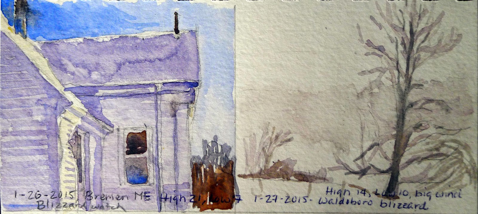
It helps to understand the instructor’s reasoning. My list is based on paired primaries because I believe it allows the greatest range in color space. It occasionally changes as my painting technique evolves.  
Students usually show up with too much stuff because they don’t want to be caught without something they need. Most of what they carry, they never use. I’m feeling that urge to over-pack as I assemble the materials for Poppy Balser’s workshop in May.  Poppy, like me, is loath to send her students on spending sprees. However, it makes no sense to drive that distance and not be prepared.
And I don’t need a new mixing tray, either.
I trotted out my watercolor basket expecting to have to fill in color gaps. Actually, I should KonMarimy paints. What’s in the picture, above, is probably a quarter of the tubes in my basket. Does anyone really need five tubes of ‘opera pink’? More importantly, what is ‘opera pink,’ anyway?
Manufacturers love labeling convenience mixes with historic names. Consider Naples Yellow, used from the 18th to the 20th century. The real pigment is toxic lead antimonate. Modern paints labeled “Naples yellow” are made with a mix of modern pigments. You can make your own easily enough with white and yellow ochre.
That is the only name that really matters.
Pigments are listed on the tubes of all major paint makers in the form of Colour Index (CI) numbers. These are in tiny lettering on the side of most paint tubes. If the first letter is a “P,” that’s a pigment; if it’s an “N,” that’s a lake of a naturally-occurring substance like cochineal. The second letter tells you the general color family. The third tells you the actual pigment used.
A glance at my tube of ‘opera pink’ tells me it’s really PR122+BV10. The first is my old friend quinacridone magenta. Unfortunately, the second is a dye, rhodamine B, which bleeds and isn’t lightfast at all. I should pitch all five of those tubes.
My brushes, on the other hand, need help. New Yorkers will recognize some as being from the cheap bin at Pearl Paint.
If there is more than one CI number on the tube, you’re actually buying a hue or convenience mix. Many paint manufacturers sell hues of expensive pigments like the cadmiums and cerulean blue. They’re not consistent across brands, and they never have the handling characteristics of the more expensive paints they’re meant to imitate.
As with opera pink, even if the main pigment is lightfast, its partner may not be. Almost always, using single-pigment paint gives you the most flexibility in mixing.
There are many pigment guides on the web. Here is my favorite. Although it’s meant for watercolor, pigments are consistent across all media.

Seeking peace in a painting

“Spring Snow in the Maples,” 10X14, Poppy Balser

“Spring Snow in the Maples,” 10X14, Poppy Balser
The most-read post I’ve ever written was about how to fold a plastic shopping bag. Peoples’ reactions to my writing always surprise me. It’s one of the great joys about blogging—and about painting. You send your ideas out into the world, and they elicit responses you never dreamed of. And here you thought you were being perfectly clear.
When I wrote about going to Buffalo for a funeral last Thursday, it was a howl from my own darkness. I figured people would read it and move on. Instead, I’ve received a deluge of responses: on Facebook, by email, and in person. Stories of sons dying, friends dying, nephews dying. Stories about the child of a senior pastor, a daughter-in-law. Stories of near misses and years of soul-crushing worry.
“Passing Goat Island,” 7X11, Poppy Balser

“Passing Goat Island,” 7X11, Poppy Balser
About five years ago, I decided I would pay attention every murder in Rochester, NY. Two things became apparent. The first was that murder victims in my city were overwhelmingly black, male and young. The second was that society reacted much more strongly when the crime victim didn’t fit that demographic. Young gang-bangers, we tell ourselves, bring this on themselves. It is only when they miss and shoot a child or a grandmother that people make a fuss.
That is part of the black, urban, poor side of the drug war.* I’d totally missed the white, suburban, affluent side because we don’t call drug overdoses “murder,” and we don’t put them in the news. Often, we don’t even talk about the cause of death. But inner-city murders and suburban overdoses are flip sides of the same evil coin.
“Your adversary the devil prowls around like a roaring lion, seeking someone to devour,” says 1 Peter 5:8.
“Hay Bales and Evergreens,” 7X11, Poppy Balser

“Hay Bales and Evergreens,” 7X11, Poppy Balser
As you can imagine, I drove home from Buffalo in a black mood. I’m seeking peace. And I found it in my mailbox last night, with four paintings by Nova Scotia artist Poppy Balser. (I’ve written about her before, here.) “To spread a little calm this week I thought I would share some of my paintings from this last year that I painted in particularly peaceful surroundings,” she wrote.
Why are these particular paintings so peaceful? Poppy painted them in tightly-controlled analogous color schemes—it was a blue day on the water, a green day in the fields, or a misty grey day in the winter. There are no notes of complementary color to engage us. Our minds are free to rest.
These paintings are a great example of color theory in action. If they make you feel less frantic this holiday season, they’ve just demonstrated one reason why art is so profoundly important to society. In fact, take one painting and call me in the morning. They’re more powerful than Xanax, and totally free of side effects.
“Farmyard Morning, 7X11,” Poppy Balser

“Farmyard Morning, 7X11,” Poppy Balser
*In 2000, the highest overdose rate was among black Americans aged 45-64. Today, it’s young white people. Non-whites actually use less heroin than in the past; the out-of-control epidemic is in white America.

Soon-to-be famous woman artist

Indiana Statehouse, by Karen Pence.

Indiana Statehouse, by Karen Pence.
Yesterday, a reader sent me this piece from the Washington Post, asking what the Trump administration means for the arts. I’ve written about the cringeworthy portrait of him by Ralph Wolfe Cowan that hangs in his home in Mar-a-Lago. However, his taste in art hardly matters. Politics doesn’t affect the arts directly; it makes or breaks us in how it runs the economy.
WaPo mentioned that incoming VP Mike Pence and his wife Karen have a strong history of supporting the arts. She has an undergraduate minor in art, she has taught art, worked as an artist, and championed art therapy.
That undergraduate minor was an afterthought. Her college, Butler University, required a declared minor. “I thought gosh, ‘I’d like to learn more about art,” she told the Indianapolis Star on the eve of Pence’s inauguration as governor of Indiana. “I pulled it out of the air.”
Mrs. Pence grew up outside of Indianapolis in a town called Broad Ripple. I’ve painted in Indiana, and I agree with her assessment that “Indiana is just a very special place. There are no other people like Hoosiers.”
When the Pences had children, Karen decided to take an art class. She chose watercolor because it dries fast. “I told Mike I need a night when you’re in charge and I just go have fun,” she said. “Then what happened was, I realized I can paint.”
Unlike Mrs. Pence, I’ve always painted, but work and kids got in the way. I picked up my brushes again when my youngest child was born, from the same need to escape the incessant demands of motherhood. I’d wager that isn’t uncommon.
Indiana First Lady Karen Pence takes in the 91st Annual Hoosier Salon Exhibition at the Indiana Historical Society, August 2015 (courtesy of http://www.in.gov/).

Indiana First Lady Karen Pence takes in the 91st Annual Hoosier Salon Exhibition at the Indiana Historical Society, August 2015. (Courtesy of http://www.in.gov/)
What followed for Karen Pence was a series of house portrait commissions: well-executed and deeply traditional. As a politician’s wife, she’s had the opportunity to champion art to a broader audience. In 2008, she became the honorary chair of the Art Therapy Committee at the Riley Hospital for Children. The Indiana First Lady’s Charitable Foundation, has, during her tenure, focused on children, families and the arts.
Karen Pence also ran an Etsy shop, selling something she called “towel charms.” It was suspended during the election, but not before it was broadly ridiculed.
Indiana First Lady Karen Pence working with students from Southside Elementary School on an art exchange program with Japanese students (courtesy of http://www.in.gov/).

Indiana First Lady Karen Pence working with students from Southside Elementary School on an art exchange program with Japanese students. (Courtesy of http://www.in.gov/)
Those who lampooned her towel charms as ‘useless’ have apparently spent no time at all on Etsy, where whimsy is the by-word that has created an $85.3 million a year business. While I certainly wouldn’t defend her towel charms as ‘art,’ I would note that art is intended to be useless. In fact, lack of purpose is the primary distinction between fine art and fine craft.
Do I think Karen Pence is a great artist? No, but I hardly see how that matters. Teacher, wife, mother, artist, operator of an Etsy shop: it’s the resume of many working artists.
As we ponder how to close the gender gap in the art world (here and here), I suggest that we quit apologizing for being women. It’s not like male artists don’t work other jobs at points in their careers (including child care). The bottom line is, no matter what lip service they give to feminism, many intellectuals don’t really like the things women actually do.

A mystery

The painting Russ bought at an antique shop in Southern Maine,

The painting Russ bought at an antique shop in Southern Maine,
Today I present a mystery. I wish I could solve it myself, but it’s out of my area of expertise. I hope that one of you knows someone who knows someone who can speak definitively on the subject.
Russel Whitten is a talented young watercolor painter. In the short time I’ve known him, he’s become one of my favorite artists in the Maine plein air scene. At this year’s Art in the Park, we took a break together outside the Ocean Park Soda Fountain. He showed me a photo of a picture he acquired at an antique shop several years ago.
Russ believes it’s an Edward Hopper watercolor. He has studied Hopper’s watercolors extensively and is convinced he’s right. Since Russ is a watercolorist himself, he thinks deeply about painting technique and style within his own medium.
“Trawlers,” Edward Hopper (Gloucester, MA)

“Trawlers,” Edward Hopper (Gloucester, MA)
Although he was best known as an oil painter, Hopper first achieved success as a watercolorist, a medium he never abandoned. He produced many, many watercolor paintings, including studies of working boats such as trawlers, freighters and tugboats.
“Rocks and House,” Edward Hopper, undated

“Rocks and House,” Edward Hopper, undated
When art historians determine who painted something, it’s called “attribution,” and it’s by no means an exact science. How certain they can be depends on style, documentary evidence and scientific experimentation.
I did a quick perusal of Hopper’s Gloucester and Maine watercolors. Sometimes he signed them; sometimes he didn’t. Sometimes his drawing was exceptionally accurate; at other times it was whimsical. (Hopper had a great capacity for narrative and whimsy.) I’m not an art historian, and the image Russ sent me is very low resolution, but the color palette and the brushwork seem appropriate for the time, and possible for the artist.
“Back Street, Gloucester,” Edward Hopper, 1928.

“Back Street, Gloucester,” Edward Hopper, 1928.
I’m writing this from the airport at Toronto, Ontario. In this noise and chaos, it’s almost impossible to research anything intelligently, so I’m leaving it up to you.
So while I’m hiking around Iona tomorrow, you can scratch your head over this. If you know anyone whose specialty is Hopper, forward this to them and see what they say. Even better, look up some Hoppers yourself and try to make an informed guess. After all, art history is for everyone.

Wherever we go, that’s where the party’s at

"Parker dinghy," by Carol L. Douglas. 8X10, oil on canvasboard.

“Parker dinghy,” by Carol L. Douglas. 8X10, oil on canvasboard.
On Friday, Brad Marshall and I had only a short time to paint before he had to head back south. We decided small watercolor sketches were all we could pull together in the time we had. Sandy Quang is my former studio assistant and is now working at Camden Falls Gallery this summer. She joined us with her sketchbook before work. Since we weren’t using easels, the simplest thing was to dangle our feet in the water and draw the lobster boat on the next dock.
Sandy, me and Brad hard at work at Camden harbor, with our feet in the water.

Sandy, me and Brad hard at work at Camden harbor, with our feet in the water. (Photo courtesy of Kathy Jalbert)
Across the harbor, another painter was working away at his easel. It was George Van Hook.  I called him on my cell phone to say hi, since my voice would never carry that far over open water. He was ready for a short break so he came over and joined us on our dock.
I never know who I’ll see at Camden’s Public Landing, but there’s always someone I know—a sailor, another painter, or a Camden or Rockport friend just enjoying the sun. And I’m always meeting new people, too. For me, plein airpainting is often about balancing the party with the need to do serious work.
We didn't have time to paint anything polished, so we each did little watercolor sketches before saying goodbye.

We didn’t have time to paint anything polished, so we each did little watercolor sketches before saying goodbye. This was mine.
Later that day, my husband and I joined painter Bobbi Heath and her husband aboard their lobster boat for dinner. Moored in Tenants Harbor, we were surrounded by wildlife. An osprey took up residence on the mast of a neighboring boat, chirruping to his mate who flew nearby. Suddenly he dropped into the sea like a rock, and rose with a fish in his beak—and then he was gone, bringing home the bacon. A seal poked his dappled nose out of the water nearby. Black Guillemots—a kind of puffin—potted around us as we ate. The light dropped and the evening breeze picked up, and we glided back to shore under a sliver of new moon.
Lobster dinner on a lobster boat.

Lobster dinner on a lobster boat. (Photo courtesy of Douglas J. Perot)
Today I start a series of wild perambulations, which include Acadia National Park, Scotland, and an Alaska-to-Nova-Scotia painting trip (plus three more events in Maine). I expect to be home for good in mid-September. On Saturday I finished the painting above, which is of a Parker dinghy built on Deer Island, NB. That allowed me just enough time to pack and get to the Schoodic Institute, where I met up with this year’s workshop students.
After dinner at the Commons, Ken and Corinne Avery and I spent some time looking at aurora borealis predictions. Turns out these can’t be made very far in advance, but there was some possibility of solar-wind activity last night. The partly-cloudy sky was predicted to clear by 11 PM.
My first realization is that I need an app for this. My second is that they exist. Since I’ll be spending much of the next month traversing prime Northern Lights territory, I need to figure one out.
Alas, the aurora borealis didn’t show up. It’s a whole new week, however, and thePerseid meteor shower is expected to peak on Thursday and Friday. Who needs sleep? I do, of course. But I feel the likelihood of a spectacular night-sky event in my bones.

Holy mackerel!

My demo painting. Not inspired, but by the time we were done, everyone had done all the steps.

My demo painting. Not inspired or finished, but by the time we were done, everyone had done all the steps.
I hate whole-class demonstrations, mostly because I hate watching them myself. Nevertheless, some processes require step-by-step instruction, and I try to sneak them in where possible.
With oil paint, you can set your easel up like a lectern in front of a group. With watercolor, particularly used as a field sketching medium, it’s not that simple. The work needs to be angled nearly flat, which makes watching the process more difficult.
Even in Vacationland painting classes fade away in August. People have things to do. Yesterday I was down to two students. Both are in the early stages. It was the perfect time to go over the basics of watercolor.
My idea was similar to those paint and sip events that are so popular right now. Being mid-morning, there was no wine. (Of course, there is no real relationship between drinking and art, any more so than there is between drinking and engineering.) Furthermore, I didn’t give them a canned subject; we would choose a general area in which to work and they could frame it as they wanted.
Come to Maine. The work is strenuous, but you will learn a lot.

Come to Maine to paint. The conditions are strenuous, but you will learn a lot.
We did each step in unison. First we chose subjects, then we did a value study, then we cropped our studies. We transferred our drawing to paper, did washes, built in darks.
At no time did we proceed to the next step before all three of us had finished with the prior one. That has a curious way of messing with your concentration.
For a while, a school of mackerel swirled in the water at our feet, snapping at something on the surface. A large gull dove into it, coming up empty-beaked. Come to Maine to learn to paint; it’s never boring.
My polarized sunglasses let me watch the column of fish deep in the water, but sadly my camera could only photograph the surface.

My polarized sunglasses let me watch this column of fish swirling in the water, but my camera could only photograph the surface.
We ran out of time long before we were finished, but we’d reviewed all the principles, including that a good painting takes a long time. Whatever the medium is, that’s universally true.
Our subject was simple and pedestrian, and eventually was obliterated by the arrival of lobster boats back from their morning’s work. None of us painted anything brilliant. But we established the order of operations for watercolor, which is so radically different from painting with oil. We were able to discuss brushes and technique in detail.
After class, I walked to the post office to get my mail. I remarked to my husband that teaching two students always requires more concentration than teaching six. I think all three of us learned a lot.

Saying silly things

"Evening at Marshall Point," 8X6, by Carol L. Douglas

“Evening at Marshall Point,” 8X6, by Carol L. Douglas
Forty minutes from my studio, Marshall Point Light is really too far to go for a day class. However, without the large islands that protect Penobscot Bay, bigger breakers form here. It makes for nice painting.
My off-the-cuff assessment is that tourism in mid-coast Maine is up this year. Marshall Point and Drift Inn Beach were both full of visitors yesterday. Perhaps it’s because a nice domestic vacation on the beach seems so safe in this world of dark violence. I feel some advertising slogans bubbling up. Maine: where nobody wants to cut your head off.
Fog at Marshall Point.

Fog in the morning.
My personal goal right now is to stop correcting people. I am not everyone’s mother, nor do I always have to be right. I repeat this to myself like a mantra. It’s a special challenge in a tourist town, because being out of our own milieu sometimes makes us say really silly things. I’m no exception, and—worse—I occasionally say them in print.
Marshall Point has some astonishing geological features. Basalt dikes lace into light grey granite. Around them twist wildly-contorted bands of quartzite and schist. In some places, these materials have been remelted and formed into migmatite.
I only know this because I looked it up after I told someone those light bands were probably limestone.
Part of the beautiful rock formations at Marshall Point.

Part of the beautiful rock formations at Marshall Point.
You can see the whole dazzling rock array from the ramp up to the lighthouse. I tend to stall there until someone nudges me to move on. That’s how I happened to hear a visitor ask her husband, “Is that marble?” The new me didn’t correct her.
Along the edge of the rocks are burrows of the type dug by groundhogs or ground squirrels. A group of tween girls picked their way through this area as we painted nearby. One authoritatively told her peers, “Look at the beaver holes!”
“Beaver holes,” she confidently reasserted. For about fifteen seconds, she held absolute intellectual sway. Finally, I couldn’t help myself. I snorted in laughter. One of her mates ventured diffidently, “I think beavers live in freshwater lakes,” and the spell was broken.
I discuss painting options with a student.

I discuss painting options with a student.
Last week Poppy Balser floored me with a simple, obvious point. We were painting together and she scooped up saltwater for her brush tank. I’ve always thought that was a no-no. When I asked her why it would work, she pointed out that people regularly add table salt to granulate their watercolors. Why not just start with sea water?
My wee, quick experiment in granulation.

My wee, quick experiment in painting with sea-water.
After yesterday’s class, I tried it, quickly, in a small sketch in my field-book. I have to say that it worked very well. Sorry I ever doubted you, Poppy!

Tide? What tide?

Tide? What tide? Poppy Balser and I painted boats together.

Tide? What tide? Poppy Balser and I painted boats together.
Poppy Balser is a noted watercolorist from Digby, Nova Scotia. In addition to being a full-time artist, she’s a part-time pharmacist and a wife and mother of two kids. I admire her painting tremendously and looked forward to seeing her at Castine Plein Air again this year.
Yesterday we painted together and she told me a story. She dropped her kids at their grandparents’ house in St. Andrews, NB, and crossed the border at Calais, Maine. This crossing is routine for her.
Her interview with U.S. Customs and Border Protection started in the ordinary way. She told the inspector that she was coming into the US for a few days to paint in a plein air event and see friends. A second agent joined the first one and her car was searched. They found—unsurprisingly—art supplies and frames.
“How much money do you anticipate making?” they asked. The answer, not surprisingly, was in the very low thousands, not the six figures a Canadian performing artist might expect to earn on tour. Nevertheless, they shut her down.
Poppy's offending brushes in the sand.

Poppy’s offending brushes.
She was allowed to proceed with a serious warning. Yes, she can paint at Castine, but she cannot sell her artwork. Her passport has been flagged. If she sells here, either alone or through the non-profit organization, she will forfeit her ability to return to the United States.
I don’t think it was just Poppy’s earnest honesty that got her into hot water, because artists travel outside their home countries to paint, teach and study all the time. The biggest questions we normally face are about our materials, not our intentions. We understand that finished artwork is a commodity subject to tariff laws.
I painted in Canada last year and plan to do it again this fall. I hate the idea that I might be subject to the same hassles crossing our shared border.
Poppy’s newly-flagged passport is no small matter. It means that she will be routinely stopped by Border Control any time she crosses between Calais and St. Stephen and subjected to further interviews or denied access to the US altogether.
Earlier in the day, we discovered we'd both painted the lovely J. & E. Riggin as she left Castine. That's the Bowdoin in the background.

Earlier in the day, we discovered we’d both painted the lovely J. & E. Riggin as she left Castine. That’s the Bowdoin in the background.
For those readers who did not grow up along the Canadian-American border, it’s always been porous. My husband and I used to walk across the Peace Bridge into Ft. Erie, Ontario, on summer evenings. Canadians would, with equal casualness, cross the river to party or shop in Buffalo.
We didn’t need passports. Nobody was repeatedly harassed because they had a common name or had irritated an inspector at a different checkpoint.
If Poppy’s inspector was right and Canadians need work visas or special clearance to cross the border to paint, it’s a closely-held international secret. I could name several who are here in the US painting right now.
Purely for research purposes, I shared Poppy's Scotch Egg. It's my new favorite junk food.

Purely for research purposes, I shared Poppy’s Scotch Egg. It’s my new favorite junk food.
I suppose the government’s rationale is that they’re protecting American jobs. Yet millions of migrant workers have crossed our southern border to work illegally in this country. We lack either the will or the ability to stop them. But we somehow have the resources to prevent a mild-mannered pharmacist from bringing her brushes across from Canada.
Get a grip, Customs and Immigration. Protect us from Nickleback and Celine Dion, not the Poppy Balsers of this world.

Road with a view

A million quiet moments of beauty are in every vista. (Photo by Sandy Quang)

A million quiet moments of beauty are in every vista. (Photo by Sandy Quang)
One of the tasks of a plein air painting teacher is to locate painting sites. Not only must they have good subject matter, but they must be safe, have sufficient parking, and give access to a bathroom or a quiet stretch of shrubbery. They should be easily accessible to people coming from a wide range of places. Some of my favorites are on the St. George Peninsula.
After being surprised by the overgrowth at Glen Cove a few weeks ago, I decided I should reconnoiter more. Even that doesn’t always work. When I got to Spruce Head yesterday, a bucket truck was parked where I’d hoped to teach, doing something to the power lines. No matter. A little farther along there was ample parking and a different view.
Yesterday's view from the causeway at Spruce Head. (Photo by Sandy Quang)

Yesterday’s view from the causeway at Spruce Head. (Photo by Sandy Quang)
Back in the day, studios at the Art Students League were jammed full of students, to a degree non-New Yorkers would never accept. Needless to say, not everyone had a “good view.” We were expected to make the most of what we had. It was very good training in finding the sublime anywhere.
In general, if you can’t find something to paint, it’s your mind that need adjusting, not the view. That’s not to say that it’s not easier in Maine, where every twist in the road brings something new. But there are many levels of beauty in every scene.
Yesterday, my students all painted variations of a dinghy at rest on the mud flats. It was an easily accessible composition, and it’s what I would have painted. But sometimes when you’re sitting quietly in nature, other things begin to vie with your attention—a rock formation, the shadows formed by a dock. For me, that usually happens about halfway through a painting, when I realize I’m actually more interested in something completely different from where I started.
A heron flew in to fish in the shallows. He spent the whole morning with us.
I currently have three students painting in water-based media. For the teacher, having both oils and watercolor in your class requires turning your brain inside out repeatedly, for the basic way you see and work—light vs. dark—is reversed between them.
Sheryl Cassibry and I did this little watercolor sketch together, as a way of exploring how the medium works.

Sheryl Cassibry and I did this little watercolor sketch together, as a way of exploring how the medium works.
Sheryl Cassibry and I did a joint watercolor painting in my sketchbook last week. We took turns painting on it. It was a fun way to explore how the medium works.
My Southern readers will laugh, but even out on Spruce Head, it was just too hot to paint. My car thermometer read 79° F. as I drove back to Rockport. I’m not acclimated to any kind of heat, and standing out in the blazing sun with a strong on-shore breeze, I got a terrific headache.
It wasn’t just me, either. Renee Lammers told me later that it was too hot to paint in Stonington, too. “I think I need a cooling vest,” she said. Maybe she’ll invent one.

Weather notes

When I arrived in Waldoboro, it was hovering around a high of 27° with a low in the single digits, and no snow.

A few weeks ago I quoted a sailing instructor:
For God’s sake, learn how to read the weather!

For home work, I made my sailing students keep a notebook chronicling the daily weather. It had to have the forecast from the newspaper with their own observations.
At the time, I said that would be a great idea for my plein air painting students, too. Rather than assign work I haven’t tried myself, I packed a small watercolor sketchbook, ruled off into six squares per page, and my trusty old Winsor & Newton pocket paint kit.
That was the pattern until the end of the week, when the temperatures moved up and the sky started building.
In Rochester my studio faces to the north and east, away from the weather front, and the southwest sides of our house—which is where the action is, weatherwise—have more limited visibility. After this week of balancing in precarious positions, I feel like I might just go out on the stoop and sit. It takes fifteen minutes for the paints to really freeze.
I was in Winter Harbor, left, when snow moved in.
What have I learned so far? It’s generally sunnier here in winter than it is in Rochester. The winter light is lemony and the shadows are purple, whereas in Rochester, the winter light tends toward peach and the shadows toward blue (perhaps because it’s never truly bright). And a blizzard is a blizzard is a blizzard, no matter where it’s blowing.
I hope to shovel out and hit the road to Pittsford today, but the plows remain obstinately quiet. Still, they needn’t come by until I’m ready to roll. Just in time is fine.
The day before the blizzard, left, was a perfectly clear Maine day.

Let me know if you’re interested in painting with me in Maine in 2015 or Rochester at any time. Click here for more information on my Maine workshops! Download a brochure here.