
“Color is the most relative medium in art.” (Josef Albers)
 |
|
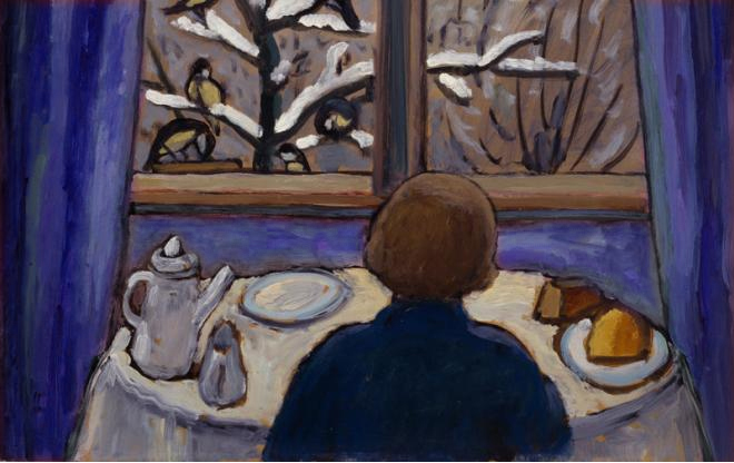
Breakfast of the Birds, 1934, Gabriele Münter
|
Periodically, we’re going to dip into color theory as taught by Josef Albers. Today’s lesson is from Chapter 4 of his Interaction of Color. If you don’t own this book and are serious about painting, I suggest you buy it.
Each November, we Northerners go outside in our down jackets on the first 40°F day and we’re shivering with cold. Come spring, the mercury rises to 40°F again and we’re scampering around in shorts. This is an example of a tactile illusioncalled a contingent aftereffect.
There are visual equivalents, most notably the McCullough effect. These cause us to perceive colors differently depending on what surrounds them. Why this happens is still not completely understood, but they have something to do with edge-sensors in the brain.
Josef Albers understood how important these edge relationships are in painting. He devised an exercise to explore them. It was meant to be done with Color-Aid, which is a delicious but very expensive system of colored papers. You can just as easily go to the paint store and get similar paint chips for free. Or you can draw the design, mix paint, and apply it with a brush.
The important thing is that you must not have raised edges. If you do this with paint chips or Color-Aid, use a sharp blade to cut out the shapes and fit them together like a jigsaw puzzle.
 |
| Plate IV-1 from Interaction of Color by Josef Albers. Your assignment is to replicate this in different color schemes, with the two squares always the same color. (Courtesy Yale University Press) |
In plate IV-1, the two small squares are the same color. This is the influenced color. The horizontal teal, dark blue, yellow and orange stripes are the influencing colors. In this example, it’s almost unbelievable that the influenced color is the same in both squares.
Your assignment is to repeat Plate IV-1 with other color combinations. You’ll find that some combinations are more pleasing than others. Some color combinations have more influence on the influenced color. Some colors are more easily influenced than others. The more you experiment, the more you’ll learn, and the more you share your homework with others on our Facebook homework site, the more others will learn.
 |
| Plate IV-2 from Interaction of Color by Josef Albers. Why do we perceive these grids so differently when they are exactly the same size? (Courtesy Yale University Press) |
Plate IV-2 shows a grid of a secondary color on two different backgrounds made of its constituent primary colors. Our perception of the grid is very different when it’s set on cool blue or warm yellow. What is happening in our brains to create that difference?
 |
| Plate IV-4 from Interaction of Color by Josef Albers again shows the relationship between influenced color and influencing color. (Courtesy Yale University Press) |
In plate IV-4, the two interior violet shapes are the same color, but we see the top violet insert as the same as the bottom violet surround. The bottom surround is a tint (the color mixed with white) of the violet.
Albers designed these exercises to be completely abstract, so that your perception is not altered by symbolic or verbal thinking. Now, let’s toss in some meaning.
 |
|
Gabriele Münter’s Breakfast of the Birds with the drapery color changed.
|
At the very top of this post is Gabriele Münter’s Breakfast of the Birds, 1934. Münter had a difficult life, and this painting is thought to be autobiographical. The draperies have been described alternatively as cozy or claustrophobic, the model as reflective or isolated.
Immediately above, I have recolored the draperies to a cool blue. How does that change our perception of the other colors in the piece? How does it change the mood of the piece?