I’ve written about why we do art and about the artists’ statements we all loathe. Targeted questions sometimes help us think through the bigger issues with greater clarity. I hope you can use these questions for artists as a jumping off point for your own thinking.
- What inspired you to create this piece?
The answer for me is always:
- The idea fascinated me;
- It was a challenge; or,
- I thought it was beautiful.
How would you answer that question about one of your paintings?
2. What is your creative process?
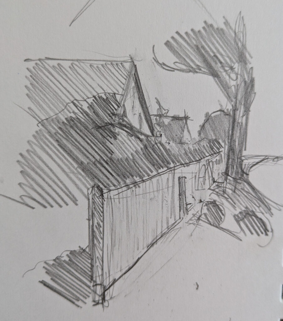
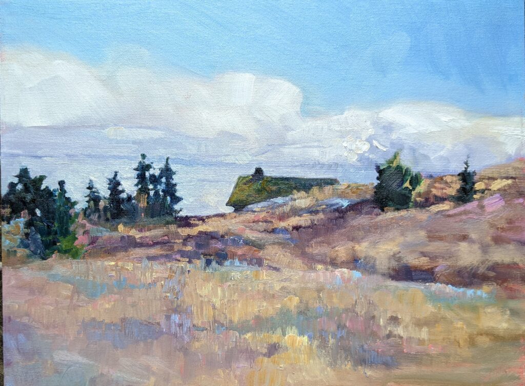
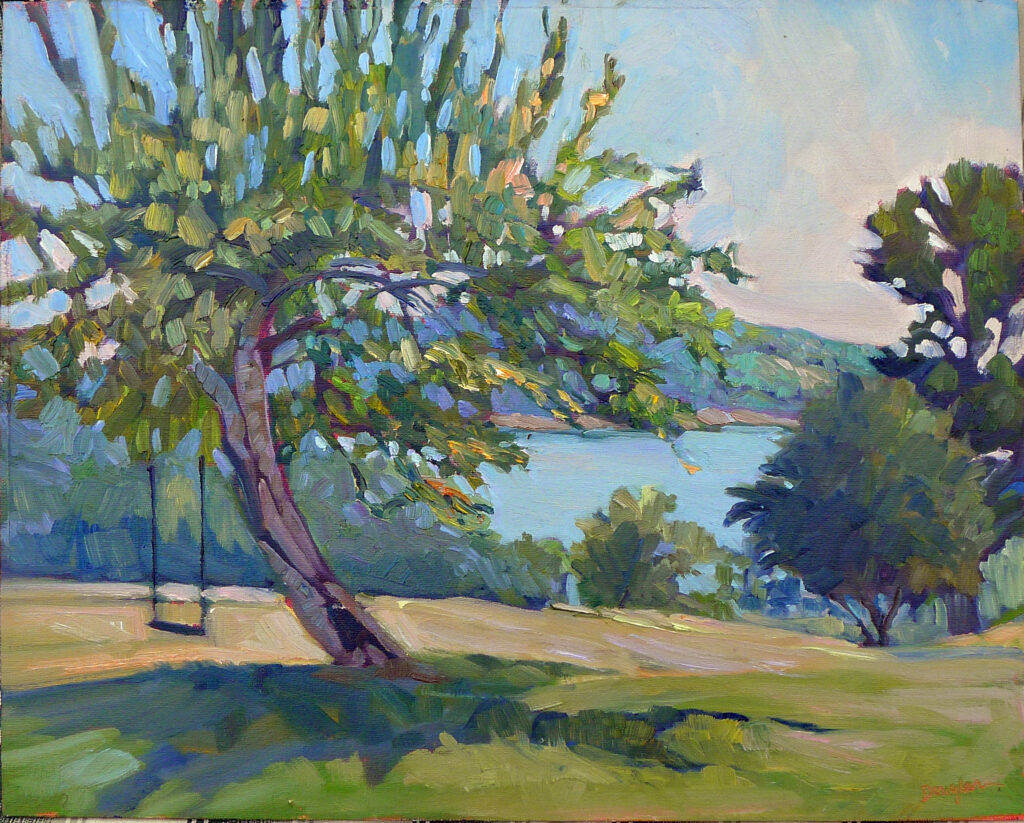
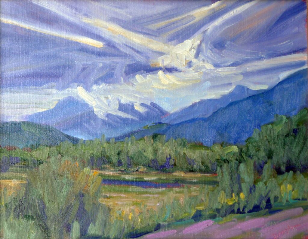
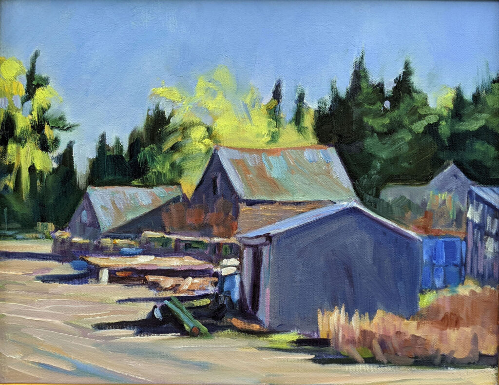
My painting process is outlined here and here. This is the same process I teach, so it’s straightforward.
For areas outside my discipline, I start by learning the technology. For me, this is hands-on and spatial; for example, I’d rather work with a printmaker than read a book or watch a movie about lithography.
What is your working process?
3. How do you come up with your ideas?
I have more ideas than I could ever execute, and when they’re still rattling around my head, I’m always convinced they’re the best ideas ever. Are you ever short of inspiration? If so, how do you deal with that?
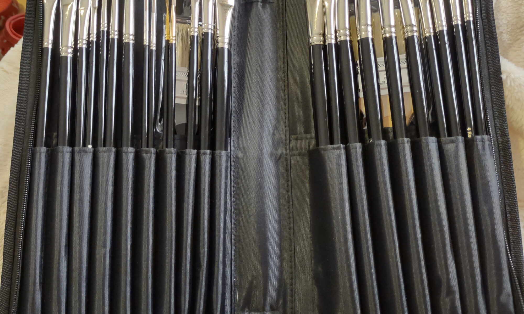
4. What materials or techniques do you use?
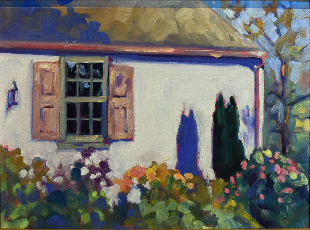
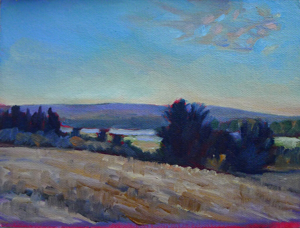
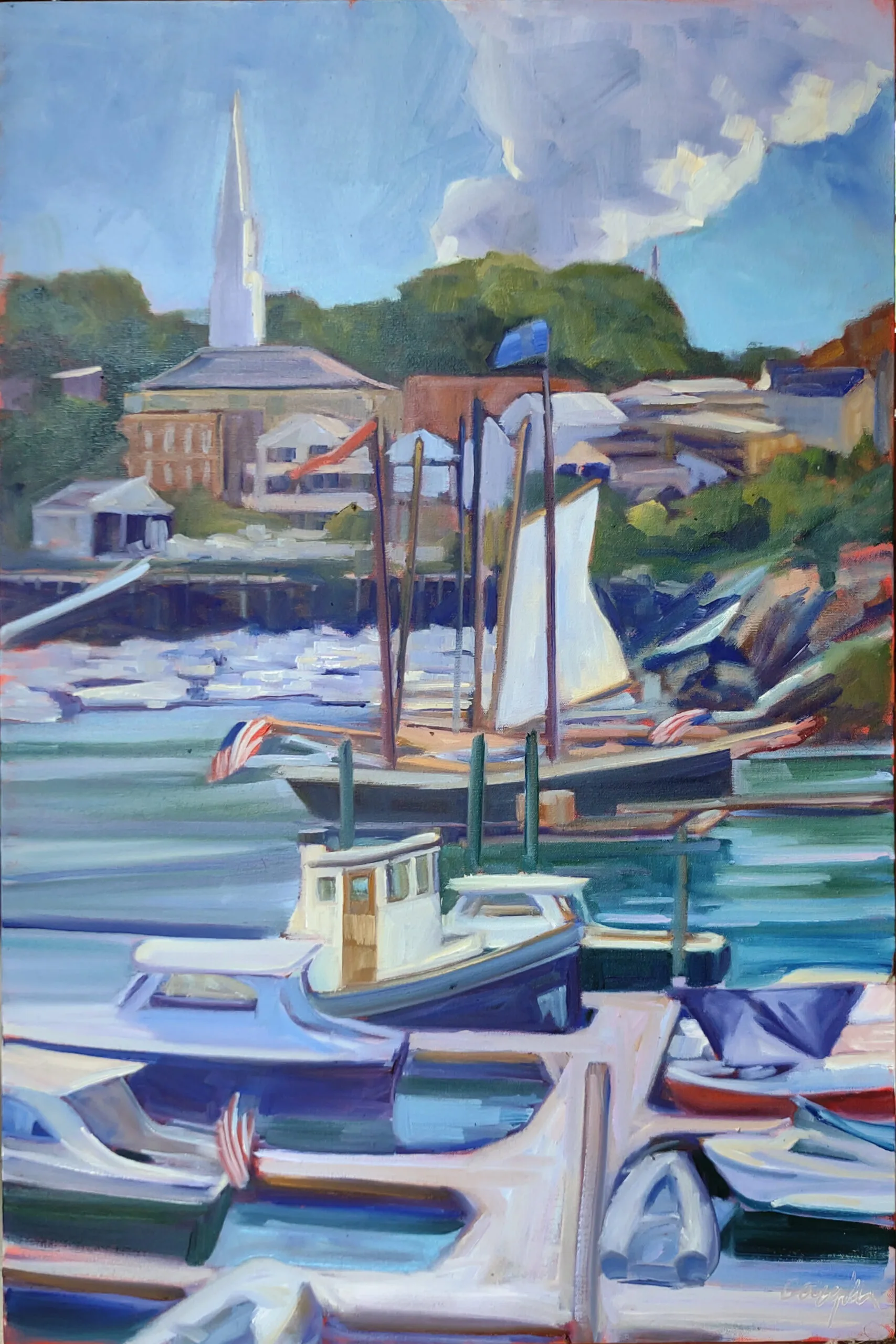
I’m conversant with oils, watercolors, acrylics, pastel and gouache—in fact, with most two-dimensional art forms. Drawing is personal for me. I wish I knew more about 3D art, and particularly about building things.
What is your preferred medium? What medium would you like to spend more time with?
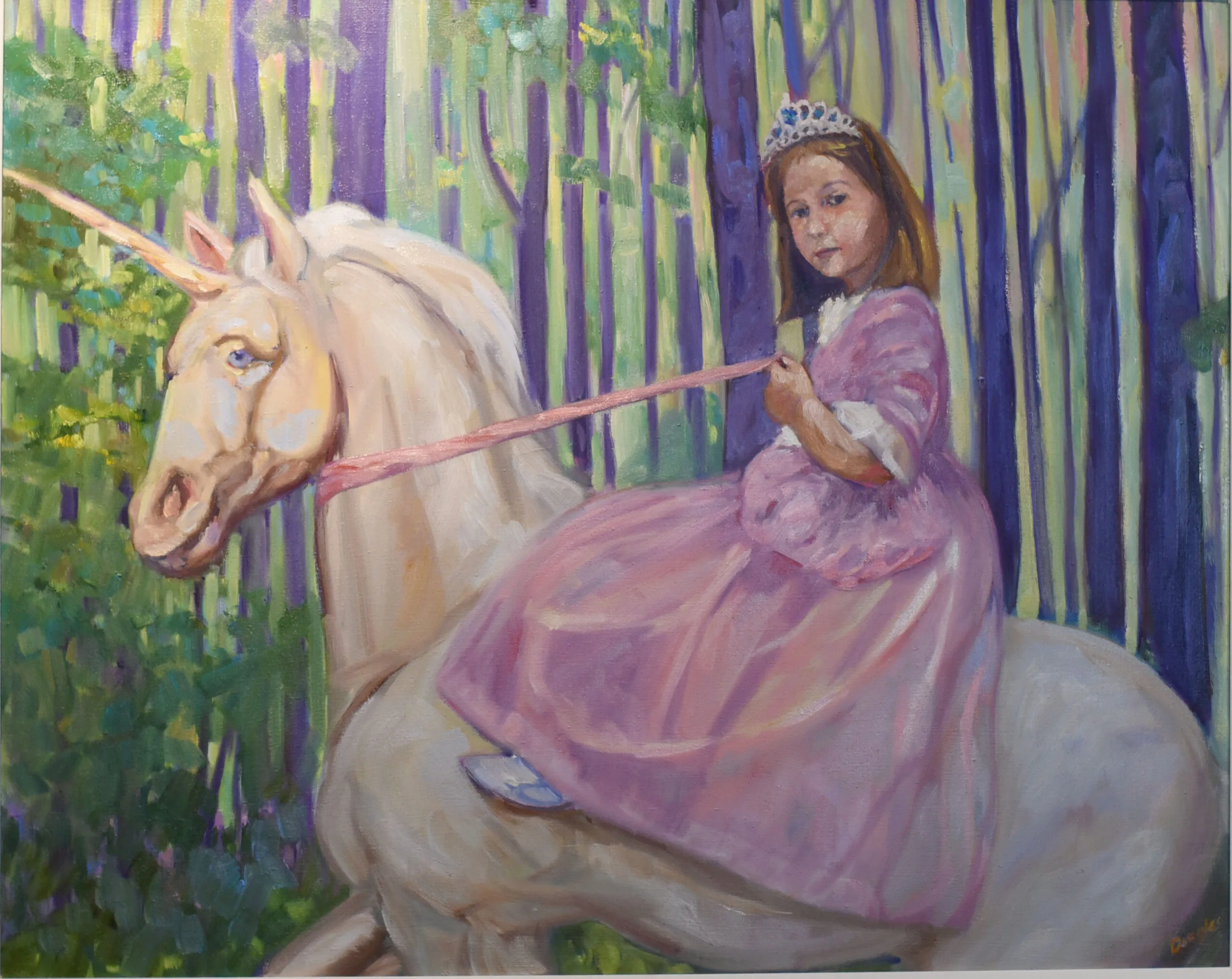
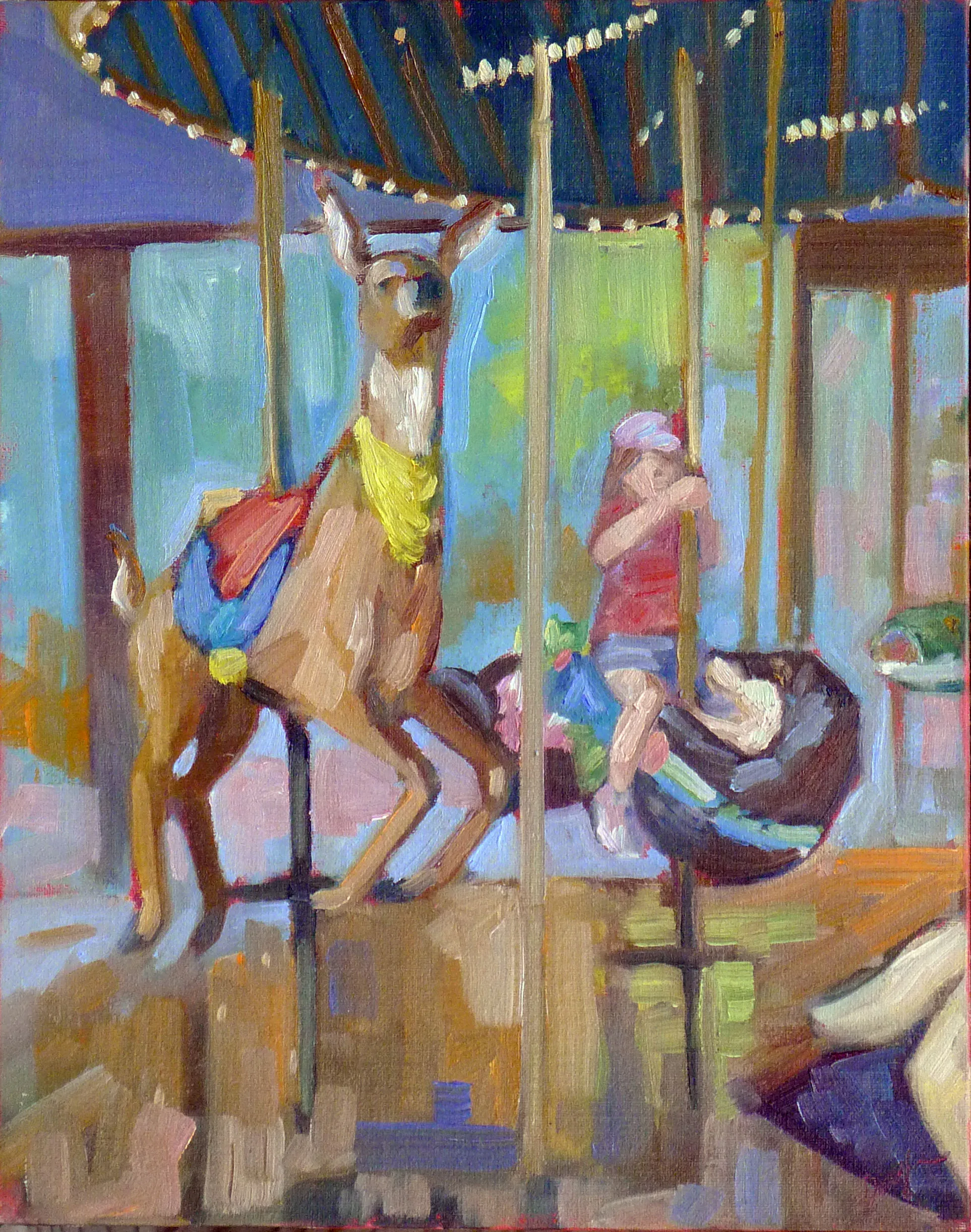
5. What is the story behind this piece?
There’s sometimes a very simple answer, such as with In Control: Grace and her Unicorn. Sometimes there’s no story at all.
Can you articulate stories for your paintings, or are they less tangible?
6. How long does it take you to finish a painting?
This is the most-commonly asked of all questions for artists. The only proper answer is that made by James McNeill Whistler during court testimony in 1878. Whistler was asked by a lawyer about the stiff price he had set for a painting.
“Oh, two days! The labour of two days, then, is that for which you ask two hundred guineas!”
“No;—I ask it for the knowledge of a lifetime.”
7. What are you trying to convey?
I suppose if you must ask that, I’ve failed, but if it’s in an artist’s statement, I’d just say my work is a pale imitation of the glories of God’s creation.
What are you trying to say in your work? Can it be reduced to words?
8. Do you have any upcoming projects or exhibitions?
It’s good to have something in your future. I’ll be at an opening in Camden on Tuesday, and then there is Camden Art Walk for August-October. Meanwhile I have three workshops remaining this season. And I’ll be at Sedona Plein Air in October. There are also a few one-day plein air events scattered in there.
If your calendar is overbooked, you’ll burn yourself out, but if you aren’t working toward a goal, you may not be working hard enough. If you’re not yet advanced enough to be showing regularly, a class or workshop is a good way to hold yourself accountable.
9. Why are you an artist?
I’ve been an artist since I was old enough to sit up. I’ve been lucky enough to be a professional artist for the past 28 years. I tell people it’s either that or greeting at Walmart, but in fact I do it because I have a pressing need to communicate. How about you?
10. How do you handle criticism or feedback about your work?
In that it’s morally wrong to crush the skulls of your enemies, I’m forced to be philosophical about rejection. The more it happens the better I deal with it, but at times, I admit it’s painful.
Usually I just kvetch. How about you?
Registration is now open for workshops in 2026! Reserve your spot:
- Advanced Plein Air Painting | Rockport, ME, July 13-17, 2026
- Sea & Sky | Acadia National Park, ME, August 2–7, 2026
- Find your Authentic Voice in Plein Air | Berkshires, MA, August 10-14, 2026
- New! Color Clinic 2026 | Rockport, ME, October 3-4, 2026
- New! Composition Week 2026 | Rockport, ME, October 5-9, 2026
Can’t commit to a full workshop? Work online at your own pace: