Monday Morning Art School: avoid muddy colors

Early spring in Maine, oil on canvasboard, by Carol L. Douglas

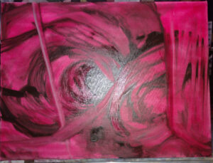
Does your oil paint look bright on the palette, but turn muddy or grey on the canvas? Do you have trouble keeping colors clean? You’re using too much solvent and/or medium. It’s an easy problem to fix, once you’ve learned the correct technique.

Why fat-over-lean?

Fat-over-lean prevents sinking color and cracking paint emulsion. The first is that dullish grey film that develops over paint that’s overthinned with solvent. Cracking paint doesn’t usually appear until after the artist is dead but is a major issue in some masterpieces.

Some manufacturers of alkyd mediums argue that the fat-over-lean rule no longer applies. Take this with a grain of salt. It takes time for problems to appear in paintings, time that’s measured in decades, not years.

Perfect layering demonstrated by Laura Felina at my recent workshop in Sedona.

Simple concept, tricky application

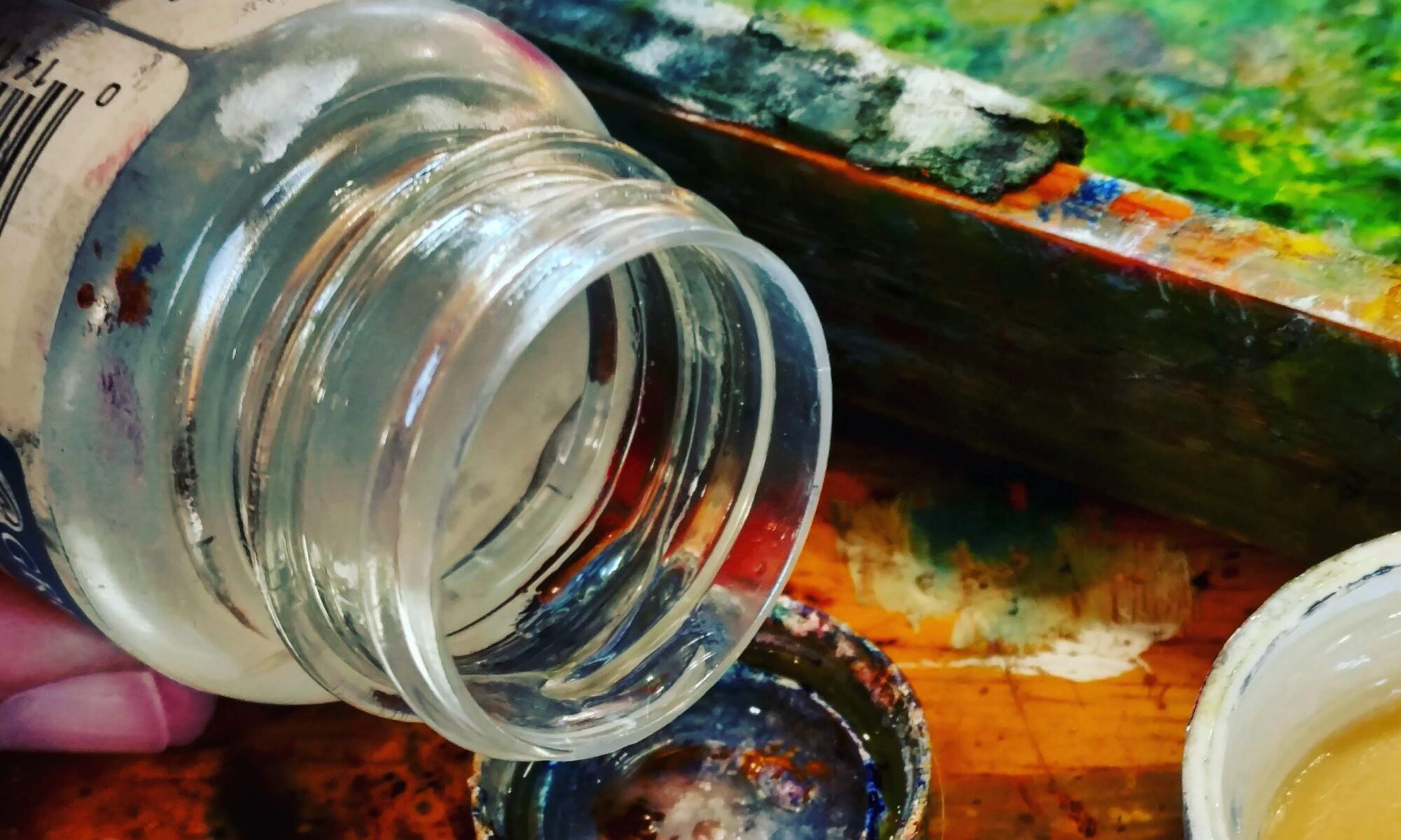
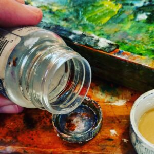
By ‘fat’ we mean the medium-either commercially-mixed mediums or drying oils like linseed, poppy or walnut. The paint itself contains medium as a binder, usually in the form of linseed oil. By ‘lean’ we mean a solvent, usually odorless mineral spirits (OMS).

OMS evaporates, so its dry-time is dependent on temperature and humidity. Drying oils don’t evaporate, they oxidize. That means they stay there, bonding with oxygen, creating a new chemical structure on the surface of the paint. This combination can be extremely durable.

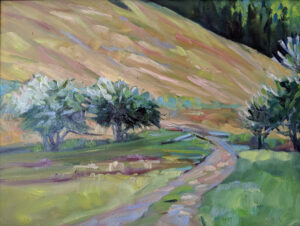
In plein air, this process is usually cut back to two or three steps: an underpainting cut with OMS, a layer that’s pure paint, and then possibly a detail layer cut with medium on the top. However, in more complex paintings with more layers, the shift from lean to fat can be more gradual.

This is a properly-dry start to a painting.

The underpainting

The underpainting or grisaille should be thinned sparingly, and only with solvent (OMS). Keep it dry enough that it’s not shiny. How can you tell? Stick a finger in your paint. If you can slide the paint around, it’s too sloppy. If your finger looks like you were just fingerprinted, it’s too sloppy. You should be able to see just a bare hint of color on your fingertip.

If you put too much solvent in the bottom layer, you’ll get muddy, mushy color as you try to build. No, you don’t need to wait for it to dry. Take a paper towel and lay it carefully on the surface of your painting. Use your hand to apply pressure. You’re blotting-not wiping-the excess moisture away. It should be almost dry to the touch before you proceed.

It’s best to avoid blotting. Learn to use only fractional amounts of solvent, just enough to allow the paint to move without dragging. Use a rag to lift paint from light passages, instead of using excess solvent to thin these passages.

If it’s shiny, there’s too much solvent in the bottom layer. The subsequent layers will be soft and muddy.

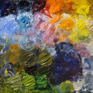
The middle layer (which is also sometimes the last layer)

This next layer should be as close to pure paint as possible. If your paint is too stodgy to move freely, check to be sure that you aren’t using clotted, hardening paint. Or, your brushes may be too soft for alla prima painting, which works best with hog bristles. If you must thin your paint, a drop of oil is all that’s appropriate in this layer.

The top layers may need no medium at all. Many painters don’t use it. Blueberry barrents, by me, early spring.

Top layer or detailing

Here you can use medium or linseed oil. But if you use more than a dollop the size of a mechanical pencil’s eraser in an 8X10 painting, you’re overdoing it. Using too much medium will result in soft, lost lines and mediocre brushwork.

Medium is helpful for laying detail down over wet paint, but don’t develop an overreliance on it. Many artists use none at all.

There’s room in my upcoming critique class. It’s a great way to bring your painting to the next level. Open to intermediate painters in all media.

My 2024 workshops:

Five things I won’t waste money on

I’m wearing the tiara in honor of Queen Elizabeth II, whose state funeral is today.

Cheap paint

There are many good paint brands out there. They tend to be more expensive, but price is not the sole indicator of quantity. There are an equal number of horrible paints on the market. You might think you’ve saved a few bucks, but that’s a mistake that will cost you in time and frustration.

There are differences in the binders, in the amount of pigment the manufacturer uses, and how the pigments are stabilized. There may be filler or drying agents added.

Instead of buying cheaper paint, cut down on the number of colors you buy. I suggest a system of paired primaries, as explained here. Oil painters will add titanium white; watercolor painters should avoid white altogether at the outset.

My personal preferences are: Golden acrylics
QoR watercolors
Unison pastels
RGH or Gamblin for oils.

These aren’t the only good paints out there, of course; they’re just my go-to brands.

Fewer colors, no convenience mixes or hues, and better quality paints–that’s the most economical way to paint.

Hues and convenience mixes

Art paints are marketed with names that appeal to our sense of tradition. If you buy Naples Yellow thinking you’re buying an historic pigment, think again: the modern paint is a convenience mix replacing the historic (and toxic) lead antimonate.

Expect to find, at minimum, the following information on the label of your paint tube:

  • Manufacturer’s name or common name for the color;
  • The CII number and, sometimes, the name of the pigment(s);
  • The manufacturer’s lightfastness or permanence rating.

The CII code consists of two letters and some numbers. Most paints start with a “P” which means it’s a pigment, not a dye. The next letter is the color family:  PR is red, PY is yellow, etc. The number is the specific pigment included in the tube.

When you compare paints with the same names, check their CIIs. It seldom makes sense to buy a tube of paint that contains more than one pigment. These blends are meant to look like something else-either an historic pigment or an expensive one. They don’t behave like the pigments they’re named after. For example, ‘cadmium yellow hue’ may look like cadmium yellow coming out of the tube, but it makes insipid greens.

If you are comfortable painting with a hue, learn what’s in it and mix it yourself. You always have the greatest flexibility by working with pure pigments (rather than mixes) out of the tube.

The students in my watercolor workshop aboard schooner American Eagle get QoR paints, Princeton brushes, and Strathmore paper. You can’t learn with bad materials.

No-name brushes

You can buy a whole set of bristle brushes on Amazon for $20. The same price will get you a set of genuine sable brushes for watercolor. Good deal, right? Wrong.

Natural bristles have splits at the end, called flags. These help the bristles hold more paint. (With high-stain pigments, the flags can discolor, but that’s not a sign of permanent damage.) With good brushes, bristles are cleaned, sorted, sized and wrapped into bundles where the flags cup, or curl naturally into each other. This bundle is then glued into the ferrule with a solvent-resistant glue. The best ferrules are seamless nickel-plated copper, crimped onto a lacquered hardwood handle.

Badly cupped brushes and poor-quality bristles can be made to look good with lots of sizing that dissolves as soon as the brush is used. Bad brushes often lose hairs, which can ruin a painting. And ferrules that fall off the handles can’t be crimped back on.

You need fewer brushes than you think. In watercolor, a ½” flat, a 1″ wash brush, a #6 quill and a #8 round are enough to get you started. Add a set of short synthetic flats (or mottlers, as they’re sometimes called) in ¾”, 1″ and 1½”. A little pointed brush to sign your name is helpful.

In oils and acrylics, a life list would include:

  • Brights (short flats) in 6, 8, 10, possibly 12, depending on how big you’re going to paint;
  • Rounds: 2, 4, 6;
  • Long (true) flats: 3, 4, 5;
  • Filbert: 2, 4, 6;
  • A few tiny rounds in sable for detail and to sign your name: 2,4;
  • 1″ badger blender brush;
  • 2″ spalter or hog bristle background brush-this is for blocking.

I recommend Princeton brushes to students; they come in a range of quality and material and are good value for money. I’m currently painting with Rosemary & Co. in both watercolor and oils, but they’re quite expensive. Other brushes I’ve known and loved include Isabey, and Winsor & Newton. But brushes are a highly-personal thing, and you’re best buying one or two from a maker and running them through their paces before you commit to a relationship.

Dollar-Store painting boards

Why does one manufacturer charge $15 for a painting board when you can buy one at a local discount store for $2? There’s a difference in quality at every step. The cheap board is made of cardboard, which warps. The gesso is thin and porous, so paint bleeds through it, breaching the all-important barrier between surface and substrate. The canvas is glued with a water-based glue, so if the board gets wet, it will start to separate.

Still, the price of a premium painting board is too high for painting exercises. Instead, buy a tablet of linen or canvas and tape sheets down on a board. For linen, I like Centurion; for canvas, Dick Blick’s house brand. If you do end up creating a masterpiece, you can glue it to a stable board with PVA adhesive.

As a bonus, a tablet of painting canvases is a lot lighter than the same number of boards when you’re traveling.

Straight up linseed oil, and for a palette cup, a bottle cap.

Painting mediums

I used to spend a lot of money on painting mediums tailored for specific situations-matte finish, quick-drying, slow-drying. However, because these all have solvents in them, they’re not legal to carry on airplanes. I found myself replacing them on every trip. Eventually I went back to the jar of linseed oil I’ve been carting around since my salad days. It’s cheaper, it lasts forever, and you can carry it in your checked luggage. (An aside-you can also fly with a small jar of Gamsol, but not Turpenoid; they have different flash points.)

Linseed oil is the binder for most oil paints. It’s harmless; it’s made from flax-seed, the same thing I eat for breakfast. The same cannot be said of the driers and solvents in many mediums.

If you’re worried about yellowing (I’m not, because my paints are linseed-oil-based) then use stand oil. That’s linseed oil that’s been polymerized by heating.

No blog Wednesday–I’m sailing this week.