
We’ve just marked the 250th birthday of Britain’s great Romantic artist, Joseph Mallord William Turner. As with so many great painters, Turner really didn’t become Turner (the prefigurer of modern painting) until he was closing in on old age. While there are many lessons to be learned from his work, here are two that stand out to me:
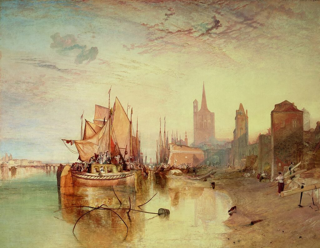
The Fighting Temeraire
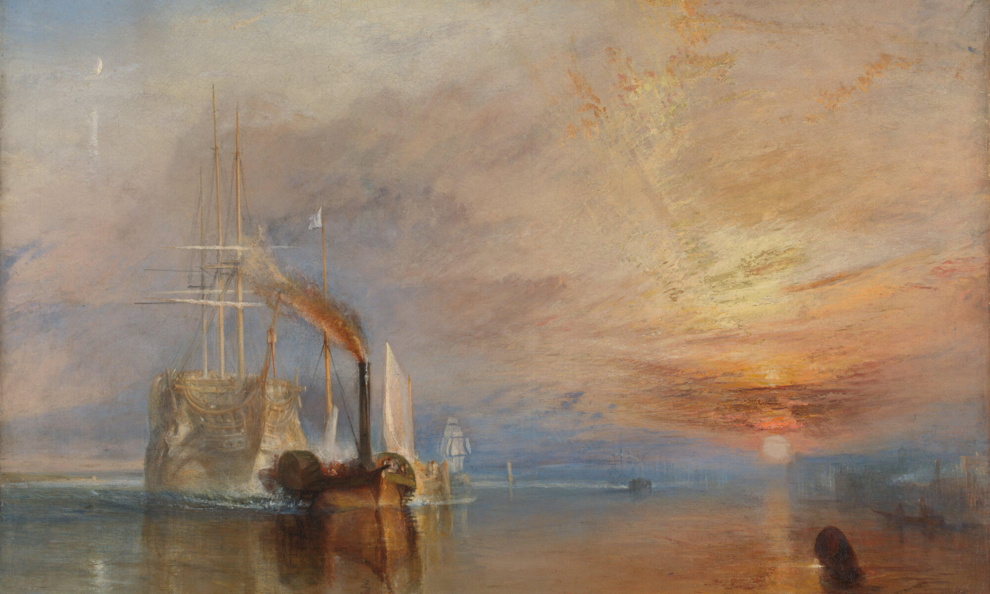
The Fighting Temeraire was once voted Britain’s favorite painting. It’s featured on the £20 banknote, which also includes the Turner quote, “Light is therefore colour.”
The painting shows the 98-gun HMS Temeraire being towed up the Thames by a paddle-wheel steam tug, to be broken up for scrap. The Temeraire was one of the last second-rate ships of the line left from the Battle of Trafalgar in 1805. Her role had been pivotal in the deadly sea battle between the British Royal Navy and the fleets of Spain and France. Vice-Admiral Horatio Nelson was killed when his flagship, HMS Victory, was battered by the French ship Redoutable. In response, Temeraire surged forward, raking Redoutable with grapeshot, causing her to strike her colors. The victory confirmed British naval supremacy and prevented Napoleon from ever again considering invading England.
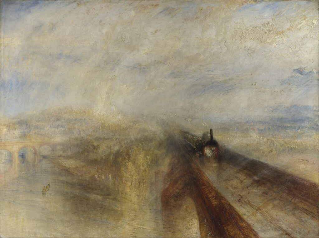
The Fighting Temeraire is generally taken as an elegy for faded national glory. But modern interpretations focus on Turner’s admiration for newness, as epitomized in Rain, Steam and Speed—the Great Western Railway. In that view, Turner was actually painting the steamship and arguing for leaving the past behind.
The focal point is not always the subject
Yes, the main focal point of The Fighting Temeraire is inarguably the steamship; it’s the passage with the greatest contrast. (It, and the amorphous shape in the foreground right and the sun on the horizon are the three focal points, forming a strong triangular composition.) But that doesn’t make it the subject of the painting. Turner explicitly tells us otherwise with his title and the careful prep work he did for the painting. The moonlight, the wrecker’s flag (not the Union Jack) and the detail on the Temeraire tell us we’re to read this all of a piece, together. Long before anyone talked about focal points and subject, he was playing them against each other to make a complex statement.
Making the jump from linear to painterly
Painterly vs. linear is not a quality distinction, but rather a stylistic distinction.
A painting is linear when it uses skillful drawing, shading and contour to create the illusion of dimensionality. Painterly means there are visible brushstrokes, less control, and more impulsive color. While there have always been artists on the painterly side of the divide, the real historic divide is with the Impressionists, who slewed off into painterliness in the latter half of the 19th century. We have, for the most part, stayed on that side ever since.
Like his peers, Turner was a linear painter until sometime in the mid-1830s, when suddenly he wasn’t anymore. The mature Turner stopped painting line and became a painter of mass, tone and light. He treated land, air, and water, as if they were all one. “Indistinctness is my forte”, he said. This being the onset of Victorian England, with its rising tide of realism and of sentimental Landseers and Pre-Raphaelites, it’s hard to imagine how he struck out in such a unique direction.
Did Turner wake up one morning and decide to make soft miasmas of color? No; you can see hints of this in earlier paintings. Somehow, by poking at it, day in and day out, he came up with something new to himself and everyone else. We can learn a lot about painterliness from studying his paintings, but ultimately we have to do the studio time, too.
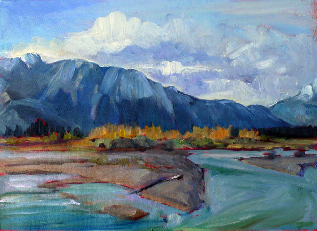
Reserve your spot now for a workshop in 2025:
- Advanced Plein Air Painting, Rockport, ME, July 7-11, 2025.
- Sea and Sky at Acadia National Park, August 3-8, 2025.
- Find Your Authentic Voice in Plein Air, Berkshires, MA, August 11-15, 2025.
- Immersive In-Person Fall Workshop, Rockport, ME, October 6-10, 2025.


