“What kind of paper/canvas should I buy” is among the first questions I’m asked by new workshop students. While I can’t recommend museum-grade panels to beginners, it’s disheartening to watch students struggle with cheap painting supports.
The painting support you choose affects how your paint behaves, how your marks read and whether your work lasts.
A quick note before we get into it
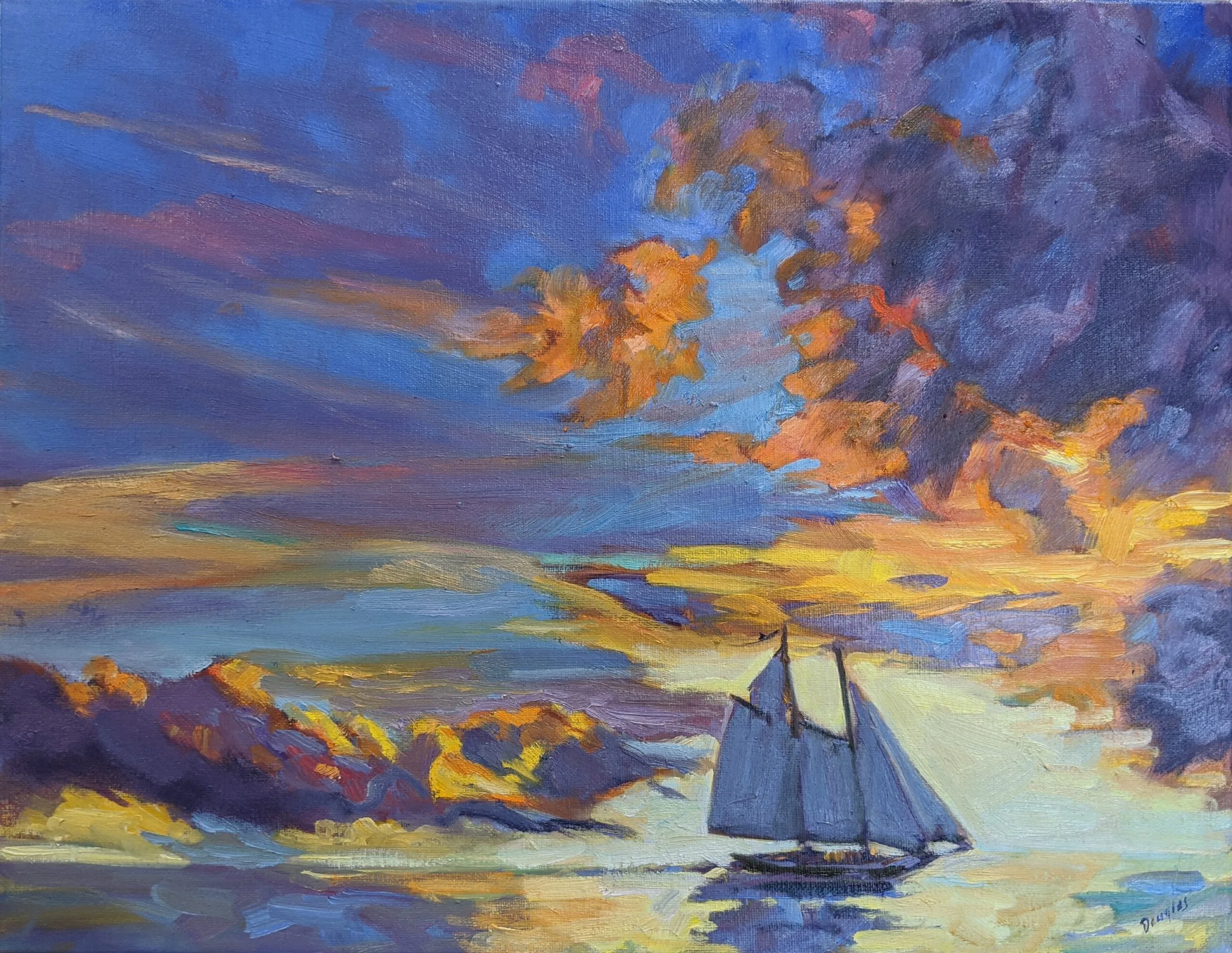
It’s time to claim your spot in Advanced Plein Air Painting, July 13-17 in Rockport, ME. If you have any questions about whether you fit into an advanced class, just ask!
Let’s discuss medium first
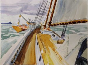
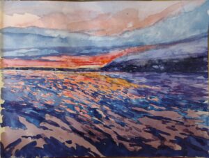
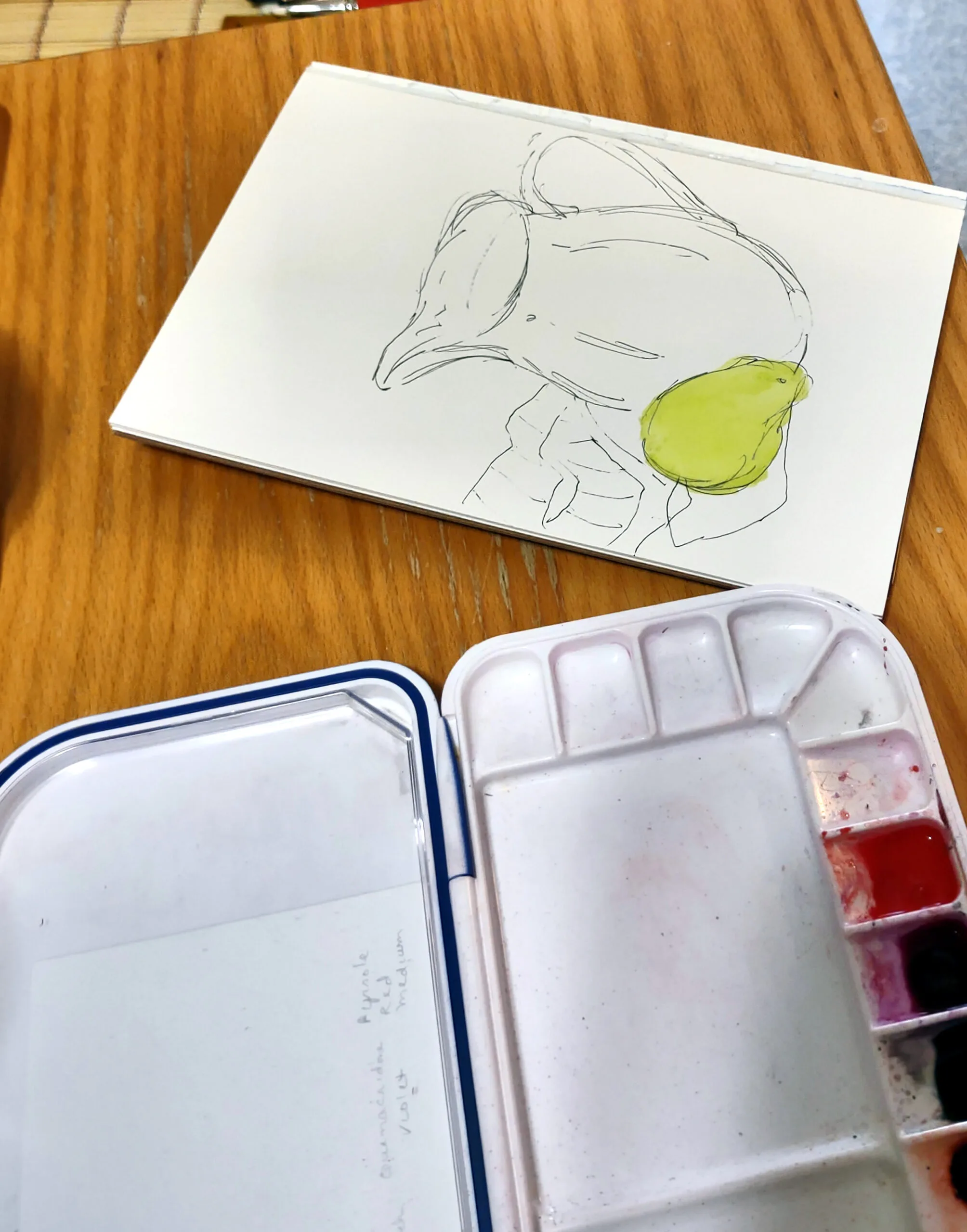
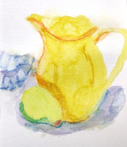
Watercolor depends on controlled absorbency. The paint sits in the surface, not on top of it. That’s why the quality of watercolor paper matters so much. 100% cotton papers hold water evenly, allow controlled washes, allow for scrubbing out changes and resist breakdown over time. Cheaper wood-pulp papers buckle, blotch, and lose clarity.
The best support for gouache is heavy-weight paper (at least 140 lb.) that can handle water without warping. Because texture isn’t as important as for watercolor, hot-pressed paper—also known as Bristol—is ideal. Other options include illustration board, watercolor journals, and heavy mixed-media paper. Gouache can be painted on gessoed board, but it’s not necessary.

Acrylics will stick to almost anything, but a properly gessoed surface controls absorbency and prevents paint from sinking in unevenly. Cheap surfaces can feel draggy or dead.
Oils absolutely require a sealed, primed ground. Oil paint binders are acidic, which reacts with and destroys the support over time. If painting on paper or a wood board, prime with either clear or regular gesso.
Rigid versus paper supports
Paper is immediate and responsive. It’s ideal for watercolor and gouache, and perfectly good for acrylic studies. But quality varies wildly. Good paper has proper sizing (which controls absorbency) and consistent texture; poor paper acts like a blotter or warps under even modest moisture. Paper must be properly prepared for oil and acrylic painting.
There are many good paper watercolor boards on the market. They’re more convenient and less prone to buckling than watercolor paper, but they cost more.
For oils or acrylics, I use archival canvas-boards for all smaller paintings. They’re easier to frame and carry, and I don’t have to worry about light coming through the back of the canvas. However, larger boards can be prone to warping.
When I travel, I sometimes bring loose canvas and tape it to a board. That gives me less bulk when flying, but floppy wet sheets of canvas can also be difficult to transport.
Stretched canvas and linen are the traditional choices for oils and acrylics, and I use them for all larger work. It can sometimes be hard to determine the quality of packaged canvas, so research before you buy. Cheap canvas can sag or distort, and insufficient gesso allows paint to bleed through to the backing.
In practice student-grade panels and canvases are fine for students but can have inconsistent tooth and weaker priming.
Size matters
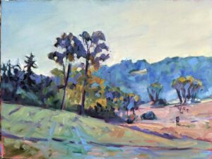
I tell students to prepare to paint two 9X12 paintings a day during a workshop. In practice, some will paint more, some less. Some students produce small jewels on 4”X5” canvases; others love working big. This is personal preference.
When preparing for an event, I usually bring canvases and frames in all sizes. I never know how a scene will inspire me.
What separates good from mediocre?
- Absorbency control–good surfaces absorb just enough paint or water without sinking color or bleeding through.
- Surface consistency—cheap painting supports have inconsistent surfaces. Good ones behave predictably.
- Longevity—archival materials including cotton paper, proper sizing and rigid supports, keep your work intact over time.
The right painting support isn’t magic, but it will improve your painting.
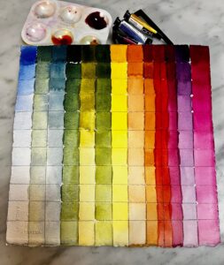
Want to learn more?
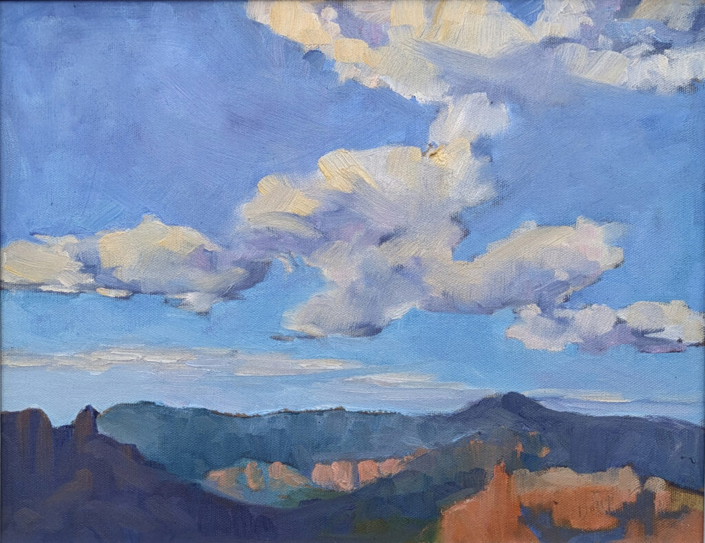
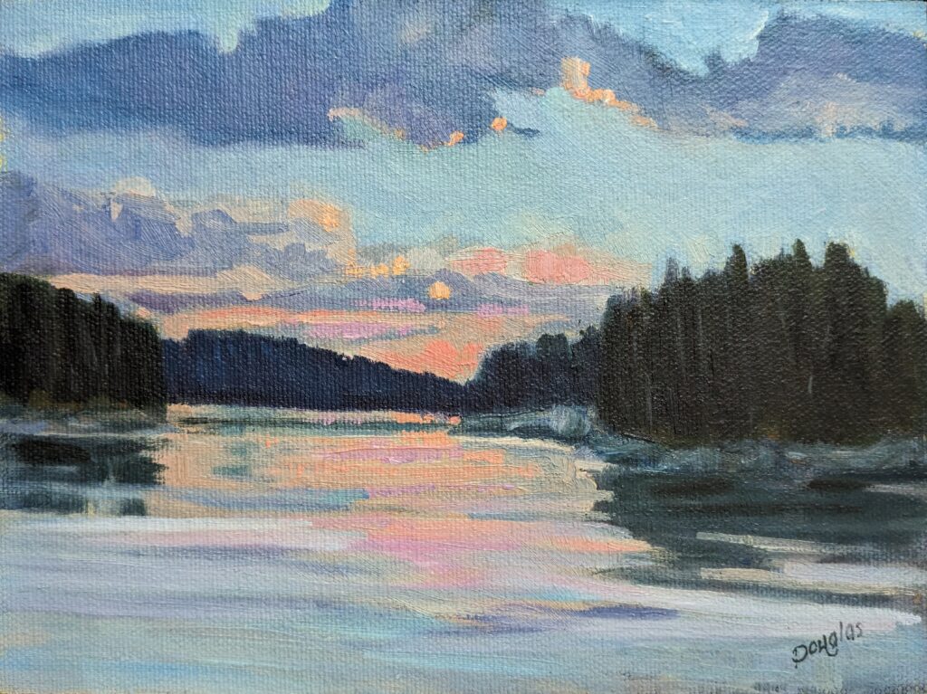
I have three upcoming Zoom classes. In From Field Sketch to Final Studio Work (six weeks on Tuesday evenings) we talk about how your initial decisions carry through to a fully-realized studio painting. In Painting Clouds (a three-week Monday session), you’ll learn practical ways to paint these all-important natural phenomena.
Registration is now open for workshops in 2026! Reserve your spot:
- Advanced Plein Air Painting | Rockport, ME, July 13-17, 2026
- Sea & Sky | Acadia National Park, ME, August 2–7, 2026
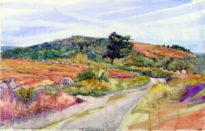
- Find your Authentic Voice in Plein Air | Berkshires, MA, August 10-14, 2026
- New! Color Clinic 2026 | Rockport, ME, October 3-4, 2026
- New! Composition Week 2026 | Rockport, ME, October 5-9, 2026
Can’t commit to a full workshop? Work online at your own pace: