Cult and color

Our ideas of the psychology of color come from a 19th century occultist, Madame Blavatsky.

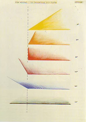
From Concerning the Spiritual in Art, by Wassily Kandinsky. He believed both shapes and colors had specific meanings.

My student used to love to read aloud to me while I was painting. This is how I ‘read’ Wassily Kandinsky’s Concerning the Spiritual in Art.

Kandinsky was a student of the great occultist of his day, Madame Helena Blavatsky. She has the distinction of being one of the few women to successfully found a cult in modern western society, Theosophy.
Two Helens (Helena Hahn and Helena Blavatsky), artist unknown, is a portrait of the teenage Helena and her late mother.
Born into the Russian nobility, Madame Blavatsky’s nomadic youth exposed her, in turn, to Tibetan Buddhism, Freemasonry and the meandering byways of esotericism. Her mother died when she was 14. Shortly after, she began to experience astral projectionand visions involving a spirit guide, a “mysterious Indian” named Master Morya. He would become the first Master of Ancient Wisdom in Theosophy. Blavatsky claimed to have traveled the world with him.
At age 17, she married a much older man because, she said, he was interested in magic. The marriage was a disaster. She fled, escaping to Constantinople. According to biographer Peter Washington, at this point “myth and reality begin to merge seamlessly in Blavatsky’s biography.” She claimed to visit Asia, the Americas, and Tibet, where she learned a secret language, Senzar, from which she translated the texts of Theosophy. She developed clairvoyance, telepathy, the ability to control another person’s consciousness, to dematerialize and rematerialize physical objects, and to project her astral body. “Hardly a word of this appears to be true,” wrote her biographer.
Madame Blavatsky as a medium in New York. Courtesy New York Public Library.

With Colonel Henry Steel Olcott and Irish Spiritualist William Quan Judge, she founded the Theosophical Societyin 1875. Shortly thereafter, Blavatsky penned the first ‘bible’ of her new religion, Isis Unveiled: A Master-Key to the Mysteries of Ancient and Modern Science and Theology.
Olcott and Blavatsky continued her peripatetic lifestyle, moving first to India, and then to Europe. Meanwhile, Theosophy was a growing concern. By 1885, there were 121 Theosophical Society lodges worldwide. The movement had attracted such luminaries as W. B. Yeats, Thomas EdisonAbner Doubleday and the social reformer social Annie Besant.
Among them were many successful artists, including Wassily Kandinsky. Concerning the Spiritual in Art was written after Madame Blavatsky’s death, but it is heavily influenced by her theories.
Kandinsky was an avid student of occult and mystical teachings, especially Theosophy. Madame Blavatsky taught that creation is a geometrical progression, beginning with a single point. The creative aspect of the form is expressed by a descending series of circles, triangles and squares. Kandinsky adopted this. He based his color teachings on Blavatsky’s writings about the correlation between vibrations, color, and sound. While the framework of his color theory was based on that of Johann Wolfgang von Goethe, the content was pure Theosophy.
Madame Blavatsky and Colonel Olcott in their later years.
We think of Kandinsky as the first abstract painter, but he was in fact attempting to create a visible representation of the astral world as described by Blavatsky.
Kandinsky believed:
  • Yellow is “warm,” “cheeky and exciting,” “disturbing.” This is the color of madness.
  • Green represents passivity and peace. Good for tired people, it can become boring.
  • Blue is a supernatural “typical heavenly color.” The lighter it is, the more calming it is.
  • Red is the color of “manly maturity.” It is restless, glowing, and alive.
  • Light Red means joy, energy and triumph.
  • Middle Red expresses stability and passion.
  • Dark Red is a “deep” color.
  • Brown is inhibited, dull, and inflexible.
  • Orange is a healthy radiant mix of red and yellow. 
  • Violet  is “morbid, extinguished, sad.”
  • White is the harmony of silence.
  • Black  is “Not without possibilities […] like an eternal silence, without future and hope.”
  • Grey is soundless and motionless, but different from green because it expresses a hopeless stillness.
These ideas still kick around today and influence our beliefs about color.

The truth about red

Why does red pop out at you? The first question to answer is whether that’s actually true.

Tilt-a-Whirl, by Carol L. Douglas

“Your color temperature reference seems to be something other than degrees Kelvin of a black-body radiator. Can you explain?” an engineer wrote me yesterday. The simple answer is that, to the painter, color is not a property of electromagnetic radiation, but a sensory perception question.

During the past few weeks, I’ve told you that much of what we accept as truth about color perception is just social convention. Today I’d like to talk about what (we currently think) is true. Science is constantly discovering new things, and in a hundred years, this understanding might be as obsolete as phrenology.
There are two basic theories of how we perceive color. The Young-Helmholtz Theory tells us that the retina’s three types of cones are sensitive to either red, green or blue. Ewald Hering proposed that we interpret color antagonistically. In other words, it’s either red or green, blue or yellow, black or white. Both theories appear to be true.
Deflatable, by Carol L. Douglas. The orange life jackets stand out because they’re the complement to the blue water.
The range of color (the “gamut”) that normal people can see is limited by this antagonism. We can see yellowish-green easily enough. We can’t see reddish-green because the cones in our eyes can’t perceive red and green simultaneously. Furthermore, we can’t see colors that are outside the limits of our receptors. Of course, the brain is always outsmarting us, so there are times the brain thinks it can see these so-called impossible colors.
Color perception doesn’t just happen on the retina; the visual cortex is involved, too. Some parts of the spectrum get a bigger response in the visual cortex than others, but that depends on what light conditions the visual system is adapting to.
Palm shadow, by Carol L. Douglas.
We’ve all noticed this in practice. On a clear day, a red dinghy bobbing on the turquoise waves stands out. In gloom it is hardly noticeable. Our perception of reds falls off fast in low light conditions. This is why one can’t fall back on truisms like “the retina perceives red first.” The human brain is far too wily for that.
Our mind practices something called color constancy. It’s how we understand that an apple is green whether we see it in the blue light of dawn, the true light of midday, or in the golden light of the setting sun. If we use a viewfinder to isolate the color of the apple, we often realize that what we’re seeing is anything but green. Still, our mind stubbornly processes the object as green.
This is an adaptive process that probably helps keep us alive, but it often mucks painters up. It’s hard to render unusual lighting effects when your brain is trying so hard to normalize them for you.
The same thing happens with lighting levels. That’s why it’s so important to check values against neighboring objects as we go. Our brain constantly adjusts our perception to normalize lights and darks.
Castine lunch break, by Carol L. Douglas
So why does red stand out? The answer is complex. In certain situations, such as a leafy green tunnel of a road, a red stop sign does, indeed, stand out. It’s the complementary color to its environment. But much of our reaction to color is a learned response. We notice red stop signs because we’ve trained ourselves to notice them. We believe red is an energetic color because society tells us so.
I use red to prime my canvases not because I believe it has special properties, but because it’s the complement of the dominant color in my environment, which is green.
Tomorrow, I’m going to introduce you to the 19thcentury cult leader who, more than anyone else, gave us our modern ideas about color. 

Monday Morning Art School: Add back the banned black

A color exercise that can be done with anything from a dime-store watercolor kit to a professional palette.

Back before black was banned from the palette, we had shades and tints. Shades are made by adding black to a pure color. Tints are an admixture of white to a pure color. Shades aren’t an effective way to make something darker, but they often make nice new hues.
What we consider acceptable in color-mixing is style-driven, just like everything else. For example, see the Permanent Pigments Practical Color Mixing Guide of 1954, below. It’s all about making shades and tints. That’s a hint about why mid-century paintings looked so grey. A little shading goes a long way.
A mid-century guide to mixing colors.
Today’s exercise is to make a paint chart playing the warm tones on your palette against the cool tones. Both of these examples were done in class by students. My definition of warm vs. cool has shifted over time. Ten years ago, I included quinacridone violet among the cools; last month I had my student stick it in among the warms. That’s because warm-vs.-cool is an arbitrary designation.
The chart in watercolors.

The instructions are a little different for solid-media students than for watercolorists. In either case, start by marking off your paper or canvas with 1” squares, allowing enough room for the cool colors on the left and the warm colors across the top.

Watercolorists (and users of fluid acrylics) just need to mix the colors. Oil painters need to tint their colors with a little bit of white. I’ll get to that below.
In watercolor, the column on the far left should be pure pigments straight from the tube: blues, greens, black, and violets if you want to call them cool. The row across the very top should also be pure pigments, but in the warm tones: reds, oranges and yellows.
The boxes in the middle of the chart are all mixtures. For example, the second-row-second-column box on Sheryl’s chart is black+raw umber. The third-row-second-column box is ultramarine blue+raw umber. The bottom right box is sap green+quinacridone violet, and so on.
The greatest difficulty for watercolor painters is to try and keep the color balance equal. Pigments differ in density, and it’s hard to control dilution. Still, try to use the same amount of each in your mixtures.
Sheryl was doing something my friend Poppy Balser calls “licking the paper.” (That’s partly because she was using a very cheap paper.) That means she was fussing after she put the first brushstroke down. That gave her final chart a mottled appearance. Try to get the mixture down in one brushstroke and leave it.
The chart in oils.
Solid media (oil, gouache, and acrylic) painters have a slightly different assignment. They need to add white to their mixtures. I always add it on the cool side of the chart, by mixing a large clump of the cool-plus-white colors and using that to work across, modulating the warm colors. Working this way, your second-row-second-column box will be (black+white)+raw umber. The third-row-second-column box will be (ultramarine blue+white)+raw umber, and so on.
Note that there is one three-way mixture on the left column. I do not typically paint with a tubed violet, so row five started with a mixed violet to which I added white. If you use a dioxazine purple, it belongs here.
The chart above was designed for figure painting, but applies everywhere. It easily adapts for differences in skin color. Figure commission by Carol L. Douglas
Your last task for this week is to use color temperature, rather than value (lightness or darkness) to define the volume of a sphere, as in Sheryl’s example, below. Her shadows are warm, and her light is cool. Experiment with reversing that as well.
The shape of this sphere isn’t defined with value (lightness or darkness) but with a shift in color temperature. Try it!

You’ll find me out back with the horses.

Come to see the art, stay to feed the horses.

Toy Monkey, by Carol L. Douglas
The Kelpie Galleryis located in front of Pepper Hill Farmin South Thomaston. I’ve never walked back to the barns, because I’m always too busy looking at the paintings. However, gallery owner Susan Lewis Baines promises that if I visit next Saturday, November 18, she’ll give me (and you) carrots to treat the beasties with.
That’s an irresistible deal. Sue is sometimes seen with a furry fellow who might be a Haflinger—I don’t know, because we’ve never been properly introduced—and perhaps I’ll get to meet him. We kept horses in my misspent youth, and I know them pretty well. I doubt I could swing into a saddle now, but I can still whisper sweet nothings in their ears.
I’ll be there because the Kelpie Gallery will be presenting its Holiday Season show, Provenance, with an opening reception on Friday, November 17, from 5 to 8 PM. The party continues all day Saturday. Sue’s offering hot coffee or mulled cider and homemade biscotti, including a gluten-free option. If you’ve never attended an opening at the Kelpie, you don’t yet know that Sue’s a first-rank foodie. The nibbles at her events are always fantastic.
Little White Pumpkin, by Nancy Lee Lovley
I dropped off two pieces for the show yesterday. I never meant to go past the doorway, but was drawn in to look at a small, detailed painting by Jerry Cable that called to me from the farthest room. It was of the white walls and red roof of Monhegan Island Light. It was iconic while still avoiding any hint of cliché. This is a hard trick to pull off, and it’s the best in Maine regional painting. It’s why people come here to look at art.
I’m often compelled to look farther than I intended when I stop at the Kelpie Gallery. Sue’s a painter herself, and I think her arrangement of paintings is a continuation of her own color sense. She treats it fluidly, making it flow from room to room. She can hang disparate works together in a way that flatters them all.
Father Christmas, by Carol L. Douglas
The two paintings I dropped off are silly and sweet—a Father Christmas figurine and a toy monkey. Both remind me of younger days and a house full of noisy kids on Christmas morning.
Represented artists are Tania Amazeen-Jones, Susan Lewis Baines, Holly Berry, John Bowdren, Jerry Cable, Sandra Leinonen Dunn, Maggie Galen, Julie Haskell, Pamela Hetherly, Beth London, Nancy Lee Lovley, the late Erik Lundin, Angela Anderson Pomerleau, Wayne Robbins, Ann Sklar, Kay Sullivan, Gwen Sylvester, and Lucas Sylvester. Oh, and yours truly.
To get to the Kelpie Gallery, just head south on Maine Rt. 73 from Rockland. The gallery is about a mile south of the Owls Head Transportation Museum and on the same side of the road. (That’s 81 Elm Street, S. Thomaston, if you’re using your GPS.)
And, yes, the bridge over the Weskeag is now open.

Bits and bobs go on the block

Chrissy Pahucki has created an easy platform to experiment with online marketing this Christmas season. You might want to try it.

This rock study was painted at Upper Jay, in New York. While I might be able to pass it off as Jay, Maine, it would be better to just sell it to someone who loves the Adirondacks.
Over time, an artist’s studio gets overrun with orphan work. These are the one or two paintings from a previous body of work, field sketches that came back from trips and weren’t sold, and work left from plein air events.  The more you’re making art, the more these things tend to clog up the works. In fact, if we were to be strictly honest, we sometimes want to sell paintings mainly to make room to make more paintings.
Like most painters, I have a bin of plein air studies. This is where I drop things that I’m not going to pursue. Visitors are welcome to fish through them whenever they stop by, but they’re not orphan work. They’re my repository of ideas.
This spring lake was painted in New York. It should go home to New York.
A non-artist would be shocked by the turnaround time for selling artwork; it can take several years for a painting to find its buyer. This is why we don’t aggressively mark stuff down at the end of each season: we know its sale depends on it being seen by the right person.
I haven’t had a holiday painting sale in several years, since I moved to the edge of the continent. By the time Thanksgiving rolls around, the visitors are gone and all that’s left around here are other artists.
This is the last painting I have left of Vigo County, Indiana.
I decided it was time and that this year I should do it solely online.
Sales events always force me to try to make objective judgments about my paintings. This year, I decided I should mark down work created outside of my current location in midcoast Maine. There are some funny bits and bobs in my studio.
And one of two I have left of central Pennsylvania.
I have only one small canvas left of paintings I did in Vigo County, Indiana. I’d had the opportunity to go out there with my friend Jane while she took care of some family business. I have two small canvases left of a set I did from the top of a hillside on Route 125 in Pennsylvania. I’d had a 360° view of rolling farmland and capitalized on it by turning my easel around on the top of the hill. I got most of the way around before the light failed.
Perhaps the most difficult to add to this collection are my two remaining canvases of the Genesee River at Letchworth State Park. I spent a summer driving down to this spot, hiking my equipment into the gorge and concentrating on painting the rock walls. My goal was to learn to simplify and abstract them, and in these two canvases, I think I succeeded in that. But last year, they were knocked from the wall in my gallery and their frames were damaged. I realized then that they perfectly represent the Genesee Valley but have no place in my current inventory, so they, too, are going on the block.
These were part of a series I did from a mountain top, trying to capture 360° in one painting day. I almost succeeded.
Where am I going to do this? My friend Chrissy Pahucki has started an online plein-air store, here. By this weekend, I expect to have my work up, but that’s not why I mention it. I think other artists ought to try it, too. Chrissy is a painter and art teacher herself, and her terms are very reasonable. I haven’t pursued online selling because I didn’t want to have to add e-commerce to my website. This is an easy way for me to dip my toe into this marketplace.

Keeping the beat

What’s important in painting? Master the basics and the mark-making will take care of itself.


Mother of Pearl and Silver: The Andalusian, 1888–1900, James Abbott McNeill Whistler, National Gallery of Art, Washington, DC. This painting demonstrates the power of letting a single value dominate the composition. 

My husband has this thing he likes to tell young musicians: “Just do what you’re doing but do it in time.” That’s because they like to try things that are more complicated than their skill supports, and they end up losing the beat. He wants them to understand that the beat is what’s essential, not slick fingering.

Of course, young musicians are fascinated with ornamentation. For one thing, it’s actually easier than keeping the beat.
On Monday, I wrote, “I never bother much about my mark-making [in drawing]. It can take care of itself. I’m mostly interested in applying accurate values.” If it becomes your focus, mark-making can be the slick fingering that makes you lose the beat.
That’s not to say that mark-making isn’t important. But what’s essential in painting is:
Values: A good painting rests primarily on the framework of a good value structure. This means massed darks in a coherent pattern, simplified shapes, and a limited number of value steps. In a strong composition, one value generally takes precedence over the others. It in effect ‘sets the mood.’
Weymouth Bay, 1816, John Constable. This uses closely analogous colors to create cohesiveness in a painting of raw natural elements.
Color: Right now, we focus on color temperature, but that hasn’t always been the case. Every generation has had its own ideas about color unity, contrast, and cohesion. A good color structure has balance and a few points of brilliant contrast to drive the eye. It reuses colors in different passages to tie things together.
Movement: A good painter directs his audience to read his work in a specific order, by giving compositional priority to different elements. He uses contrast, line, shape and color to do this. If nothing’s moving, the painting will be boring.
Line: These are the edges between forms, rather than literal lines. These edges lead you through the painting. They might be broken (the “lost and found line”) or clear and sharp. Their character controls how we perceive the forms they outline.
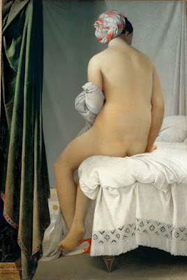
Even the most linear of painters uses movement to direct the viewer in reading his work. The Grand Baigneuse, also called The Valpinçon Bather, 1808, Jean-Auguste-Dominique Ingres, the Louvre.
Form: Paintings are made of two-dimensional shapes, but they create the illusion of form. That is the sense that what we’re seeing exists in three dimension. While some abstract painting ignores form, a feeling of depth is critical in representational painting.
Texture: A work is called ‘painterly’ when brushstrokes and drawing are not completely controlled, as with Vincent van Gogh. A work is ‘linear’ when it relies on skillful drawing, shading, and controlled color, as with Jean-Auguste-Dominique Ingres.
Unity: Do all the parts of the picture feel as if they belong together, or does something feel like it was stuck there as an afterthought? In realism, it’s important that objects are proportional to each other. Last-ditch additions to salvage a bad composition usually just destroy a painting’s unity.
Loose brushwork does not mean lack of drawing or preparation. Vase of Sunflowers, 1898, Henri Matisse, Hermitage Museum, St. Petersburg, Russia.
Balance: While asymmetry is pleasing, any sense that a painting is heavily weighted to one side is disconcerting.
Focus: Most paintings have a main and then secondary focal points. A good artist directs you through them using movement, above.
Rhythm: An underlying rhythm of shapes and color supports that movement.
Content: I realize this is a dated concept, but it’s nice if a painting is more than just another pretty face, if it conveys some deeper truth to the viewer.
By the time you master these, scribing and mark-making will come naturally to you.

Perfectly pure art

It’s not about money, and nobody gets to say whether it’s good or bad. Too bad more art isn’t like NaNoWriMo.
Lady Writing a Letter with her Maid, c. 1670–71, Johannes Vermeer, National Gallery of Ireland
November might be our month to express gratitude, but it’s also NaNoWriMo, or National Novel Writing Month. My third daughter has been participating since she was in high school. Now, her younger brother also spends the month of November writing a novel.
“I might as well do it while I still can,” is their rationale. That reflects a sad view of adulthood in America. Young people see their mid-twenties as the end of all self-actualization, when in truth it ought to be just the beginning.
I’ve mostly interacted with NaNoWriMo as a mom. My kids knew that, “I can’t rake leaves, Mom, I’m short on my word count,” stood a pretty good chance of working.
Occasionally one of my older friends takes a swing at NaNoWriMo. This year it’s a retired religious who’s in palliative care in Jerusalem. She’s the survivor of two different cancers, breast and adult Ewing sarcoma, and she has lots of professional experience writing and editing. It’s been interesting to watch her struggle with the NaNoWriMo challenge.
Paul Alexis Reading to Émile Zola, 1869–1870, Paul Cézanne, Museo de Arte de Sao Paulo
Since 2006, almost 400 NaNoWriMo novels have been picked up and published by publishing houses. These include the best-seller Water for Elephants by Sara Gruen. More have been successfully self-published. (A complete list is available here.) Recently, winners have received five free, paperback proof copies of their manuscripts that they can use for marketing. They’re also encouraged to do revisions in a “Now What?” month, where published authors help them polish up their work for submission.
NaNoWriMo focuses on the doing, not the quality of the results. A winner is a person who completes their 50,000-word work in the one-month window. “If you believe you’re writing a novel, we believe you’re writing a novel too,” says their website.
The participation rate is huge. This year, 441,184 people are participating, from all over the globe. There will be about 40,000 winners. These people will write 1,667 words a day, every day, for thirty days straight. That’s a lot of words. It supports what art teachers often say: inspiration lies in methodical disciplined action, not in some mad flash of genius.
As with so much other crowd-sourcing, NaNoWriMo was only possible after the development of the internet diffused the power of traditional publishing. It’s popular with young people. I expect that their tastes and style, coupled with this engine of quick distribution, will create a period of great achievement in literature.
Young Man Writing, 1650-1675, Jacob van Oost, Musée d’arts de Nantes
I don’t need to read my son’s story; he’s already told it to me. As he talked, I smiled at his vocabulary and word structure. He’s always been good with language, but I’m sure these forays into forced-march fiction have influenced how he thinks and speaks.
Complete works don’t just fall out of your head onto the paper, whether they’re painted or written. They’re clawed out in great chunks, then endlessly revised. Painting or writing may be intensely satisfying but they’re also hard work.
We humans love to spin stories, and we love to hear them. I love NaNoWriMo because it celebrates that inventive human spirit. I love it because it’s never been mostly about the business of art, but about the simple joy of creativity. I love it because nobody’s appointed themselves the arbiter of what’s good or bad. Too bad more art isn’t like that.
Monday Morning Art School: How to draw almost anything

There’s now a Facebook group for you to post your homework, folks. 
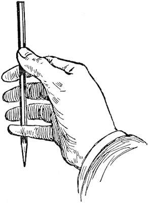
You’ve all seen artists holding a pencil up like the clip art below. What they’re doing is rough measuring. It’s simple. Just hold the pencil up like a ruler in front of the object you’re drawing. Move it around to see the relative height and width of the thing. For example, a vase may be twice as tall as it is wide. That’s all you’re figuring out; you can make the vase any size you want on the paper.
It’s not just an affectation.
You can hold your pencil up to figure out the other important thing in drawing: the angles of lines. I could give you a formal perspective lesson before we start drawing, but it’s not as important as learning to see angles. If you develop the ability to see angles, you’ll have better natural perspective than if you try to fit up what you see to a theory.
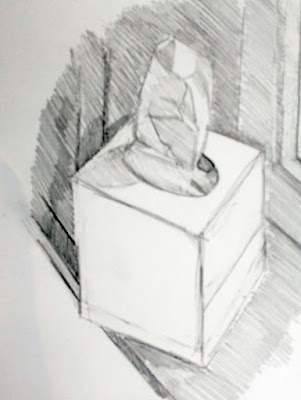
I used my pencil as a measuring tool to get the relative sizes and angles right.
The tissue box I was drawing in church yesterday had lovely angles. However, what you see in the photo isn’t what I saw while working. A drawing from life will never match what the camera portrays. Cameras are not as subjective as artists, but they lie just as much as we do.
You should do your measuring with one eye closed, especially if you’re working in a tight space, as I was. Art books will tell you to measure with your arm straight out. I find that uncomfortable. Instead, I just shoot for always having the pencil the same distance away from my eye as I work.
Then I checked the sizes and angles and corrected them. The box was taller than I originally thought.
All drawing starts with simple shapes. After laying them down, I check and correct them. I do this by analyzing each large shape. Where does the back of the box intersect the tissue column? Is the curve of the cutout fat enough? I discovered that my cube wasn’t really tall enough, so I added some to the bottom.
After I was reasonably confident I had the shapes right, I added some overall values.
The next step is to establish some overall values.  “Value” just means how light or dark something is. This box was sitting on a south-facing windowsill behind a person who was casting another shadow. Thus, the window-frame behind the box was in deep shadow, but not nearly as dark as the photograph. I roughed in those darks first. They helped me know how to shade the box properly.
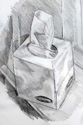
I added shadows to the box itself, and developed some detail.
Next, I set shadows on the tissue box itself. I am more concerned with the column of tissue, so with each pass, I spend more time on that.
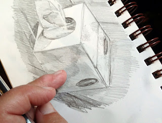
Finally, I did some blending, using the handiest tool I carry: my finger. You should use a stumpor tortillonon work you care about, but in a pinch, your finger works great.
Blending using the side of my finger.
Note that I never bother much about my mark-making. It can take care of itself. I’m mostly interested in applying accurate values. I did this drawing with a mechanical pencil, which will never be as luscious as a good graphite stick, but it survives banging around in my purse week after week.
Time to go home!
Some general rules:
  1. Draw everyday objects. The better you get with these, the better you’ll be with complex subjects. There’s amazing beauty in everyday things.
  2. Draw any time you get the chance. I did this drawing in church, and I didn’t miss a word. Drawing and language don’t use the same channels of your brain.
  3. Measuring is the most important part of drawing. Keep checking and correcting sizes.
  4. Start with big shapes and break them down into little shapes. If the big shapes are right, the smaller parts will slip into their spots just fine.
  5. Value is relative. How dark something is, is only important in terms of how dark its neighbor is.
  6. Constantly recheck shapes and values as you go.

The perfect body

What is the ideal of beauty in art? That’s a moving target.

Death of Boudicca, by Carol L. Douglas. The sculpted female form is peculiar to our own time in history. Our ancestors would have found it déclassé.
I once had a perfect body, you know. Like most women, I didn’t realize that until I’d lost it to childbearing, cancer and that ultimate indignity, age.
I was reminded of this yesterday when a friend showed me new photos of her daughter, who’s an actress (and a great kid). Her publicity pictures focus on her long, articulated muscles, whippet-thin torso, and delicate fair hair. By contemporary standards, she is physically perfect.
Longing, by Carol L. Douglas
“You have to suffer to be beautiful,” my grandmother told me as she tried to tame my frizzy hair into submission. I must have told my own kids that without thinking, because I’ve heard it from their mouths.
“Perfection is ‘lean’ and ‘taut’ and ‘hard’ — like a boy athlete of twenty, a girl gymnast of twelve. What kind of body is that for a man of fifty or a woman of any age? ‘Perfect’? What’s perfect? A black cat on a white cushion, a white cat on a black one… A soft brown woman in a flowery dress… There are a whole lot of ways to be perfect, and not one of them is attained through punishment,” wrote Ursula K. Le Guin in The Wave in the Mind: Talks and Essays on the Writer, the Reader, and the Imagination.
Physical ideals change, but they are reflected by artists. That is their only tangible record. Sleeping Venus may have been painted by a woman (Artemisia Gentileschi) but it suggests all the tropes of female beauty of the time. She is soft, languid, deferential. She is young, because youth has always been associated with beauty.
Michelle reading, by Carol L. Douglas
Fashions in beauty were enhanced through whatever panniers, stays or padding were in style at the time. But it wasn’t until the 20th century that women started sculpting our own bodies in earnest. Dieting became a fact of life for most of us. In the 1980s, plastic surgery went mainstream, with women buying dental veneers, breast and buttocks augmentation, nose jobs and eye lifts.
Changes in beauty norms are more pronounced for women, but they’re true for men, too. Historically, the markers of male beauty were money, power and class. These were expressed through clothing, ornamentation, and setting. Sculpted muscles were considered vulgar, reflecting the hard work of the lower classes. The shift to beefcake as beauty corresponds historically with the shift to sculpted bodies in women.
The Laborer Resting, by Carol L. Douglas
As always, our ideals about beauty reflect our longing for something we cannot have. Only the wealthy have the leisure and money to afford personal trainers at expensive gyms, chefs to create careful, well-thought-out diet regimens, plastic surgery or tropical tans. The vast majority of us grab breakfast on the run and head in to work, where we sit all day.
“Beauty always has rules. It’s a game. I resent the beauty game when I see it controlled by people who grab fortunes from it and don’t care who they hurt. I hate it when I see it making people so self-dissatisfied that they starve and deform and poison themselves,” wrote Le Guin.
“There’s the ideal beauty of youth and health, which never really changes, and is always true. There’s the ideal beauty of movie stars and advertising models, the beauty-game ideal, which changes its rules all the time and from place to place, and is never entirely true. And there’s an ideal beauty that is harder to define or understand, because it occurs not just in the body but where the body and the spirit meet and define each other.”

Violettomania

I love violet, but there was a time when the critics thought it meant you were defective. I would’ve been considered a sufferer of violettomania.

Lake Tear of the Clouds (Headwaters of the Hudson), 30X40, Carol L. Douglas, private collection.

Richard Liebreich was a distinguished 19th century German ophthalmologist and an admirer of the earlier works of J. M. W. Turner. While visiting London, he called at the National Gallery. He was shocked by the artist’s later works, which were so much looser and hazier than the pieces he knew. “Was the great change… caused by an ocular or cerebral disturbance?” he asked, and then answered his own question with an exploration of how illness might have affected Turner’s painting. “To be physiologically normal is not at all a fundamental condition in art,” he wrote.

He was not the only 19th century scientist to wonder if contemporary artists had lost their collective minds, vision, or both. “Liebreich’s Sign” came to mean color-blindness as seen in painting.

Italian ophthalmologist Arnaldo Angelucci assembled a large collection of paintings which purported to show color-blindness. He identified five characteristics we could look for in painting to determine that the artist had vision problems. They were:

  1. Exaggerated reds in the highlights;
  2. Too much green in the shadows;
  3. The abuse of violet;
  4. Exaggerating the yellows in highlights and blues in shadows in the color green;
  5. Excessive mixing up of hues in a single object’s color.

He had just described Impressionism in a nutshell.

“Flood tide,” plein air, oil on canvasboard, Carol L. Douglas

“I have finally discovered the true color of the atmosphere,” Claude Monet once declared. “It’s violet. Fresh air is violet.”

Whether he was saying that to annoy his critics, or whether the criticism just naturally followed, is hard to say. He and his fellow Impressionists were gleefully using new pigments churned out by the nascent chemical industry. They were brilliant and they sometimes clashed, but who could know that without trying them out in their raw, pure states?

The first true purple was cobalt violet, synthesized in 1859. That was replaced with manganese violet, first made in 1868, and also called Permanent Violet, Nuremberg Violet or Mineral Violet.

High Tide, Carol L. Douglas

Manganese violet was cleaner, more opaque and less toxic than cobalt violet, and worlds better than the historical violets (capet mortuum and Tyrian purple).

The Impressionists—especially Monet—adored their new violet hues. They used them so much that critics accused them of suffering from “violettomania” or “seeing blue.” The establishment was deeply offended by this reliance on violet, so much so that a critic described the third Impressionist exhibition in 1877 as having the overall effect of a worm-eaten Roquefort cheese.

Whatever the disease of “violettomania” was, it was apparently catching. Eventually, scientists were seeing Liebreich’s Sign in establishment painters like Alfred Munnings.

Mohawk Valley nocturne, oil pastel, Carol L. Douglas.

The Impressionists were justified in their excitement over this new pigment (and with the greens, pinks, and other shades suddenly available to them). It was impossible to mix a true violet with the pigments available to their predecessors. Today we have cleaner blues and quinacridone red tones (first synthesized as a pigment in 1935). It’s not necessary to carry manganese violet in our painting kit. But modern painters—myself included—still love violet.

My 2024 workshops: