
I love violet, but there was a time when the critics thought it meant you were defective. I would’ve been considered a sufferer of violettomania.
Richard Liebreich was a distinguished 19th century German ophthalmologist and an admirer of the earlier works of J. M. W. Turner. While visiting London, he called at the National Gallery. He was shocked by the artist’s later works, which were so much looser and hazier than the pieces he knew. “Was the great change… caused by an ocular or cerebral disturbance?” he asked, and then answered his own question with an exploration of how illness might have affected Turner’s painting. “To be physiologically normal is not at all a fundamental condition in art,” he wrote.
He was not the only 19th century scientist to wonder if contemporary artists had lost their collective minds, vision, or both. “Liebreich’s Sign” came to mean color-blindness as seen in painting.
Italian ophthalmologist Arnaldo Angelucci assembled a large collection of paintings which purported to show color-blindness. He identified five characteristics we could look for in painting to determine that the artist had vision problems. They were:
- Exaggerated reds in the highlights;
- Too much green in the shadows;
- The abuse of violet;
- Exaggerating the yellows in highlights and blues in shadows in the color green;
- Excessive mixing up of hues in a single object’s color.
He had just described Impressionism in a nutshell.
“I have finally discovered the true color of the atmosphere,” Claude Monet once declared. “It’s violet. Fresh air is violet.”
Whether he was saying that to annoy his critics, or whether the criticism just naturally followed, is hard to say. He and his fellow Impressionists were gleefully using new pigments churned out by the nascent chemical industry. They were brilliant and they sometimes clashed, but who could know that without trying them out in their raw, pure states?
The first true purple was cobalt violet, synthesized in 1859. That was replaced with manganese violet, first made in 1868, and also called Permanent Violet, Nuremberg Violet or Mineral Violet.

Manganese violet was cleaner, more opaque and less toxic than cobalt violet, and worlds better than the historical violets (capet mortuum and Tyrian purple).
The Impressionists—especially Monet—adored their new violet hues. They used them so much that critics accused them of suffering from “violettomania” or “seeing blue.” The establishment was deeply offended by this reliance on violet, so much so that a critic described the third Impressionist exhibition in 1877 as having the overall effect of a worm-eaten Roquefort cheese.
Whatever the disease of “violettomania” was, it was apparently catching. Eventually, scientists were seeing Liebreich’s Sign in establishment painters like Alfred Munnings.

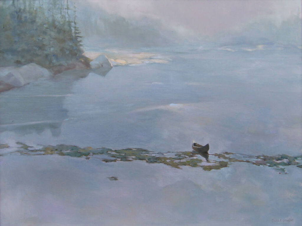
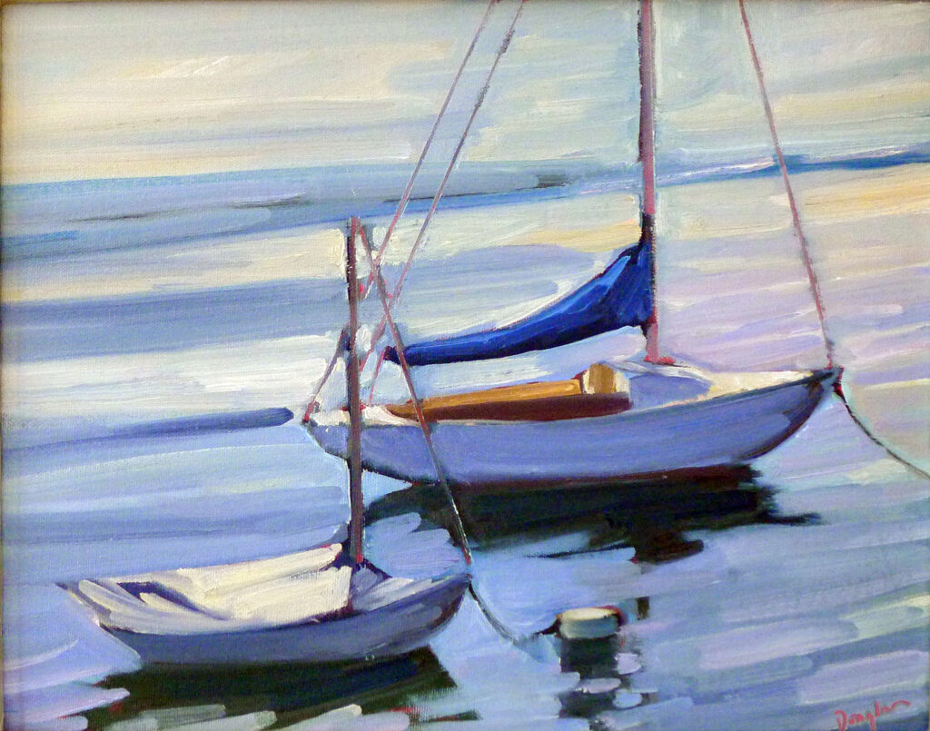
The Impressionists were justified in their excitement over this new pigment (and with the greens, pinks, and other shades suddenly available to them). It was impossible to mix a true violet with the pigments available to their predecessors. Today we have cleaner blues and quinacridone red tones (first synthesized as a pigment in 1935). It’s not necessary to carry manganese violet in our painting kit. But modern painters—myself included—still love violet.
Registration is now open for workshops in 2026! Reserve your spot:
- Advanced Plein Air Painting | Rockport, ME, July 13-17, 2026
- Sea & Sky | Acadia National Park, ME, August 2–7, 2026
- Find your Authentic Voice in Plein Air | Berkshires, MA, August 10-14, 2026
- New! Color Clinic 2026 | Rockport, ME, October 3-4, 2026
- New! Composition Week 2026 | Rockport, ME, October 5-9, 2026
Can’t commit to a full workshop? Work online at your own pace: