Ruthless pruning

If I had more time, I would have written a shorter essay.

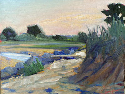
Coast Guard Inspection, 6X8, oil on canvasboard.

The above witticism has been attributed to many people because it’s a universal truth. President Woodrow Wilson put it thus: “If it is a ten-minute speech it takes me all of two weeks to prepare it; if it is a half-hour speech it takes me a week; if I can talk as long as I want to it requires no preparation at all. I am ready now.”

On Wednesday, I wrote and designed an ad with exactly 24 words of new copy; it took five hours. Then I made a short promotional video. I spent 12 hours to make two minutes of finished video.

This won’t surprise anyone in the creative fields. Editing is an important skill in any creative endeavor.

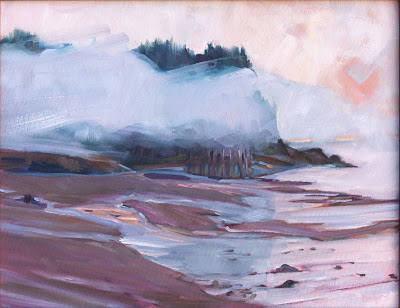
Blueberry Barrens, Clary Hill, 24X36, oil on canvas.

When I started blogging experts recommended that a blog post be kept to a thousand words. Today, I try to keep it around 500-600 words. There are many things that interest me, but if they don’t support the main trunk of the narrative, they’re ruthlessly scrubbed out.

This has changed my writing style, just as ruthless editing has changed my painting style. There are things I used to be able to do with pen or brush that I can no longer do. Losing some skills is the price we pay for pursuing mastery of others.

I’d like to blame simplification on our sleek modern sensibilities, but the quote at the head of this page dates from at least 1657. It was written (more wordily) by the French mathematician and philosopher Blaise Pascal. For centuries, writers have aimed for spare simplicity.

Main Street, Owl’s Head, 16X20, oil on gessoboard.

There are, of course, actions and reactions in public taste. Following hard on the heels of Pascal’s geometry came the French Rococo, with painters like Giovanni Battista Tiepolo, Antoine Watteau and François Boucher creating absurdly exuberant paintings. But rococo had a limited run; within a few decades, tastes swung back to the neoclassical.

There’s a limit, apparently, to the frenzy the human mind can tolerate. At the same time, there are paintings that seem empty to us. Dutch Golden Age church interiors come to mind, as do most of the experiments of 20th century op art. There isn’t enough there to hold our interest. Editing is a delicate balance.

I’ve written before on the question of simplification in painting, most recently here. It’s not a question of taking things out for the sake of simplicity, but of ruthlessly paring away what doesn’t matter. That makes room for what’s important. That’s not necessarily content; it could be rhythm, texture, color or line.

The Late Bus, 8X6, oil on archival canvasboard.

“When in doubt, take it out” is another pithy aphorism that can also apply to painting. I’ve spent vast amounts of time trying to squeeze an idea into a painting or essay only to realize it was superfluous from the get-go.

In painting, the best time to do these edits is before you pick up a brush. Paper and charcoal (or pencil) are cheap and forgiving. Andrew Wyeth was a careful planner; his preparatory sketches are worth studying. Just as an outline is invaluable for the writer, a sketch is invaluable to the painter.

Paintings almost never benefit from last-minute additions or changes to the composition. These decisions need to be taken early on. Jan van Eyck may have moved feet and hands and added the little dog to the Arnolfini portrait, but he did so in the underpainting. The essential composition was worked out long before he got to the end.

All the plein air events, at your fingertips

Thinking about competitive plein air painting? Here’s a useful tool.

Beach Erosion, 8X10, oil on canvasboard, $652 framed, available through Ocean Park Association.

I met Chrissy Pahucki at a plein air event. She was standing in line with one of her children waiting to have her canvases stamped. Chrissy’s branding came naturally—she always had a kid trailing along. I once asked a show organizer how many years we’d been doing his event. “You can tell how long it’s been by how much Ben has shot up in height,” he answered.

All three Pahucki kids are grown now and Chrissy’s still doing the plein air circuit. In her spare time, she’s a full-time, award-winning middle school art teacher in Goshen, NY. About a decade ago, she created a website to direct-sell paintings called the Plein Air Store, and she still maintains it.

Quebec Brook, 12X16, oil on canvasboard, $1449 framed.

She also made this spreadsheet for applying to events. It’s a useful tool because it lays out application, notification and event dates in tabular form. That means a busy person doesn’t have to hunt through reams of material looking for a show. Unlike a magazine, it’s searchable. And it’s free. Thank you, Chrissy.

The plein air circuit is where I first met Mary Byrom, Bobbi Heath, Poppy Balser, and many other talented, hard-working and like-minded women. Like Chrissy, they’ve become valued friends. These events are much like the rodeo circuit; the same artists show up at them over and over. Artists compete with each other for prizes and sales, but at the same time, they’re supportive and friendly. That’s a good life lesson right there.

Plein air events teach you to search out beauty. There is something otherworldly about grey, soaking weather that you don’t realize if you only go out when it’s fine. The painting Sometimes It Rains, below, was painted during a complete washout at Ocean Park, ME. I tucked myself into the vestibule at the Temple and painted down Royal Street. Ed Buonvecchio set up right behind me and painted me with my little red wagon. Sometimes It Rains turned out to be one of my favorite paintings. Ed’s painting sold, although why anyone would want me on their wall remains a mystery to me.

Fog Bank off Partridge Island, 14X18, oil on canvasboard, $1594 framed.

Sometimes there’s very little to work with. I once did an event in a coastal resort comprised of boxy modern houses shoved cheek-by-jowl along a strand. We were forced to find something beautiful, and the only way forward was to search shapes for a transformative angle or trick of the light. “You can make a good painting out of anything” is a good painting lesson and an even better life lesson.

Plein air events teach us to finish work. That last bit used to be my undoing. I once perseverated for years over a commission, to the point where it became a standing joke among my students. “Is that thing still there?” they’d ask as they trooped into my studio week after week.

Sometimes It Rains, 9X12, oil on archival canvasboard, $869 framed.

But plein air events allow for no such noodling. There’s an immutable deadline. You hand in work whether you think its done or not. A buyer or judge loves it for its unrefined energy. The adage that we spend 90% of our time doing 10% of the work is true in painting. It’s also true that we sometimes spend 90% of our time overworking that 10%.

Plein air painting is, simply, the most important art movement of our time. If you’re interested in it, I encourage you to dip your toe into the competitive process. Start with a regional show near you and see how it goes. Chrissy’s table is a good way to start.

Monday Morning Art School: more interesting greens

We take a snapshot of a dancing, glowing landscape and what we end up with is a wall of dull green. We need to insinuate that original energy back into our picture.

Bracken Fern, 9X12, oil on canvasboard, available, Carol L. Douglas

Michael Wilcox published a watercolor pigment guide called Blue and Yellow Don’t Make Green. (Don’t buy it unless you can get it for a few dollars; its information is widely available on the internet, including here.)

Of course blue and yellow make green, but there are many routes to the same destination. I ask my students to avoid greens out of the tube, because they’re a sure-fired way of ending up with a monochromatic ‘wall of green’.

Apple Tree with Swing, 16X20, oil on canvasboard, Carol L. Douglas

Instead, I ask them to mix their greens using a matrix. I’ve written about this many times, so I’m not going to repeat the concept, except to say that it’s critically important to avoid the soul-sucking deadness of greens out of a tube.

Impressionism changed the way we look at and mix color. From the beginning of painting, artists understood that to warm a color up, you add a warmer tone, and to cool a color down, you add a cooler tone. If that neutralizes the color, so be it. That’s in fact what happens in real life with real light.

The Impressionists started to treat color as a wheel. If you wanted a warmer, lighter green, you mixed it not with Naples yellow* but with its cadmium yellow neighbor. If you wanted a cooler, darker green, you mixed it with it not with black but with its Prussian blue neighbor.

Better yet, you didn’t mix them at all, but laid gold next to green to warm it up, and laid blue next to green to cool it down. These tiny, discrete spots of color are averaged by the human eye into a coherent image. A blizzard of brushstrokes and color resolves into a discernable truth.

Spring Greens, 8X10, oil on canvasboard, Carol L. Douglas

If you look carefully at human skin, you realize it’s not ‘skin-tone’ but is quite varied. There are areas tinged with blue, yellow, purple, and red. Without that, a person would look dead. The same is true of foliage. There are moments in which the color leans toward khaki, yellow, teal, violet and orange. They are what give life to greens.

Unfortunately, these color shifts are subtle and almost never caught in the snapshots we use as reference photos. We talk about ‘photographic proof’ as if it is an absolute, although by now we all know that photos are terrible liars.

For guiding a painting, photos have their limits. They distort distance and spatial relationships. Modern point-and-shoot cameras (especially cell phones) blow contrast and chroma up, because that’s what buyers like. In exchange, subtle value and hue shifts disappear.

We take a snapshot of a dancing, glowing landscape and what we end up with is a wall of dull green. Does that mean we can’t ever paint from photos? Of course not (although you’ll never really master the intricacies of natural color if you don’t go outside). It means we have to insinuate that energy back into the picture, and the tool we have to do that with is color.

The Impressionists taught us that we can do that by extending the range of color in an object. I can give you many examples of artists who did that, starting with Claude Monet and Vincent van Gogh. Spend a few hours analyzing their paintings in terms of color range.

I made a series of four photoshopped trees, above, to illustrate the concept. The first one is the normal way we might paint trees. With each step, I’ve added color range to the tree, until the final version has every position in the color wheel.

The guiding principle is the color of light. I’ve kept (for the most part) cool colors in the shadows and warm colors in the highlights. When you first try this, it will seem artificial and possibly absurd, but persevere. It’s the key to dynamic greens.

*Today’s Naples yellow is a mix and almost as deadening to a painting as sap green.