Helping Ukraine

We can all do what Americans and Canadians do best: send money.

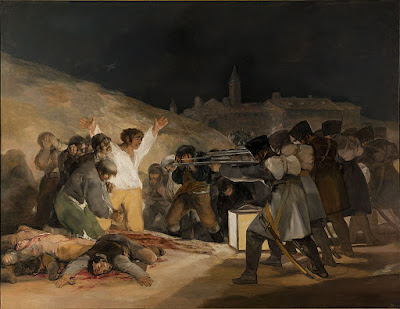
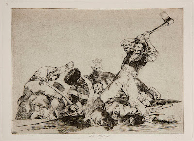
This painting has ceased to exist; it was a musing on the First Gulf War.
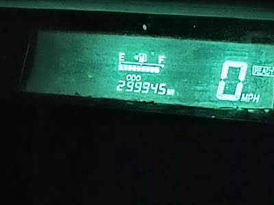
Although Iā€™m fairly ā€˜greenā€™, I bought my Prius in 2005 primarily for geopolitical reasons. It had been only a few short years since 9/11. There was credible information that our oil purchases were funding jihadism. I wanted to limit the amount of money I was sending to the Middle East.

Dependency on foreign oil has been a fact of life since the invention of the internal-combustion engine.  Today itā€™s Europe that is suffering from the boycott of Russian oil. I reckon that every gallon we donā€™t consume is a gallon that eases pressure on European consumers.

We drive a hybrid and heat primarily with wood. We can and will curtail unnecessary travel, but I canā€™t figure out how to cut our oil consumption much further. If you have suggestions, Iā€™d love to hear them.

Russiaā€™s attack on Ukraine has put paid to any idea that modern Europeans have somehow sidestepped their bloody history. The post-Cold War peace was illusory; it has exploded into hot conflagration.

As I write, a friend is driving to Poland to try to rescue her cousin from the mass of refugees streaming across the border. I canā€™t drive to Poland, but I can do what Americans and Canadians do best: send money.

Retired journalist Rita Truschel is the child of refugees herself. She put together this list of organizations helping in Ukraine or for refugees. Iā€™ve appended Charity Navigator ratings where appropriate. (No rating doesnā€™t mean the organization is wasteful; it just means that they arenā€™t required to file American tax forms.)

Children’s welfare

Save the Children (91.82)                         

United Nations Children’s Fund(89.18)     

Emergency housing

Airbnb Disaster Response (not a charitable organization but funneling money to people on the ground)

Surplus medical supplies 

Afya Foundation Disaster Response  (97)

MedWish International (100)

Medical volunteers

Doctors Without Borders (92.25)

International Medical Corps (83.94)

Logistics & shipping

Brother’s Brother Foundation(92.92)

Flexport (not rated)

Refugees’ survival & resettlement 

Catholic Relief Service(83.94)

Canada Helps (not rated)

Canada-Ukraine Foundation (not rated)

CARE Ukraine Crisis Fund (92.64)

International Rescue Committee (86.92)

Lutheran World Federation (not rated)

Sunflower of Peace (not rated)

US-Ukraine Foundation (not rated)

United Nations Refugee Agency(not rated)

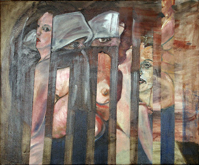
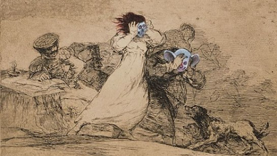
Damned if you do, damned if you don’t is one of the paintings at Rye Arts Center’s Censored and Poetic, which is what I should be writing about today.

In normal times, this post would have been about the opening of Censored and Poetictomorrow evening, so I should at least mention it. If youā€™re in the metro New York City area, Iā€™d love to see you there, and if not, the event will be livestreamed here.

Monday Morning Art School: that sinking feeling

Over time, the dark passages in an oil painting can grow hazy. In watercolors, the beautiful, jewel tone on the palette can look flat and dull after the paper dries. Thatā€™s ā€˜sinkingā€™ color, and an ounce of prevention beats a pound of cure.

Clear Morning on Bunker Hill, 24X36, $3985 framed.

Oil painting: Sinking is caused by the displacement of the oil in the top layer. Itā€™s most obvious in dark passages, but thatā€™s only because the dusty haze is most visible there. It appears slowly over timeā€”a painting that was once exuberantly colorful is suddenly dull. The different drying times of pigments means that color will sink unevenly across the canvas, giving it an irregular, blotchy look. Details that were once subtly beautiful will disappear.

Sinking can be repaired by oiling out or varnishing, but this may need to be repeated to keep the painting beautiful. If a painting is sold, you have no idea if itā€™s losing its color. Itā€™s far better to do it right in the first place.

Tom Sawyer’s Fence, 14X18, $1275 unframed.

Sinking has three common causes:

Too much solventā€”the painter has not mastered the art of using unadulterated paint or painting mediums in the top layer. He relies too much on odorless mineral spirit (OMS) to get good flow. The OMS takes the place of the linseed oil binder and then evaporates. That leaves the pigment particles isolated, with no oil surround. Air doesnā€™t have the same refractive index as linseed oil, so a pigment that looks dark and beautiful in solution looks dull and grey when the binder disappears.

Not enough oil in the top layer of paintā€”this is why we keep repeating that old saw, ā€˜fat over lean.ā€™ Thereā€™s enough oil in modern paints to make a solid top layer, but only if applied in proper thickness. If you want to paint thin, you must cut your paint not with OMS but with an oil-based medium.

Over-absorbent groundsā€”acrylic gesso is more absorbent than oil gesso, but a well-prepared acrylic ground is fine. However, a very inexpensive board may not have enough ground to stop oil from seeping through. An aftermarket coating of gesso is a good cure. Non-traditional grounds like paper and raw fabric need very careful preparation.

Bunker Hill overlook, full sheet watercolor, available. One of the advantages of Yupo is that there is no sinking.

Watercolor: ā€œThe difficulty in watercolors is not that it is ā€˜unforgivingā€™, as amateurs widely misbelieve: it is that it begs for fussing,ā€ wroteBruce MacEvoy. That fussing takes the form of overworking passages. Alla prima, or ā€˜on the first strikeā€™ is vital in watercolor.

We want the pigments to stay on the top of the paper, rather than sink into it where they canā€™t be seen. The cellulose fibers of watercolor paper were laid down in a stiff mat so that pigments will sit nicely on top. Reworking wet-on-wet, scrubbing, and other repairs cause the fibers to unravel, creating a microscopic forest of random threads. Paint sinks into its crevices. The color is duller and, worse, blotchy.

The deck of American Eagle, from my sketchbook from Age of Sail workshop

Most watercolor paper is coated with gelatin or other sizing. This controls its absorption of paint. When you do a preliminary wash of color, youā€™re wetting the paper along with establishing primary shapes. If this wash layer is allowed to dry completely before the next layer is applied, the water and paint mix with the sizing and create a new layer, comprised of binder, sizing and pigment. That new, dense sizing layer can help hold successive layers of paint on the surface.

But if you ā€˜lickā€™ the wet paper constantly with your brush in an attempt to control minor flaws, you interrupt this process. Unless the paper dries completely between approaches, each pass with the brush lifts more paper fibers. That disturbance increases the capillary action that draws the pigment deeper into the paper. Overworked passages look dull and fuzzy.

Of course, the type and quality of the paper you use matters. Hot press paper is more tightly-compacted, making it more tolerant of overbrushing. Cold-press paper has less sizing and looser fibers. It tolerates less fussing.

Iā€™d rather be painting

We donā€™t control our legacy; we just do our best work and hope for the best. But, please, if you love me, donā€™t tell me you like my writing better than my painting.

Pull up your Big Girl Panties, 6X8, is one of the paintings at Rye Arts Center this month.

Next Thursday, I give a short talk at the opening of Censored and Poetic at the Rye Arts Center in New York. It will be livestreamed; you can register here. Iā€™m no stranger to speaking; I generally lecture for 25 minutes each week to my painting classes. That takes me about three hours to research and write.

Cutting that in half increases the prep time exponentially. The more economical the text, the longer it takes to prepare. Certainly, the more emotionally engaged you are with the subject, the more difficult it is to put it in lucid order, and Iā€™m passionate about my subject.

Spring, 24X30, isĀ one of the paintings atĀ Rye Arts CenterĀ this month.

The net result is that Iā€™ve used my entire week writing and practicing my talk. Iā€™ll get out tomorrow for a few hours of plein airpainting in the snow, but thatā€™s only because Iā€™m doing a photo shoot with Derek Hayes.

Iā€™ve spent an inordinate amount of time recently writing. And yet, I donā€™t think of myself as a writer, but a painter. This winter, it seems, Iā€™m a writer whose subject is painting. Or, perhaps Iā€™m a painter who writes.

Itā€™s all very annoying. Iā€™ve spent many years learning the craft of painting and almost none learning to write. That comes as naturally to me as talking.

Michelle Reading, 24X30, isĀ one of the paintings atĀ Rye Arts CenterĀ this month.

All of us carry these labels. I told someone recently that my husband was a programmer. He corrected me, because he isā€”of courseā€”a software engineer. Not being in the profession, I donā€™t understand the difference, but it clearly matters.

Labels can be limiting. Mid-century America used to talk about the ā€˜Renaissance man.ā€™ This was a polymath, a person who was a virtuoso at many things. Thatā€™s very different from the pejorative ā€˜Jack of all trades and master of noneā€™ that we sometimes use to describe a person who canā€™t light on any one thing and do it well.

Polymathy was, in fact, a characteristic of the Renaissance and Enlightenment. Gentlemen (and some ladies) were expected to speak multiple languages, pursue science as a passionate avocation, playĀ musical instruments, and draw competently, all while fulfilling their roles as aristocrats and courtiers. Of course, that was only possible because a whole host of peons (that would be you and me) attended to their every need from birth.

This Little Boat of Mine, 16X20,Ā isĀ one of the paintings atĀ Rye Arts CenterĀ this month.

Having to work and do your own laundry tends to cut into oneā€™s leisure time. In fact, in America, we have an inversion of the historic distribution of leisure. Our elite are workaholics. Wealthy American men, in particular, work longer hours than poor men in our society and rich men in other countries.

This leaves no time to do other things. It also affects our overall culture, since culture is the byproduct of leisure. We used to love highbrow things like classical music and art because the well-educated had time to turn their hobbies into art. Today our culture is much earthier, for good or ill.

Loretta Lynn made a commercial in the 1970s which opened with, ā€œSome people like my pies better than my singinā€™.ā€ I remember that and her 1970 hit single, Coal Minerā€™s Daughter, and, sadly, nothing else of her three-time-Grammy-Award oeuvre.

We donā€™t control our legacy; we just do our best work and hope for the best. But, please, if you love me, donā€™t tell me you like my writing better than my painting.

Donā€™t look at the hill

My asthma is teaching me life lessons that are applicable to painting and any other heroic endeavor.

Clary Hill Blueberry Barrens, full sheet watercolor, available.

My asthma, which is usually quiet, has been kicking up since I had COVID. I find myself stopping to suck air as I climb Beech Hill in the morning.

Beech Hill is no great shakes as hills go, since its summit is only a few hundred feet higher than my house. I climb it every morning, which gives me a good base level of cardiovascular fitness (and around 6000 steps to start my day). I figure that a little cardio work each morning will give better long-term results than killing myself a few times a week at the gym.

Early Spring on Beech Hill,Ā oil on canvasboard, Carol L. Douglas, 12X16, $1449 framed.

Painting is like that, too. In their Art & Fear: Observations On the Perils (and Rewards) of Artmaking, David Bayles and Ted Orland make the point that the best art is made by people who do it over and over. A half-hour drawing every morning will yield quiet, positive results that no painting marathon can.

Weā€™ve had a cold winter here in New England. Yesterday, it was -2Ā°F. as we set out. Sensible people donā€™t go rambling in those temperatures, but rambling is a habit, and habit forces me out the door. In my professional life, Iā€™m in a phase where Iā€™ve spent most days ā€˜putting out firesā€™ rather than working on new material. There will always be challenges, but habit alone forces me back into my studio.

Mountain Path, 11X14, oil on canvasboard, available.

Iā€™ve started repeating a mantra as my chest tightens: ā€œDonā€™t look at the hill.ā€ If I look at the distance I still have to climb, the tightness doubles and I have to stop. I know Iā€™m psyching myself out, but I canā€™t seem to stop it. So, in the steepest parts of my climb, I concentrate assiduously on my footing. Itā€™s better not to contemplate the enormity of what lies before me.

A few weeks ago, a student asked me how long it takes to learn to paint. Because heā€™s tough, I answered honestly: it takes years. But to focus on that is like looking up at the hill; it makes every step harder.

That dissuades many people from even trying. But time elapses whether or not weā€™re doing anything useful. Itā€™s easy to fritter away, as all those people who were going to learn second languages during lockdown have learned to their dismay.

Christmas Eve, 6X8, oil on canvasboard, available.

Iā€™m planning on walking the length of Hadrianā€™s Wall in Britain in May. Itā€™s the wallā€™s 1900th anniversary and Queen Elizabethā€™s Platinum Jubilee. Walking across an entire country sounds absurd to an American, but itā€™s a shorter distance (84 miles) than from my house to the New Hampshire border. However, it will be a series of long days in the company of friends who are all younger than me. And northern England is hilly.

I should be seriously training right now, and instead Iā€™m unable to keep up my usual four-mile-a-day pace. Iā€™ll regret ruining this trip for my companions, so I occasionally wonder if I should just bow out now.

However, Iā€™m old enough to realize the truth in the adage, ā€œSufficient unto the day is the evil thereof.ā€ Worrying about tomorrow is a great way to stop myself from doing anything today. Thatā€™s true of painting or any other heroic endeavor. Instead of panicking, Iā€™ll just challenge myself again this morning. And, lest you worry, I have an appointment with my nurse-practitioner on Friday.

Monday Morning Art School: the color of darkness

Painters spend lots of time thinking about the subtractive color system. We spend very little time thinking about the additive system. Thatā€™s a mistake, because this is the color of light.

A deer I painted years ago as a demonstration for my class. Shadows are the complement of the morning light.

Every artist is familiar with the three primary colors: red, blue and yellow, and their complements, the secondary colors green, orange and violet. This is the fundamental color wheel for the subtractive color system, or whatā€™s used for paint and ink.

Thereā€™s another set that became more important in the 20thcentury, with the rise of electric lights and then electronics. These are the so-called additive color primaries, which are red, green and blue. This color system doesnā€™t have a color wheel, but it does have complements, which are shown below.

Additive complements (left) and subtractive complements (right). Courtesy Wikipedia.

Painters spend lots of time thinking about the subtractive color system. We spend very little time thinking about the additive system. Thatā€™s a mistake, because this is the color of light.

For painters, color theory is a balance between natural light (additive color) and their paints (subtractive color). Thatā€™s mind-blowing but theyā€™re not alone in this challenge. Despite working in an additive-color medium, many web designers still think in terms of subtractive color. This system has influenced our aesthetics since the 18th century, and we donā€™t let go of what ā€˜looks rightā€™ easily.

But in practical terms, shadows are the absence of light. If light is full-spectrum, then its shadows will be full-spectrum too. That means a white light will cast a grey shadow.

However, natural light is far more complex than that. It seldom shows up with all wavelengths being equal.

Sunrise, or the so-called ‘golden hour’ on Beech Hill. The shadows are definitely blue.

For this reason, artists have a useful rule: shadows are the complement of the color of the light. In the north on a snowy morning, golden light casts blue-violet shadows on the snow. In overcast light, the shadows are vaguer and full-spectrum, meaning they appear greyer. Thatā€™s easy to see, and demonstrates an idea that you can then generalize to all subjects. Although you should never trust your camera for color, I have included two photographs that show this.

Midday at the same location, the light is diffuse and so are the shadows.

It’s a mistake to get too attached to theory, however. For one thing, light is tricky. And for another thing, ā€˜primary colorā€™ is another one of those constructs that we use because itā€™s useful, not because itā€™s absolute or provable. Our understanding and technologies are imperfect. CRT televisions of the 20th century were dull compared to modern LED screens. As technology got better, so did the color gamut, and what was considered ā€˜primaryā€™ changed accordingly.

Most importantly, all these color systems are a dim mirror of the interaction of natural light and the human brain. Both are complex and imperfectly understood.

Light and shadows exist in the additive system, so your understanding of primaries is wrong if itā€™s based on what you learned in kindergarten. The complement of yellow in subtractive color is violet. The complement of yellow in additive color is blue. So, if the light is golden, the complement is more likely to be blue than violet.

At sunset, shadows appear black. There’s color in those darks, but our eyes can’t process it.

On the other hand, at sunset, the light is often red. The complement of red in additive color is cyan, but we almost never see any colors in the shadows at sunset. Instead, theyā€™re just black, because weā€™ve hit the limit of what our poor rods and cones can process.

Thereā€™s a lot of latitude in what colors you can make your shadows, as long as you maintain the warm-cool balance. Andā€”as alwaysā€”all the theory in the world is no substitute for observation.


War and rumors of war

The violence and inhumanity of war is apparently a lesson that every generation needs to learn for itself.

The Third of May 1808, 1814, Francisco Goya, courtesy Museo del Prado.

Francisco Goya was the most important Spanish artist of his day. His late painting, The Dog, was an icon for modern and symbolist painters through the 20th century. Thereā€™s a good reason: it prefigures modern art.

Goya became a court painter in 1786 and the First Court Painter to the Bourbon monarchy in 1799. This made him, in effect, a courtier of the Crown. As expressive as his painting was, he wrote nothing about current affairs.

In 1808, Napoleon turned on his former allies and occupied Spain. He forced the abdication of the King and installed his brother Joseph Bonaparte on the throne. Spaniards rejected French rule and fought a long and bloody guerrilla war to oust them.

The Third of May 1808, 1814, Francisco Goya, courtesy Museo del Prado.

The war started with the Dos de Mayo Uprising, the reprisals to which were memorably recorded by Goya in his masterpiece above. This was painted in 1814, after the war ended. Whatever his private thoughts, Goya meant to stay alive and working.

Goya remained in Madrid through the conflict. His ruminations resulted in a series of prints called The Disasters of War. Thatā€™s a modern title; Goyaā€™s only written comment was on a proof-set, where he wrote, ā€œFatal consequences of Spain’s bloody war with Bonaparte, and other emphatic caprices.ā€ In using the word caprichos, which also translates as ā€˜whimsā€™, Goya said a mouthful.

Plate 10: Tampoco (Nor do these). Spanish women being raped, Francisco Goya from The Disasters of War, courtesy Museo del Prado.

The Disasters of War is a series of 82 prints, finished between 1810 and 1820. They are an expression of revulsion against the violence of the Peninsular War, an outpouring from the gut against the inhumanity of war. There is no polemic about the causes of the conflict, despite the fact that Goya retained his position in the Bourbon court while working on them. They were private works, and not published until 35 years after his death. Their influence has been incalculable.

Fast forward to 2003 and a pair of British art enfants terrible, Jake and Dinos Chapman. They purchased a folio of the Disasters of Warand set about systematically defacing it with cartoon figures drawn over Goyaā€™s art. They called this appropriation work, Insult to Injury and the overall show Rape of Creativity.

One image of Jake and Dinos Chapmanā€™s defacing of Disasters of War, which they retitled, What is this hubbub?

ā€œDrawings of mutant Ronald McDonalds, a bronze sculpture of a painting showing a sad-faced Hitler in clown make-up and a major installation featuring a knackered old caravan and fake dog turds,ā€ is how the BBC described the show at the time.

For this twitting of human suffering, they should have been spanked and sent to their rooms. Instead, they were nominated for the Turner Prize.

The Chapmans were born in the 1960s. They have lived through the longest period of peace in modern British history. The Disasters of Warmight have seemed funny to them, but it would not have amused those who remembered the convulsions of the two great 20th century European wars.

That kind of generational amnesia is an odd function of the human mind. Itā€™s the only possible explanation for why we get into war over and over again.

I hadnā€™t meant to write on this subject, but the war in Ukraine couldnā€™t have happened without the slow forgetting of the violence and inhumanity that is war. Apparently, itā€™s a lesson that every generation needs to learn for itself.

In control

Every day, in every way, things are not necessarily getting better.

In Control (Grace and her unicorn), 24X36, is one of the paintings that’s going to Rye Arts Center’s Censored and Poetic: the works of Carol Douglas and Anne de Villemejane, March 2022.

A visitor to my studio recently asked me about the gender disparity in painting. ā€œEighty percent of art students are women,ā€ I saidā€”and that may be a low estimate. ā€œBut 80% of the top cadre of professional painters are men.ā€ That, too, may be a low estimate.

ā€œWhy?ā€ she asked. I was stumped for an answer. If Iā€™d thought about it at all, Iā€™d have attributed it to changeā€”women moving up through the atelier system to take their rightful place in the art world. But since the 19th century women have studied and practiced painting with great seriousness. There were more girls in art class when I was young, and the earning disparity didnā€™t disappear when we came of age.

Michelle Reading, 24X30, is one of the paintings that’s going to Rye Arts Center’s Censored and Poetic: the works of Carol Douglas and Anne de Villemejane, March 2022.

This is not anecdotal. There have been many studies worldwide that document this phenomenon. The most exhaustivewas done in 2017. It analyzed 1.5 million auction transactions in 45 countries, and found a 47.6% gender discount in prices. The discount was worst (unsurprisingly) in countries with greater overall gender disparity.

Do women drop out, practicing art as dedicated amateurs rather than professionals? No; 51% of practicing visual artists are women.

Are womenā€™s paintings somehow more ā€˜girly,ā€™ and therefore less attractive to buyers? In blind studies (with the artistā€™s name excised), participants could not guess the gender of the artist. Women’s art sells for less because the signature is feminine. Period.

The Beggar, 36X48, is one of the paintings that’s going to Rye Arts Center’s Censored and Poetic: the works of Carol Douglas and Anne de Villemejane, March 2022.

My childhood chum Cynthia Cadwell Pacheco was a professional ballet dancer. While she was traveling around the world, her mother regaled me with stories of the culture of submission, abuse and body-shaming that the corps de ballet were subject to.

Itā€™s a miserable career choice for women, but, ironically, serious ballet used to be a women-led art form. That was before it spun money. Today, itā€™s a multi-billion-dollar business. As it has grown in economic importance, women have been pushed out of leadership. Todayā€™s companies are run by men, the work is choreographed by men, the jurors are men, and the big bucks go to men. Let that be a lesson to you if you believe that every day, in every way, weā€™re getting better and better.

ā€œDespite the fact that girls outnumber boys 20 to one and pay most of the fees in ballet schools, and despite the audience and donor base being 70% women, female artistic directors are paid 68 percent of what their male counterparts earn,ā€ wrote Elizabeth Yntema.

Saran Wrap Cynic, 20X24, is one of the paintings that’s going to Rye Arts Center’s Censored and Poetic: the works of Carol Douglas and Anne de Villemejane, March 2022.

Our culture actively discourages boys from dancing. Thatā€™s foolish and unfair, and it leads to a tremendous imbalance in dance classes. If there is a boy at all, he wonā€™t lack for principal roles, no matter how execrably he dances; the great classical ballets require male dancers. No wonder boys in the dance world grow up thinking theyā€™re the cock of the walk.

No other legal American industry is as gender-skewed as ballet, but the visual arts do share some of its daft values. You only have to compare the career of Lois Dodd with her contemporaries to see that.

Identifying the problem is only the first step. What can we do about it? Young artists might choose a gender-neutral nom de pinceau, but that perpetuates the problem. Womenā€™s role in the arts will only be as strong as womenā€™s role in the greater culture. Iā€™m old enough to have seen some remarkable changes in society, but Iā€™m also alive to the very real risk that we can move backwards, just as the dance world has.

Monday Morning Art School: is that painting finished?

Our hectoring superegos are not always the best judges of painterly quality.

Self Portrait with Disheveled Hair, 1628-29, Rembrandt van Rijn, courtesy Rijksmuseum

In my studio, there are more than a hundred unfinished paintings in drying racks. Iā€™d feel bad about that, except that most plein air artists I know store up unfinished pictures like squirrels store nuts. We say weā€™re going to work on them during the winter, and sometimes we do. Other times, we just go out and start more paintings.

There is another stack on the other side of my studio. These are paintings Iā€™ve either decided arenā€™t first rate or that I wonā€™t ever bother to finish. I periodically go through them with the intention of winnowing them down. Often, Iā€™m surprised that theyā€™re actually not bad at all.

Self Portrait at the Age of 63, 1669, Rembrandt van Rijn, courtesy National Gallery, London

ā€œAh, a procrastinator,ā€ you might say, but youā€™d be wrong. Iā€™m actually disciplined in my work habits. Iā€™ve just learned to trust my subconscious more than I did as a younger person. Twenty years ago, I thought a painting was finished when it achieved the effect I was striving for. Today a painting is finished when Iā€™m sick of working on it. Iā€™ve learned to be less critical of myself. My hectoring superego is not always the best judge of painterly quality.

The division between brilliantly-raw and plain-unfinished is highly subjective. That line often changes over the course of an artistā€™s career. Paul Cezanneā€™s paintings of Mont Sainte-Victoire done in the 1880s are significantly more refined than those done from 1904-6. Rembrandtā€™s youthful Self Portrait with Disheveled Hair is an amazing exercise in chiaroscuro, but the brushwork is much tighter than his Self-Portrait at the Age of 63 (the year of his death). The changes in Claude Monetā€™s final paintings are usually blamed on his failing eyesight, but they are also the culmination of a career-long path toward looser, more audacious painting.

Women in the Garden, 1866ā€“1867, Claude Monet, courtesy MusĆ©e d’Orsay

That is not to say that every artist becomes looser as they age. Grant Wood painted in the same precise style until his death of pancreatic cancer at age 51. Of course, we have no idea how he might have painted had he lived longer. The same is true of Caravaggio, who only made it to 39. On the other hand, Titian, who lived until his late eighties, spent his last years as an impossible perfectionist. He returned to older works and repainted them, fixed up copies made by his students, and kept some paintings in his studio for more than a decade of tweakingā€”all of which must give art historians the vapors.

The difference lies in what drove these artists in the first place. Cezanne, Rembrandt and Monet were never interested in a high degree of finish, but rather in the effects of paint. The culmination of their efforts was looseness. In contrast, Caravaggio, Titian, and Wood were what we call linear painters, interested in creating the illusion of three-dimensional space through careful modeling. For them to suddenly become interested in dynamic brushwork would have been a complete repudiation of their lifeā€™s work.

Weeping Willow, 1918ā€“19, Claude Monet, courtesy Kimball Art Museum

One of the cliches of art instruction I particularly hate is, ā€œNot another brushstroke! Donā€™t overwork it.ā€ Nobody else can tell you positively that your painting is finished, because nobody else knows your intentions. We can engage you in dialog and help you clarify your thinking. But the only legitimate judge of whether youā€™re done is you, the artist. 

I have found that when I canā€™t finish a painting, the best thing I can do is to set it aside. Sometimes, my skills arenā€™t up to the effect I was trying to achieve, and I need to practice. Sometimes I donā€™t know how to finish it, and I need to think. Sometimes itā€™s a lousy painting, and it belongs in the reject pile. And sometimes a period of reflection reveals that the painting was, in fact, finished all along.

How long did it take you to become a genius, anyway?

Mastery is a moving target. Occasional moments of greatness are a byproduct of that continuing struggle.

Autumn farm, evening blues, oil on archival canvasboard, Carol L. Douglas

ā€œHow @#$% long does it take great painters to learn to paint?ā€ asked a student recently, with only the slightest hint of frustration in his voice. ā€œIā€™m not looking for affirmations,ā€ he added. ā€œI really would like some perspective.ā€

In the age of apprenticeships and less-flexible standards of art, that was an easier question to answer. Titian started his apprenticeship somewhere around age 10-12, and finished it around ten years later. Diego VelƔzquez did a six-year apprenticeship starting at around age ten. Peter Paul Rubensdid a 7-year apprenticeship starting at age 14. The British portrait painter George Romneydid only four years, but he started at age 21, with watchmaking and drawing experience under his belt. Most women at this time studied with family members.

Vineyard, oil on canvas, 30X40, Carol L. Douglas

These budding artists made learning their craft a full-time occupation during their apprenticeships. They were also responsible for elements of painting we donā€™t bother with today, such as preparing panels and grinding pigments, along with the scut-work of any successful business. In addition, their master (or more probably, his wife) taught them the necessary skills for living.

By the end of the 18th century, the apprenticeship system was dead. Painters were more likely to come up through atelier training. Many artists of this period, including Ɖdouard Manet and Vincent van Gogh, came from affluent families. They had the liberty to direct their own destinies and well-heeled friends to buy their first paintings.

Mary Cassatt is typical in that she had a good liberal education (including exposure to great art in Europe) before enrolling at the  Pennsylvania Academy of the Fine Arts at the age of 15. She spent four years there. It was not coincidence that atelier training took about as long as a humanities degree; artists had transitioned from being craftsmen to intellectuals.

Midsummer, 24X36, oil on canvas (plein air), $3188 unframed, Carol L. Douglas

By the 20th century, the down-and-dirty craftsmen in the art world were illustrators. Norman Rockwell also spent four years studying art, but he didnā€™t have the advantage of a Grand Tour. He started art school at age 14 and was working for Boyā€™s Life at 18.

The 20th century was a confused time for art education in the western world. Grant Wood is representative of mid-century painters in that he moved around through various schools and collectives learning his craft. Andy Warhol, on the other hand, had a BFA from Carnegie-Mellon. Those who came up outside the formal art world, like Jasper Johns, still put in a lot of years perfecting their craft.

There have always been outliers. N.C Wyeth had a fairly typical art education for his time, with Howard Pyle and others. However, when it came to the next generations, Andrew Wyeth and grandson Jamie Wyethwere both tutored at home. This hearkens back to historic family painting dynasties like the Brueghelsor Gentileschis.

Termination Dust, oil on archival canvasboard, Carol L. Douglas

We love stories of instant success, but most, like Grandma Moses, were working hard at art for decades before their discovery. Moses spent a lifetime doing fine needlework until her arthritis forced her to take up a brush at age 78.

My studentā€™s question presumes thereā€™s a point at which the painter says, ā€˜whew, Iā€™ve made it!ā€ Every credible painter I know is simply striving to be good at what he or she does, but the goal keeps moving. Greatness is merely a by-product of that continuing struggle.

Historically, masterpiece had a specific meaning. It was a work produced to earn membership in oneā€™s guild. Velazquezā€™ first Waterseller of Seville was such a painting, done to prove that he was good enough to hang out his own shingle. It was the start of his professional life, not its culmination.

I had just one jobā€¦

COVID kicks like a mule, which is why I failed at my goal, and why Iā€™m just getting this information out about my next session of classes.

Oops.

I set out two weeks ago on an impromptu excursion with my son to West Yellowstone, Montana. We would look at geysers in the snow, and celebrate his Prius clicking over 300,000 miles, which we calculated would happen somewhere on the NYS Thruway as we returned to Albany, NY.

I was last in Yellowstone 26 years ago with a baby in a backpack saying ā€œbub-bleā€. On this trip, her younger brother was more erudite. Heā€™s a newly-minted geologist. I now know more about the Yellowstone Supervolcano than I ever thought possible.

Coyote at Yellowstone, photo courtesy Dwight Perot.

On Monday of last week, my husband told me he had COVID. I was starting to develop cold symptoms myself, but according to the CDC weā€™d been apart too long for me to have been exposed with him. However, by Tuesday morning, it was apparent that my son and I also had COVID. We decided to beat feet back home.

If youā€™re not feeling well, a car provides a strange insulation. You stop at roadside rest stops, you eat fast food, you sleep, and then you do it all over again. Itā€™s amazing how fast you can travel 2600 miles when youā€™re self-quarantined.

Yellowstone in the snow, photo courtesy Dwight Perot.

One problem became evident as we approached Ohio. We would be 55 miles short of our 300,000-mile goal. ā€œNo problem,ā€ I said. ā€œWeā€™ll just take a fast run up the Northway when we get back to Albany.ā€

Except that we couldnā€™t. Even in its Omicron form, COVID has a wicked kick. I left the boy on his sickbed, drove home and slept all weekend.

Yellowstone River, photo courtesy Dwight Perot.

Thatā€™s why Iā€™m just getting around to telling you about my openings for my next session of Zoom classes. There are three seats open in each class. (My current students always have first dibs on returning.)

These classes are open to intermediate painters in watercolor, acrylics, pastels and oils. What do I mean by that? You have a basic understanding of how to apply paint, but want to learn more about how to paint boldly, use fresh, clean color, build commanding compositions, and draw the eye through your paintings. (If you need a beginner class, contact me and Iā€™ll put you in contact with some excellent teachers.)

The great thing about Zoom classes is that theyā€™re one place you canā€™t spread a virus. And having just done COVID myself, I think thatā€™s an awesome thing.

ZOOM Tuesday morning Session

We meet on Tuesdays from 10 AM to 1 PM EST, on the following dates:

February 22

March 1, 8, 15, 29 (off week of March 21 for Sedona workshop)

April 5 

ZOOM Monday evening Session

We meet on Mondays from 6 to 9 PM EST, on the following dates:

February 21, 28

March 7, 14, 28 (off week of March 21 for Sedona workshop)

April 4

For more information, see here.