A little knowledge is a dangerous thing

Chemistry was my worst subject, so it’s ironic that it plays such an important role in painting.

Blueberry barrens, watercolor on Yupo, Carol L. Douglas, available through Maine Farmland Trust Gallery.

My students ask me, on average, a question a week that I can’t answer. Often, these revolve around chemistry. This was my worst subject, so it’s ironic that it plays such an important role in painting. Because I care about the survival of paintings, I really wish I’d paid more attention in high school. Let that be a lesson to you, kids.

I like painting with saltwater in my watercolors. It’s a habit I picked up from Poppy Balser, who also lives along the North Atlantic. It encourages the separation and granulation of the colors, adding just a bit of texture to the whole process. In addition, I occasionally—like many other watercolorists—add salt to create more texture.

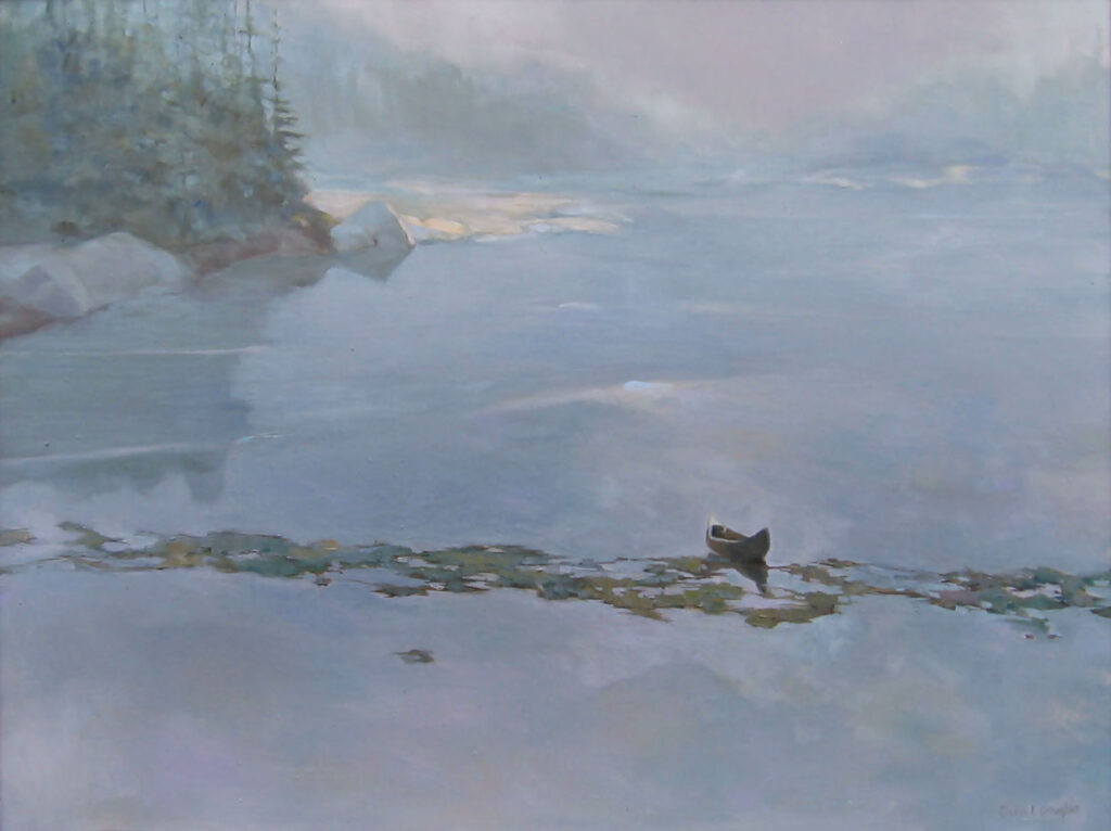
Float, watercolor on Yupo, Carol L. Douglas, available.

“But won’t salt degrade the paper?” a student asked. In searching the internet, I found dissenting opinions. The ones that said it would, thought it would do so by lowering the pH of the paper. Acidity is the enemy of paper, a fact known even to dolts like me.

Now, the idea that salt was acid-forming didn’t make much sense to me. Table salt is neutral; you can tell by its taste. I asked my husband, who had the same chemistry teacher as me, but was good at it. He mumbled something about salts being chemical compounds consisting of cations and anions. Suddenly, I remembered just what it was I disliked about the subject.

Bunker Hill Overlook, watercolor on Yupo, Carol L. Douglas, available .

Well, it would be easy enough to test, I thought. I just needed to find some pH test strips. That was complicated a bit by the fact that we live a little to the north of nowhere, and everyone sensible has left for the winter. Eventually, I ordered some online.

At the post office, I tucked them in my jacket pocket. They were promptly filched by my dog. I can now tell you that my dog’s saliva has a pH of 8.5. This is, interestingly, considerably more alkaline than human saliva, which I looked up. Our mouth drippings have a pH normal range of 6.2-7.6.

What was left of my test strips after Guillo ate them.

There were enough strips left to test the raw paper (Strathmore), an area where I’d painted without salt, and a section where I’d used enough salt to create a new ocean. Both painted samples were slightly more acidic than the unpainted paper itself, which was neutral.

Any real scientist would be appalled by my technique. I wet the paper with the spray bottle in my watercolor kit. That contains common tap water, but I figured that whatever impurities it contained would affect all the samples equally. I then stuck the samples down with my index finger—more or less clean—and waited. But I think the results were good enough to tell me that salt doesn’t really affect the pH of the paper. But paint itself does.

My conclusion: salt doesn’t make any difference, but paint itself does.

All of which reminded me of a hoary old joke you hear from kids, about dihydrogen monoxide, which is a colorless, odorless, tasteless liquid that’s in everything we eat or drink. I was thinking about it when I rinsed my hair with the stuff this morning, after scrubbing it with a chemical bath that was a surfactant combined with a co-surfactant, and then rinsing with a polymer. Why do we find the results of that so pleasant, and our dirty hair so offensive?

But, more importantly, I was thinking of a little ditty that’s been with us since the early 18th century:

A little learning is a dangerous thing;
drink deep, or taste not the Pierian spring

(Alexander Pope)

It’s why I discourage people from making their own mediums, experimenting with substrates, etc. Painting is hard enough when we’re using proven technique. It’s hard enough for conservators to preserve paintings that were done properly. Why make things more difficult?

If it was good enough for my grandfather

Was litharge in earlier paintings, or did Rembrandt just get lucky?
Rembrandt’s impasto.
I’m constantly railing about using time-tested technique in your painting. Painters have been experimenting with weird additives in their paints for centuries. The results are often disastrous. Rembrandt van Rijn may be the exception that proves the rule.
Now, 350 years later, we tend to think of Rembrandt as the model of traditional art. That’s especially true since, through most of the 20thcentury, his indirect painting techniques were taught as a sort of ‘purer’ painting in reaction to the volatility of Abstract-Expressionism.
It’s easy to forget that he and his Dutch Golden Agefellows were highly innovative, creating whole new genres of painting and challenging the Baroquestatus quo.
Portrait of Marten Soolmans, 1634, is one of three Rembrandt paintings in which plumbonacrite has been found. Courtesy of the Louvre.
Rembrandt’s is probably the most-studied technique in art history. We know his palette: lead white, ochre, Cassel earth, bone and ivory char, vermillion, madder lake, yellow lake, lead-tin-yellow and very limited use of azurite and ultramarine blue.
We know that, in his later paintings, he used moody glazes of dark color punctuated by fat impasto passages of pure light, often modeled with a soft brush after they were laid down. These impasto layers were then glazed with color.
Susanna and the Elders, 1647, is one of three Rembrandt paintings in which plumbonacrite has been found. Courtesy of the Staatliche Museen zu Berlin.
For that he needed a thick, fast-drying white. The danger with that is brittlenesss and cracking. Adding lead and heat-treated oils kept the paint layers more pliable over time. So Rembrandt used a combination of lead white, chalk, and smalt (ground glass). His paintings look great today.
Recently, researchers have found traces of a lead carbonate mineral— plumbonacrite—in three of Rembrandt’s best-known paintings. They’re terrifically excited, because the previously earliest-known appearance of plumbonacrite was in Vincent Van Gogh’s Wheat Stack under a Cloudy Sky (1889).
Wheat Stacks under a Cloudy Sky, 1889, Vincent Van Gogh, Kröller-MĂŒller Museum
Since lead is cheap and plentiful, it’s been used in paints since antiquity. But it can darken or fade other pigments. In 2015, chemists were trying to figure out what was damaging the red lead pigment in Van Gogh’s picture. In the space between the sample’s reddish-orange Pb3O4 core and the light blue PbCO3 layer that surrounds it, they found plumbonacrite. That was the first time it was ever seen in a pre-20th-century painting.
How did Rembrandt manage to get plumbonacrite into his paintings two centuries before it came into common use? “[O]ur research shows that its presence is not accidental or due to contamination, but that it is the result of an intended synthesis,” wroteVictor Gonzalez of the Rijksmuseum and Delft University of Technology.
Bathsheba at her Bath, 1654, is one of three Rembrandt paintings in which plumbonacrite has been found. Courtesy of the Louvre.
Their best guess is that it came from litharge, which is an oxide of lead used to refine silver. In the seventeenth century litharge was made by pumping a set of bellows to send very hot air across molten lead, creating the oxide and sending it flying into a nearby receptacle. If this sounds dangerous, it is.
Litharge did create some pretty colors. Litharge of gold is litharge mixed with red lead, which may have been how Van Gogh acquired it. Litharge of bismuth is a brownish silver color—just the kind of color that would appeal to Rembrandt, in fact.
Why would Rembrant have even considered adding litharge to his paint? The most obvious possibility is that it was in use all along, and appears in other, earlier paintings that scientists haven’t examined yet. Or, Rembrandt was messing around and got lucky.

Black and white all over

A class exercise on design, and a chemistry question I can’t answer.
Christ and the Woman Taken in Adultery, 1565, Pieter Bruegel the Elder, image courtesy of the Courtauld Institute of Art but the painting has been stolen.

Yesterday was the kind of day that drives poets mad. Just below freezing, it rained heavily, with gusts of wind. Our plein air painting class was forced into the studio.

grisaille (pronounced griz-eye) is a painting done entirely in shades of grey or another neutral color. Historically, it was used as decorative painting in imitation of sculpture. Some are what we moderns call duotones. They have subtle colors added to extend the value range. But for our class, they would be strictly in black and white.
Abstract design by Christine Covert

Painting runs along two parallel tracks. The first is design. This is why painting teachers relentlessly push students to do thumbnails and other value sketches. Value is our most important tool. Get it right, and you can be wrong about a lot of other things.

(I came to this realization late, by the way. I studied with Cornelia Foss, who tinkers endlessly with the ‘rules’ of painting. From her I got the hairbrained idea of minimizing value as a structural concept. However, this was a misinterpretation on my part. That’s a good lesson in not asking the right questions at the opportune moment.)
Grisaille by Jennifer Johnson.
The second track is color. It’s so much more interesting in some ways that it can be a distraction to the beginning painter. Mixing paints is both difficult and exciting.
Of course, value is part of color. In color space, value is the range from black to white. All successful paintings have some kind of pre-meditated value range in them. A high-key painting is one in which the contrasts are extreme. A low-key painting is one in which the range is narrower. In either case, there must be midtones too. They are also part of the design process.
Grisaille by David Blanchard.
It’s a lot easier to experiment with value when you’re not fussing about color management at the same time. One way to familiarize yourself with this idea is to paint a ten-step scale ranging from black to white. That’s not a bad exercise, but it’s boring. Instead I asked my students to do the monochromatic still life that I assigned in Monday Morning Art School last month.
Grisaille by Chris Covert.
Before that, however, they did an abstraction in charcoal, based loosely on the drawing I included in yesterday’s blog. Charcoal is the most painterly of drawing tools, but this is something you can do in a sketchbook while watching TV. It is a bit intimidating for someone to ask you to do an abstract drawing, but if I call it “doodling,” you can relax and get on with it.
There are only two rules:
  • Have a full range of tones, not just a line drawing.
  • And no realistic objects belong in your drawing at all.

A question: One of my students has had a problem with red pigment from her toned boards bleeding into her final paintings. She prepared a sample board for me to test her M. Graham acrylics vs. a similar red from a very inexpensive craft paint. I tried the squares at 15 minute- and 30 minute-intervals. The M. Graham pigment bled into the white paint, but the craft paint did not. I then tried the same intervals using my own Golden-toned board. Again, there was no bleeding.
Acrylic is pigment suspended in acrylic polymer emulsion. It is supposed to be water-resistant when dried. That doesn’t mean it’s oil-resistant. I’m beyond my chemistry knowledge here, but if any readers can suggest what’s happening, I’d be very grateful.

Violettomania

I love violet, but there was a time when the critics thought it meant you were defective. I would’ve been considered a sufferer of violettomania.

Lake Tear of the Clouds (Headwaters of the Hudson), 30X40, Carol L. Douglas, private collection.

Richard Liebreich was a distinguished 19th century German ophthalmologist and an admirer of the earlier works of J. M. W. Turner. While visiting London, he called at the National Gallery. He was shocked by the artist’s later works, which were so much looser and hazier than the pieces he knew. “Was the great change
 caused by an ocular or cerebral disturbance?” he asked, and then answered his own question with an exploration of how illness might have affected Turner’s painting. “To be physiologically normal is not at all a fundamental condition in art,” he wrote.

He was not the only 19th century scientist to wonder if contemporary artists had lost their collective minds, vision, or both. “Liebreich’s Sign” came to mean color-blindness as seen in painting.

Italian ophthalmologist Arnaldo Angelucci assembled a large collection of paintings which purported to show color-blindness. He identified five characteristics we could look for in painting to determine that the artist had vision problems. They were:

  1. Exaggerated reds in the highlights;
  2. Too much green in the shadows;
  3. The abuse of violet;
  4. Exaggerating the yellows in highlights and blues in shadows in the color green;
  5. Excessive mixing up of hues in a single object’s color.

He had just described Impressionism in a nutshell.

“Flood tide,” plein air, oil on canvasboard, Carol L. Douglas

“I have finally discovered the true color of the atmosphere,” Claude Monet once declared. “It’s violet. Fresh air is violet.”

Whether he was saying that to annoy his critics, or whether the criticism just naturally followed, is hard to say. He and his fellow Impressionists were gleefully using new pigments churned out by the nascent chemical industry. They were brilliant and they sometimes clashed, but who could know that without trying them out in their raw, pure states?

The first true purple was cobalt violet, synthesized in 1859. That was replaced with manganese violet, first made in 1868, and also called Permanent Violet, Nuremberg Violet or Mineral Violet.

High Tide, Carol L. Douglas

Manganese violet was cleaner, more opaque and less toxic than cobalt violet, and worlds better than the historical violets (capet mortuum and Tyrian purple).

The Impressionists—especially Monet—adored their new violet hues. They used them so much that critics accused them of suffering from “violettomania” or “seeing blue.” The establishment was deeply offended by this reliance on violet, so much so that a critic described the third Impressionist exhibition in 1877 as having the overall effect of a worm-eaten Roquefort cheese.

Whatever the disease of “violettomania” was, it was apparently catching. Eventually, scientists were seeing Liebreich’s Sign in establishment painters like Alfred Munnings.

Mohawk Valley nocturne, oil pastel, Carol L. Douglas.

The Impressionists were justified in their excitement over this new pigment (and with the greens, pinks, and other shades suddenly available to them). It was impossible to mix a true violet with the pigments available to their predecessors. Today we have cleaner blues and quinacridone red tones (first synthesized as a pigment in 1935). It’s not necessary to carry manganese violet in our painting kit. But modern painters—myself included—still love violet.

My 2024 workshops: