Monday Morning Art School: the color of darkness

Painters spend lots of time thinking about the subtractive color system. We spend very little time thinking about the additive system. That’s a mistake, because this is the color of light.

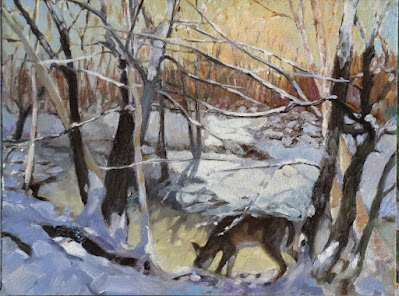
A deer I painted years ago as a demonstration for my class. Shadows are the complement of the morning light.

Every artist is familiar with the three primary colors: red, blue and yellow, and their complements, the secondary colors green, orange and violet. This is the fundamental color wheel for the subtractive color system, or what’s used for paint and ink.

There’s another set that became more important in the 20thcentury, with the rise of electric lights and then electronics. These are the so-called additive color primaries, which are red, green and blue. This color system doesn’t have a color wheel, but it does have complements, which are shown below.

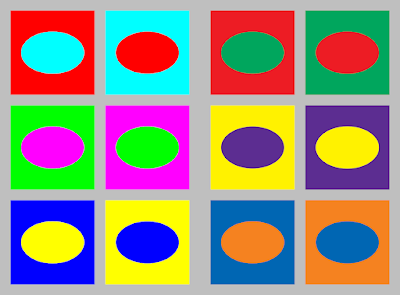
Additive complements (left) and subtractive complements (right). Courtesy Wikipedia.

Painters spend lots of time thinking about the subtractive color system. We spend very little time thinking about the additive system. That’s a mistake, because this is the color of light.

For painters, color theory is a balance between natural light (additive color) and their paints (subtractive color). That’s mind-blowing but they’re not alone in this challenge. Despite working in an additive-color medium, many web designers still think in terms of subtractive color. This system has influenced our aesthetics since the 18th century, and we don’t let go of what ‘looks right’ easily.

But in practical terms, shadows are the absence of light. If light is full-spectrum, then its shadows will be full-spectrum too. That means a white light will cast a grey shadow.

However, natural light is far more complex than that. It seldom shows up with all wavelengths being equal.

Sunrise, or the so-called ‘golden hour’ on Beech Hill. The shadows are definitely blue.

For this reason, artists have a useful rule: shadows are the complement of the color of the light. In the north on a snowy morning, golden light casts blue-violet shadows on the snow. In overcast light, the shadows are vaguer and full-spectrum, meaning they appear greyer. That’s easy to see, and demonstrates an idea that you can then generalize to all subjects. Although you should never trust your camera for color, I have included two photographs that show this.

Midday at the same location, the light is diffuse and so are the shadows.

It’s a mistake to get too attached to theory, however. For one thing, light is tricky. And for another thing, ‘primary color’ is another one of those constructs that we use because it’s useful, not because it’s absolute or provable. Our understanding and technologies are imperfect. CRT televisions of the 20th century were dull compared to modern LED screens. As technology got better, so did the color gamut, and what was considered ‘primary’ changed accordingly.

Most importantly, all these color systems are a dim mirror of the interaction of natural light and the human brain. Both are complex and imperfectly understood.

Light and shadows exist in the additive system, so your understanding of primaries is wrong if it’s based on what you learned in kindergarten. The complement of yellow in subtractive color is violet. The complement of yellow in additive color is blue. So, if the light is golden, the complement is more likely to be blue than violet.

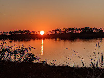
At sunset, shadows appear black. There’s color in those darks, but our eyes can’t process it.

On the other hand, at sunset, the light is often red. The complement of red in additive color is cyan, but we almost never see any colors in the shadows at sunset. Instead, they’re just black, because we’ve hit the limit of what our poor rods and cones can process.

There’s a lot of latitude in what colors you can make your shadows, as long as you maintain the warm-cool balance. And—as always—all the theory in the world is no substitute for observation.


Monday Morning Art School: the color of light

In winter, we’re in warm light from sunup to sunset, because the sun never really climbs very high in the sky. That’s our payoff for putting up with this weather.

Three photos of the golden hour, courtesy of Jennifer Johnson

The golden hour is that period after dawn and before sunset when the light is warm and the shadows are long and blue. The farther north you go, the longer the golden hour lasts. In winter in the northern United States, we’re in warm light from sunup to sunset, because the sun never really climbs very high in the sky. That’s our payoff for putting up with this weather.

Most of us prefer to paint that winter light from the comfort of our studio, but cameras lie. That’s the same black glove, below; the image on the left is with a cellphone camera and the one on the right is with a DSLR. In attempting to correct exposure, the cellphone is interpreting that black as purple.

Two photos of a black glove, courtesy Dwight Perot

So too does your eye-brain connection see things interpretively. You may see the same blue shadows in the three photographs at top, but I’ve sampled them and they’re not the same at all. In fact, they’re not even blue, but rather three variations of a soft blueish-grey. Your mind is interpolating what it knows to be true, which is that those shadows are cool. In this case it’s better to trust your mind than the hard ‘facts’ of camera and laptop.

Looking for Shellfish, JoaquĂ­n Sorolla, 1905. A warm light comes from our side of the figure, but there are warm shadows—the result of local color reflection from the rock. Likewise the bottom half of the torso reflects strong cool tones from the water and anchors the boy into the sea.

What we call light is really the narrow band of electromagnetic waves that our retinas can perceive. This narrow band is comprised of the colors of the rainbow, or what we sometimes call ROY G BIV. (There really isn’t an indigo; it’s there so that Roy has a pronounceable surname.) Each of Roy’s color names corresponds to a specific wavelength. For example, blue is about 475 nm; red is about 650 nm.

When the whole visible light spectrum strikes your eye at the same time, you perceive white. This is not a color in itself, but the admixture of a bunch of colors. In the real world, this is never a pure mix. The atmosphere bends light just like a prism does, so what you see is always tinted. The light might be gold and peach at sunset and cool at midday. Impurities in the atmosphere also give us the energetic indigo-violet of the far distant hills.

Valencian Fishwives, JoaquĂ­n Sorolla, 1903. Here the light is cool and the shadows are warmer.

The farther away something is, the more likely dust has filtered out the longer wavelengths, i.e., the warm colors. That’s why your plein airpainting teacher keeps telling you that the reds drop out first, then the yellows, leaving you with blue.

Just as all the colors together form white light, the absence of light is total blackness. But unless you’re in a cave or darkroom, that’s a theoretical construct. There’s always reflected light bouncing around in the shadows, and that light gives the shadows its color. It’s never black and it’s unlikely to be grey, either.

Return from Fishing, JoaquĂ­n Sorolla, 1894. The light is warm, the shadows are cool, and the places where the light is going through the sails are warmer still, since they’re filtered by the off-white fabric.

If the color of the light is warm, the color of the shadows is almost always going to be cool, and vice-versa. Knowing this and identifying the color of the light and shadow is the first step to a good landscape painting.

The exception to this is an object in filtered light. Its shadows and lighter passages will be variations of the same color temperature. This is how we instinctively know that something we’re seeing is under an awning, for example.

Catalonia: the Tuna Catch, from Visions of Spain, JoaquĂ­n Sorolla, 1919. In this case, most of the painting is in shadow, and what light there is, is filtered through the yellow awning. It is the distortion of the light-dark color scheme that tells us viewers that we are in an enclosed space.

Study the Spanish painter JoaquĂ­n Sorolla to understand the color of light. He was a master at painting white fabric in a variety of circumstances, and comparing the light passages to the shadow passages will tell you much about managing the color of light in your painting.

Monday Morning Art School: white on white

The color of white is the color of light. Mastering that will make all your paintings more exciting.

Girl Arranging Her Hair, 1886, Mary Cassatt, courtesy National Gallery of Art

Do you remember learning that “white is not a color; it’s the combination of all the colors”? That’s malarkey, although it’s based on a truth. Yes, Isaac Newton demonstrated that white light is a reflection of all the visible light spectrum. That doesn’t change the fact that white is a perceived color (as is black). Our perception is based not just on the physical light bouncing from the surface of an object, but on a whole host of contextual cues, which is why our brain is so easily fooled by optical illusions.

White is, in theory, a reflection of all the visible light spectrum. But that is never true in real life. Inevitably, all light shifts to either the cool (blue-violet) or warm (golden) side, depending on the time of day, season, and atmospheric conditions. Artificial light is even more limited in spectrum than sunlight, which is why it kills the colors in paintings, textiles, and human skin.

Sita and Sarita, 1896, Cecilia Beaux, courtesy National Gallery of Art

At the end of the 19th century, the Impressionist revolution in color had spread to painters like Anders ZornJoaquĂ­n Sorolla and John Singer Sargent. Nowhere does this show more than in their handling of white.

The colors in her gown.

Sorolla was painting in the brilliant light of his native Valencia. Zorn lived in Sweden, and many of his scenes have flat light. Sargent lived most of his life in western Europe. None were working in the same lighting conditions, but all of them adopted the same approach to color and light. It was a marriage of Impressionist color theory to more traditional brushwork. The combination still works today.

Helen Sears, 1895, John Singer Sargent, courtesy Museum of Fine Arts, Boston

By adding color to white, these painters were able to give their subject the sparkle and truth of natural light. To have painted their whites with just white or grey would have resulted in flat, dull canvases. This is because convincing whites, in the real world, are actually quite colorful.

The colors in her dress.

Sargent’s portrait of Helen Sears was painted under gaslight (and what a patient little child she must have been to tolerate all that primping and then all that standing). The little girl is thrown into stark relief by the dark interior, and the whole painting is drenched in warmth. What we perceive as blue is mostly a cool neutral. (Here is a photo of the girl taken by her mother, so that you can see Sargent’s liberal editing.) Even the blue-and-white hydrangeas are actually comprised of mostly warm tones. In this painting, the whites are influenced primarily by the light source.

Mending the Sail, 1896, JoaquĂ­n Sorolla courtesy Museo d’Arte Moderna di Ca’ Pesaro. This is a warm-light, cool-shadow combination.

Zorn’s portrait, on the other hand, is mostly influenced by reflected color. It is set against a rich orange floor that influences everything in the foreground. The older girl’s dress is washed in its pinkish tones. The younger daughter recedes in space because of the less-saturated color in her clothes and the grey drapes. Despite all the warmth in the painting, we understand it’s under natural light by the cool highlights. It’s a masterful composition, a brilliant use of color, and above all, an insightful glimpse into the childish mind.

The colors in Sorolla’s sail.

I’ve picked six random ‘whites’ from each painting to show you just how varied whites could be in the hands of accomplished painters. Had I used Impressionist paintings, the tints would have been clearer and brighter.

A Portrait of the Daughters of RamĂłn Subercaseaux, 1892, Anders Zorn, private collection

I strongly encourage my students to premix tints (the tube pigment plus white) of every color except black on their palette, and then to ignore pure white. Their assignment this week—and now it’s your assignment too—is to paint a white object without using any straight white paint at all. It should go without saying that your neutrals (greys) should not be mixed with black, either. Everything in this exercise should have color.

The colors in the older girl’s dress. It’s picking up the warmth from the carpet, which is in turn unifying the painting.

The addition of white makes any other pigment opaque and somewhat cooler, since titanium white is cool in its pure state. Add too much white, and you’ve got a bleached, dull image. When you start this exercise, it’s best to err on the side of too much color, rather than too little.

The tints in the second line drive this exercise. Graphic courtesy of Victoria Brzustowicz.

What are some good white objects to paint? Eggs, roses, china dishes, clothing or sheets on the line are all options.

This post was revised from one originally appearing in 2019.

Monday Morning Art School: The color of light

The season of mist and mellow fruitfulness is upon us. Let’s talk about the color of light.
Boys on the Beach, JoaquĂ­n Sorolla, 1908. There is warm light with cool shadows, but there’s also a strong warm reflection from the sand on which the figures are resting. 
What we call “light” is really the narrow band of electromagnetic waves that our retinas can perceive. This narrow band is comprised of the colors of the rainbow, or what we sometimes call ROY G BIV. (There really isn’t an indigo; it’s there so that Roy has a pronounceable surname.) Each of Roy’s color names corresponds to a specific wavelength. For example, blue is about 475 nm; red is about 650 nm.
Valencian Fishwives, JoaquĂ­n Sorolla, 1903. Here the light is cool and the shadows are warmer.
When the whole visible light spectrum strikes your eye at the same time, you perceive white. This is not a color in itself, but the admixture of a bunch of colors. In the real world, this is never a pure mix. The atmosphere bends light just like a prism does, so what you see is always tinted. The light might be gold and peach at sunset and blue at midday. Impurities in the atmosphere also give us the energetic indigo-violet of the far distant hills—the farther away something is, the more likely dust has filtered out the higher wavelengths (the warm colors).
Return from Fishing, JoaquĂ­n Sorolla, 1894. The light is warm, the shadows are cool, and the places where the light is going through the sails are warmer still, since they’re filtered by the off-white fabric.
Just as all the colors together form white light, the absence of light is total blackness. But unless you’re in a cave or darkroom, that’s a theoretical construct. There’s always reflected light bouncing around in the shadows, and that light gives the shadows its color. It’s never black and it’s unlikely to be grey, either.
Looking for Shellfish, JoaquĂ­n Sorolla, 1905. A warm light comes from our side of the figure, but there are warm shadows—the result of local color reflection from the rock. Likewise the bottom half of the torso reflects strong cool tones from the water and anchors the boy into the sea.
If the color of the light is essentially warm, the color of the shadows is almost always going to be cool, and vice-versa. Knowing this and identifying the color of the light and shadow is the first step to a good landscape painting.
Catalonia: the Tuna Catch, from Visions of Spain, JoaquĂ­n Sorolla, 1919. In this case, most of the painting is in shadow, and what light there is, is filtered through the yellow awning. It is the distortion of the light-dark color scheme that tells us viewers that we are in an enclosed space.
The exception to this is an object in filtered light. Its shadows and lighter passages will be variations of the same color temperature. This is how we instinctively know that something we’re seeing is under an awning, for example.
Study the Spanish painter JoaquĂ­n Sorollato understand the color of light. He was a master at painting white fabric in a variety of circumstances, and comparing the light passages to the shadow passages will tell you much about managing the color of light in your painting.
This post was originally published in 2015. Let me know if you’re interested in painting with me aboard the schooner American Eagle in late September.

White on white

The color of white is the color of light. Mastering that will make all your paintings more exciting.
Girl Arranging Her Hair, 1886, Mary Cassatt, courtesy National Gallery of Art
The colors in her chemise.
White is, in theory, a reflection of all the visible light spectrum. But that is never true in real life. Inevitably, all light shifts to either the cool (blue-violet) or warm (golden) side, depending on the time of day, season, and atmospheric conditions. Artificial light is even more limited in spectrum than sunlight.
At the end of the 19th century, the Impressionist revolution in color had spread to painters like Anders Zorn, JoaquĂ­n Sorollaand John Singer Sargent. Nowhere does this show more than in their handling of white. Sorolla was painting in the brilliant light of his native Valencia. Zorn lived in Sweden, and many of his scenes have flat light. Sargent lived most of his life in western Europe. None were working in the same lighting conditions, but all of them adopted the same approach to color and light. It was a marriage of Impressionist color theory to more traditional brushwork. The combination still works today.
Mending the Sail, 1896, JoaquĂ­n Sorolla courtesy Museo d’Arte Moderna di Ca’ Pesaro. This is a warm-light, cool-shadow combination.
The colors in Sorolla’s sail.
By adding color to white, these painters were able to give their subject the sparkle and truth of natural light. To have painted their whites with just white or grey would have resulted in flat, dull canvases. This is because convincing whites, in the real world, are actually quite colorful.
Helen Sears, 1895, John Singer Sargent, courtesy Museum of Fine Arts, Boston
The colors in her dress.
Sargent’s portrait of Helen Sears was painted under gaslight. The little girl is thrown into stark relief by the dark interior, and the whole painting is drenched in warmth. What we perceive as blue is mostly a cool neutral. (Hereis a photo of the girl taken by her mother, so that you can see Sargent’s liberal editing.) Even the blue-and-white hydrangeas are actually comprised of mostly warm tones. In this painting, the whites are influenced primarily by the light source.
A Portrait of the Daughters of RamĂłn Subercaseaux, 1892, Anders Zorn, private collection
The colors in the older girl’s dress.
Zorn’s portrait, on the other hand, is mostly influenced by reflected color. It is set against a rich orange floor that influences everything in the foreground. The older girl’s dress is washed in its pinkish tones. The younger daughter recedes in space because of the less-saturated color in her clothes and the grey drapes. Despite all the warmth in the painting, we understand it’s under natural light by the cool highlights. It’s a masterful composition, a brilliant use of color, and above all, an insightful glimpse into the childish mind.
Sita and Sarita, 1896, Cecilia Beaux, courtesy National Gallery of Art
The colors in Sarah’s gown.
I’ve picked six random ‘whites’ from each painting to show you just how varied whites could be in the hands of accomplished painters. Had I used Impressionist paintings, the tints would have been clearer and brighter.
I strongly encourage my students to premix tints(the tube pigment plus white) of every color except black on their palette, and then to ignore pure white. Their assignment this week—and now it’s your assignment too—was to paint a white object without using any straight white paint at all. It should go without saying that your neutrals (greys) should not be mixed with black, either. Everything in this exercise should have color.
The tints in the second line drive this exercise. Graphic courtesy of Victoria Brzustowicz.
The addition of white makes any other pigment opaque and somewhat cooler, since titanium white is cool in its pure state. Add too much white, and you’ve got a bleached, dull image. When you start this exercise, it’s best to err on the side of too much color, rather than too little.
What are some good white objects to paint? Eggs, roses, china dishes, clothing or sheets on the line are all options.

Devilishly difficult in the details

Color theory is a great place to get caught up in what you know versus what you see.
Schoodic fog-bow.
It was a splendid North Atlantic morning, looking more like November than August. The horizon was obscured in sea smoke. The rocks at Schoodic Point were covered with gulls who either felt a weather event in the offing or were sick of work. There was an onshore breeze and thunderheads building over Cadillac Mountain.
Plein air painting requires, above all, flexibility. I’d had a different plan for Wednesday, but everyone should spend one day painting the sheer magnificence of Schoodic Point, and today’s weather forecast is iffy. I swapped my plans as well as our location. Instead of teaching about believable greens, I concentrated on the color of light.
Visitors to Schoodic inevitably stop and stare. It’s stupefaction in the face of overwhelming power. 
On a day with a sea fog, all color theory goes out the window. What is the color of light when you are enveloped in a blanket of thick, peaceful, fluffy wool? It’s grey, sometimes tempered with pink, sometimes with blue, but ever-changeable. There’s a lot to leave to the imagination in such a setting. I sometimes paint the fog pale violet, because I like that color, but I don’t want it to become a gimmick.
There are three components to color: hue, saturation and value. They’re all the artist has to lead his viewer through his story, develop points of emphasis, and drive the eye.
I demo through the lunch hour at my workshops…
Value â€“ How light or dark is the paint?
Hue â€“ Where does the color sit on the color wheel? All colors fall into one of the following hue families: red, orange, yellow, green, blue and violet. Within those families, however, are many subdivisions.
Chroma â€“ How much intensity, or “punch” does the color have? A red geranium flower is high-chroma, a fog bank is low-chroma.
That sounds so sensible and neat on paper, but it gets messy on the canvas. The same is true of the color of light.
When the whole visible light spectrum strikes your eye at the same time, you perceive white. In the real world, this doesn’t happen. What you see is always filtered by our atmosphere.
Which is why I was so angry at the gull who thumped me in the shoulder and stole my sandwich from my lips. Rude.
It’s easy to see the gold and peach light of sunset, or the cold light of midday, but what is the color of fog? It’s often a cool, desaturated blue-grey, but that isn’t always true. It depends on the direction you’re looking and the time of day.
Color theory is a great place to get caught up in what you know versus what you see. When that happens, try to understand why it’s not working the way you thought it would. Then paint what you see, or, better yet, paint what you feel.

Monday Morning Art School: what is color?

Understanding color space is the most important thing an artist can do.

A little bit of everything, by Carol L. Douglas. That’s the incredibly cool light of a midsummer day.

Color is a word with radically different definitions depending on its use. In optics, it refers to

the unique way in which the cone cells in the human eye are stimulated by electromagnetic radiation. How an object reflects or emits light gives it its unique color.
In common parlance, we think of red, green or blue as colors. In art, however, those aren’t colors. Colors have three attributes, all of which you must understand in order to navigate color space successfully:
Value â€“ How light or dark is the pigment?
Hue â€“ Where does the color sit on the color wheel? All colors fall into one of the following hue families: red, orange, yellow, green, blue and violet. Within those families, however, are many subdivisions.
Chroma â€“ How much intensity, or “punch” does the color have?
Doe drinking in the woods, by Carol L. Douglas, has warm light and cool shadows.
Since color has three attributes, it exists in a three-dimensional color space. However, we’re used to looking at it in two dimensions, in the form of a color wheel. I think the Quiller watercolor wheel is the best color wheel, since it shows you where neutral pigments fall inside the hue families.
Still, the conventional color wheel doesn’t take value into consideration. Every pigment has its own natural darkness or lightness. Dioxazine purple, for example, is very dark coming out of the tube. Lemon yellow is very light coming out of the tube. That does not mean that dark colors are cool and light colors are warm, however. Consider burnt umber. It’s very dark, and it’s also very warm.
Winch (American Eagle),by Carol L. Douglas. There was definitely some warm light that winter day.
There’s a misunderstanding that mixing across the color wheel darkens pigments. Only with certain greens and reds does this work. Mixing across the color wheel gives you neutrals: grays and browns.
We call the hue families of green, blue and violet “cool” and the hue families of yellow, orange and red “warm.” Within each hue family, there are warm and cool variations. Gamblin has this nifty chart of warm and cool pigments so you can see where your paints fall.
White, black, and grey are chromatic neutrals. Raw umber is fairly neutral. Naphthol red and phthalo blue are very high-chroma colors. In general, modern pigments are much more intense than the mineral pigments of the Renaissance.
Cobequid Bay Farm, by Carol L. Douglas. Warm evening light translates to cool evening shadows.
It works to sort colors this way. I use a system of paired primaries which gives me a great, high-key mixing range. However, the whole idea of warm-vs.-cool is a painterly convention. It’s best to not have this discussion with a physicist, who will tell you that you have it backwards. He may be right, but that doesn’t mean he can paint.
I’ve written about the color temperature of light here, but there’s a simple rule that helps. The predominant shadows will always be the opposite (across the color wheel) from the color of the light. On a sunny day, the light will be cool and the shadows will be warm. At dusk the light will be golden and the shadows violet. Of course, there are exceptions to this rule, but it’s a good place to start.
Breaking storm, by Carol L. Douglas, courtesy Camden Falls Gallery. I’m potting around on this boat this week, teaching watercolor. Wish you were here!
I strongly recommend this video from Gamblin, which organizes color space in three dimensions. It’s also full of information about the history of color.
There’s no internet (and darn little cell phone service) out in Penobscot Bay. After this post, my blog is going dark for the week. Don’t be alarmed! Assuming there are no pirates, I’ll be back next Monday.

Monday Morning Art School: sketching with Inktense pencils

Inexpensive, portable, and way fun, you can use watercolor pencils anywhere you normally sketch.

One advantage of being a lefty is that nobody borrows your scissors.

I use Derwent Inktense pencils to draw my sketches in field paintings. On a gessoed board, you can erase with a damp cloth. When you start laying oil paint down, the watercolor drawing freezes in place. I’ve been doing this for so many years, I’d forgotten why I bought the pencils in the first place. That is, until Mary Byrom reminded me last week that they’re great for pocket drawings and value studies.

This and a multimedia sketchbook is all you need to carry.

I buy them in packs of six in burnt sienna and ultramarine. This is a warm-and-cool combination that makes great neutrals in every medium. I use it for watercolor value studies and for my dark neutrals in oil colors. I can flip from warm to cool instantly with this mix, making it perfect for setting darks.

I always start with a pencil sketch.
The simplest (and most important) value study looks at the ways in which you can translate an image into simple black and white. At the same time as you’re thinking about black and white, you can also think about cool vs. warm. This is the modern, post-impressionist way of looking at value.
All light has color. An overcast sky has a color temperature of about 10,000K (blue). A room lit by candles has a color temperature of about 1,000K (orange). The most neutral light is sunlight at noon.
This photo of Mission San Jose in San Antonio starkly demonstrates the color of light. All the walls are white.
Of course, the ambient light color is also affected by the objects it’s bouncing off. I took the photo above in Mission San Jose in San Antonio to demonstrate this. The walls are white, but there was incandescent light above the loft. The lower part of the room was lit by daylight or in shadow. The effect was to make it appear that the room had been painted in blue and gold.
An aqua-flow brush is the easiest way to move Inktense around.
The color of shadow is always the complement of the color of the light. Of course, this is all mutated by the color of the objects being lit. A red sphere in warm light will appear crimson in the light spots and more purplish in the shadows. That’s just red mixed with orange light and blue shadows. We simplify matters by saying that if the light is cool, the shadows are warm and vice-versa.
The principle’s the same whether the light is warm or cool, as long as it is consistent and matches reality.
Inktense pencils allow you to add in color temperature as you think about value. Ignoring their actual color and modeling, I made a simple contour drawing of my sewing scissors. I set the lighter half of my value range in blue. It’s simple to soften Inktense with a water-brush. Just fill it and run it over your pencil drawing. When that was done, I added my shadows in burnt sienna. You can get fairly intense darks with Inktense pencils.
Two different Inktense pencils can take you almost anywhere.
My fantasia was hardly inspired, but I’ve included it to show you how much depth you can get out of Inktense pencils. You can buy two Inktense pencils, a water-flow brush and a small pad of watercolor paper for around $20. The combination is no bigger than a sketchbook and pencil.

ADDENDUM: Susan Hanna points out that Derwent doesn’t havethose color names. I should have checked first. My burnt sienna WAS a color called Venetian Red; they don’t market it as that any more. Try Red Oxide. Try Deep Blue for ultramarine. Once again, caught in the trap of romance naming for pigments.

SECOND ADDENDUM: Another reader mentions that Inktense pencils are fugitive. She prefers Caran d’Ache watercolor pencils. I’ve not tried them so can’t comment.

It’s about time for you to consider your summer workshop plans. Join me on the American Eagle, at Acadia National Park, at Rye Art Center, or at Genesee Valley this summer.

The meaning of blue: color temperature on a snowy day

"Lewis R. French raising her sails," by Carol L. Douglas

“Lewis R. French raising her sails,” by Carol L. Douglas
I’m busy finishing plein air work from last season. Some of this needs nothing more than a few brush-strokes and a signature, some of it returned home as nothing more than color notes that need to be fleshed out into a painting.
That was the case with this small painting of the Lewis R. French raising her sails at Pulpit Harbor. I started this in the early morning, knowing I had only a few minutes to finish before the American Eagle sailed out. I probably did fewer than twenty brush strokes on site, but Sue Baines of the Kelpie Gallery saw something in it and urged me to finish it.
Normally, I trust my plein air sketches for color notes. In this case what I’d recorded didn’t match my emotional memory of the day, which told me that this had happened just after sunrise. So I heated up the lighting structure and it much more closely resembles the mood of that early morning in Pulpit Harbor.
"Doe drinking in the woods," by Carol L. Douglas

“Doe drinking in the woods,” by Carol L. Douglas
Blue shadows on evening snow. (Carol L. Douglas)
I painted Doe drinking in the Woods years ago. It was a demonstration to my students on how the color of light works in practice. The setting and lighting were imaginary.
The photograph of footprints in the ice on a winter evening, above, clearly shows blue shadows across the snow. I think it also gives a sense of my frustration about the condition of the sidewalks.
The exception to the color-of-light rule happens in indirect light. There are many places where an ambient cloudy milkiness is the dominant weather condition. In it, both color temperature and contrast are muted.
Snow shovelers in a snow squall. (Carol L. Douglas)

Snow shovelers in a snow squall. (Carol L. Douglas)
A snowstorm is an exaggeration of indirect light. There are no shadows; there are merely objects in space. A snowstorm exaggerates atmospheric perspective, too, rendering even middle-distance objects indistinct and neutral.
Artists constantly check themselves against a construct called “color temperature.” There are warm and cool colors, and warm and cool variations within each color. A warm color gives us a sense of warmth and energy and tends to draw our eye, like the life preserver on my painting of the Cadet. A cool color recedes from the eye and gives us a sense of static coldness, like the underside of Rockwell Kent’s iceberg from yesterday.
I’ve written before about the color of light, and it’s one of the most important concepts in painting. The earth’s atmosphere bends light just like a prism does, so what you see is always tinted. Either the light is warm and its shadows cool, or the light is cool and its shadows warm. Which that is depends on the time of day and the season of the year.
In the wintertime, the sun barely crests the treetops here in the North. The ground is often covered with neutral white snow. That gives us textbook conditions to see light temperature in action, for the sun on the horizon always gives us warm light and cool shadows.
Blue shadows on evening snow. (Carol L. Douglas)

The color of light

Boys on the Beach, JoaquĂ­n Sorolla, 1908. There is warm light with cool shadows, but there’s also a strong warm reflection from the sand on which the figures are resting. 
What we call “light” is really the narrow band of electromagnetic waves that our retinas can perceive. This narrow band is comprised of the colors of the rainbow, or what we sometimes call ROY G BIV. (There really isn’t an indigo; it’s there so that Roy has a pronounceable surname.) Each of Roy’s color names corresponds to a specific wavelength. For example, blue is about 475 nm; red is about 650 nm.
Return from Fishing, Joaquín Sorolla, 1894. The light is warm, the shadows are cool, and the places where the light is going through the sails are warmer still, since they’re filtered by the off-white fabric.
When the whole visible light spectrum strikes your eye at the same time, you perceive white. This is not a color in itself, but the admixture of a bunch of colors. In the real world, this is never a pure mix. The atmosphere bends light just like a prism does, so what you see is always tinted. The light might be gold and peach at sunset and blue at midday. Impurities in the atmosphere also give us the energetic indigo-violet of the far distant hills—the farther away something is, the more likely dust has filtered out the higher wavelengths (the warm colors).
Valencian Fishwives, JoaquĂ­n Sorolla, 1903. Here the light is cool and the shadows are warmer.
Just as all the colors together form white light, the absence of light is total blackness. But unless you’re in a cave or darkroom, that’s a theoretical construct. There’s always reflected light bouncing around in the shadows, and that light gives the shadows its color. It’s never black and it’s unlikely to be grey, either.
Looking for Shellfish, Joaquín Sorolla, 1905. A warm light comes from our side of the figure, but there are warm shadows—the result of local color reflection from the rock. Likewise the bottom half of the torso reflects strong cool tones from the water and anchors the boy into the sea.
If the color of the light is essentially warm, the color of the shadows is likely to be cool, and vice-versa. Knowing this and identifying the color of the light and shadow is the first step to a good landscape painting.

Catalonia: the Tuna Catch, from Visions of Spain, JoaquĂ­n Sorolla, 1919. In this case, most of the painting is in shadow, and what light there is, is filtered through the yellow awning. It is the distortion of the light-dark color scheme that tells us viewers that we are in an enclosed space.
Study the Spanish painter JoaquĂ­n Sorolla to understand the color of light. He was a master at painting white fabric in a variety of circumstances, and comparing the light passages to the shadow passages will tell you much about managing the color of light in your painting.

Let me know if you’re interested in painting with me on the Schoodic Peninsula in beautiful Acadia National Park in 2015 or Rochester at any time. Click here for more information on my Maine workshops! Download a brochure here.