Monday Morning Art School: painting fall foliage

Autumn has started its great transition; here are some tips to paint it in a believable way.
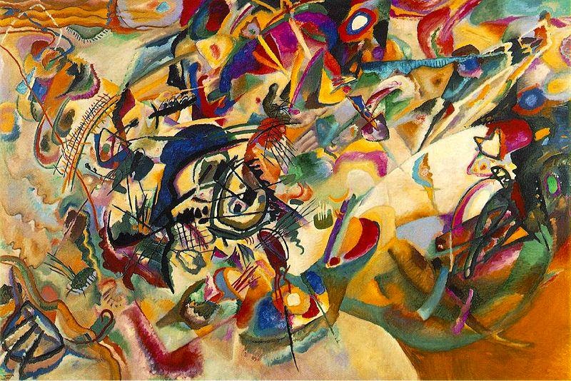
Catskill Farm, pastel, by Carol L. Douglas. The light is definitely warm in Autumn, but the predominant landscape color is still green.
In the northeast, soft maples start to turn orange and pink at the end of August. There are similar phase changes happening throughout the north. For example, in the Canadian west the aspens are starting to turn yellow-gold and the larches prepare to shed their needles.
 
The transition from summer green to November’s dun will take roughly ten weeks, but the daily changes are incremental.
 
The Dugs, oil on canvas, by Carol L. Douglas. The earliest foliage change in the northeast is in the soft maples.
Don’t delete the greens
 
Until late fall, the predominant local color remains fairly cool: there is the blue of sky and water, and plenty of green leaves. Trees change at different rates. There are some that never change at all, but simply drop their leaves. Mowed grass remains green all year long. And, of course, there are evergreen spruces and pines.
Adirondack Spring, by Carol L. Douglas. The same colors that appear in early spring return in the fall, but in a brassier way.
There are far more colors than just red and gold
 
The same colors that appear in early spring foliage are repeated in autumn, but in a brassier way—reds, pinks, golds, chartreuse, teals, purples. In early fall, tinge the tops of trees with these hues; as the season progresses, they will become more dominant.
 
Know how trees change color
 
Where I live, the brilliant soft maples and ashes change first. Later, the oaks and beeches rattle mournfully in the wind. Each species has a characteristic color as well as a specific time to turn. Observe these changes, rather than just dashing color around.
 
Glade, watercolor, by Carol L. Douglas. This painting is at the Jackson Memorial Library, Tenants Harbor, ME, through September.
Pay attention to the understory
 
There are wildflowers blooming on the edges of fields—goldenrod, asters, blue chicory, and Queen Anne’s lace. These are less brilliant than their early-season counterparts, but the overall effect is a beautiful spangle against dried grasses. Meanwhile, hayfields are still bright green and there are apples in every hedgerow.
 
Underpaint the sky in last
 
When we put the sky in first, we have a tendency to paint it darker and brighter than it is. (That’s because of how our eyes respond to light.) It’s easy to then make the whole painting too dark.
 
That’s a great argument for the dark-to-light rule of oil painting, but what should watercolorists do? Start with a monochrome value study, so you hit the blues properly the first time out.
 
How dark are the leaves?
 
Trees are often among the darkest features of the landscape, especially when we’re below them. But yellows and golds are naturally light colors. That makes us perceive fall foliage as lighter than it is. We need to take care to check the value of foliage in the design phase.
 
Avoid white in your foliage mixes, except to articulate a sun-struck passage. Darken yellow-gold with yellow ochre rather than with its complement, or you’ll kill the chroma. And check the leaf values against tree trunks; in some cases, they may not be that different.
Keuka Vineyard, Carol L. Douglas, available through the Kelpie Gallery. This shows the earliest autumn changes, which in New York are in late August.
How intense is fall color?
 
It’s easy to overstate the chroma in any season. It’s especially easy in autumn, because we’re responding to unusual brilliance. But Nature has a wide variety of chromatic intensities, from the delicate robin’s egg blue of a winter sky to the dazzling reflections off the ocean. There are plenty of greys in the landscape, especially in autumn.
 
There are other ways to convey the brilliance of autumn than to just use bright colors. Set the subject tree against more neutral tones, or place an intensely warm tone against a cool tone.
 
Autumn has its own color temperature
 
Above, I wrote that autumn colors were still predominantly blue and green. But the overall color temperature is warm, because the sun spends a lot more time on the horizon than it does in midsummer.
 
Autumn is known for its magical lambent light—the “season of mists and mellow fruitfulness/Close bosom friend of the maturing sun,” as John Keats said.
 
Color temperature is a lengthy subject, and I’ve written about it here, here, here, hereand here(that’ll keep you out of the bars). The basic rule is that the color of the shadow is the complement of the color of the light. If light is golden, shadows are cool.
 
This was originally posted in September, 2019. Happy Labor Day, my friends!

My 2024 workshops:

Monday Morning Art School: The color of light

The season of mist and mellow fruitfulness is upon us. Let’s talk about the color of light.
Boys on the Beach, JoaquĂ­n Sorolla, 1908. There is warm light with cool shadows, but there’s also a strong warm reflection from the sand on which the figures are resting. 
What we call “light” is really the narrow band of electromagnetic waves that our retinas can perceive. This narrow band is comprised of the colors of the rainbow, or what we sometimes call ROY G BIV. (There really isn’t an indigo; it’s there so that Roy has a pronounceable surname.) Each of Roy’s color names corresponds to a specific wavelength. For example, blue is about 475 nm; red is about 650 nm.
Valencian Fishwives, JoaquĂ­n Sorolla, 1903. Here the light is cool and the shadows are warmer.
When the whole visible light spectrum strikes your eye at the same time, you perceive white. This is not a color in itself, but the admixture of a bunch of colors. In the real world, this is never a pure mix. The atmosphere bends light just like a prism does, so what you see is always tinted. The light might be gold and peach at sunset and blue at midday. Impurities in the atmosphere also give us the energetic indigo-violet of the far distant hills—the farther away something is, the more likely dust has filtered out the higher wavelengths (the warm colors).
Return from Fishing, JoaquĂ­n Sorolla, 1894. The light is warm, the shadows are cool, and the places where the light is going through the sails are warmer still, since they’re filtered by the off-white fabric.
Just as all the colors together form white light, the absence of light is total blackness. But unless you’re in a cave or darkroom, that’s a theoretical construct. There’s always reflected light bouncing around in the shadows, and that light gives the shadows its color. It’s never black and it’s unlikely to be grey, either.
Looking for Shellfish, JoaquĂ­n Sorolla, 1905. A warm light comes from our side of the figure, but there are warm shadows—the result of local color reflection from the rock. Likewise the bottom half of the torso reflects strong cool tones from the water and anchors the boy into the sea.
If the color of the light is essentially warm, the color of the shadows is almost always going to be cool, and vice-versa. Knowing this and identifying the color of the light and shadow is the first step to a good landscape painting.
Catalonia: the Tuna Catch, from Visions of Spain, JoaquĂ­n Sorolla, 1919. In this case, most of the painting is in shadow, and what light there is, is filtered through the yellow awning. It is the distortion of the light-dark color scheme that tells us viewers that we are in an enclosed space.
The exception to this is an object in filtered light. Its shadows and lighter passages will be variations of the same color temperature. This is how we instinctively know that something we’re seeing is under an awning, for example.
Study the Spanish painter JoaquĂ­n Sorollato understand the color of light. He was a master at painting white fabric in a variety of circumstances, and comparing the light passages to the shadow passages will tell you much about managing the color of light in your painting.
This post was originally published in 2015. Let me know if you’re interested in painting with me aboard the schooner American Eagle in late September.

Monday Morning Art School: don’t chase the light

Nice advice. How exactly do you avoid making mush as the light changes?

The Thimble, Carol L. Douglas, oil on gessoboard, sold.

I’m painting bigger this season, with the goal of doing some very large landscapes during my Joseph A. Fiore Art Center residency. Down the Reach from last week, is 24X20; The Thimble, above, is 20X16. Big paintings outlast the light. Having a protocol to deal with shifting light is essential.

One technique is to go back to the same location over many days. In the Northeast, weather is capricious. You’re as likely to come back to a sea fog as to the limpid light of the prior day. The tide doesn’t move in sync with daylight, meaning the light may be the same but the scene will change.
In many cases, it’s impossible to come back and set up at the same spot over and over. A little preparatory work will save you hours of frustration later in your painting.
Value sketch of the Monument.
Make a value sketch.
This is the most important step in painting. I don’t care whether you do this in watercolor, with charcoal, a gel pen, as a notan, or in mixed media. Make a study, or multiple studies. 
In my classes I strongly discourage the use of viewfinders. The value study is where one explores relationships and determines the ‘final cut.’
Don’t make a bounding box and fill it in; instead, do a drawing and then crop it to the shape of your board. It’s in the value sketch that you can make subtle adjustments to the elements of the scene. You can’t do that when you’re slavishly transcribing a scene from a viewfinder.
Value underpainting for The Monument. This early in the morning, the light was warm.
Choose a color scheme.
I’ve written about the color of light many times. One of three situations must prevail:
  • Shadows are warm and the light is cool. This is what happens at midday.
  • Shadows are cool and the light is warm. This is the golden light of early morning and late afternoon.
  • Shadows and light are neutral. This happens mostly on grey days.

Choose one of these and stick with it.
Do a fast underpainting that’s a direct transcription of your value sketch.
I don’t look at the landscape very much at this stage. I have my sketch in my right hand and my brush in my left. I paint in the big dark shapes in an already-mixed shadow color and the big light shapes in an already-mixed highlight color. At this phase, my paint is lightly thinned with odorless mineral spirits or turpentine. Knowing how much thinner to use is a matter of practice. The paint layer should be thin, but there shouldn’t be so much turpentine that everything applied over it turns to mush.
The Monument, by Carol L. Douglas.
Paint the details on top of that underpainting, making sure to retain your original values.
Go ahead and paint in details now, matching values to what’s on your canvas rather than what you see. During the great flat light of midday, you will have a good opportunity to paint into your already-defined shadows and highlights. However, at some point after the sun swings completely over the yardarm, you’re going to have to stop. Your light source will be inverted. 
Make a drawn reference to any spectacular lighting effects that whiz by.

Atmospheric effects like crepuscular rays, breaking clouds and rainbows are transient. Before you add them, be certain they support your composition. If so, and you’re in a position to do so, paint them right in. If you’re not at that point of development, sketch what’s happening so you can refer back to your notes.
They may be beautiful but clash with your existing composition. If that’s the case, just sit back and enjoy them, or record them in your sketchbook for another painting.
Sea Fog on Main Street, by Carol L. Douglas. By the time I finished this, the fog had completely evaporated. My sketch and underpainting saved this painting.
Notice there is nothing in here about capturing effects on your camera.

You should be able to develop a plein air painting without any relying on photo reference at all.
I’ve got one more workshop available this summer. Join me for Sea and Sky at Schoodic, August 5-10. We’re strictly limited to twelve, but there are still seats open.

Monday Morning Art School: what is color?

Understanding color space is the most important thing an artist can do.

A little bit of everything, by Carol L. Douglas. That’s the incredibly cool light of a midsummer day.

Color is a word with radically different definitions depending on its use. In optics, it refers to

the unique way in which the cone cells in the human eye are stimulated by electromagnetic radiation. How an object reflects or emits light gives it its unique color.
In common parlance, we think of red, green or blue as colors. In art, however, those aren’t colors. Colors have three attributes, all of which you must understand in order to navigate color space successfully:
Value â€“ How light or dark is the pigment?
Hue â€“ Where does the color sit on the color wheel? All colors fall into one of the following hue families: red, orange, yellow, green, blue and violet. Within those families, however, are many subdivisions.
Chroma â€“ How much intensity, or “punch” does the color have?
Doe drinking in the woods, by Carol L. Douglas, has warm light and cool shadows.
Since color has three attributes, it exists in a three-dimensional color space. However, we’re used to looking at it in two dimensions, in the form of a color wheel. I think the Quiller watercolor wheel is the best color wheel, since it shows you where neutral pigments fall inside the hue families.
Still, the conventional color wheel doesn’t take value into consideration. Every pigment has its own natural darkness or lightness. Dioxazine purple, for example, is very dark coming out of the tube. Lemon yellow is very light coming out of the tube. That does not mean that dark colors are cool and light colors are warm, however. Consider burnt umber. It’s very dark, and it’s also very warm.
Winch (American Eagle),by Carol L. Douglas. There was definitely some warm light that winter day.
There’s a misunderstanding that mixing across the color wheel darkens pigments. Only with certain greens and reds does this work. Mixing across the color wheel gives you neutrals: grays and browns.
We call the hue families of green, blue and violet “cool” and the hue families of yellow, orange and red “warm.” Within each hue family, there are warm and cool variations. Gamblin has this nifty chart of warm and cool pigments so you can see where your paints fall.
White, black, and grey are chromatic neutrals. Raw umber is fairly neutral. Naphthol red and phthalo blue are very high-chroma colors. In general, modern pigments are much more intense than the mineral pigments of the Renaissance.
Cobequid Bay Farm, by Carol L. Douglas. Warm evening light translates to cool evening shadows.
It works to sort colors this way. I use a system of paired primaries which gives me a great, high-key mixing range. However, the whole idea of warm-vs.-cool is a painterly convention. It’s best to not have this discussion with a physicist, who will tell you that you have it backwards. He may be right, but that doesn’t mean he can paint.
I’ve written about the color temperature of light here, but there’s a simple rule that helps. The predominant shadows will always be the opposite (across the color wheel) from the color of the light. On a sunny day, the light will be cool and the shadows will be warm. At dusk the light will be golden and the shadows violet. Of course, there are exceptions to this rule, but it’s a good place to start.
Breaking storm, by Carol L. Douglas, courtesy Camden Falls Gallery. I’m potting around on this boat this week, teaching watercolor. Wish you were here!
I strongly recommend this video from Gamblin, which organizes color space in three dimensions. It’s also full of information about the history of color.
There’s no internet (and darn little cell phone service) out in Penobscot Bay. After this post, my blog is going dark for the week. Don’t be alarmed! Assuming there are no pirates, I’ll be back next Monday.

The meaning of blue: color temperature on a snowy day

"Lewis R. French raising her sails," by Carol L. Douglas

“Lewis R. French raising her sails,” by Carol L. Douglas
I’m busy finishing plein air work from last season. Some of this needs nothing more than a few brush-strokes and a signature, some of it returned home as nothing more than color notes that need to be fleshed out into a painting.
That was the case with this small painting of the Lewis R. French raising her sails at Pulpit Harbor. I started this in the early morning, knowing I had only a few minutes to finish before the American Eagle sailed out. I probably did fewer than twenty brush strokes on site, but Sue Baines of the Kelpie Gallery saw something in it and urged me to finish it.
Normally, I trust my plein air sketches for color notes. In this case what I’d recorded didn’t match my emotional memory of the day, which told me that this had happened just after sunrise. So I heated up the lighting structure and it much more closely resembles the mood of that early morning in Pulpit Harbor.
"Doe drinking in the woods," by Carol L. Douglas

“Doe drinking in the woods,” by Carol L. Douglas
Blue shadows on evening snow. (Carol L. Douglas)
I painted Doe drinking in the Woods years ago. It was a demonstration to my students on how the color of light works in practice. The setting and lighting were imaginary.
The photograph of footprints in the ice on a winter evening, above, clearly shows blue shadows across the snow. I think it also gives a sense of my frustration about the condition of the sidewalks.
The exception to the color-of-light rule happens in indirect light. There are many places where an ambient cloudy milkiness is the dominant weather condition. In it, both color temperature and contrast are muted.
Snow shovelers in a snow squall. (Carol L. Douglas)

Snow shovelers in a snow squall. (Carol L. Douglas)
A snowstorm is an exaggeration of indirect light. There are no shadows; there are merely objects in space. A snowstorm exaggerates atmospheric perspective, too, rendering even middle-distance objects indistinct and neutral.
Artists constantly check themselves against a construct called “color temperature.” There are warm and cool colors, and warm and cool variations within each color. A warm color gives us a sense of warmth and energy and tends to draw our eye, like the life preserver on my painting of the Cadet. A cool color recedes from the eye and gives us a sense of static coldness, like the underside of Rockwell Kent’s iceberg from yesterday.
I’ve written before about the color of light, and it’s one of the most important concepts in painting. The earth’s atmosphere bends light just like a prism does, so what you see is always tinted. Either the light is warm and its shadows cool, or the light is cool and its shadows warm. Which that is depends on the time of day and the season of the year.
In the wintertime, the sun barely crests the treetops here in the North. The ground is often covered with neutral white snow. That gives us textbook conditions to see light temperature in action, for the sun on the horizon always gives us warm light and cool shadows.
Blue shadows on evening snow. (Carol L. Douglas)

Manna from heaven

Corinne's exquisite pen-and-ink drawing of our still life.

Corinne’s pen-and-ink drawing of our still life.
The last time I was certain that I had my phone on Tuesday was when I launched Dark Sky to check the weather. A few minutes later, it was missing. I checked with the Schoodic Institute staff, other guests, and my students. I retraced my steps for the prior two hours. No phone.
I’m a pro at losing things, so my searches have become methodical. I don’t panic, since most of the time I eventually find the missing item. Nor do I tear things apart in a frenzy. I clean and straighten until I find what I was looking for. After all, one might as well get some benefit out of the experience.
Cecelia's lovely painting of the mouth of Frazer Creek at low tide.

Cecelia’s lovely painting of the mouth of Frazer Creek at low tide.
Although I was certain I’d had my phone at supper, I returned to my suite and carefully stripped and remade my bed. I tidied the kitchen. No phone.

Each morning I collect a giant cooler with our lunches and snacks in it. On Wednesday, I resolved to clean and reorganize my car before putting the cooler in. I was halfway through when someone asked me a question. I walked about twenty feet away to answer it.
I gave Lynne six pastels of my choosing and told her to do a painting with them. She did an awesome job.

I gave Lynne six pastels of my choosing and told her to do a painting with them. She did an awesome job.
When I returned I was stunned to see my phone sitting on my car roof. It was covered with dew. If there was anyone else in the area, they were pretty nippy on their feet.
“Manna from heaven!” exclaimed Ken Avery. “It returned with the dew!” Answered prayer can be big or small but it always leaves you chuffed.
As Lynne did her limited-palette pastel drawing, I painted alongside with a similar palette.

As Lynne did her limited-palette pastel drawing, I painted alongside with a similar palette. Very unfinished.
We began our work at Frazer Point. This area was named after Thomas Frazer, an African-American who established a salt works near the mouth of Frazer Creek sometime before 1790. Our view looked across Mosquito Harbor to Norris Island and the bridge across Frazer Creek.
Yes, it got cold when it started raining.

Yes, it got cold.
By 1 PM a light mist was developing and the air smelled of rain. Lynne collected a mess of still life material from the beach before we returned to the Schoodic Institute Pavilion. There we did color temperature exercises in what eventually developed into a downpour.
Corinne was captivated by the reflections from Norris Island.

Corinne was captivated by the reflections from Norris Island.
By 5 PM, all we wanted were hot showers and dry clothes. We met for dinner at 6, where we were joined by a late arrival to our group, Matt Avery.
I got back to my suite at 7:30, thrilled to be in early on such a cool, rainy night. I changed into my nightclothes and settled down with my laptop. There I found a message from two of my dearest friends in the world: “We are at Schoodic for the night. Have to leave by 8:30 AM.” After a brief war with my lazier self, I got dressed again and headed back out. We had a nice but all-too-brief visit.
The still life materials on a beach are limitless.

The still life materials on a beach are limitless.
A fog swirled through the dark woods as I walked back. Yes, there are black bears and moose in Maine. I don’t like surprising wild animals in their native habitat, so I sang the first song that popped into my mind. “A Mighty Fortress is our God” seemed oddly appropriate.
Manna from heaven, indeed.

Debunkery #1: No, you’re probably not a tetrachromat

The distribution of cone cells in the fovea of an individual with normal color vision (left), and a color blind (protanopic) retina, by Mark Fairchild.

Tetrachromacy means that you have four types of cone cells in the retina. Tetrachromats exist among birds, fish, amphibians, reptiles and insects, but in most mammals there are two kinds of cones, and in humans and some of our primate relatives, there are three kinds.

As you remember from high school, there are two types of photoreceptor cells in your retina. (Actually, they now say there are three, but the photosensitive ganglion cells aren’t there for vision). The rods work in low light; the cones work in normal light. The three kinds of cones respond, more or less, to short, medium, and long wavelengths.

The four pigments in a bird’s cones extend the range into ultraviolet. That would do you no good, since your eyes are designed to block ultraviolet rays.

In humans, those three cone types give us the capacity to distinguish a million color variations. Some men suffer from having two kinds of normal cones and a third, mutant, cone that is less sensitive to green and red. We call that color blindness. It’s a sex-specific trait.

In 1948 a scientist named H.L .de Vries studied the daughters of color-blind men to see if they might be carrying the mutant cone type along with their three normal ones. He did notice that the daughters of one of his test subjects responded to reds and greens differently than most women. Since then, a lot of people have searched for the so-called ‘four-coned woman’.

Turns out a significant portion of woman have dud ‘fourth cones.’ In June 2012, after 20 years of studying them, neuroscientist Dr. Gabriele Jordan identified a woman who could detect a greater variety of colors than trichromats could, meaning that she is a ‘true tetrachromat.’

To be a true tetrachromat, you’d have to start by being a carrier female in a family with genetic colorblindness.

One woman thus far. Yes, there probably are several more, but I doubt that includes you. For one thing, you’d need color-blindness to run in your family.

Visual information has to be collected and processed with retinal neurons and the resulting information sent via the optic nerve to the brain. It is processed and refined all along the way. What would the existing neural structure of the brain do with the information it got from a fourth set of cones if the infrastructure to interpret it wasn’t in place?

The cones in your eyes are part of a complex system for distinguishing color. From Anatomy & Physiology, Connexions Web site.

Human vision has plasticity that we don’t even begin to explore. When I first see painting students, they are puzzled about the color temperatures of white and grey. A year later, they’re manipulating color temperature like old pros. That isn’t because they sprouted new hardware; it’s because they’ve started to use the hardware with which they were born.

Want to see more color? Take up painting.

My 2024 workshops:

Color and meaning (color temperature, part 2)

Composition VII, 1913, by Wassily Kandinsky.

Three artists arrived at the idea of pure abstraction at roughly the same time: Wassily Kandinsky, Piet Mondrian, and Kazimir Malevich. This was not coincidence; all three believed in the spiritual properties of abstraction, an idea they got from the rich stew of spiritualism swirling around turn-of-the-century Europe.

One of the chief promoters of the Fourth Dimension was Pyotr Demianovich Ouspenskii, a follower of G. I. Gurdjieff. Ouspenskii believed our consciousness was evolving, which would ultimately lead us to perceive the fourth dimension, and that art and music were the path to this evolution.  In the fourth dimension, reality and unreality were reversed, and time and motion were revealed as illusions.
Theosophy was Madame Blavatsky’s occult movement. She described it as “the archaic Wisdom-Religion, the esoteric doctrine once known in every ancient country having claims to civilization.” Madame Blavatsky taught that color had spiritual vibrations which would awaken the dormant spirituality within a person, and that art should begin in nature, a nature that would be found in a world-birthing apocalypse.

A fully realized theory must include the proper colors for shapes. The passive and dull circle deserves a correspondingly dull blue. The energetic triangle ought to be rendered in a dangeresqueyellow.
Rudolph Steiner’s spin on theosophy was called Anthroposophy.  This postulated the existence of an objective spiritual world accessible through inner development of the clairvoyance and intuition that modern man had lost as he developed rational thought. Steiner focused on the symbolic and synesthetic properties of color.

And then there are angles, which should be matched in aggression with their colors.
Kandinsky’s Concerning the Spiritual in Art (1912) is both turgid and broad-ranging. Let me just hit his major points about color:
  • Colors evoke both a purely physical effect on the eye and a vibration of the soul or an “inner resonance.”
  • The elements of color are warmth or coolness, and clarity or obscurity. 
  • Warmth means yellow, and coolness means blue, so yellow and blue form the first great contrast. Yellow has an eccentric movement and blue a concentric movement; a yellow surface seems to move closer to us, while a blue surface seems to move away. Yellow is a terrestrial color: mad, disturbed and violent. Blue is a celestial color, deeply calm but sinking toward the mourning of black. The combination of blue and yellow (green) yields total immobility.
  • Clarity is a tendency towards white, and obscurity is a tendency towards black. White and black form the second great contrast, which is static. White is a deep, absolute silence, full of possibility. Black is nothingness, an eternal silence without hope (death). 
  • The mixing of white with black gives gray, which possesses no active force and is similar in tonality to green. Gray is frozen immobility; dark grays tend toward despair, but even lightening gray yields very little hope.
  • Red is a warm color, forceful, lively and agitated. Mixed with black it becomes brown, which is a dull, hard, inhibited color. Mixed with yellow, red gains in warmth and becomes orange, which irradiates and energizes its surroundings. When red is mixed with blue it moves away from man to become morbid and mourning purple. Red and green form the third great contrast, and orange and purple the fourth.
In short, Kandinsky’s color theory is a magnificent exercise in hooey. Still, it has had a long-reaching influence, with overtones in fashion, industrial design, and every other area that touches our lives.

Message me if you want information about next year’s classes and workshops.

Color Temperature, part one

The idea of “warm” and “cool” colors was first posited by the English miniaturist and teacher Charles Hayter. The illustration is from his treatise, Perspective, published in 1813.
The way we perceive color is greatly influenced by our experience. We all know that fire is hot and ice is cold, so we perceive reddish orange as a “hot” color and blue as a “cold” color. This association is so strong that painters, photographers, interior designers and fashion designers can all use it color temperature as emotional shorthand.
This association actually flies in the face of physics. While we call colors over 5000K cool, and colors below 3000K warm, the actual physics of the matter are exactly opposite—the shorter the wavelength, the higher the temperature.
Goethe’s color wheel, 1809.
That “warm” and “cool” are subjective is demonstrated by the fact that different painters learn the hottest and coolest points differently. I understand blue-violet as the coolest color, while one of my painting students—an art teacher herself—learned blue to be the coolest tone. And look at this attemptto quantify color temperature by a Chinese-American painter; he seems to be putting aqua at the coldest point.
The first color wheel we know of was created by Johann Wolfgang von Goethe, the first of a long line of philosophers to concern themselves with the meaning of color. He wrote: “The chromatic circle… [is] arranged in a general way according to the natural order… for the colours diametrically opposed to each other in this diagram are those which reciprocally evoke each other in the eye. Thus, yellow demands violet; orange [demands] blue; purple [demands] green; and vice versa: thus… all intermediate gradations reciprocally evoke each other; the simpler colour demanding the compound, and vice versa…”
The “rose of temperaments” (1798-99) by Goethe and Friedrich Schiller, matched human occupations and character traits to colors. I don’t read German, but I swear my red couch qualifies me to be a tyrant.
So far, so awesome. Unfortunately, Goethe also included aesthetic values in his color wheel, titling them the “allegorical, symbolic, mystic use of colour.” That was an idea that developed a life of its own.

Message me if you want information about next year’s classes and workshops.