fbpx

Uncovering your mark and more

Two opportunities to learn in mid-coast Maine
Meeting Up, by Ann Trainor Domingue, acrylic on canvas
Baby Joshua and his mom are doing great, so I can concentrate on work again. There are several things I should have told you about and missed with the excitement of the last two weeks. Here are two very important ones.
I’m bringing Ann Trainor Domingue to teach a day-long workshop in my studio because she does something that seems magical to me, and I want to know how. Ann paints lyrical, mysterious, narrative paintings, seemingly drawn from within her own psyche. “I love the same things you do about New England. I just reflect on them in a different light,” she says. Annie’s developed a series of exercises to loosen up our thinking, and they will be good for everyone, no matter what their style.
Here’s Annie!

Uncovering Your Mark, with Ann Trainor Domingue

Sat June 6th, 10-4
Carol L. Douglas Studio
394 Commercial Street, Rockport, ME 04856
Cost $95 per person.
Confused by too many options? Feel uninspired? Need help to get back to your artmaking? Uncovering Your Mark workshop could be just what you need to find your way!
Discover personally meaningful imagery and ideas through a fun guided exploration of things you love. Bring clarity and focus to help make sense as you implement fresh ideas for this phase of your lifelong art journey.
Think quietly about what kinds of things energize you. Sort and combine insights to form something new that feels more authentic by finding your mark.
Take time to work on loose sketches to explore these exciting new ideas and directions to help you stay on your path.

This workshop is a hands-on class aimed at artists of all levels. The first part of the class is a process of guided inquiry. Then, students will apply their self-discoveries through small scale sketching exercises and preliminary color play. It’s strictly limited to twelve students so you’ll get lots of attention. Every style is welcome.
Ann Trainor Domingue is a graduate of Rhode Island College with a BA Studio degree in painting. Her career has included working in adver­tising, as a teacher and as a painter. She is represented in public collections and galleries nationwide.
Download a flyer here or a registration form here.

Tin-foil hat, by Carol L. Douglas. You don’t have to learn about painting reflections by looking at a vase!
Next session of weekly classes in my Rockport studio starts next week.
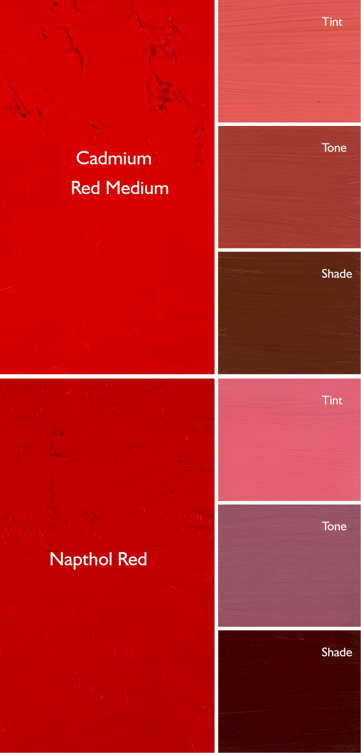
Some people wonder what we paint when the winter weather drives our class indoors. I build still lives, but they aren’t typical. For example, yesterday’s creation was a clash of greens including pine boughs, gift bags, wine bottles and more. The idea was to learn to mix and use a medley of greens without using any green out of a tube. That’s excellent preparation for spring, which really is just around the corner.
Marie told me, “I always come in and see a still life and think, ‘ugh’, but then I get into it and it’s great.” I’m not interested in still-life as a genre either, but I think painting from life is critically important, so I make an effort to make them unusual and interesting.
Back it up (hard drive and bubble wrap), by Carol L. Douglas
Working in my studio gives us a great opportunity to focus on color theory and technique. We have more time to concentrate on mixing colors and brushwork than we do in the field, where the demands of the scene takes over.
Our next mid-coast Maine painting session will meet on Tuesday mornings, from 10-1. The dates are:
February 25
March 3
March 10 (followed by a two-week break while I hare off to Argentina)
March 31
April 7
April 14
Peppers, by Carol L. Douglas
Painters are encouraged to broaden their skills in drawing, brushwork and color. Your own individual style will be nurtured. We’ll learn how to paint boldly, with fresh, clean color, to build commanding compositions, and to use hue, value and line to draw the eye through our paintings.
Watercolor, oils, pastels and acrylics are welcome. Because it’s a small group, I can work with painters of all levels. The fee is $200 for the six-week session, and we meet at 394 Commercial Street in Rockport.

Monday Morning Art School: don’t buy ‘hues’

The imperfection of paint is what gives it its liveliness and depth, but it also makes mixing colors tricky.
Autumn, by Carol L. Douglas. This painting contains no reds. The red tones are a combination of cadmium orange and quinacridone magenta.

A “hue,” is made a blend of less-expensive pigments that mimics more expensive ones. There is nothing inherently wrong with these pigments, but they don’t behave the same as the more expensive ones, and you should at least know what you’re buying.
Generally speaking, there’s little to be gained by buying a hue mimicking a more expensive pigment. If you are comfortable painting with a hue, then learn what’s in it and mix it yourself. You always have the greatest flexibility by working with pure pigments (rather than mixes) out of the tube.
How do you know if something is a hue, not a true pigment? First, ‘hue’ is often in the name, as in ‘cadmium yellow hue’. But you should learn to read the paint tubes, too. I’ve spelled that out in How to read a paint tube. It’s information every painter should know.
Three blues that look similar out of the tube, but behave very differently. The ‘glaze’ on the left is the undertone. Courtesy Gamblin paints
A mass tone is the color a pigment is straight out of the tube, dense and unmixed with another color. No real-world pigment is a pure color. While two pigments may look the same to the naked eye, their behavior when mixed can be radically different.
Undertone is the color revealed when a paint is spread thin enough that light bounces back up from the substrate. Some pigments are fairly consistent when moving from mass tone to undertone. Others have significant color shifts. This is where painting with hues can lead to muddy mixes, because they will not behave the same way as the original pigment.
Ultramarine, Prussian and phthalo blue are colors that shift radically from mass tone to undertone. They’re all so dark out of the tube that their differences aren’t apparent to the naked eye. But dilute them, and you’ll find a wide range of blues. Luckily, they’re all inexpensive pigments, so they’re never mimicked.
But they can be used to make hues of other colors—particularly phthalo, which is often found in viridian hue. Real viridian green (PG18) is a moderately staining, moderately dark and moderately dull blueish green. Viridian hue is terrifically staining and powerfully bright, because of its phthalo component.
Cadmium Red Hue is usually made with napthol red and a little white. They mix very differently, which is why the hue is a bad substitute for the real pigment. Courtesy Gamblin paints.
Cadmium red hue is usually a naphthol red with a small amount of white added. Out of the tube, the two paints are very similar, but they mix very differently. There’s nothing wrong with naphthol red; it’s my red of choice, but it doesn’t behave much like its cadmium cousin.
Even paints with the same pigments can have different undertones depending on the manufacturer. That comes back to the imperfectability of pigments and their essential complexity.
A drawdown test showing a paint’s undertone. Courtesy Utrecht paints.
If you’re considering two different pigments, or thinking about switching brands, you can test them. It’s fast and easy. To see their mass tone, put a small dab of paint on a smooth white board or glass palette and draw it down with a knife, creating a uniform, solid stripe that completely obscures the painting surface.
To see the undertone, draw the samples down again so they are translucent. You should be able to see minute variations in the color, and in the covering power.
This old paint chart from my childhood explains tints, shades and tones. It’s so old, it’s from before they banned black. 😉
But to understand the behavior of each more fully, you need to make tints, tones and shades of each sample.
  • A tint is a color plus white.
  • A shade is a color plus black.
  • A tone is a color plus black and white.
Even when the mass tone appears quite similar, two close colors will act very differently when mixed. Their unique qualities of tinting strength, chroma, undertone and color temperature come into play here. But mixing paint with white or black immediately adds another layer of complexity. Different blacks and whites have their own undertones. Titanium white is cool. Zinc white is warmer, but it’s also brittle and thin, making it a bad choice for general painting. Ivory black is slightly warm.

Monday Morning Art School: four color exercises

By the time you’re done with these exercises, you’ll have lots more experience in mixing color.

Our basic classroom still-life for these exercises. 

Above is the still life I created for these exercises. Make your own, or work from a photograph. You can use the same subject for all four exercises. Keep it simple; it doesn’t pay to get lost in the details when you’re supposed to be thinking about color.

Mimicking the masters

The Starry Night, Vincent van Gogh, 1889, courtesy MoMA
What’s your favorite painting? Look carefully and mix the basic colors in it. One student referenced The Starry Night, above, for her painting, below. 
Jennifer’s painting based on The Starry Night.
The goal is to use those colors in various positions in your own painting. That means substituting Van Gogh’s blue for the blue in your painting, etc. You don’t need to use the same proportion of colors as Van Gogh used; just use them in your painting. If a color in your painting doesn’t appear in the picture you are mimicking, work around that. Don’t mix to approximate what you see.
Olive Trees with the Alpilles in the Background, Vincent van Gogh, 1889, courtesy MoMA
Van Gogh painted a series of olive trees in 1889. One of these, Olive Trees in a Mountainous Landscape, (above) was a complement to The Starry Night. You can see how he manipulated the palette (and linework and composition) to relate the olive trees to the night sky.
Color triads
For this exercise, I refer you back to this blog post on color harmonies. Re-read the section on triads, because you’re going to use either an equilateral triad or a harmonic triad to build a painting.
Mary’s color triad painting.
The easiest triad to use is a primary triad. The still life at top was set up to include primary triads and secondary triads, depending on which objects students emphasized. They started by choosing a dominant color and then from that, subservient ones. For example, one might base the painting on the cobalt of the blue vase, with the yellow bowl and red apples subservient to the blue.
Harmonic triads are not balanced, but are counted 3-4-5 in either direction on the color wheel (as in the section on triads). Again, mix a dominant tone, and then its subservient tones. Your goal is not to match the real colors in your subject; your goal is to substitute the color palette for what you see.
This, plus white, is a limited palette.
Limited palette
In theory, you can get to any color using just red, blue, yellow and white paint. But the chroma and clarity of those mixes depends on the pigments you start with. For example, cadmium red mixes brilliantly on the orange side, but muddily on the blue side.
Limited-palette paintings tend to be more unified than broader-palette paintings, precisely because you can’t hit all the points in the color wheel.
My limited-palette demo using the paints above.
The classic color pigments are cadmium yellow, cadmium red and ultramarine blue. You’ll need white as well. Don’t buy extra paints for this exercise; use what you have that’s closest to these colors.
Hardwood, by Carol L. Douglas. This is a color substitution painting.
Color substitution
The painting above is a kind of substitution painting, but we’re going to use a narrower interpretation of the idea. We’re going to substitute each main color for its complement on the color wheel.
Olive Orchard with a Man and a Woman Picking Fruit, Vincent van Gogh, 1889, courtesy KrĂśller-MĂźller Museum
In Van Gogh’s olive tree painting, above, he’s substituted a warm gold for a blue sky. We’re going to do the same thing, except we’ll do it everywhere on the canvas. Keep the value and chroma the same as the original color, but substitute the complementary position on the color wheel. It sounds simple, but it’s devilishly difficult. Have fun!

Monday Morning Art School: color harmonies

Understanding basic color harmonies will help you integrate color in your painting.

Split the color wheel in half like this and you have your cool tones on one side, warm ones on the left.
Color is comprised of three elements: hue, value and saturation. We see value first, but our emotional response is largely dictated by hue. There are some common color schemes, or chords, found in nature and by extension, in art.
The idea isn’t to be slavishly attached to these schemes, but to use them to perceive and point up color relationships in nature.
With all color schemes, one hue should dominate. 
Complementary
Complementary color scheme
These are colors that lie opposite each other on the color wheel. The most famous example is Christmas’ red and green.
This is a vibrant, high-contrast scheme. It’s the basic schematic for the color of light, where shadows are always the complement of the light color. If the light is a warm gold, for example, its shadows will be cool blues.
Analogous
Analogous colors
Analogous color schemes use colors that lie next to each other on the color wheel. Using analogous colors can make what might be a garish scene (a sunset, for example) more serene.
Equilateral Triad
Equilateral colors
This uses colors that are evenly spaced on the color wheel. The most well-known example is the primary combination of red-blue-yellow.
Triadic color harmonies can be quite vibrant, even without high-saturation colors.  
Harmonic triads
A harmonic triad counting clockwise from the green
This variation counts 3-4-5 in either direction on the color wheel. Start with a key color, and count from there. This is a sophisticated variation on the equilateral triad.
Split-Complementary

Split complementary omitting the complement of blue

This is the color scheme I go to intuitively. It’s a variation of complementary colors. It substitutes for the complement or includes the complement’s adjacent hues. It’s as visually compelling as a complementary color scheme, but allows for much more variation in the accent colors.

Split complementary including the complement of green

Double complements
A symmetrical (square) double-complement color scheme
An asymmetrical (rectangle) double-complement color scheme.

The rectangle or tetradic color scheme uses four colors arranged into two complementary pairs. The colors can be in a rectangle or in a square.
Your assignment
Your assignment, should you choose to accept it, is to find these color schemes in your closet, in graphic designs, and in painting. Then paint a small still life using one of the color combinations you’ve located.

White on white

The color of white is the color of light. Mastering that will make all your paintings more exciting.
Girl Arranging Her Hair, 1886, Mary Cassatt, courtesy National Gallery of Art
The colors in her chemise.
White is, in theory, a reflection of all the visible light spectrum. But that is never true in real life. Inevitably, all light shifts to either the cool (blue-violet) or warm (golden) side, depending on the time of day, season, and atmospheric conditions. Artificial light is even more limited in spectrum than sunlight.
At the end of the 19th century, the Impressionist revolution in color had spread to painters like Anders Zorn, JoaquĂ­n Sorollaand John Singer Sargent. Nowhere does this show more than in their handling of white. Sorolla was painting in the brilliant light of his native Valencia. Zorn lived in Sweden, and many of his scenes have flat light. Sargent lived most of his life in western Europe. None were working in the same lighting conditions, but all of them adopted the same approach to color and light. It was a marriage of Impressionist color theory to more traditional brushwork. The combination still works today.
Mending the Sail, 1896, JoaquĂ­n Sorolla courtesy Museo d’Arte Moderna di Ca’ Pesaro. This is a warm-light, cool-shadow combination.
The colors in Sorolla’s sail.
By adding color to white, these painters were able to give their subject the sparkle and truth of natural light. To have painted their whites with just white or grey would have resulted in flat, dull canvases. This is because convincing whites, in the real world, are actually quite colorful.
Helen Sears, 1895, John Singer Sargent, courtesy Museum of Fine Arts, Boston
The colors in her dress.
Sargent’s portrait of Helen Sears was painted under gaslight. The little girl is thrown into stark relief by the dark interior, and the whole painting is drenched in warmth. What we perceive as blue is mostly a cool neutral. (Hereis a photo of the girl taken by her mother, so that you can see Sargent’s liberal editing.) Even the blue-and-white hydrangeas are actually comprised of mostly warm tones. In this painting, the whites are influenced primarily by the light source.
A Portrait of the Daughters of RamĂłn Subercaseaux, 1892, Anders Zorn, private collection
The colors in the older girl’s dress.
Zorn’s portrait, on the other hand, is mostly influenced by reflected color. It is set against a rich orange floor that influences everything in the foreground. The older girl’s dress is washed in its pinkish tones. The younger daughter recedes in space because of the less-saturated color in her clothes and the grey drapes. Despite all the warmth in the painting, we understand it’s under natural light by the cool highlights. It’s a masterful composition, a brilliant use of color, and above all, an insightful glimpse into the childish mind.
Sita and Sarita, 1896, Cecilia Beaux, courtesy National Gallery of Art
The colors in Sarah’s gown.
I’ve picked six random ‘whites’ from each painting to show you just how varied whites could be in the hands of accomplished painters. Had I used Impressionist paintings, the tints would have been clearer and brighter.
I strongly encourage my students to premix tints(the tube pigment plus white) of every color except black on their palette, and then to ignore pure white. Their assignment this week—and now it’s your assignment too—was to paint a white object without using any straight white paint at all. It should go without saying that your neutrals (greys) should not be mixed with black, either. Everything in this exercise should have color.
The tints in the second line drive this exercise. Graphic courtesy of Victoria Brzustowicz.
The addition of white makes any other pigment opaque and somewhat cooler, since titanium white is cool in its pure state. Add too much white, and you’ve got a bleached, dull image. When you start this exercise, it’s best to err on the side of too much color, rather than too little.
What are some good white objects to paint? Eggs, roses, china dishes, clothing or sheets on the line are all options.

Monday Morning Art School: the need for green

A fast, easy route to mixing plausible summer greens.

Overlooking Lake Champlain, by Carol L. Douglas. Every green in this painting came from the matrix below. And, yes, there’s a scrape in it. It tumbled off a bluff.

The need for green came early to class this year, paradoxically because it’s been cold this spring. There’s little green peeping out in nature, even here on the coast.
Last week in class we worked on salvaging failed paintings. That meant pulling out work from summers past. Most of them included some greens, so we had to mix a green chart.
A basic mixing chart for greens, made by my friend and student Victoria Brzustowicz.
We are only weeks away from painting greens again, in all their light, airy delicacy. Even now, the osier and willows have red and yellow in their branches. By June, we will be wrapped in a blanket of immature foliage ranging in color from pale emerald to pink. It’s a good time to brush up on some color theory.
By August, the color will have settled into a deeper, more uniform tone. The only way to navigate this is to avoid greens out of a tube. A system of paired primaries gives you more options, avoiding the acidity of phthalo green, the weight of chromium oxide green, or the soul-sucking darkness of sap green.
If you look carefully at supposedly-uniform foliate, you will see patches where the color leans toward khaki, yellow, teal, violet and orange. They are what gives life to greens, just as accidental tones give life to human skin.
Michael Wilcox published a watercolor pigment guide called Blue and Yellow Don’t Make Green. Of course they do, but his point was that there are many routes to the same destination. One of the most useful landscape greens is black and cadmium lemon or Hansa yellow. Of all the greens I mix, this and ultramarine with yellow ochre are the two I use the most.
The above chart, mixed in oils. It works just as well in water-based media.

In my experience, bad paint mixing causes paintings to go wrong faster than anything else. Constantly over-daubing to modulate the paint color distorts the original drawing and makes a grey mush. If you’re confident of the color, you can apply it fast and accurately.

Above is the matrix of greens I’ve used for almost twenty years. The range of results is infinite. It depends on the proportions you choose and the brand of paint you use. However, blue/black pigments are always much stronger than their yellow mates. In any mixture, you need about half the amount of blue or black as you do yellow. This has nothing to do with color theory. It’s because darker pigments have more staining power than do lighter pigments.
Victoria Brzustowicz made this color chart based on my workshop palette. Here is a printable PDF.I crossed out the red on the chart because, while I do use it in the studio, in most field painting it’s unnecessary.
Once you’ve finished mixing that matrix, it’s time to tie it to the bigger palette. I encourage students to arrange their paints as above because:
  • It’s efficient;
  • It allows you to mix without thinking;
  • It encourages you to use the full color range in every painting;
  • It prevents the beginner’s error of modulating with white or black;

You can modulate your greens using tints of your other colors. For atmospheric greens, modulate with blues and violets. For warm, lighter greens, modulate with warmer tones.
Mount Hope Cemetery in the Spring, by Carol L. Douglas
Above is a photograph I took several summers ago. Your mission is to use the green chart I’ve made and mix tones similar to the different greens in the photo. If you get the mixing right, painting this scene will be a snap.

Buying too many paints is a classic rookie error

Mix, don’t buy, your colors.
Grand Bahama palms, by Carol L. Douglas. There’s really no reason to buy any greens for oil painting, and just one will do for watercolors.

“[Our] watercolor instructor wants us to buy every color we need for a painting. I think it is unnecessary because you can mix colors to get the same or similar results. What is your opinion?” a reader asked.

I ask my students to buy a specific palette based on paired primaries, but that is very different from asking them to buy a specific pigment for a painting. An artist who regularly switches out his or her paints is akin to a pianist who rearranges the keys for each song.
Buying too many paints is a classic rookie error. It’s easy to get pulled into a revel of paint-buying when you’re feeling unsure. We’ve all done it.
Tomatoes, by Carol L. Douglas, was painted without any red or green on my palette. The red you see is violet and orange.
The clear leader in marketing romance, as Handprintcalls it, is Daniel Smith. I sometimes go to their website to feel the verbiage wash over me. “The mineral for our Red Jasper Genuine comes from India’s Gwalior region and is colored a rich red from iron. Historically it was often carved as amulets, vases and other decorative items.  India’s red jasper was one of stones used to beautifully embellish the Taj Mahal with other semi-precious stones that were carved and inlaid into the white marble in curvilinear flower forms… Spiritually, red jasper is associated with the base or root chakra and helps to ground and energize/heal the body and provide balance and protection.”
I can infer it’s an iron oxide red. Not as romantic, but cheap and commonly available.
Headlights, by Carol L. Douglas. No black here, either. It’s ultramarine blue and burnt sienna.
Daniel Smith loves to tell people how to use each pigment: “Red Jasper Genuine is a wonderful color for landscapes, birds like the male common chaffinch and reddish egret, as well as animals who have a medium to light reddish coat like the red panda.” I imagine a studio with hundreds of tubes of their paint, in careful rows, tagged, “for sunlit shadows,” or “for moonlight,” or “for powerful, monolithic shapes.” It’s all very entertaining and poetic, but will do nothing for your painting.  
Get tough, Reader. Ask your teacher the purpose in all these single-use paints. If the answer isn’t satisfactory, it’s time to find a new instructor. Mixing color is so integral to painting that a class that avoids it isn’t going to teach you anything useful.
Ogunquit rocks, by Carol L. Douglas. All four paintings were done with the same palette.
On the heels of that note came another. “Do you teach color mixing by visual understanding or by paint name?” a reader asked. “The moment I understood that there was no such thing as red, blue, and yellow, the world changed and it became possible to see the nature of each color.”
I teach color mixing (as distinct from color theory) on the basis of pigment. I’ve developed, over the years, a stable palette that gives me the widest gamut (range) of color tones. They don’t include convenience mixes.
These are combinations of two or more pigments to approximate a different pigment. Many of them were developed as substitutes for antiquated pigments that may have been pulled from the market because they’re fugitive or toxic. They are limited, because:
  • Every time you add another color to a mix, you’re adding overtones;
  • You can easily make the mix yourself if you should need it and;
  • They’re inconsistent. Their marketing name tells you nothing.

How do I know what pigment(s) are in my paint? They’re written on the tubes, in tiny letters. Here’s a quick primer on how to read a paint tube. It sounds complicated, but it’s nothing compared to the frustration of painting with the wrong materials.

Monday Morning Art School: an exercise in color

This exercise teaches you to think of the three aspects of color as separate properties.
Water lilies (Yellow Nirwana), 1920, Claude Monet, courtesy the National Gallery, London. Much of Monet’s work was experimenting about the nature of color.

When we ask people, “what’s your favorite color,” we’re using the word color in a simple way, and we expect a simple answer. In fact, color has three basic characteristics:

Value â€“ How light or dark is the color? Blue-indigo is the darkest color, yellow is the lightest. Red and green fall somewhere in the middle.
Hue â€“ Where does it sit on the color wheel? All colors fall into one of the following hue families: red, orange, yellow, green, blue and violet. Within those families, however, are many subdivisions.
Chroma â€“ How much intensity, or “punch” does the color have? Grey is low-chroma; fuchsia is high-chroma.
For more detail, see here.
Complementary colors are opposite positions on the color wheel.
Analogous colorsare a set of colors that sit next to each other on the color wheel.
This exercise teaches you to hold value and chroma steady and manipulate only hue. It’s hard to make these judgments subjectively, so your samples may not look exactly like someone else’s.
Go to the paint store and select paint chips in two different color schemes—complementary and analogous. I want you to choose paints with the same value and chroma but the hue will be different.
Complements where the value and chroma are the same.
They don’t necessarily have to be high-chroma combinations. Here’s a pair of complementary hues which have less saturation (lower chroma):
An example of an analogous color scheme where the value and chroma are the same for all three hues:
Once you’ve selected the three paint samples, chop them up and arrange them on a little card as a design. Glue them down in a pattern that pleases you. Try to leave no space between the different colored tiles so your finished work looks something like this:
Above: my chops. Below: Photoshop’s evaluation of how close I came with the values. (Remember, Photoshop is interpreting as much as I am.)

I don’t care what kind of shapes you make or how complicated your design is. I just don’t want white showing between the sections.

If it proves difficult to get out, and you want to get started, you can always make your own paint swatches. But it’s fun to get them from the hardware store, cut them up and make patterns.

Black and white all over

A class exercise on design, and a chemistry question I can’t answer.
Christ and the Woman Taken in Adultery, 1565, Pieter Bruegel the Elder, image courtesy of the Courtauld Institute of Art but the painting has been stolen.

Yesterday was the kind of day that drives poets mad. Just below freezing, it rained heavily, with gusts of wind. Our plein air painting class was forced into the studio.

grisaille (pronounced griz-eye) is a painting done entirely in shades of grey or another neutral color. Historically, it was used as decorative painting in imitation of sculpture. Some are what we moderns call duotones. They have subtle colors added to extend the value range. But for our class, they would be strictly in black and white.
Abstract design by Christine Covert

Painting runs along two parallel tracks. The first is design. This is why painting teachers relentlessly push students to do thumbnails and other value sketches. Value is our most important tool. Get it right, and you can be wrong about a lot of other things.

(I came to this realization late, by the way. I studied with Cornelia Foss, who tinkers endlessly with the ‘rules’ of painting. From her I got the hairbrained idea of minimizing value as a structural concept. However, this was a misinterpretation on my part. That’s a good lesson in not asking the right questions at the opportune moment.)
Grisaille by Jennifer Johnson.
The second track is color. It’s so much more interesting in some ways that it can be a distraction to the beginning painter. Mixing paints is both difficult and exciting.
Of course, value is part of color. In color space, value is the range from black to white. All successful paintings have some kind of pre-meditated value range in them. A high-key painting is one in which the contrasts are extreme. A low-key painting is one in which the range is narrower. In either case, there must be midtones too. They are also part of the design process.
Grisaille by David Blanchard.
It’s a lot easier to experiment with value when you’re not fussing about color management at the same time. One way to familiarize yourself with this idea is to paint a ten-step scale ranging from black to white. That’s not a bad exercise, but it’s boring. Instead I asked my students to do the monochromatic still life that I assigned in Monday Morning Art School last month.
Grisaille by Chris Covert.
Before that, however, they did an abstraction in charcoal, based loosely on the drawing I included in yesterday’s blog. Charcoal is the most painterly of drawing tools, but this is something you can do in a sketchbook while watching TV. It is a bit intimidating for someone to ask you to do an abstract drawing, but if I call it “doodling,” you can relax and get on with it.
There are only two rules:
  • Have a full range of tones, not just a line drawing.
  • And no realistic objects belong in your drawing at all.

A question: One of my students has had a problem with red pigment from her toned boards bleeding into her final paintings. She prepared a sample board for me to test her M. Graham acrylics vs. a similar red from a very inexpensive craft paint. I tried the squares at 15 minute- and 30 minute-intervals. The M. Graham pigment bled into the white paint, but the craft paint did not. I then tried the same intervals using my own Golden-toned board. Again, there was no bleeding.
Acrylic is pigment suspended in acrylic polymer emulsion. It is supposed to be water-resistant when dried. That doesn’t mean it’s oil-resistant. I’m beyond my chemistry knowledge here, but if any readers can suggest what’s happening, I’d be very grateful.

Monday Morning Art School: mass tones, undertones and mixing

The imperfection of paint is what gives it its liveliness and depth, but it also makes mixing colors tricky.
Autumn, by Carol L. Douglas. This painting contains no reds. The red tones are a combination of cadmium orange and quinacridone magenta.
Last week, I made a flippant remark about clashing colors. This weekend, I had an opportunity to see clashing at work, in an ottoman proposed for my living room. It was a cool rose tint and looked horrible with my sectional’s warm red cushions. I’m usually happy with putting closely analogous colors together but this combination would be terrible. The mass tones were fine; the undertones were all wrong.
A mass tone is the color a pigment is straight out of the tube, dense and unmixed with another color. No real-world pigment, however, is as pure as a color on a video screen. While two pigments may look the same to the naked eye, their behavior when mixed can be radically different.
Undertone is the color revealed when a paint is spread thin enough that light bounces back up from the substrate. Some pigments are fairly consistent when moving from mass tone to undertone. Others have significant color shifts. Not understanding those undertones tones can lead to muddy mixes.
Three blues that look similar out of the tube, but behave very differently. The ‘glaze’ on the left is the undertone. Courtesy Gamblin paints.
Ultramarine, Prussian and phthalo blue are colors that shift radically from mass tone to undertone. They’re all so dark out of the tube that their differences aren’t apparent to the naked eye. But dilute them, and you’ll find a wide range of blues.
Undertones are why buying “hues” instead of pure pigments can be such bad value. Take, for example, cadmium red hue, which is usually a napthol red with a small amount of white added. Out of the tube, the two paints are indistinguishable, but they mix very differently.
Cadmium Red Hue is usually made with napthol red and a little white. They mix very differently, which is why the hue is a bad substitute for the real pigment. (In its own right, napthol is a fine red, however.) Courtesy Gamblin paints.
Even paints with the same pigments can have different undertones depending on the manufacturer. I’m experiencing this right now with my quinacridone violets, which I’ve been replacing with whatever I can buy along the road. That comes back to the imperfectability of pigments and their essential complexity.
A drawdown test showing a paint’s undertone. Courtesy Utrecht paints.
If you’re considering two different pigments, or thinking about switching brands, you could test them. It’s fast and easy. To see their mass tone, put a small dab of paint on a smooth white board or glass palette and draw it down with a knife, creating a uniform, solid stripe that completely obscures the painting surface.
To see the undertone, draw the samples down again so they are translucent. You should be able to see minute variations in the color, and in the covering power.
To understand the behavior of each more fully, you now need to make tints, tones and shades of each sample.
  • A tint is a color plus white.
  • A shade is a color plus black.
  • A tone is a color plus black and white.

This old paint chart from my studio explains tints, shades and tones.
Even when the mass tone appears quite similar, two close colors will act very differently when mixed. Their unique qualities of tinting strength, chroma, undertones and color temperature come into play here. But mixing paint with white or black immediately adds another layer of complexity. Different blacks and whites have their own undertones. Titanium white has a cool undertone. Zinc white is warmer, but it’s also brittle and thin, making it a bad choice for general painting. Ivory black is slightly warm.
The imperfection of paint is what gives it its liveliness and depth. It’s also why I don’t use a limited palette, but a system of paired primaries, which I described here.