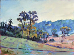
Chromophobia

Until you start playing and experimenting, you won’t really own your own color pathway.

Bobbi Heath once posited to me that painters learn to manage color in three phases:

  • They make everything grey;
  • They vastly overshoot the chroma;
  • They finally learn a pleasing color sensibility.

 â€śIs it even possible to overshoot the chroma?” I riposted, because I’m apparently stuck in the second phase. I was joking, of course. In being a high-chroma painter, I’m operating within my own time and place in history. High chroma is part of our current landscape painting style.
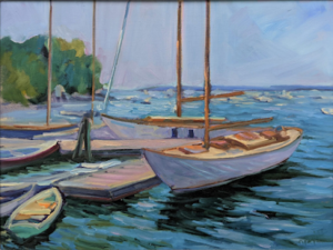
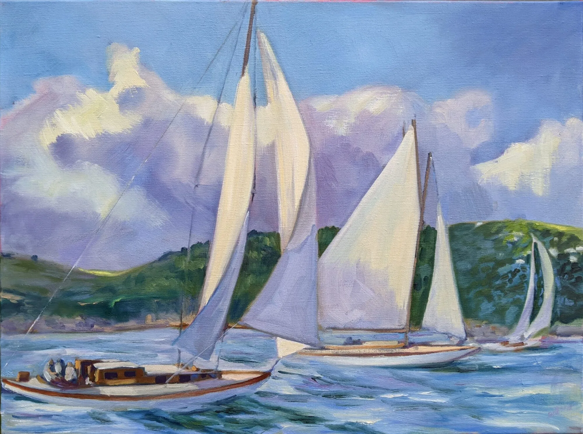
Beautiful Dream, 12X16, oil on archival canvasboard, available.

(For those of you new to the discussion, chroma is one of three aspects of color, which you can read about here. It means how intense the color is. Grey is low-chroma; fuchsia is high-chroma.)

Bobbi had it right, of course. Painters start in a world of soft greys because grey is safe. They need to blow through that safety net to master all aspects of color.

The problem is exacerbated when the painter lives in an area with grey skies. I spent 21 years in Rochester, NY, where the weather is controlled by tempestuous Lake Ontario. Those damp, overcast skies were great for gardening and my skin, but they mean indirect light. That, in turn, can lead to gloomier color and less separation between lights and darks. Beautiful, but dull in a painting—unless you take a page from the Luministplaybook and straight-up lie. Before you can do that, you have to be able to see it.

Giving birth to a brighter color palette can be painful. Brilliant color looks garish at first, often because our first experiments at high-chroma painting are garish. The question of color harmony is more important when our painting isn’t subdued by a leavening wash of grey. With chroma elevated, we can no longer ignore when color combinations don’t work.
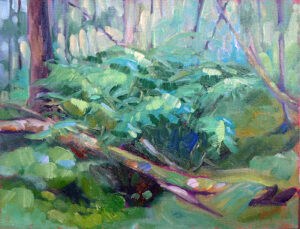
Bracken Fern, 9×12, oil on archival canvasboard, available.

You can’t get to that phase of development until you let go of the crutch of neutrality. This is one area where a teacher or mentor can be a great help. “Leave it,” we say. “Set it aside and look at it again in two weeks.” Actually, it would be more helpful to set it aside and paint twenty or thirty paintings in this new high-chroma space until you start to see how it hangs together.

Yes, you’ll make some awful paintings. It’s a necessary phase of growth. “No mistakes, no success. Know mistakes, know success,” my buddy Ivan Ramostold me yesterday. That’s never truer than with color. I can lecture all year about color interaction but there are millions of ways to lay colors down next to each other. Until you start playing and experimenting, you won’t really own your own color pathway.
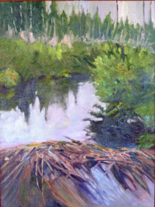
Quebec Brook, 12X16, oil on archival canvasboard, available.

I encourage my students to have tintson their palette because they help keep color clean. These premixes can save a lot of time and prevent a whole lot of dullness.

None of this is to say there isn’t room for neutrals in painting. Of course, there is, and the third phase of color management is to add those neutrals back in. (I’m still waiting.) But let’s not jump the gun here; neutrals are in some ways the apotheosis of color, a counterpoint to chroma. They come last in our color-sensibility development.
We’re all fauvists now

There’s no place for subtle in online art sales.
Headwaters of the Hudson, by Carol L. Douglas

If you look at pastel kits online, you’ll see a bias toward high-chroma colors, even though lower-saturation chalks are the workhorses of pastel painting. In part, that’s because all mixing results in lower chroma; pigments are impure and their overtones tend to cancel each other out. But more than that, pastel kits are sold to beginners. People who already have kits just buy individual chalks to fill in holes.

Bright colors are attractive; a kit with luscious reds, brilliant yellows, and tropical turquoises will turn our heads while the hardworking neutrals sit in the corner, ignored. Since pastel manufacturers are in business to sell their products, they give the people what they want.
Fish Beach, by Carol L. Douglas
The same thing happens with online painting sites. Although my Android phone has a 1440p display, the standard square image on Instagram scrolls by at 600Ă—600 pixels. (Instagram stores at up to 1080 pixels, but doesn’t display at that size.) Compressed so severely, the best-looking images are the ones that have arresting composition, high contrast and lots of color.
Inside people’s homes, a very different trend continues. In 2015, when I painted my last house to sell, I used Benjamin Moore’s best-selling color, Revere Pewter. This is a warm, soft grey, and I ran it ruthlessly through that elegant 1928 interior. I wish I’d done it when I still lived there; it looked beautiful and the house sold fast.
Finger Lakes vineyard, by Carol L. Douglas. There are a lot of places in America with muted light.
Greys show no sign of abating. Benjamin Moore’s Color of the Year for 2019 is Metropolitan, a neutral that somehow manages to look like it contains every pigment mixed together. BM is marketing this palette as a neutral refuge from the noise of the modern world, with tag lines like, “The calibrated silence of layered grays helps a modern home find its soft side.” They are not alone. Other paint manufacturers are also exploring the world of greys words like “repose,” “sea salt,” “mindfulness,” or “passive.”
I’m not averse to this trend of neutral walls with eye-popping color within picture frames; it looks great and matches my own worldview. But it behooves us to remember that high-chroma is just a style thing, driven by our electronic toys. It’s not an eternal verity, and it might not be the best way to make our point. Is there room for the quiet, contemplative painting in such a media-driven world?
All flesh is as grass, by Carol L. Douglas
Yes. For one thing, the online market remains a small part of the overall art market—about $5 billion of a total market of around $63 billion. That means plenty of paintings are still sold in galleries.
But an interesting thing happened in the last cooling period for art sales, which was from 2015 to 2017. While traditional galleries and auction houses experienced retraction, online sellers did not.
I assume this is another sign of the bifurcation of the art market, between high-net-worth individuals trading pieces worth millions in the global market, and the small (under $10,000) galleries that represent the bulk of working artists. But sales aren’t tracked that way, so I’m only guessing.
The numbers for 2018 aren’t out yet, but in 2017, online sales represented 12% of the total art market. That’s too big a percentage to be ignored, and it’s steadily growing. We can’t ignore the screen-popping world of contemporary painting much longer.

Mixing complements and making grey

Some people say it doesn’t work. Is that true?

All flesh is as grass, by Carol L. Douglas. Since the Impressionists we have mixed our grays with complements.

Painters use mixes of complementary colors to make neutrals: red and green, blue and orange, or yellow and purple. The exact mixes have to be juggled around depending on the paint, but it’s an efficient system to get soft greys and browns. It’s centuries old and it endures because it’s a useful system.

Yesterday, a student flummoxed me by asking why it works. I could answer in general terms—interference—but I really didn’t know in any detail. I started to read about it and came up with a striking problem: many people don’t believe it actually does work.
From The Natural System of Colours, 1776, by Moses Harris. Courtesy Project Gutenberg. 
The traditional color wheel is a concept that we’ve been tinkering around with since Sir Isaac Newtonand his experiments with light in the 17th century. By the time the Impressionists started their world-changing experiments with light and color, the color wheel was settled in the format we currently use: a triad of so-called primary colors (red, blue and yellow) with secondary colors inserted between them.
A complementary color pair is made up of a primary color and the secondary color that sits across from it on the wheel. For example, yellow is a primary color, and purple is made by mixing red and blue. When yellow and purple paint are mixed, all three primary colors are present.
L’air du soir, c.1893, Henri-Edmond Cross, courtesy MusĂ©e d’Orsay. Pointillism works because the eye averages adjacent spots of color into mixes.
Paints are what we call subtractive color. That means they absorb light. What we see is what’s allowed to bounce back to our eyes. Neutrals happen when no particular color bouncing back to us is able to dominate; the three primary colors cancel each other out.
So why do some scientists and artists say this system doesn’t work? Mostly, it has to do with the impurity of pigment. Historically, all pigments were approximations of pure color, based on what technology could produce.
Our paints never sit exactly on the point of a primary or secondary color. Furthermore, there are a million sets of complements. For this reason, I devised a class exercise based on Stephen Quiller’s painter-specific color wheel, so that my students could find beautiful combinations based on the pigments they actually use. If you missed this lesson, I encourage you to try it now.
Fish Beach, by Carol L. Douglas.
Traditional pigments also change with concentration. We’ve all experienced this: three different reds may look the same out of the tube but end up looking very different when diluted or mixed with white. These imperfections allow us to mix some odd combinations that shouldn’t be possible—ultramarine, which is a violet-blue, can still make a passable green. This is also why we can mix ultramarine and burnt sienna—both on the red side—and get wonderful greys. There are undertones to those pigments that gain prominence when we start manipulating them.
Twentieth century pigments were designed with industrial and commercial applications in mind. They don’t change color with concentration, so mixing historic and new pigments together sometimes yields surprising results.
It’s about time for you to consider your summer workshop plans. Join me on the American Eagle, at Acadia National Park, at Rye Art Center, or at Genesee Valley this summer.