Nature preaches peace

But it’s a jungle out there.

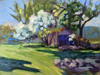
Apple blossom time, 9X12, oil on canvasboard, available.

My friend Jonathan Becker took a lovely photo of spring outside his back door in Samaria. There are poppies to the left and something that looks like flax to the right—and beyond that a chain-link fence and the desert.

Overshadowed by the cataclysm in Ukraine, Israel has sustained deadly attacks in recent weeks. They have people talking about another Intifada. My knowledge of Israeli geography is hazy, but I believe that Samaria is part of the West Bank. Jonathan is hardly sitting pretty.

Spring in Samaria, photo courtesy of Jonathan Becker.

And yet spring blooms, as it has always done so far. “Nature preaches peace,” I said to Jonathan.

“But it’s a jungle out there,” he replied. Well, he’s the one sitting on the tinderbox, not me.

I recently wrote about purpose, that indefinable goal that drives all artists. “I’d be hard-pressed to put my mission statement into words,” I said, and that remains true. But relative to landscape painting—and let’s face it, it’s primarily what I do these days—my conversation with Jonathan hit me like a bullet on the N-train in Sunset Park.

Nature preaches peace.

Blueberry barrens at Clary Hill, watercolor on Yupo, 24X36, available.

Jonathan may wake up every morning of this Pesach season wondering what fresh hell will be visited on his little community, but the flax and poppies know no such fears. They bloom as they’ve always bloomed.

I’m reading the news these days from under my security blanket, with one eye on my phone, the other screwed firmly shut. I haven’t known such a fraught period in my lifetime. There will be no blossoms in Mariupol, which has sustained scorched-earth bombings. There are reports of chemical weapons being used there, which hasn’t happened in Europe since WW2. The term Mutually Assured Destruction is back in my mind for the first time since 1980. The economic news is worrisome, and I’m sick about the shootings in Brooklyn.

But my Israeli friends? They’ve been living in such uncertainty since 1948, and they’re generally cheerful about it. I could learn a lot from their attitude. “Sufficient unto the day is the evil thereof,” says the gospel of Matthew, and it’s a good thing to remember.

Every morning on Beech Hill, the scene changes infinitesimally. Each branch is covered with tiny buds of green or pink, waiting expectantly for warmer air. The blueberry barrens are turning green in stripes, looking like a cockeyed Christmas sweater. Woodpeckers are back, as are the ticks (who aren’t really evil, merely looking for a free lunch).

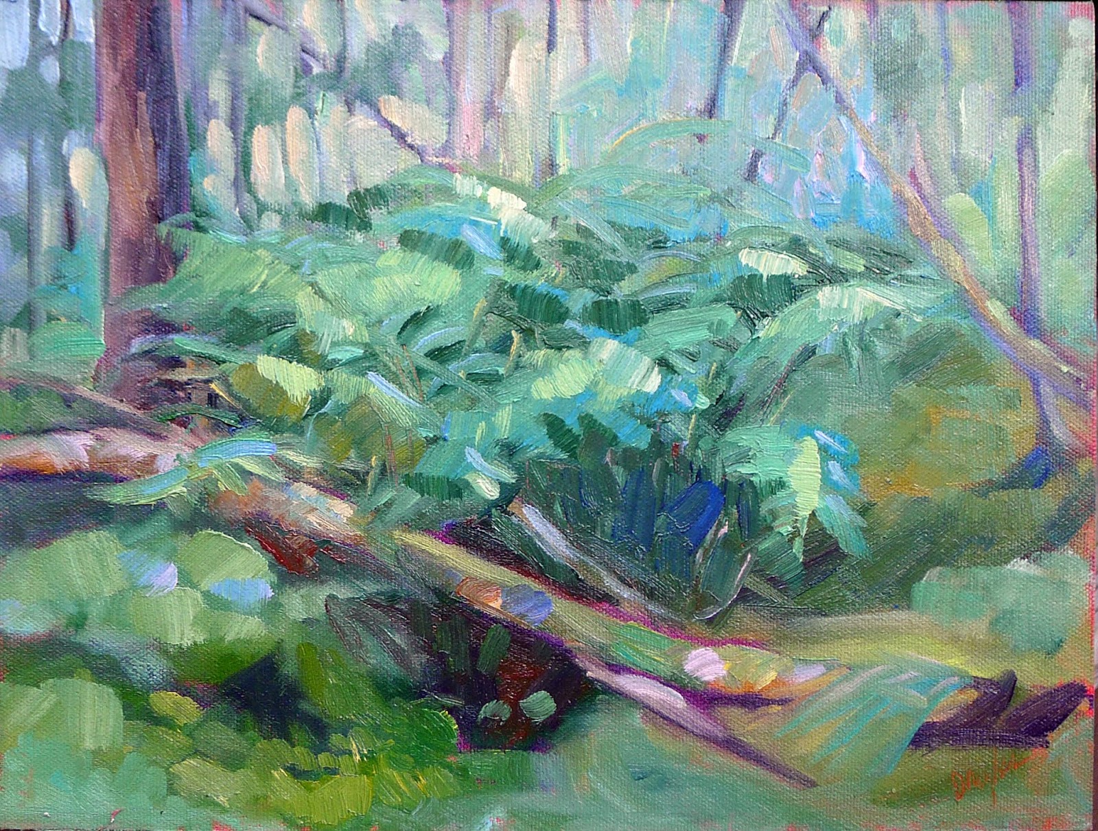
Sometimes it rains, oil on archival canvasboard, 9X12, available.

Nature preaches peace.

Yes, I’m aware that under the verdancy of spring, hawks are still killing voles and fishers are stalking porcupines. Nature is red in tooth and claw. But nature doesn’t seek the wholesale extirpation of its enemies, as some of mankind seems to be doing right now.

Nature continues in its preordained courses. The Northern Hemisphere awakens from winter, its seasonal death forgotten. Life is gradually restored.

We landscape painters, in copying nature, can preach peace secondhand. That’s a mission I can wholeheartedly embrace.

Monday Morning Art School: clouds are not flat

Clouds have volume and are subject to the rules of perspective.

Clouds over Whiteface Mountain, oil on canvasboard, available.

Clouds are not flat. The same perspective rules that apply to objects on the ground also apply to objects in the air. We are sometimes misled about that because clouds that appear to be almost overhead are, in fact, a long distance away.

I’ve alluded before to two-point perspective. I’ve never gotten too specific because it’s a great theoretical concept but a lousy way to draw. Today I’ll explain it.

A two-point perspective grid. You don’t need to draw all those rays, just the horizon line. The vertical lines indicate the edges of your paper.

Draw a horizontal line somewhere near the middle of your paper. This horizon line represents the height of your eyeballs. Put dots on the far left and far right ends of this line, at the edges of your paper. These are your vanishing points.

All objects in your drawing must be fitted to rays coming from those points. A cube is the simplest form of this. Start with a vertical line; that’s the front corner of your block. It can be anywhere on your picture. Bound it by extending ray lines back to the vanishing points. Make your first block transparent, just so you can see how the rays cross in the back. This is the fundamental building block of perspective drawing, and everything else derives from it. You can add architectural flourishes using the rules I gave for drawing windows and doors that fit.

A cube drawn with perspective rays. It’s that simple.

I’ve included a simple landscape perspective here, omitting some of the backside lines for the sake of clarity.

As a practical tool, two-point perspective breaks down quickly. In reality, those vanishing points are infinitely distant from you. But it’s hard to align a ruler to an infinitely-distant point, so we draw finite points at the edges of our paper. They throw the whole drawing into a fake exaggeration of perspective. That’s why I started with a grid where the vanishing points were off the paper. It doesn’t fix the problem, but it makes it less obvious.

All objects can be rendered from that basic cube.

(There is also three-point perspective, which gives us an ant’s view of things, and four-point perspective, which gives a fish-eye distortion reminiscent of mid-century comic book art. And there are even more complex perspective schemes. At that point, you’ve left painting and entered a fantastical world of technical drawing.)

Basic shapes of clouds using the same perspective grid.

Still, two-point perspective is useful for understanding clouds. Clouds follow the rules of perspective, being smaller, flatter and less distinct the farther they are from the viewer. The difference is that the vanishing point is at the bottom of the object, rather than the top as it is with terrestrial objects.

Cumulus clouds have flat bases and fluffy tops, and they tend to run in patterns across the sky. I’ve rendered them as slabs, using the same basic perspective rules as I would for a house. They may be far more fantastical in shape, but they obey this same basic rule of design.

You can see that basic perspective when looking at a photo of cumulus clouds.

A flight of cumulus clouds or a mackerel sky will be at a consistent altitude. That means their bottoms are on the same plane. However, there can be more than one cloud formation mucking around up there. That’s particularly true where there’s a big, scenic object like the ocean or a mountain in your vista. These have a way of interfering with the orderly patterns of clouds.

I don’t expect you to go outside and draw clouds using a perspective grid. This is for understanding the concept before you tackle the subject. Then you’ll be more likely to see clouds marching across the sky in volume, rather than as puffy white shapes pasted on the surface of your painting.

Monday Morning Art School: know your trees

To paint trees, you need to understand them. That doesn’t mean you need to memorize species, but you do need to be able to spot the differences.

Palm, by Carol L. Douglas, available.


When I first posted this back in 2018, I wrote, “There is a major division in the forest world between conifers (the trees with needles) and broadleaf trees.” I should have added a third class of trees—the palms, since there are 2,600 known species, generally in the tropics and sub-tropics.

Palms are distinguished by their large, compound, evergreen leaves, called fronds, which are arranged at the top of an unbranched stem. Most (but not all) conifers are evergreens; the biggest exception being the larches, which turn a delicious yellow-gold in autumn. Broadleaf trees are always deciduous in the north, but not in the south. Every landscape has a combination of deciduous and conifer trees, but palms grow only in the tropics and subtropics and conifers dominate in the far north. Which are dominant in your landscape? In the Pine Tree State, the distribution of conifers to deciduous trees is about 50/50.

That matters even if the trees in your painting are not much more than silhouettes, because different types of trees have different shapes and traps (sky-holes).

Old Bones, by Carol L. Douglas, available.

For broadleaf trees, the most important distinguishing characteristic is the branching pattern, which defines the shape of its canopy. Silver maples are large trees with open, vase-like canopies. Oaks have large spreading crowns; beeches have similar crowns that appear to have melted. Most broadleaf trees branch alternately but maple, ash, dogwood and horse chestnut branch in opposite pairs. Here’s a tip: whatever pattern the twigs have, the major branches will also have.

Watercolor study of the branching pattern of a live oak, which can seem pretty inscrutable to a Northerner.

Pines have fewer branches than spruces or firs, and their branches grow in circular whorls on the trunk. As they age, they develop an open, jagged canopy. Spruce branches grow in an upturned direction; as youngsters, they look the most like ‘Christmas trees’. In their dotage, they turn a fine, weathered figure to the wind. Firs have wide lower branches and a downcast mien. Notably, their cones point upward.

The beginning artist usually errs in drawing trees in two dimensions, as if they only branched on two sides. In fact, there will be branches coming straight at you and straight away. Perspective is muddied by the diminishing size of branches as they arc toward you. The only solution is to draw carefuly and check angles.

Conifers are most easily identified by their needles. Pine needles grow in clusters of two, (red pines), three (yellow pines), or five (white pines), held onto the stem with a tiny papery wrapper. Spruce needles are short, stiff and grow individually from twigs. Fir needles are soft and flat. Cedars have flat, scale-like leaves and stringy bark. Junipers (including, confusingly, the Eastern Red Cedar) have berrylike, bluish cones on the tips of their shoots.

Many people can identify the common broadleaf trees by their leaves, and I’ve included a chart to help you. It’s more important to see and understand the differences in color. Silver maples have a lovely grey-silver color. Sycamores are garbed in military-fatigue green. Black spruces are dark while Eastern White Pines are fair and soft in their coloring. This is why I discourage my students from using tube greens and encourage them, instead, to mix a matrix of green colors.

The sycamore is a successful urban tree because it’s pollution-resistant. It has peeling, multicolored bark. Maples are grey and deeply grooved in maturity. Oak bark is dark. Cherry has a lovely red, shiny bark in its youth, but becomes furrowed and grey with age, like most of the rest of us. Only beeches maintain their smooth skin into great old age.

Spruces and pines on the Barnum Brook Trail, by Carol L. Douglas

Too often, we painters ignore young trees. Young trees often look radically different from their aged ancestors, but they have a beauty of their own.

To be a convincing painter, you don’t need to memorize tree species, but you do need to learn to distinguish between them. Any plausible landscape will contain a variety of them, with different bark, branch structures, and leaf colors.

Look in your own backyard

I don’t need to go anywhere to see the beauty of autumn. It’s right here.

Thicket, by Carol L. Douglas

Maine’s official state motto is Dirigo, which means, “I lead… slowly.” Or, as our unofficial state motto reads, “35 mph was good enough for my grandfather, and it’s good enough for me.” Route 1, the state’s major north-south (or east-west, depending on how you look at it) road, is mostly a twisty two-lane highway. For the most part, you can’t pass. It’s pointless to try, because there’s another slowpoke a mile ahead. Except when you get to Portland, where 55 means 77. Sometimes I go there just to remember how to drive fast.

As a recovering New Yorker, I’ve learned to slow down. In the summer, there will be out-of-staters bearing down on my bumper, and a few local idiots as well. They are often boiling more merrily than a lobster boil, waiting impatiently for their chance to pass.

Autumn Farm, by Carol L. Douglas. Available through Maine Farmland Trust Gallery.

In the early stages of pandemic, my car went weeks without a fill-up, but recently I’ve been driving more—up to Schoodicto teach, and down to Portland for doctors’ visits. This week I painted with Plein Air Painters of Maineat a roadside rest stop in Newcastle. It’s about 45 minutes from my house. Alas, it was a misty, overcast day, and the marsh grasses’ color was muted. I painted a wild apple tree instead.

Engine lights came on as I headed home. I stopped and read the codes. There were twelve of them. My poor old Prius has 276,000 miles on it, and it’s getting fragile. No more long trips until I figure this out.

The Dugs, by Carol L. Douglas. Available.

We’re at a glorious moment in the seasonal pageant. The maples have stopped flaming red and yellow. Now the oaks are doing their star turn, arrayed in burnished gold. The other reticent tree that shines this time of year is the wild apple tree. They don’t have much color in their leaves, but they’re covered with bright red fruit. Johnny Appleseed may never have visited Maine, but his influence was certainly felt.

I usually don’t have red on my palette for landscape painting, since most reds in nature can be approximated with cadmium orange and quinacridone violet. However, there was a small ironwood tree in Wednesday’s painting. Its foliage was so intense that I couldn’t hit that note without a spot of naphthol red.

Annie Kirill doing a value study in plein air class at Thomaston. It’s been a spectacular year, weather-wise.


This week, my plein air class went to an unofficial pocket park in Thomaston. It’s not on any maps, but it’s behind the Maine State Prison Showroom It has a lovely view of the St. George River, but you would never know about it if you didn’t have inside information.

The gold of the oaks is gorgeous, but it’s the last player on the autumn stage. In a few weeks, empty branches will be rattling in a fierce November wind, and these beautiful days will be a memory.

Autumn is my favorite time of year, but I never seem to get much painting done. I’m committing myself to being out there on every good day from now until the snow flies, capturing the last glimmers of summer beauty before it goes. And not wasting my time driving, either, but setting up in my own backyard.

A side note: with all the conversation about COVID, we forget the very real threat of Lyme Disease. This morning my husband found a tick embedded in his leg. Even after the first frost, they’re still hanging around. Have a care.

Hilda Bush

I can just hear the old ladies whispering that I’ve finally come to my senses.

Seaside Provincetown House, 1960, Hilda Bush. Sadly, this is the only painting of hers I could find online.

There was a lady in my home town who made and sold landscape paintings. Her marketing technique was very simple: she would string clothesline between the old maples on her lawn and clip the paintings to the lines. The prices were modest but not as cheap as you might imagine for a sidewalk sale. The example above (the only painting I could find online) was tagged in 1961 at $40. That’s $350 in today’s money.

Mrs. Bush graduated from Middleport High School in 1922, after which she started teaching art in the two local schools. That was a time when the best-educated teachers were graduates of normal schools, so she wasn’t as unprepared as you might think. For the record, these teachers managed to turn out students who read primary sources in Latin, could do math and diagram sentences, understood civics, and drew accurately and sang in tune.

Mrs. Bush went to work at Harrison Radiator as part of the WW2 war effort. In 1946, she married and settled in to domestic life. And, of course, she painted. Even after she went to live with a granddaughter down in Pavilion, NY, she was still painting. She sent a picture of lilacs to my mother shortly before she died; I confess I gave it only a cursory glance. A combination of good genes and country living meant that Mrs. Bush lived to the ripe old age of 106.

Hilda Bush

As a child, I was young and impressionable and extremely snooty about art. As we trundled by Mrs. Bush’s house, I was certain of one thing: I would never be an artist who made sweet, silly paintings, and I would never sell them by tying them to trees.

Fast forward fifty years. I’ve been through my period of painting meaningful blight. I’ve done angst and soul-searching. Now I’m most interested in painting the same subjects as Mrs. Bush—the simple beauty that is all around us. If it makes people happy, I’m all for it.

With all non-essential public spaces closed down in my state, nobody can visit my studio-gallery for the foreseeable future. So I’m thinking of displaying art in my front yard. It won’t be on clotheslines, but only because I don’t have properly spaced trees. I can just hear the old ladies of Zion Lutheran Church whispering that I’ve finally come to my senses.

Erie Canal, by Carol L. Douglas, private collection. Mrs. Bush spent her entire life in this little hamlet outside of Buffalo.

Mrs. Bush and her entire generation (including my own parents) are, for the most part, gone now. They aren’t here to observe the 75thanniversary of VE Day today. I cannot say this any better than Mark Piggott did in the Spectator, so I’ll just quote him:

I’m glad the Allied Forces destroyed the Nazi machine and like millions of others on 8 May I’ll give thanks to the millions – including members of my family – who laid down their lives to prevent Hitler’s demented dream becoming reality.

In a world which seems to be more complicated than ever, where notions of good and evil, right and wrong are increasingly blurred, it’s good to be reminded of what true evil really is – and be proud that so many people, from all around the world, fought so bravely to defeat it.

Painters of the middle class

There’s no shame in painting what people love, as long as you do it well.
Two chattering housewives, 1655, Nicolaes Maes, courtesy Dordrechts Museum
If I weren’t in Buffalo, I could fly to see Nicolaes Maes: Dutch Master of the Golden Age, opening on February 22 at the National Gallery in London. (London and Los Angeles are roughly equidistant from my house, so that’s not as daft as it seems.)
The Dutch Golden Age (the 17th century, roughly) was when trade brought prosperity to the Netherlands. That, in turn, fostered a flowering of scientific thought, military might and culture. The conditions that made this possible were the nation’s recent liberation from Spanish rule, a solid Protestant work ethic, and the development of a new kind of business: the corporation.
The Dutch East India Company was founded in 1602. It was the first multinational corporation and it was created by exchanging shares on the first modern stock exchange. This may seem humdrum to us, but at a time when for most of the world wealth and poverty were inherited conditions, it allowed for the creation of thriving merchant and middle classes.
The Eavesdropper, 1657, Nicolaes Maes, courtesy Dordrechts Museum
Until the Dutch Golden Age, great art was commissioned by extremely wealthy people, who essentially dictated the tastes of the times. Suddenly, middle class people were buying art. This radically changed what artists painted.
The Dutch Reformed church and Dutch nationalism informed the aesthetic of Golden Age painting. Catholic Baroque was out; simplicity and Calvinist austerity were in. Dutch art concentrated on reality and ordinary life at all levels of society. The focus on realism is why the period is sometimes called Dutch Realism.
Always that realism was invested with meaning. Significant in this worldview was a rapid growth in landscape painting, particularly as it represented unique Dutch values and scenes. A windmill on a flat plain or a boat at sea may seem like tropes today, but they were symbols of heroism to the audience of the time.
The Dutch painted lavish still lives that seem overly full and overripe to modern eyes. They were simultaneously objects of beauty, symbols of abundance, and full of symbolic meaning. Among these are floral vanitas paintings, done with scientific accuracy while warning us of our ultimate destiny.
The Virtuous Woman, c. 1656, Nicolaes Maes, courtesy Wallace Collection
Genre painting underwent a renaissance, because home and hearth were as important to these middle-class buyers as they were irrelevant to princes elsewhere. Nicolaes Maes was among the most important of these genre painters. After studying with Rembrandt for five years, he hung out his shingle, first in Dordrecht and then in Amsterdam. Like so many artists, he didn’t specialize in the beginning, painting whatever was necessary to make a living. After about 1660 he focused on lucrative portrait paintings. It was a good strategy, because he died a very wealthy man.
The contemporary American artist has two broad market paths open to him. The first is to produce conceptual art that is meaningful to high-flyers in New York. The second is to produce work that appeals to middle-class buyers. If the latter is your target audience you can learn a lot by studying the careers and subjects of Maes and his peers.
There are those who sneer at plein air painting even as it develops into the largest modern movement in painting. But the critical message of the Dutch Golden Age is that there’s no shame in painting what people love, as long as you do it well.

Monday Morning Art School: the architecture of trees

To paint trees, you have to know trees. That doesn’t mean you need to memorize species, but you do need to be able to see the differences.

Along the Ottawa River, by Carol L. Douglas. You don’t need to be able to identify species at 200 paces, but you do need to be able to recognize how trees differ.
Trees, clouds and rocks are all frequently abused in the same way: the oblivious painter never thinks about their individual characteristics but paints them interchangeably. That’s a mistake.
There is a major division in the forest world between conifers (the trees with needles) and broadleaf trees. Most, but not all, conifers are evergreens; the biggest exception being the larches (tamaracks), which turn a delicious yellow-gold in autumn. Which are dominant in your landscape? Even in the Pine Tree State, the distribution of conifers to deciduous trees is about 50/50.
Old Bones, by Carol L. Douglas

For broadleaf trees, the most important distinguishing characteristic is the branching pattern of the tree, which defines the shape of its canopy. Silver maples are large trees with open, vase-like canopies. Oaks have large spreading crowns; beeches have similar crowns that appear to have melted. Most broadleaf trees branch alternately but maple, ash, dogwood and horse chestnut branch in opposite pairs.

Pines have fewer branches than spruces or firs, and their branches grow in circular whorls on the trunk. As they age, they develop an open, jagged canopy. Spruce branches grow in an upturned direction; as youngsters, they look the most like ‘Christmas trees’. In their dotage, they turn a fine, weathered figure to the wind. Firs have wide lower branches and a downcast mien. Notably, their cones point upward.
Most scenes will include a variety of canopy shapes.
(Something that puzzles me: why do people find ancient trees more beautiful than their offspring, but prefer looking at young people over the elderly?)
Conifers are most easily identified by their needles. Pine needles grow in clusters of two, (red pines), three (yellow pines), or five (white pines), held onto the stem with a tiny papery wrapper. Spruce needles are short, stiff and grow individually from twigs. Fir needles are soft and flat. Cedars have flat, scale-like leaves and stringy bark. Junipers (including, confusingly, the Eastern Red Cedar) have berrylike, bluish cones on the tips of their shoots.
Along Kiwassa Lake, by Carol L. Douglas
Many people can identify the common broadleaf trees by their leaves, and I’ve included a chart to help you. The important part for the painter, however, is to see the differences in color. Silver maples have a lovely grey-silver color. Sycamores are garbed in military-fatigue green. Black spruces are dark while Eastern White Pines are fair and soft in their coloring.
This is why I discourage my students from using tube greens and encourage them, instead, to mix a matrix of green colors.
Basic broadleaf leaves.
Too often, we painters ignore young trees, something I tried to rectify (with varying success) last season. Young trees often look radically different from their aged ancestors, but they have a beauty of their own.
To be a convincing painter, you don’t need to memorize the species of trees, but you do need to learn to distinguish between them. Any plausible landscape will contain a variety of them, with different bark, branch structures, and leaf colors.
Baby black spruce and pines, by Carol L. Douglas
It’s almost the end of Early Bird discounts for my summer workshops. Join me on the American Eagle or at Acadia National Park this summer.

This column was originally published on May 18, 2018. 

Monday Morning Art School: painting fall foliage

Autumn has started its great transition; here are some tips to paint it in a believable way.
Catskill Farm, pastel, by Carol L. Douglas. The light is definitely warm in Autumn, but the predominant landscape color is still green.
In the northeast, soft maples start to turn orange and pink at the end of August. There are similar phase changes happening throughout the north. For example, in the Canadian west the aspens are starting to turn yellow-gold and the larches prepare to shed their needles.
 
The transition from summer green to November’s dun will take roughly ten weeks, but the daily changes are incremental.
 
The Dugs, oil on canvas, by Carol L. Douglas. The earliest foliage change in the northeast is in the soft maples.
Don’t delete the greens
 
Until late fall, the predominant local color remains fairly cool: there is the blue of sky and water, and plenty of green leaves. Trees change at different rates. There are some that never change at all, but simply drop their leaves. Mowed grass remains green all year long. And, of course, there are evergreen spruces and pines.
Adirondack Spring, by Carol L. Douglas. The same colors that appear in early spring return in the fall, but in a brassier way.
There are far more colors than just red and gold
 
The same colors that appear in early spring foliage are repeated in autumn, but in a brassier way—reds, pinks, golds, chartreuse, teals, purples. In early fall, tinge the tops of trees with these hues; as the season progresses, they will become more dominant.
 
Know how trees change color
 
Where I live, the brilliant soft maples and ashes change first. Later, the oaks and beeches rattle mournfully in the wind. Each species has a characteristic color as well as a specific time to turn. Observe these changes, rather than just dashing color around.
 
Glade, watercolor, by Carol L. Douglas. This painting is at the Jackson Memorial Library, Tenants Harbor, ME, through September.
Pay attention to the understory
 
There are wildflowers blooming on the edges of fields—goldenrod, asters, blue chicory, and Queen Anne’s lace. These are less brilliant than their early-season counterparts, but the overall effect is a beautiful spangle against dried grasses. Meanwhile, hayfields are still bright green and there are apples in every hedgerow.
 
Underpaint the sky in last
 
When we put the sky in first, we have a tendency to paint it darker and brighter than it is. (That’s because of how our eyes respond to light.) It’s easy to then make the whole painting too dark.
 
That’s a great argument for the dark-to-light rule of oil painting, but what should watercolorists do? Start with a monochrome value study, so you hit the blues properly the first time out.
 
How dark are the leaves?
 
Trees are often among the darkest features of the landscape, especially when we’re below them. But yellows and golds are naturally light colors. That makes us perceive fall foliage as lighter than it is. We need to take care to check the value of foliage in the design phase.
 
Avoid white in your foliage mixes, except to articulate a sun-struck passage. Darken yellow-gold with yellow ochre rather than with its complement, or you’ll kill the chroma. And check the leaf values against tree trunks; in some cases, they may not be that different.
Keuka Vineyard, Carol L. Douglas, available through the Kelpie Gallery. This shows the earliest autumn changes, which in New York are in late August.
How intense is fall color?
 
It’s easy to overstate the chroma in any season. It’s especially easy in autumn, because we’re responding to unusual brilliance. But Nature has a wide variety of chromatic intensities, from the delicate robin’s egg blue of a winter sky to the dazzling reflections off the ocean. There are plenty of greys in the landscape, especially in autumn.
 
There are other ways to convey the brilliance of autumn than to just use bright colors. Set the subject tree against more neutral tones, or place an intensely warm tone against a cool tone.
 
Autumn has its own color temperature
 
Above, I wrote that autumn colors were still predominantly blue and green. But the overall color temperature is warm, because the sun spends a lot more time on the horizon than it does in midsummer.
 
Autumn is known for its magical lambent light—the “season of mists and mellow fruitfulness/Close bosom friend of the maturing sun,” as John Keats said.
 
Color temperature is a lengthy subject, and I’ve written about it here, here, here, hereand here(that’ll keep you out of the bars). The basic rule is that the color of the shadow is the complement of the color of the light. If light is golden, shadows are cool.
 
This was originally posted in September, 2019. Happy Labor Day, my friends!

My 2024 workshops:

A common footman in the army of art

Plein air painting isn’t highbrow, but it speaks to my soul.
La casa de los abuelitos, by Carol L. Douglas
“You’re lucky to love to do something that people love,” Clif Travers told me soon after we’d met. He meant that sincerely. It’s easier to sell landscape paintings than the large-scale installation piece he’s working on.
The earliest known “pure landscapes” (with no human figures) are Minoanmurals dating from around 1500 BC. Landscape flowered in Rome, Egypt and China. It died out in western art and was rediscovered in the Renaissance.
Rocky, by Carol L. Douglas
In China, the mountain-water ink painting was traditionally the most valued form of picture. Here in the west, landscape occupied a low position in the accepted hierarchy of genres, which went:
  1. History, including all that allegorical stuff;
  2. Portrait;
  3. Genre painting, or scenes of everyday life;
  4. Landscape;
  5. Animals;
  6. Still life.
This hierarchy was established in 16th century Italy. It elevated those things which rendered the universal essence of things (imitare) over the mere mechanical copying of appearances (ritrarre). While the Impressionists did much to knock this on its head, there’s still a decided whiff of lowbrow to landscape painting, particularly the plein air variety. I think it’s because people actually like it.
Some days it rains, by Carol L. Douglas
The 17th century Dutch Golden Agepainters were among the first artists with middle-class customers, so it’s no surprise that they painted lots of landscape. But they were conflicted about it. Samuel Dirksz van Hoogstraten was the century’s most important art critic. He called landscape paintings “the common footmen in the army of art.” But he also recognized that landscape “provides scope for artistic freedom, for coloristic virtuosity and for chance: for a dialogue between Mother Nature and the artist’s own innate ability.”
It’s surprisingly difficult to find data on what genres of art sell the best, but I did find this top-ten list from Art Business Today. It’s for the UK art market, but ours isn’t much different:
  1. Traditional landscapes
  2. Local views
  3. Modern or semi-abstract landscapes
  4. Abstracts
  5. Dogs
  6. Figure studies (excluding nudes)
  7. Seascapes, harbor, and beach scenes
  8. Wildlife
  9. Impressionistic landscapes
  10. Nudes

Beach Grass (Goosefare Brook) by Carol L. Douglas
Obviously, none of us invented landscape painting, but each of us invents ourselves as landscape painters. When we start out, there’s absolutely no market for our work. We create that market through dialogue. We produce our first paintings, gauge the audience’s reaction (through sales and critiques), and then refine our message and reenter the fray with new work. That’s an ongoing process throughout our careers. It’s no different from many other lines of work.
There are artists working out there in splendid isolation, not caring what the audience thinks, but they’re very rare. For most of us, painting is a dialogue, and the other half of the dialogue is the buying public.
Bracken Fern, by Carol L. Douglas
Most artists don’t shape their work because a certain kind of landscape painting will sell better (although we are influenced by our peers and gallerists). But the best feedback we get is often in the form of a purchase.
I don’t paint en plein air because I think it’s somehow higher on a hierarchy of landscape. I do it because it appeals to me on a soul level. My friend Brad Marshall once said, “My clients don’t care if I did it in the studio or out. They only care about the quality of the work itself.” Plein air is not, in itself, a virtue. It’s only when it helps the painting become transcendent that it matters.

Monday Morning Art School: the architecture of trees

To paint trees, you have to know trees. That doesn’t mean you need to memorize species, but you do need to be able to see the differences.
Along the Ottawa River, by Carol L. Douglas. You don’t need to be able to identify species at 200 paces, but you do need to be able to recognize how trees differ.
Trees, clouds and rocks are all frequently abused in the same way: the oblivious painter never thinks about their individual characteristics but paints them interchangeably. That’s a mistake.
Old Bones, by Carol L. Douglas
There is a major division in the forest world between conifers (the trees with needles) and broadleaf trees. Most, but not all, conifers are evergreens; the biggest exception being the larches (tamaracks), which turn a delicious yellow-gold in autumn. Which are dominant in your landscape? Even in the Pine Tree State, the distribution of conifers to deciduous trees is about 50-50.
Most scenes will include a variety of canopy shapes.
For broadleaf trees, the most important distinguishing characteristic is the branching pattern of the tree, which defines the shape of its canopy. Silver maples are large trees with open, vase-like canopies. Oaks have large spreading crowns; beeches have similar crowns that appear to have melted. Most broadleaf trees branch alternately but maple, ash, dogwood and horse chestnut branch in opposite pairs.
Pines have fewer branches than spruces or firs, and their branches grow in circular whorls on the trunk. As they age, they develop an open, jagged canopy. Spruce branches grow in an upturned direction; as youngsters, they look the most like ‘Christmas trees’. In their dotage, they turn a fine, weathered figure to the wind. Firs have wide lower branches and a downcast mien. Notably, their cones point upward.
Along Kiwassa Lake, by Carol L. Douglas
Conifers are most easily identified by their needles. Pine needles grow in clusters of two, (red pines), three (yellow pines), or five (white pines), held onto the stem with a tiny papery wrapper. Spruce needles are short, stiff and grow individually from twigs. Fir needles are soft and flat. Cedars have flat, scale-like leaves and stringy bark. Junipers (including, confusingly, the Eastern Red Cedar) have berrylike, bluish cones on the tips of their shoots.
Basic broadleaf leaves.
Many people can identify the common broadleaf trees by their leaves, and I’ve included a chart to help you. The important part for the painter, however, is to see the differences in color. Silver maples have a lovely grey-silver color. Sycamores are garbed in military-fatigue green. Black spruces are dark while Eastern White Pines are fair and soft in their coloring.
This is why I discourage my students from using tube greens and encourage them, instead, to mix a matrix of green colors.
Baby black spruce and pines, by Carol L. Douglas
Too often, we painters ignore young trees, something I tried to rectify (with varying success) last season. Young trees often look radically different from their aged ancestors, but they have a beauty of their own.
To be a convincing painter, you don’t need to memorize the species of trees, but you do have to learn to distinguish between them. Any plausible landscape will contain a variety of them, with different bark, branch structures, and leaf colors.
It’s about time for you to consider your summer workshop plans. Join me on the American Eagle, at Acadia National Park, or at Genesee Valley this summer.