Monday Morning Art School: how to draw windows and doors that fit

 The South sure loves its Greek Revival pillars, doors and windows. Here’s a little trick to draw them evenly.

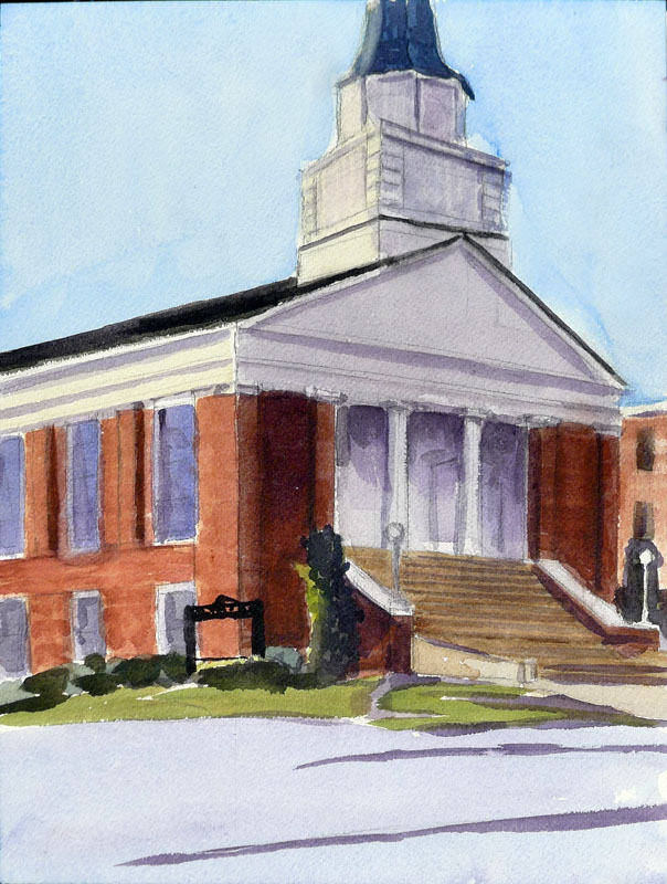
My painting of Siloam Baptist Church from last week.

The South also observes Blue Laws. That meant I wasn’t able to get a replacement sketchbook at Hobby Lobby yesterday. I drew these on tissue paper; the quality is terrible.

Earlier, I taught you how to draw a door in basic perspective. The door makes a shape called a trapezoid. (Don’t be frightened; that’s as mathematical as we’re going to get here.) When drawing buildings, most people get basic two-point perspective right but then mess up in spacing windows and doors. Here’s a technique you can use to divide the face of any building into regular units, no matter what angle you are looking at it from.
Dividing in half
Just draw an X from corner to corner. The vertical line that runs through the middle of this X is the center of your building. This is very useful for buildings, because if there’s a pitched roof, it almost always comes down from that center point.

Dividing into thirds

Draw a star shape, starting from the bottom outside corners and running to the top-middle and the top-outside corners.
Do the same thing, upside down, so that you have a six-pointed star.
The points where the lines intersect are the thirds.
Dividing into fourths
This requires that you figure out the middle of one side of your trapezoid. Then draw a line between it and the middle-point. Now you have the horizontal center-line. It will not be level; it should hit both sides at the mid-point.
Draw your star-shape again. The points where it intersects the center line are the quarters.
Dividing into fifths

This is the most complicated and fun of the divisions. Start with a horizontal center-line as you did above.
Now you’re going to draw some crazy diagonals:
  • From the bottom left corner to the top middle.
  • From the bottom middle to the top right.
  • From the top left to the right middle.
  • From the middle left to the right bottom.

The points where those diagonals meet are the 1/5 divisions.
In practice you can divide and subdivide these units to figure out the placement of windows and doors pretty quickly. Here is my division of Siloam Baptist Church, above (yes, the bottom line was wrong; I fixed it after I took this photo):
And here is a fast division of my first drawing. I just broke the units I had into smaller ones using the same principles:
Which I then extrapolated into this purely imaginary facade of a house:
I didn’t do any of this with a ruler, but with another piece of paper as a straight-edge. Once you learn these divisions of space, they take only seconds to do. They are much easier than guessing and erasing.

Monday Morning Art School: Visual Harmony

Five classic techniques for organizing your picture plane.
Kaikroddare by Anders Zorn (watercolor) uses the principles of opposition and transition.
Arthur Wesley Dow was a painter, printmaker, photographer and well-known art teacher in the beginning of the 20th century. He felt that composition was largely a question of proportion. He identified five elements of spatial harmony:
  • Opposition
  • Transition
  • Subordination
  • Repetition
  • Symmetry
Examples of Opposition. The intersections of lines are raw and unadorned.
Opposition is a principle we see both in nature and human objects. It’s when two lines meet or cross to form a simple and severe pattern. These crossings are always abrupt, and can even be violent.
The beauty of a door lies in its unmediated opposition and symmetry.
Transition tries to mediate opposition. A line or object is added at the join, softening the moment of impact. This is a strong and ancient goal for human designers. The columns at Karnak, which were started more than 4000 years ago, are softened with decorative capitals at the ceiling. We’ve been doing it ever since, with brackets, corbels, and other architectural elements to soften stark architectural lines.
Examples of Transition. A bracket is probably the most common example we see in everyday life.
Transitions also occur in nature. A beautiful example is the overlapping, trailing silhouettes of the Blue Ridge Mountains, which are far less stark than mountains looming black against the sky.
Kaikroddare by Anders Zorn, top, uses the principles of opposition and transition. The cross of the oars and arms is unopposed in the closer figure, who seems vigorous to us. The burden in the far boat softens the sharp lines of the oars, making that figure seem less vital.
Different forms of subordination.
Subordination: To form a complete group, elements of the painting are attached or related to a single dominating focal point. This is the fastest way to create unity out of complexity and confusion.
Subordination can happens in three ways:
  • By grouping around an axis, (leaf to stem or branches to trunk).
  • By radiating from a central point, such as petals in flowers, or water splashing over a rock.
  • By size, as with a mountain within in a mountain range, or a cathedral around its steeple.
Our Maine houses and barnyards are excellent examples of repetition.
Repetition: In a sense, this is the opposite of subordination, since the objects are generally the same size. It is made by repeating lines in rhythmical order. The intervals may be equal as in a fish weir, or unequal, as in a grove of trees. Our long run-on houses in Maine are visually pleasing because of their repetition.
A Bust of Amenhotep IV/Akhenaten in the Luxor Museum, Egypt.
Symmetry: This is a technique that we often avoid in contemporary western art, being more interested in balanced asymmetry (which is in itself a variation on the theme). However, the most obvious way to create balance is symmetry, where equal lines and shapes occur on either side of a central axis. I’ve included a portrait bust of Akhenaten as a demonstration of its effectiveness. Used carefully, it has the same severity and clarity as opposition.
None of these, of course, produce great art on their own. The skill lies in carefully using them to create harmonious outcomes. That requires practice.
Your homework.
The above illustration contains examples of each of the principles of design as identified by Dow. Your homework today is to identify which principle is at work and then draw your own version. Depending on your confidence, you can either copy his drawings or draw something of your own.
It takes a lot of trial and error to make something that’s visually harmonious, even for experienced artists. But the experiments are fun and easy. As always, I’d love to see you post your work on our Facebook page.
Interested in real-life learning? I’m teaching four plein air workshops in the coming year. Message me here for more information, or visit my website.
Today’s lesson and illustrations are from Composition, by Arthur Wesley Dow (Doubleday, Page and Company, 1920). Mr. Dow taught at the Art Students League, Pratt Institute, and Columbia University.

Monday Morning Art School: draw six different boats

Drawing six similar objects will teach you to observe details.
Reliant rigged as a sloop.

I once got a commission to paint Lazy Jack II in Camden Harbor. I was pretty happy with the results. As I finished, two deckhands from another boat stopped to look at it. Their eyes met. “You’ve got the…” one started. “It’s not important,” said the other, and they quickly walked away. I’ve never figured out what’s wrong in that painting, but I did realize that you can only fudge the details so far. The experts will find you out.

In the normal course of things, you’re not going to see many square-rigged vessels here in mid-coast Maine (although you could see USS Constitution if you drive down to Boston). You’ll see fore-and-aft rigs, where the sails run above the keel rather than perpendicular to it.
A Bermuda-rigged sloop. This is the most common silhouette you’ll see wherever pleasure boats congregate. 
A boat’s sails all suspend from a vertical spar called the mast. This transmits all the power of the wind pushing the boat through the water. It’s really a marvel of engineering, especially since the kinks were worked out before the age of composite materials. There are some other spars whose names will be useful to know: booms, which run along the bottom of the sails, and gaffs, which get raised up in the air. Not every sailboat has gaffs, but they all have at least one mast and boom to hold the sails taut.
A gaff-rigged catboat.
A catboat is small and has a single sail on a single mast set well forward in the bow, or front of the boat. (I think this would be the perfect painter’s boat, especially if I could find one towable with my Prius.)
A sloop also has one mast, with only one sail in front of the mast. If that head-sail multiplies, your boat has morphed into a cutter. Reliance, the 1903 America’s Cup defender, could be rigged as either a sloop or cutter. I drew Reliance to illustrate that single-masted boats can be gaff-rigged as well as Bermuda-rigged. She was a peculiar thing, built only to win America’s Cup and then sold for scrap. Like all transitory things, she was, oh, so pretty.
A ketch. Angelique is far prettier.
Ketches and yawls have two masts, with the back (mizzen) sail smaller than the front sail. The difference is that in a ketch (like Angelique) the aft mast is meant to push. It’s pretty big. A yawl’s mizzen sail is very wee, almost vestigial, and is way to the back of the boat. It’s basically an air rudder, used to keep things in balance.
A yawl (or y’all, for those of you from the south).
Schooners started out having two masts, but three-masted schooners were introduced around 1800, and the spars proliferated from there. The only seven-masted schooner, the steel-hulled Thomas W. Lawson, was built in 1902. It was 395 ft. long.
While you might run across Victory Chimes, a three-masted schooner out of Rockland, the rest of the Maine windjammer fleet have two masts. A schooner’s forward mast is shorter than its mainmast, giving it an appearance of eagerness. Schooners come in all kinds of sail configurations.
A schooner’s foremast is shorter than its mainmast.
Your assignment is to find a photo of each of these sailing vessels and sketch them out as I did, paying particular attention to where the sails attach to the masts, the angles at which the gaffs are running, and the height of the masts in relationship to the length of the hull. This is not about sailing, it’s about attention to the details that matter.
If you aren’t interested in boats, you can do the same exercise with cars, motorcycles, or varieties of apples; I don’t care what they are, just that you have six objects from the same class of objects. 
The point of this exercise is not to create six beautiful boat drawings. It is to show you how much you learn by sketching. At the end of it, you should have a clear sense of why sketching in the field is a far better preparation for painting than taking photos is.
Remember, those of you who love boats: we’ll be sailing with Captain John Foss on the most beautiful of all windjammers—American Eagle—in June, studying watercolor painting on the move. For more information, see here.
My little assistants. I drew the boats and they colored.

Monday Morning Art School: how to draw a boat

This exercise is like learning perspective. You’ll never draw this way in the real world, but practicing it will improve your harborside skills.
Cadet, by Carol L. Douglas
I tell my students that it’s best to paint a boat from the deck of another boat or a floating dock. If you can’t, then keep your distance. The tides in Rockport average about 12 feet. That means that if you stand on the public landing painting the lovely and graceful Heron, her angle is going to shift more than 20° over six hours. That’s an impossible perspective shift to manage.
There aren’t tides on lakes, obviously, but the waterline-view of a boat is still often the loveliest view.
Two figure eights. The top one is going to be stern-facing; the bottom one is going to be bow-facing. Thus the lines on the right are straight for the sides of the transom, curved for the bow. I made the bow loop slightly bigger because in practice the bow is likely to be higher.
I learned to draw boats based on figure eights. This is simple. You can master it in the studio before you go out to tackle the real thing. Since the bow of a boat is generally higher than the stern, I draw that end of the figure eight higher. The figure mustn’t be two circles, but you can make it as short or long as you wish. There’s no reason the two loops must be equal, although you should try it that way first. It’s easiest to do this when you’re not trying to be overly precise.
The fattest points of your figure eight are going to be the stern and bow of your boat. The keel curves in the front, so that line is drawn as a curve. The stern may curve in a fantail or be a flat transom. That varies by the boat.
The next step is to erase the extra lines and add a little shading. I took the liberty of adding a little extra height to the bow on the bottom.
In the top example, I put the transom forward; in the bottom drawing I put the bow forward. The important thing to realize is that the figure-eight is just like an optical illusion: it can go either way. Once I draw the curve or cut off the transom, I just erase the extra lines and gussy it up with some shadows. 
The actual direction of the boat is like an optical illusion; it can flip either way. The Scrumpy‘s notch is a little crooked; sorry.
In the very old days, small boats were sometimes clinker-built, meaning they had overlapping planks that made for beautiful curving lines beloved of artists. If you see those planks on a modern boat, they’re molded. I halfheartedly faked them in on my drawing, because I no longer entirely believe in them.
Dinghy, by Carol L. Douglas, shows how fast that can be done in practice. This was a workshop demo.
Drawing boats like this is like drawing perspective. You need to know how to draw 2-point perspective but you’ll never really draw those rays on your canvas while you’re working. It’s an exercise that teaches you a principle that you then incorporate into your work.
Once you see it as a process of squeezing and lengthening the horizontal shapes while leaving the heights the same, drawing boats is easy.
The same with this kind of boat drawing. The take-away lesson is this: as long as you have the relative heights of the pieces of your boat right, it can swing on its anchor all afternoon without significantly messing up your painting. Block it in with initial measurements and let it go from there. The parts will stretch out or grow shorter, but their heights will always remain the same. That liberates you from worrying when your boat—as it will—wanders around its mooring. I did the little sketch above to demonstrate that.

Thinking about teaching?

You might be an excellent painter, but make sure you understand your own process thoroughly. 

Me,teaching at Acadia National Park
I started writing Monday Morning Art School back in October. This was in response to my students’ need for continuing education while I was elsewhere. It was also a way to put my scattershot “how to” posts in some kind of framework.
It takes longer than the posts I write the rest of the week, and it’s more complicated. It does funny things to my readership stats as well: Monday Morning Art School gets fewer hits than any other day of the week, but I get more mail about it than about anything else.
The difficult thing about writing a “how to” is slicing and dicing your process. That’s true of teaching in general. It’s one thing to know how to do something, and another to be able to stand outside your work and explain it step-by-step to a beginner. In a classroom, you read your students’ reactions and adjust your method accordingly. Writing (or video) is a one-way street.
Painting by student Catherine Bullinger in a one-day workshop last summer.
A friend took drawing classes at a prestigious art school. I’ve wondered how a person with her mind could manage to not learn to draw in such a setting, but she did. She’s a brilliant woman. Drawing should have been a snap for her.
As I was writing about measuring curves as a series of straight line segments, I asked her if she’d ever been taught this simple skill. “The teacher was a wonderful botanical illustrator herself, but really in retrospect her teaching method was: ‘look at it and sketch it,’” she told me.
I’ve taken a few classes and workshops with great artists who couldn’t teach. At times the instructor thought that watching him paint was enough. No questions were allowed during the demo. That’s a real misunderstanding of the teacher’s role. His focus should be on describing and examining his process, not protecting it.
Students painting at Owls Head.
Anyway, if I wanted to watch someone paint, I’d have just bought the video.
Almost all artists get the idea somewhere along the way that they can teach, especially after their accountants tut-tut over their books. Many artists teach wonderfully, of course, and the world needs more people like them.
Others may be excellent painters, but haven’t analyzed their process thoroughly. Or, worse, they don’t have the communication skills to interact with strangers.
Yes, I demo, but there’s a lot more to teaching than that.
Before you decide to run that class, run a check on yourself as you start and finish a painting. Can you clearly describe all aspects of your process, or is some of it automatic and mysterious even to you? If the latter, do yourself and your students a favor and hold off on teaching until you’ve got it straight in your mind.
This, by the way, is a lesson I learned the hard way.

Monday Morning Art School—drawing from the inside out.

There are times when you have to dance backwards in 2-inch heels. Or at least do the equivalent in pencil. Here’s how.

My soap dish and towel. These are very small drawings, by the wayabout three inches across.

If you’ve been reading this blog for a while, you know I stress working from big shapes to little shapes.  We start with generalizations and move to detail. This is such a fundamental rule of drawing that it seems almost inviolable.

Yet there are times where the reverse can work brilliantly. There are artists—Albert Handell, for example—who work from their focal point outward. It’s a good trick to have in your kit. Practicing it occasionally helps you see composition differently.
Don’t hate me for the state of that soap dish. At least I wash my hands!
Your assignment this week is to draw a small still life, starting from whatever detail first catches your eye. I used my grimy soap dish. For me, the most attractive thing was the elliptical shadow thrown by the bar of soap, so I started there.
The soap and its shadow. That would soon change.
When is a still life not a still life? When it’s a-travelin’, man. The soap and brush were still wet. As the towel settled down into its pose of casual insouciance, it deflated somewhat. All the pieces moved, imperceptibly at first, and then faster. The soap and brush slithered across the table and on to the floor. This happened three times before I got them to sit and stay.
Finding the arcs of the soap dish around the soap.
One of the advantages of drawing the what interests you first is that it helps you avoid losing your subject. This is particularly important if you draw people on the subway, or lobster boats in harbor. Both will leave on their schedule, not yours.
Fit the dish shapes around the soap like puzzle pieces. Note that the brush has mysteriously flipped over.
If you were drawing this big-to-small, you would start with the ellipse of the dish and its placement on the bigger shape of the towel. You would then break the dish down into its parts. Reversing that, I started with the bar of soap and its shadow. I then built the dish around those objects. To do that, I figured out how they fit around my brush and soap, like pieces of a puzzle, paying careful attention to the so-called negative shapes that resulted.
Brush and soap in their bowl.
(Remember that what you see in the photo isn’t what I saw in real life. Photos distort reality.)
After that, it’s just a question of continuing the process outward. At the end you’ll want to spend a few moments integrating everything and setting a few final, strong lines to hold the composition together.
Growing a shadow.
Where might I use this technique? If there’s one object that’s the focus of my piece, like a beautiful tree, I might start by positioning it elegantly on my canvas and working around it. I sometimes draw hanging coats from small-to-big, since it can be difficult to get the parts to flow together. I always work small-to-big when the object of my attentions is in danger of moving along soon. 
I developed the drapery from the inside out, as well, like little puzzle pieces.
This is a technique applicable to drawing, for the most part. The only time I do it when painting is when my subject is a boat and I’m concerned it will soon be off to sea. Oil paintings can’t be cropped as easily as watercolor or pastel. Making an error of placement at the beginning is a difficult mistake to work around. In oils, it makes the most sense to do a careful drawing and tuck it away against the possibility of losing your subject.
This technique works well for drapery. This is someone’s jacket, draped over a chair.
I’m teaching four workshops this summer, in Rochester and Rye, New York, on the Schooner American Eagle, and at Acadia National Park. For more information on any of these, email me here, or check my website.  

A few questions (and answers) about plein air painting in Maine

Yes, there are bathrooms. We like to call them ‘heads’ on a boat
Jonathan Submarining, by Carol L. Douglas

If you’ve been thinking about taking my Sea & Skyor Age of Sailworkshops, this is a reminder that you have only two weeks left to get an early-bird discount. That’s $50 off the price of the boat trip or $100 off the Acadia workshop.

The Age of Sail is June 10-14, 2018 on the historic schooner American Eagle out of Rockland, ME. Sea & Sky is August 5-10 at Schoodic Institute in Acadia National Park. Here are some questions I’ve been asked recently:

Drying sails, by Carol L. Douglas

What do you do if it rains?

While the rain in Maine falls mainly on the plain, it does sometimes rain over Penobscot Bay and the ocean. American Eagle has a canopy over the main deck for when the boat is at anchor, and we’ll use that. At Schoodic, we have access to a pavilion. In either case, if the worst happens and we’re totally unable to work outside, there are interior places where we can gather.
Are there bathrooms?
Yes and no. On a boat, a toilet is more properly called ‘the head.’ Although American Eagle is a restored heritage boat, she does have these modern conveniences. Schoodic Institute does, too.
On the boat, you’ll sleep in a berth. At Schoodic, you’ll have a room in an apartment with a kitchen, two bedrooms, two bathrooms, and access to laundry facilities. Out in the woods, we either drive to the nearest park facility, or we take an amble into the woods like the locals (bear, moose, and foxes) do.
Outrunning the Storm, Carol L. Douglas
Are these workshops handicapped-access?
Schoodic Institute is, but let me know if you have physical limitations when you register. Our painting locations are all accessible by car and involve little hiking, so you won’t miss out. American Eagle is not accessible. It was built as a working fishing boat.
What about food?
In both cases, all meals are provided, so you don’t have to worry about where and when you eat. Schoodic’s chefs prepare lunches and snacks for us to take into the field, and we have breakfast and dinner cafeteria-style. American Eagle’s cook and mess-mate feed us three squares a day on deck.
Both trips include a lobster boil. Schoodic’s is prepared by a fisherman from nearby Corea, ME, who hauls that day’s catch over to us. On American Eagle, you’re likely to see Captain John Foss row his dinghy into a nearby harborage to buy seafood off the dock. You’re encouraged to make dinghy jokes.
An island lobster bake, in progress.
Can I get a glass of wine?
You can bring some along. In Maine wine and liquor are sold in grocery stores, and you can easily pick some up along the way.
What about black flies or mosquitoes?
I’ve painted in the far north from northern Alaska to Labrador, and the worst black flies I ever did see were at Piseco Lake in New York. They’re an early-summer phenomenon, which is why we’ll be out on the water in June and on land in August.
Watercolor field sketches, by Carol L. Douglas
What equipment should we bring?
For Sea & Sky, all mediums are welcome. Here are my packing lists for oils, acrylicsand watercolor. The Age of Sail is a little different. I’m supplying everything, and we’re going to work in field-sketch style in watercolor and gouache, the better to capture fast impressions.
A reader once posted this comment on my blog: “Noted watercolor painter John Marin of the Maine coast not only painted many boats but also painted from a boat. He rowed out from Mt. Desert Island where he sketched and painted quick minutes-long watercolors while bobbing in his rowboat. One was on display at the Ogunquit Museum of American Art this past summer… Mount Desert Minute Drawing, most likely a view of Cadillac Mountain, and can be seen on this web page

Monday Morning Art School: drawing a globe

Start with the mechanical measurement and work your way down to the details.

All illustrations are by Carol L. Douglas (left) and Sandy P. Quang (right)
By now, the long slog to decorate for the Christmas holidays is in full swing. If you haven’t got your tree up, you’ve at least located the boxes and asked your family to help you carry them down from the attic. (Good luck with that, by the way.) Find a simple, round, reflective ornament. That’s your subject for today.
Those of you who don’t believe in Santa Claus can find a spherical object to substitute. A ball or a snow-globe will work just fine.
The ornaments in question.
Some of you might know Sandy Quang; she was my painting student in Rochester. She went on to get a BFA from Pratt and an MFA from Hunter and now works at Camden Falls Gallery. She came by yesterday to hang the high ornaments on my tree.
I asked her if she wanted to draw with me. As my students do, she had her sketchbook tucked in her backpack. “Which one do you want?” I asked her. She chose the spider ornament.
Last week, I wrote about drawing a glass dish, which is a series of ellipses on a central axis. A circle is easier to draw than an ellipse; it’s an ellipse that is symmetrical on all sides. A sphere appears to be a circle when it’s viewed in two dimensions. This is an unbreakable rule.
Noting the axes.
Both of us started with the axis of our drawing. For me, that was the vertical axis; for Sandy it was the axis holding her circles together. I mention this because when people say “I can’t draw!” they seldom realize how much of drawing is mechanical, simple measurement.
We both added details. Mine were the ellipses on the collar of the ornament; Sandy’s were the beaded legs of the spider and her first markings for reflections.
Next, we both put the appendages on our spheres. For me, that meant measuring the ellipses in the collar, as I demonstrated in detail last week. For Sandy, it was the beaded spider legs. Sandy was starting to note the overall areas of reflection in her spheres.
Marking out the outlines of our reflected shapes.
Sandy and I chose different approaches in the next step, dictated by the paper we were working on. Because I had a smooth Bristol, I was able to blend my pencil line into smooth darks with my finger. Sandy could only work light-to-dark on the rougher paper she was carrying. That gives you the chance to see two different approaches to shading.
We both worked on shading next. I finished my shading with an eraser, Sandy couldn’t do that because her paper was too rough.
Sandy has a shadow under her final drawing because the ornament was sitting directly on my coffee table. I put the reflection of myself drawing in my ornament.
All drawing rests on accurate observation and measurement. Get that right and the shading and mark-making is simple. And remember, you’re welcome to post your finished work on the open Facebook page, Monday Morning Art School.

Monday Morning Art School: Repeating shapes and perspective

Everyone has a door somewhere in their house, right? It’s a great subject to practice drawing.

I’m sure you have a door almost exactly like this one somewhere in your house. It’s commonplace, but it’s also a series of repeating shapes that can teach you a lot about perspective.

I left it slightly ajar, but it doesn’t have to be. Seat yourself as far away as you can get from it. The closer you are, the more difficult it is to keep your measurements straight. I’d like you to sit at a slight angle to it so you can think about perspective.


This is intended to be a fast drawing, taking you no more than 15 or 20 minutes. The same rules apply to a careful drawing, of course; you’d just be more meticulous in your measuring and marking. But you’ll learn just as much going fast.

My first task is to figure out the angles of the top and bottom of the door. (My camera distorts perspective so what’s in the photo won’t match what’s on my drawing.) I do that by holding my pencil along the bottom of the door and figuring out the angle.
I find that setting my pencil down on my paper at the appropriate angle helps me see it better.
Then I do the exact same thing on the top.
Note that the shelf at my eye level is completely horizontal. Any level surface at eye level has to be horizontal; that’s a hard-and-fast rule. 
Two-point perspective, courtesy Luciano Testoni. All those lines traveling off to the vanishing points on the left and right? Let’s call them rays.
The picture above is classical two-point perspective with a lot of extra bells and whistles. I don’t want you to get bogged down in it; I included it so you can compare the rays in that drawing to what you see in your room. Notice that when you look at lines high in your room, the ‘rays’ travel downward to the sides, where the so-called ‘vanishing points’ are. When you look at objects near the floor, the rays travel upward to the vanishing points. That’s because the vanishing points are always at the viewer’s eye level. 
My measuring hashmarks
Next, I do that nifty measuring thing that involves holding my pencil in front of my eye and using it as a ruler. Since the height is already determined by my angled lines, I just need to figure out how wide the door is relative to the height. I figured the door is a little less than half as wide as it was tall. Later, I’ll find out just how off I was.
This shape is called a trapezoid, and there’s an easy way to find its center. Just draw an X from corner to corner as shown. That’s very useful information in perspective drawing, because it helps you place windows, doors, roof peaks, etc. correctly. Make a habit of finding it.
And here’s a quick-and-dirty way to get the perspective right. Divide the two side lines into equal units—thirds, quarters, eighths, or whatever other units you can mark off by eye. Then just draw lines connecting the corresponding sides. The 1/3 point on the left gets attached to the 1/3 point on the right, etc. You’ll have the perspective rays right in one try.
I never get my measurements right on the first try, so I’ve learned to not fuss too much on my initial measurements. The great thing about repeating shapes is that your mistakes are easy to see. I realized the door was slightly too short and wide, so I adjusted them slightly. I also took out the free-hand curl on the right-bottom corner. Note how useful the center point is in placing the central spine of the door. I know that the moulding around the glass is the same width all around, so this is one of those repeating shapes I can use to check my work. (Of course, it’s going to be ever so slightly wider on the side closer to me.)
No, I can’t draw a straight line, not without a ruler.
My finished drawing. I would have enjoyed putting in all the details, and I could always be more careful, but I still have letters to write. You can finish it or not, to your heart’s content.
Next week, I’m going to have you draw a pie plate. That means you have to finish up the leftover pie before Monday. And a reminder, you can post your homework here. There are lots of people reading Monday Morning Art School; I’d love to see some drawings!

Monday Morning Art School: Add back the banned black

A color exercise that can be done with anything from a dime-store watercolor kit to a professional palette.

Back before black was banned from the palette, we had shades and tints. Shades are made by adding black to a pure color. Tints are an admixture of white to a pure color. Shades aren’t an effective way to make something darker, but they often make nice new hues.
What we consider acceptable in color-mixing is style-driven, just like everything else. For example, see the Permanent Pigments Practical Color Mixing Guide of 1954, below. It’s all about making shades and tints. That’s a hint about why mid-century paintings looked so grey. A little shading goes a long way.
A mid-century guide to mixing colors.
Today’s exercise is to make a paint chart playing the warm tones on your palette against the cool tones. Both of these examples were done in class by students. My definition of warm vs. cool has shifted over time. Ten years ago, I included quinacridone violet among the cools; last month I had my student stick it in among the warms. That’s because warm-vs.-cool is an arbitrary designation.
The chart in watercolors.

The instructions are a little different for solid-media students than for watercolorists. In either case, start by marking off your paper or canvas with 1” squares, allowing enough room for the cool colors on the left and the warm colors across the top.

Watercolorists (and users of fluid acrylics) just need to mix the colors. Oil painters need to tint their colors with a little bit of white. I’ll get to that below.
In watercolor, the column on the far left should be pure pigments straight from the tube: blues, greens, black, and violets if you want to call them cool. The row across the very top should also be pure pigments, but in the warm tones: reds, oranges and yellows.
The boxes in the middle of the chart are all mixtures. For example, the second-row-second-column box on Sheryl’s chart is black+raw umber. The third-row-second-column box is ultramarine blue+raw umber. The bottom right box is sap green+quinacridone violet, and so on.
The greatest difficulty for watercolor painters is to try and keep the color balance equal. Pigments differ in density, and it’s hard to control dilution. Still, try to use the same amount of each in your mixtures.
Sheryl was doing something my friend Poppy Balser calls “licking the paper.” (That’s partly because she was using a very cheap paper.) That means she was fussing after she put the first brushstroke down. That gave her final chart a mottled appearance. Try to get the mixture down in one brushstroke and leave it.
The chart in oils.
Solid media (oil, gouache, and acrylic) painters have a slightly different assignment. They need to add white to their mixtures. I always add it on the cool side of the chart, by mixing a large clump of the cool-plus-white colors and using that to work across, modulating the warm colors. Working this way, your second-row-second-column box will be (black+white)+raw umber. The third-row-second-column box will be (ultramarine blue+white)+raw umber, and so on.
Note that there is one three-way mixture on the left column. I do not typically paint with a tubed violet, so row five started with a mixed violet to which I added white. If you use a dioxazine purple, it belongs here.
The chart above was designed for figure painting, but applies everywhere. It easily adapts for differences in skin color. Figure commission by Carol L. Douglas
Your last task for this week is to use color temperature, rather than value (lightness or darkness) to define the volume of a sphere, as in Sheryl’s example, below. Her shadows are warm, and her light is cool. Experiment with reversing that as well.
The shape of this sphere isn’t defined with value (lightness or darkness) but with a shift in color temperature. Try it!