Monday Morning Art School: How to draw almost anything

There’s now a Facebook group for you to post your homework, folks. 
You’ve all seen artists holding a pencil up like the clip art below. What they’re doing is rough measuring. It’s simple. Just hold the pencil up like a ruler in front of the object you’re drawing. Move it around to see the relative height and width of the thing. For example, a vase may be twice as tall as it is wide. That’s all you’re figuring out; you can make the vase any size you want on the paper.
It’s not just an affectation.
You can hold your pencil up to figure out the other important thing in drawing: the angles of lines. I could give you a formal perspective lesson before we start drawing, but it’s not as important as learning to see angles. If you develop the ability to see angles, you’ll have better natural perspective than if you try to fit up what you see to a theory.
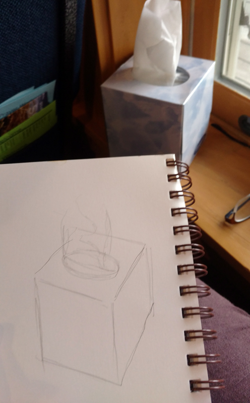
I used my pencil as a measuring tool to get the relative sizes and angles right.
The tissue box I was drawing in church yesterday had lovely angles. However, what you see in the photo isn’t what I saw while working. A drawing from life will never match what the camera portrays. Cameras are not as subjective as artists, but they lie just as much as we do.
You should do your measuring with one eye closed, especially if you’re working in a tight space, as I was. Art books will tell you to measure with your arm straight out. I find that uncomfortable. Instead, I just shoot for always having the pencil the same distance away from my eye as I work.
Then I checked the sizes and angles and corrected them. The box was taller than I originally thought.
All drawing starts with simple shapes. After laying them down, I check and correct them. I do this by analyzing each large shape. Where does the back of the box intersect the tissue column? Is the curve of the cutout fat enough? I discovered that my cube wasn’t really tall enough, so I added some to the bottom.
After I was reasonably confident I had the shapes right, I added some overall values.
The next step is to establish some overall values.  â€œValue” just means how light or dark something is. This box was sitting on a south-facing windowsill behind a person who was casting another shadow. Thus, the window-frame behind the box was in deep shadow, but not nearly as dark as the photograph. I roughed in those darks first. They helped me know how to shade the box properly.
I added shadows to the box itself, and developed some detail.
Next, I set shadows on the tissue box itself. I am more concerned with the column of tissue, so with each pass, I spend more time on that.
Finally, I did some blending, using the handiest tool I carry: my finger. You should use a stumpor tortillonon work you care about, but in a pinch, your finger works great.
Blending using the side of my finger.
Note that I never bother much about my mark-making. It can take care of itself. I’m mostly interested in applying accurate values. I did this drawing with a mechanical pencil, which will never be as luscious as a good graphite stick, but it survives banging around in my purse week after week.
Time to go home!
Some general rules:
  1. Draw everyday objects. The better you get with these, the better you’ll be with complex subjects. There’s amazing beauty in everyday things.
  2. Draw any time you get the chance. I did this drawing in church, and I didn’t miss a word. Drawing and language don’t use the same channels of your brain.
  3. Measuring is the most important part of drawing. Keep checking and correcting sizes.
  4. Start with big shapes and break them down into little shapes. If the big shapes are right, the smaller parts will slip into their spots just fine.
  5. Value is relative. How dark something is, is only important in terms of how dark its neighbor is.
  6. Constantly recheck shapes and values as you go.

Wanna go sailing?

I’ll wager that you won’t find a more interesting brace of workshops anywhere.
The light is ever-changing on the open water.

If you’ve been following my blog for a while, you know I moved to Maine for the painting. The light, the sea and the granite coast have drawn artists here for 200 years. I was just the latest sucker they snared.

In the early spring of 2016, I wandered into the North End Shipyard and asked if I could paint while they worked. The smell of varnish in the cold morning air brought back memories of equally frigid mornings on Lake Ontario.
Exploring off the American Eagle.
That summer, Captain John Foss asked me to sail with him on the American Eagle. I painted some work I really liked. This October, I went out with them again, bringing watercolors instead of oils. I found that watercolor is perfect for capturing the changing scene from a boat under sail. And it’s less intimidating than oils. Several people tried painting with me.
This trip includes a gam, an open-water raft up of boats. That’s been known to include rowing troubadours.
When we got back to land, Captain Foss and I designed the perfect trip for the artistically-inclined boat lover. Next June, he and his crew will sail us around the coast of Maine on their beautifully-appointed boat, providing berths and all our meals. I will teach you watercolors.
From the galley.
Can you even paint on a moving boat? Heck, yeah, and it’s fascinating. The water, sky and shoreline are constantly changing. We’ve scheduled this workshop for the longest days of the year so that we’ll have plenty of time to paint sunrises and sunsets while at anchor.
What if you prefer your ocean from the shore?

Schoodic is a wild and isolated place, but still accessible from Bangor International Airport.
I offer a workshop at Acadia National Park’s Schoodic Institute every August. This is designed to help the painter find his or her own voice and style. It’s intensive, with morning and afternoon on-site painting sessions and lunch-time demos. Classes are kept small so every student gets the attention they deserve.
All mediums are welcome.
Acadia is famous for its ocean breakers and big granite outcroppings. I’ve ferreted out some very exciting spots to paint, both in and out of the park. By the time your week is done, you’ll be at one with the wind, waves and pounding surf.
Breakers by Carol L. Douglas.
Schoodic offers many other non-painting entertainments for the outdoors enthusiast. There’s biking, mountain climbing, fishing and hiking all in the immediate area. Seabirds, dolphins and grey seals are regularly sighted off the coast here.
Both trips are also all-inclusive, so you don’t have to worry about meals or accommodations. And both are designed so it’s easy to bring your non-painting partner.
The instruction is one-on-one and intensive.
Why am I mentioning this now? Christmas is coming, but that’s not all. If you register before January 1 for either workshop, you get a discount. And I’m willing to wager that you won’t find a more interesting brace of workshops anywhere.
You can learn more about both workshops here.

Monday Morning Art School: mastering your color palette

Monday Morning Art School now has a Facebook page, a place for online students to post their homework and look at others’ projects. I’ll look in to see what you’re doing. Try to limit your posts to the class exercises, please.
Today’s project is designed to help you learn more about the colors you’ve chosen and to give you more confidence in mixing colors. You can do this in any medium: oils, acrylics, pastels, gouache, colored pencils, watercolor, or even a dime-store paint kit. The examples were done with a Winsor& Newton field kit by my student Sheryl in my Rockport, ME class.
My wheel, above, is an approximation. Every manufacturer formulates its colors differently. Still, I’ve tried to match a pigment name with each spot on the wheel. The biggest circles are what we call the primary colors, followed in size by the secondary colors, and then the tertiary colors.
The outside of the wheel represents the highest chroma (intensity) colors. The center of the wheel represents low-chroma neutrals. The circles in the middle are the common earth pigments.
Start by drawing two circles, one inside of the other, on a piece of paper or a primed white canvas. Then draw a triangle inside the circle to help position your colors.
We’re going to use paint straight out of the tube. The colors on the outside of the wheel are modern pigments. They’re the highest chroma. The earth tones are historic pigments and less intense. Black falls in the middle.
Use only the paints you carry in your paint kit. No painter has everything. One point of this exercise is to find the holes in your colorspace.
Sheryl’s palette, interpreted on the color wheel above. Note how lacking her palette is in cool tones.
Find the closest thing you have to true red, blue and yellow. Choose paints that don’t have overtones of other colors. You might not have a color that is a true primary. Don’t force another color into that spot. Sheryl’s kit didn’t have a clear blue. She put both her blue dots to the left of the primary blue square, because they were both a little on the violet side. Another common paint is cadmium yellow medium. It’s actually pretty orange, so it goes to the side of true yellow. Label your colors, if you know their names.
You will have some tubes in your paint kit that don’t belong on the outside of the color wheel at all. Besides the earth tones, tubes that contain more than one pigment are less intense than straight pigments. (Pigments are usually listed on the tube.) Approximate where they go. For example, Sheryl has sap green, which is mix. She put it slightly inside the pure-pigment wheel, because it’s on the dull side.
Check your color wheel to see where you have gaps. Sheryl’s paint wheel is strongly weighted toward the warm colors—reds and yellows—and short on the blues and violets.
Sheryl’s finished wheel, showing various mixes of pigments. Yours should look something like this.
Draw a dotted line from two pigments on the outside of your color wheel—say quinacridone rose to ultramarine blue. Then make a mixture of those two colors and put a circle of that paint between the two. Repeat this with different combinations until you get bored.
Note that the holes in Sheryl’s palette means she can’t hit a clear blue-green or a clear purple.

Pastel and pencil artists can fill in the missing points with colors they have in their boxes, or they can mix combinations.
You should notice three things:

  • Mixing across the color wheel gives you beautiful neutral tones. They are far more interesting than mixing black and white to get grey;
  • You can never mix a paint that’s more brilliant than the straight-from-the-tube paints you started with. If all your paints are on the dull side, your finished painting will be dull too.
  • What you learned about primary colors in elementary school is only partially true. I remember my disappointment while trying to mix purple as a kid; that was because the paints I had weren’t true blues or reds.

Note: These lessons are a learning experience for me as well as you. I’ve taught painting for many years, but teaching in print is a new experience for me. I’m still trying to figure it out, so your suggestions and input are appreciated. You can email me here.

Monday Morning Art School: Reflections

Time for art class. Get out your pencils and get started.

Reflections off American Eagle in Stonington, watercolor, by Carol L. Douglas
Artists often trip up on the stochastic processes: things that have a general pattern but can’t be predicted precisely. We tend to either ignore the pattern altogether or overstate it into rigid regularity. These are everywhere in nature: in the distribution of leaves on trees, wildflowers in fields, the cleaving of rocks, and the behavior of water.
The surface of water is one of the most fascinating and difficult things to paint. It can be utterly still, or random and choppy, or it can create orderly patterns of surface ripples or waves. When it hits an obstacle like a ledge or the shore, its surface behavior is dictated by what’s underneath. In a rainstorm, fresh water floats on the surface of salt water, adding another pattern.
I like to sketch what the surface of water is doing. This changes quickly, so it helps to do this in a fast-working medium like pencil or watercolor. I did the above sketch while anchored off Stonington last week, but you don’t need an ocean for this exercise. There’s standing water almost everywhere: in ponds, lakes, or streams.
Light reflects identically but opposite. That’s immutable. What changes with water is the shape of the surface.
Reflection involves two rays – an incoming (incident) ray and an outgoing (reflected) ray. Physics tells us that the angles are identical but on opposite sides of a tangent. This is immutable. It’s why reflections that do not run in a generally-straight line down to the viewer are always wrong.
If water were perfectly still and perfectly reflective, its surface would be a mirror. Two factors prevent that. First, some rays of light are absorbed, and not reflected. This is true in both directions. Some of the light from the sky is absorbed. At the same time, we can see some of the color (or objects) under the water. Furthermore, the surface is never flat; it’s wavy or worse, just like a fun-house mirror.
The surface of the water at the Isaac H. Evans’ berth in Rockland.
In most cases, a sea wave’s surface is also windblown and irregular. That makes its surface infinitely varied. Rays are reflected at many different angles, radically disrupting the image. This gives the surface of the sea or its spray a solid or matte appearance.
Where we see directly into water, it’s the least reflective. That can either mean looking straight down or into the face of the wave. These surfaces are most likely green or brown in tone, depending on what’s underneath. The tops of the waves reflect the sky, but the sky isn’t the same color in all directions. Other surfaces reflect what’s in the distance—moonlight, other boats, structures, trees. Often these last reflections take the form of rings.
In relatively still water, reflections are irregularly elliptical.
In relatively still water, reflections are generally elliptical, although those ellipses may join in long strings or have vibration interference depending on the surface breeze. As the water becomes less still, water generally sorts itself into waves with identifiable patterns.
Waves can range from very tiny ripples to towering structures nearly a hundred feet tall. Most of us see waves as they approach the shore. There their behavior changes radically. They tend to pile up as the water gets shallower, effectively growing taller and slowing down. As they break, all predictability ends. The spray from a breaking wave can and does go anywhere.
The light stream is fresh water on top of salt water during a rainstorm.
Your assignment, then, is to find a body of standing water somewhere near you, and draw or paint the reflections. Don’t worry about the setting; we are only concerned with the behavior of the waves you are seeing.

Laid low

Asthma. My body has just told me to spend a little time on self-care. I think that means a pedicure.
Painting at the American Yacht Club with Brad Marshall. (Courtesy Rye Arts Center)

I spent the weekend dealing with asthmatic bronchitis, and yesterday at the ER having it calmed down. This happens. Providing it’s managed, it’s not going to kill me. But it is a sign of fatigue, and it means that I won’t be teaching my regularly scheduled class this morning.

Asthmatic bronchitis is not contagious, but it can be rude. There’s no reason to douse my students with spittle. That’s a pity, because I had a nefariously challenging idea and just the students to rise to the challenge.
One year I shared my painting location at Rye with this fisherman. He explained surf casting in great detail, none of which I remember.
Speaking of this class, there are a few openings. It meets locally in Rockport, ME—outdoors when the weather is fine, and in my studio when it’s not.
Visitors may go home at Labor Day, but we know that the weather in the northeast is at its most beautiful in September and October. It’s cool and crisp. The trees turn in a brilliant panoply of color that contrasts with the lakes and ocean.
The tuition for a six-week session is $200. You can contact me here if you’re interested.
Meanwhile, I’ve cancelled today’s class and I feel badly about it. I have an assignment for my students which I’ll share with you. I will ask them to clip off a bud from an Eastern White Pine and a Black Spruce and render each, in detail, in watercolor, before our next class. If you don’t have watercolor, do it in pencil. This is an exercise in observation, not in artistic sensibility. Assuming I can get out to collect samples, I’ll be doing the same thing.
I must feel better soon because it’s nearly time for Rye’s Painters on Location, September 15-16, in Rye, NY. This show was launched in 2001, making it a granddaddy among plein air events. It certainly has been a major fixture in my calendar. I love going back and seeing old friends in the community and among the artists.
My favorite thing I ever painted at Rye was this painting of the bridge at Mamaroneck. This, alas, is the only photo I have of it.
We set up our easels on Friday and Saturday, September 15-16. For the first time, the Rye Arts Center will post our locations on a Google Map so we can be more easily found. This, I suppose, requires some planning on my part.
I usually paint with my pal Brad Marshall, but he will be in Britain at that time. That leaves me on my own to choose a site. I’m still dazzled by the choices, despite the better part of two decades’ experience: beautiful architecture, a historic amusement park, lots of boats and Long Island Sound itself.
Spring at the boatyard, 14X18, is my silent auction piece. You can bid on it by contacting the Rye Art Center.
Two years ago, Brad and I prepared to paint into a hurricane, but it fizzled. I’m watching the weather reports now, since we seem to be in another season of high activity.
Yesterday I got a note from a reader who lives on St. Martin in the Caribbean, thanking me for publishing Lauren R. Lewis’ information about rescuing water-damaged artwork. The eastern Caribbean islands are, according to the National Weather Service, just now being mauled by this Category 4 hurricane. This isn’t an abstraction. I know people along that string of islands. I pray for their safety. 

How to critique work (and still have friends)

Imagine if we visited the Sistine Chapel looking for things to criticize instead of enjoying it for what it is.

Kaaterskill Falls, by Carol L. Douglas

Anyone who has ever taught teenagers knows they are simultaneously hypercritical and thin-skinned. They must be taught to be constructive and humble. A few years ago, there was a flash-in-the-pan video of an art student destroying her own work during a critique. She was mocked for being oversensitive, but listen to the girl criticizing the work. She is larding her critique with personal comments. That’s what happens in an unstructured critique class.

For that reason, we routinely used the “sandwich rule” in our class. We began by pointing out something the person did well. We then discussed the problems of the painting. We finished by pointing out something else that the person did well, so that each session ended on a positive note.
This method has been mocked as “fluffy bun—meat—fluffy bun,” but that misses the point. Often, people have no idea what they’re doing well. Their own self-doubt gets in the way of seeing what is successful in their painting. That needs articulation as much as the negatives do.
Camden in the fog, by Carol L. Douglas
We are taught from a young age that education is about correction, but it is as much about encouraging what is successful.
One problem with formal critique is that we sit there wondering what brilliant insight we can come up with about the work, rather than spending time absorbing it for what it is. Imagine if we approached the Sistine Chapel like that.
I once ruined a painting because of muddled criticism. It especially rankles that I’d paid a high-profile artist to deliver it. “It looks like a crude Chagall,” she said. Dismayed, I painted over the whole thing. Years later, I realized she was flat-out wrong. Criticism is, after all, just an opinion. Today, I’m confident enough to trust my own judgment, but I wasn’t at the time.
Lunch Break, by Carol L. Douglas
It’s easy to misconstrue a student’s intention. For this reason, it’s best to listen first, before offering commentary.
A critique session isn’t just about learning what’s wrong with your painting. It’s also about learning to read artwork, and learning to write artwork that is readable. To this end, I ask some general questions of the class, such as:
“What do you notice first? Second?”
“Why did you see those things in that order?”
“Does this evoke a feeling or response in you?”
“What is the point of this work?”
I am often asked to critique work over the internet. This is difficult. Our cameras and displays are not very accurate. I may not know the person in real life. Since we’re not having a personal conversation, I am guarded in my comments.
Piseco Outlet, by Carol L. Douglas
There is a very small coterie of artists I trust enough to ask for criticism via text or email. They’ve demonstrated that they’re knowledgeable and sympathetic to my painting goals.
Today, for my last class of this session, we’ll be critiquing work. Frankly, there’s enough negativity in this world. If we err, let us err on the side of kindness.

The perfect size painting class

Bigger art classes are easier for the instructor, but not necessarily good for the students. Neither are very small classes.

A delightful day at Owls Head.
“Do you ever offer private lessons and if so, what advice can you offer me on what I should charge?” a painting instructor asked.
There are very few things I won’t do for money, but private painting instruction heads that list. Learning to paint is all about repetition. I show you a technique, and you repeat it until you’ve got it. The best balance for plein air painting, I’ve found, is a class of 6-9 people. Fewer, and I am crowding my students with too much information. More, and I can’t pay enough attention to their needs.
The wilder the terrain, the fewer students I can teach. That’s why I often use a monitor at my Acadia National Parkworkshop. He or she handles problems of logistics, freeing me to concentrate on painting questions.
The rockier the terrain, the fewer students you can teach.
“How many people are in the class?” a person wrote me this summer. That was one smart cookie. We’ve all taken workshops where the instructor tries to manage a group that’s much too large. Teachers cope by doing long demos, but that’s unfair to the students. They might as well watch a video.
Rushing around on rocks can lead to injury, as we discovered a few years ago.
It’s easier indoors. Classes at the Art Students League were very large, but I wasn’t neglected. I benefitted from the instruction happening around me as much as from what my teachers told me.
A big group is easier to teach than one or two people. Teachers are only human, and humans are essentially proprietary. The longer we spend at a students’ easel, the more we want to take over.
Demos have their place, but they’re no substitute for one-on-one attention.

When I’m first looking at a student’s work, my mind is fresh. One or two things immediately jump out at me for correction or praise. I can articulate them and move on without meddling. That keeps the focus clear and directed.

Give me a enough time there, however, and I start deconstructing the painter’s vision. Students tell horror stories of teachers who have repainted whole sections of their work. That’s hard to avoid when you’re spending too much time with a single painting. You get proprietary.
The right size class makes for lots of attention but no hovering.
Handicapping conditions don’t necessarily require private lessons. They can often be accommodated surprisingly well in a class. Several years ago, I taught a mobility-impaired student in an outdoor workshop. We made sure there was a safe, flat, level site available at every painting location. She brought an assistant with her.
If you choose to teach private lessons, you should charge based on your hourly earnings for teaching a class. Tot up the number of students you usually teach, multiply by the class fee, and divide by the number of hours you spend on that session. Add travel time if you’re expected to go to the students. $50-75 an hour is not an unreasonable fee for your undivided attention.

The many virtues of value studies

They can help you fix a bad painting or avoid painting one in the first place. They can be inventive, abstract, stress-free and fun.
Value study of my pieris japonica.

I knew I would have a small class the day after the long weekend; I didn’t expect it would be just Roger. It would also have to be indoors because the weather forecast was for cool air and rain.

Private lessons don’t allow time for the student to practice what I’ve taught. Nobody can remember more than a few things at once without applying their new skills. Having an instructor hovering while you’re practicing can be overwhelming. But Roger is a good mid-level painter and this seemed like an opportunity to work one-on-one on value studies with him.
What I’d intended us to do was straight up value studies of an intentionally-boring scene, but we strayed.
I set up a monochromatic still life that I would never really paint: a wooden basket on a wooden tray, with wooden tools and blocks scattered around it. Any interest came from the pattern of shadows and light. We sat down with some umber paint and a handful of small cards and did a few studies of the scene.
Roger asked me what had gone wrong with a plein air painting he’d started in April. That was another day of changeable weather. The eastern sky had glowed pale yellow across Rockport harbor just before it dumped icy rain on us. The odd colors stuck with him.
My interpretation of the painting more or less as Roger painted it.
When a painting is failing, I ask myself some basic questions: Is my composition good? Are my paints fresh? Am I physically uncomfortable? Are my brushes hardened into sticks? Has the subject changed beyond recognition?
I thought Roger had abandoned his initial value drawing, weakening his composition. When that happens, we need to go back and restate the darks. In fact, this is a necessary step in almost every oil painting, but it’s particularly important when you can’t remember what attracted you to the scene in the first place. It helps to have your thumbnail study on hand.
How I thought he could improve the scene.
We didn’t, so I painted a quick copy of what he had on his canvas, and then a suggestion of how I might fix it. I’ve never done a value study after the fact, but it proved helpful. I need to remember that when I’m flailing around at a plein air event.
Meanwhile, the fickle sky had turned a deep cornflower blue. There was nary a hint of the promised rain. There are too many ticks right now to stand in tall grass and paint, so we moved our operation to my patio, and did studies of the light playing on the roof of my shed. That pointed out one of the great values of preliminary studies: they save you from wasting a lot of time on bad ideas. Bleech.
My shed. Boring.
My pieris japonica, on the other hand, is a leggy, ailing shrub that nonetheless looks good against the woods. Our studies of that turned out much better.
Lastly, I showed Roger my favorite game with value studies: making abstractions and then applying real objects to them. This is akin to finding faces in the steam on your shower walls. I create a loose monochrome abstraction that I like, and then mate reality to it. I’ve demonstrated the process here, with the final result here.
An abstraction that could become a figurative painting.
His assignment—and yours too, if you accept it—is to create a monochromatic abstraction and then use it as the basis for a representational painting.

Welcome back to the Flower City

I’ll be teaching at Highland Park this afternoon. A break in the rain is a fine welcome-home.

Spring at Highland Park, Carol L. Douglas
Even though I’ve taught at Highland Park in Rochester countless times, I still needed to pace through it to determine the best place for my class. It’s chock-full of specimen plants. When they bloom depends on many factors besides the calendar date, as the organizers of the Lilac Festival know. This year, they were dead to rights. The festival (which closed this weekend) and the lilacs lined up perfectly.
Lilacs, like all mauve or blue flowers, make a difficult focal point for a painting. They recede just when they’re asked to take center stage, so they need architecture to support them. This the park doesn’t offer. Its lilacs are planted en masse, in a sloping forest, designed to overwhelm the wanderer with sight and smell.
Lilacs are beautiful, but they need an architectural foil to compensate for their color. (Painting by Carol L. Douglas.)
I looped through all my favorite haunts: the pinetum, the rhododendrons and azaleas, around the reservoir. With each turn, I remembered prior classes—Gwendolyn arriving from hospital in her robe, Sam eating a huge fried turkey leg among the flowers, Teressa wailing in frustration and then nailing a perfect drawing. Highland Park was the center of my teaching practice for many years.
The park was started on a twenty-acre parcel given to the city by George Ellwanger and Patrick Barry of Mount Hope Nurseries. It came with restrictions, but also with the gift of plantings from what was then a world-class nursery. Landscape architect Frederick Law Olmsteddidn’t want the gig because the site didn’t include a natural water feature, but he relented when Seneca and Genesee Valley Parks were thrown in.
Highland Park Pinetum, Carol L. Douglas
What Highland Park does have is glacial topography. It sits atop Pinnacle Hill, a terminal moraine in an otherwise flat landscape. Olmsted used this to create the illusion of wilderness in this most urban of parks.
The Lake Plain on which Rochester is located is sopping wet during the best of years, and the city has been breaking rainfall records all spring. Plants are enormous and healthy. The result is a jungle-like shagginess. I was reminded that much of my gardening work in the so-called Flower City involved hacking back plants to keep them in some kind of control.
I stopped to see the gardens at St. Thomas’ Episcopal Church, which I designed and planted (with much help, of course) back in the day. The gardeners-in-chief, Michael and Kathy Walczak, were hard at work replanting canna lily tubers. I then drove by my old house, and was pleased to see my plantings looking well.
Redbud blossoms, Carol L. Douglas
Gardens are cooperative art. Once you hand them over, you’ve ceded control.
There’s a break in the rain forecast for today, and Rochester’s normally heavy skies are expected to clear. I’ll be teaching this afternoon at my favorite spring spot of all, the path along the Poet’s Garden where the peonies meet the magnolias. It’s a fine welcome-home from my former town.

Checking my drawings

Even the most traditional painter can check his drawings against the photo evidence. It’s a great use for Adobe Photoshop.

Mary Day (unfinished) by Carol L. Douglas

 As I mentioned in an earlier post, tracing from a projection is no guarantee you’ll get the drawing right. It was cold and wet yesterday. Instead of going to the North End Shipyard to finish my painting of the Mary Day, I stayed in my studio and fixed the bowsprit on my painting of the American Eagle.

That got me wondering whether I could check the accuracy of my field drawing. After all, the tools are crude: a pencil or brush, used as both ruler and protractor. The circumstances in which we draw are often difficult, too. The studio has the great advantage of being physically comfortable.
Mary Day in drydock.
I decided to compare my half-finished painting of the Mary Day to a reference photo I took of it. Since I have Adobe Photoshop, I used its ‘poster edges’ filter on the reference photo. I then superimposed it on my painting. (If you don’t have Photoshop, you can superimpose photos using the freeware GIMP.)
Clearly, I’ve taken significant license in raising the angle of the bow in my painting.  Within the structure of the hull itself, the volume relationships are pretty accurate. Of course, that’s easy enough to check on site, by comparing the shapes of all the interstices within the cradle.
Superimposing the photo over my painting shows how far off the masts and booms are.
Where I went off the beam was in the rakeof the masts. The forward one is too vertical for the angle of the hull. Furthermore, multiple masts should tend to ‘toe in’ at the top, which mine definitely don’t do. This problem was then compounded in the booms. Since I set them relative to the horizon line, they ended up too high. That won’t do, and fixing them is now a high priority.
I’m also making a note to myself to make sure I do my measurements from the boat, not the background.
Little Giant (North End Ship Yard), 16X12, oil on canvas, Carol L. Douglas
Note the pickup truck pulled in alongside the cradle. It was only there for a few minutes, but that’s a subject for a painting of its own. Pickup trucks go with boats like cheese goes with apple pie, and they’re often pretty close to actually being in the water.
I seldom take photos of things I’ve painted. This isn’t a conscious choice; I’m just finished and I move on. But I did find a picture of the Little Giant crane I painted last month. In this case, I’d made a decision to angle the bed of the truck slightly to avoid a strong diagonal pointing toward the corner of my canvas. I’d also raised the hook. But the photo tells me that the space relationships between the crane and the masts of the Heritage are very different in my painting and in the photo.
Superimposing the photo over my painting shows that I exaggerated the distance between the crane and the Heritage.
The camera distorts reality as assuredly as does the human eye, so in no case would I assume that one or the other is objectively more accurate. But, lightly applied, comparing one’s paintings to photographs is a useful exercise.