Monday Morning Art School: pigment and race

We all know race is an artificial construct, yet we persist in using it anyway. It’s not even skin deep. It doesn’t exist at all.

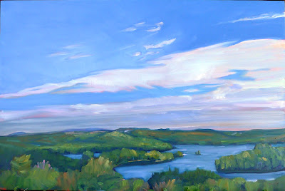
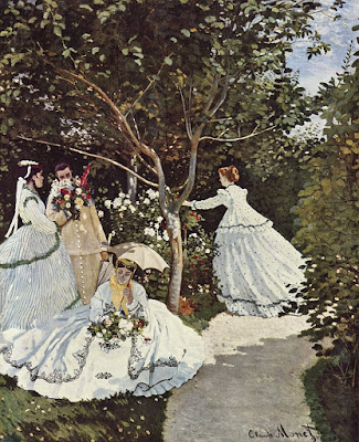
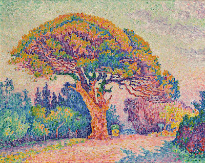
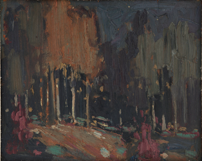
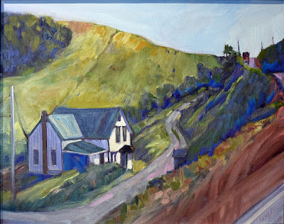
The Servant, Carol L. Douglas, is on display at the Rye Arts Center for the month of March.

There is nothing that worries me more about the future of our democracy than Daylight Savings Time. It serves no practical purpose and disrupts our sleep schedules twice a year. Yet we can’t seem to get our corporate act in gear and rid of it.

I don’t just say that because I forgot to reset the clock on the coffee-maker last night.

This week I’ll be teaching my classes to mix and use a variety of skin tones. The actual mixing is fairly simple; there’s a complete chart just below that will get you to every color you might need. It’s the application that’s so fascinating and difficult.

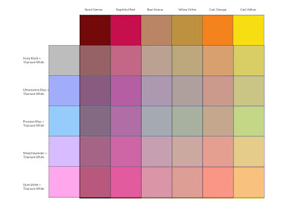
There are darker and lighter people, of course; to catch their color, just adjust the amount of white (or water) you use. There are also warmer and cooler skin tones. That’s why my chart has different rows. If your model is more olive, stick with a row that gives you more green tones. If pinker, choose a row that tends in that direction. You don’t need to mix all these colors for each model; it’s just a guide to set you in the right direction.

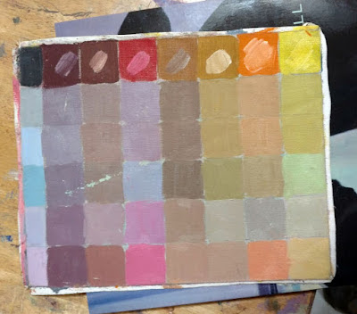
My original painted chart is ratty and worn but I also included it so you can see what the colors look like in paint rather than Adobe Illustrator.

Natural light hitting the human skin is far more variable than we see indoors. We live (and paint) under artificial light. That narrows the color range dramatically, which is why painting the model under spotlights is poor practice. Photography also narrows the chromatic range of human skin. However, painting from life in natural light is not always possible.

There are greens, purples, and yellows in every person’s skin. The ears, face, fingers and toes all tend to pink; there’s blood closer to the surface. Some of us have visible traceries of blue veins. There are lovely greens and mauves in shadows. In fact, the only difference between my landscape palette and my studio palette is that red always makes an appearance inside.

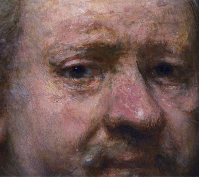
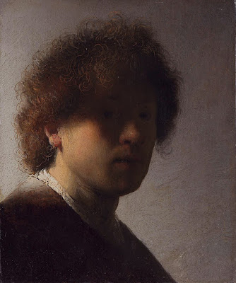
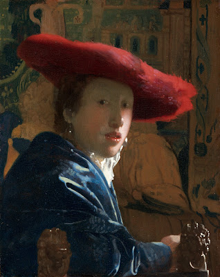
Self-portrait at the age of 63 (detail) Rembrandt van Rijn, 1669, National Portrait Gallery

Rembrandt was a master at capturing these subtle, varying colors in the human skin, as shown in the detail from his last self-portrait, above. He did this with the narrowest of palettes—essentially earth pigments with white. And yet he fools us into seeing a whole range of colors including blues and greens.

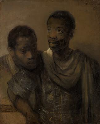
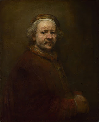
Rembrandt also painted Two African Men, below. Unfortunately, its surface is in such bad repair that it’s impossible to see what colors he saw in their skin. However, he would have used the same paints as he used in his own self-portrait. They’re all he had available.

Two African Men, 1661, Rembrandt van Rijn, courtesy Mauritshuis

Our actual skin color is based on just one pigment, melanin. Lighter people just have more blue-white connective tissue and hemoglobin showing through.

We talk of Asians as having ‘yellow’ skin. That’s a modern lie. In the 13th century Travels of Marco Polo, the people of China are described as white. Eighteenth century missionaries also called Japanese and other East Asians white.

The ‘yellow’ label can be laid squarely at the feet of science. The father of modern taxonomy, Carl Linnaeus, first used the label fuscus (dark) to describe the skin color of Asians. Later, he began calling them luridus instead. That translates to ‘pale yellow’, ‘wan’, ‘sallow’, ‘lurid’—with a dash of ‘horrifying’ attached.

The father of comparative anatomy, Johann Friedrich Blumenbach, used the word gilvus, which translates to ‘yellow’. (He’s also the guy who started calling Asians ‘Mongolians’.) By the nineteenth century, westerners were completely sold on the idea that Asians were yellow. Thanks, Science.

The farther down the Italian boot you go, the more you find genetic mixtures with Greeks, North Africans and Middle Easterners. That’s no surprise; the Mediterranean was the original melting pot. Southern Italians and Greeks are often very dark in color. 

It’s no surprise that neither were considered quite white in 19th century America (although they had that designation for naturalization purposes). In fact the largest mass lynching in American history was of Italian-Americans. What’s more peculiar is that some people didn’t consider Irish-Americans white, either.

We all know race is an artificial construct, yet we persist in using it anyway. Paint-mixing shows us that the similarity in our coloration is far greater than the differences. Race isn’t skin-deep; it doesn’t exist at all.

Monday Morning Art School: that sinking feeling

Over time, the dark passages in an oil painting can grow hazy. In watercolors, the beautiful, jewel tone on the palette can look flat and dull after the paper dries. That’s ‘sinking’ color, and an ounce of prevention beats a pound of cure.

Clear Morning on Bunker Hill, 24X36, $3985 framed.

Oil painting: Sinking is caused by the displacement of the oil in the top layer. It’s most obvious in dark passages, but that’s only because the dusty haze is most visible there. It appears slowly over time—a painting that was once exuberantly colorful is suddenly dull. The different drying times of pigments means that color will sink unevenly across the canvas, giving it an irregular, blotchy look. Details that were once subtly beautiful will disappear.

Sinking can be repaired by oiling out or varnishing, but this may need to be repeated to keep the painting beautiful. If a painting is sold, you have no idea if it’s losing its color. It’s far better to do it right in the first place.

Tom Sawyer’s Fence, 14X18, $1275 unframed.

Sinking has three common causes:

Too much solvent—the painter has not mastered the art of using unadulterated paint or painting mediums in the top layer. He relies too much on odorless mineral spirit (OMS) to get good flow. The OMS takes the place of the linseed oil binder and then evaporates. That leaves the pigment particles isolated, with no oil surround. Air doesn’t have the same refractive index as linseed oil, so a pigment that looks dark and beautiful in solution looks dull and grey when the binder disappears.

Not enough oil in the top layer of paint—this is why we keep repeating that old saw, ‘fat over lean.’ There’s enough oil in modern paints to make a solid top layer, but only if applied in proper thickness. If you want to paint thin, you must cut your paint not with OMS but with an oil-based medium.

Over-absorbent grounds—acrylic gesso is more absorbent than oil gesso, but a well-prepared acrylic ground is fine. However, a very inexpensive board may not have enough ground to stop oil from seeping through. An aftermarket coating of gesso is a good cure. Non-traditional grounds like paper and raw fabric need very careful preparation.

Bunker Hill overlook, full sheet watercolor, available. One of the advantages of Yupo is that there is no sinking.

Watercolor: “The difficulty in watercolors is not that it is ‘unforgiving’, as amateurs widely misbelieve: it is that it begs for fussing,” wroteBruce MacEvoy. That fussing takes the form of overworking passages. Alla prima, or ‘on the first strike’ is vital in watercolor.

We want the pigments to stay on the top of the paper, rather than sink into it where they can’t be seen. The cellulose fibers of watercolor paper were laid down in a stiff mat so that pigments will sit nicely on top. Reworking wet-on-wet, scrubbing, and other repairs cause the fibers to unravel, creating a microscopic forest of random threads. Paint sinks into its crevices. The color is duller and, worse, blotchy.

The deck of American Eagle, from my sketchbook from Age of Sail workshop

Most watercolor paper is coated with gelatin or other sizing. This controls its absorption of paint. When you do a preliminary wash of color, you’re wetting the paper along with establishing primary shapes. If this wash layer is allowed to dry completely before the next layer is applied, the water and paint mix with the sizing and create a new layer, comprised of binder, sizing and pigment. That new, dense sizing layer can help hold successive layers of paint on the surface.

But if you ‘lick’ the wet paper constantly with your brush in an attempt to control minor flaws, you interrupt this process. Unless the paper dries completely between approaches, each pass with the brush lifts more paper fibers. That disturbance increases the capillary action that draws the pigment deeper into the paper. Overworked passages look dull and fuzzy.

Of course, the type and quality of the paper you use matters. Hot press paper is more tightly-compacted, making it more tolerant of overbrushing. Cold-press paper has less sizing and looser fibers. It tolerates less fussing.

Monday Morning Art School: is that painting finished?

Our hectoring superegos are not always the best judges of painterly quality.

Self Portrait with Disheveled Hair, 1628-29, Rembrandt van Rijn, courtesy Rijksmuseum

In my studio, there are more than a hundred unfinished paintings in drying racks. I’d feel bad about that, except that most plein air artists I know store up unfinished pictures like squirrels store nuts. We say we’re going to work on them during the winter, and sometimes we do. Other times, we just go out and start more paintings.

There is another stack on the other side of my studio. These are paintings I’ve either decided aren’t first rate or that I won’t ever bother to finish. I periodically go through them with the intention of winnowing them down. Often, I’m surprised that they’re actually not bad at all.

Self Portrait at the Age of 63, 1669, Rembrandt van Rijn, courtesy National Gallery, London

“Ah, a procrastinator,” you might say, but you’d be wrong. I’m actually disciplined in my work habits. I’ve just learned to trust my subconscious more than I did as a younger person. Twenty years ago, I thought a painting was finished when it achieved the effect I was striving for. Today a painting is finished when I’m sick of working on it. I’ve learned to be less critical of myself. My hectoring superego is not always the best judge of painterly quality.

The division between brilliantly-raw and plain-unfinished is highly subjective. That line often changes over the course of an artist’s career. Paul Cezanne’s paintings of Mont Sainte-Victoire done in the 1880s are significantly more refined than those done from 1904-6. Rembrandt’s youthful Self Portrait with Disheveled Hair is an amazing exercise in chiaroscuro, but the brushwork is much tighter than his Self-Portrait at the Age of 63 (the year of his death). The changes in Claude Monet’s final paintings are usually blamed on his failing eyesight, but they are also the culmination of a career-long path toward looser, more audacious painting.

Women in the Garden, 1866–1867, Claude Monet, courtesy MusĂ©e d’Orsay

That is not to say that every artist becomes looser as they age. Grant Wood painted in the same precise style until his death of pancreatic cancer at age 51. Of course, we have no idea how he might have painted had he lived longer. The same is true of Caravaggio, who only made it to 39. On the other hand, Titian, who lived until his late eighties, spent his last years as an impossible perfectionist. He returned to older works and repainted them, fixed up copies made by his students, and kept some paintings in his studio for more than a decade of tweaking—all of which must give art historians the vapors.

The difference lies in what drove these artists in the first place. Cezanne, Rembrandt and Monet were never interested in a high degree of finish, but rather in the effects of paint. The culmination of their efforts was looseness. In contrast, Caravaggio, Titian, and Wood were what we call linear painters, interested in creating the illusion of three-dimensional space through careful modeling. For them to suddenly become interested in dynamic brushwork would have been a complete repudiation of their life’s work.

Weeping Willow, 1918–19, Claude Monet, courtesy Kimball Art Museum

One of the cliches of art instruction I particularly hate is, “Not another brushstroke! Don’t overwork it.” Nobody else can tell you positively that your painting is finished, because nobody else knows your intentions. We can engage you in dialog and help you clarify your thinking. But the only legitimate judge of whether you’re done is you, the artist. 

I have found that when I can’t finish a painting, the best thing I can do is to set it aside. Sometimes, my skills aren’t up to the effect I was trying to achieve, and I need to practice. Sometimes I don’t know how to finish it, and I need to think. Sometimes it’s a lousy painting, and it belongs in the reject pile. And sometimes a period of reflection reveals that the painting was, in fact, finished all along.

Monday Morning Art School: get to that color fast

To paint with assurance, you need to be able to mix colors effortlessly. These tips will help you get there.

Peppers, by me. Cool light, warm shadows.

Start with an organized palette. I paint with my pigments moving from blues on the left through reds and yellows, followed by the three earth pigments to the far right. White is at the bottom. My particular system isn’t what’s important. But always put paints in some kind of logical order and in the same spot.

These basic rules make mixing easier:

  • Never try to paint with hardened paints;
  • Squeeze out enough paint;
  • Put out every color, regardless of what you think you’ll need. Every painting should have a broad range of colors in it, regardless of the subject;
  • Put out more of each color when you use it up, not when you think you’ll need it again;
  • Start mixing each color with the closest match on your palette, and adjust from there;
  • Add small amounts of paint as you adjust the mixture.
Jamie Williams Grossman‘s lovely painting and palette in the Hudson Valley style, showing color strings. Photo courtesy of the artist.
A color string is a set of premixed paints, usually modulated with white or another light color. Artists sometimes mix a series of these starting from each base color. In the Hudson Valley, you’ll sometimes see artists working from vertical palette boxes containing a slew of these premixed colors.

I use a simpler variation of that idea. I make mid-tone tints of each pigment. Different pigments may look the same when squeezed out of the tube, but there the similarity ends. Knowing how a pigment works when tinted with white is critical. Moreover, these tints become the backbone of a bright finished painting. 

A matrix is a color string in 3-D.

In watercolor, the equivalent is tonal steps, or how the pigment acts in different dilutions. You can’t premix them, but you should understand them.

Before you lift a brush, premix three colors for each major object:

  • A light tone, the color of the lightest side of the object;
  • A mid-tone, which is the local color of the object;
  • A dark tone, which is the deepest color.

These should be fairly close in value. For the extremes, you’ll use your global shadow and highlight colors.

In the example at top of the page, the light is cool—you can tell by looking at the tray. There is a warm dark shadow, a ‘true’ mid-tone, and a cool light color for each pepper. The tray is black. Since the shadows are warm, they’re a reddish black. They were made by tempering burnt sienna with ultramarine blue. The highlights are pale blue.

Start by getting the value right first. That’s usually the most difficult part. You can’t raise the chroma of a paint, so if you get it too neutral, set it aside and start again. If it’s too intense, mix in a bit of its complement.

My palette, diagrammed by Victoria Brzustowicz. I generally don’t use red in landscape painting.

Black has a role in painting, but it’s not in making grey. If you need grey, make one by mixing two complements. Greys are never totally neutral in real life; they always have overtones of color. Start by figuring out what that is. Then start from that color, and add its complement until you hit the perfect neutral note.

Once you’ve mixed your color ‘puddles’, look at them as a whole. How do they go together? Which do you want to emphasize?

Keuka Lake, by Carol L. Douglas. Available.

I use a green matrix for painting foliage. Otherwise, greens can be oppressively monochromatic in high summer. Remember those tints I had you mix? You can use them to modulate these greens into hundreds of different shades. Just use blues and violet tints to drive the greens back in space, and yellows and oranges to bring them forward.

By thinking through color relationships before you start painting, you can keep them consistent and unified. As time goes by, you’ll learn to do this intuitively. However, when I muck up a painting, it’s almost always because I haven’t really thought the light and color structure through.

This was originally posted in 2020.

Monday Morning Art School: why copy a masterpiece?

Think of it as getting a painting lesson from the masters.

Great Springs of the Firehole River, by Thomas Moran, 1871, is one of the paintings my students will be copying this week. Courtesy National Park Service.

If you visit art museums regularly, you may have seen students set up to copy masterpieces. Or, you’ve seen copies made by great artists of other artists’ work. What were they trying to accomplish?

Vincent van Gogh admitted himself to the Saint-Paul asylum in May, 1889. He painted around 150 canvases there, including the iconic The Starry Night. He also made about thirty copies of masterworks of others.

“I started making them inadvertently and now find that I can learn from them and that they give me a kind of comfort,” he wrote. “My brush then moves through my fingers like a bow over the strings of a violin – completely for my pleasure.”

The Champion Single Sculls (Max Schmitt in a Single Scull), by Thomas Eakins, 1871, is one of the paintings my students will be copying this week. Courtesy Metropolitan Museum.

Copying masterworks is a time-honored way of learning, both in western traditions and in others. Transmission by Copying is one of the six principles of Chinese painting laid down by the Chinese art historian Xie He in 550 AD.

“Nobody is born with a style or a voice. We don’t come out of the womb knowing who we are. In the beginning, we learn by pretending to be our heroes. We learn by copying,” wrote Austin Kleon.

The Pine Tree at Saint Tropez, by Paul Signac, 1909, is one of the paintings my students will be copying this week. Courtesy Pushkin Museum.

Copying is a way to study and evaluate a painting that’s far more immersive than simple looking. It enables us to understand another artist’s process. It forces us to consider what we find admirable in art in general. And it teaches us brushwork.

Most importantly, it sets aside our own need to tell a story. That liberates us from the frustration of our own limitations. We can concentrate on composition and color instead of being fully engaged in the problem-solving of unique subject matter.

It makes sense to copy works you admire. If you’re drawn to the paintings of the Canadian Group of Seven, don’t copy a Titian. You’re going to be paying a lot of attention to the painting you copy. It should be something you really love.

Today, we have a technical advantage over Van Gogh, locked up as he was. We can easily retrieve high-quality images from the internet. Many museums even have scalable images on their websites.

You must be able to see the brushwork to fully immerse yourself into the work. (Of course, if you’re copying a linear painter like Bronzino, there may not be much visible brushwork to copy.)

Woman with a Parasol, Turned to the Left, by Claude Monet, 1886, is one of the paintings my students will be copying this week. Courtesy MusĂ©e d’Orsay.

What you can’t see on the internet is the dimensionality of the painting, its impasto, so that is one area where you’ll have to interpolate.

“I was surprised at how small the Mona Lisa is,” is a common sentiment about one of the world’s most-copied paintings. It’s important to know how large the work you’re copying is, even if your copy is going to be very small. The brushes appropriate to a massive painting are not appropriate to a miniature, and that will affect your interpretation.

Mona Lisa shows that paintings can undergo significant changes through restoration, fading, or the appearance of pentimenti. She once had eyebrows and eyelashes and was lighter in color; all those changes have occurred in the 500 years since Leonardo set down his brush. That doesn’t mean we can’t learn from copying her, but it’s something we should be aware of.

Monday Morning Art School: the color of light

In winter, we’re in warm light from sunup to sunset, because the sun never really climbs very high in the sky. That’s our payoff for putting up with this weather.

Three photos of the golden hour, courtesy of Jennifer Johnson

The golden hour is that period after dawn and before sunset when the light is warm and the shadows are long and blue. The farther north you go, the longer the golden hour lasts. In winter in the northern United States, we’re in warm light from sunup to sunset, because the sun never really climbs very high in the sky. That’s our payoff for putting up with this weather.

Most of us prefer to paint that winter light from the comfort of our studio, but cameras lie. That’s the same black glove, below; the image on the left is with a cellphone camera and the one on the right is with a DSLR. In attempting to correct exposure, the cellphone is interpreting that black as purple.

Two photos of a black glove, courtesy Dwight Perot

So too does your eye-brain connection see things interpretively. You may see the same blue shadows in the three photographs at top, but I’ve sampled them and they’re not the same at all. In fact, they’re not even blue, but rather three variations of a soft blueish-grey. Your mind is interpolating what it knows to be true, which is that those shadows are cool. In this case it’s better to trust your mind than the hard ‘facts’ of camera and laptop.

Looking for Shellfish, JoaquĂ­n Sorolla, 1905. A warm light comes from our side of the figure, but there are warm shadows—the result of local color reflection from the rock. Likewise the bottom half of the torso reflects strong cool tones from the water and anchors the boy into the sea.

What we call light is really the narrow band of electromagnetic waves that our retinas can perceive. This narrow band is comprised of the colors of the rainbow, or what we sometimes call ROY G BIV. (There really isn’t an indigo; it’s there so that Roy has a pronounceable surname.) Each of Roy’s color names corresponds to a specific wavelength. For example, blue is about 475 nm; red is about 650 nm.

When the whole visible light spectrum strikes your eye at the same time, you perceive white. This is not a color in itself, but the admixture of a bunch of colors. In the real world, this is never a pure mix. The atmosphere bends light just like a prism does, so what you see is always tinted. The light might be gold and peach at sunset and cool at midday. Impurities in the atmosphere also give us the energetic indigo-violet of the far distant hills.

Valencian Fishwives, JoaquĂ­n Sorolla, 1903. Here the light is cool and the shadows are warmer.

The farther away something is, the more likely dust has filtered out the longer wavelengths, i.e., the warm colors. That’s why your plein airpainting teacher keeps telling you that the reds drop out first, then the yellows, leaving you with blue.

Just as all the colors together form white light, the absence of light is total blackness. But unless you’re in a cave or darkroom, that’s a theoretical construct. There’s always reflected light bouncing around in the shadows, and that light gives the shadows its color. It’s never black and it’s unlikely to be grey, either.

Return from Fishing, JoaquĂ­n Sorolla, 1894. The light is warm, the shadows are cool, and the places where the light is going through the sails are warmer still, since they’re filtered by the off-white fabric.

If the color of the light is warm, the color of the shadows is almost always going to be cool, and vice-versa. Knowing this and identifying the color of the light and shadow is the first step to a good landscape painting.

The exception to this is an object in filtered light. Its shadows and lighter passages will be variations of the same color temperature. This is how we instinctively know that something we’re seeing is under an awning, for example.

Catalonia: the Tuna Catch, from Visions of Spain, JoaquĂ­n Sorolla, 1919. In this case, most of the painting is in shadow, and what light there is, is filtered through the yellow awning. It is the distortion of the light-dark color scheme that tells us viewers that we are in an enclosed space.

Study the Spanish painter JoaquĂ­n Sorolla to understand the color of light. He was a master at painting white fabric in a variety of circumstances, and comparing the light passages to the shadow passages will tell you much about managing the color of light in your painting.

Monday Morning Art School: deadlines

Sometimes it’s not fun. Sometimes it’s almost painfully stressful. What do you do then?

Home Farm, oil on canvas, 20X24, Carol L. Douglas

At my first plein air competition, I was a nervous wreck. “Come on, Carol,” my exasperated friend said. “Get a grip! You know how to do this.” At that moment, that wasn’t exactly true; I’d forgotten everything I ever knew about paint.

For some of us, commissions result in painter’s block. For others, plein air competitions are painfully stressful. Occasionally, I’ll have a student who freezes in my workshops. I used to suffer terrible performance anxiety, which is why I’m a painter and not a musician. As I’ve gotten older, I’ve found ways to cope. These strategies are also applicable to life in general.

Jack Pine, 10X8, oil on archival canvasboard, Carol L. Douglas

The first of these is to have a plan. It may seem counterintuitive to go into a painting with a process mapped out, but in fact that’s what you have to do to complete any project within an allotted time. Not having a plan is the luxury of the dilletante.

When I flew to Edinburgh to paint a portrait in 2018, I had a deadline imposed by my plane tickets. I planned how long I had for the charcoal drawings, how long for the underpainting, and how long to finish the top coat. When I did Quick-Draws for plein air competitions, I knew I must finish the drawing and underpainting in the first hour in order to finish the top layers in the allotted time.

You might think that a flow plan is inhibiting, but it’s exactly the opposite. I learned this many years ago while painting a portrait commission for my late friend Dean. It was a surprise birthday gift for his wife. That meant a precise deadline, which he never let me forget. As I worked, I found the tight schedule liberating. I couldn’t perseverate and noodle endlessly on passages. That, in turn, meant freer, better brushwork.

Evening in the garden, 9X12, oil on archival canvasboard, Carol L. Douglas

Playwright Robert More was finishing a comedy when I last saw him. “I can rewrite this ending eight times, and the last one won’t necessarily be better,” he told me. “I’ll just end up with eight different versions.”

Having a set protocol is invaluable for quelling nerves. In addition to providing consistent results, it focuses your mental energy on the doing, rather than on worry.

Once you’ve established a painting process, practice it repeatedly—not concentrating on the results, but on mastering the process. Being absolutely prepared is the best cure for performance anxiety. This is the great benefit of painting-a-day schemes; they’re not about producing great artwork, but about getting a hammerlock on your process.

As you go on, stop thinking about all the ways you can screw up the painting. Instead, think only about the phase you’re in. If something goes wrong, don’t berate yourself. Above all, ignore the voices in your head that tell you you’re no good. They’re wrong. Instead, ask yourself where in your process you made a wrong turn.

Main Street, Owl’s Head, oil on linenboard, 16X20, Carol L. Douglas

In other words, develop enough self-awareness that you can monitor your own progress. When I’m nervous, I develop a tic of constantly rinsing my brush. That’s a mud-making mistake in any medium. Because I know I do it, I can stop it before it’s out of hand—and ask myself what’s gotten me upset.

Even in pressurized painting situations, take time to eat decently and get some exercise. Exercise lifts the mood and reduces anxiety.

Above all, don’t waste time worrying about whether the client will like the work, or whether you’ll make a sale or win a prize. Focusing on the results, rather than the process, can effectively kill a painting.

This is a rewrite of a post that first appeared in 2019.

Monday Morning Art School: the nocturne

Forget the fairy-lights; a good nocturne follows the same rules as any good painting.

Hunter’s Supper, c. 1909, Frederic Remington, courtesy National Cowboy and Western Heritage Museum
Nocturne is a term appropriated by James Abbott McNeill Whistler from music. Whistler used it to title works that evoked the sensation of nighttime or twilight. It didn’t mean just any painting done at night. The difference was whether the absence of light plays a role in the painting’s construction and meaning.

Prior to the Industrial Revolution, the night was a more powerful force than it is today. It’s no surprise that nocturnes have always had a place in art. Giotto’s The Kiss of Judas (c. 1304) is an early example. By the 15thcentury it was a tradition to set the Nativity and Annunciation to the Shepherds as night scenes, pitting the Light of the World against darkness for dramatic effect.

Nocturne in Black and Gold – The Falling Rocket, 1874, James Abbott McNeill Whistler, courtesy Detroit Institute of Art

The 17th century brought us chiaroscuro, tenebrism and three great interpreters of darkness: Rembrandt van Rijn, Georges de La Tour, and Caravaggio. In modern terms, most of their paintings aren’t considered nocturnes, because they’re set indoors. But they are nocturnes in spirit. Darkness is palpable and part of the message; it sits in counterpoint to the main theme.

It wasn’t until landscape painting came into its own that we started to see the development of true nocturnes under Whistler’s definition. Ironically, artificial light played a big part in this; it made it possible to paint at night.

Nocturnes are particularly associated with Tonalism, which eschewed the bright colors of Impressionism and Post-Impressionismin favor of neutral colors, diffused light, and soft outlines, all of which naturally suggest low-light situations.

Frederic Remington did about 70 paintings which we might properly call nocturnes before his premature death at age 48. He was very scientific and technical in his approach, which is no surprise for an artist who started as an illustrator.

Nocturne, c. 1914, Tom Thomson, courtesy Art Gallery of Windsor

Remington’s nocturnes are filled with color and light. Their composition is complex, often involving a foreground figure in silhouette, setting off the light source. He experimented with electric lighting and flash photography to make his paintings. That’s ironic in that they’re an elegy for the rapidly-disappearing pre-technological way of life. If you’re interested in the nocturne, the National Gallery’s The Color of Night is an excellent reference book.

Study Remington’s compositions; they’re energetic and well-realized. Too many nocturnes rest on the time-worn device of reflected light. These can be part of a great painting but they won’t carry the whole construction. A good nocturne follows the same rules as any good painting: it rests on a solid composition, it has an integrated color scheme, and its brushwork engages the viewer. If you don’t have those three things, go back to the drawing board.

Painting nocturnes en plein air requires a light. I have a cheap battery-operated book light; other artists use head lamps. The level of illumination should be kept as low as possible so that you don’t blind yourself to what you’re seeing.

Nocturne, c. 1885, watercolor, John La Farge, courtesy Metropolitan Museum of Art

Plein air nocturnes are especially difficult in watercolor. Night air is damp, so paper doesn’t dry well (or at all). Watercolor is simply not designed for large masses of opaque darkness. Sometimes artists use ink instead of watercolor in the darkest passages; I’ve tried it and find it deadens the painting. In general, I’d suggest the watercolor artist start by drawing and move over to paint in the studio.

However, the above painting by John LaFarge suggests a workaround. He uses a medium blue in the place of black, and the viewer’s mind makes the substitution. It’s transparent enough that it would dry in the night air. A nocturne need not always be about the dead of night; it can be of twilight and dawn, too.

Regular readers know that I’m no longer taking beginning students, except in my boat workshops. Bobbi Heath is offering classes to new students in oils, and Cassie Sano has started her first session with watercolor (to rave reviews, I might add)

Bobbi’s classes are pre-recorded so students can go at their own pace. I am intimately familiar with her teaching style and material and know that you will be ready to paint with me when you’ve finished her program.

You can learn more here.

Granite State Gallery: New Hampshire Art and Artists through the Years will look at the history of New Hampshire’s native painters and visitors. It’s tonight at 6 PM, which means I can’t watch it live, so I sure hope they record it.

Monday Morning Art School: why study art history?

Understanding the major movements in western art will make you a better painter.

Yo Yos, 1963, Wayne Thiebaud, courtesy Albright-Knox Art Museum. This, I think, is the first Thiebaud canvas I ever saw.

Wayne Thiebaud passed away on Christmas Day at the age of 101. Thiebaud is best known for his pop-art still lives of everyday objects, but should be equally remembered for his superlatively-drawn landscapes. He worked right into his centenary year, and that in itself should be a lesson to us all.

I regularly haul him out in class as an example of paint application, controlling edges, simplification and draftsmanship. Now he has crossed over from being a working artist to being an Old Dead Master, but his voice as a painter and teacher is not stilled.

Girl with the red hat, Johannes Vermeer, c. 1665-7, courtesy National Gallery of Art. No painting better demonstrates how to intentionally control the viewer’s eyeballs.

I had the fortune of growing up near a good art gallery which, moreover, was free. There were gaps in its collection, of course, because Seymour Knox was monomaniacal about abstract-expressionism. However, Paul Gauguin’s Yellow Christ, James Tissot’s trophy wife, the Buffalo newsboy, the little Charles Burchfield watercolors and huge Clyfford Stillabstractions are all imprinted in my memory, stroke by stroke. I’m sure they’ve influenced my painting.

There is no substitute for time spent in art galleries, but there is—equally—no substitute for time spent understanding the major movements in western art. It will make you a better painter.

I think of this every time I meet a new student stuck in indirect painting. It’s how I learned, since a small mania for Rembrandt had blossomed in mid-century (and continues to throw up shoots here and there).

Portrait of George Washington (The Athenaeum Portrait), 1796, Gilbert Stuart, courtesy Museum of Fine Arts

There’s absolutely nothing wrong with indirect painting, but in 2021, it’s a nod to the past. Perhaps some great genius will come along and divert the course of art history back to glazing (as, in a way, Andrew Wyeth did for realism). Or, more plausibly, an advance will be made in paint technology that drives a style change.

But right now, you may as well lecture in Attic Greek for all the influence you’ll have if you pursue indirect technique. We’re in an age of alla prima, bravura brushwork and brilliant color. One may be contrarian and reject that, but it’s at least helpful to know where you stand.

I vividly remember my first class with Cornelia Foss. She set me the task of drawing and painting an orange. When I was finished, she said, “If this was 1950, I’d say, ‘brava’, but it’s not,” the implication being that I needed to get with the times.

Napoleon I on his Imperial Throne, 1806, Jean-Auguste-Dominique Ingres, courtesy MusĂ©e de l’ArmĂ©e

There’s probably not a lot that hasn’t been tried with oil paint. Tonalism involved a lot of dabbling, including glazing with experimental substances. Many canvases by Albert Pinkham Ryderand Ralph Blakelock have deteriorated beyond recognition. Knowing this would save a lot of anguish going forward.

Equally, there are brilliant technical skills that can be best mastered from looking at Old Masters. Nothing demonstrates edge control better than Vermeer’s Girl with a Red Hat, for example. Some of my students are currently on an Edgar Payne journey. They’ll learn more from studying his canvases than I can teach with all my bloviating.

But, beyond that, art can teach social history as well as any lecture. Think of Gilbert Stuart’s unfinished portrait of George Washington, the one which became our one-dollar bill. Compare its austerity with its contemporary, Ingres’ Napoleon I on his Imperial Throne and you have all the difference between the French and American Revolutions in a nutshell. I don’t know what any teacher could say that would improve on that.

Monday Morning Art School: the opacity of paints

To understand refraction, just remember that hideous invention of the 1970s, the wet t-shirt contest.

The Logging Truck, 16X20, oil on linen, on exhibit this month at Camden Public Library.

Opacity (or ‘hiding strength’, if you prefer) is a simple way of describing a paint’s refractive index. Opaque pigments refract, or bend, more light. Transparent pigments (which really ought to be called ‘translucent’) allow light to pass through to bounce off the substrate before it returns to you. Understanding the opacity or transparency of your paints gives you more control in color mixing and glazing. This is obviously important for watercolors, but it matters in oil paints and acrylics as well.

The hiding power of a paint is also dependent on the ability of a pigment to absorb light. That’s why black is opaque—it’s bouncing no light back at us. For most pigments, it’s a combination of these two properties—the ability to absorb and scatter light—that give us opacity.

Mountain Path (the Susurration of Dried Leaves), 11X14, on exhibit this month at Camden Public Library.

Most 20th century pigments, like ultramarine, are milled very small. They have a particle size of less than 1 micrometer (something akin to white flour). Milled mineral pigments can have particle sizes of over 100 micrometers (more like sand). Moreover, the size of these mineral pigments isn’t consistent; they are, after all, basically ground-up rocks. Some of these mineral pigments can cause an effect called granulation, which watercolor painters prize.

In watercolor, smaller particle size gives you higher tinting strength, more transparency, and more staining, because the pigment particles more easily penetrate the paper. In oils and acrylics, smaller particle sizes make the pigments more transparent and saturated. In watercolors, there’s just less pigment covering the paper, which allows the paper to show through. Even opaque pigments look more transparent when diluted, although they do not usually excel at being treated like transparent pigments.

Spring Allee, 14X18, on exhibit this month at Camden Public Library.

That brings us to the question of paint quality. Students are often instructed to ‘buy good paints’ without any idea why that is important. Pigment load is the primary consideration. Manufacturers make paint more cheaply by adding less of the good stuff. Compensating for inferior pigment load can build bad habits in the beginning painter. Buy a good student-grade paint from a good manufacturer, like Gamblin, Winsor & Newton, or Grumbacher.

The boiled linseed oil you buy at the hardware store is never appropriate for oil painting. It darkens and turns yellow with age.

A pigment’s natural refractiveness is only one consideration. The binder it’s suspended in also affects what’s refracted. You have only to think of that hideous invention of the 1970s, the wet t-shirt contest, to understand this. (And then ask yourself: what the #@$ were those young women thinking?) A t-shirt that appears opaque when dry will suddenly become transparent when wet. Air does not have the same refractive index as water. That’s why watercolor shifts in color as it dries.

And of course, acrylic and linseed oil binders also play a role in refraction. They never disappear on drying, so their refractive index, if close to that of the pigment, can render some paints permanently transparent.

Evening in the Garden, 9X12, is on exhibit this month at Camden Public Library.

We know that, as linseed oil ages, the refractive index increases. This can cause oil paint to lose its hiding strength, which is why we see pentimentiappearing hundreds of years after masterworks were painted. To avoid this, painters need to learn to use sufficient quantities of paint. And, of course, acrylics, alkyds, and water-miscible oils have not been around long enough to have any track record on the subject.

Most paints fall somewhere in the middle of the continuum of opacity and transparency. The most opaque are titanium white, carbon black, raw sienna, burnt umber and yellow ochre. We typically use white to create opacity, but there are times when its lightening properties make that inappropriate. In those instances, one of the other opaque pigments is appropriate.

Zinc white, sold as China white to watercolor painters, is not as opaque as titanium white. (It’s also more brittle.) That’s why its application in oil painting is limited to glazing, but is also why it’s so useful in watercolor.

(I have two more openings in my Tuesday AM online class and one in my Monday night class, starting January 3-4. If you’re interested, the information is here.)