Monday Morning Art School: How to scale up a small sketch

When working big, start with a smaller sketch and grid it up. It’s easy.

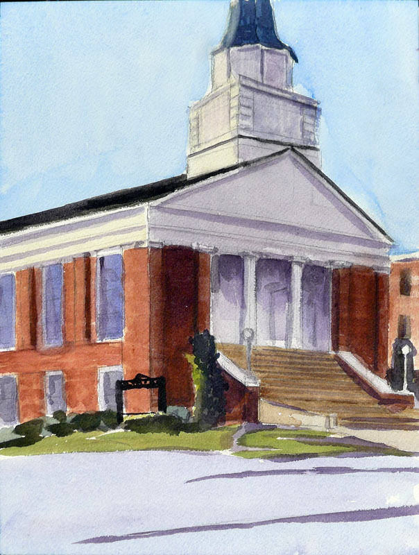
A large canvas transferred from a 9X12 sketch.
The largest I generally work is 60X60. This is too large to draw directly, as I can’t get far enough away to see the whole thing as I’m drawing. When I’m working this big, I always do a smaller sketch in oil or cartoon in graphite first. Then I scale it up. This prevents proportion distortion.
I have a projector, but I find that gridding is more accurate and takes less time.
I realize many artists are math-phobic, but there are times when an small bit of arithmetic can save  you a lot of work. I’ll try to make this painless.
The first step is to work out whether the aspect ratio of your sketch is the same as the canvas. This is the proportional relationship between height and width.
Usually I grid in Photoshop because it’s faster and I can just delete the lines with a keystroke. But you can grid just as well with a pencil on your sketch.
Sometimes this is very obvious, such as a 9X12 sketch being the same aspect ratio as an 18X24 canvas. But sometimes, you’re starting with a peculiar little sketch drawn on the back of an envelope. You can use a trick you learned back in elementary school.
Remember learning that 1/2 was the same as 2/4? We want to force our sketch into a similar equivalent ratio with our canvas.
Let’s assume that you’ve cropped your sketch to be 8” across. You want to know how tall your crop should be to match your canvas.
Write out the ratios of height to width as above.
To make them equivalent, you cross-multiply the two fixed numbers, and divide by the other fixed number, as below:
Use your common sense here. If it doesn’t look like they should be equal, you probably made a mistake. And you can work from a known height as easily as from a known width; it doesn’t matter if the variable is on the top or the bottom, the principle is the same.
The next step is to grid both the canvas and sketch. You could spend a lot of time calculating the distances, but I prefer to just divide it in even amounts in each direction. I use a T-square and charcoal, and I’m not crazy about the lines being perfect; I adjust constantly as I go.
The last step is to transfer the little drawing, square by square to the larger canvas. I generally do this with loose paint, in raw umber. It’s time-consuming, but with big paintings it saves a lot of work in the long run.
(This was originally published on January 31, 2014 and was revised and updated for this post.)

Monday Morning Art School: how to draw windows and doors that fit

 The South sure loves its Greek Revival pillars, doors and windows. Here’s a little trick to draw them evenly.

My painting of Siloam Baptist Church from last week.

The South also observes Blue Laws. That meant I wasn’t able to get a replacement sketchbook at Hobby Lobby yesterday. I drew these on tissue paper; the quality is terrible.

Earlier, I taught you how to draw a door in basic perspective. The door makes a shape called a trapezoid. (Don’t be frightened; that’s as mathematical as we’re going to get here.) When drawing buildings, most people get basic two-point perspective right but then mess up in spacing windows and doors. Here’s a technique you can use to divide the face of any building into regular units, no matter what angle you are looking at it from.
Dividing in half
Just draw an X from corner to corner. The vertical line that runs through the middle of this X is the center of your building. This is very useful for buildings, because if there’s a pitched roof, it almost always comes down from that center point.

Dividing into thirds

Draw a star shape, starting from the bottom outside corners and running to the top-middle and the top-outside corners.
Do the same thing, upside down, so that you have a six-pointed star.
The points where the lines intersect are the thirds.
Dividing into fourths
This requires that you figure out the middle of one side of your trapezoid. Then draw a line between it and the middle-point. Now you have the horizontal center-line. It will not be level; it should hit both sides at the mid-point.
Draw your star-shape again. The points where it intersects the center line are the quarters.
Dividing into fifths

This is the most complicated and fun of the divisions. Start with a horizontal center-line as you did above.
Now you’re going to draw some crazy diagonals:
  • From the bottom left corner to the top middle.
  • From the bottom middle to the top right.
  • From the top left to the right middle.
  • From the middle left to the right bottom.

The points where those diagonals meet are the 1/5 divisions.
In practice you can divide and subdivide these units to figure out the placement of windows and doors pretty quickly. Here is my division of Siloam Baptist Church, above (yes, the bottom line was wrong; I fixed it after I took this photo):
And here is a fast division of my first drawing. I just broke the units I had into smaller ones using the same principles:
Which I then extrapolated into this purely imaginary facade of a house:
I didn’t do any of this with a ruler, but with another piece of paper as a straight-edge. Once you learn these divisions of space, they take only seconds to do. They are much easier than guessing and erasing.

Monday Morning Art School: How to paint from a moving vehicle

If you have room for a cup of coffee, you have room to paint.

I finished this sketch as the sun finally set.

I painted across Canada (the first time) in a corner of an overloaded Suzuki Grand Vitara containing four people and all my daughter’s earthly belongings. Compared to that, the passenger seat of my Prius is downright spacious.

You will need a plastic cup, water, a small watercolor kit and a watercolor sketchbook. That will all fit in a roomy pocket or a purse.
You should be carrying water when you drive. The plastic cup is just a refinement.
“But the scene is constantly changing!” you say, and you’re right. You’re going to generalize rather than draw a specific moment on the road. This teaches us about composition and reducing our paintings to their essentials.
You can’t paint while driving, any more than you can text. (I would think this goes without saying, but apparently there is no idea so bad that someone won’t try it.) This is why I ended up doing this painting on I-495 instead of on scenic Route 1. It was my turn to drive during the interesting parts.
This was the road I chose to demonstrate this technique. Not a Scenic Byway.
I-495 is a contender for America’s most boring road, except when traffic stops and it becomes one of our most irritating roads. Yesterday, its monotony was compounded by a gloomy sky, the tail end of last week’s Nor’easter. There’s a lesson in that: you can find beauty anywhere, if you look for it.
I start car paintings by studying the passing scene. What is the line or motif that is most commonly repeated?  In some cases, it’s the pitch and roll of the hills. In others, it’s the way farm buildings sprawl down hillsides. 
A generalization of the passing scene.
Usually, I look out the side window, at about the point where old cars used to have vent windows with little cranks. That gives you a view of something other than the road, while still being comfortable.
However, in eastern Massachusetts the trees grow right up to the verge. You must look forward, straight down the road. The dominant motif is the stands of trees, and the question is how they interrupt the skyline. There are occasional hills in the distance, and there are other cars.
This was the point when I realized I left my pencil on my dining room table. It’s easily replaced, but not on a freeway on a Sunday evening. Miraculously, we stopped at a rest stop and parked next to a pencil stuck in the mud. Cleaned up, it was perfectly serviceable.
Some light washes in place. I would normally use a different brush, but I want to demonstrate that this can all be done with a kit that fits in a pocket.
I needed that pencil, because I always start with a line drawing incorporating those iconic features of the landscape. A light wash established the drear of the sky and the hill in the distance. I used the tiny brush from my field kit to make the point that you don’t need a lot of tools for this. This brush is great for fine lines, but it doesn’t make good washes. I laid it on its side and scumbled the grey sky in instead. If I were using a juicier brush, I’d have run the sky below the tree line.

My pocket paint kit. You can make one out of an Altoids tin but unless you already have the paint, buying the pre-made one is actually cheaper.
Every watercolor painting needs a test sheet, because watercolor is all about density control. Luckily, you can test on the reverse of a prior page. It won’t hurt the painting on the other side. Or, if you want to conserve paper, stick a loose sheet in there and move it around as you need it.
You always need a test sheet, even when you’re messing around.
When it comes to observing details, the repetitiveness of the freeway helps. When I need a stand of spruces, there is always one more just up the road. There are dormant, deciduous trees everywhere, and Massachusetts has no shortage of rocks.
Of course, you’re not going to paint fine lines unless you’re stopped in a traffic jam. The roads in the northeast are too jarring for that. Thus, my taillights are just a suggestion, dripped onto the paper at the last minute. I finished just as the last light faded from the sky.
St. Elias Mountain Range, Yukon Territory, painted from a car in 2015.
This is a technique you can use to amuse yourself anywhere you have at least 40 minutes to kill—in a car, a train, on a plane. It’s the basis of our sketchbook technique for our Age of Sail workshop, except we’ll be concentrating on water instead of pavement. Of course, Penobscot Bay is also much prettier than a Massachusetts turnpike.
I’m on the road to Alabama and points west this week. Tonight’s destination is the lovely Blue Ridge Mountains of Virginia. Stay tuned to this spot to follow my travels. (Or subscribe above; it’s probably easier.)

Monday Morning Art School: Visual Harmony

Five classic techniques for organizing your picture plane.
Kaikroddare by Anders Zorn (watercolor) uses the principles of opposition and transition.
Arthur Wesley Dow was a painter, printmaker, photographer and well-known art teacher in the beginning of the 20th century. He felt that composition was largely a question of proportion. He identified five elements of spatial harmony:
  • Opposition
  • Transition
  • Subordination
  • Repetition
  • Symmetry
Examples of Opposition. The intersections of lines are raw and unadorned.
Opposition is a principle we see both in nature and human objects. It’s when two lines meet or cross to form a simple and severe pattern. These crossings are always abrupt, and can even be violent.
The beauty of a door lies in its unmediated opposition and symmetry.
Transition tries to mediate opposition. A line or object is added at the join, softening the moment of impact. This is a strong and ancient goal for human designers. The columns at Karnak, which were started more than 4000 years ago, are softened with decorative capitals at the ceiling. We’ve been doing it ever since, with brackets, corbels, and other architectural elements to soften stark architectural lines.
Examples of Transition. A bracket is probably the most common example we see in everyday life.
Transitions also occur in nature. A beautiful example is the overlapping, trailing silhouettes of the Blue Ridge Mountains, which are far less stark than mountains looming black against the sky.
Kaikroddare by Anders Zorn, top, uses the principles of opposition and transition. The cross of the oars and arms is unopposed in the closer figure, who seems vigorous to us. The burden in the far boat softens the sharp lines of the oars, making that figure seem less vital.
Different forms of subordination.
Subordination: To form a complete group, elements of the painting are attached or related to a single dominating focal point. This is the fastest way to create unity out of complexity and confusion.
Subordination can happens in three ways:
  • By grouping around an axis, (leaf to stem or branches to trunk).
  • By radiating from a central point, such as petals in flowers, or water splashing over a rock.
  • By size, as with a mountain within in a mountain range, or a cathedral around its steeple.
Our Maine houses and barnyards are excellent examples of repetition.
Repetition: In a sense, this is the opposite of subordination, since the objects are generally the same size. It is made by repeating lines in rhythmical order. The intervals may be equal as in a fish weir, or unequal, as in a grove of trees. Our long run-on houses in Maine are visually pleasing because of their repetition.
A Bust of Amenhotep IV/Akhenaten in the Luxor Museum, Egypt.
Symmetry: This is a technique that we often avoid in contemporary western art, being more interested in balanced asymmetry (which is in itself a variation on the theme). However, the most obvious way to create balance is symmetry, where equal lines and shapes occur on either side of a central axis. I’ve included a portrait bust of Akhenaten as a demonstration of its effectiveness. Used carefully, it has the same severity and clarity as opposition.
None of these, of course, produce great art on their own. The skill lies in carefully using them to create harmonious outcomes. That requires practice.
Your homework.
The above illustration contains examples of each of the principles of design as identified by Dow. Your homework today is to identify which principle is at work and then draw your own version. Depending on your confidence, you can either copy his drawings or draw something of your own.
It takes a lot of trial and error to make something that’s visually harmonious, even for experienced artists. But the experiments are fun and easy. As always, I’d love to see you post your work on our Facebook page.
Interested in real-life learning? I’m teaching four plein air workshops in the coming year. Message me here for more information, or visit my website.
Today’s lesson and illustrations are from Composition, by Arthur Wesley Dow (Doubleday, Page and Company, 1920). Mr. Dow taught at the Art Students League, Pratt Institute, and Columbia University.

Monday Morning Art School: draw six different boats

Drawing six similar objects will teach you to observe details.
Reliant rigged as a sloop.

I once got a commission to paint Lazy Jack II in Camden Harbor. I was pretty happy with the results. As I finished, two deckhands from another boat stopped to look at it. Their eyes met. “You’ve got the…” one started. “It’s not important,” said the other, and they quickly walked away. I’ve never figured out what’s wrong in that painting, but I did realize that you can only fudge the details so far. The experts will find you out.

In the normal course of things, you’re not going to see many square-rigged vessels here in mid-coast Maine (although you could see USS Constitution if you drive down to Boston). You’ll see fore-and-aft rigs, where the sails run above the keel rather than perpendicular to it.
A Bermuda-rigged sloop. This is the most common silhouette you’ll see wherever pleasure boats congregate. 
A boat’s sails all suspend from a vertical spar called the mast. This transmits all the power of the wind pushing the boat through the water. It’s really a marvel of engineering, especially since the kinks were worked out before the age of composite materials. There are some other spars whose names will be useful to know: booms, which run along the bottom of the sails, and gaffs, which get raised up in the air. Not every sailboat has gaffs, but they all have at least one mast and boom to hold the sails taut.
A gaff-rigged catboat.
A catboat is small and has a single sail on a single mast set well forward in the bow, or front of the boat. (I think this would be the perfect painter’s boat, especially if I could find one towable with my Prius.)
A sloop also has one mast, with only one sail in front of the mast. If that head-sail multiplies, your boat has morphed into a cutter. Reliance, the 1903 America’s Cup defender, could be rigged as either a sloop or cutter. I drew Reliance to illustrate that single-masted boats can be gaff-rigged as well as Bermuda-rigged. She was a peculiar thing, built only to win America’s Cup and then sold for scrap. Like all transitory things, she was, oh, so pretty.
A ketch. Angelique is far prettier.
Ketches and yawls have two masts, with the back (mizzen) sail smaller than the front sail. The difference is that in a ketch (like Angelique) the aft mast is meant to push. It’s pretty big. A yawl’s mizzen sail is very wee, almost vestigial, and is way to the back of the boat. It’s basically an air rudder, used to keep things in balance.
A yawl (or y’all, for those of you from the south).
Schooners started out having two masts, but three-masted schooners were introduced around 1800, and the spars proliferated from there. The only seven-masted schooner, the steel-hulled Thomas W. Lawson, was built in 1902. It was 395 ft. long.
While you might run across Victory Chimes, a three-masted schooner out of Rockland, the rest of the Maine windjammer fleet have two masts. A schooner’s forward mast is shorter than its mainmast, giving it an appearance of eagerness. Schooners come in all kinds of sail configurations.
A schooner’s foremast is shorter than its mainmast.
Your assignment is to find a photo of each of these sailing vessels and sketch them out as I did, paying particular attention to where the sails attach to the masts, the angles at which the gaffs are running, and the height of the masts in relationship to the length of the hull. This is not about sailing, it’s about attention to the details that matter.
If you aren’t interested in boats, you can do the same exercise with cars, motorcycles, or varieties of apples; I don’t care what they are, just that you have six objects from the same class of objects. 
The point of this exercise is not to create six beautiful boat drawings. It is to show you how much you learn by sketching. At the end of it, you should have a clear sense of why sketching in the field is a far better preparation for painting than taking photos is.
Remember, those of you who love boats: we’ll be sailing with Captain John Foss on the most beautiful of all windjammers—American Eagle—in June, studying watercolor painting on the move. For more information, see here.
My little assistants. I drew the boats and they colored.

Monday Morning Art School: how to draw a boat

This exercise is like learning perspective. You’ll never draw this way in the real world, but practicing it will improve your harborside skills.
Cadet, by Carol L. Douglas
I tell my students that it’s best to paint a boat from the deck of another boat or a floating dock. If you can’t, then keep your distance. The tides in Rockport average about 12 feet. That means that if you stand on the public landing painting the lovely and graceful Heron, her angle is going to shift more than 20° over six hours. That’s an impossible perspective shift to manage.
There aren’t tides on lakes, obviously, but the waterline-view of a boat is still often the loveliest view.
Two figure eights. The top one is going to be stern-facing; the bottom one is going to be bow-facing. Thus the lines on the right are straight for the sides of the transom, curved for the bow. I made the bow loop slightly bigger because in practice the bow is likely to be higher.
I learned to draw boats based on figure eights. This is simple. You can master it in the studio before you go out to tackle the real thing. Since the bow of a boat is generally higher than the stern, I draw that end of the figure eight higher. The figure mustn’t be two circles, but you can make it as short or long as you wish. There’s no reason the two loops must be equal, although you should try it that way first. It’s easiest to do this when you’re not trying to be overly precise.
The fattest points of your figure eight are going to be the stern and bow of your boat. The keel curves in the front, so that line is drawn as a curve. The stern may curve in a fantail or be a flat transom. That varies by the boat.
The next step is to erase the extra lines and add a little shading. I took the liberty of adding a little extra height to the bow on the bottom.
In the top example, I put the transom forward; in the bottom drawing I put the bow forward. The important thing to realize is that the figure-eight is just like an optical illusion: it can go either way. Once I draw the curve or cut off the transom, I just erase the extra lines and gussy it up with some shadows. 
The actual direction of the boat is like an optical illusion; it can flip either way. The Scrumpy‘s notch is a little crooked; sorry.
In the very old days, small boats were sometimes clinker-built, meaning they had overlapping planks that made for beautiful curving lines beloved of artists. If you see those planks on a modern boat, they’re molded. I halfheartedly faked them in on my drawing, because I no longer entirely believe in them.
Dinghy, by Carol L. Douglas, shows how fast that can be done in practice. This was a workshop demo.
Drawing boats like this is like drawing perspective. You need to know how to draw 2-point perspective but you’ll never really draw those rays on your canvas while you’re working. It’s an exercise that teaches you a principle that you then incorporate into your work.
Once you see it as a process of squeezing and lengthening the horizontal shapes while leaving the heights the same, drawing boats is easy.
The same with this kind of boat drawing. The take-away lesson is this: as long as you have the relative heights of the pieces of your boat right, it can swing on its anchor all afternoon without significantly messing up your painting. Block it in with initial measurements and let it go from there. The parts will stretch out or grow shorter, but their heights will always remain the same. That liberates you from worrying when your boat—as it will—wanders around its mooring. I did the little sketch above to demonstrate that.

Monday Morning Art School: Repoussoir

If your landscape is flat and delicate, you can introduce drama using this framing device.
 
Paris Street; Rainy Day, 1877, Gustave Caillebotte (courtesy Art Institute of Chicago).

Repoussoir is a compositional technique where an object along the left or right foreground directs the viewer’s eye into the composition. The bracket is often done with a tree, but sometimes it’s a person. In Paris Street; Rainy Day(above) the man with the umbrella on the far right of the canvas drives your eye up. Note that he’s a simplified and non-distracting figure compared to the complexity and detail of the rest of the canvas.

The Art of Painting, 1665-68, Johannes Vermeer (courtesy Kunsthistorisches Museum)

Repoussoir was an important special effect of the 17th century. Vermeer used it in The Art of Painting, above. The great dark shape of the drapery drives our eye to the traceries of the map on the far wall.

El Río de Luz (The River of Light), 1877, Frederic Edwin Church (Courtesy National Gallery of Art)

The Dutch Golden Age painters particularly loved repoussioras a way to pop drama into the flat, Dutch landscape. So did the Hudson River School painters. The example above, is by Frederick Edwin Church. Church was keenly interested in the flora and fauna of the tropics. There’s a canoe in the distance and waterfowl in the middle-foreground, but the tree on the left conveys most of our factual information about the scene. But it’s still a framing device, and what lies beyond is even more important. That’s our impression of the terrifying sublimity of the steaming riverbed beyond. (You can look at the painting in detail here.)

Nunda Farm, by Carol L. Douglas. This is not repoussoir, but rather a path drawing you into the composition.

Repoussoir is still extensively used in modern photography and landscape painting. It is a different effect from creating a path into the composition. I’ve given you an example of that in Nunda Farm, above, where the corn stalks draw your eye through the composition.

Repoussoir gone bad, by Carol L. Douglas. Why do you think the evergreen on the right fails to draw you into the composition?

I’ve also given you a failed sketch by me as an example of how repoussoir can go wrong. I was searching for a way to give perspective to a scene of unbroken snow and darkness. The small pine at the right doesn’t exist in the real scene. I abandoned this composition because the tree conflicted with, rather than enhanced, the main subject. Why do you think it didn’t work?

Hedgerow in Paradise, by Carol L. Douglas. I’m deliberately blocking the viewer out here. Why do you think that is?

Hedgerow in Paradise is a painting of a farm in Bloomfield, New York. This is an area of delicate beauty, where the flat lake plains are tentatively breaking out into gentle rolling hills. I intentionally chose to let the long view sit alone, giving the viewer no framing and no path into the subject. In other words, there’s no real foreground, just a scene set in the middle distance.

Hedgerow in Paradise, reimagined with repoussoir. How does it change the composition?

Above, I’ve imposed a tree in the foreground. Does it add to or distract from the subject? How does it change the meaning of the composition?

In your work, do you have something similar to Hedgerow in Paradise? Your assignment is to do a sketch based on that painting or drawing, reframing the composition using repoussoir. If you don’t have a painting like this, use a photograph from the internet. I’m interested in the before-and-after. I used Photoshop, but you can do a simple sketch. It doesn’t need to be complicated. How is the scene changed with repoussoir? Do you like it better or not?
Repoussoir is a technique that’s particularly applicable to the midwestern plains and to ocean views. I’ll be stressing it at my Rochester workshop* because of the delicacy of the glacial landscape at Mendon Ponds, but it works well with water, too.
*Since this post was written, I’ve replaced my Rochester workshop with several other exciting locations. Register ASAP!

Thinking about teaching?

You might be an excellent painter, but make sure you understand your own process thoroughly. 

Me,teaching at Acadia National Park
I started writing Monday Morning Art School back in October. This was in response to my students’ need for continuing education while I was elsewhere. It was also a way to put my scattershot “how to” posts in some kind of framework.
It takes longer than the posts I write the rest of the week, and it’s more complicated. It does funny things to my readership stats as well: Monday Morning Art School gets fewer hits than any other day of the week, but I get more mail about it than about anything else.
The difficult thing about writing a “how to” is slicing and dicing your process. That’s true of teaching in general. It’s one thing to know how to do something, and another to be able to stand outside your work and explain it step-by-step to a beginner. In a classroom, you read your students’ reactions and adjust your method accordingly. Writing (or video) is a one-way street.
Painting by student Catherine Bullinger in a one-day workshop last summer.
A friend took drawing classes at a prestigious art school. I’ve wondered how a person with her mind could manage to not learn to draw in such a setting, but she did. She’s a brilliant woman. Drawing should have been a snap for her.
As I was writing about measuring curves as a series of straight line segments, I asked her if she’d ever been taught this simple skill. “The teacher was a wonderful botanical illustrator herself, but really in retrospect her teaching method was: ‘look at it and sketch it,’” she told me.
I’ve taken a few classes and workshops with great artists who couldn’t teach. At times the instructor thought that watching him paint was enough. No questions were allowed during the demo. That’s a real misunderstanding of the teacher’s role. His focus should be on describing and examining his process, not protecting it.
Students painting at Owls Head.
Anyway, if I wanted to watch someone paint, I’d have just bought the video.
Almost all artists get the idea somewhere along the way that they can teach, especially after their accountants tut-tut over their books. Many artists teach wonderfully, of course, and the world needs more people like them.
Others may be excellent painters, but haven’t analyzed their process thoroughly. Or, worse, they don’t have the communication skills to interact with strangers.
Yes, I demo, but there’s a lot more to teaching than that.
Before you decide to run that class, run a check on yourself as you start and finish a painting. Can you clearly describe all aspects of your process, or is some of it automatic and mysterious even to you? If the latter, do yourself and your students a favor and hold off on teaching until you’ve got it straight in your mind.
This, by the way, is a lesson I learned the hard way.

Monday Morning Art School: drawing draperies

Whether you want to make a drawing as detailed as Prud’hon’s or as simplified as Gauguin’s, the process is the same.

My precious linen drape.

If you’re lucky enough to own a worn mid-century linen tablecloth, don’t get rid of it. It can stand in as a drape under a still life, or as a sheet in a figure drawing. You can even iron it and put it over the deal table in your garret when company comes. If you don’t have one, you need a cotton sheet for today’s exercise. Throw it over something and let’s get going.

In the late eighteenth century, Neoclassicism brought drapery studies back to the forefront of art training. Their challenge and appeal were the same as in antiquity. Drapery plays peek-a-boo with the human form, exaggerating and pointing up the body’s activities. That artfulness is lost on modern viewers, and so is the skill of draping.
Same linen cloth, appearing as a sheet in The Laborer Resting, by Carol L. Douglas
Modern man wanders around in jeans and t-shirts. We don’t tend to draw people in them; most figure classes are done with nude models. We don’t learn much about rendering fabric, or about rendering people in clothes.
Free form curves are measured as straight line segments, as on the right, and then smoothed into their final shape.
We’ve talked about ellipses, but free-form curves appear often in the natural world, and especially in drapery. They’re wild and sinuous, and they can be very confusing. It helps to visualize them as straight-line segments that are joined up and smoothed, as in the above illustration. For a refresher on how to use your pencil to measure, click here.
This is done the same way; there are just more line segments.
In my first pass, I have drawn all the curves of the drapes as straight-line segments. Pay no attention to value at this point. As always, measurement comes first. The most complicated shapes and shadows are still just a collection of angles, proportions and alignments.
With practice, you’ll be able to measure the curves as you draw them. You’ll still be measuring; you’ll just be doing it automatically.
Place the shadows. You get white or dark and that’s it. No shades of grey.
In your second pass, define the large areas of shadow. There is no detailed modeling done in this step, just placement of the large shapes. (If you’re nearsighted, you can take off your glasses for this step.) Don’t use value steps as we did two weeks ago: you get white and dark, and that’s it. Don’t refine your shapes, either.
Now you can start focusing on the details.
In your third pass, you can begin to explore the subtlety of the shapes and the relative values of each fold. Erase if you want, be more careful with your linework. If you love detailed drawing, start big and revel in this phase; it’s fun. Because you set the value relationships up front, you can’t really go wrong focusing on the details.
Drapery study, 1813, Pierre Paul Prud’hon, black and white chalk with stumping on blue paper, some squaring in black chalk (courtesy Metropolitan Museum of Art)
Why do I never finish these Monday Morning Art School drawings to the level of Pierre Paul Prud’hon’s wonderful drapery study at the Met, above? That kind of high finish is actually the easiest part of drawing, requiring just loads of time (and interest) to finish. It’s not where most people need help. They need help knowing how to fit all the puzzle pieces together at the beginning.
Whether you want to make a drawing as detailed as Prud’hon’s or as simplified as Gauguin’s, the process is the same—start by figuring out the shapes, then work out the shadow structure and then—and only then—worry about detailed modeling and mark-making.

Monday Morning Art School—drawing from the inside out.

There are times when you have to dance backwards in 2-inch heels. Or at least do the equivalent in pencil. Here’s how.

My soap dish and towel. These are very small drawings, by the wayabout three inches across.

If you’ve been reading this blog for a while, you know I stress working from big shapes to little shapes.  We start with generalizations and move to detail. This is such a fundamental rule of drawing that it seems almost inviolable.

Yet there are times where the reverse can work brilliantly. There are artists—Albert Handell, for example—who work from their focal point outward. It’s a good trick to have in your kit. Practicing it occasionally helps you see composition differently.
Don’t hate me for the state of that soap dish. At least I wash my hands!
Your assignment this week is to draw a small still life, starting from whatever detail first catches your eye. I used my grimy soap dish. For me, the most attractive thing was the elliptical shadow thrown by the bar of soap, so I started there.
The soap and its shadow. That would soon change.
When is a still life not a still life? When it’s a-travelin’, man. The soap and brush were still wet. As the towel settled down into its pose of casual insouciance, it deflated somewhat. All the pieces moved, imperceptibly at first, and then faster. The soap and brush slithered across the table and on to the floor. This happened three times before I got them to sit and stay.
Finding the arcs of the soap dish around the soap.
One of the advantages of drawing the what interests you first is that it helps you avoid losing your subject. This is particularly important if you draw people on the subway, or lobster boats in harbor. Both will leave on their schedule, not yours.
Fit the dish shapes around the soap like puzzle pieces. Note that the brush has mysteriously flipped over.
If you were drawing this big-to-small, you would start with the ellipse of the dish and its placement on the bigger shape of the towel. You would then break the dish down into its parts. Reversing that, I started with the bar of soap and its shadow. I then built the dish around those objects. To do that, I figured out how they fit around my brush and soap, like pieces of a puzzle, paying careful attention to the so-called negative shapes that resulted.
Brush and soap in their bowl.
(Remember that what you see in the photo isn’t what I saw in real life. Photos distort reality.)
After that, it’s just a question of continuing the process outward. At the end you’ll want to spend a few moments integrating everything and setting a few final, strong lines to hold the composition together.
Growing a shadow.
Where might I use this technique? If there’s one object that’s the focus of my piece, like a beautiful tree, I might start by positioning it elegantly on my canvas and working around it. I sometimes draw hanging coats from small-to-big, since it can be difficult to get the parts to flow together. I always work small-to-big when the object of my attentions is in danger of moving along soon. 
I developed the drapery from the inside out, as well, like little puzzle pieces.
This is a technique applicable to drawing, for the most part. The only time I do it when painting is when my subject is a boat and I’m concerned it will soon be off to sea. Oil paintings can’t be cropped as easily as watercolor or pastel. Making an error of placement at the beginning is a difficult mistake to work around. In oils, it makes the most sense to do a careful drawing and tuck it away against the possibility of losing your subject.
This technique works well for drapery. This is someone’s jacket, draped over a chair.
I’m teaching four workshops this summer, in Rochester and Rye, New York, on the Schooner American Eagle, and at Acadia National Park. For more information on any of these, email me here, or check my website.