Monday Morning Art School: the basic rules of oil painting

This weekend’s workshop was all oil painters. This gave me the opportunity to review some fundamentals.
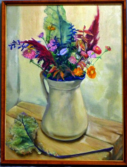
Nicole Reddington’s painting ruthlessly subjugated detail for design, and was tremendously powerful for that. I wish I had more student work to show you, but I can’t find my camera!

Use enough paint

Using too little paint is a rookie error. Too little paint on your palette means you’ll try to stretch it with solvent on the bottom layers or medium on the top layers, and before you know it, you’re going to have a mushy, monochromatic mess on your hand. In the northeast, that soup usually assumes an unpleasant green tone.
Modern paints are formulated to use almost straight out of the tube. They may need a small amount of solvent for underpainting, or a dab of medium to create a juicy top layer, but too much of either ruins paintings.
In my weekly classes, I don’t let students touch painting medium until they have the steps of constructing a painting firmly in hand. That’s hard to do in a workshop, but remember that painting medium is a boost, not a crutch.
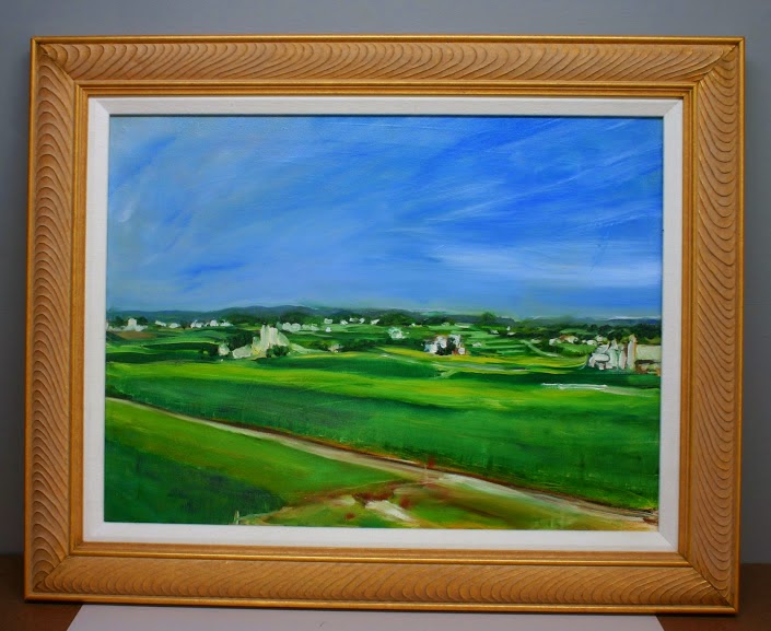
Sandy Quang’s painting of a downed tree.
Big shapes to little shapes
Stop thinking of your value sketches as something you must get through before you get to the fun of painting. They’re the most important part of the process, and they’re also a lot of fun.
I like to do lots of preparatory sketches before I start to paint, either in marker or in monochromatic watercolor. The abstract pattern is far more important than the details. In the early phases of a painting, you must relentlessly sacrifice detail to the good of the whole.  This is true whether the results you want are hyper-realistic or impressionistic.
The untrained eye looks at a scene and thinks about it piecemeal and in terms of objects: there’s a flower, there’s a path, there’s a tree. The trained eye sees patterns and considers the objects afterward.
Is there an interesting, coherent pattern of darks and lights? This pattern is the primary issue in composition.

Stop thinking of drawing as something you have to get through, and start doing your dreaming in a sketchbook.
Darks to light
In oils, it’s easy to paint into dark passages with a lighter color; the reverse isn’t true. Put down white paint too quickly, and you’re going to fight all afternoon to avoid fifty shades of meh.
This doesn’t mean oil painters don’t jump around after we set the darks; we can and do. But that dark pattern controls your paintings.
Don’t choose slow-drying or high-stain pigment to make your darks. The umbers are great because the manganese in them speeds drying. However, I don’t want to carry an extra tube just for this. I use a combination of burnt sienna and ultramarine.
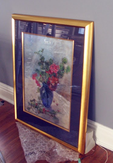
A student’s palette… This is the color space in which the modern painter can work. It sizzles.
Fat over lean

Odorless mineral spirits (OMS) replaces turpentine as the modern solvent. This is different from medium, which is some combination of oil, drying agent, solvent and varnish. Paint with solvent in the bottom layers. Paint with medium in the top layers. As noted above, use both sparingly.
The more oil in a layer, the longer the binder takes to oxidize. This keeps paints brighter and more flexible. However, oil also retards drying. Using too much in underpainting will result in a cracked and crazed surface over time.
The makers of Galkyd and Liquin say their products are designed to circumvent this rule. However, we have no track record for these alkyd-based synthetic mediums, whereas we have centuries of experience layering the traditional way.
Even if we could change it, why would we want to? Underpainting with soft, sloppy medium gives soft, sloppy results. The coverage is spotty and thin. The traditional method is tremendously variable and gives great control. It just takes a little while to learn it properly.
Next up, a watercolor workshop aboard American Eagle, June 10-14, and my annual Sea & Sky workshop at Acadia National Park, August 5-10. Email me if you have any questions.

Monday Morning Art School: how to paint a quickie

Only got an hour? If you’re set up right, you can still do a credible field painting.
The bones of a painting.
I mentioned last week that I didn’t have time to get back to paint the apple tree at the abuelitos’ house in the tiny pueblo above Pecos, NM. That tree is what initially drew me to the place, and I didn’t want to leave without painting it. On Friday morning I went back to the little village to make a quick sketch. I was carrying only 12X16 canvases, so I had to work very fast.
I had two hours before I needed to get back to the ranch and pack for my flight. It turns out I had less time than that, because it spattered rain. But I was still able to get a field sketch done.
You’d hardly want to paint from this photograph, unless you knew what a magical place it was in real life.
I seldom paint from photos without a good field sketch alongside. One glance at my photograph will tell you why. Camera lenses distort shapes and flatten color and light. I know how to use my camera to make more interesting photos, but I eschew that artistry in reference pictures. Photographic artistry comes at the expense of details and architecture I want to preserve for the expression of the painting.
A good photograph is not necessarily a good reference photograph for painting. For example, too tight a crop often leaves out details you need later. Artists constantly move things around when painting, and you can’t do that if you’ve cut those items out.
The paint array never changes, no matter how fast I’m painting. (The bottle cap is there for medium.)
Start by putting out your typical array of colors, including a dark mix with which you will draw. In the northeast, I typically use a dark mix of ultramarine and burnt sienna. In New Mexico, I made a mix of ultramarine and quinacridone red. I thought I was pushing the purples excessively, but in comparison with other paintings at the opening, my work felt low-key. That’s less a question of the light than of regional tastes.
Note the line of white just below my pure pigments. I always make tints of my colors when I start. That too speeds up my painting.
I do not clean my palette except for before a flight or at the end of the season. It goes in the freezer in a waterproof stuff-sack. That means I don’t have to mess around putting out paints at the start of each painting session. That’s important, since setting them out and cleaning them up can use up a half hour of precious time.
A very sophisticated drawing, the work of about two minutes.
Fast painting is where the habit of always setting out your paint in the same order helps. It would be disconcerting for a musician to find the keys of the piano in different places each time he played, or for a surgeon to have to hunt for the proper scalpel. The same is true in paints. You can read about my color organization here, but the important thing is consistency. 
I did not do a value study for this super-fast painting. I simply outlined my drawing with large strokes. Then I filled in the drawing with blotches of color. Mix and splat, with a fairly heavy dilution with mineral spirits.
From there, it was just a question of revising and dividing shapes. I was starting to break the apple tree into a pattern when the rain kicked up.
Right before scraping back and packing up.
My last step, which I forgot to photograph, was to scrape back slightly—not to bare canvas, but so I have a level surface on which to proceed. It’s important to not leave impasto in a half-finished alla prima painting, especially when you don’t know when you’ll get back to it. Scraping back often reveals the true lines, since it creates a shadow average of all your guesses in different layers.
And then I ran for the car. No, I didn’t win any prizes, but I don’t think my choices of paintings had anything to do with that. There was some terrifically strong work in this show. Onwards and upwards!

Monday Morning Art School: Basic principles of painting

Some painting rules are meant to be broken. But they all exist to make painting faster and easier.

Cadet, by Carol L. Douglas. That’s American Eagle in the background. That’s the boat my June workshop will be on.

 It’s closing in on plein air season again. Here are some basic rules to speed up your field painting.

Buy the best materials and equipment you can afford: I was reminded of that this weekend as I struggled to get my low-end sewing machine to handle layers of tulle. If you invest in decent paints and decent brushes at the onset, you’ll make better progress in the long run. You’re better off with a decent limited palette and two decent brushes than more stuff of lower quality. Then you can add to, instead of replace, over time.
Skinny layers in the beginning, please!
Fat over lean (oil painting only): This means applying paint with more oil-to-pigment over paint with less oil-to-pigment; in other words, use turpentine or odorless mineral spirits (OMS) judiciously in the bottom layers and painting medium in the top layer.
The more oil, the longer the binder takes to oxidize. This keeps paints brighter and more flexible. However, oil also retards drying. Using too much in underpainting, will result in a cracked and crazed surface over time.
The makers of Galkyd and Liquin say their products are designed to circumvent this rule. However, we have no track record for these alkyd-based synthetic mediums, whereas we have centuries of experience layering the traditional way.
Even if we could change it, why would we want to? Underpainting with soft, sloppy medium gives soft, sloppy results. The coverage is spotty and thin. The traditional method is tremendously variable and gives great control. It just takes a little while to learn it properly.
Can’t tell what that’s going to be? No matter; it’s the shapes that drive a painting, not the other way around.
Big shapes to little shapes: Work on the abstract pattern before you start focusing on the details.
The untrained eye looks at a scene and thinks about it piecemeal and in terms of objects: there’s a flower, there’s a path, there’s a tree. The trained eye sees patterns and considers the objects afterward.
Is there an interesting, coherent pattern of darks and lights? Are there color temperature shifts you can use? In the early phases of a painting, you must relentlessly sacrifice detail to the good of the whole.  This is true whether the results you want are hyper-realistic or impressionistic. Composition is the key to good painting, and the pattern of lights and darks is the primary issue in composition.
Following the fat-over-lean rule, above, allows you to think about broad shapes first. In the field an underpainting done with turpentine or OMS will be mostly dry when you start the next layer. Stop frequently to make sure you haven’t lost your darks. If you have, restate them.
Follow the natural working characteristics of your medium: For oil painters, that’s dark to light. For watercolorists, that’s light to dark, because dark is impossible to eradicate. Acrylic painters can proceed any way they want, as long as they’re using opaque paint.
Doing the drawing in a dark neutral follows the natural working characteristics of oil paints. By Carol L. Douglas.
In oils, it’s easy to paint into dark passages with a lighter color; the reverse isn’t true. This doesn’t mean oil painters don’t jump around after we set the darks; we can and do. In watercolor, it’s almost impossible to erase a dark passage, so it’s best to know where it belongs before you commit to it.
Don’t choose slow-drying or high-stain pigment to make your darks. The umbers are great because the manganese in them speeds drying. However, I don’t want to carry an extra tube just for this. I use a combination of burnt sienna and ultramarine.
By the way, this is a common rule of painting to break. Just be sure you have the process down before you start experimenting.
Drawn slow and painted fast by Carol L. Douglas.
Draw slow, paint fast: This isn’t a classic tenet; it’s something my student Rhea Zweifler coined in my class years ago. Nevertheless, it’s a great rule.  
Taking time over your drawing allows you to be looser and more assured in your painting. Do value studies and sketches before you commit to color. Your mind needs time to think about the shapes it sees. Spend that time in the drawing phase, when ideas are easy to assess. Otherwise, you will be doing it on canvas, where your mistakes are more difficult to clean up.
Value study at Point Prim, Nova Scotia, by Carol L. Douglas.
Value studies and sketches allow you to be inventive. When you’ve only spent three minutes on a sketch, you don’t lose much by throwing it out. Drawing and value studies at the beginning actually speed you up, rather than slow you down.
It’s about time for you to consider your summer workshop plans. Join me on the American Eagle, at Acadia National Park, at Rye Art Center, or at Genesee Valley this summer.
This post was originally published in May, 2017 and has been edited and updated.

Water-miscible oils

They’re marketed as easier and safer than traditional oils. Are they?
Fitz Hugh Lane Day at Camden, by Carol L. Douglas. This would have been impossible to paint with water-miscible oils. They run at the first hint of atmospheric moisture.
Yesterday I got a note from a fellow professional mentioning that she’s finally seen the last of her water-miscible oil (WMO) paints. I was surprised she’d lasted this long.
Water miscible oil paint is engineered to be thinned and cleaned with water, thereby avoiding the supposedly-harmful use of turpentine. But few painters use turpentine anymore. It has been overwhelmingly replaced by odorless mineral spirits. Still, WMO are perceived as somehow ‘safer’ than regular oil paint.
Of course, the toxicity of paint rests not in its binders, but in its pigments. The heavy, or toxic, metals like copper, cobalt, cadmium, and lead are the worst. It’s impossible to avoid them completely, but when you buy paints, consider not just your own safety, but that of the poor schmoe in China who has to make them.
Traditionally, pigments were made in a binder of drying oil—flax, walnut, safflower or egg yolk—or gum Arabic, in the case of watercolor. All of these binders are organic, by the way. In the 20th century, we saw new binders developed, including alkyds, vinyl and acrylics. Water-miscible oils are in this class of engineered polymers.
Squall on Lake Huron, by Carol L. Douglas. I got soaked; so did my painting.
Most brands add an emulsifier, or detergent, that allows the linseed oil to accept up to 25% water by volume. Since emulsified paint rapidly becomes stodge, it’s wise to use as little water as you can with these paints.
Holbein’s Aqua Duo manipulates the polymer to accept water in a loose bond at the end of the chain. These paints contain no detergent. They tend to be less gummy than other WMO. However, they are marketed to be mixed with acrylics. Acrylics and oils dry so differently that this promises to be an archival disaster.
When this happens, the oil painter ducks, but can save his painting. WMO are immediately ruined.
WMO are designed to handle like oil paints, but in practice, they don’t. When thinned to a wash using water, they may refuse to adhere to the ground. At middle thicknesses, they dry more like gouache than like oil, with a flat surface and color shift. As impasto, they have the consistency of oatmeal. Like acrylics, their transparency changes as they dry. The paints have a different flow rate than conventional oils, so you can’t really place a long, lovely line with a loaded brush.
              
All oil paints dry through oxidation, but first the water-soluble oil must disperse the water through evaporation. That leaves the final surface slightly tacky to the touch.
Oil painters have been known to pick off the water droplets right before a sale. That’s impossible with WMO.
Most paint looks pretty good the moment it’s applied to a canvas. The question is, what will it look like when it’s been drying for a few hundred years? Oil paints develop cross-linked polymers that create a strong, tough surface over time. How will the emulsifier in water-miscible oils affect that? I don’t know, and neither does anyone else. They haven’t been around long enough.
How do manufacturers suggest you work around the technical limitations of WMO? By adding oil-based media to their product line: stand oils, quick dry media, or alkyds.
All of which defeats the purpose. Here’s a news flash: traditional oil painters wash our brushes with soap and water, too. I use a saddle soap, but any super-fatted soap will do. That’s because soap—like detergent—is an emulsifier. Soap is made up of molecules with different ends. One end loves water. The other end loves oil. It’s the same principle as the detergent in water-miscible oils, but applied at the end, where it can’t harm your painting or technique. Just rinse the solids out of your brush in your slops tank first, and you’ll find that oil brushes wash easily.

Choosing your paints

My own palette contains no greens. I mix them.
There are millions of possible palette combinations out there, and there is no one ‘correct’ system. My goals in choosing pigments are:
·          Lightfastness
·          Transparency
·          Single pigment
·          Position on the color wheel
·          Environmental friendliness
Understanding the difference between pigments and colors is essential in buying the right paint. Almost all paints sold in the US carry a Pigment CI name in tiny letters somewhere on the label. Learn to buy paint from this, rather than the poetic color name under which the paint is marketed.
Top row: hansa yellow, yellow ochre, raw sienna, burnt sienna. Second row: Indian yellow, cadmium orange, quinacridone violet, ultramarine blue. Bottom row: Prussian blue, ivory black, titanium white. The carrier was Jamie Grossman’s idea and I’ve used it for several seasons instead of tubes.
The single-pigment paints are made with only one pigment. Thus, cobalt blue contains only the pigment PB28; Prussian Blue contains onlythe pigment PB27. Paint manufacturers often blend pigments to approximate discontinued historic colors (Naples yellow or Alizarin Crimson) or to sell cheaper ‘hues’ of pricier paints, like the cadmiums.
My own palette doesn’t usually contain a true red, but when I use one, it’s generally naphthol red, because I’m concerned about the consequences of cadmium manufacture in China. Sadly, I’ve not found a substitute for cadmium orange, which is one of the three solid opaque pigments I use (the others being titanium white and yellow ochre).
Long after my own palette was written in stone, I came across this in a Grumbacher book and realized what I’m doing is pairing primaries.
My palette is roughly based on the idea of paired primaries. This means I have two blues—a warm and a cool—two yellows—a warm and a cool—and two ‘reds’, which in this case are quinacridone violet and cadmium orange. I fill these out with a variety of ‘earth tones’ because these are inexpensive paints and save me a lot of mixing.

Let me know if you’re interested in painting with me on the Schoodic Peninsula in beautiful Acadia National Park in 2015 or Rochester at any time. Click here for more information on my Maine workshops! Download a brochure here.

My book of pithy aphorisms

The Mamaroneck River, oil on canvas, by Carol L. Douglas
My teaching year ends at the beginning of June, when I start my summer wanderings. So I was conflicted when V— contacted me about lessons. She is a well-known lithographer and designer. Normally I’d jump at the chance to have her join us, but there’s so little time left in the year. Still, we have time to lay out the basics.

Let’s start with my mantras. These are the things I say so frequently they might even be true.

Slow to Fast

The quality most appreciated in modern painting is assurance.  If you take the time to map out your painting in advance, you will avoid a lot of tentative or corrected brush strokes.
That means doing your measuring, erasing, and composition in the drawing phase.  
Draw, baby, draw…
Dark to Light

In oils, it’s difficult to paint darks over white. However, this rule is appropriate for all media except watercolor.* If you mass in darks first, you can see the value structure. This gives you a pretty good idea whether the painting will work.
A grisaille by any other name. It is still a great way to start an oil painting. This one, by me.
*In watercolor, you start with light washes. The lights are where you omit paint. It’s important for watercolorists to make a value sketch before they start.

Thin to Thick

Your bottom layers should be lean. Your top layers should be thick and creamy. It doesn’t matter if you want your painting to be clinically hyperrealistic or clotted impasto. This is the only way to paint without cracking or obvious pentimenti. That is a beautiful word to describe an ugly problem: visible reminders of how many times you’ve changed your mind.
Eventually you get to impasto, but it’s a treat you work up to.
Let me know if you’re interested in painting with me on the Schoodic Peninsula in beautiful Acadia National Park in 2015 or Rochester at any time. Click here for more information on my Maine workshops! Download a brochure here.

Better than a marked-down sweater, any day

Sea & Sky Workshop
August 9-14, 2015 
Acadia National Park
If Santa Claus screwed up this Christmas, it’s up to you to remedy it, and I don’t mean by running down to the mall to score some great Boxing Day deals. By next summer, they’ll be a distant memory, but we’ll be gearing up to paint at Schoodic Point from August 9-14, 2015
You’ve got less than a week to get the $125 early-bird discount. Four slots of the twelve are already filled, but I DO want to be able to pass on these savings to you. And I can’t do that if I don’t have your registration in hand by January 1.
Corinne at Owl’s Head in 2013.
I spend a great deal of time stalking and bagging perfect venues for my workshops. I’m really excited about this one. In 2014, we painted the ‘quaint’ Maine coastline, along the sheltering coast of Penobscot Bay. This year, we’re going for the thundering, open ocean.
Schoodic Point is far from the hustle of Bar Harbor, but it is has the same dramatic rock formations, pounding surf, and stunning mountain views that make Acadia a worldwide tourist destination.
The places we’ll go!
Open sea, stunning views of Cadillac Mountain, and veins of dark basalt running through red granite rocks are the dominant features of this “road less traveled.” Pines, birch, spruce, cedar, cherry, alder, mountain ash, and maples forest the land. There are numerous coves, inlets, islands, and lighthouses.
Here is the brochure. Here is the registration form. I’m off to Philly for the weekend, but take a moment to sit down and send your registration form in. I promise you it will be a lot more satisfying than a new sweater set in 2014’s color of the year.

A painting to match the couch

Lancaster County, PA, 18X24, by Carol L. Douglas. It’s moving from my own bedroom to our guestroom, where it will better match the pale blue walls and furniture.
Artists kvetch about people who buy paintings to match their sofas, but it is a real consideration. A mismatch will never be to the painting’s or the room’s advantage.
I’ve been putting away work from my Black Friday sale. It’s been an opportunity to rearrange some of the artwork in my house (and, yes, to vacuum). It’s interesting how some paintings look grand against some walls and bland against others.
Autumn floral, 16X20, by Carol L. Douglas. I think I’m going to see what this looks like in my dining room.
I had a mid-century street scene done by a cousin in Tennessee hanging in my living room.  It’s a very accomplished painting, but it never looked good against the pale-turquoise-and-red décor. To keep it safe during the sale, I slid it on a hook in my bedroom, which has navy walls and warm accents. Here in a room with fruitwood furniture and a related color scheme, the painting glows.
Where then, to put the high-chroma but abstract landscape that previously was in that spot? With its pale frame and cool colors, it looks far better in our guest room, which has pale blue walls and pale furniture.
And this pastel of geraniums has already relocated to the living room.
Most artists I know own too many paintings, of our own and others. We usually just plop new work on hooks wherever we can. This exercise has been a good reminder that a painting’s inherent value can be obscured by bad interior design.

I will be teaching in Acadia National Park next August. Read all about it here, or download a brochure here


Starting and searching

Rock Study, 11X14, by Carol L. Douglas. I did this rock study with my pal Bruce Bundock and hated it at the time. I love it today.
I admire the well-planned, carefully-drafted, meticulously-executed painting, but something happens between the time I start and the time I finish. A furious spirit overtakes me that drives me irresistibly in the opposite direction.
This is why I’m very reluctant to wipe out all but the absolute worst starts. In so many cases, what I thought was bad five years ago has turned out to be pivotal in my evolution as a painter. I’ve come to listen to my ‘bad’ paintings; they’re usually trying to tell me something.
Rockport, 9X12, by Carol L. Douglas.
Textile artist Jane Bartlett sent me the list below, which was (according to the Internet) found among Diebenkorn’s papers after his death in 1993. I haven’t corrected the spelling or punctuation, even though they pain me.
Notes to myself on beginning a painting (by Richard Diebenkorn)
1. attempt what is not certain. Certainty may or may not come later. It may then be a valuable delusion.
2. The pretty, initial position which falls short of completeness is not to be valued — except as a stimulus for further moves.
3. Do search. But in order to find other than what is searched for.
4. Use and respond to the initial fresh qualities but consider them absolutely expendable.
5. Dont “discover” a subject — of any kind.
6. Somehow don’t be bored — but if you must, use it in action. Use its destructive potential.
7. Mistakes can’t be erased but they move you from your present position.
8. Keep thinking about Pollyanna.
9. Tolerate chaos.
10. Be careful only in a perverse way.

Rock Tumble, 16X20, unframed, by Carol L. Douglas
I will be teaching in Acadia National Park next August. Read all about it here, or download a brochure here

Lesson #1: sunscreen makes a lousy white paint

Three houses, a bad photo of a decent painting by little ol’ me.
It’s a little hard to get an hourly forecast for a specific spot on the Maine coast. It can be pouring in one place and clear in the next town over. However, not only was the National Weather Service calling for rain, my New York buddies were all talking about the whopping deluge they’d just gotten.
Lyn painting the Fort Point lighthouse.
No painting trip to Maine is complete without a lighthouse, and my intention had been for us to paint the Grindle Point Lighthouse on Islesboro. Without knowing exactly when it would start raining, relying on ferry transportation seemed unwise. Instead we drove north to the Fort Point light, where my charges promptly spread themselves across a quarter mile of terrain to paint. That is why I take my bicycle while teaching, although since the grounds include the ruins of a Revolutionary War fort, a mountain bike might have worked better.
Loren learned that the cover on his truck leaks.
The rain held off until  we could regroup at the hotel for a demo, which I did using Sandy’s kit.
Elizabeth and Sandy did some foraging for the painters.
It’s always hard to use someone else’s paint, and I was complaining that hers mixed poorly. That was partially because it’s not good paint, but it turns out that dab of white at the left of her palette was sunscreen, not paint. I’m not asking why it was there.
Dedicated students watching a demo in the rain. “I learned that you oil painters have it easy,” said Virginia.
A demo is a great opportunity to reach painters of all levels. Earlier in the day, I’d talked to Cecilia and Nancy about a new way of setting up their paintings than straight-up drawing. Both are naturally good compositors, but this technique gives more consistent control over the outcome. I was able to demonstrate that.
Nancy’s first attempt at the view.
After a while, Nancy left and went back to her own balcony to finish a painting she’d started earlier. When she was done with that, she painted the same scene again. I loved seeing how she integrated what I’d told her, and how it made the second painting stronger.
Nancy’s post-demo painting of the same view.

Message me if you want information about next year’s programs. Information is available here.

Rain affects people differently. This is the artist formerly known as Brad.