Finishing a stubborn painting

Asking a respected peer for an opinion is good, but sometimes we’re stuck fixing our problems without help. That’s where knowing how to self-critique comes in.
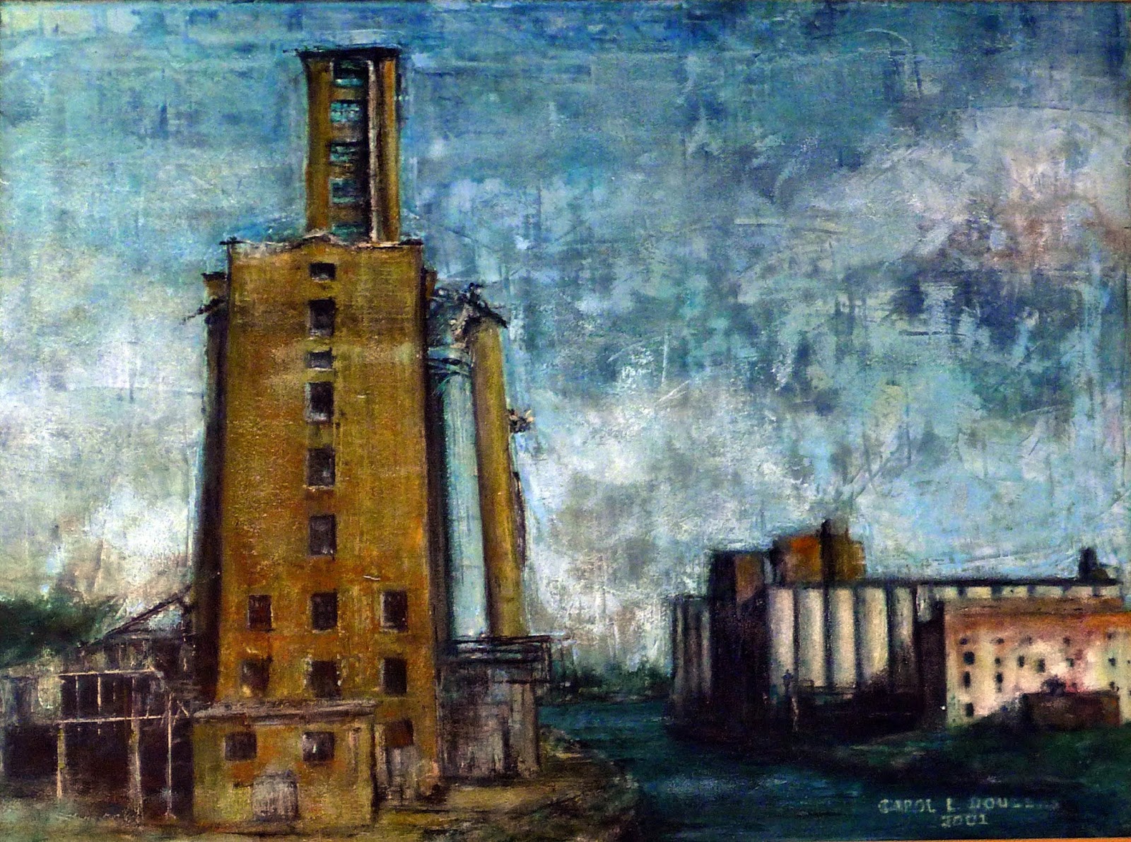
Tom Sawyer’s Fence, by Carol L. Douglas, oil on canvasboard.
Yesterday I got a text message from a peer that read, “Working on a commission and can’t figure out how to finish it.” She went on to add, “That last 20% of the painting is always the hardest part for me. I can tell something is wrong but finding it and fixing it is the challenge.”
From my perspective, it was easy enough to see that the background needed to be toned down so that the focus could ring. That’s because I wasn’t wrapped up in its creation.
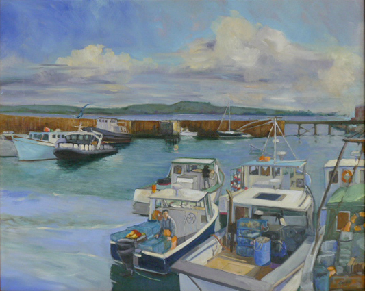
Downdraft Snow by Carol L. Douglas is on exhibition at the Joseph A. Fiore Art Center this summer.
I had a similar experience at Castine. I couldn’t get the contrast to work between the water and a roofline. Kari Ganoung Ruiz suggested I add a shingle edge. That single brushstroke changed everything. Similarly, Kirk McBrideasked for an opinion from his wife, who’s also an artist. Her suggestion made his painting more coherent.
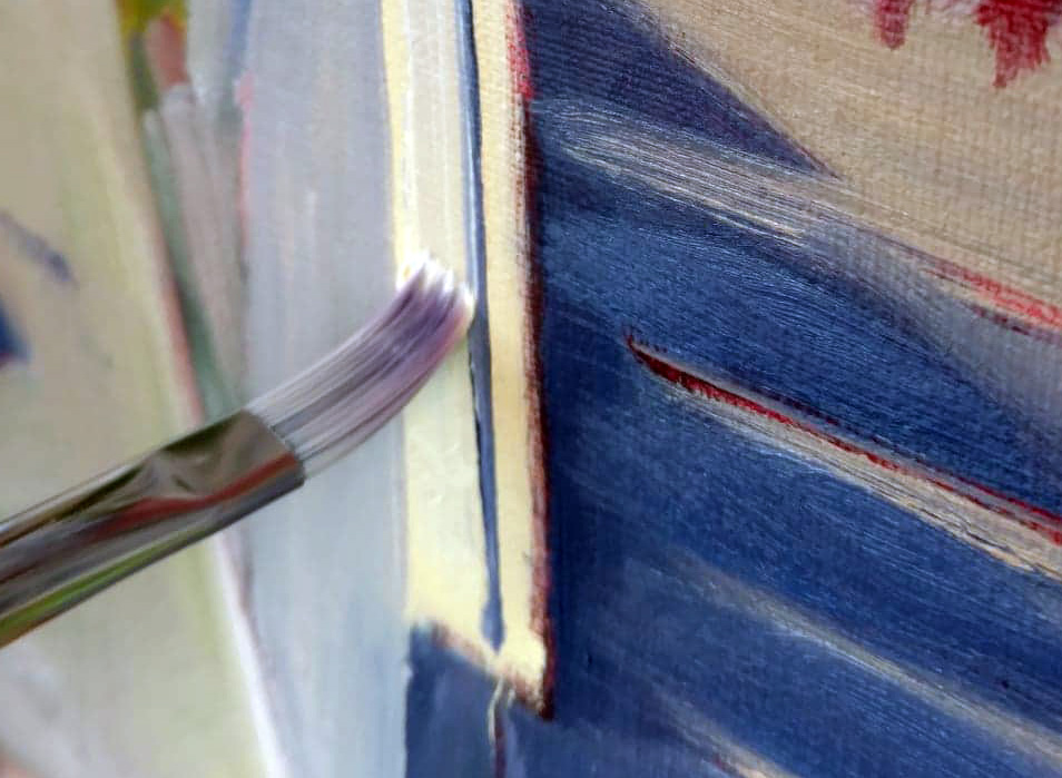
Painting, however, isn’t always a game of Who Wants to be a Millionaire. Sometimes, we’re stuck answering the question without a Lifeline. One of the best ways to do this is to subject your own work to formal analysis.
That means you ask yourself how each of the five basic elements of painting design are working. That doesn’t mean you have to write a dissertation. It means you consider your painting in terms of each of these design elements. Are you using line, shape, space, color and texture to guide the viewer through the space you’ve created? Have you emphasized important passages and subordinated others? Is there repetition, pattern and rhythm in the piece?
Marshall Point Rock Study, by Carol L. Douglas
A painting that doesn’t work almost always fails in several of these areas. You are as qualified as anyone to analyze your paintings based on these objective standards. There’s a great advantage in learning to do this: you will never be led astray be a stupid critique again, and you can help yourself fix what’s wrong.
I like to consider my own paintings first on the questions of motive, line, and value. I’m looking for a strong impulse—created by dark shapes—that pulls the viewer through the painting. I’m not relying on chance to create a focal point; I want to drive the viewer there at warp speed.
Good group critiques teach us to look at our own work dispassionately and objectively, rather than possessively and emotionally. For those of us who’ve experienced the nasty criticism of art classes, it can take a lot to unbend from the defensive posture. That’s why I practice positive critiquing.
Ottawa House, by Carol L. Douglas
Positive reaction, done right, is harder than negative criticism. You need to catch a person doing something right before you can comment. That means constant vigilance and a rock-solid understanding of process. It requires being able to differentiate between idiosyncrasy, style, and the real technical issues that can cause a painting to fail. Above all, it requires confidence. Nobody is supportive from a position of weakness.
I demonstrated this technique to my friends in the Knox County Art Societythis week and realized I’ve never blogged about how to do it. Look for it.
Meanwhile, I have two new opportunities for you: a Tuesday class from my Rockport studio, starting on August 20, and a second watercolor workshop aboard American Eagle, September 25-29. I’d love to see you there!

It’s not the brushes, kiddo

Brushes are ordinary; it’s what you can do with them that is extraordinary.

Home Port, by Carol L. Douglas, 18X24, oil on linen.
At Castine Plein Air, Ken DeWaard did a small boat painting that I thought was darn near perfect. (I don’t have an image of it, but you can see it at Camden Falls Gallery.) One of the things that struck me was the fluid brushwork. My brushes are getting frayed, so none of my flats are still flat, and many of my rounds are splayed. And, frankly, I abuse them, tossing them in my hot car and forgetting to clean them. I’ve had trouble with my last batch of Robert Simmons signets—the ferrules are loose—so I’m interested in experimenting with something else.
I asked Ken what brushes he’s using. “Some Rosemarys, and some cheap synthetics,” he answered. That made sense. In oils, the trade off with synthetic or soft animal hair is that you get better control, but they carry less paint. You can’t be rudely aggressive with them. But if you want lyrical linework or detail, or want to glaze, they’re unbeatable. I’ve been messing with a Princeton Snap! brush this month. Synthetics have come a long way.
What I was working on while painting with Ken DeWaard on Monday. Another day and I think I’ll be well on the way to finishing.
Monday, Ken and I painted together in Rockport. I took the opportunity to look at his brushes. They’re a saturated, half-hardened mess—even worse than mine. If he can paint that beautifully with those cudgels, I need to stop grumbling about my brushes.
Albrecht Dürer was arguably the most facile brush-wrangler who ever lived. Whether it was in watercolor, as in the Young Hare, or in oils, as in his many self-portraits, he could seemingly lay down every single hair on man or beast’s head. He was famous for this skill all over Europe.
He was in communication with the major Italian artists of his time, including RaphaelLeonardo da Vinci, and Giovanni Bellini. His relationship with Bellini was more than merely professional. Dürer visited Venice twice and developed a friendship with the older man. Bellini was the most famous member of a prestigious family of artists and very influential. He was no slouch with the fine brush himself.
Self-Portrait at Twenty-Eight, 1500, Albrecht Dürer, courtesy Alte Pinakothek, Munich
By Dürer’s second visit, Bellini was at the end of his long life. He extended many professional courtesies to Dürer, not the least of which was introducing the younger man to his own noble Venetian clients.
One day, after carefully examining the head of one of Dürer’s saints, Bellini asked to use the brush that had creating such lifelike hair. Dürer handed the old man the brush in question. Bellini tried it and failed to produce anything fine. Dürer took the brush back, still loaded with Bellini’s paint, and painted a lock of hair so marvelous that the older man said he wouldn’t have believed it had he not seen it with his own eyes.
Doge Leonardo Loredan, after 1501, Giovanni Bellini, National Gallery, London
This story is apocryphal, but makes a true point. Dürer’s brush was ordinary; his abilities were extraordinary. Brushes influence our mark-making, but they don’t control it. Strength, age, experience, personality and patience all play roles in how we lay down paint.
Dürer, by the way, was inordinately proud of his own hair, painting his ringlets in several wonderful self-portraits. I have the same ringlets as that cocky young man had five hundred years ago, and I’m almost as vain about them as he was. But I’ve never painted a self-portrait. Perhaps this winter I should rectify that.

Monday Morning Art School—basic protocol for oil painting

An efficient plan for fast outdoor painting in oils.
Perkins Point, by Carol L. Douglas. All the paintings in this post were done for Castine Plein Air last week.

Often people ask me how we manage to get so many paintings done during an event. We avoid what my friend Brad Marshall called “flailing around.” That means those times when you seem to lose your way. We’ve all done it, when apparently everything we know falls out of our memory. I’ve written a simple protocol to avoid this. If you always work in this order, you’re less likely to flail around. Feel free to print this and tape it inside your paint box.

Glacial erratic, by Carol L. Douglas

1. Set up your palette with all colors out, organized in a rainbow pattern; may be done before going out.

Putting your pigments in the same spots each time speeds up your process. And putting out all of them when you start ensures that you develop the painting based on what you see, rather than on what’s at hand. Be sure to replace a color when you run out, not when you think you’ll next need it.

Lil’ Toot, by Carol L. Douglas
2. Value drawing of the scene in question, in your sketchbook.
If you do this on your canvas and then paint over it, you won’t have it to refer to when the light changes or you need to restate your darks. Keeping it in your notebook means it’s always accessible.
3. Crop your drawing, and identify and strengthen big shapes and movements.
If you start by filling in a little box, you only allow yourself one way to look at the composition. Instead, draw what interests you first, and then contemplate how it might best be boxed into a painting.
Tenney cottage, by Carol L. Douglas
4. Transfer drawing to canvas with paint as a monochromatic grisaille.
This allows you to draw with a brush and check your composition’s values.
5. Underpaint big shapes making sure value, chroma and hue are correct. Thin with odorless mineral spirits (OMS), turpentine, or whatever solvent you generally use.
This underlayer should be thin, but not soupy, so it can accept top layers without making mud. You don’t want added oil or medium in this layer as it can lead to cracking in the future. How much OMS? That varies by the day, but just enough that you can drag your brush without scumbling.

Sunrise, by Carol L. Douglas
6. Second layer: divide big shapes and develop details. A slightly thicker layer.
This is the body of your painting, without a lot of detail. Use almost no OMS, and no painting medium or linseed oil. It’s still too early for impasto. For some painters, this is combined with the last layer.
Water Street, by Carol L. Douglas
7. Third and last layer: use medium and more paint, adding highlights, detail and impasto.
This is the final layer, the one with painterly flourishes. Controlled use of medium here results in an even, bright, tough final surface.

Next week: a basic protocol for watercolor painting.

The servant stairs

My diet is in tatters but I’m on schedule with the portrait.
I spent most of my time yesterday moving the coffee table from place to place trying to make an interesting geometry of that bottom left corner.

Mary Killen tells the story of Antony Armstrong-Jones (Lord Snowdon) and his lifelong enmity to Colin Tennant. It began when Armstrong-Jones was told to go to the tradesmen’s entrance while photographing Tennant’s wedding to Lady Anne Coke. The two men had been at Eton together.

I’d assumed it was a story of injured amour-propre. This week I’ve spent some time on the servants’ stairs of a Georgian townhouse, and my sympathy for Lord Snowdon has increased (albeit marginally). I would not have enjoyed hefting the absurdly-heavy photography equipment of 1956 up and down those narrow stairs, skirting past the maids and footmen I ignored in everyday life.
I’ve rearranged the furniture, set up my easel, and otherwise made a terrible mess of the drawing room. That’s a James Morrison landscape overlooking my shoulder there; a happy omen, if you ask me.
The house in which I’m working has had many iterations since its construction. The main staircase, very grand, rises in a beautiful spiral from a first-floor vestibule. There is a modern staircase, added after the building served a stint as offices after World War 1, when the house was converted to flats. This staircase connects the first floor with the basement floors into a three-story unit. But in its original form, the public rooms of this house—the first floor, the piano nobile above it, and the bedrooms above that—were effectively sealed off from the tradesmen’s entrance by this lack of public staircase.
The only staircase which ran the height of the house was a stone one, intended for servants. Despite my familiarity with historical English novels, I didn’t fully grasp what this meant until I’d trotted up and down them a dozen times.
It’s easy to feel how intimidated a homeowner would be at the idea of running down those service stairs to check on the operation of his own home (if such an outlandish idea had even occurred to him). The stone steps are set as far back as is possible without actually being in the garden, and they’re not easy on the feet. They are narrow and turn fast in their circular shaft. The humble historical housemaid must have had legs of steel.
I captured my subject briefly for a quick drawing and managed to make her look all of fifteen years old. The bones are right, however, and I’ll try again today.
The modern Scots who live in these terraced houses are more fit than their American cousins, with our easy, lazy two-story homes. The stone stairs are now the main stairs between the garden-level kitchen and the main rooms of the house. Our host, a man in his fifties, regularly trots up and down them. I’m working in a drawing room, and I’m not as strong as a Regency lady’s maid, so I recruited my husband to carry my easel and kit up for me.
This room is a symphony of indirect light and beautiful paneling. The setting is very lovely, but I don’t want to allow it to dwarf my subject. I spent the day carefully measuring and plotting my composition.
I’ve also managed, occasionally, to sit my subject down for some preliminary drawings. I’m afraid I’ll need a butterfly net and some duct tape to fully capture her. She’s a very energetic woman.
Then there is the city itself, which is hilly and congested. It was a foggy, rainy evening, and our hosts graciously took us to dinner. We took a cab there and walked home; the trips took the same length of time, and walking was frankly more pleasant.
I had Shetland scallops, served very differently from the bay scallops at home, with a dry white wine along the lines of a vinho verde. This was followed by a nightcap of a private cask single-malt whisky. My diet is in tatters but I’m feeling less guilty than you might think.

Monday Morning Art School: painting the details

It may seem like a fine brush is better, but that’s not true in wet-on-wet painting.

The Halve Maen passing Hudson Highlands, by Carol L. Douglas
One of the things painting teachers repeat over and over is, “use a bigger brush.” Students think they have better control with a smaller brush, but in many cases, the reverse is true. Smaller brushes hold less paint, and they waggle more when we tremble. To draw a juicy line, a brush has to be big enough to hold enough pigment.
It’s relatively easy to lay fine lines down in thin paint, either water-based or when glazing with oils. It’s not so easy in alla prima oil painting. The style tends to be looser and rougher. A fine line added with a rigger can lie on the surface looking silly, or it can melt into the lower layers and look like a grey streak of mush.
Working backwards allows you to make clean edges without being overly fussy.
One solution is to paint edges and lines in the underpainting, and then overlap the color in the top layers to meet the edges. This allows you to create a line that’s razor thin without looking fussy.
Of course, if you’re painting big to small, you don’t have lines or detail in the underpainting. They’re not important in the big-shape phase. You need a technique to remove the excess paint before you draw. For large corrections, I take off excess paint with a palette knife. For lines, I use a wipe-out tool. I had a very old one made by Loew-Cornell that I lost last summer. I replaced it with a Kemper wipe-out tool, and it works perfectly well. These tools are also great for signing wet canvases.
Start by getting rid of excess paint.
You must get rid of excess paint before you can paint your initial shape. You can’t draw into soup. Once you’ve prepared the surface, lay the line in first, before the surrounding background. This sometimes means a line of light-colored paint is laid in before its dark surround. Don’t worry that you’ve broken the dark-to-light rule. This rule is about overall composition, not the final details of a painting.
It’s easier to paint a line with a flat on its side than with a small round.
The side of a flat brush works better than a small round for straight lines. Flats are more stable and tend to track in the right direction. Or, use a palette knife or the edge of a credit card here. Go ahead and use a ruler if you need to, making sure to keep it from dragging the paint.
Your line should be made of fairly thin paint, with just enough medium to carry it smoothly. Too much oil and it will melt into its surround.
Then push the background color right up against the line.
Next paint the surrounding area, pushing up against the line with the background color. Use enough paint and be bold. It’s best to do this edging in a single stroke, but that takes practice. However, as a general rule, the more you touch the surface, the muddier the edges will get.
American Eagle in Dry Dock, by Carol L. Douglas
In my examples, I use two different brushes. The fine flat, made by Rosemary & Co., is very precise, but as with all synthetic fibers, it doesn’t carry much paint. The bright is old and clunkier, but it carries enough paint for a good, finished line. It may seem like finer is better, but that’s actually not true. What’s most important is getting enough paint on the canvas in one pass, evenly, so that your line doesn’t look anemic. With alla prima painting, hog bristles are almost always better.

Monday Morning Art School: stop flailing

An efficient plan for fast outdoor painting in oils.
Camden harbor, by Carol L. Douglas

Sometimes people ask me how we manage to get so many paintings done during an event. We avoid what my friend Brad Marshall called “flailing around.” That means those times when you seem to lose your way. We’ve all done it, when apparently everything we know falls out the bottom of our mind. I’ve written a simple protocol to avoid this. If you always work in this order, you’re less likely to flail around.

1. Set up your palette with all colors out, organized in a rainbow pattern; may be done before going out.
Putting your pigments in the same spots each time speeds up your process. And putting out all of them when you start ensures that you develop the painting based on what you see, rather than on what’s at hand.
Beach saplings, by Carol L. Douglas
2. Value drawing of the scene in question, in your sketchbook.
If you do this on your canvas and then paint over it, you won’t have it to refer back to when the light changes or you need to restate your darks.
3. Crop drawing, identify and strengthen big shapes.
If you start by filling in a little box, you only allow yourself one way to look at the composition. Instead, draw what interests you first, and then contemplate how it might best be boxed into a painting.

Parrsboro sunrise, by Carol L. Douglas
4. Transfer drawing to canvas with paint as a monochromatic grisaille.
This allows you to draw with a brush and check your composition’s values.
5. Underpaint big shapes making sure value, chroma and hue are correct. Thin with OMS.
This underlayer should be thin, but not soupy, so it can accept top layers without making mud. You don’t want a lot of oil in this layer as it can lead to cracking in the future.

Eastport harbor, by Carol L. Douglas
6. Second layer: divide big shapes and develop details. A slightly thicker layer.
This is the body of your painting, without a lot of detail. Almost pure paint without either medium or heavy impasto. Note: for some painters, this is combined with the last layer.
7. Third and last layer: use medium and more paint, adding highlights and impasto.
This is the final layer, the one with painterly flourishes. Controlled use of medium here results in an even, bright, tough final surface.

Monday Morning Art School: accurate lines in oils

It may seem like a fine brush is better, but that’s not always true in wet-on-wet painting.
Sea Fog on Main Street, by Carol L. Douglas. When painting plein air, you don’t have time to wait for the painting to dry to draw lines.

I’m working on a commission that has a lot of architectural detail. I don’t want the end result to be fussy. I’m not a clean renderer like Frank Costantino. He can drop a fine line with a rigger and it falls into the painting, cool and elegant.

Watercolor loves fine lines. Alla prima oil painting doesn’t. It tends to be looser and rougher. A fine line added with a rigger can lie on the surface looking silly, or it can melt into the bottom layers and look like mush.
Working backwards allows you to make clean edges without being overly fussy.
My solution is to paint edges and lines in reverse. I lay down the line and then back the color up to meet it.
Lines should be happening on an already-wet surface, because they aren’t important in the big-shape phase. That means you need a technique for removing excess paint before you draw. For large erasures, I take off excess paint with a palette knife. For lines, I use a wipe-out tool. I had a very old one made by Loew-Cornell that I lost this summer. I replaced it with a terrible one I picked up on the road. But Bobbi Heath assures me this is the best one currently available.
Start by getting rid of excess paint.
Getting rid of that schmearof excess paint is an important first step. You can’t draw into soup.
Lay the line in before the surrounding background. With architecture, this often means a line of light-colored paint before its dark surround. Don’t worry that you’ve broken the dark-to-light rule. Lines are usually added toward the middle or end of a painting, so you should be past that point anyway.
In oils, the side of a flat brush always works better than a tiny round for straight lines. Flats are more stable and tends to track in the right direction. Go ahead and use a ruler if you want.
The line going on with a bright.
This line should be made of fairly thin paint, with just enough medium to carry it smoothly. Too much oil and it will blend into its surround.
It’s easier to paint a line with a flat on its side than with a small round.
Next paint the surrounding area, pushing up against the line with the background color. Use enough paint and be bold. It’s best to do this edging in a single stroke, but that takes practice. However, as a general rule, the more you touch the surface, the muddier the edges will get.
Then push the background color right up against the line.
In my examples, I use two different brushes. The fine flat, made by Rosemary & Co., was a gift this summer. It is very precise, but as with all synthetic fibers, it doesn’t carry much paint. The bright is old and clunkier, but it carries enough paint for a good, finished line. It may seem like finer is better, but that’s actually not true. What’s most important is getting enough paint on the canvas, evenly, so that your line doesn’t look anemic. I find that with alla prima painting, hog bristles are almost always better.
After two flags, a chair, and a lot of white trim, I was so cramped up by precision that I had to do this fast surf exercise to wash out my mind (and loosen up my hand).
I enjoyed painting with the Rosemary & Co. flat, but it was no good for surface work. Eventually, I realized I didn’t like my painting at all. I set it aside and did a fast exercise with big brushes that got rid of the stiffness that had crept into my painting from using the wrong brush.

Monday Morning Art School: what do different brushes do? (Part 1)

The best way to learn about your brushes is to experiment, but meanwhile, here’s a handy guide to oil painting brushes.

Plein air painters usually favor hog’s bristle brushes. These are far less expensive than softer hairs like sable. They are the only brushes that spread thick paint smoothly and evenly, making for the freshest technique.
Bristle brushes tend to form a flag (a v-shaped split) at the end over time. However, if the brush is made properly, with good interlocking bristles, it will have a natural resistance to fraying. Because field painters often go long periods without being able to clean their brushes, this durability is important.
There are some good synthetic brushes on the market, but none of them are quite as stiff as a good natural bristle brush. 
In the following exercises, I’ve tried to keep the amount of solvent the same (except with the fan brush).

Above is a sable flat brush by Rosemary & Company. It can put down a very smooth surface and offers a lot of control, but it doesn’t carry the quantity of paint that an equivalent bristle brush will. I do have many sable brushes, but I save them for thin work in the studio.

This is a Robert Simmons Signet flat brush. The paint it lays down is both rougher and more impasto than the sable.

Flat brushes make an immediate, energetic mark. They’re excellent for fast, powerful surface work, long sweeping strokes, and blocking in shapes.

Used on their sides, they also make great lines, far more evenly than a small round can do.

Two rounds of very different sizes. A round is a more lyrical brush than a flat, and is a classic tool for painterly surface marks. It can be used to make lines that vary from thin to thick. A pointed round is used for fine detail. Bristle rounds tend to lose their points very quickly, however.

The great advantage of a filbert is the variety of brushstrokes you can get from one brush. This is great for single strokes that taper, such as in water reflections. Its rounded edges are good for blending. Set on its side, it makes nearly as good a line as a flat does.

A bright is a less-flexible version of a flat. It’s great for short, powerful strokes or situations where you want a lot of control.

A fan brush probably has no place in a plein air kit, but I carry one anyway. I use it for blending, as on the left, although some people like using it to make whacked out marks as on the right. The problem is, it can carry very little paint, so its marks tend to be either gooey, as above, or very abrupt.

In my studio, I just use a clapped out soft-haired brush to blend.

The only ‘novelty’ brush I carry is a double filbert, or Egbert, above. It’s a lyrical brush that has a lot of expressive quality.
Many plein air painters also carry liners and riggers, which are useful in paintings that are built up smoothly. I don’t paint that way, so I seldom use them. Another brush that is good for detailed work is an angled brush. However, you can do almost any work you can envision with just the brushes I’ve shown you above.
Next week, I’ll talk about watercolor brushes.

Do you dread writing an artist’s statement?

The artist’s statement is, unfortunately, not optional.
The float, by Carol L. Douglas. This is my first work out the gate at Joseph A. Fiore Art Center. I struggled with the aspect ratio. Is it done? Beats me.

Last week I wrote about getting into galleries. The artist who prompted that post responded, “I would much rather discuss how I feel my work communicates the essence of wilderness and why it’s important to preserve wild places, than trying to convince them that I’m an accomplished painter and would be an asset to their gallery. I’d be much more comfortable discussing the importance of making sure people develop an appreciation for the wild places left on our planet, than the merits of my paintings.”

She’s hit on a topic that most artists (including me) approach with dread: the artist’s statement. I’ve been mulling that over this week, because a residency can be about figuring out where you’re going as much as it is about producing new work.
My Mabef easel may nominally hold a 24×36 canvas, but in practice it’s too heavy. So it’s back to the Gloucester easel for oils.
An artist’s statement can be dull as dishwater or it can hit you between the eyes. My correspondent above is clearly passionate about wilderness; I’d be interested in her work just from the few sentences above.
We want our work to transmit our ideas non-verbally. Still, we are expected to write these statements. Our gallerists and collectors need a starting point for discussion.
Today I move over to Yupo and watercolor paper.
An artist statement generally contains:
  • An overview of one’s ideas;
  • An explanation of materials and process;
  • A personal statement of beliefs/philosophy;
  • A closing statement.

As a plein airpainter, there’s not much I can say about my materials; however, I can talk about my strong preference for painting from life instead of photos.
The first and last sections are great opportunities for pomposity, clichés, sophomoric writing and irrelevant anecdotes. As experienced as I am at writing, I’ve fallen into those traps. I look back on some of my artist’s statements and cringe.
What questions could you address?
  • What compels you in your current work?
  • Why did you make this specific body of work?
  • What are the spiritual, moral, or experiential underpinnings of your work?
  • What do you want your audience to take away from it?
  • How does this work relate to work you’ve done before?
  • Who or what are your inspirations?
  • Is there something unique about your technique?
  • What is your place in art history? How are you building on what’s been done before?
  • Is your painting tied to a specific place, a specific history, or a group of people?
I was so taken by Yupo last month that I ordered twenty full sheets of it. Here’s hoping it works as well in that size.
What points should you avoid?

  • Talking about how much you love art. Everyone does.
  • Quoting famous artists and/or poetry.
  • A minute description of your process, especially when it’s the same as everyone else’s process.
  • Your personal experience, unless it ties in with a greater theme.
  • “My work is interesting because…”
  • Comparing yourself to a famous artist.

Be spare in your prose, direct, and honest. Refer to yourself in the first person, not as ‘the artist.’ And expect to work on it for a while. If you really and truly can’t write, hire someone to help you; the artist’s statement is, unfortunately, not optional.
In practice, I’ve found that I need several different versions of artist statement (which are of course strewn all over my hard drive). There’s the short one for show applications, the longer one for gallerists, and the painfully long one that gets incorporated into press releases.

There’s nothing new under the sun, and that includes glazing

Is it true that the fat-over-lean rule is suspended when using alkyd paints and mediums?

Grain Elevators, by Carol L. Douglas, is an example of a cold-wax medium painting. I used it to add the rough texture of a beaten down industrial setting to the sky.
 Oil paints are pigments suspended in vegetable oil. These drying oils are most commonly linseed oil but also may be walnut oil or tung, poppy, or perilla seed oils. They do not dry by evaporation, but by oxidation. To speed up the drying process, metal salts are sometimes added. 
In my youth, we made our own medium with equal parts linseed oil, turpentine, damar varnish and a few drops of cobalt drier. After seeing the condition of some 20th century masterpieces, cracked and brittle after less than a century, I stopped making my own and started to use commercially-prepared medium instead.
Alkyd mediums have almost completely taken over the industrial coating world. They dry more quickly than old-fashioned drying oils. There are many ways to make an alkyd medium, but they all involve cooking a vegetable oil with a polyol like glycerine. Before you consider eating the results, however, alkyds generally have Xylene added to control the viscosity. Alkyds for decorative painting have extra oil cooked in to lengthen the oil strands and to make a more durable finish.
The Sacrifice of Isaac, c. 1527, by Andrea del Sarto, courtesy of the Cleveland Museum of Art, shows a painting at the pre-glaze point.
I’m seeing more and more students come to class with alkyd-based products like Galkydor Liquin. I’ve used both and like them well enough; they don’t feel significantly different from conventional media. But I’m skeptical of replacing something proven with something unproven to save dry time, which is relatively unimportant in alla prima painting. Classic painting mediums last for centuries when properly applied.
It’s claimed by some teachers that alkyd media allow you to ignore the fat-over-lean rule in painting. That’s the principle that higher-oil paints (i.e., mixed with medium) belong on the top levels, whereas lower-oil mixes (i.e. cut with turpentine or OMS) belong in the initial underpainting. 
The Sacrifice of Isaac, c. 1522, by Andrea del Sarto, courtesy of the Prado, shows the same subject in what del Sarto would have called its finished form, after meticulous glazing.
Pigments affect the dry time of paints as much as the oil binder does. However, as a general rule, the more oil, the longer it takes for paint to dry. The less oil, the faster the paint dries, but this produces a more brittle film. That’s one reaason we use thin layers at the bottom and save the juicy paint for the top.
There’s been a trend toward painting techniques using glazing layer after glazing layer of thin pigment dissolved in alkyd media. I’ve even seen paintings done by laying down layers of alkyd medium and then painting into that. None of that is proven technology, and won’t be in our lifetimes. It will take another few generations before the durability of indiscriminate alkyd glazing is proved.
Self-portrait, c. 1655, Rembrandt van Rijn, courtesy Kunsthistorisches Museum. His technique involved painting impasto passages above transparent ones, or the opposite of glazing.
Glazing has been used since oil painting was invented. It was traditionally done by applying transparent colors over an opaque monochromatic grisaille or colored foundation. That doesn’t mean the masters just indiscriminately glazed everything. Most passages were painted alla prima, just as we do today. Glazing was restricted to dynamic passages and fine modulations.
To do it right is very tricky; I’ve never mastered it. It’s hard to predict how a passage will look when dry. You get no second try at the underpainting, so if it’s wrong, too bad. And the thickness of the glaze affects not only the paint’s tonal value, but its surface finish.
Still, pigment suspended in a binder is very beautiful. If you’re interested in this effect, you might try cold-wax mediuminstead. Unlike encaustic, which uses heat to thin the wax, cold-wax medium is whipped with mineral spirits. It has a milky, soft, appearance. You can sand it, scrape it, and rework it to your heart’s content, and it’s thoroughly modern in its final appearance.