fbpx

Why grisaille?

Your painting should be a carefully judged pas de deuxbetween reality and your own vision. That’s best worked out before you start adding a million different color variables.

There are days when I just want to think compositionally, without any reality or detail cluttering up my mind. Monochrome is the best way I know to do this.

I have a student who has started painting in monochrome as he learns to master color. It’s a great idea; I might insist on it, except it would result in revolution. People love ‘color’ but fail to see that value is color’s anchor. However one expresses darks, their pattern is what drives a painting. It’s best seen in monochrome, before you add in hues.

By removing the hue question, Mark is doing the equivalent of practicing one hand of his difficult piano sonata at a time. It’s a time-honored technique because it works.
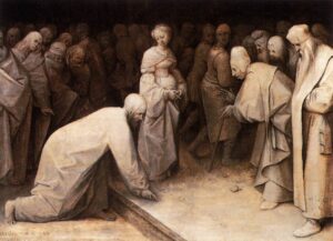
Christ and the Woman Taken in Adultery, 1565, Pieter Bruegel the Elder, courtesy the Courtauld Gallery

A grisaille (pronounced ‘griz-EYE’) is a painting done entirely in shades of grey or another neutral. It can take the form of an underpainting or can be a finished painting in itself. It’s not generally done in lieu of a pencil sketch or notan, but rather as a discrete step in the process of planning a painting.

It is possible to start a painting with just hash-marks on the canvas. Some excellent painters do this; however, for the beginner, that’s the circus trapeze without a net.

Historically, grisaille has been used for finished works of art. This was particularly true in decorative painting, where grisaille might serve as a sort of trompe l’oeilfor sculptural relief. Paint, even in the hands of a master, is cheaper than marble.

Christ and the Woman Taken in Adultery, above, was a personal painting owned by Pieter Bruegel the Elder and his descendants. It’s tiny, roughly 9X12. Its character and intimacy are enhanced by being in monochrome. In that way, it has the feel of a fine drawing.
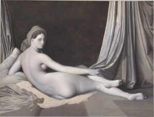
Odalisque in Grisaille, Jean-Auguste-Dominique Ingres and his workshop, 1823-24, courtesy Metropolitan Museum of Art

Sometimes popular paintings were copied in monochrome to simplify life for engravers. Jean-Auguste-Dominique Ingres’ copy of his La Grande Odalisque, above, is one such example. There lies a lesson for students: if engravers, who are skilled artisans in their own right, find it difficult to track value, how much harder is it for new painters?

Mostly, grisaille has been done as underpainting. Until the Impressionists, with a few exceptions, painting was done in what is called ‘indirect painting.’ Paint was applied in thin layers, or glazes. The underpainting was laid down in a thinned form, usually (but not always) in monochrome. This layer also served to tone the canvas. After it dried, subsequent thin washes of color were worked over the top. The underpainting was allowed to mingle with the glaze colors. It’s a powerful technique, but not as lyrical or free as alla prima painting.
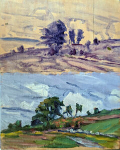
A small underpainting grisaille example I made for my students.

Alla prima doesn’t really require any underpainting, but it’s an act of incredible courage to just start daubing on a blank canvas. Few artists are that brave—or foolhardy, depending on how you look at it. So, we tend to do exactly the same thing as our predecessors—a thin wash of paint, usually in grisaille, that tells us where stuff is supposed to go. Of course, we must learn to judge that first wash to a nicety. Too stiff, and the underpainting is too thick. Too goopy, and everything above it turns to soup.

If the composition reads well at this value-study phase, the painting is almost always going to work, providing you stick with your plan. If it doesn’t, you’re unlikely to salvage it.

All value judgments are subjective. There’s no reliable way to measure the value of a color. The camera is as subjective as the human eye. Your painting should be a carefully judged pas de deux between reality and your own vision. That’s best worked out before you start adding a million different variables in the form of hues.
Monday Morning Art School: the silhouette

Want to paint like John Singer Sargent? Start by learning to draw like him.

Singer with a Glove, 1878, pastel, Edgar Degas, courtesy Fogg Museum

In Edgar Degas’ Singer with a Glove, above, the model’s hand has no volumetric form. There is almost no shading in that hand, merely a silhouette. Yet our minds can immediately decode the image. We understand it because of its context and the accuracy of its drafting. It’s a silhouette of a hand, and it illustrates an important point in painting. The accuracy of drawing matters.

In this painting—so remarkable in many ways—there is, in fact, a carefully-plotted harmony of silhouettes. There are the dark outlines of her cuff and bodice, the inverted triangle of her torso, and the long stripes of color in the background. In fact, very little of this painting relies on modeling; most of it is a series of shapes. Volume is secondary to that dazzling array of shapes and color.
The Valpinçon Bather, 1808, Jean-Auguste-Dominique Ingres, courtesy the Louvre

I used this painting as an example because it’s overwhelmingly obvious. However, in the context of painting, silhouette does not mean a solid shape of black. It means the major shape(s) within a painting. In Ingres’ The Valpinçon Bather, above, the body is the silhouette—solid and tangible. You could almost cut it out with scissors and paste it in a book.

To lead with silhouette, the artist must get the line as perfect as possible from the beginning. That means drawing a proper line, with all its jots and tittles. Want to paint like John Singer Sargent? Start by learning to draw like him.

W. B. Yeats, charcoal on paper, 1908, John Singer Sargent, Private collection.

The two ideas—volume and silhouette—are the fundamental elements of painting. The silhouette is simply the outer contour of the modeled shape. If you draw it perfectly, you can suggest the form with minimal modelling. But it’s through modeling that the form becomes expressive and we have a sense of reality.

In general, artists choose to emphasize either volume or silhouette, but they both exist in most paintings. You can see that co-existence quite clearly in Bruegel’s Peasant Wedding, below. It’s a positive cornucopia of dazzling shapes. Still, the faces are fully formed and evocative, and the figures have volume.

The Peasant Wedding, 1566-69, Pieter Bruegel the Elder, courtesy Kunsthistorisches Museum

It’s tempting to think of silhouette as intellectual and volume as intuitive, because in practical painting, that’s often how they progress. We work from big shapes down to little shapes (‘modeling’) and as we progress, we’re drawing more and more from our non-intellectual reserves.

This post was drawn from a long Facebook discussion between artist Tom Root and his friends. Thanks, Tom!

Awe-inspiring snow

At times, the Great White North reaches down and touches us with its living whiteness and its freakish cold.

Winter Comes From The Arctic To The Temperate Zone, 1935, Lawren Harris, courtesy McMichael Collection of Canadian Art. He is describing exactly what we’re experiencing today, where arctic airmasses have flowed into the northern US.

We got more snow than expected; there’s something like 15” of it in my driveway. That’s nothing compared to the Newark Valley of New York; my friend Marjean trenched a path to her barn through 45” of new powder. Animals must be tended regardless of the weather.

Long before there were cell phones, I routinely painted outside in winter. One year, I committed to plein air painting six days a week regardless of weather. In western New York that can be wicked indeed. That year made me into a painter. It is also how I moved from being an amateur to a professional. I had so many paintings lying around, I was forced to sell them.

The Artist in Greenland, 1935, Rockwell Kent, courtesy Baltimore Museum of Art

Rockwell Kent first visited Greenland in 1929, saying the visit â€œhad filled me with a longing to spend a winter there, to see and experience the far north at its spectacular worst; to know the people and share their way of life.”  In 1931, Kent built himself a hut in in the tiny settlement of Illorsuit, a village north of the Arctic Circle. He wintered and painted there. As a socialist, Kent was enamored of Inuit society, considering their little village a kind of utopia.

Kent later said that his year in Illorsuit was the happiest and most productive time of his life. Among his other pursuits, he acquired a sled and team so that he could make even more remote painting and camping expeditions. In a witty aside, Kent painted himself painting an iceberg, above.

 The Sea of Ice, 1823–24, Caspar David Friedrich, courtesy Hamburger Kunsthalle. The only sign of human activity is the shipwreck.

As a German Romantic, Caspar David Friedrich could be described as a utopianist of a different stripe. His goal was to portray that sublime moment when the contemplation of nature causes a reawakening of our spiritual self. (Friedrich was a city-dweller; otherwise he’d have felt differently.)

Friedrich set out a manifesto for painters that still rings true: “The artist should paint not only what he sees before him, but also what he sees within him. If, however, he sees nothing within him, then he should also refrain from painting that which he sees before him. Otherwise, his pictures will be like those folding screens behind which one expects to find only the sick or the dead.”

The only hint of human activity in The Sea of Ice, above, is the subtle, moralizing shipwreck. This is very different from Pieter Bruegel the Elder’s The Hunters in the Snow, which is a parade of everything medieval man did in the wintertime.

The Hunters in the Snow, 1565, Pieter Bruegel the Elder, courtesy Kunsthistorisches Museum

While the overwhelming sense is one of order and industry, the hunters and their dogs are exhausted, and they’ve bagged only one measly red fox. This painting was done during the Little Ice Age, when the threat of famine was real.

Lawren Harris was one of the driving forces behind the Canadian Group of Seven, and the most elastic of them. He went from impressionism to art nouveau realism to complete abstraction in two decades. His final break with realism occurred in the early 1930s, after he visited and painted in the Arctic.

Harris believed in the arctic as a living force: “We are on the fringe of the great North and its living whiteness, its loneliness and replenishment, its resignations and release, its call and answer, its cleansing rhythms. It seems that the top of the continent is a source of spiritual flow that will ever shed clarity into the growing race of America.” His painting at top is a narration of what happens when that power spills into the northern US and Canada.

Four different painters from different places and times, but they’re all telling stories of winter in very inventive ways. Could we do half as well?

Why travel to paint?

Sometimes it takes different light, and different objects, to shake us into really seeing.

The artistically-mature Vincent van Gogh: View of Arles, Flowering Orchards, 1889. Courtesy Neue Pinakothek

It’s possible to achieve mastery as an artist while never leaving your little village. That’s especially true today, with museum and learning resources so widely available. Yet few great artists ever stayed put. The ones who did—like Frans Hals—lived in places like Haarlem, which were so cosmopolitan that they brought the world to the artist.

Artistic itchy feet are nothing new. In medieval Northern Europe, painters (and other craftsmen) were expected to complete the wanderjahre. For a minimum of three years after their apprenticeship, they traveled around Europe learning their craft from different masters. This is where the English word (and custom) ‘journeyman’ originated.

Van Gogh developing his color sense in Paris: Fritillaries in a Copper Vase, 1887. Courtesy MusĂ©e d’Orsay

The most intrepid, of course, traveled the farthest. Albrecht DĂŒrer was on the road for four years after his apprenticeship ended, including two trips to Italy. (An unhappy arranged marriage might have contributed to his wanderlust.) Pieter Bruegel the Elder went to France and Italy. Not only did the wanderjahreallow craftsmen to study with the best practitioners of their age, it had a tremendous effect on culture itself. The ideas and practices of the Renaissance were transmitted across Europe by these working journeymen.

Vincent van Gogh invented himself as a painter with his move to Paris in 1886. There he met the avant-garde and dropped the somber color palette and subjects of his northern painting. It was not until he went to the south of France in 1888, however, that his style became fully realized.

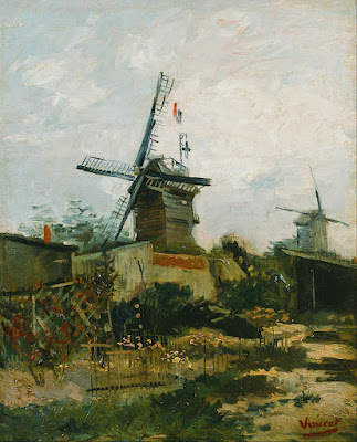
Van Gogh newly arrived in Paris: Le Moulin de Blute-Fin, 1886. Courtesy Bridgestone Museum of Art

Van Gogh found a place that fitted his sensibilities, and his painting expanded to embrace the place. That’s something that happens to many artists, and is perhaps why so many of them are so darn footloose (myself included). But isn’t this just self-indulgence? Can’t you achieve the same thing at home?

A few years ago, I assigned a student to draw a fishing boat in Rockport harbor. Becca & Meagan was iconic; she’s red and was a popular subject for artists and photographers. Sheryl would draw a line; I would correct it. We went back and forth until she finally stopped me and made me really look. The boat she was drawing wasn’t Becca & Meagan at all; the owner had hauled her and replaced her with a different red boat. I was so familiar with the scene that what I ‘knew’ had overwritten what I saw.

Van Gogh in the Netherlands: his first major work, The Potato Eaters, 1885. Courtesy Van Gogh Museum

I had an epiphany while watching a student painting an horno in New Mexico last week. These bake ovens are traditional conical structures, deceptively simple in form. Linda, who’s from New England, couldn’t rely on what she thought she knew. She had to hunker down with the essentials of measurement and line to get it right. Because she did, she drew (and then painted) the hornoaccurately.

When we’re painting what we’re familiar with, we can fall into relying on a few sketchy lines to suggest what we already know. That leads to ambiguous, waffling painting. Sometimes it takes different light, and different objects, to shake us into really seeing.

I’m doing a FREE Zoom workshop on Friday, October 2 at 5 PM. Consider it Happy Hour, and join me with a glass of wine, a spritzer, or whatever else. We’re going to talk about studying painting. What should students expect to get from a workshop or class? What should teachers offer? Have you always wanted to try painting but been afraid of classes? Are you taking classes but want to get more out of them? Join us for a free-ranging discussion.

While this is in advance of my Find your Authentic Voice in Plein Air workshop in November in Tallahassee, everyone is welcome. There’s absolutely no charge or obligation. Signups are already brisk, so register soon!

Reading (and writing) a painting

A good artist, like a good writer, controls how his painting is read.

Early November: North Greenland, 1932, oil on canvas, Rockwell Kent, courtesy the Hermitage

People are sometimes under the mistaken notion that I’m intellectual. In fact, my taste in books is decidedly low-brow. Luckily, there are as many different books out there as there are readers. The same is true of paintings.

Reading a painting is similar to reading a book. First, there’s an introduction. We enter every painting at some point, although the artist need not create a literal visual path in for us. It’s just as likely that there are a series of focal points that the reader notices and absorbs in order. These are supported by incidental matter that contributes tone and information. A good artist, like a good writer, doesn’t leave this to chance. It’s organized in the composition phase and then supported in the painting phase.
Whalers, c. 1845, oil on canvas, JMW Turner, courtesy Metropolitan Museum of Art. There are only three intelligible passages in this painting—the whale, the whalers in their dories, and the ship. The water might as well be a wheatfield for all the information we’re given.
That requires that you, the artist, understands the basics of composition. You control the motive line of your painting. You know how to use contrast and color to encourage the viewer to read your work in a specific order. You know how to make some passages subservient to these main themes.
You must understand the focal points of your painting, either overtly or subconsciously. These are not necessarily the subject. In Rockwell Kent’s Early November: North Greenland, 1932, our eyes go first to the iceberg in the foreground. Kent has made it the most luminous, warmest part of the scene, and set it off against the briny depths. Next we look at the hillside behind, which is almost as bright as the iceberg. Only after that does our eye travel to the human activity at the bottom. Here we’re arrested by an ageless story: man wrestling against the vast power of nature for his very survival. We spend a long time looking at these tiny fishermen, which we wouldn’t have done had they been what we noticed first.
The Census at Bethlehem, 1566, oil on wood panel, Pieter Bruegel the Elder, courtesy Royal Museums of Fine Arts. As with the gospels, all the action is in the most inconspicuous corner.
Kent has borrowed a technique first used by Pieter Bruegel the Elder four hundred years earlier. In his Census at Bethlehem, all the bustle and contrast of the midfield drive our eyes down to the least important part of the painting, the corner. There the scene is laid for the birth of Christ. Just as in the Bible story, this great event happens in an unimportant place.
We know that because we’re bringing our own understanding to the painting. In both literature and painting, prior knowledge plays a profound role in how we read the work. There are symbols we must decode, and experiences we relate to. The thematic thread tying together the three paintings above is the insignificance of man. Every one of us has felt that some time. That feeling transcends the specific narrative.
The Charioteer of Delphi, 478 or 474 BC, courtesy Delphi Museum. We may know nothing of this young man, but his beauty and concentration speak through the ages.
Some of the great art of the past has lost its narrative power today. We don’t know enough Greek mythology or Bible to fully decode them. But the greatest still have the power to transport us. They touch a common chord of experience and emotion.
In our digital culture, we don’t often take time to read artwork quietly. But that’s in the shopping phase. In the end, paintings will go home with someone, to be seen over long periods of time. To survive, they must have some story to tell, some depth of meaning, or they will be relegated to the attic. The work that compels the most on Instagram may be, sadly, the least successful in real life.

Slow looking

Don’t blame people’s short attention spans. Blame your overstuffed museums.
Above the Eternal Tranquility, 1894, Isaac Levitan, courtesy State Tretyakov Gallery
A landmark study conducted at the Metropolitan Museum of Art in 2001 found that the mean amount of time visitors spent looking at great works of art was 27.2 seconds. However, the mode—the number seen most often—was just 10 seconds. In 2017, the study was repeated at the Art Institute of Chicago, with almost exactly the same results.
There was one striking difference, however; the later study found those times included people taking selfies with the work. This was common across genders, race and age. It meant that the already scant time that museum-goers were spending looking at paintings was being deflected into the act of making self-referential photos.
Westminster Abbey with a procession of Knights of the Bath, 1749, Canaletto
Recently, Tate Modern cited a study saying their average viewer spends eight seconds looking at a piece of art. Another study declared that gallery goers spend two seconds looking at the painting and eight seconds reading the label, a trend that depresses me more than the selfies. The illustration for the latter story was of a couple reading the label for a large solid-grey canvas. Perhaps two seconds was actually too long.
Clearly, people don’t spend much time looking at paintings when they visit museums. But for some reason, museums are very popular with tourists. Among the world’s leaders are the Louvre, with 8.1 million visitors; the Met, 7 million; the Vatican Museum, 6.4 million; Tate Modern, 5.6 million; and the (US) National Gallery, with 5.2 million. That’s a lot of people milling through buildings stuffed with things nobody wants to look at.
To combat this, Tate Modern is pitching something called slow looking. They want you to look at paintings for ten minutes, but saythat five minutes or half an hour are okay, too. “To keep track of time, set a quiet timer on your phone or try simply counting a number of breaths.”
Portrait of a Lady, c. 1460. Rogier van der Weyden, courtesy National Gallery of Art, Washington DC
Please, no. Painting and sculpture are unique in that they don’t impose obligations on our time. Once we open a book or take a seat at a movie, we’ve obligated ourselves to sit through a narrative whose duration is laid out for us. With painting, we’re free to walk right past or to take a bench and sit for an hour.
Obviously, nobody metered the time spent looking at all the works in any of these major galleries. The Metropolitan owns 2 million pieces; the Art Institute of Chicago has about 300,000. (Of course, only a fraction of them are on display.)
What works were they measuring? There’s more content in a Roger van der Weydenaltarpiece than a stripe painting by Kenneth Noland. There’s the architecture, the starched linen coifs, a blood vessel throbbing below a monk’s tonsure, the oddly-plucked hairline of a lady, and angels with wings that match their gowns.
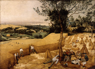
The Harvesters, c. 1565, Pieter Brueghel the Elder, courtesy the Metropolitan Museum
One of the powerful attributes of visual art is how it can disengage you from time and place. Stand in front of a Canaletto and you’re suddenly in Venice. But that isn’t going to happen with someone at your elbow, silently pushing you along.
Of course, paintings were never intended to be hung in a crowded museum. They were originally in churches, dining rooms, drawing rooms, and public halls, as part of the experience of that place. People looked at them over many years. Perhaps the problem is not our digital age, but the massive warehouses of art we’ve created and called museums.

Cause du Jour?

Be careful about reading your own times and beliefs into paintings.
Massacre of the Innocents, 1565-67, Pieter Bruegel the Elder, courtesy British Royal Collection
It has been, as my friend Poppy Balser from Nova Scotia noted yesterday, an unsatisfying season for winter painting along the North Atlantic. Squalls have resolved into freezing rain. That makes for bad optics and treacherous footing.
Monday, my pal Ed Buonvecchio and I had a date to paint. It stormed, so we rescheduled for Thursday. He texted me from Augusta in the morning. “0° here!” By 11 AM, it had reached a meager 16° F. with a light, biting wind. It’s one thing to be outside in those temperatures; it’s another to stand for hours in front of an easel. We’ll try again next week.
Artsy recently ran an essay about Pieter Bruegel the Elder’s winter landscapes and their relationship to the Little Ice Age, the intense cooling cycle of the earth that occurred between roughly 1300 and 1850. It’s interesting but hyperbolic reading, intent on making a statement about global warming.
Hunters in the Snow, 1565, Pieter Bruegel the Elder, courtesy Kunsthistorisches Museum
About Hunters in the Snow, Jonathan McAloon writes, “three men and their dogs—soggy, exhausted, and hunched against the cold—trudge home from a hunting expedition,” returning with only “a single small fox.” Yes, dogs and men are tired—as anyone is after hiking through deep snow—but there’s no reason to think they’re wet, and they certainly aren’t malnourished or dressed in rags.
There was much suffering during the Little Ice Age, including the Great Famine of 1315–1317, which took out millions of people worldwide. Seawater froze as far south as the Bosporus. The Swedes could march across frozen ocean straits to attack and defeat Denmark. Grains and vines failed in the northern reaches, and Norse settlements in the New World withered away.
Winter Landscape with (Skaters and) a Bird Trap, 1565, Pieter Bruegel the Elder, courtesy Royal Museums of Fine Arts of Belgium
But those settlements were themselves the result of another climatic fluctuation. The Little Ice Age followed on the heels of the Medieval Warm Period. The North Atlantic became so temperate that the Vikings sailed as far west as far as L’Anse aux Meadows, and probably beyond. Warmth in some regions of North America exceeded temperatures of the current (1990–2010) period. I’m not telling you this to ignite yet another tedious argument about global warming, but to set the context of Bruegel’s painting.
For three hundred years, Europe was warmer than normal, and then for 550 years, it was colder than normal. These weather shifts brought displacement, disease and drought. Naturally, people tried to explain them, but they also learned to exploit them.
The period in which Bruegel painted was bitterly cold, but it was also the third century of the Little Ice Age. To him, intensely cold winters were the norm. The people in Bruegel’s village are simply living through winter, much as we do today.
The Census at Bethlehem, 1566, Pieter Bruegel the Elder, courtesy Royal Museums of Fine Arts of Belgium
It’s important to link great paintings with their historical context; it teaches history, and it makes us understand the painter. But focusing on an imaginary struggle between the terribleness of winter and its harsh beauty deflects from Bruegel’s own focus. He was, of course, the first painter of snow, but he was also a faithful scribe of the Protestant Reformation.
Bruegel dealt with a problem which still bedevils us: how can the artist tell an ancient, unvarying story in a new language? His solution was to quote traditional Bible stories in the context of his own experience. This was not just the landscape, dress and activities of his times. It was the Reformation idea of priesthood of all believers, represented by the masses of people who inhabit his paintings. That marks him as a northerner as surely as the snow does.

Black and white all over

A class exercise on design, and a chemistry question I can’t answer.
Christ and the Woman Taken in Adultery, 1565, Pieter Bruegel the Elder, image courtesy of the Courtauld Institute of Art but the painting has been stolen.

Yesterday was the kind of day that drives poets mad. Just below freezing, it rained heavily, with gusts of wind. Our plein air painting class was forced into the studio.

grisaille (pronounced griz-eye) is a painting done entirely in shades of grey or another neutral color. Historically, it was used as decorative painting in imitation of sculpture. Some are what we moderns call duotones. They have subtle colors added to extend the value range. But for our class, they would be strictly in black and white.
Abstract design by Christine Covert

Painting runs along two parallel tracks. The first is design. This is why painting teachers relentlessly push students to do thumbnails and other value sketches. Value is our most important tool. Get it right, and you can be wrong about a lot of other things.

(I came to this realization late, by the way. I studied with Cornelia Foss, who tinkers endlessly with the ‘rules’ of painting. From her I got the hairbrained idea of minimizing value as a structural concept. However, this was a misinterpretation on my part. That’s a good lesson in not asking the right questions at the opportune moment.)
Grisaille by Jennifer Johnson.
The second track is color. It’s so much more interesting in some ways that it can be a distraction to the beginning painter. Mixing paints is both difficult and exciting.
Of course, value is part of color. In color space, value is the range from black to white. All successful paintings have some kind of pre-meditated value range in them. A high-key painting is one in which the contrasts are extreme. A low-key painting is one in which the range is narrower. In either case, there must be midtones too. They are also part of the design process.
Grisaille by David Blanchard.
It’s a lot easier to experiment with value when you’re not fussing about color management at the same time. One way to familiarize yourself with this idea is to paint a ten-step scale ranging from black to white. That’s not a bad exercise, but it’s boring. Instead I asked my students to do the monochromatic still life that I assigned in Monday Morning Art School last month.
Grisaille by Chris Covert.
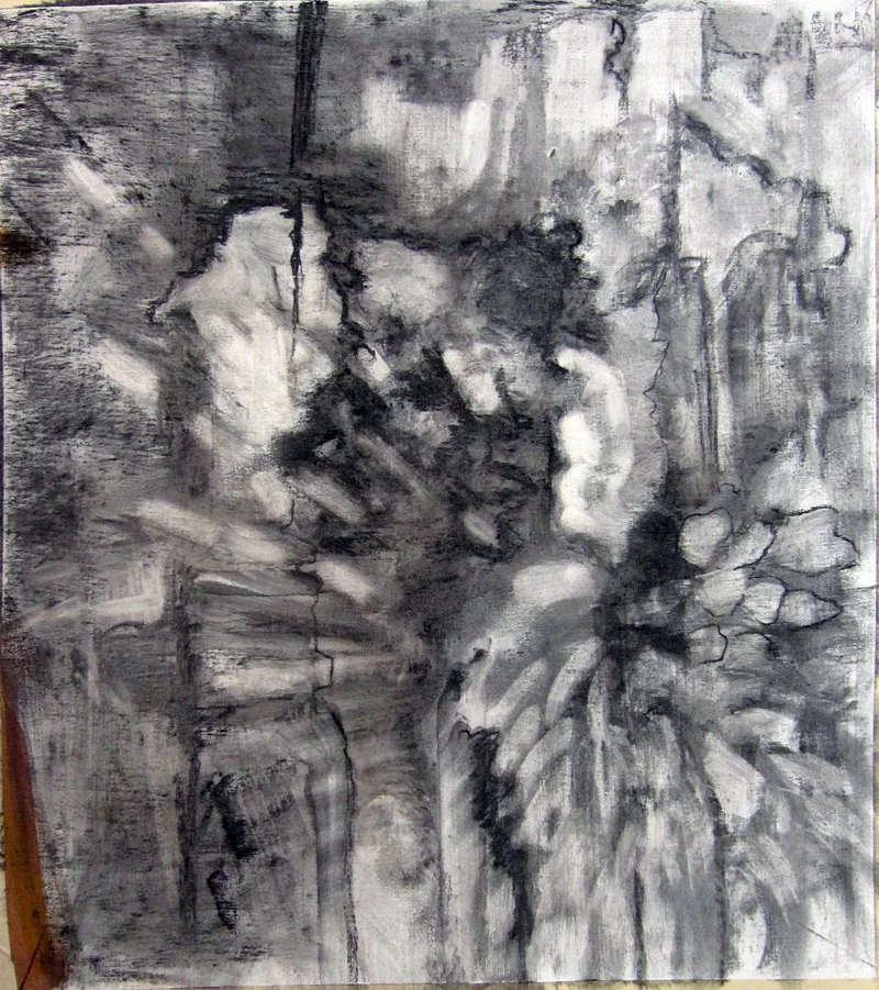
Before that, however, they did an abstraction in charcoal, based loosely on the drawing I included in yesterday’s blog. Charcoal is the most painterly of drawing tools, but this is something you can do in a sketchbook while watching TV. It is a bit intimidating for someone to ask you to do an abstract drawing, but if I call it “doodling,” you can relax and get on with it.
There are only two rules:
  • Have a full range of tones, not just a line drawing.
  • And no realistic objects belong in your drawing at all.

A question: One of my students has had a problem with red pigment from her toned boards bleeding into her final paintings. She prepared a sample board for me to test her M. Graham acrylics vs. a similar red from a very inexpensive craft paint. I tried the squares at 15 minute- and 30 minute-intervals. The M. Graham pigment bled into the white paint, but the craft paint did not. I then tried the same intervals using my own Golden-toned board. Again, there was no bleeding.
Acrylic is pigment suspended in acrylic polymer emulsion. It is supposed to be water-resistant when dried. That doesn’t mean it’s oil-resistant. I’m beyond my chemistry knowledge here, but if any readers can suggest what’s happening, I’d be very grateful.

My favorite painter?

The Procession to Calvary, 1564, Pieter Bruegel the Elder

“Who are your favorite painters?” a reader asked. That’s an impossible question. Instead, here are some painters who I profoundly admire and you should too.

Pieter Bruegel the Elder was the most significant of the Dutch/Flemish Renaissance painters. Among the first generation to paint other than religious scenes, he was a great landscape artist. His paintings, especially genre paintings, are a whirl of human activity. But what I admire the most is his ability to hide the focal point, or multiple focal points, in insignificant corners of his paintings. His figures are as fresh and realistic as when they were painted.

Knight, Death and the Devil, 1513, Albrecht DĂŒrer

Albrecht DĂŒrer was a great painter, but I admire his engravings, woodcuts and drawings most. He was a superlative draftsman, particularly in perspective. It’s his simple, profound understanding of the Passion that moves me most. He did at least three versions, and they’re the visual equivalent of J.S. Bach’s St Matthew Passion.

The Fall of the Damned, c. 1620, Peter Paul Rubens

Peter Paul Rubens may have been intellectual, classically trained, and the favorite painter of the Counter-Reformation, but to me, he’s the progenitor of comic-book art. I draw a direct line between his dynamic canvases and the work of the late Steve Ditko. Both dealt with cosmic issues in a restless, complex way.

Weymouth Bay, c. 1816, John Constable

John Constable is best known for his great set-pieces like The Hay Wain, but he is also the (largely uncredited) inventor of modern plein air painting. In place of a classical education, he spent his youth wandering the fields of his native Essex. This “made me a painter, and I am grateful,” he said. By the time he convinced his father to let him study art, the damage was done—he was a fresh, observational painter in an age when classicism was king.

The Railway Station, 1873, Édouard Manet

Édouard Manet is known as a pivotal painter in the transition between Realism to Impressionism., but his importance to me is his surface treatment. He was the first painter to eschew sparking bright lights and a superlative finish in favor of his own, raw, handwriting. He is, in this sense, the father of Modernism.

The Red Vineyard, 1888, Vincent van Gogh

Vincent van Gogh hardly needs any introduction, being one of the most influential painters in art history. His importance to landscape painters can’t be overstated. He was the precursor to Fauvism, and that, far more than Impressionism, is what speaks to our own times.

Algoma Sketch 48, 1919-20, by Lawren Harris (member of the Group of Seven)

Tom Thomson and the Group of Sevencame into being across Lake Ontario from my hometown of Buffalo, but I didn’t really learn about them until adulthood, since realism was so out of favor in my youth. Still, these painters did more than any others to apply the principles of Impressionism to the North American landscape. They vary greatly in style, but they were united by their love of the Great White North and the wilderness. They were intrepid extreme plein air painters.

Resurrection Bay, Alaska, 1965, by Rockwell Kent

Rockwell Kent was eulogized as “a thoughtful, troublesome, profoundly independent, odd and kind man” by the New York Times. That’s all true, but he was also terrific painter, aggressively simplifying his subjects to their essence. His subjects—concentrating on the Adirondacks, Alaska and Monhegan—are all about the ever-changing light of the north.

Red Shirt and Window,2013, Lois Dodd (courtesy Alexandre Galley, New York.

Lois Dodd could be admired just for her tenacious success in the male-dominated New York art scene. Her credentials are as sterling as any of her male peers, but she had her first career museum retrospective in 2013, when she was already in her eighties. That would mean nothing if she weren’t also a superlative, self-directed painter. She ignored Abstract-Expressionism and Pop Art to forge her own, realistic way.

The final workshop I’ll be teaching in 2024:

Reserve your spot now for a workshop in 2025:

Going by the numbers

We should all immediately switch to Instagram. But as with blogging, there’s a lot of unpredictability on the internet. There’s still plenty of room for intuition.
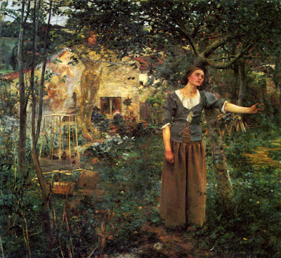
Joan of Arc, 1879, Jules Bastien-Lepage, courtesy Metropolitan Museum of Art

Yesterday I had my left foot operated on, giving me a matched pair of incisions and some hope for less pain going into the summer.

My mind is muddled, so I’d hoped to reprise an old post. To that end, I consulted my stats for this blog. Blogger tells me what my top posts are (although this blog has been on three different platforms over the years). A few years ago, the most popular posts were The One Thing Every Painter Should Know and a recipe for scallops from my friends Berna and Harry.
Plastic bags, dethroned by art history.
Since I last checked, art history has steamrolled over them. The top view-catcher is this post about Jules Bastien-Lepage’s Joan of Arc. It’s eleven years old, it violates the modern dictums of length and language, it’s complex, and it continues to get readers. In fact, there are a number of art history posts on that top ten list, including The Adoration of the Magi in the Snow and Ingres and Napoleon.
Measured week-to-week, however, art history is a slow starter. Those posts usually have the lowest immediate readership, even when they have much to say.
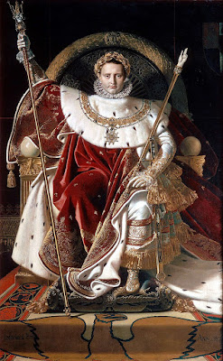
Napoleon I on his Imperial Throne, 1806, Jean-Auguste-Dominique Ingres, courtesy, MusĂ©e de l’ArmĂ©e, Paris
After more than a decade of blogging, I still see no discernible pattern for what will be popular in a post. That’s liberating. It means I can write about whatever I care about, rather than pitching content to some ‘expert’ idea of the public’s low taste.
A surveytells us that new galleries are opening more slowly than they did a decade ago. This is part of a general decline in entrepreneurship in the United States. It’s no surprise to those of us who worry about our battered small town Main Streets, but there’s good news in that same report.
It surveyed a group of high-net-worth individuals about their collecting habits. These are people with more than $1 million but less than $5 million in assets. The vast majority (89%) spent $50,000 a year or less on art and objects. That suggests they aren’t buying from tony Manhattan galleries, but from low- and mid-tier galleries. In other words, they’re buying works by people like you and me, in places like S. Thomaston, Camden and Ogunquit.
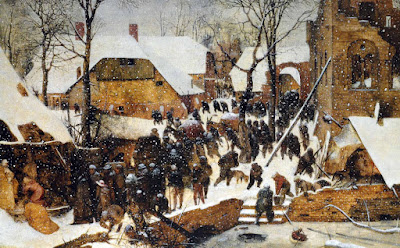
The Adoration of the Magi in the Snow, 1567, Pieter Bruegel the Elder, courtesy Oskar Reinhart Foundation
Meanwhile, the online market for art and collectables continues to grow, but at a slower pace. That makes sense as a market matures, and it’s nothing to worry about. More than half of online art buyers said they will buy more art online in 2018 than they did last year, according to the Online Art Trade Report.
Instagram has dethroned Facebook as the preferred means of online promotion. In 2016, galleries used the two platforms almost equally. Now only 31% of respondents prefer Facebook to the 62% who liked Instagram. Instagram is also the favored platform for collectors under 35, 79% of whom said they discover new artists on Instagram and 82% of whom said they use it to keep up with artists they like.
Going by the numbers, we should all immediately switch to Instagram. But just as with blogging, there’s a lot of unpredictability in sales. There’s still plenty of room for intuition.

It’s about time for you to consider your summer workshop plans. Join me on the American Eagle, at Acadia National Park, at Rye Art Center, or at Genesee Valley this summer.