Monday Morning Art School: sketching with Inktense pencils

Inexpensive, portable, and way fun, you can use watercolor pencils anywhere you normally sketch.

One advantage of being a lefty is that nobody borrows your scissors.

I use Derwent Inktense pencils to draw my sketches in field paintings. On a gessoed board, you can erase with a damp cloth. When you start laying oil paint down, the watercolor drawing freezes in place. I’ve been doing this for so many years, I’d forgotten why I bought the pencils in the first place. That is, until Mary Byrom reminded me last week that they’re great for pocket drawings and value studies.

This and a multimedia sketchbook is all you need to carry.

I buy them in packs of six in burnt sienna and ultramarine. This is a warm-and-cool combination that makes great neutrals in every medium. I use it for watercolor value studies and for my dark neutrals in oil colors. I can flip from warm to cool instantly with this mix, making it perfect for setting darks.

I always start with a pencil sketch.
The simplest (and most important) value study looks at the ways in which you can translate an image into simple black and white. At the same time as you’re thinking about black and white, you can also think about cool vs. warm. This is the modern, post-impressionist way of looking at value.
All light has color. An overcast sky has a color temperature of about 10,000K (blue). A room lit by candles has a color temperature of about 1,000K (orange). The most neutral light is sunlight at noon.
This photo of Mission San Jose in San Antonio starkly demonstrates the color of light. All the walls are white.
Of course, the ambient light color is also affected by the objects it’s bouncing off. I took the photo above in Mission San Jose in San Antonio to demonstrate this. The walls are white, but there was incandescent light above the loft. The lower part of the room was lit by daylight or in shadow. The effect was to make it appear that the room had been painted in blue and gold.
An aqua-flow brush is the easiest way to move Inktense around.
The color of shadow is always the complement of the color of the light. Of course, this is all mutated by the color of the objects being lit. A red sphere in warm light will appear crimson in the light spots and more purplish in the shadows. That’s just red mixed with orange light and blue shadows. We simplify matters by saying that if the light is cool, the shadows are warm and vice-versa.
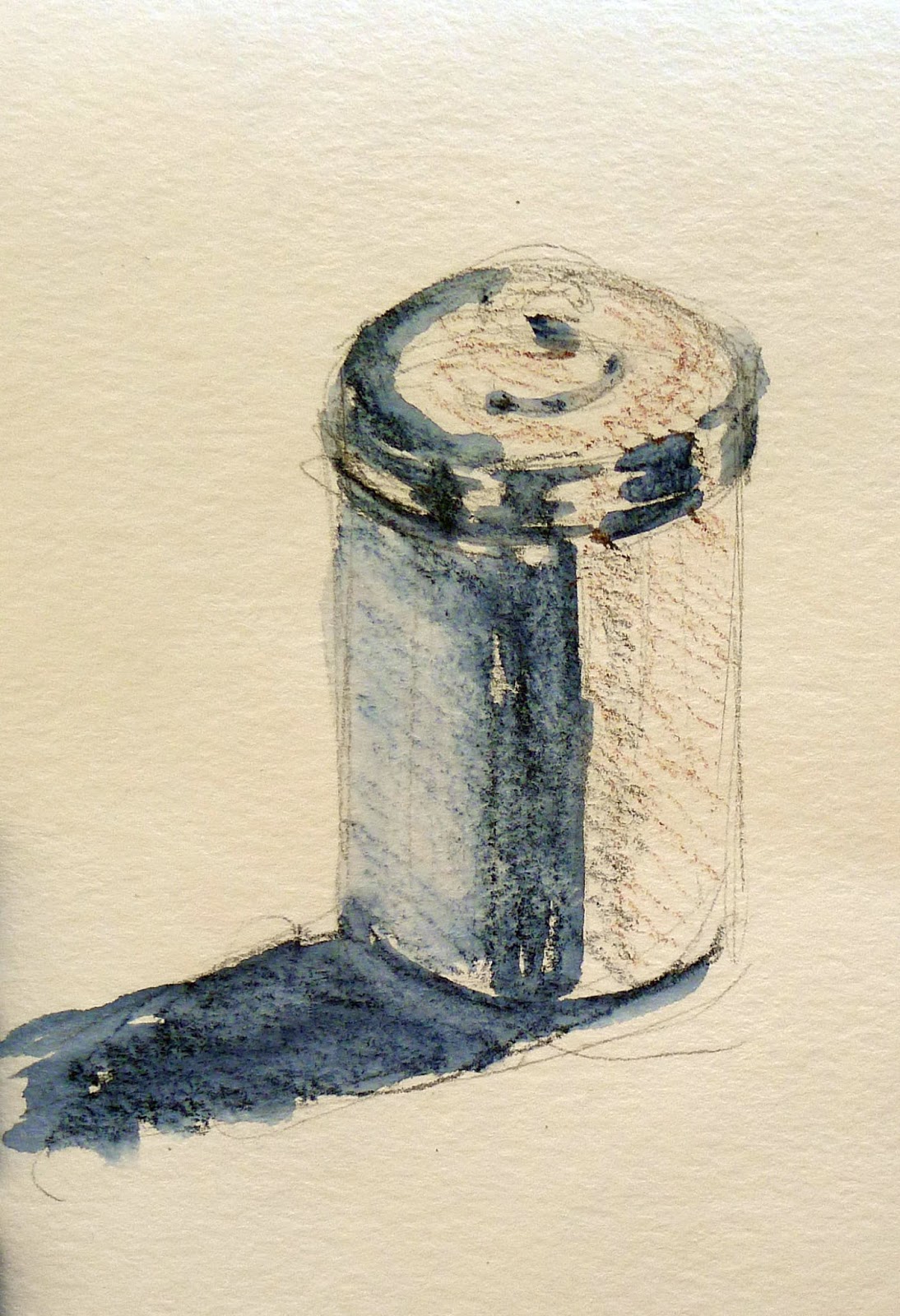
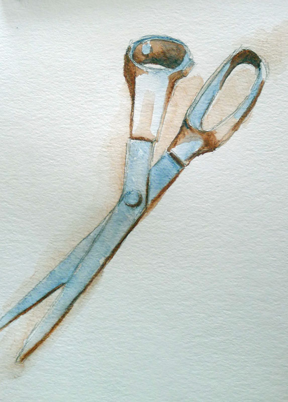
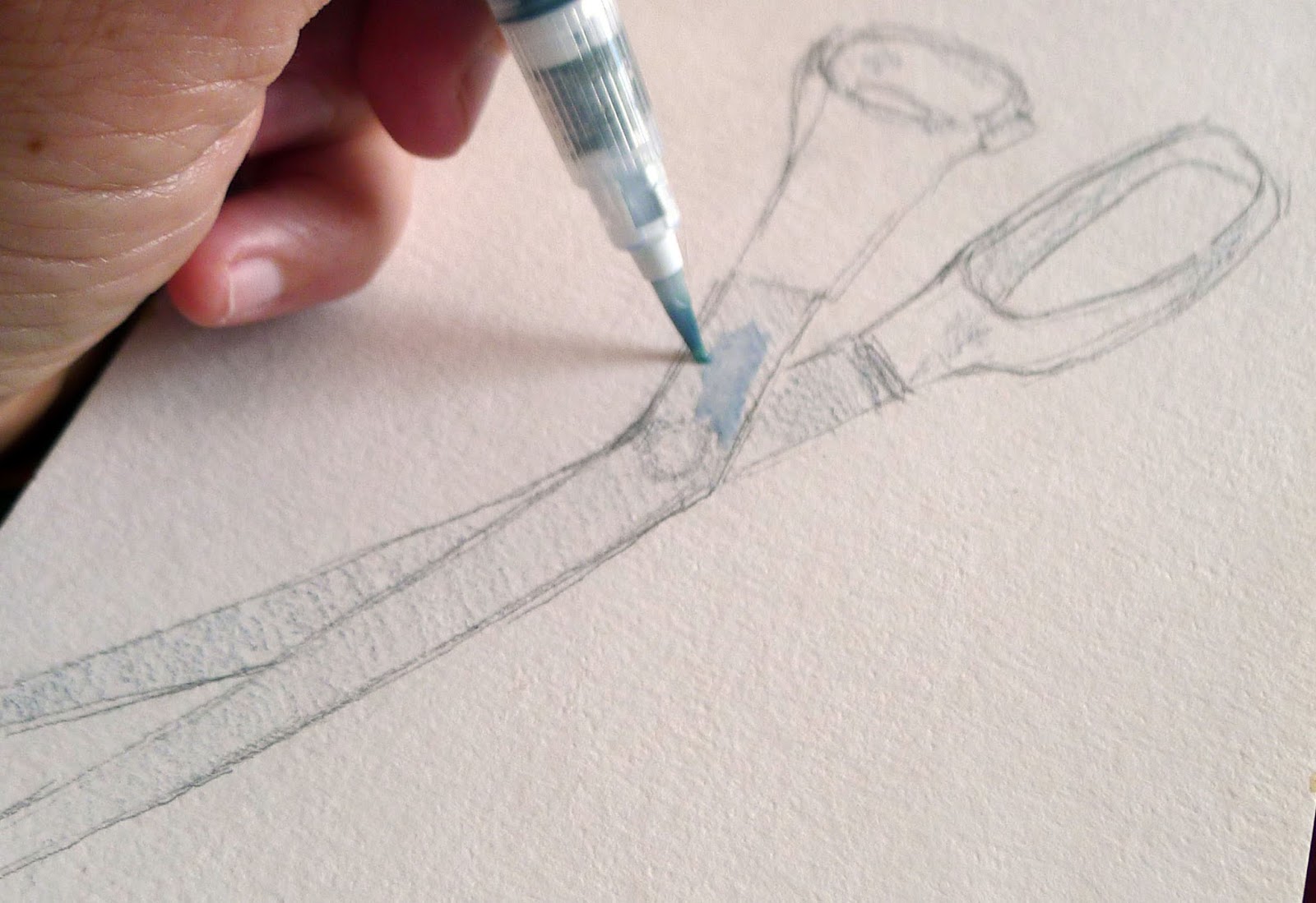
The principle’s the same whether the light is warm or cool, as long as it is consistent and matches reality.
Inktense pencils allow you to add in color temperature as you think about value. Ignoring their actual color and modeling, I made a simple contour drawing of my sewing scissors. I set the lighter half of my value range in blue. It’s simple to soften Inktense with a water-brush. Just fill it and run it over your pencil drawing. When that was done, I added my shadows in burnt sienna. You can get fairly intense darks with Inktense pencils.
Two different Inktense pencils can take you almost anywhere.
My fantasia was hardly inspired, but I’ve included it to show you how much depth you can get out of Inktense pencils. You can buy two Inktense pencils, a water-flow brush and a small pad of watercolor paper for around $20. The combination is no bigger than a sketchbook and pencil.

ADDENDUM: Susan Hanna points out that Derwent doesn’t havethose color names. I should have checked first. My burnt sienna WAS a color called Venetian Red; they don’t market it as that any more. Try Red Oxide. Try Deep Blue for ultramarine. Once again, caught in the trap of romance naming for pigments.

SECOND ADDENDUM: Another reader mentions that Inktense pencils are fugitive. She prefers Caran d’Ache watercolor pencils. I’ve not tried them so can’t comment.

It’s about time for you to consider your summer workshop plans. Join me on the American Eagle, at Acadia National Park, at Rye Art Center, or at Genesee Valley this summer.

Monday Morning Art School: Mastering values

Value is the engine that drives composition. Here’s a great exercise to help you get it right.

Four value studies of my boots. From top left: flat light, side light, fill light, back light. There’s a diagram below.
I learned to paint in New York, where the sun don’t shine. I’m good with flat lighting; I still struggle with the often-dazzling light of coastal Maine. That’s one of the reasons I encourage doing value studies before pulling out all the stops in a plein air setting.
Value means the lightness or darkness of a color. There are two other attributes of color: hue (where it sits on the color wheel) and chroma (its saturation or intensity). The human eye perceives value first, so artists rightly concentrate on it.
This week, I’m pulling out an old exercise. I didn’t think it up; it has been handed down from teacher to student since the tenebrists.
The boots themselves, from top left: flat light, side light, fill light, back light.
I want you to do four different value studies of the same object. Choose an object appropriate for your drawing experience and the amount of time you have, as long as it’s not too regular or spherical. An avocado, coffee mug, or an apple will do. I used my boots. We’ve been very close friends over the past three weeks, but they were more time-consuming than was strictly necessary.
The first drawing you’ll do (top left) should be in ambient light in your studio or room, preferably during the day. The lighting should be flat, the contrast minimal. Then, add a spotlight to your process. Any table lamp minus its shade will do. Start with the light behind your right shoulder. In the third drawing, move it so that it is lighting your object directly from the side. In the fourth, bring it around as far as you can to back-light the object. (You’ll blind yourself if it’s shining directly in your eyes.)
Limit your drawing to three levels of grey and black. I used Prismacolor neutral grey markers because that’s what I use in my classes and workshops. You can use pencils, charcoal or pre-mixed paint. Just discipline yourself to keep your exercise strictly to three values.
Your starting line drawing should be no more complicated than this.
Start with a simple line drawing in your sketchbook, as I did with figure 1. Then divide this into light-medium-dark areas. Fill them in appropriately and see what you get.
Obviously, there is a gradual range from absolute dark to light in a real-world scene. How you break that into light-medium-dark is subjective. You will not see the jumps at the same place I saw the jumps. Experiment! And don’t worry about creating finished artwork—I didn’t. This is a process-driven exercise. It should result in a flurry of paper rather than a masterpiece.
You will lose lines, which are what we think of as defining shapes. That’s one of the major points of this exercise. Edges have their place, but their place isn’t everywhere.
Our lighting scheme. #1 was done with ambient room (flat) light, #2 with a fill light, #3 with a side light, and #4 was back lit.
What our minds read is, “boot sitting on a table (which your mother told you not to do).” What we actually see is a series of values, in which the back corners of those boots meld into darkness and the fronts stick out and reflect light. It’s in following the values and ignoring the lines that we begin to create an artistic vision.
This is not meant to replace the pencil sketch, which is invaluable in understanding an object. Rather, it’s an extra step in planning a painting. Working in masses of values helps you to:
  • Use the full range of values; 
  • Simplify shapes;
  • See in abstract compositional terms; 
  • Focus on the movement of the eye through the painting;
  • Create more depth.

Remember, there’s a Facebook page for Monday Morning Art School. I’d love to see your finished exercises there! 

And we’re off

The locals were eager to share their million-dollar views and, by the way, did we need a washroom?

Ed and I did multiple value studies trying to sort out our painting sites for today.
The Canadian Maritimes shipbuilding industry dates to 1606, when two small boats were built at Port Royal. The availability of timber and proximity to the sea meant that by the nineteenth century, Nova Scotia’s shipyards were recognized worldwide.
There’s no sign of this boatbuilding industry left today, but Parrsboro built 10 barks, 2 barkentines, 11 brigs, 187 schooners, 1 full-rigged ship, and 41 brigantines. How do I know? At four in the afternoon, while I was sorting photos on my computer, Ed Buonvecchio was reading Parrsboro history.
Meanwhile, Poppy Balser was sitting on a stoop Instagramming and Mary Sheehan Winn was drafting a lobster boat. We were scattered along the harbor but linked by our cell phones.
Ed and I spent the morning doing value studies of possible locations. Because we’re in one car, we needed to agree on our final locations, without a lot of last-minute discussion. We listed the possibilities and then each listed them in order of priority. Our lists ended up being very nearly identical. In the end only one question remained: should we choose the Two Island overlook with the blue roof or the red roof?
Nova Scotians are very friendly. Several stopped to chat as we worked. Inevitably, they suggested that they, in fact, had a better view from their back deck. And, by the way, did we need a washroom?
At one point, I tossed my keys to Ed and took off with a stranger in his Ford F-150, which is the official truck of Canada. I wasn’t overly worried. He’d mentioned that he’d met his hero, George Herbert Walker Bush, several times. A man with such taste had to be trustworthy. He turned out to be charming and witty, and I returned to his property several times, to show it to Poppy and Ed in succession.
Thanks to Mary and her local connections, I’ve learned a lot about Parrsboro in two short days. In addition to her living relatives, she’s related to someone in every cemetery in town. “Aw, hello, Uncle Remus!” she would exclaim as we passed an old burying ground. “Hello, Cousin Louise!” At one point, she jumped from the car and tore crosslots looking for a grave. She caught up with me at the bottom of the hill, breathless. “That was easier than I expected,” she puffed.
That insider information made me smug. “Poppy,” I said when she arrived, “I know absolutely everything.”
“Do you know where the weir is?” she challenged. Fishing weirs are an ancient technology for catching tidal fish, dating back to prehistory. They’re dying out now, but Poppy is a master at painting them. And Parrsboro has one, just across the water from Parrsboro’s hypermodern tidal turbine, which unfortunately failed under the enormous hydraulic pressures of the Bay of Fundy and is being rebuilt this spring.
After we visited the weir, we took off at breakneck speed. I had less than three hours to show her all the sights before we were expected for the opening festivities. We were so short of time that I changed my shirt in the parking lot of the Cape D’or Lighthouse. It was so desolate that I could have had a sponge bath with nobody noticing.
We arrived back in Parrsboro with enough time to wash our faces and hands and scurry in to our appointment. By the time you read this, we’ll be out in Port Greville painting. Can you tell I’m excited?

The many virtues of value studies

They can help you fix a bad painting or avoid painting one in the first place. They can be inventive, abstract, stress-free and fun.
Value study of my pieris japonica.

I knew I would have a small class the day after the long weekend; I didn’t expect it would be just Roger. It would also have to be indoors because the weather forecast was for cool air and rain.

Private lessons don’t allow time for the student to practice what I’ve taught. Nobody can remember more than a few things at once without applying their new skills. Having an instructor hovering while you’re practicing can be overwhelming. But Roger is a good mid-level painter and this seemed like an opportunity to work one-on-one on value studies with him.
What I’d intended us to do was straight up value studies of an intentionally-boring scene, but we strayed.
I set up a monochromatic still life that I would never really paint: a wooden basket on a wooden tray, with wooden tools and blocks scattered around it. Any interest came from the pattern of shadows and light. We sat down with some umber paint and a handful of small cards and did a few studies of the scene.
Roger asked me what had gone wrong with a plein air painting he’d started in April. That was another day of changeable weather. The eastern sky had glowed pale yellow across Rockport harbor just before it dumped icy rain on us. The odd colors stuck with him.
My interpretation of the painting more or less as Roger painted it.
When a painting is failing, I ask myself some basic questions: Is my composition good? Are my paints fresh? Am I physically uncomfortable? Are my brushes hardened into sticks? Has the subject changed beyond recognition?
I thought Roger had abandoned his initial value drawing, weakening his composition. When that happens, we need to go back and restate the darks. In fact, this is a necessary step in almost every oil painting, but it’s particularly important when you can’t remember what attracted you to the scene in the first place. It helps to have your thumbnail study on hand.
How I thought he could improve the scene.
We didn’t, so I painted a quick copy of what he had on his canvas, and then a suggestion of how I might fix it. I’ve never done a value study after the fact, but it proved helpful. I need to remember that when I’m flailing around at a plein air event.
Meanwhile, the fickle sky had turned a deep cornflower blue. There was nary a hint of the promised rain. There are too many ticks right now to stand in tall grass and paint, so we moved our operation to my patio, and did studies of the light playing on the roof of my shed. That pointed out one of the great values of preliminary studies: they save you from wasting a lot of time on bad ideas. Bleech.
My shed. Boring.
My pieris japonica, on the other hand, is a leggy, ailing shrub that nonetheless looks good against the woods. Our studies of that turned out much better.
Lastly, I showed Roger my favorite game with value studies: making abstractions and then applying real objects to them. This is akin to finding faces in the steam on your shower walls. I create a loose monochrome abstraction that I like, and then mate reality to it. I’ve demonstrated the process here, with the final result here.
An abstraction that could become a figurative painting.
His assignment—and yours too, if you accept it—is to create a monochromatic abstraction and then use it as the basis for a representational painting.