While materials are important, how you lay paint down has a big effect on the purity of your color.
 |
| Summer Sky Summer Field, on a ponds walk behind my home on July 1, 2020, painted July 6, 2020 10″ x 8″ (w x h), Daniel Smith, Schmincke Horadam, and Winsor & Newton watercolors, and Uniball waterproof fade proof ink on 140 lb. Fabriano Artistico cold press rough 100% cotton extra white watercolor paper framed, available. |
I’ve read somewhere that there are 18 million different palette permutations available to modern painters. I have a rationale for those I recommend. They are paired primaries based on color temperature. That doesn’t make them the only right option, just one that works for me (and my students).
Today I’d like you to look at a radically-different way of organizing color, that of children’s book writer and avid watercolorist Bruce McMillan. In watercolor, there’s a rationale for having more pigments at hand than one needs in oil painting. Different pigments have different particle sizes. That makes them behave differently in suspension in water, and they are absorbed differently into the paper. They also precipitate differently as they dry, leading to fantastic textural combinations.
 |
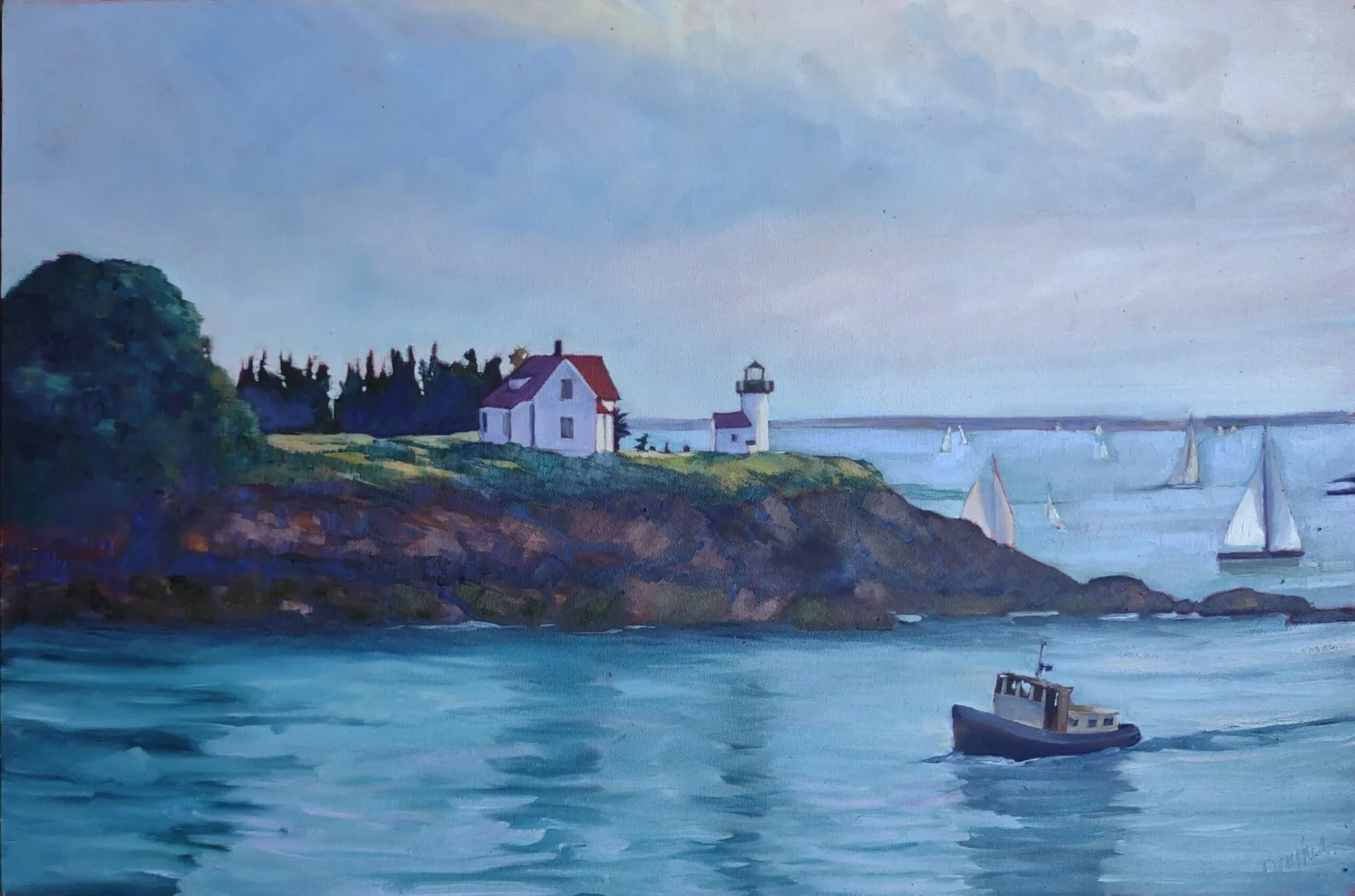
| Nubble’s Light Keeper’s House, at sunset as Georgia O’Keeffe would have seen it during her 1920s visits, as seen from Sohier Park on the Cape Neddick peninsula between Long Sands and Short Sands beaches in York, Maine. Commonly called Nubble Light or The Nubble, it’s officially named Cape Neddick Light, on Nubble Island, on October 25, 2014, painted April 19, 2020 7″ x 5″ (w x h), Daniel Smith, Schmincke Horadam, and Winsor & Newton watercolors, and Uniball waterproof fade proof ink on 140 lb. Fabriano Artistico cold press rough 100% cotton extra white watercolor paper framed, available. |
Bruce has a fantastic ability to create deep, jewel tones in watercolor, and he always seems to hit a vibrant color in the first pass. That’s based partly on the pigments he chooses and partly on how he applies them.
You can watch Bruce painting and talking about color in this demo he recorded on Cape Porpoise.
 |
| Buoys from the Sea, at the Cape Porpoise Pier in Kennebunkport, Maine on March 1, 2019, painted March 18, 2019 12″ x 9″ (w x h), Daniel Smith, Schmincke Horadam, and Winsor & Newton watercolors, wax resist, and Uniball waterproof fade proof ink on 140 lb. Fabriano Artistico cold press rough 100% cotton extra white watercolor paper framed, available.
|
Using quality materials is important, and it’s doubly crucial for students. It’s tempting to buy dimestore paints until you know if you’re going to be serious about painting, but you start at a severe disadvantage. If your paints aren’t decent quality, there’s no way you can get good color in your paintings.
In watercolor, there’s another issue—pigments fade faster in watercolor than they do in oils. That’s why watercolorists are so fiendish about lightfastness tests.
 |
| Snow Stuck Opal Apple Study 1, on a sunny day behind my home in Shapleigh, Maine on December 4, 2019, painted December 12, 2019 7″ x 5″ (w x h), Daniel Smith, Schmincke Horadam, and Winsor & Newton watercolors, and Uniball waterproof fade proof ink on 140 lb. Fabriano Artistico cold press rough 100% cotton extra white watercolor paper framed, available. |
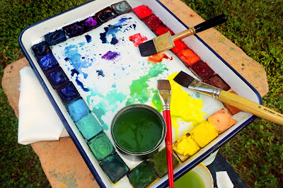
Appended to the end of this post are Bruce’s pigments. Those he uses regularly are highlighted in red. Those he carries around but seldom uses are in grey.
“These were only selected after looking at all of the archival/permanence data available. I use colors from three brands, Daniel Smith, Schmincke Horadam, and Winsor & Newton,” he said. “I used to use Holbein, fun colors, but they don’t pass the archival test.”
Bruce noted the manufacturer of each paint on his list. “Colors are not the same going from brand to brand, and not only in color but also in permanence,” he said.
Bruce’s palette is large enough to allow him to mix enough paint for each full pass. He has bigger brushes at hand and bigger puddles of color available. Anemic color comes from not having enough of the color in question at hand, and then from applying it too sparingly. Bruce can hit strong colors because he makes enough of them to start with.
Paint glazed in numerous thin layers is not darker or more saturated than a single layer of the same paint applied right the first time. That’s a myth. In fact, multiple applications just muck up the surface of the paper, reducing its reflectance. Part of the reason Bruce’s colors sing is that he hasn’t ruined the paper with excessive layering.
Your assignment is to copy one of Bruce’s paintings—you can choose which one—trying to get the same intensity of color on the first pass, using the paints you have on your own palette. (If you use my palette, you should have no problem hitting all the points in his paintings.)
I’m hearing the oil-painters chuckling, thinking ‘this is so easy.’ Try it first.
——————————
Cadmium Red W&N
Permanent Alizarin Crimson W&N
Quinacridone Coral DS
Pyrrol Orange DS
Permanent Orange DS
Burnt Sienna W&N
Raw Umber W&N
Yellow Ochre W&N
——————————
Naples Yellow DS
Hansa Yellow Medium DS
Lemon Yellow DS
Olive Green Yellowish SH
Permanent Sap Green W&N
——————————
Hooker Green W&N
Cobalt Green W&N
Cobalt Turquoise SH
Cerulean Blue W&N
Phthalo Blue Green Shade DS
Phthalo Blue Red Shade DS
French Ultramarine W&N
Prussian Blue W&N
——————————
Payne’s Gray Bluish SH
Quinacridone Purple DS
Cobalt Violet Deep DS
Davys Grey W&N
Ivory Black Winsor & Newton


I'm honored to be included in your blog, well organized, well put, and thorough. And I'm curious to see if anyone dares to paint from my art. Well done, and thanks, my friend. -Bruce