
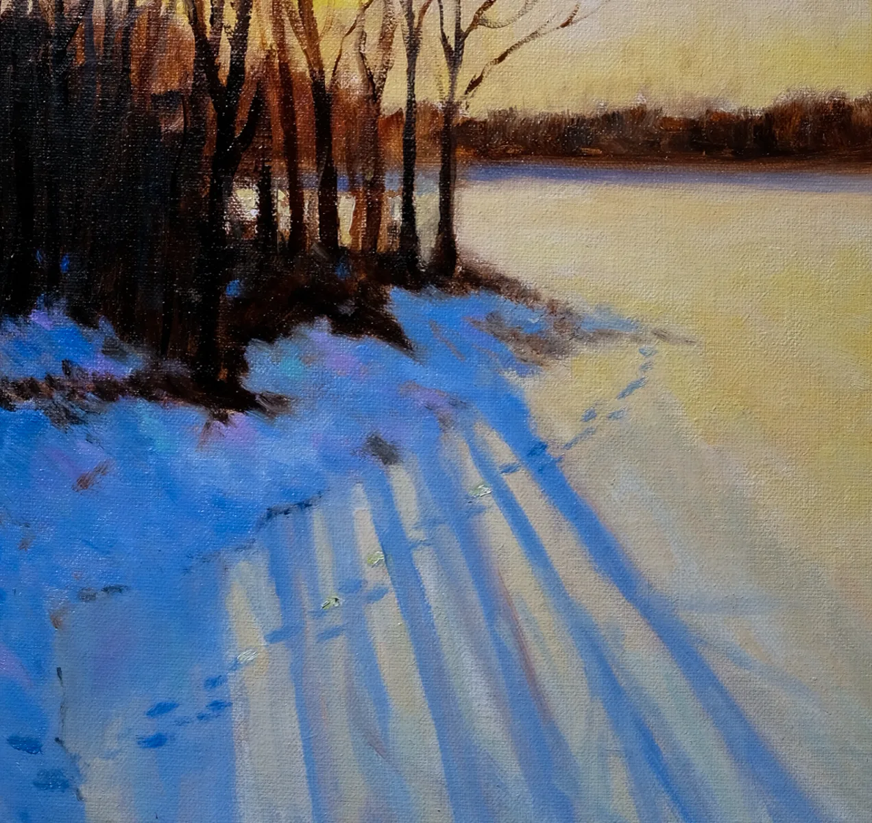
“The limited bandwidth in our optic nerve is reserved for those things we don’t expect. We effectively only notice things that are surprising – that’s how we can compress information efficiently. It’s similar to what happens in a television. There’s an expectation value for each pixel and the data is only used to the extent that the pixel deviates from the expected level of the one that precedes it, or the one that adjoins it. So that very thing of being interestingly less wrong: there’s a complete difference between things we notice and things we perceive.“
That’s Rory Sutherland in The Spectator, and he was quoting a theory from The Experience Machine: How Our Minds Predict and Shape Reality, by Andy Clark. Clark is a philosopher, not a neuroscientist, and one of his key theories—that our brains are essentially prediction machines—seems awfully simplistic to me. Nevertheless, his point about the optic nerve is backed up by science.
How your eyes work
The optic nerve has a limited number of axons, which are the things that conduct electrical impulses. That bandwidth constraint means our visual system must prioritize and condense information.
Much of that data compression happens in the retina itself, where photoreceptor cells and ganglion cells focus on edges, contrasts, and motion. Then these signals are sent to the optic nerve.
Our retinas filter spatially by detecting changes in luminance across different areas of the visual field. They filter temporally by detecting changes in brightness over time. If there are no changes, there’s no need to forward more data.
Once that happens the brain uses context and prior knowledge to interpret what the optic nerve has sent. Much of what we ‘see’ is really a reconstruction built on what we’ve seen before. So the value of ‘don’t be boring’ is that it makes the eye and brain really look.
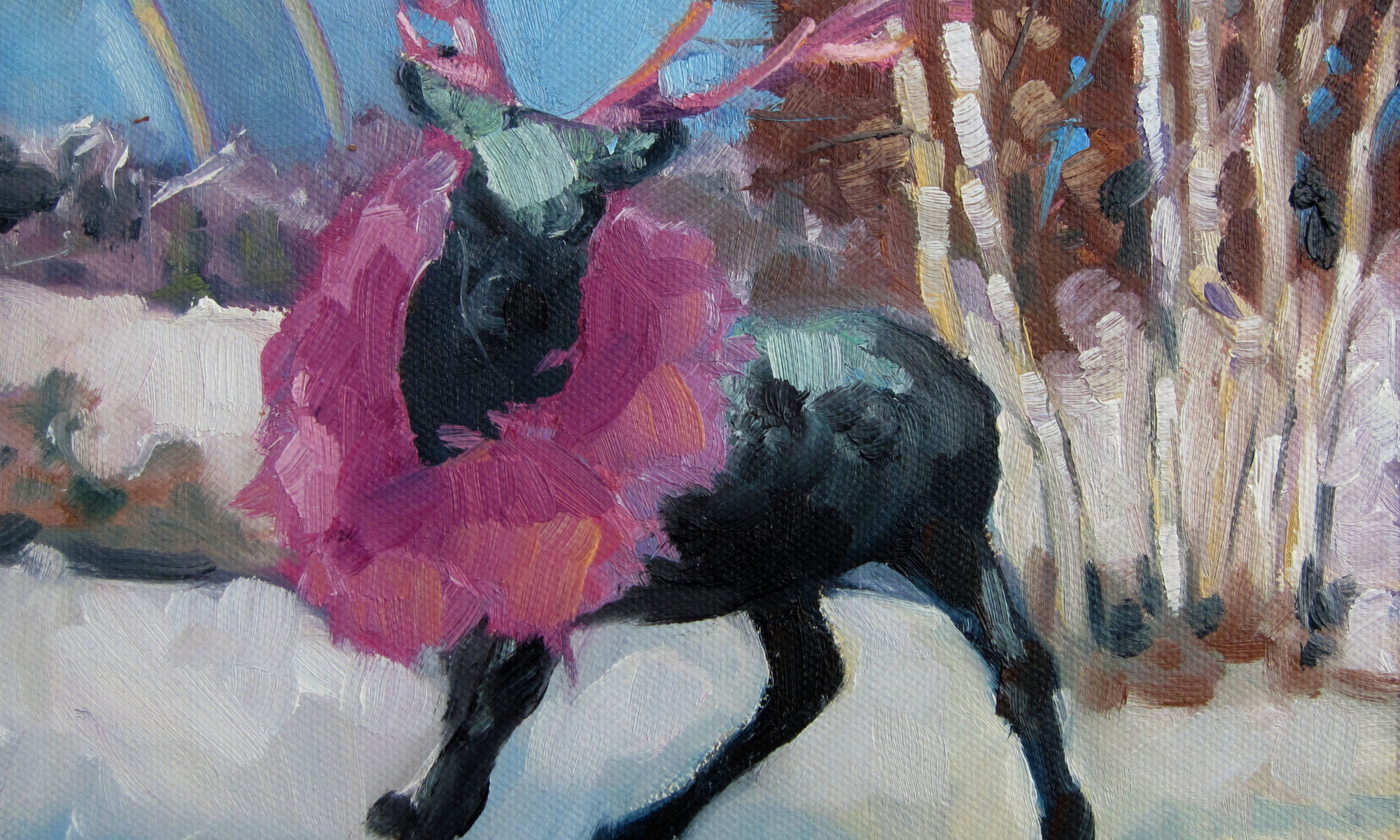
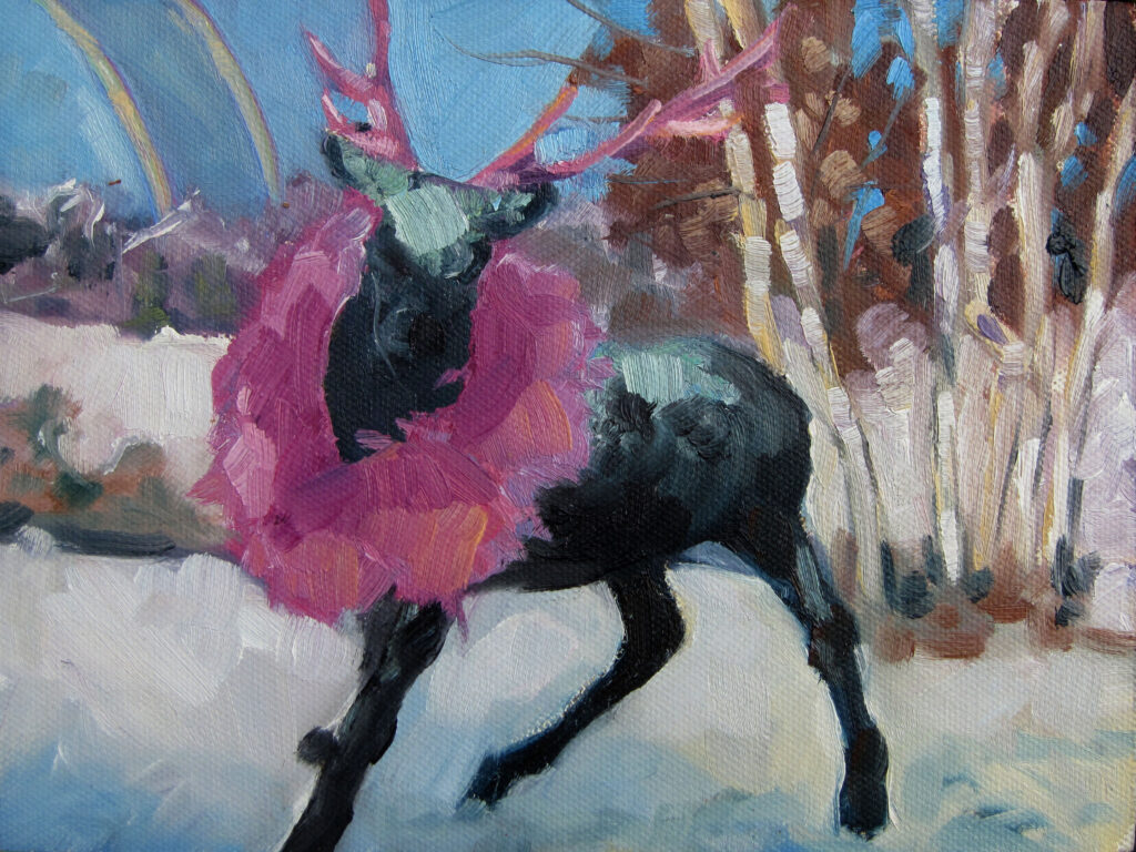
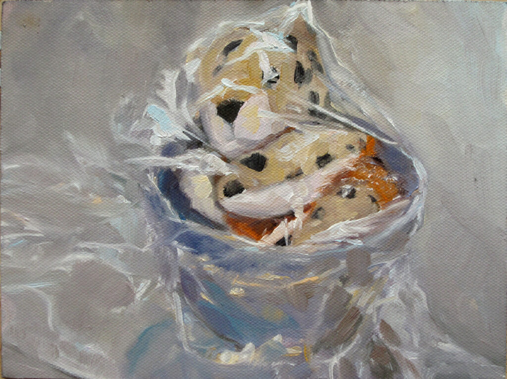
How Colin Page does ‘don’t be boring’
One of my favorite galleries is the Page Gallery in Camden. I’m constantly surprised by something there. This week, Lisa Renton gave Poppy Balser and me a detailed audiotour of (of all things) their Christmas tree. It combines natural plants with unnatural finishes and iridescent tinsel (which is a lot better executed on their tree than in the product photos).
Right now Colin seems to be in a rainbow sherbet phase; it’s cool, arresting, luminous, and you can’t really understand the subtle high-key balance from the online photos. Nathaniel Meyer is painting somewhere between the Canadian great Lawren Harris and fairy tales. Marc Hanson has some lovely small monotypes that say nothing and everything. Next time I go in, there will be something else that stops me cold or makes me laugh.
How you can do ‘don’t be boring’
I’ve written before about the importance of not being boring, but maybe it’s more accurate to say that we should strive to be innovative and surprising. That doesn’t mean awkward or badly-composed, and it certainly doesn’t excuse terrible drafting or paint handling. But with technical competence comes the freedom to think about whatever you want, rather than what others have thought about before. That means spending less time painting and more time drawing and thinking. What are you thinking about that might translate into something new and different in paint?
Speaking of drawing
I still have room in my drawing class starting right after the new year. It’s the best thing I can recommend to improve your painting in 2025. (Yeah, I’m talking to you.)
Registration is now open for workshops in 2026! Reserve your spot:
- Advanced Plein Air Painting | Rockport, ME, July 13-17, 2026
- Sea & Sky | Acadia National Park, ME, August 2–7, 2026
- Find your Authentic Voice in Plein Air | Berkshires, MA, August 10-14, 2026
- New! Color Clinic 2026 | Rockport, ME, October 3-4, 2026
- New! Composition Week 2026 | Rockport, ME, October 5-9, 2026
Can’t commit to a full workshop? Work online at your own pace:
